
Top Related Projects

Make your native android Toasts Fancy. A library that takes the standard Android toast to the next level with a variety of styling options. Style your toast from code.

🌈 A Beautiful Motion Toast Library for Kotlin Android

An Android Alerting Library
Quick Overview
Toasty is a lightweight Android library that allows developers to easily add a customizable toast animation to their applications. It provides a fun and nostalgic throwback to the classic Mortal Kombat "Toasty!" easter egg, while offering customization options for modern app designs.
Pros
- Easy integration with minimal setup required
- Highly customizable, allowing developers to change images, sounds, and animation behavior
- Lightweight library with minimal impact on app performance
- Adds a unique and playful element to Android applications
Cons
- May not be suitable for all types of applications, especially those with a more serious tone
- Limited use case, as it's primarily a visual gimmick rather than a core functionality
- Potential for overuse, which could annoy users if not implemented thoughtfully
- Requires careful consideration of sound usage to avoid disrupting user experience
Code Examples
- Basic usage:
Toasty.show(context, R.drawable.my_image)
This code displays the Toasty animation with a custom image.
- Customizing animation duration:
Toasty.show(context, R.drawable.my_image, durationInMillis = 1500)
This example sets a custom duration for the Toasty animation.
- Adding a custom sound:
Toasty.show(context, R.drawable.my_image, soundId = R.raw.my_sound)
This code adds a custom sound to play during the Toasty animation.
- Changing animation direction:
Toasty.show(context, R.drawable.my_image, fromBottom = false)
This example makes the Toasty animation appear from the right side instead of the bottom.
Getting Started
To use Toasty in your Android project, follow these steps:
- Add the JitPack repository to your project's build.gradle file:
allprojects {
    repositories {
        ...
        maven { url 'https://jitpack.io' }
    }
}
- Add the dependency to your app's build.gradle file:
dependencies {
    implementation 'com.github.GrenderG:Toasty:1.5.2'
}
- In your activity or fragment, use Toasty as shown in the code examples above.
Competitor Comparisons
Make your native android Toasts Fancy. A library that takes the standard Android toast to the next level with a variety of styling options. Style your toast from code.
Pros of FancyToast-Android
- Offers more customization options, including custom icons and fonts
- Provides a wider range of pre-defined toast styles (Success, Error, Warning, Info, Default, Confusing)
- Allows for easy creation of custom toast layouts
Cons of FancyToast-Android
- Less actively maintained (last update was 2 years ago)
- Fewer stars and forks on GitHub, indicating potentially less community support
- Slightly more complex implementation compared to Toasty
Code Comparison
FancyToast-Android:
FancyToast.makeText(this, "Hello World!", FancyToast.LENGTH_LONG, FancyToast.SUCCESS, true).show();
Toasty:
Toasty.success(getApplicationContext(), "Hello World!", Toast.LENGTH_SHORT, true).show();
Both libraries offer similar ease of use, with FancyToast-Android providing more built-in styles. Toasty's implementation is slightly more concise, while FancyToast-Android offers more customization options in a single line of code.
Overall, FancyToast-Android provides more features and customization options, making it suitable for projects requiring diverse toast styles. However, Toasty is more actively maintained and has a larger community, which may be preferable for long-term stability and support.
🌈 A Beautiful Motion Toast Library for Kotlin Android
Pros of MotionToast
- Offers more customizable and visually appealing toast animations
- Supports dark mode and custom themes out of the box
- Provides a wider variety of pre-defined toast styles (success, error, warning, etc.)
Cons of MotionToast
- Larger library size due to additional features and animations
- Slightly more complex implementation compared to Toasty's simplicity
- May require more system resources for animations
Code Comparison
MotionToast:
MotionToast.createColorToast(this,
    "Success",
    "Profile Updated Successfully!",
    MotionToastStyle.SUCCESS,
    MotionToast.GRAVITY_BOTTOM,
    MotionToast.LONG_DURATION,
    ResourcesCompat.getFont(this, R.font.helvetica_regular))
Toasty:
Toasty.success(getApplicationContext(), "Success!", Toast.LENGTH_SHORT, true).show();
MotionToast offers more customization options in a single method call, while Toasty provides a simpler, more concise implementation. MotionToast allows for greater control over appearance and positioning, whereas Toasty focuses on quick, pre-defined toast styles with minimal configuration.
An Android Alerting Library
Pros of Alerter
- More customizable appearance with options for custom layouts and icons
- Supports chaining multiple alerts
- Offers swipe-to-dismiss functionality
Cons of Alerter
- Slightly more complex implementation compared to Toasty
- Limited to displaying alerts at the top of the screen
Code Comparison
Alerter:
Alerter.create(this@DemoActivity)
    .setTitle("Alert Title")
    .setText("Alert text...")
    .show()
Toasty:
Toasty.info(context, "Info toast!", Toast.LENGTH_SHORT, true).show();
Key Differences
Alerter focuses on creating customizable alert dialogs that appear at the top of the screen, while Toasty specializes in enhancing Android's built-in toast notifications. Alerter offers more advanced features like custom layouts and chaining multiple alerts, making it suitable for more complex notification requirements. Toasty, on the other hand, provides a simpler API for creating stylized toast messages with predefined styles and icons.
Alerter is better suited for applications that need prominent, customizable alerts with more screen presence. Toasty is ideal for quick, non-intrusive notifications that blend well with Android's native look and feel.
Convert  designs to code with AI

Introducing Visual Copilot: A new AI model to turn Figma designs to high quality code using your components.
Try Visual CopilotREADME

Toasty

The usual Toast, but with steroids.
Prerequisites
Add this in your root build.gradle file (not your module build.gradle file):
allprojects {
	repositories {
		...
		maven { url "https://jitpack.io" }
	}
}
Dependency
Add this to your module's build.gradle file (make sure the version matches the JitPack badge above):
dependencies {
	...
	implementation 'com.github.GrenderG:Toasty:1.5.2'
}
Configuration
This step is optional, but if you want you can configure some Toasty parameters. Place this anywhere in your app:
Toasty.Config.getInstance()
    .tintIcon(boolean tintIcon) // optional (apply textColor also to the icon)
    .setToastTypeface(@NonNull Typeface typeface) // optional
    .setTextSize(int sizeInSp) // optional
    .allowQueue(boolean allowQueue) // optional (prevents several Toastys from queuing)
    .setGravity(int gravity, int xOffset, int yOffset) // optional (set toast gravity, offsets are optional)
    .supportDarkTheme(boolean supportDarkTheme) // optional (whether to support dark theme or not)
    .setRTL(boolean isRTL) // optional (icon is on the right)
    .apply(); // required
You can reset the configuration by using reset() method:
Toasty.Config.reset();
Usage
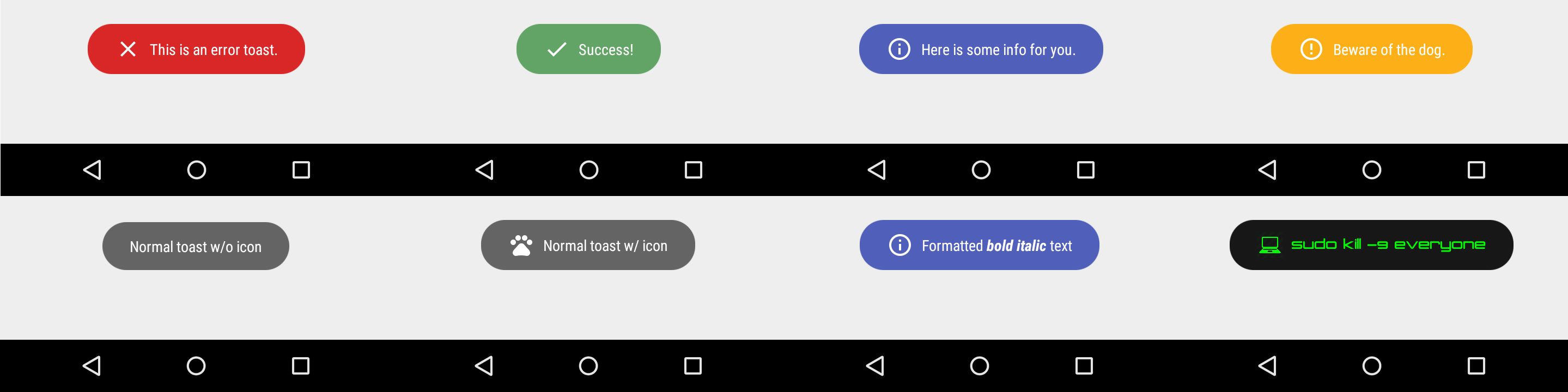
Each method always returns a Toast object, so you can customize the Toast much more. DON'T FORGET THE show() METHOD!
To display an error Toast:
Toasty.error(yourContext, "This is an error toast.", Toast.LENGTH_SHORT, true).show();
To display a success Toast:
Toasty.success(yourContext, "Success!", Toast.LENGTH_SHORT, true).show();
To display an info Toast:
Toasty.info(yourContext, "Here is some info for you.", Toast.LENGTH_SHORT, true).show();
To display a warning Toast:
Toasty.warning(yourContext, "Beware of the dog.", Toast.LENGTH_SHORT, true).show();
To display the usual Toast:
Toasty.normal(yourContext, "Normal toast w/o icon").show();
To display the usual Toast with icon:
Toasty.normal(yourContext, "Normal toast w/ icon", yourIconDrawable).show();
You can also create your custom Toasts with the custom() method:
Toasty.custom(yourContext, "I'm a custom Toast", yourIconDrawable, tintColor, duration, withIcon,
shouldTint).show();
Extra
You can pass formatted text to Toasty!
There are variants of each method, feel free to explore this library.
Screenshots
Please click the image below to enlarge.
Third Party Bindings
React Native
You may now use this library with React Native via this module.
Apps using Toasty
Want to be here? Open an issue or make a pull request.


Top Related Projects
Make your native android Toasts Fancy. A library that takes the standard Android toast to the next level with a variety of styling options. Style your toast from code.
🌈 A Beautiful Motion Toast Library for Kotlin Android
An Android Alerting Library
Convert designs to code with AI
Introducing Visual Copilot: A new AI model to turn Figma designs to high quality code using your components.
Try Visual Copilot