 antwort
Beautiful responsive email templates with code as beautiful as email templates can be
Top Related Projects

A free simple responsive HTML email template

A few simple, but solid patterns for responsive HTML email templates and newsletters. Even in Outlook and Gmail.

MJML: the only framework that makes responsive-email easy

Rock-solid transactional email templates for applications.

Email Blueprints is a collection of HTML email templates that can serve as a solid foundation and starting point for the design of emails

Quickly create responsive HTML emails that work on any device and client. Even Outlook.
Quick Overview
Antwort is an email template builder and generator designed to create responsive HTML emails. It provides a set of tools and templates to streamline the process of creating email-client-friendly HTML emails that work across various devices and email clients.
Pros
- Simplifies the creation of responsive HTML emails
- Includes pre-built templates and components for quick development
- Supports Sass for more efficient styling
- Offers a build process for optimizing email code
Cons
- Limited documentation and examples available
- Not actively maintained (last commit was in 2017)
- May require updates to work with newer email clients
- Lacks advanced features found in some modern email builders
Code Examples
- Using the default template:
<!-- example.html -->
<container>
  <row>
    <columns small="12" large="6">
      <h1>Welcome to Antwort</h1>
      <p>This is a responsive email template.</p>
    </columns>
    <columns small="12" large="6">
      <img src="image.jpg" alt="Example Image">
    </columns>
  </row>
</container>
- Adding custom styles:
// styles.scss
$primary-color: #007bff;

h1 {
  color: $primary-color;
  font-size: 24px;
}

.button {
  background-color: $primary-color;
  color: white;
  padding: 10px 20px;
  text-decoration: none;
}
- Using a component:
<!-- button.html -->
<button class="button" href="https://example.com">
  Click me!
</button>
Getting Started
-
Clone the repository:
git clone https://github.com/InterNations/antwort.git -
Install dependencies:
cd antwort npm install -
Create a new email template:
cp templates/default.html emails/my-email.html -
Build the email:
gulp build -
Find the generated email in the
distfolder.
Competitor Comparisons
A free simple responsive HTML email template
Pros of responsive-html-email-template
- Simpler structure with a single HTML file, making it easier to understand and modify
- More extensive inline documentation and comments explaining each section
- Includes a plaintext version of the email for better accessibility
Cons of responsive-html-email-template
- Less modular approach, which may make it harder to maintain for larger projects
- Fewer pre-built components and layout options compared to Antwort
- Limited customization options without significant modifications
Code Comparison
responsive-html-email-template:
<table role="presentation" border="0" cellpadding="0" cellspacing="0" class="body">
<tr>
<td> </td>
<td class="container">
<div class="content">
<!-- START CENTERED WHITE CONTAINER -->
<table role="presentation" class="main">
Antwort:
<table class="container" border="0" cellpadding="0" cellspacing="0" width="600">
  <tr>
    <td class="wrapper" width="600">
      <!--[if (gte mso 9)|(IE)]>
      <table width="600" cellpadding="0" cellspacing="0" style="border-collapse:collapse;">
        <tr>
          <td width="600">
      <![endif]-->
Both templates use table-based layouts for compatibility, but Antwort includes additional conditional comments for better Outlook support. responsive-html-email-template uses more semantic class names, while Antwort focuses on width-specific classes for responsiveness.
A few simple, but solid patterns for responsive HTML email templates and newsletters. Even in Outlook and Gmail.
Pros of Cerberus
- More comprehensive and feature-rich, offering a wider range of email template components
- Actively maintained with regular updates and improvements
- Includes extensive documentation and examples for easier implementation
Cons of Cerberus
- Larger file size due to more extensive features, potentially impacting email load times
- Steeper learning curve for beginners due to its complexity
- May require more customization to fit specific design needs
Code Comparison
Cerberus (responsive table structure):
<table role="presentation" cellspacing="0" cellpadding="0" border="0" width="100%">
    <tr>
        <td style="padding: 20px 0 30px 0;">
            <table align="center" border="0" cellpadding="0" cellspacing="0" width="600" style="border-collapse: collapse; border: 1px solid #cccccc;">
                <!-- Content goes here -->
            </table>
        </td>
    </tr>
</table>
Antwort (simple column structure):
<table class="row">
    <tr>
        <td class="wrapper last">
            <table class="twelve columns">
                <tr>
                    <td>
                        <!-- Content goes here -->
                    </td>
                    <td class="expander"></td>
                </tr>
            </table>
        </td>
    </tr>
</table>
MJML: the only framework that makes responsive-email easy
Pros of mjml
- More comprehensive and feature-rich framework for responsive email design
- Larger community and ecosystem with better documentation and support
- Offers a component-based approach, making it easier to create complex layouts
Cons of mjml
- Steeper learning curve due to its custom syntax and components
- May generate more verbose HTML output, potentially impacting email size
- Requires compilation step, which can slow down development workflow
Code Comparison
antwort example:
<table class="row">
  <tr>
    <td class="wrapper last">
      <table class="twelve columns">
        <tr>
          <td>
            <h1>Hello World</h1>
          </td>
        </tr>
      </table>
    </td>
  </tr>
</table>
mjml example:
<mjml>
  <mj-body>
    <mj-section>
      <mj-column>
        <mj-text>
          <h1>Hello World</h1>
        </mj-text>
      </mj-column>
    </mj-section>
  </mj-body>
</mjml>
Both frameworks aim to simplify responsive email development, but mjml offers a more abstracted and component-based approach, while antwort provides a simpler, table-based structure. mjml's syntax is more declarative and easier to read, but it requires learning a new language. antwort's approach is closer to traditional HTML, making it potentially easier for developers familiar with standard web development practices.
Rock-solid transactional email templates for applications.
Pros of postmark-templates
- More comprehensive set of email templates, including transactional and marketing emails
- Better documentation and usage guidelines
- Responsive design with support for various email clients
Cons of postmark-templates
- Less focus on customization and flexibility
- Larger file size and more complex structure
- Steeper learning curve for beginners
Code Comparison
antwort:
<table class="row">
  <tr>
    <td class="wrapper last">
      <table class="twelve columns">
        <tr>
          <td>
            <!-- Content here -->
          </td>
        </tr>
      </table>
    </td>
  </tr>
</table>
postmark-templates:
<table class="email-content" width="100%" cellpadding="0" cellspacing="0" role="presentation">
  <tr>
    <td class="email-body" width="100%" cellpadding="0" cellspacing="0">
      <table class="email-body_inner" align="center" width="570" cellpadding="0" cellspacing="0" role="presentation">
        <tr>
          <td class="content-cell">
            <!-- Content here -->
          </td>
        </tr>
      </table>
    </td>
  </tr>
</table>
Both repositories offer HTML email templates, but postmark-templates provides a more extensive collection with better documentation. However, antwort focuses on simplicity and ease of customization. The code comparison shows that postmark-templates uses a more complex table structure, while antwort opts for a simpler approach. Choose based on your specific needs and level of expertise in email template development.
Email Blueprints is a collection of HTML email templates that can serve as a solid foundation and starting point for the design of emails
Pros of email-blueprints
- More comprehensive collection of email templates
- Includes templates for various email types (newsletters, transactional, etc.)
- Backed by Mailchimp's extensive email marketing expertise
Cons of email-blueprints
- Less focused on responsive design compared to Antwort
- May require more customization for specific use cases
- Not actively maintained (last update was several years ago)
Code Comparison
Antwort (SCSS):
@mixin responsive-image($mobile-width: 100%) {
  img {
    height: auto;
    max-width: 100% !important;
    width: $mobile-width;
  }
}
email-blueprints (CSS):
.responsive-image {
  height: auto !important;
  max-width: 100% !important;
  width: 100% !important;
}
Both repositories provide email templates and resources for creating responsive HTML emails. Antwort focuses on a streamlined, responsive approach with a modular system, while email-blueprints offers a wider variety of templates for different email types. Antwort uses SCSS for more flexible styling, whereas email-blueprints relies on traditional CSS. The code comparison shows how each handles responsive images, with Antwort using a mixin for more customization options.
Quickly create responsive HTML emails that work on any device and client. Even Outlook.
Pros of Foundation for Emails
- More comprehensive framework with a wider range of components and features
- Includes a responsive grid system for easier layout creation
- Offers Sass support for more flexible styling options
Cons of Foundation for Emails
- Steeper learning curve due to its more complex structure
- Larger file size, which may impact email load times
- Requires more setup and configuration for custom projects
Code Comparison
Antwort:
<table class="row">
  <tr>
    <td class="wrapper last">
      <table class="twelve columns">
        <tr>
          <td>
            <!-- Content here -->
          </td>
        </tr>
      </table>
    </td>
  </tr>
</table>
Foundation for Emails:
<row>
  <columns small="12">
    <!-- Content here -->
  </columns>
</row>
Summary
Foundation for Emails offers a more robust framework with advanced features, while Antwort provides a simpler, more lightweight solution. Foundation's code is more concise and uses custom elements, whereas Antwort relies on nested tables for layout. The choice between the two depends on project requirements, team expertise, and desired email complexity.
Convert  designs to code with AI

Introducing Visual Copilot: A new AI model to turn Figma designs to high quality code using your components.
Try Visual CopilotREADME
Antwort
Responsive Layouts for Email

Antwort offers responsive layouts for Email that both fits and adapts to client widths. Don't underwhelm desktop users with single column layouts that work for mobile. Antwort offers columns on desktop that automatically become rows on mobile.
Author: Julie Ng (@jng5)
Date: October 2014
Version: 1.0.0
Features
- Works on mobile: Mail on iOS and Email on Android.
- Works in major clients like AOL, gmail, outlook.com and Yahoo.
- Even works in Outlook (2000+).
- Bulletproof layouts: made with dynamic content in mind.
- Minimalist in design for maximum customizability.
NEW since v1.0
-
Source templates
Antwort now includes the source templates (pre inlined CSS) for your reference. This lets you easily customize the template for your own use. Each template has abuild.htmlwith inlined CSS as well as the original source files in asourcefolder. -
Support for Android 4.3+
Antwort v0 relied on applyingdisplay: block;to<td>to force columns into rows. Starting with Android 4.3, that is no longer possible, i.e. columns remain columns.Antwort v1 relies on conditional wrapper tables to support Microsoft Outlook desktop clients. The columns themselves are no longer
<td>s but<table>s, whose width expand to 100% on mobile devices.
Included Templates
Included templates as of v1.0.0 release (14 October 2014):
Single Column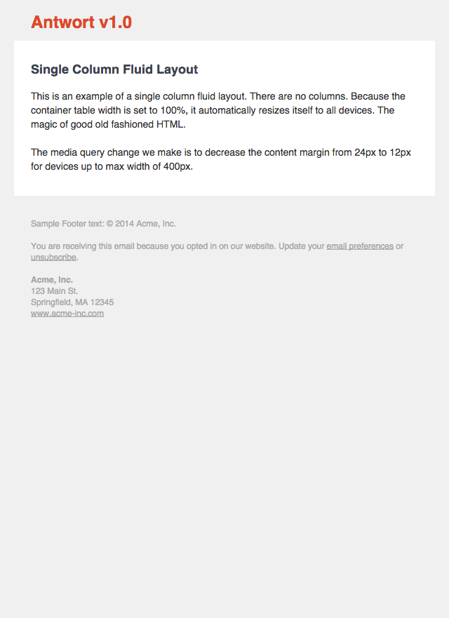
|
Two Columns (text)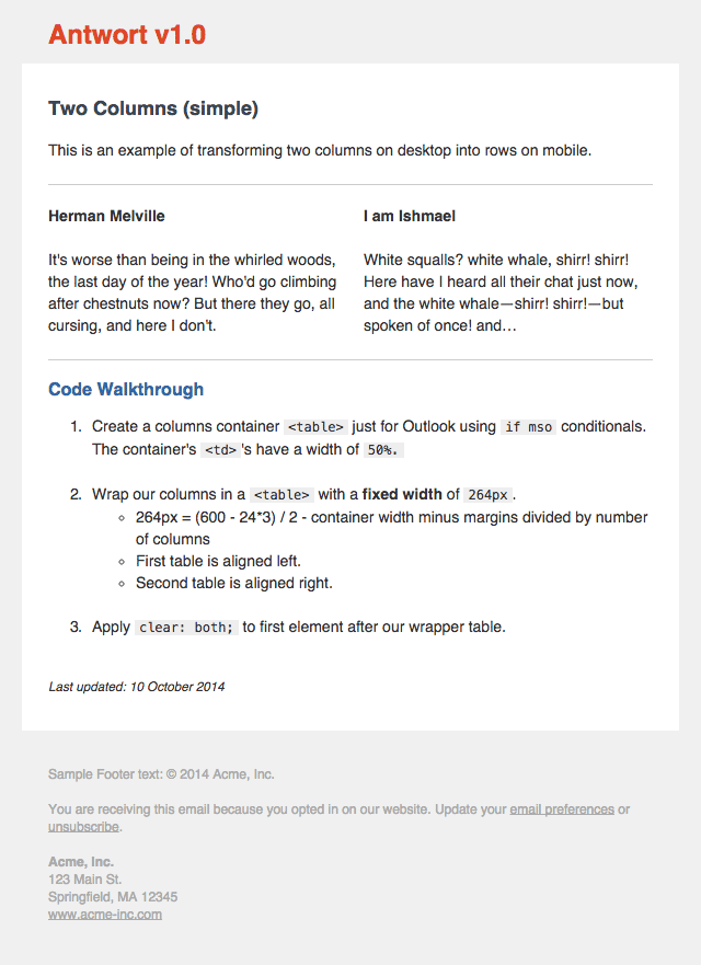
|
Three Columns (images)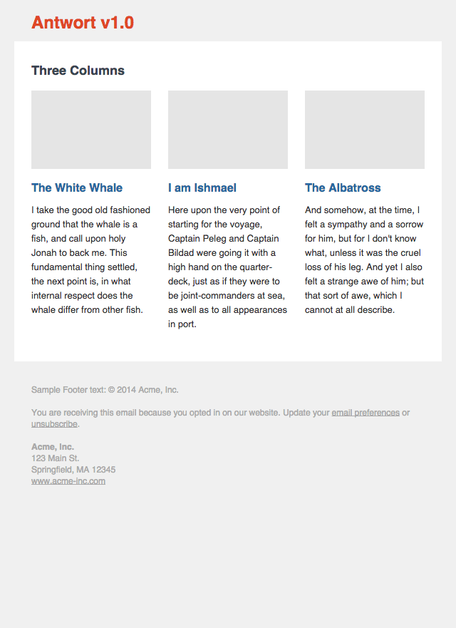
|
| Litmus Previews | Litmus Previews | Litmus Previews |
NOTE: many Litmus thumbnails are broken and not showning the white background container. But if you view the large version, you will see that the Antwort templates render perfectly as intended.
Screenshots updated on 13 January 2016.
How to use Antwort
Antwort is not a framework. Antwort is meant to teach you how to do responsive layouts for Email. That's why source pre-lined HTML is now included for you to learn from.
Need help?
Before posting an issue, please
- Make sure you are sending the email from an Email Service Provider (ESP), for example MailChimp not your Email client e.g. Outlook.
- Double check any code changes you might have made
- Do a test send to yourself and view the source. Did your ESP change the code?
Changelog
1.0.2
8 July 2015
- New: removed
attribute=""CSS selector syntax now that Yahoo Mail fixed their CSS parser - Fixed: Three columns with images: replaced margins with padding to support Outlook.com
1.0.1
3 December 2014
- Added
<meta http-equiv="X-UA-Compatible" content="IE=edge">to enable media queries on Windows 8 phones
1.0.0
14 October 2014
- Complete re-write of code, to reflect latest email development challenges, especially with Android 4.3+
- New: include source folders before inlining CSS.
- New: single column fluid layout
- Footer now includes example address, which has an example for removing blue iOS links.
0.1.2
April 2013
- Fixed issue #8 - headlines no longer centered in Outlook.com and older Outlook.
- Fixed issue #7 - moved padding overrides to parent
<td>in mobile styles.
0.1.1
26 March 2013
- Fixed column margin issue after Hotmail/Outlook dropped margin support.
- Issue #5 fixed - Outlook.com parses HTML tags in comments.
- Issue #3 fixed - control characters removed from template.
- Added screenshots of current version from Litmus test.
0.1.0
4 Jan 2013
- Hello open source world.
License
Antwort is provided under the MIT License - see LICENSE.md for full details.
Top Related Projects
A free simple responsive HTML email template
A few simple, but solid patterns for responsive HTML email templates and newsletters. Even in Outlook and Gmail.
MJML: the only framework that makes responsive-email easy
Rock-solid transactional email templates for applications.
Email Blueprints is a collection of HTML email templates that can serve as a solid foundation and starting point for the design of emails
Quickly create responsive HTML emails that work on any device and client. Even Outlook.
Convert designs to code with AI
Introducing Visual Copilot: A new AI model to turn Figma designs to high quality code using your components.
Try Visual Copilot