
Top Related Projects

:fire: Powerful and modernized popup menu with fully customizable animations.

Implementation of ExpandableListview with custom header and custom content.
Side menu with some categories to choose.
Neat library, that provides a simple way to implement guillotine-styled animation

Lollipop ViewAnimationUtils.createCircularReveal for everyone 4.0+

Android Floating Action Button based on Material Design specification
Quick Overview
Context-Menu.Android is a library for creating custom context menus in Android applications. It provides a visually appealing and customizable circular menu that can be triggered by long-pressing on UI elements, offering an alternative to the standard Android context menu.
Pros
- Visually attractive and modern circular menu design
- Highly customizable in terms of appearance and behavior
- Smooth animations for menu opening and closing
- Easy integration into existing Android projects
Cons
- May not fit all app designs or use cases
- Limited to circular layout, which might not be ideal for all menu types
- Requires additional setup compared to standard Android context menus
- Might have a steeper learning curve for developers unfamiliar with custom views
Code Examples
- Creating a basic context menu:
val menuItems = arrayListOf<MenuObject>().apply {
    add(MenuObject("Send message"))
    add(MenuObject("Like profile"))
    add(MenuObject("Add to friends"))
    add(MenuObject("Add to favourites"))
    add(MenuObject("Block user"))
}

val menuParams = MenuParams().apply {
    actionBarSize = resources.getDimension(R.dimen.tool_bar_height).toInt()
    menuObjects = menuItems
    isClosableOutside = false
    animationDuration = 100
    animationDelay = 50
}

ContextMenuDialogFragment.newInstance(menuParams).show(supportFragmentManager, ContextMenuDialogFragment.TAG)
- Customizing menu item appearance:
val menuItem = MenuObject("Custom item").apply {
    bgColor = ContextCompat.getColor(this@MainActivity, R.color.blue)
    textColor = Color.WHITE
    dividerColor = Color.GRAY
    setResourceIcon(R.drawable.ic_custom_icon)
}
- Handling menu item clicks:
override fun onMenuItemClick(view: View, position: Int) {
    when (position) {
        0 -> sendMessage()
        1 -> likeProfile()
        2 -> addToFriends()
        // ...
    }
}
Getting Started
- Add the dependency to your app's
build.gradle:
dependencies {
    implementation 'com.github.Yalantis:Context-Menu.Android:1.1.4'
}
- Create a list of
MenuObjects and set upMenuParams:
val menuItems = arrayListOf<MenuObject>()
// Add menu items...

val menuParams = MenuParams().apply {
    actionBarSize = resources.getDimension(R.dimen.tool_bar_height).toInt()
    menuObjects = menuItems
    // Set other parameters...
}
- Show the context menu:
ContextMenuDialogFragment.newInstance(menuParams).show(supportFragmentManager, ContextMenuDialogFragment.TAG)
- Implement
OnMenuItemClickListenerin your activity or fragment to handle menu item clicks.
Competitor Comparisons
:fire: Powerful and modernized popup menu with fully customizable animations.
Pros of PowerMenu
- More customizable with various styling options and animations
- Supports both ListView and GridView layouts for menu items
- Offers built-in header and footer views for additional content
Cons of PowerMenu
- Slightly more complex API compared to Context-Menu.Android
- May require more setup code for advanced customizations
- Less focus on circular menu layouts
Code Comparison
PowerMenu:
PowerMenu.Builder(context)
    .addItem(PowerMenuItem("Item 1", R.drawable.icon1))
    .addItem(PowerMenuItem("Item 2", R.drawable.icon2))
    .setAnimation(MenuAnimation.SHOWUP_TOP_LEFT)
    .setMenuRadius(10f)
    .setMenuShadow(10f)
    .build()
Context-Menu.Android:
MenuObject close = new MenuObject("Close");
close.setResource(R.drawable.icn_close);

MenuParams menuParams = new MenuParams();
menuParams.setActionBarSize((int) getResources().getDimension(R.dimen.tool_bar_height));
menuParams.setMenuObjects(getMenuObjects());
menuParams.setClosableOutside(false);
mMenuDialogFragment = ContextMenuDialogFragment.newInstance(menuParams);
Both libraries offer easy-to-use APIs for creating context menus in Android applications. PowerMenu provides more flexibility in terms of styling and layout options, while Context-Menu.Android focuses on a specific circular menu design. The choice between the two depends on the desired menu style and customization requirements of the project.
Implementation of ExpandableListview with custom header and custom content.
Pros of ExpandableLayout
- Focuses specifically on expandable/collapsible layouts, providing more specialized functionality
- Simpler implementation for basic expand/collapse animations
- Lightweight and easy to integrate into existing projects
Cons of ExpandableLayout
- Less visually appealing out-of-the-box compared to Context-Menu.Android's polished animations
- Limited to vertical expansion, whereas Context-Menu.Android offers more flexible menu options
- Less actively maintained, with fewer recent updates and contributions
Code Comparison
ExpandableLayout implementation:
ExpandableLayout expandableLayout = findViewById(R.id.expandable_layout);
expandableLayout.setExpandable(true);
expandableLayout.toggle();
Context-Menu.Android implementation:
MenuAdapter menuAdapter = new MenuAdapter(getApplicationContext(), menuItems);
ContextMenuDialogFragment cmdf = ContextMenuDialogFragment.newInstance(menuParams, menuAdapter);
cmdf.show(getSupportFragmentManager(), ContextMenuDialogFragment.TAG);
While both libraries aim to enhance Android UI interactions, they serve different purposes. ExpandableLayout is more focused on creating expandable views, making it easier to implement simple expand/collapse functionality. Context-Menu.Android, on the other hand, offers a more comprehensive and visually appealing solution for creating context menus with various animation options. The choice between the two depends on the specific requirements of your project and the desired level of customization and visual polish.
Side menu with some categories to choose.
Pros of Side-Menu.Android
- Provides a sleek, animated side menu with customizable icons and text
- Offers a more comprehensive navigation solution for apps with multiple sections
- Includes a demo app showcasing various implementation options
Cons of Side-Menu.Android
- May require more screen space compared to Context-Menu.Android
- Could be considered less intuitive for users accustomed to traditional context menus
- Potentially more complex to implement and customize
Code Comparison
Side-Menu.Android:
ResideMenu resideMenu = new ResideMenu(this);
resideMenu.setBackground(R.drawable.menu_background);
resideMenu.attachToActivity(this);
resideMenu.addMenuItem(menuItem, ResideMenu.DIRECTION_LEFT);
Context-Menu.Android:
MenuObject close = new MenuObject("Close");
close.setResource(R.drawable.icn_close);
menuObjects.add(close);
MenuParams menuParams = new MenuParams();
menuParams.setActionBarSize((int) getResources().getDimension(R.dimen.tool_bar_height));
Both libraries offer unique solutions for Android menu implementations. Side-Menu.Android provides a full-screen sliding menu, ideal for apps with multiple sections or complex navigation structures. It offers more customization options and a visually appealing animation effect. On the other hand, Context-Menu.Android focuses on providing a compact, context-specific menu that can be triggered from various UI elements. It's more suitable for apps that need quick access to contextual actions without taking up much screen space. The choice between the two depends on the specific navigation requirements and design preferences of your Android application.
Neat library, that provides a simple way to implement guillotine-styled animation
Pros of GuillotineMenu-Android
- Unique and visually striking animation effect
- Customizable menu content and appearance
- Smooth transition between menu states
Cons of GuillotineMenu-Android
- Limited to a specific animation style
- May not be suitable for all app designs or user preferences
- Potentially more complex to implement than traditional menus
Code Comparison
GuillotineMenu-Android:
val guillotineMenu = GuillotineAnimation.Builder(guillotineView, guillotineView.findViewById(R.id.guillotine_hamburger), contentView)
    .setStartDelay(250)
    .setActionBarViewForAnimation(toolbar)
    .setClosedOnStart(true)
    .build()
Context-Menu.Android:
val menuParams = MenuParams(
    actionBarSize = resources.getDimension(R.dimen.tool_bar_height).toInt(),
    menuObjects = getMenuObjects(),
    closableOutside = false
)
contextMenuDialogFragment = ContextMenuDialogFragment.newInstance(menuParams)
Both libraries offer unique menu implementations for Android applications. GuillotineMenu-Android provides a distinctive guillotine-style animation, while Context-Menu.Android offers a more traditional context menu with customizable options. The choice between the two depends on the specific design requirements and user experience goals of the application.
Lollipop ViewAnimationUtils.createCircularReveal for everyone 4.0+
Pros of CircularReveal
- Focuses specifically on circular reveal animations, providing a more specialized and potentially optimized solution
- Supports pre-Lollipop devices, extending compatibility to older Android versions
- Offers a simpler API for implementing circular reveal effects
Cons of CircularReveal
- Limited to circular reveal animations, while Context-Menu.Android provides a complete context menu solution
- Less actively maintained, with fewer recent updates compared to Context-Menu.Android
- Smaller community and fewer stars on GitHub, potentially indicating less widespread adoption
Code Comparison
CircularReveal:
ViewAnimationUtils.createCircularReveal(view, cx, cy, 0, finalRadius)
    .setDuration(duration)
    .start();
Context-Menu.Android:
MenuParams menuParams = new MenuParams();
menuParams.setActionBarSize((int) getResources().getDimension(R.dimen.tool_bar_height));
menuParams.setMenuObjects(getMenuObjects());
menuParams.setClosableOutside(false);
mMenuDialogFragment = ContextMenuDialogFragment.newInstance(menuParams);
While CircularReveal focuses on creating circular reveal animations with a simple API, Context-Menu.Android provides a more comprehensive solution for creating custom context menus with various animation options.
Android Floating Action Button based on Material Design specification
Pros of FloatingActionButton
- Focuses specifically on implementing floating action buttons, providing a more specialized and potentially optimized solution
- Offers a wider range of customization options for floating action buttons, including shadow, animations, and menu items
- Includes support for mini floating action buttons and label visibility toggling
Cons of FloatingActionButton
- Limited to floating action button functionality, whereas Context-Menu.Android provides a more versatile context menu solution
- May require additional libraries or components for implementing full context menu functionality
- Less actively maintained, with fewer recent updates compared to Context-Menu.Android
Code Comparison
Context-Menu.Android:
MenuObject close = new MenuObject();
close.setResource(R.drawable.icn_close);
menuObjects.add(close);
FloatingActionButton:
FloatingActionButton fab = new FloatingActionButton(this);
fab.setButtonSize(FloatingActionButton.SIZE_MINI);
fab.setColorNormalResId(R.color.pink);
fab.setColorPressedResId(R.color.pink_pressed);
fab.setIcon(R.drawable.ic_fab_star);
Both libraries offer straightforward implementation, but FloatingActionButton provides more specific customization options for floating action buttons, while Context-Menu.Android focuses on creating menu objects for context menus.
Convert  designs to code with AI

Introducing Visual Copilot: A new AI model to turn Figma designs to high quality code using your components.
Try Visual CopilotREADME

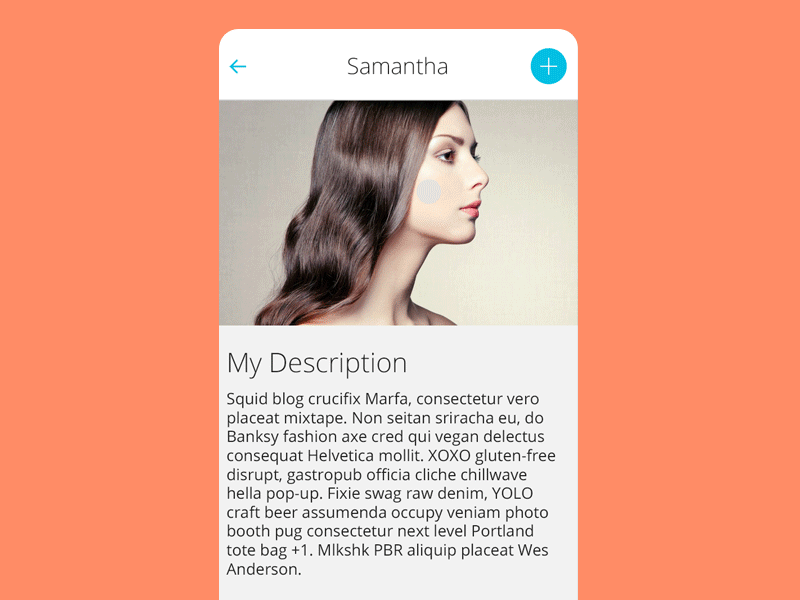
ContextMenu
You can easily add awesome animated context menu to your app.
Check this project on dribbble
Check this project on Behance
Usage:
For a working implementation, have a look at the app module
1. Clone repository and add sources into your project or use Gradle:
Add it in your root build.gradle at the end of repositories:
	allprojects {
		repositories {
			...
			maven { url 'https://jitpack.io' }
		}
	}
Add the dependency
	dependencies {
	        implementation 'com.github.Yalantis:Context-Menu.Android:1.1.4'
	}
2. Create list of MenuObject, which consists of icon or icon and description.
You can use any drawable, resource, bitmap, color as image:
    menuObject.drawable = ...
    menuObject.setResourceValue(...)
    menuObject.setBitmapValue(...)
    menuObject.setColorValue(...)
You can set image ScaleType:
menuObject.scaleType = ScaleType.FIT_XY
You can use any resource, drawable, color as background:
    menuObject.setBgResourceValue(...)
    menuObject.setBgDrawable(...)
    menuObject.setBgColorValue(...)
Now You can easily add text appearance style for menu titles:
	In your project styles create style for text appearance
	(For better visual effect extend it from TextView.DefaultStyle):

	<style name="TextViewStyle" parent="TextView.DefaultStyle">
        	<item name="android:textStyle">italic|bold</item>
        	<item name="android:textColor">#26D0EB</item>
	</style>

	And set it's id to your MenuObject :

        val bitmapDrawable = BitmapDrawable(
                resources,
                BitmapFactory.decodeResource(resources, R.drawable.icn_3)
        )

        val menuObject = MenuObject("Add to friends").apply {
            drawable = bitmapDrawable
            menuTextAppearanceStyle = R.style.TextViewStyle
        }
You can use any color as text color:
menuObject.textColor = ...
You can set any color as divider color:
menuObject.dividerColor = ...
Example:
    val close = MenuObject().apply { setResourceValue(R.drawable.icn_close) }

    val send = MenuObject("Send message").apply { setResourceValue(R.drawable.icn_1) }

    val addFriend = MenuObject("Add to friends").apply {
            drawable = BitmapDrawable(
                    resources,
                    BitmapFactory.decodeResource(resources, R.drawable.icn_3)
            )
    }

    val menuObjects = mutableListOf<MenuObject>().apply {
            add(close)
            add(send)
            add(addFriend)
    }
3. Create newInstance of ContextMenuDialogFragment, which received MenuParams object.
    val menuParams = MenuParams(
    	actionBarSize = resources.getDimension(R.dimen.tool_bar_height).toInt(),
    	menuObjects = getMenuObjects(),
    	isClosableOutside = false
    	// set other settings to meet your needs
    )

    // If you want to change the side you need to add 'gravity' parameter,
    // by default it is MenuGravity.END.

    // For example:

    val menuParams = MenuParams(
    	actionBarSize = resources.getDimension(R.dimen.tool_bar_height).toInt(),
    	menuObjects = getMenuObjects(),
    	isClosableOutside = false,
    	gravity = MenuGravity.START
    )

    val contextMenuDialogFragment = ContextMenuDialogFragment.newInstance(menuParams)
4. Set menu with button, which will open ContextMenuDialogFragment.
    override fun onCreateOptionsMenu(menu: Menu?): Boolean {
        menuInflater.inflate(R.menu.menu_main, menu)
        return true
    }

    override fun onOptionsItemSelected(item: MenuItem?): Boolean {
        item?.let {
            when (it.itemId) {
                R.id.context_menu -> {
                    showContextMenuDialogFragment()
                }
            }
        }

        return super.onOptionsItemSelected(item)
    }
5. Add menu item listeners.
    contextMenuDialogFragment = menuItemClickListener = { view, position ->
    	// do something here
    }

    contextMenuDialogFragment = menuItemLongClickListener = { view, position ->
    	// do something here
    }
Customization:
For better experience menu item size should be equal to ActionBar height.
newInstance of ContextMenuDialogFragment receives MenuParams object that has the fields:
menuObjects - list of MenuObject objects,
animationDelay - delay in millis after fragment opening and before closing, which will make animation smoother on slow devices,
animationDuration - duration of every piece of animation in millis,
isClosableOutside - if menu can be closed on touch to non-button area,
isFitSystemWindows - if true, then the default implementation of fitSystemWindows(Rect) will be executed,
isClipToPadding - true to clip children to the padding of the group, false otherwise.
The last two parameters may be useful if you use Translucent parameters in your theme:
<item name="android:windowTranslucentStatus">true</item>
To stay Context Menu below Status Bar set fitSystemWindows to true and clipToPadding to false.
Compatibility
- Android KitKat 4.4+
Changelog
Version: 1.1.4
- added background color animation
Version: 1.1.2
- added animation on close outside menu
Version: 1.1.1
- bug with
menuObject.textColorwas fixed
Version: 1.1.0
- library rewrited on Kotlin
- added
rtlsupport - added
gravityparameter forMenuParams
Version: 1.0.8
- added transparent menu background support
- dependencies actualized
Version: 1.0.7
- Text in menu now also clickable
- Support libs and gradle updated
Version: 1.0.6
- com.android.tools.build:gradle:1.5.0
- Support libs and sdk updated to 23
Version: 1.0.5
- Fixed
setClosableOutsideissue. - Fixed
setAnimationDurationdoesn´t work for open event issue. - Fixed menu item listener setting mechanism. It can be not activity but any class that implements listeners now. Issue. Attention! You have to set listeners to the context fragment manually. Check block 5 in the
Usage.
Version: 1.0.4
- Old
ContextMenuDialogFragmentnewInstancemethods are deprecated. Use new universal one that receivedMenuParams. - Added possibility to dismiss menu by clicking on non-button area. See
MenuParams.setClosableOutside(boolean).
Version: 1.0.3
- Added menu text appearence style. (Note: other text style methods are deprecated).
Version: 1.0.2
- Changed
MenuObjectconstructors. Image setting is moved to methods - Added styling of
MenuObjectimage, background, text color, divider color - Added possibility to interact with translucent Status Bar
Version: 1.0.1
- Added
OnMenuItemLongClickListener(usage: the same asOnMenuItemClickListener, check sample app) - Renamed:
com.yalantis.contextmenu.lib.ContextMenuDialogFragment.ItemClickListener ->
com.yalantis.contextmenu.lib.interfaces.OnMenuItemClickListener

com.yalantis.contextmenu.lib.ContextMenuDialogFragment.ItemClickListener.onItemClick(...) ->
com.yalantis.contextmenu.lib.interfaces.OnMenuItemClickListener.onMenuItemClick(...)
Version: 1.0
- Pilot version
Let us know!
Weâd be really happy if you sent us links to your projects where you use our component. Just send an email to github@yalantis.com And do let us know if you have any questions or suggestion regarding the animation.
P.S. Weâre going to publish more awesomeness wrapped in code and a tutorial on how to make UI for Android (iOS) better than better. Stay tuned!
License
Copyright 2019, Yalantis

Licensed under the Apache License, Version 2.0 (the "License");
you may not use this file except in compliance with the License.
You may obtain a copy of the License at

   http://www.apache.org/licenses/LICENSE-2.0

Unless required by applicable law or agreed to in writing, software
distributed under the License is distributed on an "AS IS" BASIS,
WITHOUT WARRANTIES OR CONDITIONS OF ANY KIND, either express or implied.
See the License for the specific language governing permissions and
limitations under the License.
Top Related Projects
:fire: Powerful and modernized popup menu with fully customizable animations.
Implementation of ExpandableListview with custom header and custom content.
Side menu with some categories to choose.
Neat library, that provides a simple way to implement guillotine-styled animation
Lollipop ViewAnimationUtils.createCircularReveal for everyone 4.0+
Android Floating Action Button based on Material Design specification
Convert designs to code with AI
Introducing Visual Copilot: A new AI model to turn Figma designs to high quality code using your components.
Try Visual Copilot