 incubator-weex-ui
🏄 A rich interaction, lightweight, high performance UI library based on Weex.
Top Related Projects
A framework for building Mobile cross-platform UI
Apache Weex (Incubating)
Quick Overview
Apache Weex UI is a rich and powerful UI component library for Weex, a framework for building high-performance mobile applications. It provides a set of cross-platform UI components and modules that can be used to create native-like experiences on iOS, Android, and Web platforms using a single codebase.
Pros
- Cross-platform compatibility: Works seamlessly across iOS, Android, and Web
- Rich set of pre-built UI components: Saves development time and ensures consistency
- High performance: Optimized for mobile devices
- Active community and regular updates: Ensures ongoing support and improvements
Cons
- Learning curve: Requires familiarity with Weex framework
- Limited customization options for some components
- Documentation could be more comprehensive
- Dependency on the Weex ecosystem
Code Examples
- Using the WxcButton component:
<template>
  <wxc-button text="Click me"
              @wxcButtonClicked="buttonClicked">
  </wxc-button>
</template>

<script>
import { WxcButton } from 'weex-ui';

export default {
  components: { WxcButton },
  methods: {
    buttonClicked (e) {
      console.log('Button clicked!');
    }
  }
}
</script>
- Implementing a WxcPopover:
<template>
  <wxc-popover ref="wxc-popover"
               :buttons="btns"
               @wxcPopoverButtonClicked="popoverButtonClicked">
    <wxc-button text="Show Popover"
                @wxcButtonClicked="showPopover">
    </wxc-button>
  </wxc-popover>
</template>

<script>
import { WxcPopover, WxcButton } from 'weex-ui';

export default {
  components: { WxcPopover, WxcButton },
  data: () => ({
    btns: [
      { text: 'Option 1', key: 'option1' },
      { text: 'Option 2', key: 'option2' }
    ]
  }),
  methods: {
    showPopover () {
      this.$refs['wxc-popover'].wxcPopoverShow();
    },
    popoverButtonClicked (obj) {
      console.log('Selected:', obj.key);
    }
  }
}
</script>
- Using WxcSearchbar:
<template>
  <wxc-searchbar placeholder="Search..."
                 @wxcSearchbarCancelClicked="onCancel"
                 @wxcSearchbarInputReturned="onSearch">
  </wxc-searchbar>
</template>

<script>
import { WxcSearchbar } from 'weex-ui';

export default {
  components: { WxcSearchbar },
  methods: {
    onCancel () {
      console.log('Search cancelled');
    },
    onSearch (e) {
      console.log('Searching for:', e.value);
    }
  }
}
</script>
Getting Started
-
Install Weex UI in your Weex project:
npm install weex-ui --save -
Import and use components in your Vue file:
<template> <div> <wxc-button text="Hello Weex UI"></wxc-button> </div> </template> <script> import { WxcButton } from 'weex-ui'; export default { components: { WxcButton } } </script> -
Run your Weex project as usual.
Competitor Comparisons
A framework for building Mobile cross-platform UI
Pros of Weex
- More comprehensive framework for cross-platform development
- Larger community and ecosystem with better documentation
- Supports a wider range of native components and APIs
Cons of Weex
- Steeper learning curve due to its complexity
- Larger bundle size and potentially slower performance
- Less frequent updates and maintenance compared to Weex-UI
Code Comparison
Weex component example:
<template>
  <div>
    <text>{{ message }}</text>
  </div>
</template>

<script>
export default {
  data() {
    return {
      message: 'Hello, Weex!'
    }
  }
}
</script>
Weex-UI component example:
<template>
  <wxc-button text="Click me!" @wxcButtonClicked="onButtonClick"></wxc-button>
</template>

<script>
import { WxcButton } from 'weex-ui'

export default {
  components: { WxcButton },
  methods: {
    onButtonClick() {
      // Handle button click
    }
  }
}
</script>
The main difference is that Weex-UI provides pre-built UI components like wxc-button, while Weex requires building components from scratch or using third-party libraries. Weex-UI simplifies UI development but offers less flexibility compared to the core Weex framework.
Apache Weex (Incubating)
Pros of incubator-weex
- More comprehensive framework for cross-platform development
- Supports a wider range of native components and modules
- Better integration with existing web development workflows
Cons of incubator-weex
- Steeper learning curve due to its broader scope
- Potentially more complex setup and configuration
- May have higher overhead for simpler applications
Code Comparison
incubator-weex:
import { render } from 'weex';
import App from './App.vue';

render(App, document.getElementById('root'));
incubator-weex-ui:
import { WxcButton } from 'weex-ui';

export default {
  components: { WxcButton },
  // ...
}
Summary
incubator-weex is a more comprehensive framework for building cross-platform applications, offering a wider range of native components and better integration with web development workflows. However, it comes with a steeper learning curve and potentially more complex setup.
incubator-weex-ui, on the other hand, is a UI component library built on top of Weex. It provides ready-to-use UI components, making it easier to quickly build user interfaces. While it may not offer the full range of features found in incubator-weex, it can be a good choice for projects that primarily need UI components and want to get started quickly.
The choice between the two depends on the project requirements, development team expertise, and the desired balance between flexibility and ease of use.
Pros of hackernews-App-powered-by-Apache-Weex
- Provides a complete, real-world application example using Apache Weex
- Demonstrates integration with a popular API (Hacker News)
- Offers a practical learning resource for developers new to Weex
Cons of hackernews-App-powered-by-Apache-Weex
- Less frequently updated compared to incubator-weex-ui
- Focused on a specific use case, limiting its applicability to other projects
- Lacks the extensive UI component library found in incubator-weex-ui
Code Comparison
hackernews-App-powered-by-Apache-Weex:
<template>
  <list class="list">
    <cell class="cell" v-for="(item, index) in items" :key="item.id">
      <story :item="item" :index="index"></story>
    </cell>
  </list>
</template>
incubator-weex-ui:
<template>
  <wxc-result
    :type="type"
    :show="show"
    :padding-top="paddingTop"
    :custom-set="customSet"
    @wxcResultButtonClicked="wxcResultButtonClicked">
  </wxc-result>
</template>
The hackernews-App-powered-by-Apache-Weex example shows a list component implementation, while the incubator-weex-ui snippet demonstrates the usage of a pre-built UI component. This highlights the difference in focus between the two repositories, with incubator-weex-ui providing reusable UI components and hackernews-App-powered-by-Apache-Weex showcasing a complete application structure.
Convert  designs to code with AI

Introducing Visual Copilot: A new AI model to turn Figma designs to high quality code using your components.
Try Visual CopilotREADME
Weex Ui
A rich interactive, lightweight, high performance UI library based on Weex.
Docs
Demo

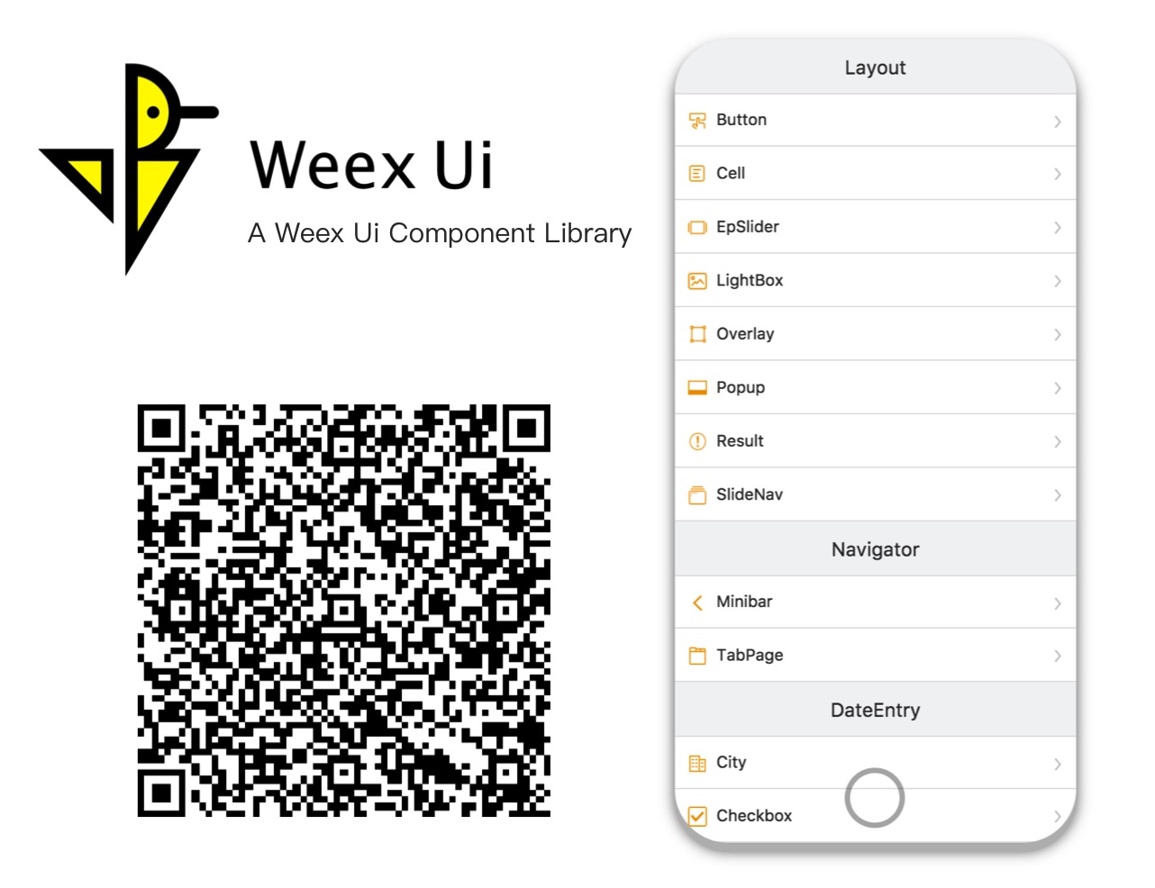
Try it with Fliggy, Taobao, Tmall, Weex Playground or any browsers now!
Installation
npm i weex-ui -S
Usage
<template>
  <div>
    <wxc-button text="Open Popup"
                @wxcButtonClicked="buttonClicked">
    </wxc-button>
    <wxc-popup width="500"
               pos="left"
               :show="isShow"
               @wxcPopupOverlayClicked="overlayClicked">
    </wxc-popup>
  </div>
</template>

<script>
  import { WxcButton, WxcPopup } from 'weex-ui';
  // or
  // import WxcButton from 'weex-ui/packages/wxc-button';
  // import WxcPopup from 'weex-ui/packages/wxc-popup';
  module.exports = {
    components: { WxcButton, WxcPopup },
    data: () => ({
      isShow: false
    }),
    methods: {
      buttonClicked () {
        this.isShow = true;
      },
      overlayClicked () {
        this.isShow = false;
      }
    }
  };
</script>
Before use
In order to not pack all the components, you need to use babel-plugin-component to import the specified component.
At the same time, if you haven't installed babel-preset-stage-0, it's necessary to install it.
npm i babel-preset-stage-0 babel-plugin-component -D
{
    "presets": ["es2015", "stage-0"],
    "plugins": [
        [
            "component",
            {
                "libraryName": "weex-ui",
                "libDir": "packages",
                "style": false
            }
        ]
    ]
}
More
- If babel-loader in
webpack.config.jshas a exclude for node_modules, please turn on for weex-ui asexclude: /node_modules(?!(\/|\\).*(weex).*)/. - In order to get the latest features, please focus on the ChangeLog and often update
weex-uito the latest. - Many questions can be found in the faq and issue list, if you find a new bug, just file an issue.
- More experience in Weex construction can be learned from Weex + Ui - Weex Conf 2018, welcome to translate it.
Development
npm i
npm run start
Once it has been compiled, a browser window will be opened automatically. You can switch to developer mode to see the demo. And there will be a QR code that you can use to try the demo on your phone in the console.
Support
- Use Weex Ui in your daily work.
- Star it if you like.
- Join the chat at DingTalk to help solve weex problems.
 |  |  |
Contribution
Want to file a bug, contribute some code, or improve documentation? Excellent! Read up on our Contributing Guide before making a pull request.
Thank you to all the people who already contributed to Weex Ui!
License
- The Apache License
- Please feel free to use and contribute to the development.
Top Related Projects
A framework for building Mobile cross-platform UI
Apache Weex (Incubating)
Convert  designs to code with AI

Introducing Visual Copilot: A new AI model to turn Figma designs to high quality code using your components.
Try Visual Copilot


