Top Related Projects
High performance and SEO friendly lazy loader for images (responsive and normal), iframes and more, that detects any visibility changes triggered through user interaction, CSS or JavaScript without configuration.
LazyLoad is a lightweight, flexible script that speeds up your website by deferring the loading of your below-the-fold images, backgrounds, videos, iframes and scripts to when they will enter the viewport. Written in plain "vanilla" JavaScript, it leverages IntersectionObserver, supports responsive images and enables native lazy loading.
Make images smaller using best-in-class codecs, right in the browser.
Quick Overview
Unpic-img is a multi-framework component for responsive, high-performance images. It provides a unified API for handling images across various JavaScript frameworks, including React, Vue, Svelte, and others. The library aims to simplify the process of implementing responsive images while optimizing performance and user experience.
Pros
- Cross-framework compatibility, supporting multiple popular JavaScript frameworks
- Automatic responsive image handling, including srcset and sizes attributes
- Built-in support for various image CDNs and optimization services
- TypeScript support for improved developer experience and type safety
Cons
- May have a learning curve for developers unfamiliar with responsive image techniques
- Potential overhead for simple use cases where advanced image handling is not required
- Dependency on external services for some features, which may not be suitable for all projects
Code Examples
- Basic usage in React:
import { Image } from "@unpic/react";

function MyComponent() {
  return (
    <Image
      src="https://example.com/image.jpg"
      layout="constrained"
      width={800}
      height={600}
      alt="An example image"
    />
  );
}
- Using with Next.js:
import { Image } from "@unpic/next";

function MyNextComponent() {
  return (
    <Image
      src="https://example.com/image.jpg"
      layout="fullWidth"
      priority
      alt="A full-width image"
    />
  );
}
- Implementing in Vue:
<script setup>
import { Image } from "@unpic/vue";
</script>

<template>
  <Image
    src="https://example.com/image.jpg"
    layout="fixed"
    width="300"
    height="200"
    alt="A fixed-size image"
  />
</template>
Getting Started
To use Unpic-img in your project, follow these steps:
-
Install the package for your framework:
npm install @unpic/react # For React npm install @unpic/vue # For Vue npm install @unpic/svelte # For Svelte -
Import and use the Image component in your code:
import { Image } from "@unpic/react"; function MyComponent() { return ( <Image src="https://example.com/image.jpg" layout="constrained" width={800} height={600} alt="An example image" /> ); } -
Customize the Image component props as needed for your specific use case.
Competitor Comparisons
High performance and SEO friendly lazy loader for images (responsive and normal), iframes and more, that detects any visibility changes triggered through user interaction, CSS or JavaScript without configuration.
Pros of lazysizes
- Widely adopted and battle-tested solution with a large user base
- Supports a broader range of browsers, including older versions
- Offers more features out-of-the-box, such as LQIP (Low-Quality Image Placeholders)
Cons of lazysizes
- Larger bundle size, which may impact page load times
- Requires more configuration and setup compared to unpic-img
- Less focused on modern image formats and responsive image techniques
Code Comparison
lazysizes:
<img data-src="image.jpg" class="lazyload" alt="Lazy-loaded image" />
<script src="lazysizes.min.js" async></script>
unpic-img:
<unpic-img
  src="image.jpg"
  layout="constrained"
  width="800"
  height="600"
  alt="Responsive image"
/>
unpic-img focuses on a more declarative approach with built-in responsive image handling, while lazysizes requires additional configuration and class usage for similar functionality. lazysizes offers more flexibility but at the cost of increased complexity, while unpic-img provides a simpler, more modern approach to responsive images.
LazyLoad is a lightweight, flexible script that speeds up your website by deferring the loading of your below-the-fold images, backgrounds, videos, iframes and scripts to when they will enter the viewport. Written in plain "vanilla" JavaScript, it leverages IntersectionObserver, supports responsive images and enables native lazy loading.
Pros of vanilla-lazyload
- Lightweight and dependency-free, focusing solely on lazy loading
- Supports various loading techniques, including native lazy loading
- Extensive browser compatibility, including older versions
Cons of vanilla-lazyload
- Limited to image lazy loading, unlike unpic-img's broader image optimization features
- Requires more manual configuration for responsive images
- Less integrated with modern frontend frameworks
Code Comparison
vanilla-lazyload:
const lazyLoadInstance = new LazyLoad({
  elements_selector: ".lazy",
  threshold: 0,
  callback_enter: (element) => {
    // Custom logic when element enters viewport
  }
});
unpic-img:
import { Image } from "@unpic/react";

function MyComponent() {
  return (
    <Image
      src="https://example.com/image.jpg"
      layout="constrained"
      width={800}
      height={600}
      alt="Example image"
    />
  );
}
vanilla-lazyload focuses on lazy loading implementation, requiring manual HTML attribute setup. unpic-img provides a more comprehensive solution with built-in responsive image handling and CDN optimization, offering a higher-level abstraction for image management in modern web applications.
Make images smaller using best-in-class codecs, right in the browser.
Pros of Squoosh
- Provides a user-friendly web interface for image optimization
- Offers a wide range of compression algorithms and image formats
- Supports both lossy and lossless compression techniques
Cons of Squoosh
- Primarily designed for manual, one-off image optimizations
- Lacks built-in support for automated workflows or integration into existing projects
- Requires more user interaction and decision-making for each image
Code Comparison
Squoosh (CLI usage):
import { ImagePool } from '@squoosh/lib';
const imagePool = new ImagePool();
const image = imagePool.ingestImage('image.jpg');
await image.encode({
  mozjpeg: { quality: 75 }
});
unpic-img (React usage):
import { Image } from 'unpic-img';
<Image
  src="image.jpg"
  layout="constrained"
  width={800}
  height={600}
  alt="Example image"
/>
Key Differences
- Squoosh focuses on powerful image compression and format conversion
- unpic-img emphasizes easy integration of responsive images in web projects
- Squoosh provides more granular control over compression settings
- unpic-img offers a simpler API for generating optimized image markup
Both projects aim to improve image performance on the web, but they approach the problem from different angles. Squoosh is more suited for manual optimization tasks, while unpic-img is designed for seamless integration into web development workflows.
Convert  designs to code with AI

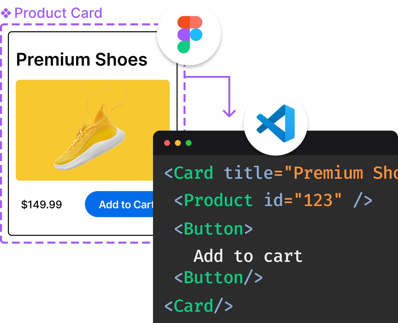
Introducing Visual Copilot: A new AI model to turn Figma designs to high quality code using your components.
Try Visual CopilotREADME
ð³ unpic-img
A cross-framework component for responsive, high-performance images using image CDNs
React
â¢
Vue
â¢
SolidJS
â¢
Svelte
â¢
Astro
Preact
â¢
Qwik
â¢
WebC
â¢
Angular
â¢
Lit
Features
- Just an
<img>tag! No extra elements, no runtime JavaScript. Easy to style. No legacy hacks or workarounds. - Automatically generates correct srcset and sizes attributes for responsive images.
- Handles responsive resizing of images, preserving aspect ratio and avoiding layout shift.
- Uses native lazy loading and async decoding for offscreen images.
- Handles different image layouts: fixed, constrained and full width.
- Uses eager loading and high priority fetching for important images.
- Delivers modern image formats, including WebP and AVIF if supported by the browser.
- No build step or server-side rendering required for the images: uses your existing image CDN or CMS, with no additional configuration.
- Uses unpic lib to support most image CDNs, including Cloudinary, Imgix, and Shopify.
- Can generate a low-res background image for a blurred placeholder effect, or
use with
@unpic/placeholderfor more options.
Usage
For details of usage, see the documentation.
FAQ
Why do I need this?
While it's easy to use an <img> tag for images, if you want to follow best
practices and deliver the most performant image to your users then it can take a
lot of work. Some frontend frameworks will automate this for you, but they often
rely on slow pre-rendering of images, or on running image optimizers on your own
site. They also generate complex HTML with wrappers and spacer elements that
make images hard to style.
Most images on modern websites are hosted on a CDN or CMS that can resize images on the fly and deliver them at the edge. Despite this, most web frameworks will still download and resize the image at build time or on your server, rather than using the CDN, or just uses a single source image rather than handling multiple resolutions.
This library works with any frontend framework or none, and uses your existing image CDN or CMS, with no additional configuration.
For more details, see this post.
How does this work?
This library uses unpic to detect the image CDN, and then uses the CDN's URL API
to resize and format images. It then generates the correct srcset and sizes
attributes for the image. It uses new features built into modern browsers to
handle lazy loading, fetch priority and decoding. It also uses pure CSS to
handle responsive resizing of images, preserving aspect ratio and avoiding
layout shift. Unlike most other image components, it does not use any
client-side JavaScript by default, and generates just a single <img> tag
without any wrapper divs or padding elements.
What HTML does this generate?
Generated HTML for a constrained image
It turns this:<Image
src="https://cdn.shopify.com/static/sample-images/bath_grande_crop_center.jpeg"
layout="constrained"
width={800}
height={600}
alt="Shopify"
/>
...into this:
<img
alt="Shopify"
loading="lazy"
decoding="async"
sizes="(min-width: 800px) 800px, 100vw"
srcset="
https://cdn.shopify.com/static/sample-images/bath.jpeg?crop=center&width=1600&height=2133 1600w,
https://cdn.shopify.com/static/sample-images/bath.jpeg?crop=center&width=1280&height=1707 1280w,
https://cdn.shopify.com/static/sample-images/bath.jpeg?crop=center&width=1080&height=1440 1080w,
https://cdn.shopify.com/static/sample-images/bath.jpeg?crop=center&width=960&height=1280 960w,
https://cdn.shopify.com/static/sample-images/bath.jpeg?crop=center&width=828&height=1104 828w,
https://cdn.shopify.com/static/sample-images/bath.jpeg?crop=center&width=800&height=1067 800w,
https://cdn.shopify.com/static/sample-images/bath.jpeg?crop=center&width=750&height=1000 750w,
https://cdn.shopify.com/static/sample-images/bath.jpeg?crop=center&width=640&height=853 640w
"
src="https://cdn.shopify.com/static/sample-images/bath.jpeg?width=800&height=600&crop=center"
style="
object-fit: cover;
max-width: 800px;
max-height: 600px;
aspect-ratio: 1.33333 / 1;
width: 100%;
"
/>
Supported CDNs
You can use any image CDN supported by unpic lib, including:
- Adobe Dynamic Media (Scene7)
- Builder.io
- Bunny.net
- Cloudflare
- Contentful
- Cloudinary
- Directus
- Imgix, including Unsplash, DatoCMS, Sanity and Prismic
- Kontent.ai
- Netlify
- Shopify
- Storyblok
- Vercel / Next.js
- WordPress.com and Jetpack Site Accelerator
License
Published under the MIT licence. © Matt Kane 2023.
Top Related Projects
High performance and SEO friendly lazy loader for images (responsive and normal), iframes and more, that detects any visibility changes triggered through user interaction, CSS or JavaScript without configuration.
LazyLoad is a lightweight, flexible script that speeds up your website by deferring the loading of your below-the-fold images, backgrounds, videos, iframes and scripts to when they will enter the viewport. Written in plain "vanilla" JavaScript, it leverages IntersectionObserver, supports responsive images and enables native lazy loading.
Make images smaller using best-in-class codecs, right in the browser.
Convert  designs to code with AI

Introducing Visual Copilot: A new AI model to turn Figma designs to high quality code using your components.
Try Visual Copilot