Top Related Projects
🗂 High resolution web browser logos
Interactive roadmaps, guides and other educational content to help developers grow in their careers.
😎 Awesome lists about all kinds of interesting topics
Learn how to design large-scale systems. Prep for the system design interview. Includes Anki flashcards.
🗂 The perfect Front-End Checklist for modern websites and meticulous developers
💯 Curated coding interview preparation materials for busy software engineers
Quick Overview
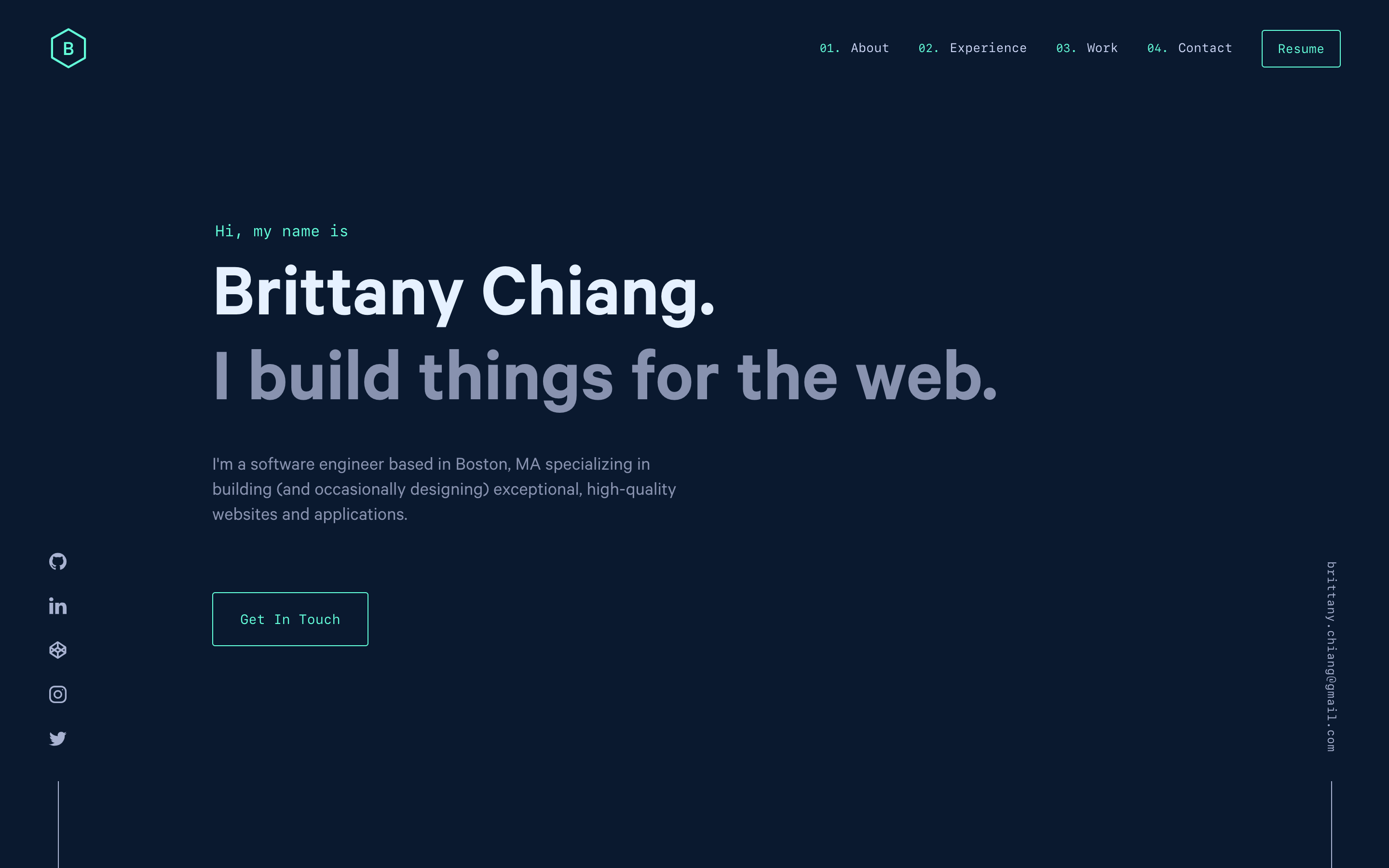
v4 is the fourth iteration of Brittany Chiang's personal website/portfolio. It's a sleek, modern, and responsive web application built with Gatsby, showcasing her projects, skills, and professional experience. The site serves as both a personal portfolio and a demonstration of her web development abilities.
Pros
- Clean and modern design with excellent attention to detail
- Built with Gatsby, offering fast performance and SEO benefits
- Fully responsive and accessible across various devices and screen sizes
- Well-organized codebase with modular components and clear structure
Cons
- Highly personalized, which may limit its use as a template for others without significant modifications
- Requires knowledge of React and Gatsby for customization
- Some users might find the dark theme less appealing or harder to read
- Limited content management options compared to CMS-based solutions
Getting Started
To set up and run this project locally:
-
Clone the repository:
git clone https://github.com/bchiang7/v4.git cd v4 -
Install dependencies:
npm install -
Start the development server:
npm start -
Open your browser and visit
http://localhost:8000to view the site.
To deploy the site, you can use Gatsby's built-in deploy command or integrate with a service like Netlify or Vercel for continuous deployment.
Competitor Comparisons
🗂 High resolution web browser logos
Pros of browser-logos
- Extensive collection of high-quality browser logos
- Regular updates to keep logos current
- Well-organized repository structure for easy navigation
Cons of browser-logos
- Limited scope, focused solely on browser logos
- Lacks additional features or functionality beyond logo storage
- May require more frequent updates to stay relevant
Code comparison
browser-logos:
{
  "name": "browser-logos",
  "version": "70.0.0",
  "description": "High resolution web browser logos",
  "repository": "alrra/browser-logos",
  "license": "MIT"
}
v4:
module.exports = {
  siteMetadata: {
    title: 'Brittany Chiang',
    description:
      'Brittany Chiang is a software engineer specializing in building (and occasionally designing) exceptional websites, applications, and everything in between.',
    siteUrl: 'https://brittanychiang.com',
    image: '/og.png',
    twitterUsername: '@bchiang7',
  },
  // ...
};
The browser-logos repository is a specialized collection of browser logos, while v4 is a personal portfolio website. browser-logos excels in providing a comprehensive set of logos but lacks additional features. v4 offers a full-fledged website with various components and functionality, making it more versatile for personal branding and showcasing projects.
Interactive roadmaps, guides and other educational content to help developers grow in their careers.
Pros of developer-roadmap
- Comprehensive guide for developers at various skill levels
- Regularly updated with new technologies and industry trends
- Large community support and contributions
Cons of developer-roadmap
- Less focus on personal branding or portfolio showcasing
- May be overwhelming for beginners due to extensive content
- Lacks specific code examples or implementations
Code Comparison
While a direct code comparison isn't relevant due to the different nature of these projects, we can compare their structure:
developer-roadmap:
├── public/
│   ├── roadmaps/
│   └── guides/
├── src/
│   ├── components/
│   └── pages/
└── README.md
v4:
├── src/
│   ├── components/
│   ├── config/
│   ├── fonts/
│   └── styles/
└── gatsby-config.js
v4 is a personal portfolio website, while developer-roadmap is an educational resource for developers. The former focuses on showcasing individual work, while the latter provides a comprehensive guide for learning various technologies and skills in the software development field.
😎 Awesome lists about all kinds of interesting topics
Pros of awesome
- Extensive curated list of resources across many topics
- Large community-driven project with frequent updates
- Useful for discovering high-quality tools and libraries
Cons of awesome
- Not a functional project, just a collection of links
- Can be overwhelming due to the sheer volume of information
- Requires manual exploration to find relevant resources
Code comparison
While a direct code comparison isn't relevant for these repositories, we can look at how they structure their content:
awesome:
## JavaScript

- [ES6 Tools](https://github.com/addyosmani/es6-tools#readme)
- [Web Performance Optimization](https://github.com/davidsonfellipe/awesome-wpo#readme)
- [Web Tools](https://github.com/lvwzhen/tools#readme)
v4:
const navLinks = [
  {
    name: 'About',
    url: '/#about',
  },
  {
    name: 'Experience',
    url: '/#jobs',
  },
  {
    name: 'Work',
    url: '/#projects',
  },
];
v4 is a personal portfolio website, while awesome is a curated list of resources. The code structures reflect their different purposes, with v4 focusing on site navigation and awesome on organizing links by category.
Learn how to design large-scale systems. Prep for the system design interview. Includes Anki flashcards.
Pros of system-design-primer
- Comprehensive resource for learning system design concepts
- Includes diagrams, code examples, and practice problems
- Regularly updated with new content and community contributions
Cons of system-design-primer
- Large repository with extensive content, which may be overwhelming for beginners
- Focuses primarily on theoretical concepts rather than practical implementation
- Less visually appealing compared to v4's portfolio-style presentation
Code Comparison
system-design-primer (Python example):
class LRUCache:
    def __init__(self, capacity):
        self.capacity = capacity
        self.cache = OrderedDict()

    def get(self, key):
        if key not in self.cache:
            return -1
        val = self.cache[key]
        self.cache.move_to_end(key)
        return val
v4 (JavaScript example):
const throttle = (func, wait = 100) => {
  let timer = null;
  return function(...args) {
    if (timer === null) {
      timer = setTimeout(() => {
        func.apply(this, args);
        timer = null;
      }, wait);
    }
  };
};
The system-design-primer repository provides a wealth of information on system design concepts, making it an excellent resource for learning and interview preparation. However, its extensive content may be overwhelming for some users. In contrast, v4 is a personal portfolio website with a focus on visual design and showcasing projects, offering a different purpose and user experience.
🗂 The perfect Front-End Checklist for modern websites and meticulous developers
Pros of Front-End-Checklist
- Comprehensive resource for front-end development best practices
- Regularly updated with community contributions
- Available in multiple languages, making it accessible to a global audience
Cons of Front-End-Checklist
- Less focused on personal portfolio showcasing
- May be overwhelming for beginners due to its extensive nature
- Lacks specific code examples for implementation
Code Comparison
While a direct code comparison isn't particularly relevant due to the different nature of these projects, we can highlight a small snippet from each to illustrate their purposes:
Front-End-Checklist (README.md):
## Table of Contents

1. **[Head](#head)**
2. **[HTML](#html)**
3. **[CSS](#css)**
4. **[JavaScript](#javascript)**
v4 (gatsby-config.js):
module.exports = {
  siteMetadata: {
    title: 'Brittany Chiang',
    description: 'Brittany Chiang is a software engineer...',
    siteUrl: 'https://brittanychiang.com',
    image: '/og.png',
    twitterUsername: '@bchiang7',
  },
  // ...
};
These snippets demonstrate that Front-End-Checklist is a comprehensive guide, while v4 is a personal portfolio website configuration.
💯 Curated coding interview preparation materials for busy software engineers
Pros of tech-interview-handbook
- Comprehensive resource for technical interview preparation
- Regularly updated with community contributions
- Covers a wide range of topics including algorithms, system design, and behavioral questions
Cons of tech-interview-handbook
- Less visually appealing and more text-heavy
- Primarily focused on interview preparation, lacking personal branding elements
- May be overwhelming for beginners due to the vast amount of information
Code Comparison
tech-interview-handbook (JavaScript):
function binarySearch(arr, target) {
  let left = 0;
  let right = arr.length - 1;
  while (left <= right) {
    const mid = Math.floor((left + right) / 2);
    if (arr[mid] === target) return mid;
    if (arr[mid] < target) left = mid + 1;
    else right = mid - 1;
  }
  return -1;
}
v4 (JavaScript):
const navLinks = [
  {
    name: 'About',
    url: '/#about',
  },
  {
    name: 'Experience',
    url: '/#jobs',
  },
  // ... more navigation links
];
The code snippets highlight the different focus areas of each repository. tech-interview-handbook provides algorithm implementations, while v4 contains website structure and navigation components.
Convert  designs to code with AI
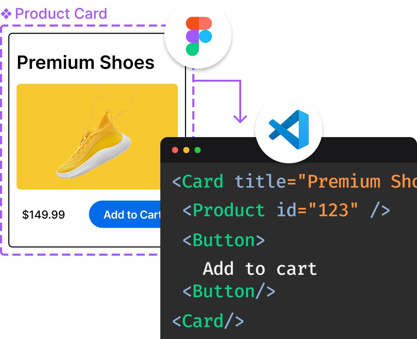
Introducing Visual Copilot: A new AI model to turn Figma designs to high quality code using your components.
Try Visual CopilotREADME

brittanychiang.com - v4
The fourth iteration of brittanychiang.com built with Gatsby and hosted with Netlify
Previous iterations: v1, v2, v3
ð¨ Forking this repo (please read!)
Many people have contacted me asking me if they can use this code for their own website, and the answer to that question is usually yes, with attribution.
I value keeping my site open source, but as you all know, plagiarism is bad. It's always disheartening whenever I find that someone has copied my site without giving me credit. I spent a non-trivial amount of effort building and designing this iteration of my website, and I am proud of it! All I ask of you all is to not claim this effort as your own.
Please also note that I did not build this site with the intention of it being a starter theme, so if you have questions about implementation, please refer to the Gatsby docs.
TL;DR
Yes, you can fork this repo. Please give me proper credit by linking back to brittanychiang.com. Thanks!
ð Installation & Set Up
-
Install the Gatsby CLI
npm install -g gatsby-cli -
Install and use the correct version of Node using NVM
nvm install -
Install dependencies
yarn -
Start the development server
npm start
ð Building and Running for Production
-
Generate a full static production build
npm run build -
Preview the site as it will appear once deployed
npm run serve
ð¨ Color Reference
| Color | Hex |
|---|---|
| Navy | #0a192f |
| Light Navy | #112240 |
| Lightest Navy | #233554 |
| Slate | #8892b0 |
| Light Slate | #a8b2d1 |
| Lightest Slate | #ccd6f6 |
| White | #e6f1ff |
| Green | #64ffda |
Top Related Projects
🗂 High resolution web browser logos
Interactive roadmaps, guides and other educational content to help developers grow in their careers.
😎 Awesome lists about all kinds of interesting topics
Learn how to design large-scale systems. Prep for the system design interview. Includes Anki flashcards.
🗂 The perfect Front-End Checklist for modern websites and meticulous developers
💯 Curated coding interview preparation materials for busy software engineers
Convert  designs to code with AI

Introducing Visual Copilot: A new AI model to turn Figma designs to high quality code using your components.
Try Visual Copilot