 react-phone-input-2
:telephone_receiver: Highly customizable phone input component with auto formatting
Top Related Projects

A JavaScript plugin for entering and validating international telephone numbers. React, Vue and Angular components also included.
Quick Overview
React-phone-input-2 is a customizable phone input component for React applications. It provides an easy-to-use interface for entering and validating international phone numbers, complete with country selection and formatting features.
Pros
- Extensive country support with flags and country codes
- Customizable styling and theming options
- Built-in phone number validation and formatting
- Regular updates and active maintenance
Cons
- Large bundle size due to comprehensive country data
- Some users report occasional issues with specific country codes
- Limited documentation for advanced customization
- Dependency on external libraries for some features
Code Examples
- Basic usage:
import PhoneInput from 'react-phone-input-2'
import 'react-phone-input-2/lib/style.css'

const MyComponent = () => (
  <PhoneInput
    country={'us'}
    value={phoneNumber}
    onChange={phone => setPhoneNumber(phone)}
  />
)
- Custom styling:
<PhoneInput
  country={'de'}
  inputStyle={{
    width: '300px',
    height: '35px',
    fontSize: '13px',
    paddingLeft: '48px',
    borderRadius: '5px'
  }}
  buttonStyle={{
    borderRadius: '5px 0 0 5px'
  }}
/>
- With material-ui:
import { TextField } from '@material-ui/core'

<PhoneInput
  country={'in'}
  inputProps={{
    name: 'phone',
    required: true,
    autoFocus: true
  }}
  component={TextField}
/>
Getting Started
-
Install the package:
npm install react-phone-input-2 -
Import and use in your React component:
import React, { useState } from 'react' import PhoneInput from 'react-phone-input-2' import 'react-phone-input-2/lib/style.css' const PhoneComponent = () => { const [phone, setPhone] = useState('') return ( <PhoneInput country={'us'} value={phone} onChange={phone => setPhone(phone)} /> ) } export default PhoneComponent -
Customize as needed using props and styling options.
Competitor Comparisons
A JavaScript plugin for entering and validating international telephone numbers. React, Vue and Angular components also included.
Pros of intl-tel-input
- More comprehensive country data and metadata
- Built-in utility functions for formatting and validation
- Wider browser compatibility, including older versions
Cons of intl-tel-input
- Not specifically designed for React, may require additional setup
- Larger bundle size due to more features and data
Code Comparison
intl-tel-input:
$("#phone").intlTelInput({
  initialCountry: "auto",
  geoIpLookup: function(callback) {
    $.get('https://ipinfo.io', function() {}, "jsonp").always(function(resp) {
      var countryCode = (resp && resp.country) ? resp.country : "";
      callback(countryCode);
    });
  },
  utilsScript: "path/to/utils.js"
});
react-phone-input-2:
import PhoneInput from 'react-phone-input-2'

<PhoneInput
  country={'us'}
  value={this.state.phone}
  onChange={phone => this.setState({ phone })}
/>
The intl-tel-input example shows more complex initialization with geolocation, while react-phone-input-2 offers a simpler React component approach. intl-tel-input provides more customization options out of the box, but react-phone-input-2 integrates more seamlessly with React applications.
Convert  designs to code with AI

Introducing Visual Copilot: A new AI model to turn Figma designs to high quality code using your components.
Try Visual CopilotREADME
React-Phone-Input-2
Highly customizable phone input component with auto formatting.


Installation
npm install react-phone-input-2 --save
Usage
import PhoneInput from 'react-phone-input-2'
import 'react-phone-input-2/lib/style.css'

<PhoneInput
  country={'us'}
  value={this.state.phone}
  onChange={phone => this.setState({ phone })}
/>
available styles - style ⢠high-res ⢠material ⢠bootstrap ⢠semantic-ui ⢠plain
Demo 1 (UI) - Demo 2 (CSS)
Options
| Name | Type | Description | Example |
|---|---|---|---|
| country | string | initial country | 'us' | 1 |
| value | string | input state value | |
| onlyCountries | array | country codes to be included | ['cu','cw','kz'] |
| preferredCountries | array | country codes to be at the top | ['cu','cw','kz'] |
| excludeCountries | array | array of country codes to be excluded | ['cu','cw','kz'] |
| placeholder | string | custom placeholder | |
| inputProps | object | props to pass into the input | |
| Booleans | Default | Description |
|---|---|---|
| autoFormat | true | on/off phone formatting |
| disabled | false | disable input and dropdown |
| disableDropdown | false | disable dropdown only |
| disableCountryCode | false | |
| enableAreaCodes | false | enable local codes for all countries |
| enableTerritories | false | enable dependent territories with population of ~100,000 or lower |
| enableLongNumbers | false | boolean/number |
| countryCodeEditable | true | |
| enableSearch | false | enable search in the dropdown |
| disableSearchIcon | false | hide icon for the search field |
<PhoneInput
  inputProps={{
    name: 'phone',
    required: true,
    autoFocus: true
  }}
/>
Contents
- Style
- Events
- Regions
- Localization
- Local area codes
- Custom masks
- Custom area codes
- Other props
- Custom localization
- Guides
- Contributing
- Support
Style
| containerClass | string | class for container | |
| inputClass | string | class for input | |
| buttonClass | string | class for dropdown button | |
| dropdownClass | string | class for dropdown container | |
| searchClass | string | class for search field | |
| containerStyle | object | styles for container | |
| inputStyle | object | styles for input | |
| buttonStyle | object | styles for dropdown button | |
| dropdownStyle | object | styles for dropdown container | |
| searchStyle | object | styles for search field | |
Events
| onChange | onFocus | onBlur | onClick | onKeyDown |
onChange(value, country, e, formattedValue)
Country data object not returns from onKeyDown event
| Data | Type | Description |
|---|---|---|
| value/event | string/object | event or the phone number |
| country data | object | country object { name, dialCode, countryCode (iso2) } |
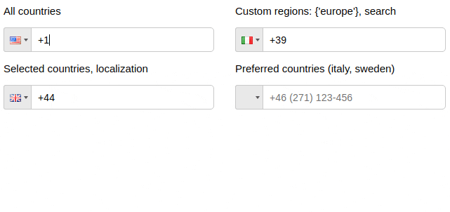
Regions
| Name | Type | Description |
|---|---|---|
| regions | array/string | to show countries only from specified regions |
| Regions |
|---|
| ['america', 'europe', 'asia', 'oceania', 'africa'] |
| Subregions |
| ['north-america', 'south-america', 'central-america', 'carribean', 'eu-union', 'ex-ussr', 'ex-yugos', 'baltic', 'middle-east', 'north-africa'] |
<PhoneInput
  country='de'
  regions={'europe'}
/>

<PhoneInput
  country='us'
  regions={['north-america', 'carribean']}
/>
Predefined localization
es Spanish, de Deutsch, ru Russian, fr French
jp Japanese, cn Chinese, pt Portuguese, it Italian
ir Iranian, ar Arabic, tr Turkish, id Indonesian
hu Hungarian, pl Polish, ko Korean
import es from 'react-phone-input-2/lang/es.json'

<PhoneInput
  localization={es}
/>
Local area codes
<PhoneInput
  enableAreaCodes={true}
  enableAreaCodes={['us', 'ca']}
  enableAreaCodeStretch
/>
Flexible mask
If enableAreaCodeStretch is added, the part of the mask with the area code will not stretch to length of the respective section of phone mask.
Example: +61 (2), +61 (02)
Custom masks
<PhoneInput
  onlyCountries={['fr', 'at']}
  masks={{fr: '(...) ..-..-..', at: '(....) ...-....'}}
/>
Custom area codes
<PhoneInput
  onlyCountries={['gr', 'fr', 'us']}
  areaCodes={{gr: ['2694', '2647'], fr: ['369', '463'], us: ['300']}}
/>
Other props
| defaultMask | ... ... ... ... .. |
| alwaysDefaultMask | false |
| prefix | + |
| searchPlaceholder | 'search' |
| searchNotFound | 'No entries to show' |
| copyNumbersOnly | true |
| renderStringAsFlag | string |
| autocompleteSearch | false |
| jumpCursorToEnd | false |
| priority | {{ca: 0, us: 1, kz: 0, ru: 1}} |
| enableClickOutside | true |
| showDropdown | false |
| defaultErrorMessage | string |
| specialLabel | string |
| disableInitialCountryGuess | false |
| disableCountryGuess | false |
Custom localization
<PhoneInput
  onlyCountries={['de', 'es']}
  localization={{de: 'Deutschland', es: 'España'}}
/>

<PhoneInput
  onlyCountries={['de', 'es']}
  localization={{'Germany': 'Deutschland', 'Spain': 'España'}}
/>
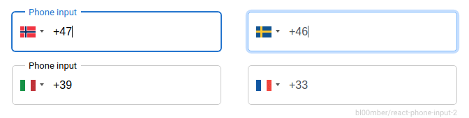
Preserve countries order
<PhoneInput
  onlyCountries={['fr', 'at']}
  preserveOrder={['onlyCountries', 'preferredCountries']}
/>
Guides
Phone without dialCode
handleOnChange(value, data, event, formattedValue) {
  this.setState({ rawPhone: value.slice(data.dialCode.length) })
}
Check validity of the phone number
isValid(value, country, countries, hiddenAreaCodes)
<PhoneInput
  isValid={(value, country) => {
    if (value.match(/12345/)) {
      return 'Invalid value: '+value+', '+country.name;
    } else if (value.match(/1234/)) {
      return false;
    } else {
      return true;
    }
  }}
/>
import startsWith from 'lodash.startswith';

<PhoneInput
  isValid={(inputNumber, country, countries) => {
    return countries.some((country) => {
      return startsWith(inputNumber, country.dialCode) || startsWith(country.dialCode, inputNumber);
    });
  }}
/>
Clear country
To clear country, pass null as value.
Dynamic placeholder
Show
const phoneCountryFormat = useMemo(() => phoneCountry?.format || undefined, [phoneCountry]);
const placeholder = useMemo(() => {
  if (phoneCountryFormat) {
    const words = phoneCountryFormat.split(' ');
    words.shift(); // I'm using only local numbers so here I remove the country code from the format
    let text = words.join(' ');
     // first digit is special on french numbers, these 3 lines could be removed
    if (country === 'fr') {
      text = text.replace('.', '6');
    }
    while (text.indexOf('.') > -1) {
      text = text.replace('.', `${Math.min(9, Math.max(1, Math.floor(Math.random() * 10)))}`);
    }
    return text;
  }
  return '';
}, [phoneCountryFormat, country]);
CDN
<script src="https://unpkg.com/react-phone-input-2@2.x/dist/lib.js"></script>
Contributing
- Code style changes not allowed
- Do not create issues about incorrect or missing country masks (of already present countries) or absent area codes (they will be closed). Only create issues if the subject is an actual mechanism that is not present in the component. Otherwise create a PR with a link that proves the correctness of your newly suggested mask or list of area codes
- Do not send new languages
License
Based on react-phone-input
Make sure you donated for lib maintenance 
Top Related Projects
A JavaScript plugin for entering and validating international telephone numbers. React, Vue and Angular components also included.
Convert designs to code with AI
Introducing Visual Copilot: A new AI model to turn Figma designs to high quality code using your components.
Try Visual Copilot