Top Related Projects
The Google I/O Android App
An Android app which provides design news & inspiration as well as being an example of implementing material design.
A collection of samples to discuss and showcase different architectural tools and patterns for Android apps.
A gardening app illustrating Android development best practices with migrating a View-based app to Jetpack Compose.
Official Jetpack Compose samples.
Modular and customizable Material Design UI components for Android
Quick Overview
Cheesesquare is a sample Android project that demonstrates the usage of the Android Design Support Library. It showcases various material design components and patterns, providing developers with practical examples of how to implement these elements in their own Android applications.
Pros
- Demonstrates real-world usage of Android Design Support Library components
- Provides a visual reference for material design implementation
- Regularly updated to reflect the latest changes in the Android ecosystem
- Serves as a learning resource for both beginner and intermediate Android developers
Cons
- Limited to showcasing design components, not a comprehensive app example
- May not cover all possible use cases for each component
- Some examples might become outdated as the Android Design Support Library evolves
- Not intended for production use, only for demonstration purposes
Code Examples
- Setting up a CoordinatorLayout with AppBarLayout:
<androidx.coordinatorlayout.widget.CoordinatorLayout
    android:layout_width="match_parent"
    android:layout_height="match_parent">

    <com.google.android.material.appbar.AppBarLayout
        android:layout_width="match_parent"
        android:layout_height="wrap_content">

        <androidx.appcompat.widget.Toolbar
            android:id="@+id/toolbar"
            android:layout_width="match_parent"
            android:layout_height="?attr/actionBarSize"
            app:layout_scrollFlags="scroll|enterAlways" />

    </com.google.android.material.appbar.AppBarLayout>

    <!-- Content goes here -->

</androidx.coordinatorlayout.widget.CoordinatorLayout>
- Implementing a FloatingActionButton:
<com.google.android.material.floatingactionbutton.FloatingActionButton
    android:id="@+id/fab"
    android:layout_width="wrap_content"
    android:layout_height="wrap_content"
    android:layout_gravity="end|bottom"
    android:layout_margin="@dimen/fab_margin"
    android:src="@drawable/ic_add" />
- Using a TabLayout with ViewPager:
val viewPager: ViewPager = findViewById(R.id.viewpager)
viewPager.adapter = SectionsPagerAdapter(supportFragmentManager)

val tabLayout: TabLayout = findViewById(R.id.tabs)
tabLayout.setupWithViewPager(viewPager)
Getting Started
To use Cheesesquare as a reference:
-
Clone the repository:
git clone https://github.com/chrisbanes/cheesesquare.git -
Open the project in Android Studio.
-
Build and run the app on an emulator or physical device.
-
Explore the various activities and layouts to see material design components in action.
-
Refer to the source code for implementation details of specific components.
Competitor Comparisons
The Google I/O Android App
Pros of iosched
- Larger, more comprehensive project showcasing real-world app development
- Regularly updated with modern Android development practices
- Extensive documentation and architecture guidelines
Cons of iosched
- More complex codebase, potentially overwhelming for beginners
- Requires more setup and configuration to run
- Specific to Google I/O conference, less generalizable
Code Comparison
iosched (Kotlin):
@Composable
fun SessionItem(
    session: UserSession,
    modifier: Modifier = Modifier,
    showReservationStatus: Boolean = true,
    onSessionClick: (String) -> Unit = {},
    onStarClick: (String) -> Unit = {}
) {
    // ... (implementation details)
}
cheesesquare (Java):
public class CheeseDetailActivity extends AppCompatActivity {

    public static final String EXTRA_NAME = "cheese_name";

    @Override
    public void onCreate(Bundle savedInstanceState) {
        super.onCreate(savedInstanceState);
        setContentView(R.layout.activity_detail);

        // ... (implementation details)
    }
}
The iosched project uses Kotlin and Jetpack Compose for modern UI development, while cheesesquare uses Java and traditional XML layouts. iosched demonstrates more advanced patterns and up-to-date Android practices, whereas cheesesquare focuses on showcasing specific Material Design components in a simpler context.
An Android app which provides design news & inspiration as well as being an example of implementing material design.
Pros of Plaid
- More comprehensive and feature-rich Android design showcase
- Actively maintained with regular updates and contributions
- Demonstrates advanced Material Design concepts and animations
Cons of Plaid
- Higher complexity, potentially steeper learning curve
- Larger codebase, which may be overwhelming for beginners
- Requires more setup and dependencies to run
Code Comparison
Plaid (Activity creation):
class HomeActivity : AppCompatActivity() {
    override fun onCreate(savedInstanceState: Bundle?) {
        super.onCreate(savedInstanceState)
        setContentView(R.layout.activity_home)
        // Complex setup and initialization
    }
}
Cheesesquare (Activity creation):
public class CheeseDetailActivity extends AppCompatActivity {
    @Override
    public void onCreate(Bundle savedInstanceState) {
        super.onCreate(savedInstanceState);
        setContentView(R.layout.activity_detail);
        // Simpler setup and initialization
    }
}
Plaid offers a more modern, Kotlin-based approach with advanced features, while Cheesesquare provides a simpler Java implementation focused on basic Material Design concepts. Plaid's code tends to be more complex but showcases current best practices, whereas Cheesesquare's code is more straightforward and accessible for beginners.
A collection of samples to discuss and showcase different architectural tools and patterns for Android apps.
Pros of architecture-samples
- Provides multiple architectural approaches (MVC, MVP, MVVM, etc.)
- Regularly updated with the latest Android development practices
- Includes comprehensive testing examples for each architecture
Cons of architecture-samples
- More complex and potentially overwhelming for beginners
- Requires more time to understand and implement in real-world projects
- May include unnecessary complexity for simpler apps
Code Comparison
architecture-samples (MVVM approach):
class TasksViewModel(
    private val tasksRepository: TasksRepository
) : ViewModel() {
    private val _items = MutableLiveData<List<Task>>().apply { value = emptyList() }
    val items: LiveData<List<Task>> = _items
}
cheesesquare (traditional approach):
public class CheeseListFragment extends Fragment {
    @Override
    public View onCreateView(LayoutInflater inflater, ViewGroup container, Bundle savedInstanceState) {
        RecyclerView rv = (RecyclerView) inflater.inflate(R.layout.fragment_cheese_list, container, false);
        setupRecyclerView(rv);
        return rv;
    }
}
The architecture-samples code demonstrates a ViewModel using Kotlin and LiveData, while cheesesquare uses a more traditional Fragment-based approach in Java. architecture-samples promotes separation of concerns and reactive programming, whereas cheesesquare focuses on simplicity and ease of understanding for beginners.
A gardening app illustrating Android development best practices with migrating a View-based app to Jetpack Compose.
Pros of Sunflower
- More comprehensive and up-to-date Android development practices
- Demonstrates modern architecture components (ViewModel, LiveData, Room)
- Includes unit and instrumentation tests
Cons of Sunflower
- More complex codebase, potentially overwhelming for beginners
- Requires more setup and dependencies
Code Comparison
Sunflower (Kotlin):
class PlantDetailFragment : Fragment() {
    private val args: PlantDetailFragmentArgs by navArgs()
    private val plantDetailViewModel: PlantDetailViewModel by viewModels {
        InjectorUtils.providePlantDetailViewModelFactory(requireActivity(), args.plantId)
    }
}
Cheesesquare (Java):
public class CheeseDetailActivity extends AppCompatActivity {
    public static final String EXTRA_NAME = "cheese_name";

    @Override
    public void onCreate(Bundle savedInstanceState) {
        super.onCreate(savedInstanceState);
        setContentView(R.layout.activity_detail);
    }
}
Sunflower uses Kotlin and demonstrates more modern Android development practices, including the use of Navigation component and ViewModel. Cheesesquare, being older, uses Java and a more traditional approach to Android development.
Sunflower is more comprehensive and showcases best practices, making it an excellent learning resource for intermediate to advanced developers. Cheesesquare, while simpler, may be more accessible for beginners but lacks modern architectural patterns.
Official Jetpack Compose samples.
Pros of compose-samples
- Showcases modern Android UI development using Jetpack Compose
- Provides a wide range of sample apps demonstrating various Compose features
- Regularly updated with the latest Compose best practices and patterns
Cons of compose-samples
- Steeper learning curve for developers new to Compose
- May require more setup and configuration compared to traditional XML-based layouts
- Some samples might be too complex for beginners
Code Comparison
cheesesquare (XML-based layout):
<android.support.design.widget.CoordinatorLayout
    android:layout_width="match_parent"
    android:layout_height="match_parent">
    <android.support.design.widget.AppBarLayout
        android:layout_width="match_parent"
        android:layout_height="wrap_content">
        <!-- ... -->
    </android.support.design.widget.AppBarLayout>
</android.support.design.widget.CoordinatorLayout>
compose-samples (Jetpack Compose):
@Composable
fun MainScreen() {
    Scaffold(
        topBar = { TopAppBar(title = { Text("My App") }) },
        content = { paddingValues ->
            LazyColumn(contentPadding = paddingValues) {
                // List items
            }
        }
    )
}
Summary
While cheesesquare demonstrates traditional Android UI development using XML layouts and the Design Support Library, compose-samples showcases the modern approach using Jetpack Compose. The latter offers more flexibility and a declarative UI paradigm but may have a steeper learning curve for developers accustomed to XML-based layouts.
Modular and customizable Material Design UI components for Android
Pros of material-components-android
- Official Google repository with comprehensive Material Design components
- Regularly updated with new features and bug fixes
- Extensive documentation and integration guides
Cons of material-components-android
- Larger codebase and potentially more complex implementation
- May require more frequent updates to stay current with Material Design changes
Code Comparison
cheesesquare:
<android.support.design.widget.CoordinatorLayout
    android:layout_width="match_parent"
    android:layout_height="match_parent">
    <!-- Content -->
</android.support.design.widget.CoordinatorLayout>
material-components-android:
<androidx.coordinatorlayout.widget.CoordinatorLayout
    android:layout_width="match_parent"
    android:layout_height="match_parent">
    <!-- Content -->
</androidx.coordinatorlayout.widget.CoordinatorLayout>
Summary
material-components-android is the official Google repository for Material Design components, offering a comprehensive set of up-to-date UI elements with extensive documentation. However, it may require more frequent updates and have a steeper learning curve compared to cheesesquare.
cheesesquare, while not as extensive, provides a simpler implementation of Material Design components and may be suitable for smaller projects or those not requiring the latest Material Design features.
The code comparison shows that material-components-android uses AndroidX dependencies, while cheesesquare uses the older Android Support Library.
Convert  designs to code with AI

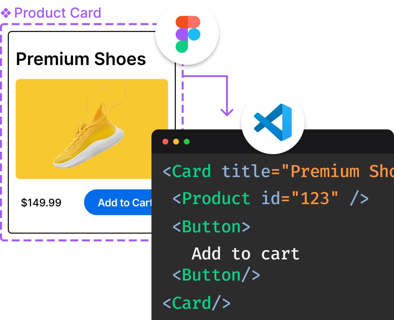
Introducing Visual Copilot: A new AI model to turn Figma designs to high quality code using your components.
Try Visual CopilotREADME
![]()
Cheesesquare Sample
Demos the new Android Design library. This is not an exhaustive sample, but shows some of the important features in the Design library:
- Collapsing Toolbar
- FloatingActionButton
- View anchoring
- NavigationView
- Snackbar
Pre-requisites
- Android SDK v22
- Android Build Tools v22.0.1
- Android Support Repository r16 (for v22.2.1)
License
Copyright 2014 The Android Open Source Project, Inc.
Licensed to the Apache Software Foundation (ASF) under one or more contributor license agreements. See the NOTICE file distributed with this work for additional information regarding copyright ownership. The ASF licenses this file to you under the Apache License, Version 2.0 (the "License"); you may not use this file except in compliance with the License. You may obtain a copy of the License at
http://www.apache.org/licenses/LICENSE-2.0
Unless required by applicable law or agreed to in writing, software distributed under the License is distributed on an "AS IS" BASIS, WITHOUT WARRANTIES OR CONDITIONS OF ANY KIND, either express or implied. See the License for the specific language governing permissions and limitations under the License.
Top Related Projects
The Google I/O Android App
An Android app which provides design news & inspiration as well as being an example of implementing material design.
A collection of samples to discuss and showcase different architectural tools and patterns for Android apps.
A gardening app illustrating Android development best practices with migrating a View-based app to Jetpack Compose.
Official Jetpack Compose samples.
Modular and customizable Material Design UI components for Android
Convert  designs to code with AI

Introducing Visual Copilot: A new AI model to turn Figma designs to high quality code using your components.
Try Visual Copilot