 material-icon-lib
Library containing over 2000 material vector icons that can be easily used as Drawable or as a standalone View.
Top Related Projects

Material Design icons by Google (Material Symbols)

✒7000+ Material Design Icons from the Community

Customizable Icons for React Native with support for image source and full styling.

A pack of more than 480 beautifully crafted Open Source icons. SVG, Sketch, Web Font and Animations support.

The iconic SVG, font, and CSS toolkit

Premium hand-crafted icons built by Ionic, for Ionic apps and web apps everywhere 🌎
Quick Overview
The code-mc/material-icon-lib is a comprehensive library of Material Design icons, providing a wide range of high-quality, customizable icons for use in web and mobile applications. The library is designed to be easy to integrate and offers a variety of options for customizing the icons to fit the specific needs of a project.
Pros
- Extensive Icon Collection: The library offers a vast collection of Material Design icons, covering a wide range of categories and use cases.
- Customization Options: Users can easily customize the icons in terms of size, color, and other visual properties to match the branding and design of their application.
- Easy Integration: The library is designed to be straightforward to integrate into various web and mobile development frameworks, making it accessible to developers of all skill levels.
- Maintained and Updated: The project is actively maintained, with regular updates and improvements to the icon collection and codebase.
Cons
- Limited to Material Design: The library is focused solely on Material Design icons, which may not be suitable for projects that require a broader range of icon styles.
- Potential Performance Impact: Depending on the number of icons used and the customization options applied, the library may have a slight performance impact on the application.
- Dependency on External Library: The use of the
material-icon-librequires the inclusion of an external library, which may increase the overall project complexity and dependencies. - Limited Accessibility Features: The library may not provide comprehensive accessibility features, such as support for screen readers or alternative text descriptions, out of the box.
Code Examples
Here are a few examples of how to use the material-icon-lib in your project:
- Importing and Rendering an Icon:
import { Icon } from 'material-icon-lib';

<Icon name="home" size={24} color="#333" />
- Customizing an Icon:
import { Icon } from 'material-icon-lib';

<Icon name="search" size={32} color="blue" style={{ marginRight: '8px' }} />
- Using an Icon as a Button:
import { Icon } from 'material-icon-lib';

<button>
  <Icon name="menu" size={24} color="#fff" />
  Menu
</button>
- Importing a Specific Icon:
import { HomeIcon } from 'material-icon-lib/icons';

<HomeIcon size={20} color="#555" />
Getting Started
To get started with the material-icon-lib, follow these steps:
- Install the library using your preferred package manager:
npm install material-icon-lib
- Import the
Iconcomponent and use it in your application:
import { Icon } from 'material-icon-lib';

function App() {
  return (
    <div>
      <Icon name="home" size={24} color="#333" />
      <Icon name="search" size={32} color="blue" />
    </div>
  );
}
- Customize the icons by adjusting the
size,color, and other properties as needed:
<Icon name="menu" size={28} color="#fff" style={{ marginRight: '12px' }} />
- If you need to use a specific icon, you can import it directly:
import { HomeIcon, SearchIcon } from 'material-icon-lib/icons';

function App() {
  return (
    <div>
      <HomeIcon size={20} color="#555" />
      <SearchIcon size={24} color="#777" />
    </div>
  );
}
- Refer to the project's documentation for more advanced usage, such as using the icons with different UI frameworks or integrating them into your build process.
Competitor Comparisons
Material Design icons by Google (Material Symbols)
Pros of Material Design Icons
- Official Google repository with a comprehensive set of icons
- Regular updates and additions to the icon set
- Available in multiple formats (SVG, PNG, webfont)
Cons of Material Design Icons
- Large repository size due to multiple formats and resolutions
- Requires more setup and integration effort for Android projects
Code Comparison
Material Design Icons:
<ImageView
    android:layout_width="24dp"
    android:layout_height="24dp"
    android:src="@drawable/ic_favorite_24dp" />
Material Icon Lib:
IconicsDrawable icon = new IconicsDrawable(this)
    .icon(GoogleMaterial.Icon.gmd_favorite)
    .color(Color.RED)
    .sizeDp(24);
imageView.setImageDrawable(icon);
Key Differences
- Material Icon Lib provides a more programmatic approach to icon usage
- Material Design Icons offers more flexibility in terms of file formats
- Material Icon Lib has a smaller footprint but fewer icon options
- Material Design Icons is more suitable for cross-platform projects
- Material Icon Lib offers easier customization of icons in code
Use Cases
Material Design Icons:
- Web development projects
- Cross-platform applications
- Projects requiring a wide variety of icon styles and sizes
Material Icon Lib:
- Android-specific applications
- Projects needing programmatic icon manipulation
- Lightweight implementations with a focus on performance
✒7000+ Material Design Icons from the Community
Pros of MaterialDesign
- Larger icon set with over 7,000 icons
- Regular updates and community contributions
- Supports multiple file formats (SVG, PNG, XAML)
Cons of MaterialDesign
- Requires more setup and integration effort
- Larger file size due to extensive icon collection
Code Comparison
MaterialDesign (using SVG):
<svg viewBox="0 0 24 24">
  <path d="M12,4L10.5,5.5L15.5,10.5H4V12.5H15.5L10.5,17.5L12,19L20,11L12,4Z" />
</svg>
material-icon-lib (using Java):
MaterialIconView iconView = new MaterialIconView(context);
iconView.setIcon(MaterialIconConstant.ICON_ARROW_FORWARD);
iconView.setColor(Color.BLACK);
Additional Notes
MaterialDesign offers a more comprehensive icon set with frequent updates, making it suitable for projects requiring a wide variety of icons. However, it may require more effort to implement and manage due to its size.
material-icon-lib provides a simpler, Android-focused solution with easy integration, but has a more limited icon selection and may not be suitable for non-Android projects.
Choose based on your project requirements, platform, and desired level of customization.
Customizable Icons for React Native with support for image source and full styling.
Pros of react-native-vector-icons
- Supports multiple icon sets (FontAwesome, Material Icons, Ionicons, etc.)
- Offers cross-platform compatibility for React Native projects
- Provides a comprehensive API for customizing icons
Cons of react-native-vector-icons
- Larger package size due to multiple icon sets
- May require additional setup for certain platforms
- Learning curve for utilizing all features and icon sets
Code Comparison
material-icon-lib:
IconGenerator iconGenerator = new IconGenerator(this);
Drawable icon = iconGenerator.generateMaterialIcon(MaterialIcon.ANDROID);
imageView.setImageDrawable(icon);
react-native-vector-icons:
import Icon from 'react-native-vector-icons/MaterialIcons';

<Icon name="android" size={24} color="black" />
Summary
react-native-vector-icons offers a wider range of icon sets and better cross-platform support for React Native projects. It provides a more flexible API for customization but comes with a larger package size. material-icon-lib is more focused on Material Design icons and has a simpler implementation, particularly for Android projects. The choice between the two depends on the specific project requirements, target platforms, and desired icon variety.
A pack of more than 480 beautifully crafted Open Source icons. SVG, Sketch, Web Font and Animations support.
Pros of Eva Icons
- Larger icon set with over 480 icons in multiple styles
- Supports animations and customizable properties
- Offers a web component for easy integration
Cons of Eva Icons
- Larger file size due to extensive icon set
- May require additional setup for web component usage
- Less focused on Material Design aesthetics
Code Comparison
Eva Icons (using web component):
<eva-icon name="github" animation="pulse"></eva-icon>
Material Icon Lib (Android XML):
<ImageView
    android:layout_width="wrap_content"
    android:layout_height="wrap_content"
    app:srcCompat="@drawable/ic_github" />
Additional Notes
Eva Icons provides a more versatile and extensive icon set with modern features like animations, making it suitable for various web and mobile projects. Material Icon Lib, on the other hand, focuses specifically on Material Design icons and is more lightweight, making it ideal for Android applications that adhere strictly to Material Design guidelines.
The choice between the two libraries depends on the project requirements, target platform, and desired design aesthetic. Eva Icons offers more flexibility and options, while Material Icon Lib provides a streamlined solution for Material Design-focused Android apps.
The iconic SVG, font, and CSS toolkit
Pros of Font-Awesome
- Larger icon set with over 7,000 icons
- Widely adopted and recognized in the web development community
- Supports both web fonts and SVG icons
Cons of Font-Awesome
- Larger file size, which may impact page load times
- Requires more setup and configuration compared to material-icon-lib
- Some advanced features are only available in the paid Pro version
Code Comparison
material-icon-lib:
<IconView
    android:layout_width="24dp"
    android:layout_height="24dp"
    app:ico_icon="md_favorite" />
Font-Awesome:
<i class="fas fa-heart"></i>
Summary
Font-Awesome offers a vast collection of icons and is widely used in web development, while material-icon-lib is more focused on Material Design icons for Android applications. Font-Awesome provides more flexibility with web fonts and SVG options but comes with a larger file size. material-icon-lib is simpler to implement in Android projects but has a more limited icon set. The choice between the two depends on the specific project requirements, platform, and desired icon style.
Premium hand-crafted icons built by Ionic, for Ionic apps and web apps everywhere 🌎
Pros of Ionicons
- Larger icon set with over 1,200 icons compared to Material Icon Lib's 750+
- Supports multiple file formats (SVG, WebFont, PNG, and JS)
- Active development with frequent updates and new icons
Cons of Ionicons
- Larger file size due to the extensive icon set
- May require more setup time for specific frameworks or environments
- Less focused on Material Design aesthetics
Code Comparison
Material Icon Lib:
IconGenerator.getInstance().addIcon(new Icon("my_icon", 0xe900));
imageView.setImageDrawable(IconGenerator.getInstance().getIcon("my_icon"));
Ionicons:
<ion-icon name="heart"></ion-icon>
import { addIcons } from 'ionicons';
import { heart } from 'ionicons/icons';
addIcons({ heart });
Summary
Ionicons offers a more extensive and versatile icon set with support for multiple file formats, making it suitable for various projects. However, Material Icon Lib provides a more focused approach to Material Design icons and may be easier to integrate into Android projects. The choice between the two depends on the specific project requirements, target platform, and desired aesthetic.
Convert  designs to code with AI

Introducing Visual Copilot: A new AI model to turn Figma designs to high quality code using your components.
Try Visual CopilotREADME
Material Icon Library
A library containing over 2000 material vector icons that can be easily used as Drawable, a standalone View or inside menu resource files. Tired of having to search for and generate png resources every time you want to test something? This library puts an end to that burden and makes swapping icons a breeze, check out the usage below and you'll see why.
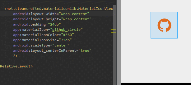
Demo
Stats
- MinSdk 4
- LIVE previews and code completion in the Android Studio Designer (Does NOT work out of the box, see step 0 below!)
- Currently contains 2354 icons, you can look at them here: https://materialdesignicons.com
- Configured in less than a minute
- Adds about 257kb to your apk (so a whopping average of 109 bytes per icon)
- Includes a custom Drawable, IconView and a MenuInflater for all different icon use cases
Usage
Step 0
Now I still have your attention, to get the previews to work in Android Studio you'll have to put the font file inside the assets of your project yourself. Due to a bug it does not think about looking inside the library's assets for some odd reason.
Get the font file here.
You don't have to worry about android including the file twice in your apk. Android Studio recognizes the duplicate file name and only keeps one copy in your apk!
Previews work inside layout files, menu resource files sadly do not support previews (more on those below).
Step 1
Gradle
dependencies {
    compile 'net.steamcrafted:materialiconlib:1.1.5'
}
Step 2
There's a total of 3 different use cases (click the links to jump to their section). You can use the provided MaterialIconView which mostly is just a more advanced ImageView or use your preferred ImageView and use the MaterialDrawable as Drawable resource. If you want to spice up your Toolbar with icons from this library there is a custom MaterialMenuInflater that does just that in a single line of code.
MaterialIconView
Add the view to your XML:
<net.steamcrafted.materialiconlib.MaterialIconView
    xmlns:app="http://schemas.android.com/apk/res-auto" <!-- VERY IMPORTANT -->

    android:layout_width="48dp"
    android:layout_height="48dp"
    app:materialIcon="clipboard_arrow_down" <!-- This sets the icon, HAS AUTOCOMPLETE ;) -->
    app:materialIconColor="#fff" <!-- Sets the icon color -->
    app:materialIconSize="24dp"  <!-- Sets the icon size -->
    android:scaleType="center" <!-- Centers the icon (all scale types supported) -->
    android:background="@android:color/darker_gray"
    android:id="@+id/icon"
/>
You can also use the other route: the "wrap_content" way:
<net.steamcrafted.materialiconlib.MaterialIconView
    xmlns:app="http://schemas.android.com/apk/res-auto" <!-- VERY IMPORTANT -->

    android:layout_width="wrap_content"
    android:layout_height="wrap_content"
    android:padding="12dp" <!-- now we use a padding to center the icon -->
    app:materialIcon="clipboard_arrow_down" <!-- This sets the icon, HAS AUTOCOMPLETE ;) -->
    app:materialIconColor="#fff" <!-- Sets the icon color -->
    app:materialIconSize="24dp"  <!-- Sets the icon size -->
    <!-- scaleType is no longer required for this method -->
    android:background="@android:color/darker_gray"
    android:id="@+id/icon"
/>
The view is inherited from ImageView. This means that you can use any and all features of the very flexible ImageView BUT be reminded that this view does not cache any of the drawables it creates, so every time you change something about the icon, it's going to regenerate the drawable. Using this view inside listviews is highly discouraged, if you want to use these icons in a ListView, cache the drawables and use the MaterialDrawableBuilder in combination with an ImageView!
As mentioned before this extends the android ImageView class, there's a few methods unique to this particular view:
// Sets the icon, all 1000+ icons are available inside the MaterialDrawableBuilder.IconValue enum
yourMaterialIconView.setIcon(IconValue iconValue);

// Sets the size of the icon to the default action bar icon size
yourMaterialIconView.setToActionbarSize();

// Provide a dimension resource to use as icon size
yourMaterialIconView.setSizeResource(int dimenRes);

// Set the icon size using a value in dp units
yourMaterialIconView.setSizeDp(int size);

// Set the icon size using a pixel value
yourMaterialIconView.setSizePx(int size);

// Set the icon color
yourMaterialIconView.setColor(int color);

// Set the icon color using a color resource
yourMaterialIconView.setColorResource(int colorRes);

// Set the icon's alpha value (0-255) 0 for completely transparent
yourMaterialIconView.setAlpha(int alpha);

// Sets a custom colorfilter to the drawing paint (for the more advanced devs)
yourMaterialIconView.setColorFilter(ColorFilter cf);

// Clear the color filter set using above method
yourMaterialIconView.clearColorFilter();

// Sets a custom paint style (for the more advanced devs)
yourMaterialIconView.setStyle(Paint.Style style);


// You can use any of the ImageView methods as well:
yourMaterialIconView.setBackgroundColor(Color.WHITE)
yourMaterialIconView.setScaleType(ScaleType.CENTER)
// etc...
MaterialDrawable
That was easy, right? Next up the custom drawables, they are internally used by the MaterialIconView so you'll see that they share many of the same methods.
The initialisation happens using the MaterialDrawableBuilder, which you can use to set all the properties of the drawable:
// The method returns a MaterialDrawable, but as it is private to the builder you'll have to store it as a regular Drawable ;)
Drawable yourDrawable = MaterialDrawableBuilder.with(context) // provide a context
        .setIcon(MaterialDrawableBuilder.IconValue.WEATHER_RAINY) // provide an icon
        .setColor(Color.WHITE) // set the icon color
        .setToActionbarSize() // set the icon size
    .build(); // Finally call build
This will throw an IconNotSetException if you forget to provide an icon.
Once you call build, your Drawable will be spit out and you are ready to use it everywhere you please! Setting it to a view is just as easy as with any other Drawable (e.g. for ImageView):
yourImageView.setImageDrawable(yourDrawable);
And that's all there is to it. Below are all the methods you can use with the MaterialDrawableBuilder for reference.
// Sets the icon, all 1000+ icons are available inside the MaterialDrawableBuilder.IconValue enum
builder.setIcon(IconValue iconValue);

// Builds the drawable, this method always comes last ofcourse
builder.build();

// Sets the size of the icon to the default action bar icon size
builder.setToActionbarSize();

// Provide a dimension resource to use as icon size
builder.setSizeResource(int dimenRes);

// Set the icon size using a value in dp units
builder.setSizeDp(int size);

// Set the icon size using a pixel value
builder.setSizePx(int size);

// Set the icon color
builder.setColor(int color);

// Set the icon color using a color resource
builder.setColorResource(int colorRes);

// Set the icon's alpha value (0-255) 0 for completely transparent
builder.setAlpha(int alpha);

// Sets a custom colorfilter to the drawing paint (for the more advanced devs)
builder.setColorFilter(ColorFilter cf);

// Clear the color filter set using above method
builder.clearColorFilter();

// Returns the alpha value
builder.getOpacity();

// Sets a custom paint style (for the more advanced devs)
builder.setStyle(Paint.Style style);
MaterialMenuInflater
With the MaterialMenuInflater you can use any of the icons available in this library inside your menu resource files. In XML you'd have to do the following:
<menu xmlns:android="http://schemas.android.com/apk/res/android"
    xmlns:app="http://schemas.android.com/apk/res-auto" <!-- important, you'll have to include this to use the custom xml attributes -->
    xmlns:tools="http://schemas.android.com/tools" >

    <!-- example of a menu item with an icon -->
    <item
        android:title="Disable Wifi"
        app:showAsAction="always"
        app:materialIcon="wifi_off" <!-- This sets the icon, HAS AUTOCOMPLETE ;) -->
        app:materialIconColor="#FE0000" <!-- Sets the icon color -->
    />

</menu>
To actually inflate this menu you'll now have to use the MaterialMenuInflater instead of the default one. For the AppCompatActivity do the following in your onCreateOptionsMenu:
@Override
public boolean onCreateOptionsMenu(Menu menu) {
    MaterialMenuInflater
            .with(this) // Provide the activity context
            // Set the fall-back color for all the icons. Colors set inside the XML will always have higher priority
            .setDefaultColor(Color.BLUE)
            // Inflate the menu
            .inflate(R.menu.your_menu_resource, menu);
    return true;
}
Since the release of the Appcompat-v7 library you can also use the Toolbar view inside your XML layouts. Inflating a menu for a toolbar is a bit different from the usual way, but it is just as easy:
// Get the toolbar from layout
Toolbar toolbar = (Toolbar) findViewById(R.id.your_toolbar);

MaterialMenuInflater
        .with(this) // Provide a context, activity context will do just fine
        // Set the fall-back color for all the icons. Colors set inside the XML will always have higher priority
        .setDefaultColor(Color.BLUE)
        // Inflate the menu
        .inflate(R.menu.your_menu_resource, toolbar.getMenu());
And that's all there is to it.
License
Released under the Apache 2.0 License
- MaterialDesignicons Released under the SIL Open Font License 1.1
- Google Material Design Icons Released under the Apache 2.0 License
Top Related Projects
Material Design icons by Google (Material Symbols)
✒7000+ Material Design Icons from the Community
Customizable Icons for React Native with support for image source and full styling.
A pack of more than 480 beautifully crafted Open Source icons. SVG, Sketch, Web Font and Animations support.
The iconic SVG, font, and CSS toolkit
Premium hand-crafted icons built by Ionic, for Ionic apps and web apps everywhere 🌎
Convert designs to code with AI
Introducing Visual Copilot: A new AI model to turn Figma designs to high quality code using your components.
Try Visual Copilot