 david-ai
David AI is a free and open-source collection of customizable, production-ready UI components built with Tailwind CSS.
Top Related Projects

A Tailwind CSS frontend preset for the Laravel Framework

😎 Awesome things related to Tailwind CSS
Quick Overview
The Tailwind Starter Kit by Creative Tim is a comprehensive collection of pre-built components and templates using Tailwind CSS. It provides developers with a solid foundation for quickly building responsive and customizable web interfaces, offering a variety of ready-to-use elements and layouts for different frameworks and technologies.
Pros
- Extensive collection of pre-built components and templates
- Compatible with multiple frameworks (React, Vue, Angular, and vanilla HTML)
- Responsive design out of the box
- Time-saving for rapid prototyping and development
Cons
- May require some customization for specific project needs
- Learning curve for developers new to Tailwind CSS
- Limited advanced components compared to some other UI libraries
Code Examples
- Using a button component:
<button class="bg-blue-500 hover:bg-blue-700 text-white font-bold py-2 px-4 rounded">
  Click me
</button>
- Implementing a card component:
<div class="max-w-sm rounded overflow-hidden shadow-lg">
  <img class="w-full" src="/img/card-top.jpg" alt="Card image">
  <div class="px-6 py-4">
    <div class="font-bold text-xl mb-2">Card Title</div>
    <p class="text-gray-700 text-base">
      Some quick example text to build on the card title and make up the bulk of the card's content.
    </p>
  </div>
</div>
- Creating a responsive navbar:
<nav class="flex items-center justify-between flex-wrap bg-teal-500 p-6">
  <div class="flex items-center flex-shrink-0 text-white mr-6">
    <span class="font-semibold text-xl tracking-tight">Logo</span>
  </div>
  <div class="block lg:hidden">
    <button class="flex items-center px-3 py-2 border rounded text-teal-200 border-teal-400 hover:text-white hover:border-white">
      <svg class="fill-current h-3 w-3" viewBox="0 0 20 20" xmlns="http://www.w3.org/2000/svg"><title>Menu</title><path d="M0 3h20v2H0V3zm0 6h20v2H0V9zm0 6h20v2H0v-2z"/></svg>
    </button>
  </div>
  <div class="w-full block flex-grow lg:flex lg:items-center lg:w-auto">
    <div class="text-sm lg:flex-grow">
      <a href="#responsive-header" class="block mt-4 lg:inline-block lg:mt-0 text-teal-200 hover:text-white mr-4">
        Link 1
      </a>
      <a href="#responsive-header" class="block mt-4 lg:inline-block lg:mt-0 text-teal-200 hover:text-white mr-4">
        Link 2
      </a>
    </div>
  </div>
</nav>
Getting Started
-
Clone the repository:
git clone https://github.com/creativetimofficial/tailwind-starter-kit.git -
Navigate to the desired template folder (e.g.,
tailwind-starter-kit/HTML/) -
Open the
index.htmlfile in your browser or use a local server to view the template -
Customize the components and styles as needed for your project
-
For framework-specific versions, follow the installation instructions in the respective folders (React, Vue, or Angular)
Competitor Comparisons
A Tailwind CSS frontend preset for the Laravel Framework
Pros of laravel-frontend-presets/tailwindcss
- Specifically designed for Laravel, providing seamless integration with the framework
- Includes Laravel-specific features like Blade components and authentication views
- Offers a more opinionated structure, which can be beneficial for Laravel developers
Cons of laravel-frontend-presets/tailwindcss
- Limited to Laravel projects, reducing flexibility for non-Laravel applications
- May have a steeper learning curve for developers not familiar with Laravel conventions
- Less extensive documentation compared to tailwind-starter-kit
Code Comparison
tailwind-starter-kit:
<div class="container mx-auto px-4">
  <div class="flex flex-wrap">
    <div class="w-full md:w-4/12 px-4">
      <!-- Content -->
    </div>
  </div>
</div>
laravel-frontend-presets/tailwindcss:
<x-app-layout>
    <x-slot name="header">
        <h2 class="font-semibold text-xl text-gray-800 leading-tight">
            {{ __('Dashboard') }}
        </h2>
    </x-slot>

    <div class="py-12">
        <!-- Content -->
    </div>
</x-app-layout>
The code comparison shows that tailwind-starter-kit uses plain HTML with Tailwind CSS classes, while laravel-frontend-presets/tailwindcss utilizes Laravel Blade components and syntax, demonstrating its tight integration with the Laravel framework.
😎 Awesome things related to Tailwind CSS
Pros of awesome-tailwindcss
- Comprehensive collection of Tailwind CSS resources, tools, and components
- Regularly updated with community contributions
- Provides a wide range of options for developers at different skill levels
Cons of awesome-tailwindcss
- Lacks ready-to-use templates or complete project setups
- May overwhelm beginners with too many options
- Requires more effort to integrate individual components into a project
Code Comparison
While a direct code comparison isn't applicable due to the nature of these repositories, here's a brief example of how they might be used:
awesome-tailwindcss:
- [Tailwind UI](https://tailwindui.com) - Component library made with Tailwind CSS
- [Tailwind Components](https://tailwindcomponents.com) - Community-driven Tailwind CSS component repository
tailwind-starter-kit:
<div class="relative pt-16 pb-32 flex content-center items-center justify-center"
     style="min-height: 75vh;">
  <div class="absolute top-0 w-full h-full bg-center bg-cover"
       style='background-image: url("https://images.unsplash.com/photo-1557804506-669a67965ba0?ixlib=rb-1.2.1&ixid=eyJhcHBfaWQiOjEyMDd9&auto=format&fit=crop&w=1267&q=80");'>
    <span id="blackOverlay" class="w-full h-full absolute opacity-75 bg-black"></span>
  </div>
  <div class="container relative mx-auto">
    <div class="items-center flex flex-wrap">
      <div class="w-full lg:w-6/12 px-4 ml-auto mr-auto text-center">
        <div class="pr-12">
          <h1 class="text-white font-semibold text-5xl">
            Your story starts with us.
          </h1>
          <p class="mt-4 text-lg text-gray-300">
            This is a simple example of a Landing Page you can build using Tailwind Starter Kit.
            It features multiple CSS components based on the Tailwindcss design system.
          </p>
        </div>
      </div>
    </div>
  </div>
</div>
Convert  designs to code with AI

Introducing Visual Copilot: A new AI model to turn Figma designs to high quality code using your components.
Try Visual CopilotREADME
[!NOTE] This repository was previously named tailwind-starter-kit and has been renamed to david-ai to better reflect its purpose and direction.
David UI - Free Tailwind CSS Components Library
David UI is a free and open-source collection of customizable, production-ready UI components built with Tailwind CSS. Designed to be developer-friendly and performance-focused, David UI streamlines the creation of modern, visually appealing interfaces, helping you deliver high-quality user experiences faster.


Table of Contents
Getting Started
Learn how to use david-ai components to quickly and easily create elegant and flexible pages using Tailwind CSS.
david-ai is working with Tailwind CSS classes and you need to have Tailwind CSS installed on your project - Tailwind CSS Installation.
Using with CDN
You can include david-ai via a CDN and initialize alerts globally in the browser. Add the following script to your HTML file:
<script
  src="https://cdn.jsdelivr.net/gh/creativetimofficial/david-ai@1.0.6/packages/dist/david-ai.min.js"
  defer
></script>
Basic Usage NPM
npm i david-ai
After installing, you can use the components in your project across different frameworks:
import { initAlert } from "david-ai";

// Initialize alerts
initAlert();
Using with Global Access
If you prefer, you can use the DavidAI global object instead of directly importing initAlert:
import * as DavidAI from "david-ai";

// Initialize alerts
DavidAI.initAlert();
TypeScript
David AI components can be used in two ways - through simple ESM imports or programmatically with TypeScript support. Here's how to use both approaches:
Simple ESM Import
The quickest way to use components is through direct ESM imports:
import { initAlert } from "david-ai";

// Initialize alerts
initAlert();
Programmatic Usage with TypeScript
For more control and type safety, you can use the programmatic approach with full TypeScript support:
This programmatic approach provides:
- Full TypeScript support
- Fine-grained control over component behavior
- Access to component instance methods
- Proper cleanup on unmount
import { Accordion } from "david-ai";
import type { AccordionConfig, IAccordion } from "david-ai";

document.addEventListener("DOMContentLoaded", () => {
  const container = document.getElementById("accordion-container");

  if (container) {
    const config: AccordionConfig = {
      exclusive: true,
      allOpen: false,
    };

    const accordion: IAccordion = new Accordion(container, config);

    // Handle external button controls
    const showAllButton = document.getElementById("show-all");
    const hideAllButton = document.getElementById("hide-all");
    const toggleFirstButton = document.getElementById("toggle-first");

    showAllButton?.addEventListener("click", () => {
      accordion.showAll();
    });

    hideAllButton?.addEventListener("click", () => {
      accordion.hideAll();
    });

    toggleFirstButton?.addEventListener("click", () => {
      const firstButton = document.getElementById("button-1") as HTMLElement;
      if (firstButton) {
        accordion.toggle(firstButton);
      }
    });

    // Cleanup on unmount
    window.addEventListener("unload", () => {
      accordion.cleanup();
    });
  }
});
For detailed usage of each component, check out their respective documentation:
- Accordion (ESM & Programmatic)
- Alert (ESM)
- Collapse (ESM & Programmatic)
- Dropdown (ESM & Programmatic)
- Gallery (ESM)
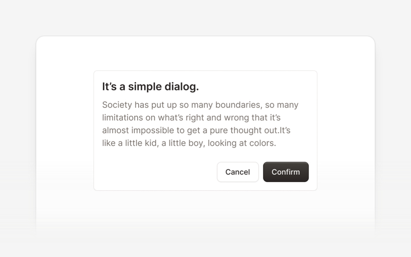
- Modal (ESM & Programmatic)
- Popover (ESM & Programmatic)
- Stepper (ESM & Programmatic)
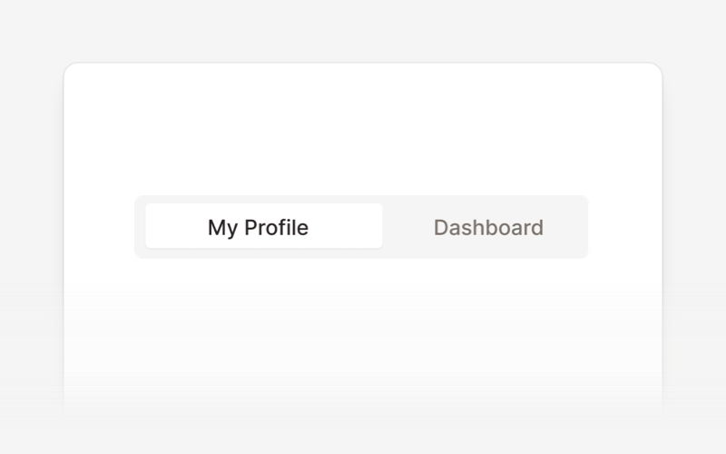
- Tabs (ESM & Programmatic)
- Tooltip (ESM & Programmatic)
Congratulations ð¥³, you did it, now you're ready to use david-ai.
Documentation
David UIâs documentation includes code snippets, previews, and detailed usage instructions for each component, ensuring a smooth implementation process.
Visit the David UI Docs to explore the entire library.
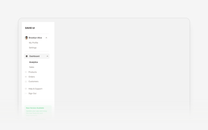
Explore Components
|
|
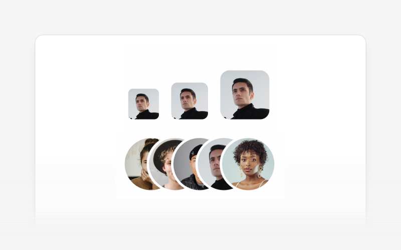
|
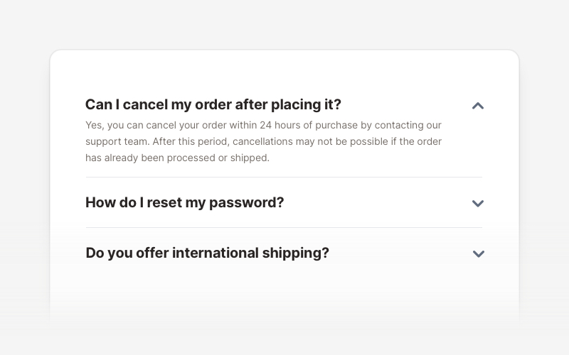
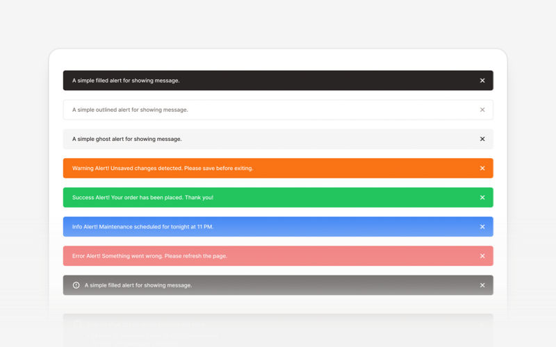
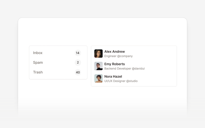
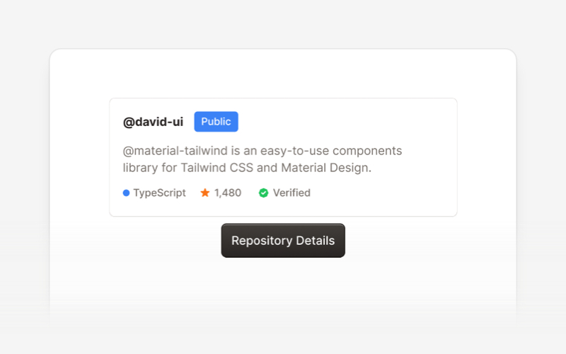
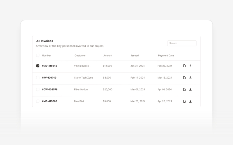
| Accordion | Alert | Avatar |
|
|
|
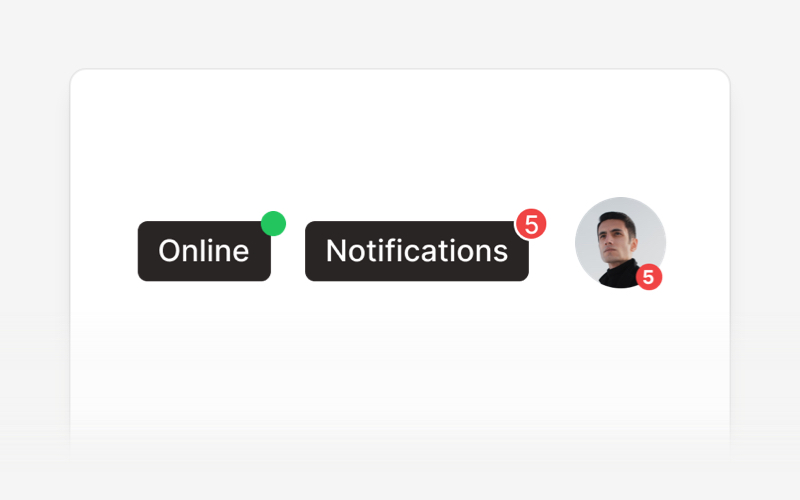
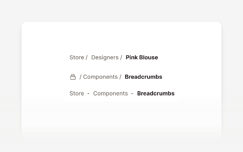
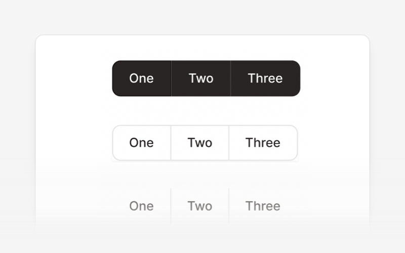
| Badge | Breadcrumbs | Button |
|
|
|
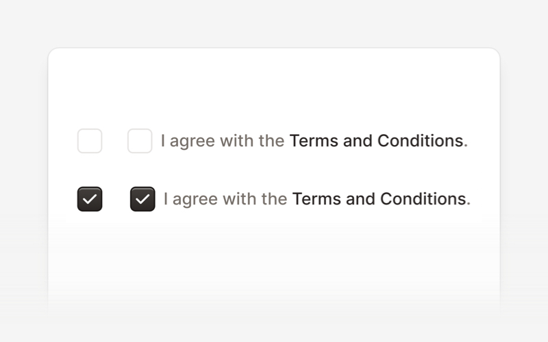
| Button Group | Card | Checkbox |
|
|
|
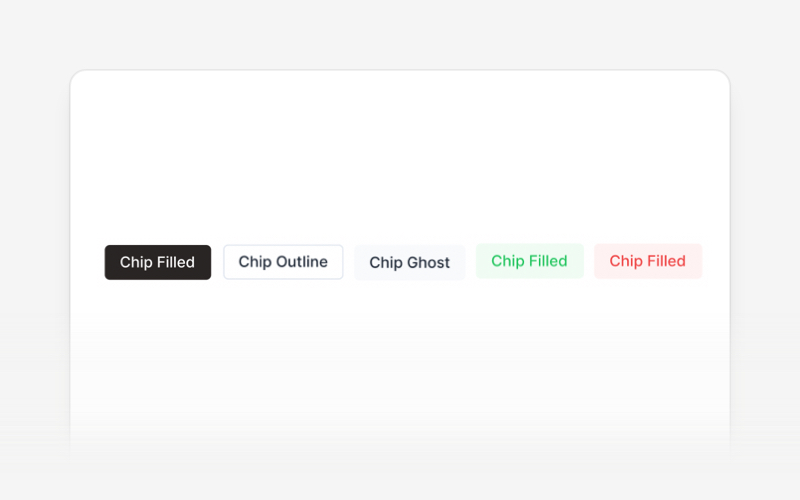
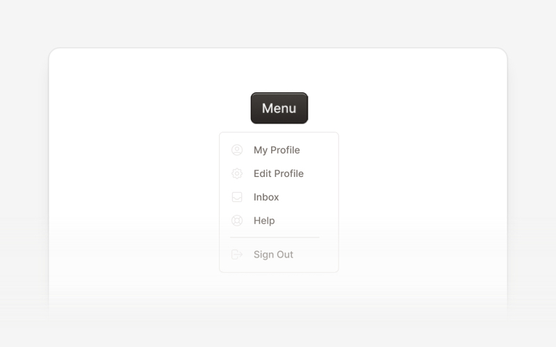
| Chip | Collapse | Dropdown |
|
|
|
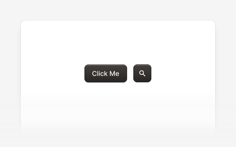
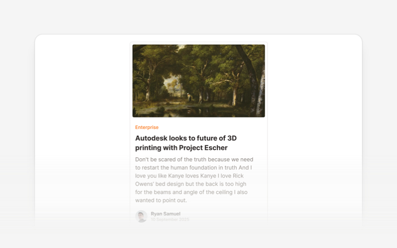
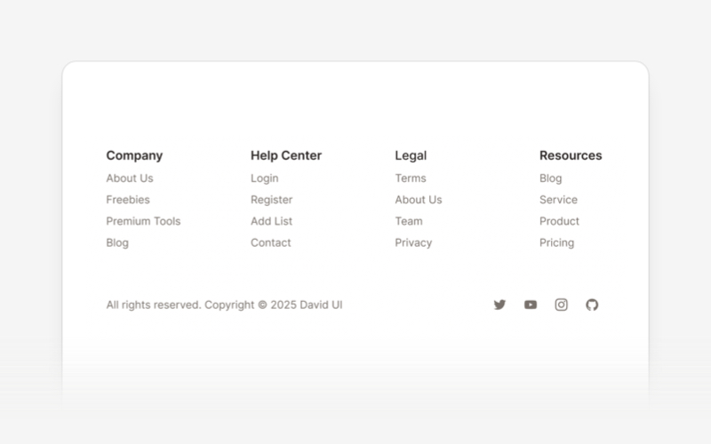
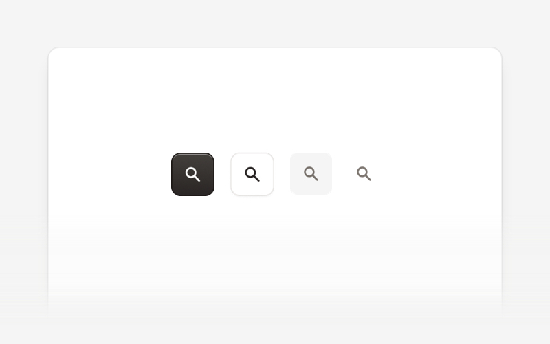
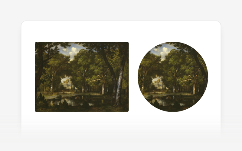
| Footer | Icon Button | Image |
|
|
|
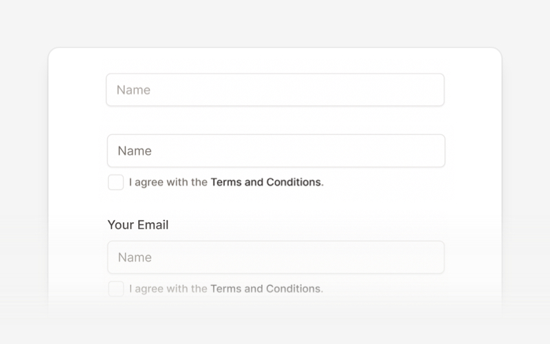
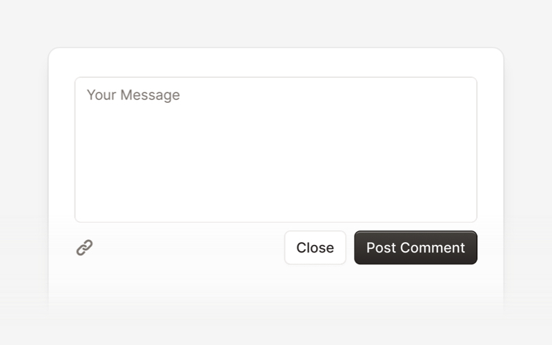
| Input | List | Modal |
|
|
|
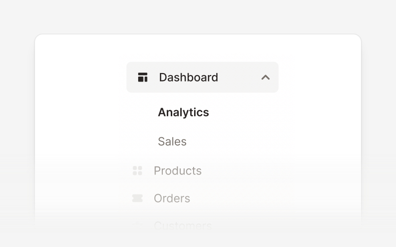
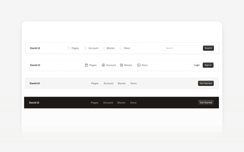
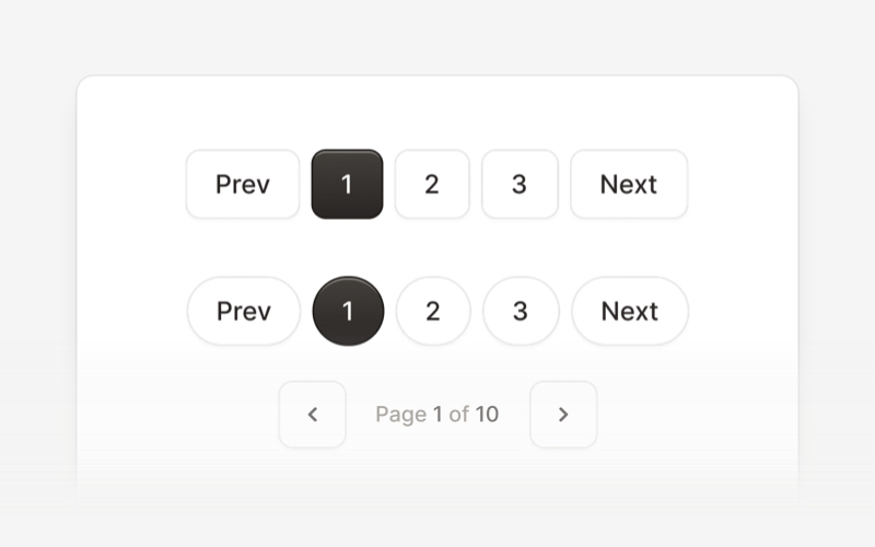
| Navbar | Pagination | Popover |
|
|
|
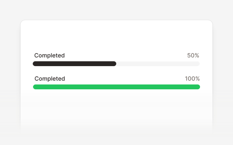
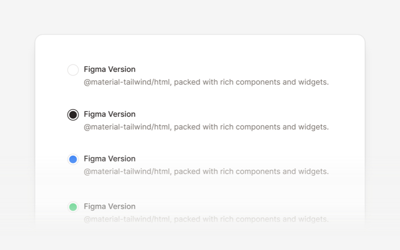
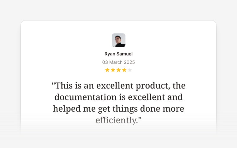
| Progress Bar | Radio Button | Rating Bar |
|
|
|
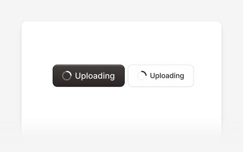
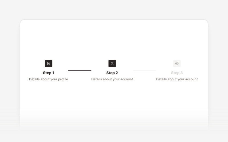
| Sidebar | Spinner | Stepper |
|
|
|
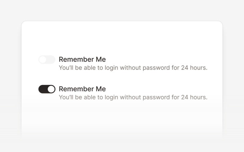
| Switch | Table | Tabs |
|
|
|
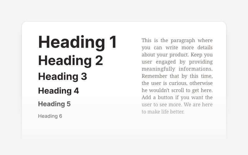
| Textarea | Tooltip | Typography |
|
|
|
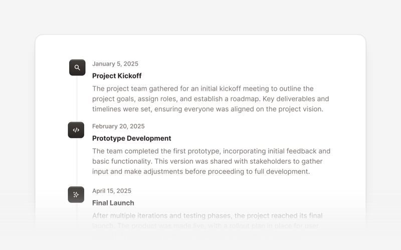
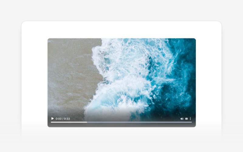
| Timeline | Video |
Community
- We're excited to see the community adopt David AI, raise issues, and provide feedback.
- Whether it's a feature request, bug report, or a project to showcase, please get involved!
License
Copyright (c) 2020-2025 Creative Tim
David UI is distributed under the MIT License, providing freedom and flexibility for all projects.
Older Version
You can find the older version of the David UI in the tailwind-starter-kit branch.
Contribute & Feedback
We welcome contributions and feedback! If you have suggestions, encounter issues, or want to propose new components, feel free to open an issue or submit a pull request on our repository. Your input helps make David UI better for everyone.
Build better, faster, and smarter with David UI. Explore the documentation and start leveraging our components to deliver polished, user-friendly interfaces with ease.
Top Related Projects
A Tailwind CSS frontend preset for the Laravel Framework
😎 Awesome things related to Tailwind CSS
Convert designs to code with AI
Introducing Visual Copilot: A new AI model to turn Figma designs to high quality code using your components.
Try Visual Copilot