
Top Related Projects

KolodaView is a class designed to simplify the implementation of Tinder like cards on iOS.

Swipe to "like" or "dislike" any view, just like Tinder.app. Build a flashcard app, a photo viewer, and more, in minutes, not hours!

A simple, highly customisable, data-driven 3D carousel for iOS and Mac OS
Quick Overview
RKSwipeCards is an iOS library that provides a Tinder-like card interface for Swift applications. It allows developers to easily implement a swipeable card UI with customizable animations and gestures, similar to popular dating and social networking apps.
Pros
- Easy to integrate and use in Swift projects
- Highly customizable with options for card appearance and animations
- Smooth and responsive swipe gestures
- Includes features like undo and reload functionality
Cons
- Limited documentation and examples
- Not actively maintained (last update was several years ago)
- May require additional work to integrate with modern Swift and iOS versions
- Lacks some advanced features found in more recent alternatives
Code Examples
- Setting up the card view:
let cardView = RKSwipeCards()
cardView.delegate = self
cardView.dataSource = self
view.addSubview(cardView)
- Implementing the data source method:
func nextCardDetails() -> RKCard? {
    guard let card = cards.popLast() else { return nil }
    return RKCard(view: card)
}
- Handling swipe actions:
func didSwipeCard(_ card: RKCard, in direction: RKSwipeDirection) {
    switch direction {
    case .left:
        print("Card swiped left")
    case .right:
        print("Card swiped right")
    }
}
Getting Started
- Add the RKSwipeCards folder to your Xcode project.
- Import the library in your Swift file:
import RKSwipeCards
- Create an instance of RKSwipeCards and add it to your view:
let cardView = RKSwipeCards()
cardView.delegate = self
cardView.dataSource = self
view.addSubview(cardView)
- Implement the required delegate and data source methods:
extension YourViewController: RKSwipeCardsDelegate, RKSwipeCardsDataSource {
    func nextCardDetails() -> RKCard? {
        // Return the next card to display
    }

    func didSwipeCard(_ card: RKCard, in direction: RKSwipeDirection) {
        // Handle swipe actions
    }
}
- Customize the appearance and behavior of the cards as needed using the available properties and methods.
Competitor Comparisons
KolodaView is a class designed to simplify the implementation of Tinder like cards on iOS.
Pros of Koloda
- More actively maintained with recent updates
- Offers more customization options and features
- Better documentation and example project
Cons of Koloda
- Slightly more complex implementation
- Larger codebase, which may impact app size
Code Comparison
RKSwipeCards:
func createNewCard() -> UIView {
    let card = UIView(frame: CGRectMake((self.frame.size.width - kCardWidth)/2, (self.frame.size.height - kCardHeight)/2, kCardWidth, kCardHeight))
    return card
}
Koloda:
func koloda(_ koloda: KolodaView, viewForCardAt index: Int) -> UIView {
    let card = UIView(frame: CGRect(x: 0, y: 0, width: koloda.frame.size.width, height: koloda.frame.size.height))
    return card
}
Both libraries provide similar functionality for creating Tinder-like swipeable card interfaces in iOS applications. RKSwipeCards offers a simpler implementation with fewer features, making it easier to integrate for basic use cases. Koloda, on the other hand, provides more advanced features and customization options, but requires a bit more setup.
Koloda's active maintenance and comprehensive documentation make it a more robust choice for long-term projects. However, RKSwipeCards might be preferable for simpler applications or prototypes due to its lightweight nature and straightforward implementation.
Swipe to "like" or "dislike" any view, just like Tinder.app. Build a flashcard app, a photo viewer, and more, in minutes, not hours!
Pros of MDCSwipeToChoose
- More customizable appearance and behavior
- Better documentation and example usage
- Supports both UIView and UICollectionView implementations
Cons of MDCSwipeToChoose
- Less active maintenance (last updated 5 years ago)
- Fewer stars and forks on GitHub
- May require more setup and configuration
Code Comparison
MDCSwipeToChoose:
MDCSwipeToChooseView *swipeView = [[MDCSwipeToChooseView alloc] initWithFrame:frame
                                                                      options:options];
swipeView.delegate = self;
[self.view addSubview:swipeView];
RKSwipeCards:
RKSwipeCards *swipeCards = [[RKSwipeCards alloc] initWithFrame:self.view.frame];
swipeCards.delegate = self;
[self.view addSubview:swipeCards];
Both libraries offer similar basic functionality for creating Tinder-like swipeable card interfaces. MDCSwipeToChoose provides more customization options and detailed documentation, making it potentially easier to implement complex designs. However, RKSwipeCards has seen more recent updates and community engagement, which could indicate better long-term support and compatibility with newer iOS versions.
The code comparison shows that MDCSwipeToChoose requires more initial setup with options, while RKSwipeCards has a simpler initialization process. Developers should consider their specific project requirements, desired customization level, and the importance of recent updates when choosing between these libraries.
A simple, highly customisable, data-driven 3D carousel for iOS and Mac OS
Pros of iCarousel
- More versatile, offering multiple carousel types (linear, circular, cylindrical, etc.)
- Extensive customization options for appearance and behavior
- Well-documented and actively maintained
Cons of iCarousel
- Steeper learning curve due to more complex API
- May be overkill for simple card swiping functionality
- Larger codebase, potentially impacting app size
Code Comparison
iCarousel implementation:
iCarousel *carousel = [[iCarousel alloc] initWithFrame:self.view.bounds];
carousel.type = iCarouselTypeLinear;
carousel.dataSource = self;
carousel.delegate = self;
[self.view addSubview:carousel];
RKSwipeCards implementation:
RKSwipeCards *swipeCards = [[RKSwipeCards alloc] initWithFrame:self.view.bounds];
swipeCards.delegate = self;
swipeCards.dataSource = self;
[self.view addSubview:swipeCards];
iCarousel offers more flexibility and features, making it suitable for complex carousel implementations. RKSwipeCards is simpler and more focused on Tinder-like card swiping functionality. Choose iCarousel for versatile carousel needs and RKSwipeCards for straightforward card swiping interfaces.
Convert  designs to code with AI

Introducing Visual Copilot: A new AI model to turn Figma designs to high quality code using your components.
Try Visual CopilotREADME
RKSwipeCards
This is for maximum customizability and / or learning purposes, not a pod or drop-in solution
The basics of a swipeable card interface inspired by Tinder and influenced by http://guti.in
This is meant to be taken and built off of, not as a simple drag and drop solution. New developers are often forced to use dependencies they don't understand and can't customize. This is the opposite. I've fully explained exactly how this works in detailed comments so that you can take it apart and customize it at will. For a pod/drag and drop solution, see https://github.com/modocache/MDCSwipeToChoose
Updates, Questions, and Requests
twitter <--- I am a very light twitterer, so I wont spam you
or Support
Relevant Article for deciding how to implement swipe cards into your app
https://medium.com/@cwRichardKim/adding-tinder-esque-cards-to-your-iphone-app-4047967303d1
On top of your current View Controllers

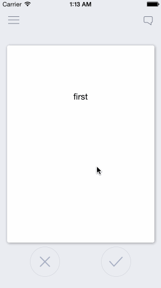
Features:
- Swipe cards left or right to call two separate actions
- Have multiple cards on screen depending on the number of items in an array
- Extremely simple, every component is explained
- Very easily customizeable
Customizeability Examples:
action margin (the distance from the middle required for an action to take place)

squeeze ratio (limit, strength)

rotation (strength, limit, angle)
+ More!
in DraggableView.h
- ACTION_MARGIN: distance from center where the action applies. Higher = swipe further in order for the action to be called
- SCALE_STRENGTH: how quickly the card shrinks. Higher = slower shrinking
- SCALE_MAX: upper bar for how much the card shrinks. Higher = shrinks less
- ROTATION_MAX: the maximum rotation allowed in radians. Higher = card can keep rotating longer
- ROTATION_STRENGTH: strength of rotation. Higher = weaker rotation
- ROTATION_ANGLE: Higher = stronger rotation angle
Each component is also explained thoroughly, so it is highly customizeable in many ways
How to use
files
- ViewController.h/m: example view controller (not necessary)
- DraggableViewBackground.h/m: UIView that holds the DraggableView. This can be put ontop of view controllers or you can set it as the main view of your view controller
- DraggableView.h/m: UIView of the draggable cards
- OverlayView.h/m: UIView of the X and â images
Setup as View Controller (see ViewController.m)
DraggableViewBackground *draggableBackground = [[DraggableViewBackground alloc]initWithFrame:self.view.frame];
[self.view addSubview:draggableBackground];
Setup as UIView ontop of View Controller
CGRect frame = self.view.frame;
frame.origin.y = -self.view.frame.size.height; //optional: if you want the view to drop down
DraggableViewBackground *draggableBackground = [[DraggableViewBackground alloc]initWithFrame:frame];
draggableBackground.alpha = 0; //optional: if you want the view to fade in

[self.view addSubview:draggableBackground];

  //optional: animate down and in
[UIView animateWithDuration:0.5 animations:^{
    draggableBackground.center = self.view.center;
    draggableBackground.alpha = 1;
}];
Presenting Your Data
Loading Data
-
edit -(void)loadCards in DraggableViewBackground.m to dictate what information is loaded and how
-
"allCards" holds all the cards you want to show, "loadedCards" only shows the first few so that it doesn't load everything at once.
-
if card data is loaded after initWithFrame, then make sure the data is included in your custom data array (currently "exampleCardLabels") at the index: yourIndex and then write the code:
DraggableView* newCard = [self createDraggableViewWithDataAtIndex:yourIndex];
[allCards addObject:newCard];
whenever you need to.
-
I used exampleCardLabels as an example of how to load data, but feel free to change that
Presenting Data in View
- Customize the presentation of your data in -(DraggableView *)createDraggableViewWithDataAtIndex:(NSInteger)index in DraggableViewBackground.m (eg: make certain data appear on labels or photos in custom UIImageViews)
- to access any card directly, use [loadedCards objectAtIndex:yourIndex]; For example, the card that is currently visible is at [loadedCards firstObject];
Looking for certain features?
- up/down-swipe: https://github.com/cwRichardKim/RKSwipeCards/issues/12
- card state: https://github.com/cwRichardKim/RKSwipeCards/issues/12
- delegate example: https://github.com/cwRichardKim/RKSwipeCards/issues/12
Areas for Future Improvement / Involvement
- Too much happening in a view (DraggableViewBackground)
- Improved naming (while maintaining legacy and / or easy directions for change)
Change Log
- May 28, 2017 - Take down notice issued from Tinder, changed naming and various references
Top Related Projects
KolodaView is a class designed to simplify the implementation of Tinder like cards on iOS.
Swipe to "like" or "dislike" any view, just like Tinder.app. Build a flashcard app, a photo viewer, and more, in minutes, not hours!
A simple, highly customisable, data-driven 3D carousel for iOS and Mac OS
Convert designs to code with AI
Introducing Visual Copilot: A new AI model to turn Figma designs to high quality code using your components.
Try Visual Copilot