
Top Related Projects

An enhanced, animated, customizable Modal for React Native.

Material Design for React Native (Android & iOS)

Picker is a cross-platform UI component for selecting an item from a list of options.

React Native date & time picker component for iOS, Android and Windows

UIMenu Component for React Native
Quick Overview
The expo/react-native-action-sheet repository provides a cross-platform ActionSheet component for React Native applications. It offers a native look and feel on both iOS and Android platforms, allowing developers to create consistent and user-friendly action sheets across different devices.
Pros
- Cross-platform compatibility with native look and feel
- Easy integration with Expo and bare React Native projects
- Customizable appearance and behavior
- TypeScript support for improved type safety
Cons
- Limited animation options compared to some custom solutions
- Requires additional setup for bare React Native projects
- May not perfectly match platform-specific designs in all cases
- Limited to basic action sheet functionality
Code Examples
- Basic usage of ActionSheetProvider and useActionSheet hook:
import { ActionSheetProvider, useActionSheet } from '@expo/react-native-action-sheet';

function App() {
  return (
    <ActionSheetProvider>
      <MyComponent />
    </ActionSheetProvider>
  );
}

function MyComponent() {
  const { showActionSheetWithOptions } = useActionSheet();

  const onPress = () => {
    const options = ['Delete', 'Save', 'Cancel'];
    const destructiveButtonIndex = 0;
    const cancelButtonIndex = 2;

    showActionSheetWithOptions(
      {
        options,
        cancelButtonIndex,
        destructiveButtonIndex,
      },
      (selectedIndex) => {
        // Handle the selected option
      }
    );
  };

  return <Button title="Show ActionSheet" onPress={onPress} />;
}
- Customizing the appearance of the ActionSheet:
showActionSheetWithOptions(
  {
    options: ['Option 1', 'Option 2', 'Cancel'],
    cancelButtonIndex: 2,
    destructiveButtonIndex: 1,
    title: 'Choose an option',
    message: 'This is a custom message',
    tintColor: '#007AFF',
    containerStyle: { backgroundColor: '#f0f0f0' },
    textStyle: { fontFamily: 'Arial', fontSize: 16 },
  },
  (selectedIndex) => {
    // Handle the selected option
  }
);
- Using the ActionSheet with async/await:
const showActionSheet = async () => {
  try {
    const { canceled, buttonIndex } = await showActionSheetWithOptions({
      options: ['Option 1', 'Option 2', 'Cancel'],
      cancelButtonIndex: 2,
    });

    if (!canceled) {
      console.log(`Selected option: ${buttonIndex}`);
    }
  } catch (error) {
    console.error('Error showing action sheet:', error);
  }
};
Getting Started
-
Install the package:
npm install @expo/react-native-action-sheet -
Wrap your app with ActionSheetProvider:
import { ActionSheetProvider } from '@expo/react-native-action-sheet'; export default function App() { return ( <ActionSheetProvider> {/* Your app components */} </ActionSheetProvider> ); } -
Use the useActionSheet hook in your components:
import { useActionSheet } from '@expo/react-native-action-sheet';

function MyComponent() {
  const { showActionSheetWithOptions } = useActionSheet();
  // Use showActionSheetWithOptions to display the action sheet
}
Competitor Comparisons
An enhanced, animated, customizable Modal for React Native.
Pros of react-native-modal
- More versatile, can create various types of modals beyond action sheets
- Highly customizable with extensive styling options
- Supports custom animations and transitions
Cons of react-native-modal
- Requires more setup and configuration for basic use cases
- May have a steeper learning curve for beginners
- Potentially larger bundle size due to additional features
Code Comparison
react-native-modal:
<Modal isVisible={isModalVisible} onBackdropPress={toggleModal}>
  <View style={styles.modalContent}>
    <Text>Hello!</Text>
    <Button title="Hide modal" onPress={toggleModal} />
  </View>
</Modal>
react-native-action-sheet:
showActionSheetWithOptions(
  {
    options: ['Cancel', 'Option 1', 'Option 2'],
    cancelButtonIndex: 0,
  },
  (buttonIndex) => {
    // Handle button press
  }
);
The react-native-modal example shows a more flexible approach for creating custom modal content, while react-native-action-sheet provides a simpler API for creating action sheets specifically. react-native-modal requires more setup but offers greater customization, whereas react-native-action-sheet is more straightforward for its specific use case.
Material Design for React Native (Android & iOS)
Pros of react-native-paper
- Comprehensive UI component library with a wide range of pre-built components
- Material Design implementation for consistent and modern look
- Active development and regular updates
Cons of react-native-paper
- Larger package size due to extensive component library
- May require additional configuration for custom theming
- Learning curve for utilizing all available components
Code Comparison
react-native-paper:
import { Button } from 'react-native-paper';

const MyComponent = () => (
  <Button mode="contained" onPress={() => console.log('Pressed')}>
    Press me
  </Button>
);
react-native-action-sheet:
import { connectActionSheet } from '@expo/react-native-action-sheet';

const MyComponent = ({ showActionSheetWithOptions }) => {
  const openActionSheet = () => {
    showActionSheetWithOptions(
      { options: ['Option 1', 'Option 2', 'Cancel'], cancelButtonIndex: 2 },
      (selectedIndex) => { /* Handle selection */ }
    );
  };
  return <Button onPress={openActionSheet}>Open Action Sheet</Button>;
};

export default connectActionSheet(MyComponent);
react-native-paper offers a more comprehensive set of UI components, while react-native-action-sheet focuses specifically on providing an action sheet functionality. The code comparison shows the simplicity of using a button in react-native-paper versus the more involved setup required for an action sheet in react-native-action-sheet.
Picker is a cross-platform UI component for selecting an item from a list of options.
Pros of react-native-picker
- Native implementation for both iOS and Android platforms
- Supports a wide range of customization options
- Seamless integration with React Native core components
Cons of react-native-picker
- Limited to picker-style selection, less versatile than action sheets
- Requires more setup and configuration compared to action sheets
- May have inconsistent behavior across different device sizes
Code Comparison
react-native-picker:
import {Picker} from '@react-native-picker/picker';

<Picker
  selectedValue={selectedValue}
  onValueChange={(itemValue, itemIndex) => setSelectedValue(itemValue)}
>
  <Picker.Item label="Option 1" value="option1" />
  <Picker.Item label="Option 2" value="option2" />
</Picker>
react-native-action-sheet:
import {useActionSheet} from '@expo/react-native-action-sheet';

const {showActionSheetWithOptions} = useActionSheet();

showActionSheetWithOptions(
  {
    options: ['Option 1', 'Option 2', 'Cancel'],
    cancelButtonIndex: 2,
  },
  (selectedIndex) => {
    // Handle selection
  }
);
Summary
react-native-picker offers a native picker component with extensive customization options, while react-native-action-sheet provides a more versatile action sheet interface. The choice between the two depends on the specific UI requirements and the desired user interaction style for your React Native application.
React Native date & time picker component for iOS, Android and Windows
Pros of datetimepicker
- Specialized for date and time selection, offering a more focused and user-friendly interface for these specific inputs
- Provides native date and time picker components for both iOS and Android platforms
- Offers more customization options for date and time formats, including minimum and maximum selectable dates
Cons of datetimepicker
- Limited to date and time selection, lacking the versatility of react-native-action-sheet for general-purpose action sheets
- May require additional setup and configuration compared to the simpler implementation of react-native-action-sheet
- Potentially larger package size due to its specialized nature and platform-specific implementations
Code Comparison
datetimepicker:
import DateTimePicker from '@react-native-community/datetimepicker';

<DateTimePicker
  value={date}
  mode="date"
  display="default"
  onChange={onChange}
/>
react-native-action-sheet:
import { connectActionSheet } from '@expo/react-native-action-sheet';

const showActionSheet = () => {
  this.props.showActionSheetWithOptions(
    {
      options: ['Option 1', 'Option 2', 'Cancel'],
      cancelButtonIndex: 2,
    },
    (buttonIndex) => {
      // Handle button press
    }
  );
};
The code comparison demonstrates the different use cases and implementations of these libraries. datetimepicker focuses on date and time selection with a specialized component, while react-native-action-sheet provides a more general-purpose action sheet functionality.
UIMenu Component for React Native
Pros of Menu
- More customizable UI with support for nested submenus
- Offers a wider variety of menu types (e.g., context menu, dropdown)
- Better suited for complex menu structures and hierarchical navigation
Cons of Menu
- Less native-feeling on iOS compared to Action Sheet
- May require more setup and configuration for basic use cases
- Less frequently updated and maintained compared to Action Sheet
Code Comparison
Menu:
<Menu>
  <MenuTrigger text='Select action' />
  <MenuOptions>
    <MenuOption onSelect={() => alert('Option 1')} text='Option 1' />
    <MenuOption onSelect={() => alert('Option 2')} text='Option 2' />
  </MenuOptions>
</Menu>
Action Sheet:
showActionSheetWithOptions(
  {
    options: ['Option 1', 'Option 2', 'Cancel'],
    cancelButtonIndex: 2,
  },
  (buttonIndex) => {
    if (buttonIndex === 0) alert('Option 1');
    else if (buttonIndex === 1) alert('Option 2');
  }
);
Summary
Menu offers more flexibility and customization options, making it suitable for complex menu structures. However, Action Sheet provides a more native iOS experience and is easier to implement for simple use cases. The choice between the two depends on the specific requirements of your project and the desired user experience.
Convert  designs to code with AI

Introducing Visual Copilot: A new AI model to turn Figma designs to high quality code using your components.
Try Visual CopilotREADME
@expo/react-native-action-sheet


React Native Action Sheet is a cross-platform React Native component that uses the native UIActionSheet on iOS and a pure JS implementation on Android.
| iOS | Android | Web |
|---|---|---|
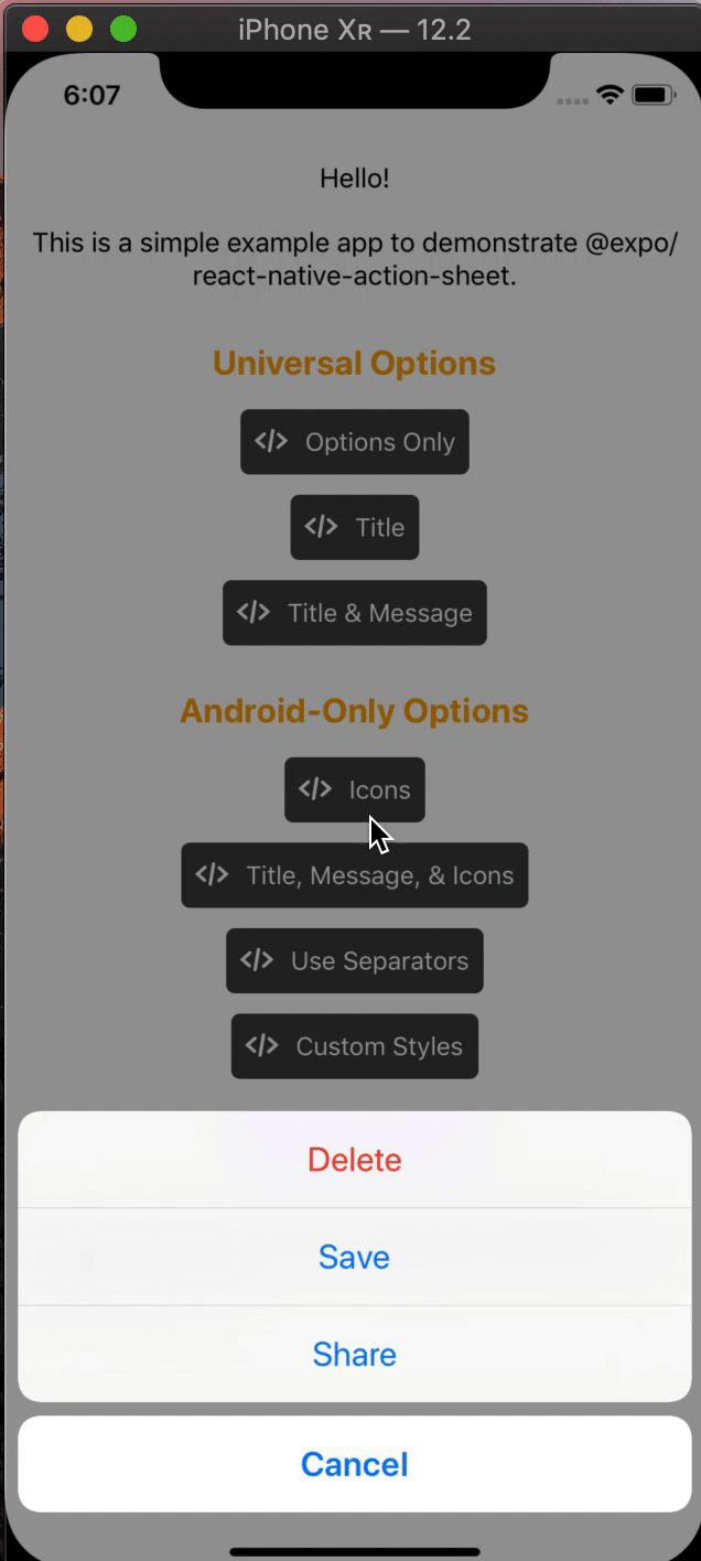 | 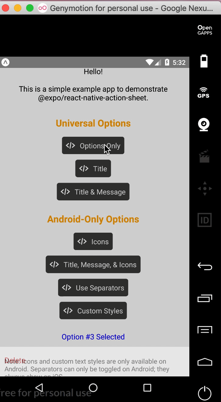 | 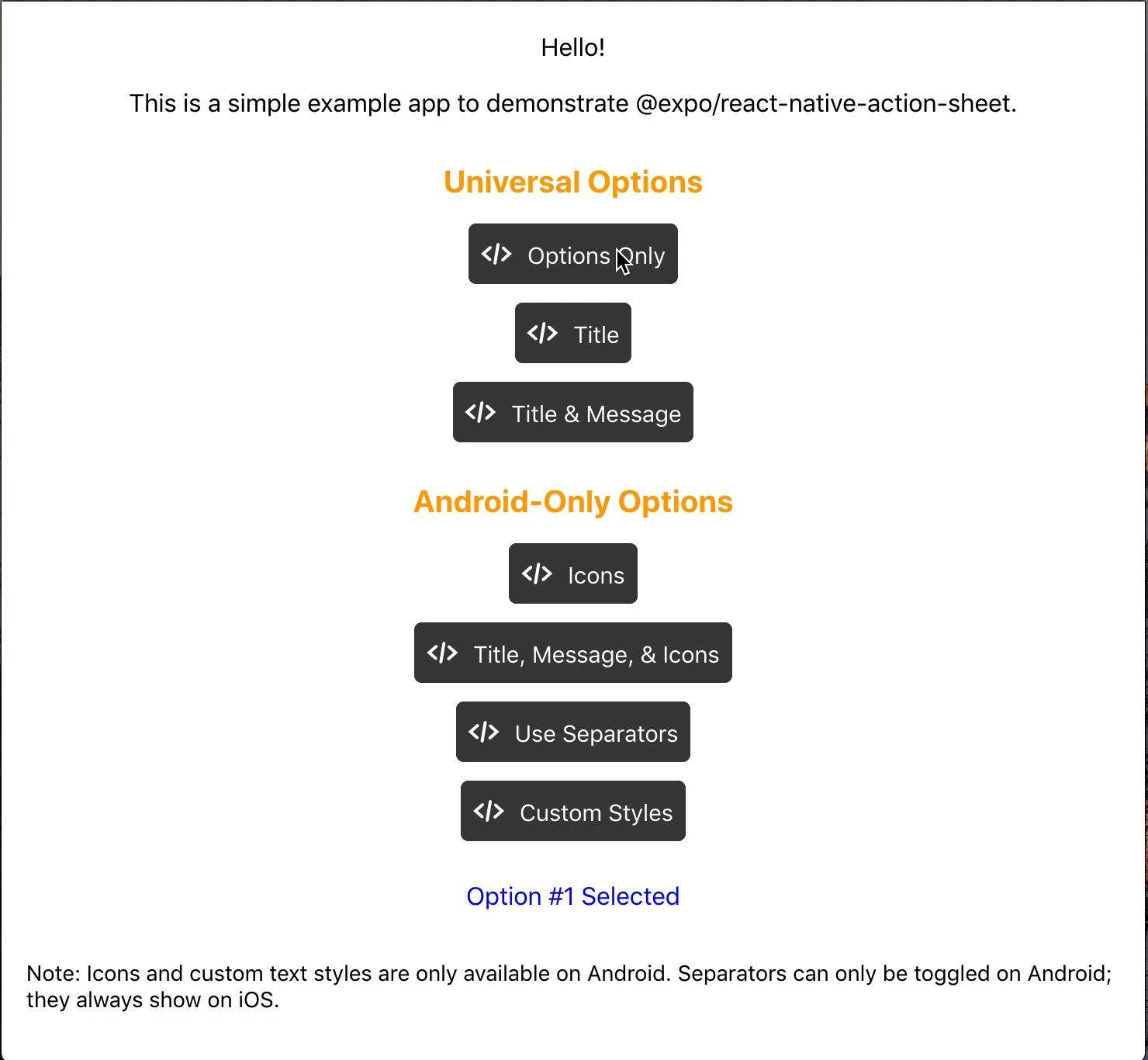 |
Check out the example snack here!
Installation
npm install @expo/react-native-action-sheet
or
yarn add @expo/react-native-action-sheet
A basic ActionSheet Setup
1. Wrap your top-level component with <ActionSheetProvider />
ReactNativeActionSheet uses React context to allow your components to invoke the menu. This means your app needs to be wrapped with the ActionSheetProvider component first.
import { ActionSheetProvider } from '@expo/react-native-action-sheet';

export default function AppContainer() {
  return (
    <ActionSheetProvider>
      <App />
    </ActionSheetProvider>
  );
}
2. Call the showActionSheetWithOptions method with a hook or a higher order component.
// Using the provided hook
import { useActionSheet } from '@expo/react-native-action-sheet';

export default Menu() {
  const { showActionSheetWithOptions } = useActionSheet();

  const onPress = () => {
    const options = ['Delete', 'Save', 'Cancel'];
    const destructiveButtonIndex = 0;
    const cancelButtonIndex = 2;

    showActionSheetWithOptions({
      options,
      cancelButtonIndex,
      destructiveButtonIndex
    }, (selectedIndex: number) => {
      switch (selectedIndex) {
        case 1:
          // Save
          break;

        case destructiveButtonIndex:
          // Delete
          break;

        case cancelButtonIndex:
          // Canceled
      }});
  }

  return (
    <Button title="Menu" onPress={onPress}/>
  )
};
Alternatively, any component can use the higher order component to access the context and pass the showActionSheetWithOptions as a prop.
// Using a Higher Order Component to wrap your component
import { connectActionSheet } from '@expo/react-native-action-sheet';

function Menu({ showActionSheetWithOptions }) {
  /* ... */
}

export default connectActionSheet(Menu);
Menu component can now access the actionSheet prop as showActionSheetWithOptions.
Options
The goal of this library is to mimic the native iOS and Android ActionSheets as closely as possible.
This library can also be used in the browser with Expo for web.
Universal Props
| Name | Type | Description |
|---|---|---|
options | array of strings | A list of button titles (required) |
cancelButtonIndex | number | Index of cancel button in options |
cancelButtonTintColor | string | Color used for the change the text color of the cancel button |
destructiveButtonIndex | number or array of numbers | Indices of destructive buttons in options |
title | string | Title to show above the action sheet |
message | string | Message to show below the title |
tintColor | string | Color used for non-destructive button titles |
disabledButtonIndices | array of numbers | Indices of disabled buttons in options |
iOS Only Props
| Name | Type | Description |
|---|---|---|
anchor | number | iPad only option that allows for docking the action sheet to a node. See ShowActionSheetButton.tsx for an example on how to implement this. |
userInterfaceStyle | string | The interface style used for the action sheet, can be set to light or dark, otherwise the default system style will be used. |
Custom Action Sheet Only (Android/Web) Props
The below props allow modification of the Android ActionSheet. They have no effect on the look on iOS as the native iOS Action Sheet does not have options for modifying these options.
| Name | Type | Description |
|---|---|---|
icons | array of required images or icons | Show icons to go along with each option. If image source paths are provided via require, images will be rendered for you. Alternatively, you can provide an array of elements such as vector icons, pre-rendered Images, etc. |
tintIcons | boolean | Icons by default will be tinted to match the text color. When set to false, the icons will be the color of the source image. This is useful if you want to use multicolor icons. If you provide your own nodes/pre-rendered icons rather than required images in the icons array, you will need to tint them appropriately before providing them in the array of icons; tintColor will not be applied to icons unless they are images from a required source. |
textStyle | TextStyle | Apply any text style props to the options. If the tintColor option is provided, it takes precedence over a color text style prop. |
titleTextStyle | TextStyle | Apply any text style props to the title if present. |
messageTextStyle | TextStyle | Apply any text style props to the message if present. |
autoFocus | boolean | If true, this will give the first option screen reader focus automatically when the action sheet becomes visible. On iOS, this is the default behavior of the native action sheet. |
showSeparators | boolean | Show separators between items. On iOS, separators always show so this prop has no effect. |
containerStyle | ViewStyle | Apply any view style props to the container rather than use the default look (e.g. dark mode). |
separatorStyle | ViewStyle | Modify the look of the separators rather than use the default look. |
useModal | boolean | Defaults to false (true if autoFocus is also true) Wraps the ActionSheet with a Modal, in order to show in front of other Modals that were already opened (issue reference). |
destructiveColor | string | Modify color for text of destructive option. Defaults to #d32f2f. |
ActionSheetProvider Props
The following props can be set directly on the ActionSheetProvider
| Name | Type | Description |
|---|---|---|
useCustomActionSheet | boolean | iOS only prop that uses the custom pure JS action sheet (Android/Web version) instead of the native ActionSheetIOS component. Defaults to false. |
useNativeDriver | boolean | Windows only option that provides the option to disable the native animation driver for React Native Windows projects targeting Windows 10 Version-1809 ; Build-10.0.17763.0 and earlier. useNativeDriver is supported in Version-1903 and later so if your project is targeting that, you don't need to set this prop. |
// example of using useCustomActionSheet on iOS
export default function AppContainer() {
  return (
    <ActionSheetProvider useCustomActionSheet={true}>
      <App />
    </ActionSheetProvider>
  );
}
Callback
The second parameter of the showActionSheetWithOptions function is a callback for when a button is selected. The callback takes a single argument which will be the zero-based index of the pressed option. You can check the value against your cancelButtonIndex to determine if the action was cancelled or not.
function onButtonPress(selectedIndex: number) {
  // handle it!
}
Try it out
Try it in Expo Snack: https://snack.expo.dev/@expo-action-sheet/example.
Example
See the example app.
Usage
$ cd example
$ yarn

// build simulator
$ yarn ios
$ yarn android

// web
$ yarn web
Development
Setup
$ git clone git@github.com:expo/react-native-action-sheet.git
$ cd react-native-action-sheet
$ yarn
Build
We use bob.
$ yarn build
Lint & Format
// tsc
$ yarn type-check

// ESLint + Prettier
$ yarn lint
Top Related Projects
An enhanced, animated, customizable Modal for React Native.
Material Design for React Native (Android & iOS)
Picker is a cross-platform UI component for selecting an item from a list of options.
React Native date & time picker component for iOS, Android and Windows
UIMenu Component for React Native
Convert designs to code with AI
Introducing Visual Copilot: A new AI model to turn Figma designs to high quality code using your components.
Try Visual Copilot