Top Related Projects
Lollipop ViewAnimationUtils.createCircularReveal for everyone 4.0+
Create circular ImageView in Android in the simplest way possible
A circular ImageView for Android
Custom shaped android imageview components
:octocat: 📃 FoldingCell is a material design expanding content cell inspired by folding paper material made by @Ramotion
Quick Overview
ShapeOfView is an Android library that allows developers to easily create custom shapes for their views, such as rounded corners, circles, or polygons. It provides a simple and flexible API for defining and applying these shapes to various UI elements.
Pros
- Customizable Shapes: The library offers a wide range of predefined shapes, including rounded corners, circles, and polygons, allowing developers to create unique and visually appealing UI elements.
- Easy Integration: The library is easy to integrate into existing Android projects, with a straightforward API and minimal setup required.
- Performance-Optimized: ShapeOfView is designed to be efficient and performant, ensuring smooth rendering and minimal impact on the overall application performance.
- Extensive Documentation: The project's documentation is comprehensive, providing clear examples and guidance for using the library effectively.
Cons
- Limited Platform Support: ShapeOfView is designed specifically for Android, and does not provide support for other platforms, such as iOS or web.
- Potential Complexity: While the library aims to simplify the process of creating custom shapes, some advanced use cases may still require a deeper understanding of the underlying implementation.
- Dependency Management: The library may introduce additional dependencies and complexity to the project, which could impact the overall project structure and build process.
- Potential Performance Overhead: Depending on the complexity of the shapes used, there may be a slight performance overhead compared to using native Android views.
Code Examples
Here are a few examples of how to use the ShapeOfView library:
Creating a Rounded Rectangle:
val roundedRectangleView = RoundedRectangleView(context)
roundedRectangleView.shapeAppearanceModel = ShapeAppearanceModel.Builder()
    .setAllCorners(CornerFamily.ROUNDED, 16f)
    .build()
Creating a Circle:
val circleView = CircleView(context)
circleView.shapeAppearanceModel = ShapeAppearanceModel.Builder()
    .setAllCorners(CornerFamily.ROUNDED, circleView.width / 2f)
    .build()
Creating a Polygon:
val polygonView = PolygonView(context)
polygonView.shapeAppearanceModel = ShapeAppearanceModel.Builder()
    .setAllCorners(CornerFamily.ROUNDED, 16f)
    .setCornerSize(0.2f)
    .setCornerFamily(CornerFamily.ROUNDED)
    .build()
Getting Started
To get started with ShapeOfView, follow these steps:
- Add the library to your project's
build.gradlefile:
dependencies {
    implementation 'com.github.florent37:shapeofview:1.4.7'
}
- In your layout XML file, use the custom views provided by the library:
<com.github.florent37.shapeofview.ShapeOfView
    android:layout_width="200dp"
    android:layout_height="200dp"
    app:shape_type="circle">

    <!-- Your view content goes here -->

</com.github.florent37.shapeofview.ShapeOfView>
- Customize the shape of your view using the available attributes:
<com.github.florent37.shapeofview.ShapeOfView
    android:layout_width="200dp"
    android:layout_height="200dp"
    app:shape_type="rounded_rectangle"
    app:shape_rounded_rectangle_radius="16dp" />
- Alternatively, you can programmatically set the shape of your view:
val myView = findViewById<ShapeOfView>(R.id.my_view)
myView.shapeAppearanceModel = ShapeAppearanceModel.Builder()
    .setAllCorners(CornerFamily.ROUNDED, 16f)
    .build()
That's it! You can now use the ShapeOfView library to create custom-shaped UI elements in your Android application.
Competitor Comparisons
Lollipop ViewAnimationUtils.createCircularReveal for everyone 4.0+
Pros of CircularReveal
- Focuses specifically on circular reveal animations
- Lightweight and easy to implement for simple reveal effects
- Supports both Java and Kotlin
Cons of CircularReveal
- Limited to circular reveal animations only
- Less customization options for shapes and effects
- Not actively maintained (last update in 2017)
Code Comparison
CircularReveal:
ViewAnimationUtils.createCircularReveal(view, cx, cy, 0f, finalRadius).apply {
    duration = 1000
    start()
}
ShapeOfView:
shapeOfView.setShape(CircleView())
shapeOfView.setClipPathProvider(RoundRectView(topLeftRadius, topRightRadius, bottomRightRadius, bottomLeftRadius))
Key Differences
ShapeOfView offers a wider range of shape options and customization, including circles, rounded rectangles, polygons, and more. It provides a more comprehensive solution for creating custom view shapes and clip paths.
CircularReveal specializes in circular reveal animations, making it simpler to implement this specific effect. However, it lacks the versatility of ShapeOfView for other shape-related tasks.
ShapeOfView is actively maintained and updated, while CircularReveal hasn't seen updates in recent years.
Overall, ShapeOfView is more suitable for projects requiring diverse shape manipulations, while CircularReveal is a good choice for quick and simple circular reveal animations.
Create circular ImageView in Android in the simplest way possible
Pros of CircularImageView
- Focused specifically on creating circular image views
- Lightweight and easy to implement for simple circular image needs
- Supports border and shadow customization out of the box
Cons of CircularImageView
- Limited to circular shapes only, less versatile than ShapeOfView
- Lacks advanced shape customization options
- May require additional libraries for more complex image manipulations
Code Comparison
CircularImageView:
<com.mikhaellopez.circularimageview.CircularImageView
    android:layout_width="250dp"
    android:layout_height="250dp"
    app:civ_border_color="#3f51b5"
    app:civ_border_width="4dp"
    app:civ_shadow="true"
    app:civ_shadow_radius="10"
    app:civ_shadow_color="#3f51b5"/>
ShapeOfView:
<com.github.florent37.shapeofview.shapes.CircleView
    android:layout_width="150dp"
    android:layout_height="150dp"
    app:shape_circle_borderColor="@android:color/black"
    app:shape_circle_borderWidth="2dp">

    <ImageView
        android:layout_width="match_parent"
        android:layout_height="match_parent"
        android:src="@drawable/your_image"/>

</com.github.florent37.shapeofview.shapes.CircleView>
While CircularImageView provides a more straightforward implementation for circular images, ShapeOfView offers greater flexibility with various shape options and the ability to wrap other views within the shape container.
A circular ImageView for Android
Pros of CircleImageView
- Specialized for circular image views, offering optimized performance
- Lightweight and focused on a single task, making it easy to integrate
- Supports border and shadow customization out of the box
Cons of CircleImageView
- Limited to circular shapes only, lacking versatility for other shapes
- Doesn't support complex clipping or masking operations
- May require additional libraries for more advanced image transformations
Code Comparison
CircleImageView:
<de.hdodenhof.circleimageview.CircleImageView
    android:layout_width="96dp"
    android:layout_height="96dp"
    android:src="@drawable/profile"
    app:civ_border_width="2dp"
    app:civ_border_color="#FF000000"/>
ShapeOfView:
<com.github.florent37.shapeofview.shapes.CircleView
    android:layout_width="150dp"
    android:layout_height="150dp"
    app:shape_circle_borderColor="@android:color/black"
    app:shape_circle_borderWidth="2dp">
    <ImageView
        android:layout_width="match_parent"
        android:layout_height="match_parent"
        android:src="@drawable/profile"
        android:scaleType="centerCrop" />
</com.github.florent37.shapeofview.shapes.CircleView>
ShapeOfView offers more flexibility with various shape options, while CircleImageView provides a simpler, more focused solution for circular images. The code comparison shows that CircleImageView requires less XML markup for basic usage, but ShapeOfView allows for more complex layouts and shape combinations.
Custom shaped android imageview components
Pros of android-shape-imageview
- Simpler implementation focused specifically on ImageView shapes
- Lightweight library with minimal dependencies
- Supports bitmap and vector drawables out of the box
Cons of android-shape-imageview
- Limited to ImageView only, not applicable to other View types
- Fewer shape options compared to ShapeOfView
- Less active development and community support
Code Comparison
android-shape-imageview:
<com.github.siyamed.shapeimageview.RoundedImageView
    android:layout_width="match_parent"
    android:layout_height="match_parent"
    app:siBorderWidth="3dp"
    app:siBorderColor="#000000"
    android:src="@drawable/sample_image" />
ShapeOfView:
<com.github.florent37.shapeofview.shapes.CircleView
    android:layout_width="150dp"
    android:layout_height="150dp"
    app:shape_circle_borderWidth="2dp"
    app:shape_circle_borderColor="@color/black">

    <ImageView
        android:layout_width="match_parent"
        android:layout_height="match_parent"
        android:src="@drawable/sample_image"/>

</com.github.florent37.shapeofview.shapes.CircleView>
ShapeOfView offers more flexibility by allowing any View to be wrapped inside its custom shapes, while android-shape-imageview is limited to ImageView modifications. ShapeOfView provides a wider range of shape options and more active development, but may be considered overkill for simple ImageView shape requirements.
:octocat: 📃 FoldingCell is a material design expanding content cell inspired by folding paper material made by @Ramotion
Pros of folding-cell-android
- Provides a unique folding animation effect for list items
- Offers a more complex and visually appealing interaction
- Includes a demo app for easy implementation and testing
Cons of folding-cell-android
- Limited to a specific folding cell animation style
- May require more setup and customization for different use cases
- Potentially higher performance impact due to complex animations
Code Comparison
ShapeOfView:
ShapeOfView(context)
    .setShape(CircleShape())
    .setClipToOutline(true)
folding-cell-android:
val foldingCell = findViewById<FoldingCell>(R.id.folding_cell)
foldingCell.setOnClickListener {
    foldingCell.toggle(false)
}
Summary
ShapeOfView offers a more versatile approach to creating custom view shapes, while folding-cell-android focuses on a specific folding animation effect. ShapeOfView is simpler to implement for basic shape modifications, whereas folding-cell-android provides a more complex but visually striking interaction for list items. The choice between the two depends on the specific design requirements and desired user experience of the application.
Convert  designs to code with AI

Introducing Visual Copilot: A new AI model to turn Figma designs to high quality code using your components.
Try Visual CopilotREADME
ShapeOfView
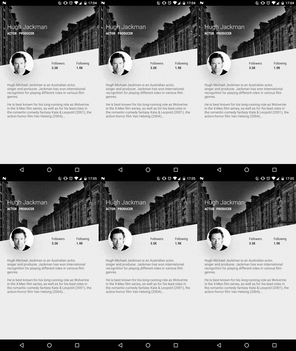
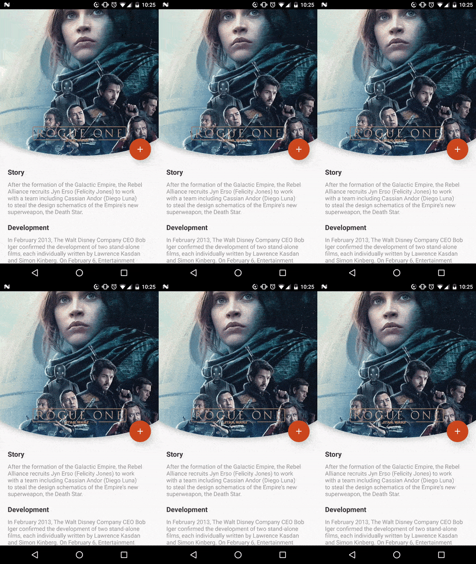
Give a custom shape to any android view Useful for Material Design 2

Breaking change
the old package com.github.florent37 has been replaced by io.github.florent37
Download
//using maven central

dependencies {
    implementation 'io.github.florent37:shapeofview:1.4.7'
}
Sample
What you can do with Shape Of View :
Use implemented shapes
ShapeOfView disable the background property of your view,
please specify a child with a background to enable it
<io.github.florent37.shapeofview.shapes.CircleView
   <FrameLayout
      android:background="@color/blue"
ShapeOfView came with pre-created shapes :
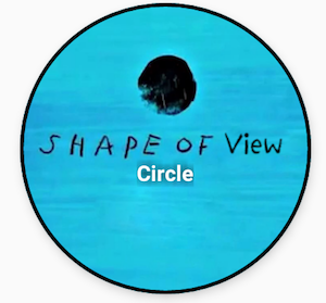
Circle
<io.github.florent37.shapeofview.shapes.CircleView
        android:layout_width="150dp"
        android:layout_height="150dp"

        android:elevation="4dp"
        app:shape_circle_borderColor="@android:color/black"
        app:shape_circle_borderWidth="2dp">

            <!-- YOUR CONTENT -->

</io.github.florent37.shapeofview.shapes.CircleView>
RoundRect
<io.github.florent37.shapeofview.shapes.RoundRectView
        android:layout_width="150dp"
        android:layout_height="100dp"
        android:elevation="4dp"
        app:shape_roundRect_bottomLeftRadius="10dp"
        app:shape_roundRect_bottomRightRadius="10dp"
        app:shape_roundRect_topLeftRadius="10dp"
        app:shape_roundRect_topRightRadius="10dp"

        app:shape_roundRect_borderColor="@android:color/black"
        app:shape_roundRect_borderWidth="2dp"
        >


            <!-- YOUR CONTENT -->

</io.github.florent37.shapeofview.shapes.RoundRectView>
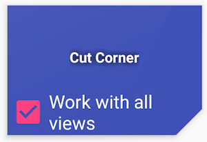
ClipCorner
<io.github.florent37.shapeofview.shapes.CutCornerView
        android:id="@+id/clipCorner"
        android:layout_width="150dp"
        android:layout_height="100dp"
        android:elevation="4dp"
        app:shape_cutCorner_bottomRightSize="20dp">

         <!-- YOUR CONTENT -->

</io.github.florent37.shapeofview.shapes.CutCornerView>
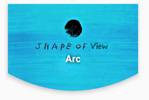
Arc
<io.github.florent37.shapeofview.shapes.ArcView
        android:layout_width="150dp"
        android:layout_height="100dp"
        android:elevation="4dp"
        app:shape_arc_cropDirection="outside"
        app:shape_arc_height="20dp"
        app:shape_arc_position="bottom"
        >

         <!-- YOUR CONTENT -->

</io.github.florent37.shapeofview.shapes.ArcView>
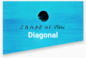
Diagonal
<io.github.florent37.shapeofview.shapes.DiagonalView
        android:layout_width="150dp"
        android:layout_height="100dp"
        android:elevation="4dp"
        app:shape_diagonal_angle="10"
        app:shape_diagonal_direction="right"
        app:shape_diagonal_position="bottom">

         <!-- YOUR CONTENT -->

</io.github.florent37.shapeofview.shapes.DiagonalView>
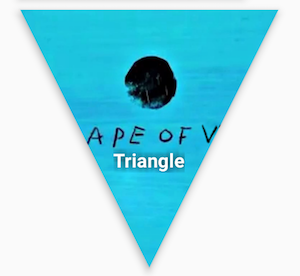
Triangle
<io.github.florent37.shapeofview.shapes.TriangleView
         android:layout_width="150dp"
         android:layout_height="150dp"
         android:elevation="4dp"

         app:shape_triangle_percentBottom="0.5"
         app:shape_triangle_percentLeft="0"
         app:shape_triangle_percentRight="0">

            <!-- YOUR CONTENT -->

</io.github.florent37.shapeofview.shapes.TriangleView>
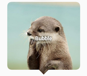
Bubble
<io.github.florent37.shapeofview.shapes.BubbleView
        android:layout_width="150dp"
        android:layout_height="150dp"
        app:shape_bubble_arrowHeight="10dp"
        app:shape_bubble_arrowWidth="10dp"
        app:shape_bubble_arrowPosition="bottom"
        app:shape_bubble_borderRadius="20dp"
        app:arrow_posititon_percent="0.5"
        >

         <!-- YOUR CONTENT -->

</io.github.florent37.shapeofview.shapes.BubbleView>
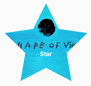
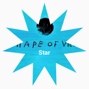
Star
<io.github.florent37.shapeofview.shapes.StarView
        android:layout_width="150dp"
        android:layout_height="150dp"
        app:shape_star_noOfPoints="5">

         <!-- YOUR CONTENT -->

</io.github.florent37.shapeofview.shapes.StarView>
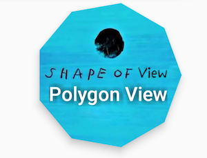
Polygon
 <io.github.florent37.shapeofview.shapes.PolygonView
            android:layout_width="150dp"
            android:layout_height="100dp"
            app:shape_polygon_noOfSides="9"
            >
         <!-- YOUR CONTENT -->

</io.github.florent37.shapeofview.shapes.PolygonView>
Dotted Edges with Cut Corners
 <io.github.florent37.shapeofview.shapes.DottedEdgesCutCornerView
             android:layout_width="100dp"
             android:layout_height="match_parent"
             app:shape_dot_radius="3dp"
             app:shape_dot_spacing="2dp"
             app:shape_edge_position="right|left"
             app:shape_dottedEdgesCutCorner_bottomLeftSize="8dp"
             app:shape_dottedEdgesCutCorner_bottomRightSize="8dp"
             >

             <!-- YOUR CONTENT -->

 </io.github.florent37.shapeofview.shapes.DottedEdgesCutCornerView>
Animation
All shapes methods can be animated
For example, you can animate a RoundRect corner :
ValueAnimator.ofFloat(0f, 200f, 0f).apply {
     addUpdateListener { animation -> roundRect.bottomLeftRadius = (animation.animatedValue as Float).toInt() }
     duration = 800
     repeatCount = ValueAnimator.INFINITE
     repeatMode = ValueAnimator.REVERSE
}.start()
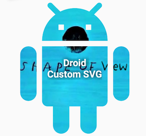
Create you own shape
You can use custom shape to cut your view
Using Drawable (no elevation)
<io.github.florent37.shapeofview.ShapeOfView
        android:layout_width="100dp"
        android:layout_height="100dp"

        app:shape_clip_drawable="@drawable/YOUR_DRAWABLE"
        >

    <!-- YOUR CONTENT -->

 </io.github.florent37.shapeofview.ShapeOfView>
Using Path (with elevation)
This method generates also a shadow path (with Lollipop elevation API 21+)
Wrap your view with a ShapeOfView
<io.github.florent37.shapeofview.ShapeOfView
        android:id="@+id/myShape"
        android:layout_width="30dp"
        android:layout_height="15dp"
        android:elevation="6dp">

        <!-- YOUR CONTENT -->

 </io.github.florent37.shapeofview.ShapeOfView>
Then generate a path in your code :
ShapeOfView shapeOfView = findViewById(R.id.myShape)
shapeOfView.setClipPathCreator(new ClipPathManager.ClipPathCreator() {
       @Override
       public Path createClipPath(int width, int height) {
           final Path path = new Path();

            //eg: triangle
           path.moveTo(0, 0);
           path.lineTo(0.5 * width, height);
           path.lineTo(width, 0);
           path.close();

           return path;
       }
});
In some case you have to specify requiresBitmap = true to enable ShapeOfView to draw the shape inside a bitmap before clipping your view. It will be less efficient but can make your custom shape work.
Contribute
Feel free to fork this project, and add customs shapes
Then make a merge-request after updated the README with a sample of your shape, including a preview
TODO
HISTORY
1.4.5 Removed DiagonalView's Direction : if diagonalAngle > 0 ? DIRECTION_LEFT : DIRECTION_RIGHT
1.4.5 Removed ArcView's ArcDirection : CROP_OUTSIDE if arcHeight > 0, CROP_INSIDE if arcHeight < 0
1.4.1 Added Dotted Edge, thanks to @khunzohn
1.4.0 Support AndroidX
1.3.2 Backport of 1.3.0 for api 14+
1.3.0 Fixed rendering on android API 28+
1.2.0 Removed bitmap usage in a lot of usecases (diagonal, arc, roundrect, circle)
1.1.0 Disabled setBackground on ShapeOfView
1.0.9 Added requiresShapeUpdate(), allowing animations to work, look at AnimationActivity
1.0.8 Used arcTo instead of quads in RoundRect, added border to RoundRect
1.0.7 Prefixed all attributes by shape_
1.0.6 Updated roundrect implementation
1.0.5 Enable hardware acceleration after clip view
1.0.4 Added PolygonView
1.0.2 Added StarView
1.0.1 Added BubbleView
Credits
Ed Sheeran, for the name of this project and his awesome songs <3
Author: Florent Champigny


License
Copyright 2017 Florent37, Inc.

Licensed under the Apache License, Version 2.0 (the "License");
you may not use this file except in compliance with the License.
You may obtain a copy of the License at

   http://www.apache.org/licenses/LICENSE-2.0

Unless required by applicable law or agreed to in writing, software
distributed under the License is distributed on an "AS IS" BASIS,
WITHOUT WARRANTIES OR CONDITIONS OF ANY KIND, either express or implied.
See the License for the specific language governing permissions and
limitations under the License.
Top Related Projects
Lollipop ViewAnimationUtils.createCircularReveal for everyone 4.0+
Create circular ImageView in Android in the simplest way possible
A circular ImageView for Android
Custom shaped android imageview components
:octocat: 📃 FoldingCell is a material design expanding content cell inspired by folding paper material made by @Ramotion
Convert  designs to code with AI

Introducing Visual Copilot: A new AI model to turn Figma designs to high quality code using your components.
Try Visual Copilot