 LikeAnimation
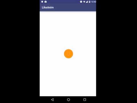
Android like button with delightful star animation inspired by Twitter's heart. See blog post for description.
Top Related Projects
Twitter's heart animation for Android
Android library to create buttons with Twitter's heart like animation.
A simple RatingBar that you can easier to customize image and animations
A circular ImageView for Android
Quick Overview
LikeAnimation is an Android library that provides a customizable "like" button animation similar to Twitter's heart animation. It offers a smooth and visually appealing animation for liking or favoriting content in Android applications, enhancing user interaction and engagement.
Pros
- Easy to implement and integrate into existing Android projects
- Customizable animation properties, including colors and sizes
- Smooth and visually appealing animation
- Lightweight library with minimal impact on app performance
Cons
- Limited to a specific type of animation (heart/like)
- May require additional customization for different use cases
- Not actively maintained (last update was several years ago)
- Lacks extensive documentation and examples
Code Examples
- Basic implementation of LikeAnimation:
val likeAnimation = LikeAnimation(context)
rootView.addView(likeAnimation)
likeAnimation.start()
- Customizing animation colors:
val likeAnimation = LikeAnimation(context)
likeAnimation.setColors(
    ContextCompat.getColor(context, R.color.start_color),
    ContextCompat.getColor(context, R.color.end_color)
)
likeAnimation.start()
- Adjusting animation duration:
val likeAnimation = LikeAnimation(context)
likeAnimation.setDuration(500) // Set duration to 500 milliseconds
likeAnimation.start()
Getting Started
To use LikeAnimation in your Android project, follow these steps:
- Add the JitPack repository to your project's
build.gradlefile:
allprojects {
    repositories {
        ...
        maven { url 'https://jitpack.io' }
    }
}
- Add the dependency to your app's
build.gradlefile:
dependencies {
    implementation 'com.github.frogermcs:LikeAnimation:1.0.0'
}
-
Sync your project with Gradle files.
-
Use the LikeAnimation in your layout or code as shown in the code examples above.
Competitor Comparisons
Twitter's heart animation for Android
Pros of LikeButton
- More customizable with various icon and animation options
- Supports state persistence and listener callbacks
- Includes additional features like dot animation and circle fill
Cons of LikeButton
- Larger library size due to more features
- May have a steeper learning curve for basic implementations
- Potentially higher performance overhead for complex animations
Code Comparison
LikeButton implementation:
<com.like.LikeButton
    app:icon_type="heart"
    app:icon_size="25dp"
    app:liked="false"/>
LikeAnimation implementation:
<com.frogermcs.likeanimation.LikeButtonView
    android:layout_width="wrap_content"
    android:layout_height="wrap_content"/>
LikeButton offers more built-in customization options directly in XML, while LikeAnimation provides a simpler implementation that may require more programmatic customization.
Both libraries aim to create engaging like/favorite button animations for Android applications. LikeButton offers a more feature-rich solution with greater out-of-the-box customization, while LikeAnimation provides a lightweight alternative focused on a specific animation style. The choice between the two depends on the project's requirements for customization, performance, and ease of implementation.
Android library to create buttons with Twitter's heart like animation.
Pros of SparkButton
- More customizable with options for particle effects, colors, and animations
- Supports both XML and programmatic implementation
- Includes additional features like pressDown and pressUp animations
Cons of SparkButton
- Larger library size due to more features
- May have a steeper learning curve for basic implementations
- Potentially higher performance overhead for complex animations
Code Comparison
SparkButton:
<com.varunest.sparkbutton.SparkButton
    android:id="@+id/spark_button"
    android:layout_width="40dp"
    android:layout_height="40dp"
    app:sparkbutton_activeImage="@drawable/ic_heart_on"
    app:sparkbutton_inActiveImage="@drawable/ic_heart_off"
    app:sparkbutton_iconSize="40dp"
    app:sparkbutton_primaryColor="@color/colorPrimary"
    app:sparkbutton_secondaryColor="@color/colorSecondary" />
LikeAnimation:
LikeButtonView likeButtonView = (LikeButtonView) findViewById(R.id.like_button);
likeButtonView.setOnClickListener(new View.OnClickListener() {
    @Override
    public void onClick(View v) {
        likeButtonView.animateButton();
    }
});
SparkButton offers more customization options directly in XML, while LikeAnimation focuses on a simpler Java implementation. SparkButton provides a more feature-rich solution, but LikeAnimation may be easier to implement for basic use cases.
A simple RatingBar that you can easier to customize image and animations
Pros of SimpleRatingBar
- More versatile, allowing for customizable rating bars beyond just "like" animations
- Supports both touch and click interactions for rating
- Offers more customization options for appearance (e.g., star size, color, spacing)
Cons of SimpleRatingBar
- Less focused on animation effects compared to LikeAnimation
- May have a steeper learning curve due to more configuration options
- Potentially larger library size due to additional features
Code Comparison
LikeAnimation:
LikeButtonView likeButtonView = (LikeButtonView) findViewById(R.id.like_button);
likeButtonView.setOnLikeListener(new OnLikeListener() {
    @Override
    public void liked(LikeButtonView likeButton) {
        // Handle like action
    }
});
SimpleRatingBar:
SimpleRatingBar ratingBar = findViewById(R.id.rating_bar);
ratingBar.setOnRatingChangeListener(new SimpleRatingBar.OnRatingChangeListener() {
    @Override
    public void onRatingChange(SimpleRatingBar simpleRatingBar, float rating, boolean fromUser) {
        // Handle rating change
    }
});
Both libraries offer easy-to-use APIs for implementing their respective functionalities. LikeAnimation focuses on a single-purpose like button with animation, while SimpleRatingBar provides a more comprehensive rating system with customizable appearance and behavior.
A circular ImageView for Android
Pros of CircleImageView
- Focused specifically on creating circular image views, making it more specialized and potentially optimized for this use case
- Supports border color and width customization, offering more styling options
- Larger community and more frequent updates, potentially indicating better long-term support
Cons of CircleImageView
- Limited to circular image views, less versatile compared to LikeAnimation's broader animation capabilities
- May require additional libraries or custom code for animations, unlike LikeAnimation which is animation-focused
Code Comparison
CircleImageView:
<de.hdodenhof.circleimageview.CircleImageView
    android:layout_width="96dp"
    android:layout_height="96dp"
    android:src="@drawable/profile"
    app:civ_border_width="2dp"
    app:civ_border_color="#FF000000"/>
LikeAnimation:
LikeButtonView likeButtonView = (LikeButtonView) findViewById(R.id.like_button);
likeButtonView.setOnLikeListener(new OnLikeListener() {
    @Override
    public void liked(LikeButtonView likeButtonView) {
        // Handle like action
    }
});
CircleImageView focuses on creating circular image views with customizable borders, while LikeAnimation provides a more specific animation for "like" actions. The choice between these libraries depends on the specific requirements of your project, whether you need circular images or animated like buttons.
Convert  designs to code with AI

Introducing Visual Copilot: A new AI model to turn Figma designs to high quality code using your components.
Try Visual CopilotREADME
LikeAnimation
Android button with delightful like animation inspired by Twitter's heart.

This is an example code described in blog post: Twitter's like animation in Android - alternative.
Top Related Projects
Twitter's heart animation for Android
Android library to create buttons with Twitter's heart like animation.
A simple RatingBar that you can easier to customize image and animations
A circular ImageView for Android
Convert  designs to code with AI

Introducing Visual Copilot: A new AI model to turn Figma designs to high quality code using your components.
Try Visual Copilot