Top Related Projects
Radix Primitives is an open-source UI component library for building high-quality, accessible design systems and web apps. Maintained by @workos.
A set of beautifully-designed, accessible components and a code distribution platform. Works with your favorite frameworks. Open Source. Open Code.
Chakra UI is a component system for building SaaS products with speed ⚡️
Completely unstyled, fully accessible UI components, designed to integrate beautifully with Tailwind CSS.
daisyUI components built with React 🌼
Quick Overview
Bits UI is a collection of unstyled, accessible, and customizable UI components for Svelte applications. It provides a foundation for building user interfaces with a focus on flexibility and accessibility, allowing developers to create their own design systems or integrate with existing ones.
Pros
- Highly customizable and unstyled components, giving developers full control over the appearance
- Built with accessibility in mind, ensuring components are usable by a wide range of users
- Lightweight and modular, allowing developers to use only the components they need
- Seamless integration with Svelte applications
Cons
- Requires more initial setup and styling compared to pre-styled component libraries
- Documentation may be less comprehensive compared to more established UI libraries
- Limited number of components compared to larger UI frameworks
- May have a steeper learning curve for developers new to building custom UI components
Code Examples
- Creating a simple button component:
<script lang="ts">
  import { Button } from '@huntabyte/bits-ui';
</script>

<Button variant="primary">Click me</Button>
- Implementing a dropdown menu:
<script lang="ts">
  import { Dropdown } from '@huntabyte/bits-ui';
</script>

<Dropdown.Root>
  <Dropdown.Trigger>Open Menu</Dropdown.Trigger>
  <Dropdown.Content>
    <Dropdown.Item>Item 1</Dropdown.Item>
    <Dropdown.Item>Item 2</Dropdown.Item>
    <Dropdown.Item>Item 3</Dropdown.Item>
  </Dropdown.Content>
</Dropdown.Root>
- Creating a custom checkbox:
<script lang="ts">
  import { Checkbox } from '@huntabyte/bits-ui';
</script>

<Checkbox.Root>
  <Checkbox.Input />
  <Checkbox.Control>
    <Checkbox.Indicator>✓</Checkbox.Indicator>
  </Checkbox.Control>
  <Checkbox.Label>Accept terms and conditions</Checkbox.Label>
</Checkbox.Root>
Getting Started
To start using Bits UI in your Svelte project, follow these steps:
-
Install the package:
npm install @huntabyte/bits-ui -
Import and use components in your Svelte files:
<script lang="ts"> import { Button, Dropdown, Checkbox } from '@huntabyte/bits-ui'; </script> <Button>Click me</Button> -
Style the components according to your design system or preferences using CSS.
Competitor Comparisons
Radix Primitives is an open-source UI component library for building high-quality, accessible design systems and web apps. Maintained by @workos.
Pros of Primitives
- More comprehensive set of UI components and primitives
- Larger community and ecosystem, with extensive documentation
- Supports multiple frameworks (React, Vue, Solid)
Cons of Primitives
- Steeper learning curve due to its extensive API
- Potentially heavier bundle size for smaller projects
- Less flexibility for custom styling compared to Bits UI
Code Comparison
Bits UI (Svelte):
<script>
  import { Button } from '@huntabyte/bits-ui';
</script>

<Button>Click me</Button>
Primitives (React):
import * as Button from '@radix-ui/react-button';

function App() {
  return <Button.Root>Click me</Button.Root>;
}
Key Differences
- Bits UI is specifically designed for Svelte, while Primitives supports multiple frameworks
- Primitives offers a more extensive set of components and features
- Bits UI provides a simpler API and easier integration for Svelte projects
- Primitives has a larger community and more extensive documentation
- Bits UI allows for more straightforward customization of components
Use Cases
- Choose Bits UI for Svelte-specific projects requiring lightweight, customizable components
- Opt for Primitives when working with multiple frameworks or needing a comprehensive set of accessible UI components
Community and Support
- Primitives has a larger community, more frequent updates, and extensive third-party resources
- Bits UI, being newer and Svelte-specific, has a smaller but growing community
A set of beautifully-designed, accessible components and a code distribution platform. Works with your favorite frameworks. Open Source. Open Code.
Pros of shadcn/ui
- More comprehensive component library with a wider range of UI elements
- Highly customizable with a focus on accessibility and theming
- Active community and frequent updates
Cons of shadcn/ui
- Steeper learning curve due to its extensive feature set
- Potentially larger bundle size for smaller projects
- Requires more setup and configuration
Code Comparison
bits-ui:
<Button variant="primary" on:click={handleClick}>
  Click me
</Button>
shadcn/ui:
<Button variant="default" onClick={handleClick}>
  Click me
</Button>
Both libraries offer similar basic component usage, but shadcn/ui provides more variants and customization options out of the box.
Key Differences
- bits-ui is specifically designed for Svelte, while shadcn/ui is more framework-agnostic
- shadcn/ui offers a more extensive set of pre-built components
- bits-ui focuses on simplicity and ease of use, while shadcn/ui prioritizes customization and flexibility
Use Cases
- Choose bits-ui for smaller Svelte projects or when simplicity is a priority
- Opt for shadcn/ui when building larger, more complex applications or when extensive customization is required
Both libraries have their strengths, and the choice between them depends on project requirements, team expertise, and desired level of customization.
Chakra UI is a component system for building SaaS products with speed ⚡️
Pros of Chakra UI
- Extensive component library with a wide range of pre-built UI elements
- Strong community support and extensive documentation
- Highly customizable with theming capabilities
Cons of Chakra UI
- Larger bundle size due to its comprehensive feature set
- Steeper learning curve for beginners due to its extensive API
- React-specific, limiting its use in other frameworks
Code Comparison
Chakra UI (React):
import { Button } from "@chakra-ui/react"

function MyComponent() {
  return <Button colorScheme="blue">Click me</Button>
}
Bits UI (Svelte):
<script>
  import { Button } from '@bits-ui/button'
</script>

<Button variant="primary">Click me</Button>
Key Differences
- Bits UI is specifically designed for Svelte, while Chakra UI is React-focused
- Chakra UI offers a more extensive set of components out of the box
- Bits UI aims for a lighter weight and more flexible approach
- Chakra UI provides more built-in styling options and theme customization
- Bits UI leverages Svelte's reactivity system for efficient updates
Both libraries aim to provide accessible and customizable UI components, but they cater to different ecosystems and have distinct design philosophies. The choice between them largely depends on the project's framework and specific requirements.
Completely unstyled, fully accessible UI components, designed to integrate beautifully with Tailwind CSS.
Pros of Headless UI
- More mature and widely adopted project with a larger community
- Supports multiple frameworks (React, Vue, Alpine.js)
- Extensive documentation and examples
Cons of Headless UI
- Larger bundle size due to supporting multiple frameworks
- Less flexibility in customization compared to Bits UI
- Steeper learning curve for beginners
Code Comparison
Bits UI (Svelte):
<Select.Root bind:value>
  <Select.Trigger>
    <Select.Value />
    <Select.Icon />
  </Select.Trigger>
  <Select.Content>
    <Select.Item value="option1">Option 1</Select.Item>
    <Select.Item value="option2">Option 2</Select.Item>
  </Select.Content>
</Select.Root>
Headless UI (React):
<Listbox value={selected} onChange={setSelected}>
  <Listbox.Button>{selected.name}</Listbox.Button>
  <Listbox.Options>
    <Listbox.Option value={option1}>Option 1</Listbox.Option>
    <Listbox.Option value={option2}>Option 2</Listbox.Option>
  </Listbox.Options>
</Listbox>
Both libraries provide unstyled, accessible UI components. Bits UI is specifically designed for Svelte, offering a more streamlined experience for Svelte developers. Headless UI, on the other hand, provides a broader framework support but may require more setup and configuration. The code structure is similar, with Bits UI using a more nested approach and Headless UI opting for a flatter component structure.
daisyUI components built with React 🌼
Pros of react-daisyui
- Extensive component library with a wide range of pre-built UI elements
- Seamless integration with Tailwind CSS for easy customization
- Active community and regular updates
Cons of react-daisyui
- Larger bundle size due to the comprehensive component set
- Less flexibility in terms of low-level component customization
- Steeper learning curve for developers new to Tailwind CSS
Code Comparison
react-daisyui:
import { Button } from 'react-daisyui'

function App() {
  return <Button color="primary">Click me</Button>
}
bits-ui:
import { Button } from '@huntabyte/bits-ui'

function App() {
  return <Button variant="primary">Click me</Button>
}
Both libraries offer similar component usage, but bits-ui focuses on providing more granular control over component behavior and styling. react-daisyui leverages Tailwind CSS classes for styling, while bits-ui uses a more traditional approach to component customization.
bits-ui is designed to be lightweight and flexible, making it easier to create custom components. On the other hand, react-daisyui provides a more comprehensive set of pre-built components, which can speed up development for projects that align with its design system.
Convert  designs to code with AI

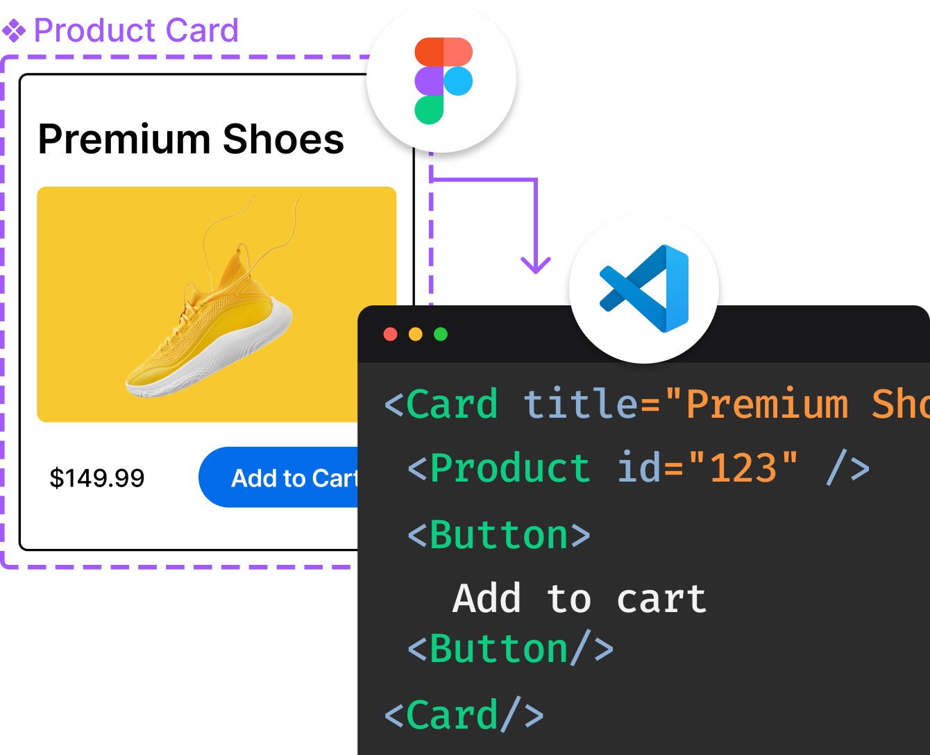
Introducing Visual Copilot: A new AI model to turn Figma designs to high quality code using your components.
Try Visual CopilotREADME
Bits UI
Bits UI â the headless components for Svelte.
Flexible, unstyled, and accessible primitives that provide the foundation for building your own high-quality component library.
Documentation
Visit https://bits-ui.com/docs to view the documentation.
Credits
- Bitworks - The design team behind the Bits UI documentation and example components.
- Melt UI - A powerful builder API that inspired the internal architecture of Bits UI.
- Radix UI - The incredible headless component APIs that we've taken heavy inspiration from.
- React Spectrum - An incredible collection of headless components we've taken inspiration from.
Sponsors
This project is supported by the following beautiful people/organizations:
License
Published under the MIT license.
Built by @huntabyte and community. Designed by Pavel Stianko ð
Community
Join the Discord server to ask questions, find collaborators, or just say hi!
Top Related Projects
Radix Primitives is an open-source UI component library for building high-quality, accessible design systems and web apps. Maintained by @workos.
A set of beautifully-designed, accessible components and a code distribution platform. Works with your favorite frameworks. Open Source. Open Code.
Chakra UI is a component system for building SaaS products with speed ⚡️
Completely unstyled, fully accessible UI components, designed to integrate beautifully with Tailwind CSS.
daisyUI components built with React 🌼
Convert  designs to code with AI

Introducing Visual Copilot: A new AI model to turn Figma designs to high quality code using your components.
Try Visual Copilot