 react-id-swiper
A library to use idangerous Swiper as a ReactJs component which allows Swiper's modules custom build
Top Related Projects

Most modern mobile touch slider with hardware accelerated transitions

React carousel component

Small, fast, and accessibility-first React carousel library with an easily customizable UI and behavior to fit your brand and site.

React.js Responsive Carousel (with Swipe)

A pure extendable React carousel, powered by Brainhub (craftsmen who ❤️ JS)

the last carousel you'll ever need
Quick Overview
React-id-swiper is a React component wrapper for the popular Swiper.js library. It allows developers to easily integrate Swiper's powerful slider functionality into React applications, providing a seamless way to create responsive and interactive carousels, galleries, and other swipeable content.
Pros
- Easy integration with React projects
- Full access to Swiper.js features and API
- Responsive and mobile-friendly
- Regular updates and maintenance
Cons
- Dependency on external Swiper.js library
- Learning curve for Swiper.js API
- Limited customization options compared to building a custom slider from scratch
Code Examples
- Basic Swiper component:
import React from 'react';
import Swiper from 'react-id-swiper';

const SimpleSwiper = () => (
  <Swiper>
    <div>Slide 1</div>
    <div>Slide 2</div>
    <div>Slide 3</div>
  </Swiper>
);

export default SimpleSwiper;
- Swiper with navigation and pagination:
import React from 'react';
import Swiper from 'react-id-swiper';

const SwiperWithNavigation = () => {
  const params = {
    navigation: {
      nextEl: '.swiper-button-next',
      prevEl: '.swiper-button-prev'
    },
    pagination: {
      el: '.swiper-pagination',
      clickable: true
    }
  };

  return (
    <Swiper {...params}>
      <div>Slide 1</div>
      <div>Slide 2</div>
      <div>Slide 3</div>
    </Swiper>
  );
};

export default SwiperWithNavigation;
- Swiper with custom configuration:
import React from 'react';
import Swiper from 'react-id-swiper';

const CustomSwiper = () => {
  const params = {
    slidesPerView: 3,
    spaceBetween: 30,
    loop: true,
    autoplay: {
      delay: 2500,
      disableOnInteraction: false
    }
  };

  return (
    <Swiper {...params}>
      <div>Slide 1</div>
      <div>Slide 2</div>
      <div>Slide 3</div>
      <div>Slide 4</div>
      <div>Slide 5</div>
    </Swiper>
  );
};

export default CustomSwiper;
Getting Started
- Install the package:
npm install react-id-swiper swiper
- Import and use in your React component:
import React from 'react';
import Swiper from 'react-id-swiper';
import 'swiper/css/swiper.css';

const MyComponent = () => (
  <Swiper>
    <div>Slide 1</div>
    <div>Slide 2</div>
    <div>Slide 3</div>
  </Swiper>
);

export default MyComponent;
- Customize Swiper parameters as needed using the
paramsprop.
Competitor Comparisons
Most modern mobile touch slider with hardware accelerated transitions
Pros of Swiper
- More comprehensive and feature-rich, offering a wider range of functionality
- Better performance and smoother animations, especially for complex layouts
- Larger community and more frequent updates
Cons of Swiper
- Steeper learning curve due to more complex API and configuration options
- Larger file size, which may impact page load times for smaller projects
Code Comparison
Swiper:
import Swiper from 'swiper';

const swiper = new Swiper('.swiper-container', {
  slidesPerView: 3,
  spaceBetween: 30,
  pagination: {
    el: '.swiper-pagination',
    clickable: true,
  },
});
React-id-swiper:
import Swiper from 'react-id-swiper';

const params = {
  slidesPerView: 3,
  spaceBetween: 30,
  pagination: {
    el: '.swiper-pagination',
    clickable: true,
  },
};

<Swiper {...params}>
  {/* Slides */}
</Swiper>
The main difference in usage is that Swiper is more vanilla JavaScript-oriented, while React-id-swiper provides a React-specific wrapper around Swiper's functionality. React-id-swiper simplifies the integration of Swiper into React applications, but may limit access to some of Swiper's more advanced features or customizations.
React carousel component
Pros of react-slick
- More mature and widely adopted project with a larger community
- Offers a wider range of customization options and features
- Better documentation and examples available
Cons of react-slick
- Larger bundle size due to additional features
- Steeper learning curve for complex configurations
- Less frequent updates and maintenance compared to react-id-swiper
Code Comparison
react-slick:
import Slider from "react-slick";

<Slider dots={true} infinite={true} speed={500} slidesToShow={3} slidesToScroll={1}>
  <div><h3>1</h3></div>
  <div><h3>2</h3></div>
  <div><h3>3</h3></div>
</Slider>
react-id-swiper:
import Swiper from 'react-id-swiper';

<Swiper slidesPerView={3} spaceBetween={30}>
  <div>Slide 1</div>
  <div>Slide 2</div>
  <div>Slide 3</div>
</Swiper>
Both libraries provide similar functionality for creating carousels and sliders in React applications. react-slick offers more built-in features and customization options, making it suitable for complex use cases. react-id-swiper, on the other hand, provides a simpler API and smaller bundle size, which can be advantageous for projects with simpler requirements or those prioritizing performance.
Small, fast, and accessibility-first React carousel library with an easily customizable UI and behavior to fit your brand and site.
Pros of nuka-carousel
- More customizable and flexible, offering a wider range of options for carousel behavior and appearance
- Better documentation and examples, making it easier for developers to implement and customize
- Supports server-side rendering, which is beneficial for SEO and initial page load performance
Cons of nuka-carousel
- Larger bundle size, which may impact load times and performance for smaller projects
- Steeper learning curve due to its extensive API and configuration options
- Less frequent updates and maintenance compared to react-id-swiper
Code Comparison
nuka-carousel:
import Carousel from 'nuka-carousel';

<Carousel>
  <img src="image1.jpg" alt="Slide 1" />
  <img src="image2.jpg" alt="Slide 2" />
  <img src="image3.jpg" alt="Slide 3" />
</Carousel>
react-id-swiper:
import Swiper from 'react-id-swiper';

<Swiper>
  <img src="image1.jpg" alt="Slide 1" />
  <img src="image2.jpg" alt="Slide 2" />
  <img src="image3.jpg" alt="Slide 3" />
</Swiper>
Both libraries offer similar basic usage, but nuka-carousel provides more built-in customization options, while react-id-swiper relies on Swiper.js for advanced features and configurations.
React.js Responsive Carousel (with Swipe)
Pros of react-responsive-carousel
- Simpler API with fewer configuration options, making it easier to set up and use
- Built-in responsive design features, adapting well to different screen sizes
- Includes additional components like thumbnails and status indicators
Cons of react-responsive-carousel
- Less customizable compared to react-id-swiper, with fewer advanced options
- May have performance issues with large numbers of slides or complex content
- Limited animation options and transitions compared to Swiper.js-based solutions
Code Comparison
react-responsive-carousel:
<Carousel>
  <div><img src="image1.jpg" alt="Image 1" /></div>
  <div><img src="image2.jpg" alt="Image 2" /></div>
  <div><img src="image3.jpg" alt="Image 3" /></div>
</Carousel>
react-id-swiper:
<Swiper>
  <div><img src="image1.jpg" alt="Image 1" /></div>
  <div><img src="image2.jpg" alt="Image 2" /></div>
  <div><img src="image3.jpg" alt="Image 3" /></div>
</Swiper>
Both libraries offer similar basic usage, but react-id-swiper provides more advanced configuration options through props, allowing for greater customization of the carousel behavior and appearance.
A pure extendable React carousel, powered by Brainhub (craftsmen who ❤️ JS)
Pros of react-carousel
- More customizable with a wider range of options and features
- Better TypeScript support and type definitions
- Actively maintained with regular updates and bug fixes
Cons of react-carousel
- Larger bundle size, which may impact performance for smaller projects
- Steeper learning curve due to more complex API and configuration options
- Less extensive documentation compared to react-id-swiper
Code Comparison
react-carousel:
import Carousel from '@brainhubeu/react-carousel';
import '@brainhubeu/react-carousel/lib/style.css';

<Carousel
  plugins={['arrows', 'infinite']}
  slidesPerPage={3}
  breakpoints={{
    640: { slidesPerPage: 1, arrows: false },
    900: { slidesPerPage: 2 },
  }}
>
  {/* Slide content */}
</Carousel>
react-id-swiper:
import Swiper from 'react-id-swiper';

<Swiper
  slidesPerView={3}
  spaceBetween={30}
  pagination={{ clickable: true }}
  breakpoints={{
    640: { slidesPerView: 1, spaceBetween: 20 },
    900: { slidesPerView: 2, spaceBetween: 40 },
  }}
>
  {/* Slide content */}
</Swiper>
Both libraries offer similar functionality, but react-carousel provides more granular control over carousel behavior and appearance. react-id-swiper, being a wrapper for Swiper.js, offers a simpler API but may be less flexible for complex use cases.
the last carousel you'll ever need
Pros of Slick
- More mature and widely adopted, with a larger community and ecosystem
- Supports a broader range of browsers, including older versions
- Offers more customization options and advanced features out of the box
Cons of Slick
- Requires jQuery as a dependency, which may not be ideal for modern React projects
- Larger bundle size due to additional features and jQuery dependency
- Less focused on React-specific implementation, potentially leading to integration challenges
Code Comparison
Slick initialization:
$('.slider').slick({
  dots: true,
  infinite: true,
  speed: 500,
  slidesToShow: 3,
  slidesToScroll: 1
});
React-id-swiper usage:
import Swiper from 'react-id-swiper';

const params = {
  pagination: {
    el: '.swiper-pagination',
    type: 'bullets',
    clickable: true
  },
  slidesPerView: 3,
  spaceBetween: 30
};

<Swiper {...params}>
  {/* Slide content */}
</Swiper>
While Slick offers a more traditional jQuery-based approach, React-id-swiper provides a more React-friendly implementation with similar functionality. The choice between the two depends on project requirements, existing dependencies, and preferred development paradigms.
Convert  designs to code with AI

Introducing Visual Copilot: A new AI model to turn Figma designs to high quality code using your components.
Try Visual CopilotREADME


react-id-swiper ( Newest version 4.0.0 )
A library to use Swiper as a ReactJs component
What is Swiper?
Swiper - is the free and most modern mobile touch slider with hardware accelerated transitions and amazing native behavior.
It is intended to be used in mobile websites, mobile web apps, and mobile native/hybrid apps. Designed mostly for iOS, but also works great on latest Android, Windows Phone 8 and modern Desktop browsers.
Swiper is not compatible with all platforms, it is a modern touch slider which is focused only on modern apps/platforms to bring the best experience and simplicity. Swiper does work well with Gatsby.
Props
| Name | Type | Default value | Description |
|---|---|---|---|
| ContainerEl | String | 'div' | Element type for container |
| containerClass | String | swiper-container | Swiper container class name |
| WrapperEl | String | 'div' | Element type for wrapper |
| wrapperClass | String | swiper-wrapper | Swiper wrapper class name |
| slideClass | String | swiper-slide | Swiper slide class name |
| shouldSwiperUpdate | Boolean | false | Update swiper when component is updated |
| rebuildOnUpdate | Boolean | false | Rebuild swiper when component is updated |
| noSwiping | Boolean | false | Disable swiping by condition |
| activeSlideKey | String | null | Initial slide index |
| renderPrevButton | function | Render props function for prev button | |
| renderNextButton | function | Render props function for next button | |
| renderScrollbar | function | Render props function for scrollbar | |
| renderPagination | function | Render props function for pagination | |
| renderParallax | function | Render props function for parallax |
If you want to use Swiper custom build to reduce bundle size, you need to use extra props below.
Custom build extra props
| Name | Type | Default value | Description |
|---|---|---|---|
| Swiper | Class | Swiper class | |
| modules | array | Array of Swiper necessary modules |
NOTE:
- You can also use Swiper's original params too. Swiper API documentation HERE
- Find more info about Swiper custom build HERE
- <= 3.x documentation
Documentation
Installation and setup
- From version 2.0.0, it requires React & ReactDOM ver >=16.8.0 to use Hooks
- From version 2.4.0, it requires Swiper ver >= 5.0.0
Npm package
By npm
npm install --save react-id-swiper@latest swiper@latest
By Yarn
yarn add react-id-swiper@latest swiper@latest
CDN
<script src="https://unpkg.com/react-id-swiper@3.0.0/lib/react-id-swiper.js"></script>
<script src="https://unpkg.com/react-id-swiper@3.0.0/lib/react-id-swiper.min.js"></script>
Styling
Swiper stylesheet file is required
Use Swiper stylesheet file from CDN
<link rel="stylesheet" href="https://unpkg.com/swiper/css/swiper.css">
<link rel="stylesheet" href="https://unpkg.com/swiper/css/swiper.min.css">
Or from Swiper package
You should import directly from Swiper package which supports css, scss and less
css
import 'swiper/css/swiper.css'
scss
import 'swiper/swiper.scss'
less
import 'swiper/swiper.less'
Examples
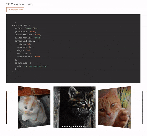
Live Examples
Default
import React from 'react';
import Swiper from 'react-id-swiper';
import 'swiper/css/swiper.css';

const SimpleSwiper = () => (
  <Swiper>
    <div>Slide 1</div>
    <div>Slide 2</div>
    <div>Slide 3</div>
    <div>Slide 4</div>
    <div>Slide 5</div>
  </Swiper>
)

export default SimpleSwiper;
Using params
import React from 'react';
import Swiper from 'react-id-swiper';

const SimpleSwiperWithParams = () => {
  const params = {
    pagination: {
      el: '.swiper-pagination',
      type: 'bullets',
      clickable: true
    },
    navigation: {
      nextEl: '.swiper-button-next',
      prevEl: '.swiper-button-prev'
    },
    spaceBetween: 30
  }

  return(
    <Swiper {...params}>
      <div>Slide 1</div>
      <div>Slide 2</div>
      <div>Slide 3</div>
      <div>Slide 4</div>
      <div>Slide 5</div>
    </Swiper>
  )
}

export default SimpleSwiperWithParams;
Manipulating swiper from outside swiper component
import React, { useRef } from 'react';
import Swiper from 'react-id-swiper';

const ManipulatingSwiper = () => {
  const ref = useRef(null);

  const ref = useRef(null);

  const goNext = () => {
    if (ref.current !== null && ref.current.swiper !== null) {
      ref.current.swiper.slideNext();
    }
  };

  const goPrev = () => {
    if (ref.current !== null && ref.current.swiper !== null) {
      ref.current.swiper.slidePrev();
    }
  };

  return (
    <div>
      <Swiper ref={ref}>
        <div>Slide 1</div>
        <div>Slide 2</div>
        <div>Slide 3</div>
        <div>Slide 4</div>
        <div>Slide 5</div>
      </Swiper>
      <button onClick={goPrev}>Prev</button>
      <button onClick={goNext}>Next</button>
    </div>
  );
};

export default ManipulatingSwiper;
Custom build Swiper
You can find the WORKING DEMO REPO HERE
import React from 'react';
import ReactIdSwiperCustom from 'react-id-swiper/lib/ReactIdSwiper.custom';
import { Swiper, Navigation, Pagination } from 'swiper/js/swiper.esm';

const CustomBuildSwiper = () => {
  const params = {
    // Provide Swiper class as props
    Swiper,
    // Add modules you need
    modules: [Navigation, Pagination],
    pagination: {
      el: '.swiper-pagination',
      type: 'bullets',
      clickable: true
    },
    navigation: {
      nextEl: '.swiper-button-next',
      prevEl: '.swiper-button-prev'
    },
    spaceBetween: 30
  }

  return(
    <ReactIdSwiperCustom {...params}>
      <div>Slide 1</div>
      <div>Slide 2</div>
      <div>Slide 3</div>
      <div>Slide 4</div>
      <div>Slide 5</div>
    </ReactIdSwiperCustom>
  )
}

export default CustomBuildSwiper;
NOTE:
- If you use Webpack & Babel you need to setup Babel loader config in
webpack.config.jslike below:
module: {
  rules: [
    {
      exclude: [/node_modules\/(?!(swiper|dom7)\/).*/, /\.test\.js(x)?$/],
      test: /\.js(x)?$/,
      use: [{ loader: 'babel-loader' }],
    }
  ],
}
Adding customized css classes
const params = {
  pagination: {
    el: '.swiper-pagination.customized-swiper-pagination',
  }, // Add your class name for pagination container
  navigation: {
    nextEl: '.swiper-button-next.customized-swiper-button-next', // Add your class name for next button
    prevEl: '.swiper-button-prev.customized-swiper-button-prev' // Add your class name for prev button
  },
  containerClass: 'customized-swiper-container' // Replace swiper-container with customized-swiper-container
}
Adding customized components
For customized rendering to work, you have to use same classname with params el.
const params = {
  navigation: {
    nextEl: '.swiper-button-next',
    prevEl: '.swiper-button-prev'
  },
  renderPrevButton: () => <button className="swiper-button-prev">Prev</button>,
  renderNextButton: () => <button className="swiper-button-next">Next</button>,
}
Workable slides
Each slide should be wrapped by HTML element
BAD CODE :thumbsdown:
<Swiper {...params}>
  Slide content
</Swiper>
GOOD CODE :thumbsup:
<Swiper {...params}>
  <span>Slide content</span>
</Swiper>
Bug report
Please use the prepared Codesanbox below to reproduce your issue. Thank you!!

Authors
- Asher Nguyen - Initial work - Asher Nguyen
See also the list of contributors who participated in this project.
Buy me a coffee
License
This project is licensed under the MIT License - see the LICENSE file for details
Top Related Projects
Most modern mobile touch slider with hardware accelerated transitions
React carousel component
Small, fast, and accessibility-first React carousel library with an easily customizable UI and behavior to fit your brand and site.
React.js Responsive Carousel (with Swipe)
A pure extendable React carousel, powered by Brainhub (craftsmen who ❤️ JS)
the last carousel you'll ever need
Convert designs to code with AI
Introducing Visual Copilot: A new AI model to turn Figma designs to high quality code using your components.
Try Visual Copilot