
Top Related Projects

A collection of loading indicators animated with CSS

CSS loading animations with minimal effort!

Delightful, performance-focused pure css loading animations.

🔮 CSS loading animations made with single element.
Quick Overview
CSS Loaders is a collection of pure CSS loading animations created by Luke Haas. It provides a variety of visually appealing and lightweight loading indicators that can be easily integrated into web projects without the need for JavaScript or images.
Pros
- Pure CSS implementation, reducing dependency on JavaScript
- Lightweight and easy to integrate into existing projects
- Variety of styles to choose from
- Cross-browser compatible
Cons
- Limited customization options without modifying the CSS
- Some animations may not be suitable for all design aesthetics
- Potential performance impact on older devices with complex animations
- Lack of built-in accessibility features
Code Examples
- Basic Loader:
<div class="loader"></div>
This code creates a simple spinning loader animation.
- Dots Loader:
<div class="loader-dots"></div>
This code creates a loader with three bouncing dots.
- Bar Loader:
<div class="loader-bar"></div>
This code creates a horizontal bar loader that fills from left to right.
Getting Started
To use CSS Loaders in your project, follow these steps:
- Download the
load1.cssfile from the GitHub repository. - Include the CSS file in your HTML:
<link rel="stylesheet" href="path/to/load1.css">
- Add the desired loader HTML to your page:
<div class="loader"></div>
- Customize the loader's appearance by modifying the CSS variables in the stylesheet if needed.
Competitor Comparisons
A collection of loading indicators animated with CSS
Pros of SpinKit
- More diverse and visually appealing animations
- Better browser compatibility, including older versions
- Modular structure allows for easy customization and integration
Cons of SpinKit
- Larger file size due to more complex animations
- Requires additional HTML markup for some loaders
- May be considered "over-designed" for minimalist projects
Code Comparison
SpinKit example:
<div class="spinner">
  <div class="bounce1"></div>
  <div class="bounce2"></div>
  <div class="bounce3"></div>
</div>
css-loaders example:
<div class="loader"></div>
SpinKit generally requires more HTML elements to create its animations, while css-loaders often achieves similar effects with a single element. This difference in approach affects both the complexity of implementation and the flexibility of the loaders.
SpinKit's CSS tends to be more verbose:
.spinner {
  width: 70px;
  text-align: center;
}
.spinner > div {
  width: 18px;
  height: 18px;
  background-color: #333;
  border-radius: 100%;
  display: inline-block;
  animation: sk-bouncedelay 1.4s infinite ease-in-out both;
}
css-loaders typically uses more compact CSS:
.loader {
  border: 16px solid #f3f3f3;
  border-top: 16px solid #3498db;
  border-radius: 50%;
  width: 120px;
  height: 120px;
  animation: spin 2s linear infinite;
}
CSS loading animations with minimal effort!
Pros of Whirl
- Larger variety of loader styles (over 100 options)
- More customizable with SCSS variables
- Includes both CSS and SCSS versions for flexibility
Cons of Whirl
- Larger file size due to more options
- May require more setup time to customize styles
- Less frequently updated (last update 3 years ago)
Code Comparison
CSS-loaders:
.loader {
  border: 16px solid #f3f3f3;
  border-top: 16px solid #3498db;
  border-radius: 50%;
  width: 120px;
  height: 120px;
  animation: spin 2s linear infinite;
}
Whirl:
.whirl {
  &:after {
    content: "\0020";
    display: block;
    width: 40px;
    height: 40px;
    border-radius: 50%;
    border: 6px solid #fff;
    border-color: #fff transparent #fff transparent;
    animation: whirl 1.5s linear infinite;
  }
}
Both repositories offer CSS-based loading animations, but they differ in approach and features. CSS-loaders provides a set of simple, lightweight loaders with minimal customization options. It's ideal for quick implementation and smaller projects. Whirl, on the other hand, offers a more extensive collection of loaders with greater customization potential through SCSS variables. This makes it suitable for larger projects or those requiring specific branding. However, the trade-off is a larger file size and potentially more complex setup. The code comparison shows that both use similar techniques for creating spinner animations, with Whirl utilizing SCSS for more flexible styling options.
Delightful, performance-focused pure css loading animations.
Pros of loaders.css
- Offers a wider variety of loader animations (42 compared to 8 in css-loaders)
- Provides SASS and CSS versions for easier integration
- Includes a demo page for easy visualization of all loaders
Cons of loaders.css
- Larger file size due to more animations
- Some animations may be more complex, potentially impacting performance
- Requires additional HTML markup for some loaders
Code Comparison
css-loaders:
.loader {
  border: 16px solid #f3f3f3;
  border-top: 16px solid #3498db;
  border-radius: 50%;
  width: 120px;
  height: 120px;
  animation: spin 2s linear infinite;
}
loaders.css:
.ball-pulse > div {
  width: 15px;
  height: 15px;
  border-radius: 100%;
  margin: 2px;
  animation-fill-mode: both;
  display: inline-block;
  animation: scale 0.75s 0.12s infinite cubic-bezier(.2,.68,.18,1.08);
}
Both repositories provide CSS-based loading animations, but loaders.css offers more variety and flexibility. css-loaders focuses on simplicity and ease of use, while loaders.css provides more complex animations with additional customization options. The choice between the two depends on the specific needs of the project and the desired level of complexity in the loading animations.
🔮 CSS loading animations made with single element.
Pros of three-dots
- More comprehensive set of loading animations, including various styles and types
- Better organized documentation with clear examples and usage instructions
- Supports both CSS and SCSS, offering more flexibility for developers
Cons of three-dots
- Larger file size due to the extensive collection of animations
- May require more customization to fit specific design needs
- Less minimalistic approach compared to css-loaders
Code Comparison
three-dots:
.dot-elastic {
  position: relative;
  width: 10px;
  height: 10px;
  border-radius: 5px;
  background-color: #9880ff;
  color: #9880ff;
  animation: dot-elastic 1s infinite linear;
}
css-loaders:
.loader {
  border: 16px solid #f3f3f3;
  border-top: 16px solid #3498db;
  border-radius: 50%;
  width: 120px;
  height: 120px;
  animation: spin 2s linear infinite;
}
Both repositories provide CSS-based loading animations, but three-dots offers a wider variety of styles and better documentation. However, css-loaders is more lightweight and may be preferable for simpler projects or when minimalism is desired. The code examples showcase the different approaches, with three-dots using more complex animations and css-loaders focusing on simpler, single-element loaders.
Convert  designs to code with AI

Introducing Visual Copilot: A new AI model to turn Figma designs to high quality code using your components.
Try Visual CopilotREADME
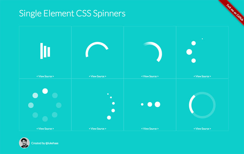
Single Element CSS Spinners
This is a collection of loading spinners animated with CSS.
Each spinner consists of a single div with a class of loader and content text of "Loading...".
The text is for screen readers and can be used as a fallback state for older browsers.
The aim of this project was to create a set of minimal loading spinners that are visually appealing and also convey their intended meaning.
A strict limit of one element per loader (not including pseudo-elements) was placed on this project based on the belief that something as simple as a loader doesn't deserve more.
Each loader is given a font size in pixels and all other sizes are in ems so to change the size of a loader, just adjust the font-size.
Demo
Browser Support
 |  |  |  |  |
|---|---|---|---|---|
| IE 10+ â | Chrome 4.0+ â | Firefox 16.0+ â | Opera 15.0+ â | Safari 4.0+ â |
Contributing
- Fork it!
- Create your feature branch:
git checkout -b my-new-feature - Commit your changes:
git commit -m 'Add some feature' - Push to the branch:
git push origin my-new-feature - Submit a pull request :)
History
For detailed changelog, check Releases.
License
Browser testing via 
Top Related Projects
A collection of loading indicators animated with CSS
CSS loading animations with minimal effort!
Delightful, performance-focused pure css loading animations.
🔮 CSS loading animations made with single element.
Convert designs to code with AI
Introducing Visual Copilot: A new AI model to turn Figma designs to high quality code using your components.
Try Visual Copilot