 TW-Elements
𝙃𝙪𝙜𝙚 collection of Tailwind MIT licensed (free) components, sections and templates 😎
Top Related Projects

The most popular HTML, CSS, and JavaScript framework for developing responsive, mobile first projects on the web.

A utility-first CSS framework for rapid UI development.

Modern CSS framework based on Flexbox

Semantic is a UI component framework based around useful principles from natural language.

The most advanced responsive front-end framework in the world. Quickly create prototypes and production code for sites that work on any kind of device.

A lightweight and modular front-end framework for developing fast and powerful web interfaces
Quick Overview
TW-Elements is a powerful and free UI kit for Tailwind CSS, offering a comprehensive set of components and templates. It combines the flexibility of Tailwind CSS with the convenience of pre-built elements, allowing developers to create responsive and visually appealing web applications quickly.
Pros
- Extensive collection of ready-to-use components and templates
- Seamless integration with Tailwind CSS
- Regular updates and active community support
- Responsive design out of the box
Cons
- Learning curve for developers new to Tailwind CSS
- Some components may require additional customization for specific use cases
- Potential for increased bundle size if not optimized properly
Code Examples
- Creating a button with TW-Elements:
<button
  type="button"
  class="inline-block rounded bg-primary px-6 pb-2 pt-2.5 text-xs font-medium uppercase leading-normal text-white shadow-[0_4px_9px_-4px_#3b71ca] transition duration-150 ease-in-out hover:bg-primary-600 hover:shadow-[0_8px_9px_-4px_rgba(59,113,202,0.3),0_4px_18px_0_rgba(59,113,202,0.2)] focus:bg-primary-600 focus:shadow-[0_8px_9px_-4px_rgba(59,113,202,0.3),0_4px_18px_0_rgba(59,113,202,0.2)] focus:outline-none focus:ring-0 active:bg-primary-700 active:shadow-[0_8px_9px_-4px_rgba(59,113,202,0.3),0_4px_18px_0_rgba(59,113,202,0.2)] dark:shadow-[0_4px_9px_-4px_rgba(59,113,202,0.5)] dark:hover:shadow-[0_8px_9px_-4px_rgba(59,113,202,0.2),0_4px_18px_0_rgba(59,113,202,0.1)] dark:focus:shadow-[0_8px_9px_-4px_rgba(59,113,202,0.2),0_4px_18px_0_rgba(59,113,202,0.1)] dark:active:shadow-[0_8px_9px_-4px_rgba(59,113,202,0.2),0_4px_18px_0_rgba(59,113,202,0.1)]"
>
  Button
</button>
- Implementing a modal dialog:
<button
  type="button"
  class="inline-block rounded bg-primary px-6 pb-2 pt-2.5 text-xs font-medium uppercase leading-normal text-white shadow-[0_4px_9px_-4px_#3b71ca] transition duration-150 ease-in-out hover:bg-primary-600 hover:shadow-[0_8px_9px_-4px_rgba(59,113,202,0.3),0_4px_18px_0_rgba(59,113,202,0.2)] focus:bg-primary-600 focus:shadow-[0_8px_9px_-4px_rgba(59,113,202,0.3),0_4px_18px_0_rgba(59,113,202,0.2)] focus:outline-none focus:ring-0 active:bg-primary-700 active:shadow-[0_8px_9px_-4px_rgba(59,113,202,0.3),0_4px_18px_0_rgba(59,113,202,0.2)] dark:shadow-[0_4px_9px_-4px_rgba(59,113,202,0.5)] dark:hover:shadow-[0_8px_9px_-4px_rgba(59,113,202,0.2),0_4px_18px_0_rgba(59,113,202,0.1)] dark:focus:shadow
Competitor Comparisons
The most popular HTML, CSS, and JavaScript framework for developing responsive, mobile first projects on the web.
Pros of Bootstrap
- Larger community and ecosystem, with extensive documentation and third-party resources
- More comprehensive set of components and utilities out-of-the-box
- Better browser compatibility, especially for older versions
Cons of Bootstrap
- Heavier file size, which can impact page load times
- Less flexibility in customization compared to utility-first frameworks
- Steeper learning curve for developers new to CSS frameworks
Code Comparison
Bootstrap:
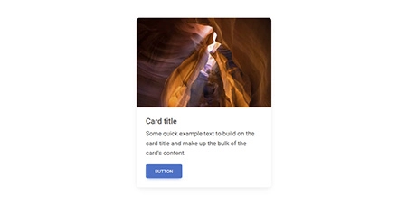
<div class="card" style="width: 18rem;">
  <img src="..." class="card-img-top" alt="...">
  <div class="card-body">
    <h5 class="card-title">Card title</h5>
    <p class="card-text">Some quick example text to build on the card title and make up the bulk of the card's content.</p>
    <a href="#" class="btn btn-primary">Go somewhere</a>
  </div>
</div>
TW-Elements:
<div class="block max-w-sm rounded-lg bg-white shadow-lg dark:bg-neutral-700">
  <a href="#!">
    <img class="rounded-t-lg" src="https://tecdn.b-cdn.net/img/new/standard/nature/184.jpg" alt="" />
  </a>
  <div class="p-6">
    <h5 class="mb-2 text-xl font-medium leading-tight text-neutral-800 dark:text-neutral-50">Card title</h5>
    <p class="mb-4 text-base text-neutral-600 dark:text-neutral-200">Some quick example text to build on the card title and make up the bulk of the card's content.</p>
    <button type="button" class="inline-block rounded bg-primary px-6 pt-2.5 pb-2 text-xs font-medium uppercase leading-normal text-white shadow-[0_4px_9px_-4px_#3b71ca] transition duration-150 ease-in-out hover:bg-primary-600 hover:shadow-[0_8px_9px_-4px_rgba(59,113,202,0.3),0_4px_18px_0_rgba(59,113,202,0.2)] focus:bg-primary-600 focus:shadow-[0_8px_9px_-4px_rgba(59,113,202,0.3),0_4px_18px_0_rgba(59,113,202,0.2)] focus:outline-none focus:ring-0 active:bg-primary-700 active:shadow-[0_8px_9px_-4px_rgba(59,113,202,0.3),0_4px_18px_0_rgba(59,113,202,0.2)]" data-te-ripple-init data-te-ripple-color="light">
      Button
    </button>
  </div>
</div>
A utility-first CSS framework for rapid UI development.
Pros of Tailwind CSS
- Highly customizable and flexible utility-first CSS framework
- Extensive documentation and large community support
- Smaller file sizes due to purging unused styles
Cons of Tailwind CSS
- Steeper learning curve for developers new to utility-first CSS
- Can lead to longer class names and potentially cluttered HTML
- Requires additional configuration for optimal performance
Code Comparison
TW-Elements:
<button type="button" class="inline-block rounded bg-primary px-6 pb-2 pt-2.5 text-xs font-medium uppercase leading-normal text-white shadow-[0_4px_9px_-4px_#3b71ca] transition duration-150 ease-in-out hover:bg-primary-600 hover:shadow-[0_8px_9px_-4px_rgba(59,113,202,0.3),0_4px_18px_0_rgba(59,113,202,0.2)] focus:bg-primary-600 focus:shadow-[0_8px_9px_-4px_rgba(59,113,202,0.3),0_4px_18px_0_rgba(59,113,202,0.2)] focus:outline-none focus:ring-0 active:bg-primary-700 active:shadow-[0_8px_9px_-4px_rgba(59,113,202,0.3),0_4px_18px_0_rgba(59,113,202,0.2)] dark:shadow-[0_4px_9px_-4px_rgba(59,113,202,0.5)] dark:hover:shadow-[0_8px_9px_-4px_rgba(59,113,202,0.2),0_4px_18px_0_rgba(59,113,202,0.1)] dark:focus:shadow-[0_8px_9px_-4px_rgba(59,113,202,0.2),0_4px_18px_0_rgba(59,113,202,0.1)] dark:active:shadow-[0_8px_9px_-4px_rgba(59,113,202,0.2),0_4px_18px_0_rgba(59,113,202,0.1)]">
  Button
</button>
Tailwind CSS:
<button class="bg-blue-500 hover:bg-blue-700 text-white font-bold py-2 px-4 rounded">
  Button
</button>
Modern CSS framework based on Flexbox
Pros of Bulma
- Lightweight and modular CSS framework, allowing for easy customization
- Simple and intuitive class naming convention
- Extensive documentation and community support
Cons of Bulma
- Less comprehensive component library compared to TW-Elements
- Lacks JavaScript functionality for interactive components
- May require additional custom CSS for complex layouts
Code Comparison
Bulma:
<div class="columns">
  <div class="column">
    <div class="card">
      <div class="card-content">
        <p class="title">Card title</p>
        <p class="subtitle">Card subtitle</p>
      </div>
    </div>
  </div>
</div>
TW-Elements:
<div class="flex flex-wrap">
  <div class="w-full sm:w-1/2 md:w-1/3 lg:w-1/4 p-4">
    <div class="bg-white rounded-lg shadow-lg">
      <div class="p-6">
        <h5 class="text-xl font-semibold mb-2">Card title</h5>
        <p class="text-gray-700">Card subtitle</p>
      </div>
    </div>
  </div>
</div>
Both frameworks offer clean and readable markup, but TW-Elements provides more granular control over layout and styling through utility classes, while Bulma relies on predefined components and modifiers.
Semantic is a UI component framework based around useful principles from natural language.
Pros of Semantic-UI
- More comprehensive and feature-rich UI framework
- Extensive theming system with easy customization
- Larger community and ecosystem
Cons of Semantic-UI
- Heavier file size and potential performance impact
- Less flexibility in terms of utility-first approach
- Steeper learning curve for beginners
Code Comparison
Semantic-UI:
<div class="ui button">
  Click me
</div>
TW-Elements:
<button class="inline-block rounded bg-primary px-6 py-2.5 text-xs font-medium uppercase leading-tight text-white shadow-md transition duration-150 ease-in-out hover:bg-primary-700 hover:shadow-lg focus:bg-primary-700 focus:shadow-lg focus:outline-none focus:ring-0 active:bg-primary-800 active:shadow-lg">
  Click me
</button>
Semantic-UI offers a more concise and semantic approach to styling, while TW-Elements leverages Tailwind CSS's utility classes for greater flexibility and customization. Semantic-UI's code is generally more readable at a glance, but TW-Elements provides more granular control over individual properties.
The most advanced responsive front-end framework in the world. Quickly create prototypes and production code for sites that work on any kind of device.
Pros of Foundation
- More mature and established framework with a longer history
- Extensive documentation and community support
- Flexible grid system that works well for complex layouts
Cons of Foundation
- Steeper learning curve compared to TW-Elements
- Larger file size, which may impact page load times
- Less frequent updates and slower adoption of modern web trends
Code Comparison
Foundation:
<div class="grid-x grid-margin-x">
  <div class="cell small-6 medium-4 large-3">Content</div>
  <div class="cell small-6 medium-4 large-3">Content</div>
</div>
TW-Elements:
<div class="grid grid-cols-2 md:grid-cols-3 lg:grid-cols-4 gap-4">
  <div>Content</div>
  <div>Content</div>
</div>
Foundation uses a more verbose class naming convention, while TW-Elements leverages Tailwind CSS's utility-first approach. Foundation's grid system offers more granular control over column sizes across breakpoints, but TW-Elements' approach is more concise and easier to read for simpler layouts.
Both frameworks provide responsive design capabilities, but their syntax and implementation differ. Foundation's approach may be more suitable for complex, enterprise-level projects, while TW-Elements offers a more streamlined experience for rapid development and prototyping.
A lightweight and modular front-end framework for developing fast and powerful web interfaces
Pros of UIkit
- More comprehensive component library with a wider range of UI elements
- Better documentation and examples, making it easier for developers to implement
- Larger community and longer development history, resulting in more stability and support
Cons of UIkit
- Larger file size, which may impact page load times
- Less flexibility in customization compared to TW-Elements' Tailwind CSS integration
- Steeper learning curve for developers new to the framework
Code Comparison
UIkit:
<div class="uk-card uk-card-default">
    <div class="uk-card-header">
        <h3 class="uk-card-title">Card Title</h3>
    </div>
    <div class="uk-card-body">
        <p>Card content</p>
    </div>
</div>
TW-Elements:
<div class="block rounded-lg bg-white shadow-[0_2px_15px_-3px_rgba(0,0,0,0.07),0_10px_20px_-2px_rgba(0,0,0,0.04)]">
    <div class="border-b-2 border-neutral-100 px-6 py-3">
        <h5 class="text-xl font-medium">Card Title</h5>
    </div>
    <div class="p-6">
        <p>Card content</p>
    </div>
</div>
Convert  designs to code with AI

Introducing Visual Copilot: A new AI model to turn Figma designs to high quality code using your components.
Try Visual CopilotREADME
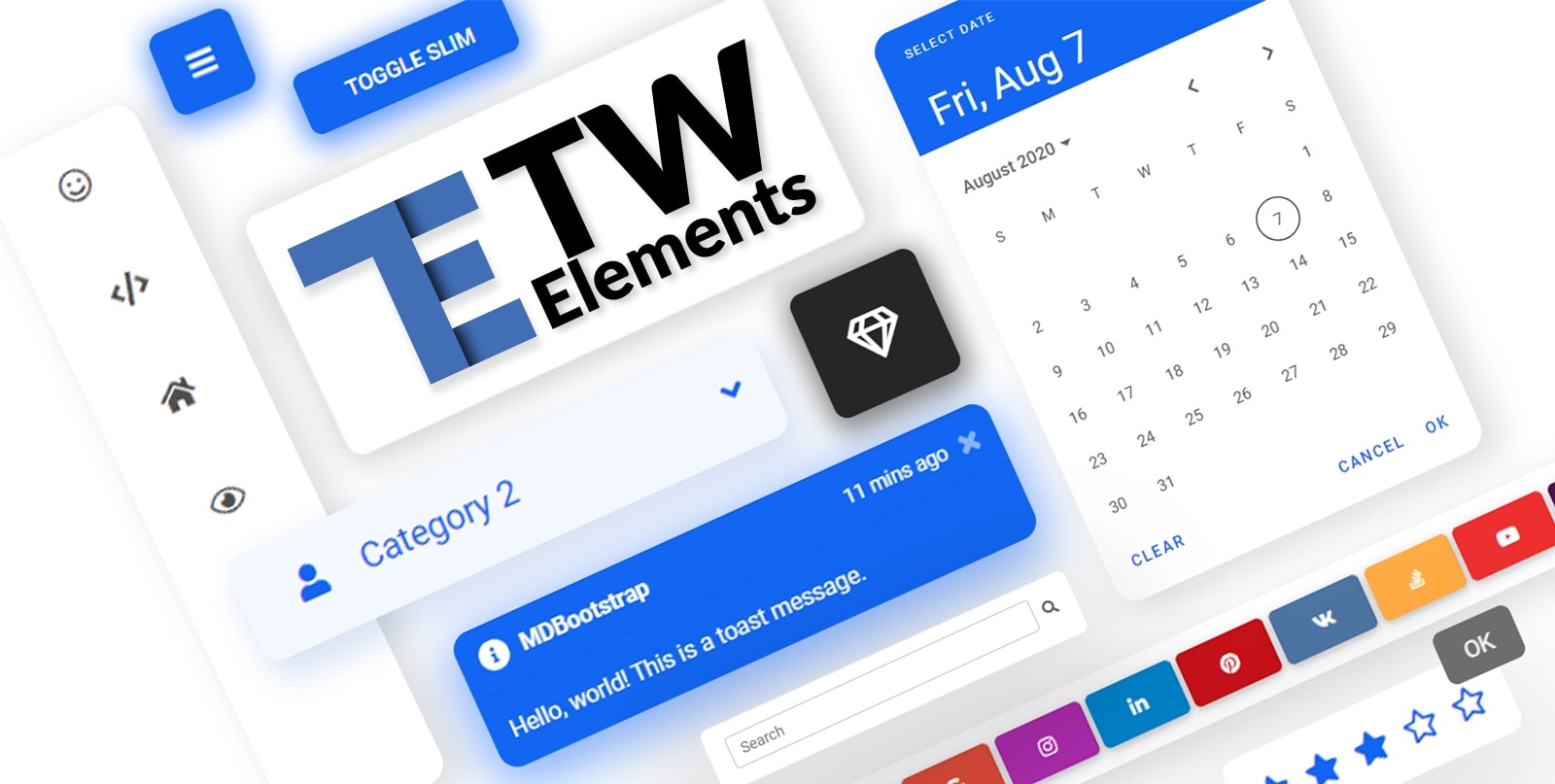
TW Elements 


TW Elements is a huge collection of free, interactive components for Tailwind CSS.
|
|
Table of Contents
Community
- Motivate us with some words of encouragament â¤ï¸
- Share your ideas & feature requests ð¡
- Aks for help & help others in our community support ð
- Engage, discuss & have fun in our community ð¬
If you want to help the project grow, start by simply sharing it with your peers!
- Share via Dev.to
- Share via Twitter
- Share via Facebook
- Share via LinkedIn
- Share via Pinterest
- Share via Reddit
- Share via StumbleUpon
- Share via Vkontakte
- Share via Weibo
- Share via Hackernews
- Share via Gmail
- Share via email
%5D(https://tw-elements.com/)%20%20%20%20%20%20%20%20%5Cn%20%20%20%20%20%20%20%20%20%20%20%20%20%20%20%20%20%20%20%20%20%20%20%20I%27d%20like%20to%20share%20my%20latest%20discovery%20with%20you.%20%5Cn%20%20%20%20%20%20%20%20%5BTailwind%20Elements%5D(https://tw-elements.com/)%20is%20currently,%20the%20most%20popular%203rd%20party%20UI%20kit%20for%20TailwindCSS%20with%20over%2010k%20Github%20stars.%20%20%20%20%20%20%20%20%5B!%5BGitHub%20Repo%20stars%5D(https://img.shields.io/github/stars/mdbootstrap/tw-elements?style=social)%5D(https://github.com/mdbootstrap/TW-Elements/)%20%20%20%20%20%20%20%20It%27s%20a%20**huge%20collection%20of%20stunning%20components**%20made%20with%20attention%20to%20the%20smallest%20detail.%20%20%20%20%20%20%20%20%20Forms,%20cards,%20buttons,%20and%20hundreds%20of%20others.%20%20%20%20%20%20%20%20%20All%20components%20have%20**dark%20mode**%20and%20very%20intuitive%20**theming%20options**.%20%20%20%20%20%20%20%20The%20project%20is%20supported%20by%20an%20%5Bengaged%20community%20on%20GitHub%5D(https://github.com/mdbootstrap/TW-Elements/discussions),%20I%20recommend%20you%20check%20it%20out%20and%20join%20one%20of%20the%20many%20discussions.%20%20%20%20%20%20%20%20%5Cn%20%20%20%20%20%20%20%20You%20will%20find%20installation%20instructions%20%5Bhere%5D(https://tw-elements.com/docs/getting-started/installation),%20and%20you%20can%20track%20the%20progress%20of%20the%20project%20live%20%20%20%20%20%20%20%20%20%5Bhere%5D(https://tw-elements.com/docs/standard/getting-started/changelog/).%20%20%20%20%20%20%20%20%5Cn%20%20%20%20%20%20%20%20The%20project%20was%20kickstarted%20by%20@MDBootstrap,%20a%20group%20of%20open-source%20developers%20behind%20%5BMDB%20UI%20Kit%5D(https://github.com/mdbootstrap/mdb-ui-kit)%20-%20a%20high-quality%20UI%20kit%20for%20Bootstrap,%20and%20also%20behind%20%5BMDB%20GO%5D(https://mdbgo.com/)%20-%20hosting%20and%20deployment%20platform.%20%20%20%20%20%20%20%20%5Cn%20%20%20%20%20%20%20%20I%20highly%20recommend%20you%20to%20check%20it%20out!%20%20%20%20%20%20%20%20%5Cn%20%20%20%20%20%20%20%20%7B%25%20link%20mdbootstrap/tw-elements-breakthrough-version-is-here-59hh%20%25%7D%20%20%20%20%20%20%20%20%5Cn)
Thank you!
Coming soon
Check out the upcoming features - make sure to join the waiting list in order to get early access!
|
|
| Drag & drop builder | Templates |
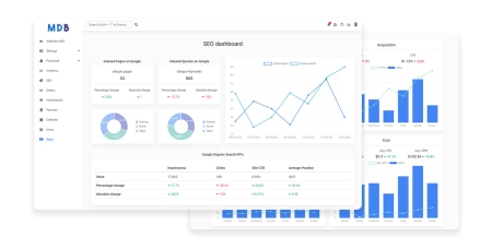
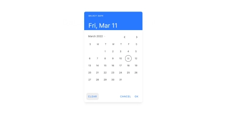
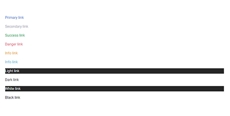
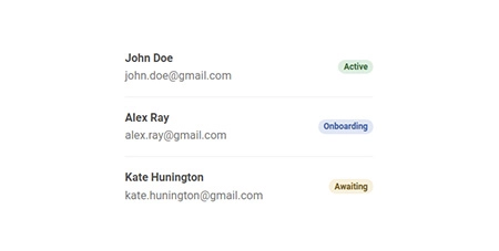
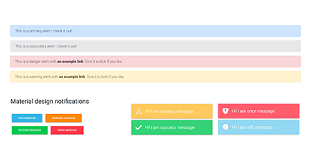
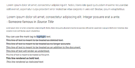
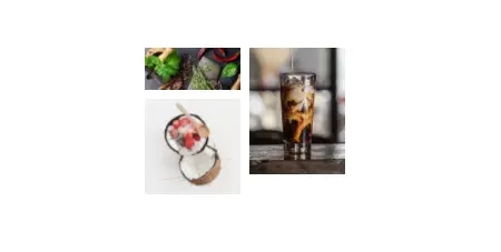
Components
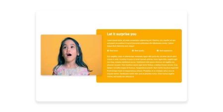
A collection of stunning components made with attention to the smallest details. Forms, cards, buttons, and hundreds of others â in TW Elements you will find all the essential elements necessary for every project.
|
|
|
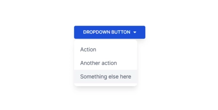
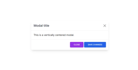
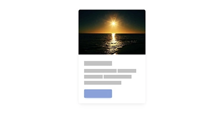
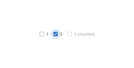
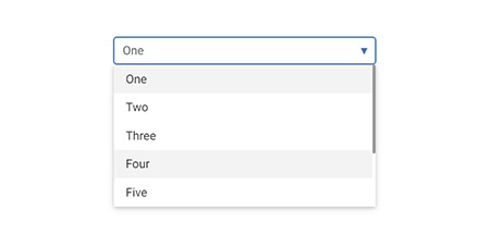
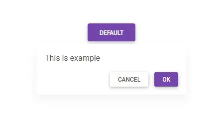
| Datepicker | Dropdown | Modal |
|
|
|
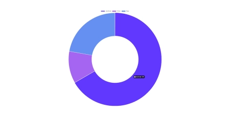
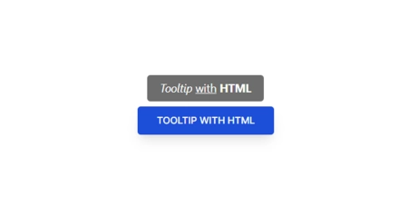
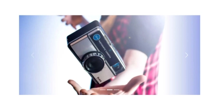
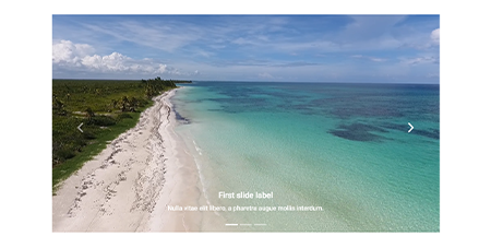
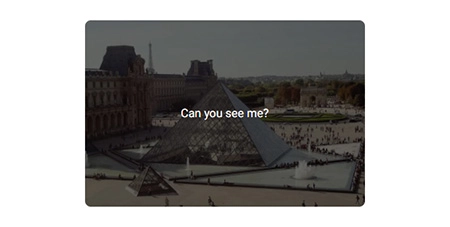
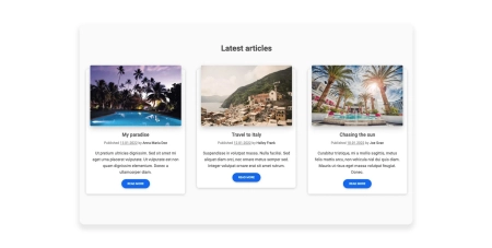
| Charts | Tooltips | Carousel |
|
|
|
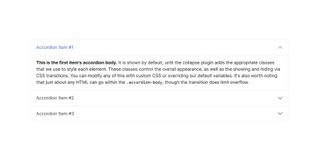
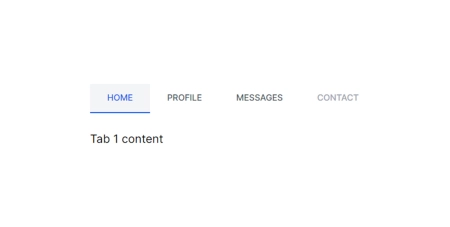
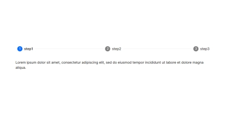
| Accordion | Tabs | Stepper |
|
|
|
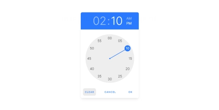
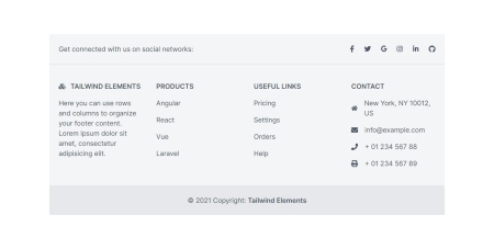
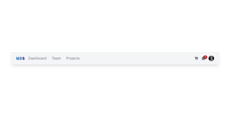
| Timepicker | Footer | Navbar |
|
|
|
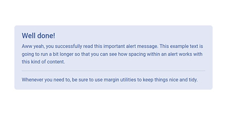
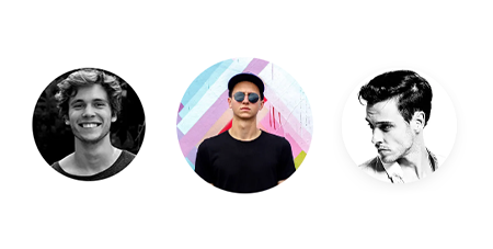
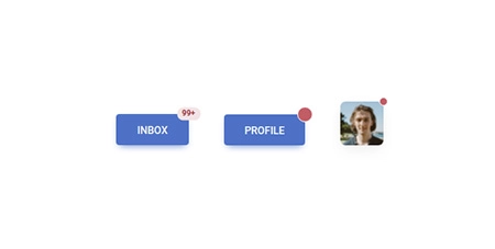
| Alerts | Avatar | Badges |
|
|
|
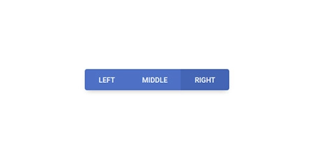
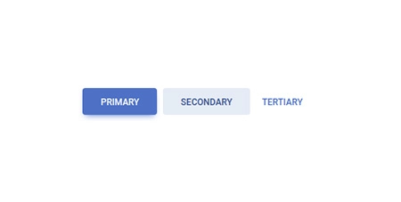
| Button group | Buttons | Cards |
|
|

|
| Chips | Collapse | Gallery |
|
|
|
| Jumbotron | Link | List group |
|
|
|
| Notifications | Paragraphs | Placeholders |
|
|
|
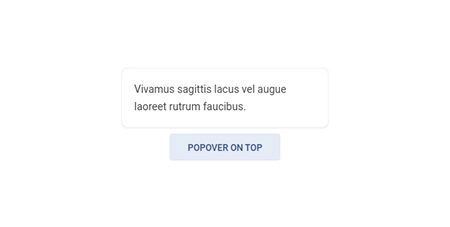
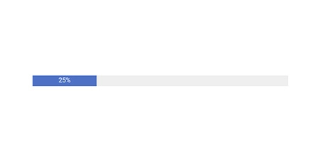
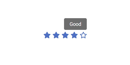
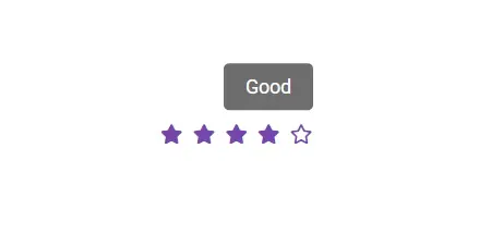
| Popover | Progress | Rating |
|
|
|
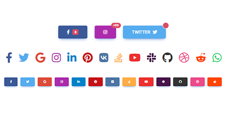
| Scroll to top | Social buttons | Spinners |
|
|
|
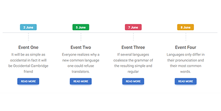
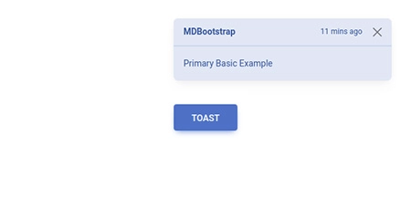
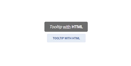
| Timeline | Toast | Tooltip |
|
|
|
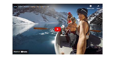
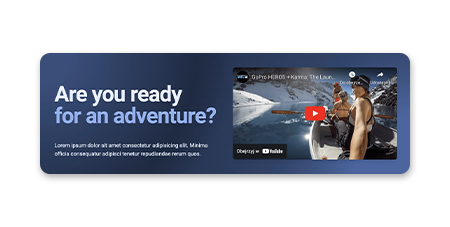
| Video | Video carousel | Checkbox |
|
|
|
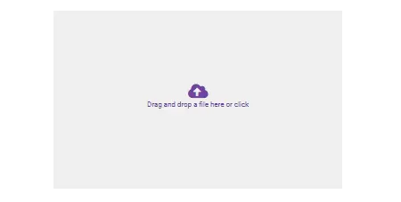
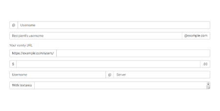
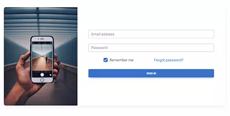
| File input | Input group | Login form |
|
|

|
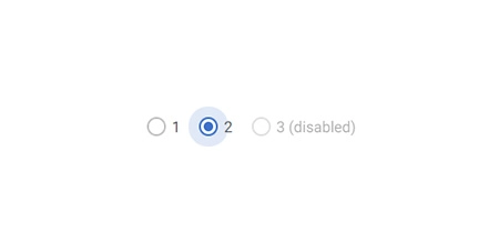
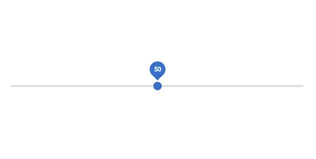
| Radio | Range | Registration form |
|
|
|
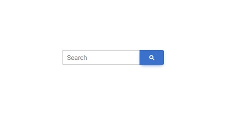
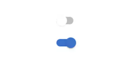
| Search | Select | Switch |
|
|
|
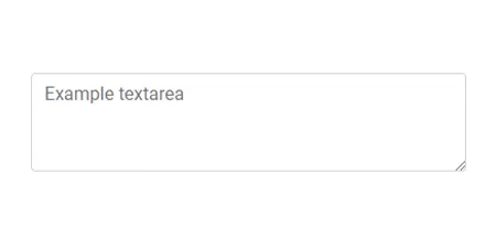
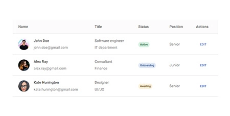
| Textarea | Tables | Ripple |
|
|
|
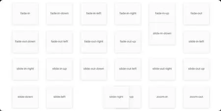
| Animations | Masks | Shadows |
|
|
|
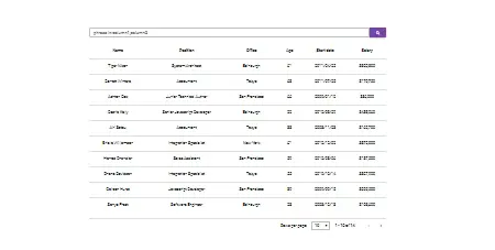
| Datatables | Lightbox | Rating |

|
|
|
| Scrollbar | Popconfirm | More coming soon |
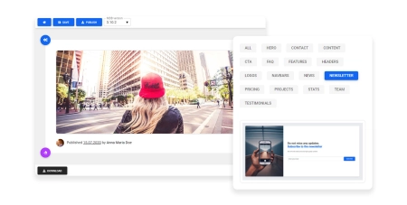
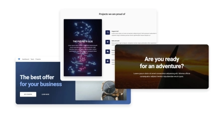
Design blocks
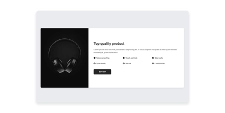
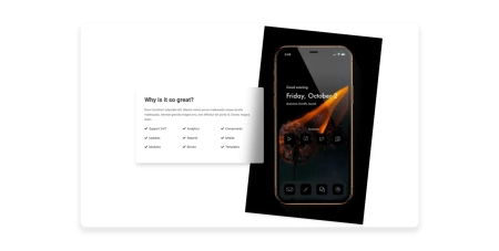
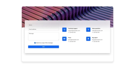
Responsive Landing page blocks built with Tailwind CSS. Plenty of design blocks examples such as Teams, services, projects, faq, and many more.

|
|
|
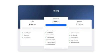
| Hero | Pricing | Call to action |
|
|
|
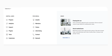
| Features | Contact | News/blog |
|
|
|
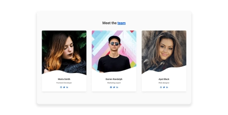
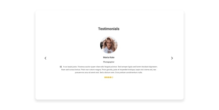
| Team | Stats | Testimonials |
|
|
|
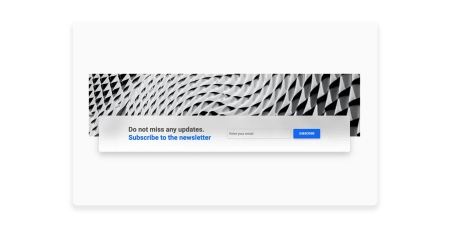
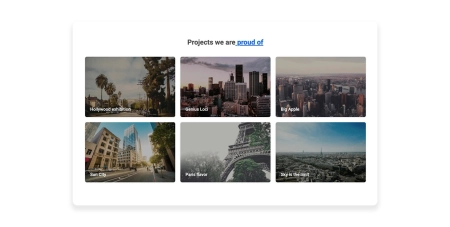
| Content | Newsletter | Projects |
|
|
|
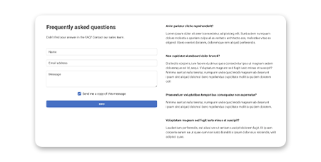
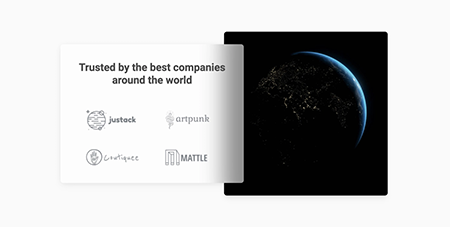
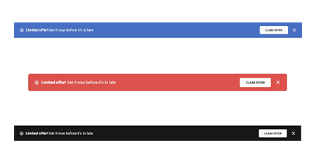
| Headers | FAQ | Logo Clouds |
|
|
|
| Banners | Mega Menu | More coming soon |
Integrations
TW Elements integrations with popular technologies.
- Django Integration
- Angular Integration
- Express Integration
- Laravel Integration
- Next Integration
- Nuxt Integration
- Django Integration
- Remix Integration
- Solid Integration
- Svelte Integration
- Sveltekit Integration
- Vue Integration
Installation
NPM
-
Before starting the project make sure to install Node.js (LTS) and TailwindCSS.
-
Run the following command to install the package via NPM:
npm install tw-elements
- TW Elements is a plugin and should be included inside the tailwind.config.js file. It is also recommended to extend the content array with a js file that loads dynamic component classes:
module.exports = {
  content: ["./src/**/*.{html,js}", "./node_modules/tw-elements/js/**/*.js"],
  plugins: [require("tw-elements/plugin.cjs")],
  darkMode: "class",
};
- Dynamic components will work after adding the js file:
<script src="./TW-ELEMENTS-PATH/js/tw-elements.umd.min.js"></script>
Alternatively, you can import it in the following way (bundler version):
import 'tw-elements';
MDB GO / CLI
Create, deploy and host anything with a single command.
- To start using MDB GO / CLI install it with one command:
npm install -g mdb-cli
- Log into the CLI using your MDB account:
mdb login
- Initialize a project and choose Tailwind Elements from the list:
mdb init tailwind-elements-free
- Install the dependencies (inside the project directory):
npm install
- Run the app:
npm start
- Publish when you're ready:
mdb publish
CDN
You can easily test TW Elements by adding CDN scripts to your classic HTML template without the need for installing any packages.
Add the stylesheet files below in the head section:
<link href="https://fonts.googleapis.com/css?family=Roboto:300,400,500,700,900&display=swap" rel="stylesheet" />
<link rel="stylesheet" href="https://cdn.jsdelivr.net/npm/tw-elements/css/tw-elements.min.css" />
<script src="https://cdn.tailwindcss.com"></script>
<script>
  tailwind.config = {
    darkMode: "class",
    theme: {
      fontFamily: {
        sans: ["Roboto", "sans-serif"],
        body: ["Roboto", "sans-serif"],
        mono: ["ui-monospace", "monospace"],
      },
    },
    corePlugins: {
      preflight: false,
    },
  };
</script>
Require the js bundled file right before the body closing tag:
<script src="https://cdn.jsdelivr.net/npm/tw-elements/js/tw-elements.umd.min.js"></script>
Top Related Projects
The most popular HTML, CSS, and JavaScript framework for developing responsive, mobile first projects on the web.
A utility-first CSS framework for rapid UI development.
Modern CSS framework based on Flexbox
Semantic is a UI component framework based around useful principles from natural language.
The most advanced responsive front-end framework in the world. Quickly create prototypes and production code for sites that work on any kind of device.
A lightweight and modular front-end framework for developing fast and powerful web interfaces
Convert designs to code with AI
Introducing Visual Copilot: A new AI model to turn Figma designs to high quality code using your components.
Try Visual Copilot