Top Related Projects
The most popular HTML, CSS, and JavaScript framework for developing responsive, mobile first projects on the web.
A utility-first CSS framework for rapid UI development.
Modern CSS framework based on Flexbox
Semantic is a UI component framework based around useful principles from natural language.
The most advanced responsive front-end framework in the world. Quickly create prototypes and production code for sites that work on any kind of device.
A lightweight and modular front-end framework for developing fast and powerful web interfaces
Quick Overview
MDB UI Kit is a comprehensive Bootstrap 5 UI kit that provides a collection of ready-to-use components and templates for web development. It offers a blend of Material Design and Bootstrap, allowing developers to create modern, responsive websites with ease.
Pros
- Extensive collection of pre-built components and templates
- Seamless integration with Bootstrap 5
- Regular updates and active community support
- Responsive design out of the box
Cons
- Some advanced features require a paid license
- Learning curve for developers new to Material Design principles
- Limited customization options in the free version
- Potential performance impact due to the large number of included features
Code Examples
- Creating a basic card component:
<div class="card">
  <div class="card-body">
    <h5 class="card-title">Card title</h5>
    <p class="card-text">Some quick example text to build on the card title.</p>
    <a href="#" class="btn btn-primary">Go somewhere</a>
  </div>
</div>
- Implementing a responsive navbar:
<nav class="navbar navbar-expand-lg navbar-light bg-light">
  <div class="container-fluid">
    <a class="navbar-brand" href="#">Navbar</a>
    <button class="navbar-toggler" type="button" data-mdb-toggle="collapse" data-mdb-target="#navbarNav">
      <i class="fas fa-bars"></i>
    </button>
    <div class="collapse navbar-collapse" id="navbarNav">
      <ul class="navbar-nav">
        <li class="nav-item">
          <a class="nav-link active" aria-current="page" href="#">Home</a>
        </li>
        <li class="nav-item">
          <a class="nav-link" href="#">Features</a>
        </li>
      </ul>
    </div>
  </div>
</nav>
- Adding a Material Design button with ripple effect:
<button type="button" class="btn btn-primary" data-mdb-ripple-color="dark">
  Click me
</button>
Getting Started
To get started with MDB UI Kit, follow these steps:
- Include the necessary CSS and JS files in your HTML:
<!-- MDB CSS -->
<link href="https://cdnjs.cloudflare.com/ajax/libs/mdb-ui-kit/6.2.0/mdb.min.css" rel="stylesheet">
<!-- MDB JavaScript -->
<script type="text/javascript" src="https://cdnjs.cloudflare.com/ajax/libs/mdb-ui-kit/6.2.0/mdb.min.js"></script>
- Start using MDB UI Kit components in your HTML:
<div class="container">
  <h1 class="mt-5">Hello, MDB!</h1>
  <button type="button" class="btn btn-primary">Primary</button>
</div>
- Customize your design using MDB UI Kit classes and components as needed.
Competitor Comparisons
The most popular HTML, CSS, and JavaScript framework for developing responsive, mobile first projects on the web.
Pros of Bootstrap
- Larger community and ecosystem, resulting in more resources and third-party extensions
- More extensive documentation and examples
- Lighter weight and faster loading times
Cons of Bootstrap
- Less visually appealing out-of-the-box designs compared to MDB UI Kit
- Fewer pre-built components and advanced features
- Steeper learning curve for customization and advanced usage
Code Comparison
Bootstrap:
<div class="card">
  <div class="card-body">
    <h5 class="card-title">Card title</h5>
    <p class="card-text">Some quick example text.</p>
    <a href="#" class="btn btn-primary">Go somewhere</a>
  </div>
</div>
MDB UI Kit:
<div class="card">
  <div class="card-body">
    <h5 class="card-title">Card title</h5>
    <p class="card-text">Some quick example text.</p>
    <a href="#" class="btn btn-primary ripple-surface">Go somewhere</a>
  </div>
</div>
The code structure is similar, but MDB UI Kit includes additional classes like ripple-surface for enhanced visual effects.
A utility-first CSS framework for rapid UI development.
Pros of Tailwind CSS
- Highly customizable and flexible utility-first approach
- Smaller file size and better performance due to purging unused styles
- Extensive documentation and active community support
Cons of Tailwind CSS
- Steeper learning curve for developers used to traditional CSS frameworks
- Can lead to longer class names and potentially cluttered HTML
- Requires additional build steps for optimal performance
Code Comparison
MDB UI Kit:
<button class="btn btn-primary">Primary Button</button>
<div class="card">
  <div class="card-body">
    <h5 class="card-title">Card Title</h5>
    <p class="card-text">Card content goes here.</p>
  </div>
</div>
Tailwind CSS:
<button class="bg-blue-500 hover:bg-blue-700 text-white font-bold py-2 px-4 rounded">
  Primary Button
</button>
<div class="bg-white shadow-md rounded-lg p-6">
  <h5 class="text-xl font-bold mb-2">Card Title</h5>
  <p class="text-gray-700">Card content goes here.</p>
</div>
Both frameworks offer component-based approaches, but Tailwind CSS uses utility classes for more granular control, while MDB UI Kit provides pre-designed components with fewer customization options out of the box.
Modern CSS framework based on Flexbox
Pros of Bulma
- Lightweight and modular, allowing for easy customization and smaller file sizes
- Pure CSS framework, requiring no JavaScript dependencies
- Extensive documentation and active community support
Cons of Bulma
- Limited built-in JavaScript components compared to MDB UI Kit
- Less comprehensive set of pre-built UI elements and templates
- Steeper learning curve for developers new to flexbox-based layouts
Code Comparison
Bulma:
<div class="columns">
  <div class="column">
    <div class="card">
      <div class="card-content">
        <p class="title">Card title</p>
        <p class="subtitle">Card subtitle</p>
      </div>
    </div>
  </div>
</div>
MDB UI Kit:
<div class="row">
  <div class="col">
    <div class="card">
      <div class="card-body">
        <h5 class="card-title">Card title</h5>
        <h6 class="card-subtitle mb-2 text-muted">Card subtitle</h6>
      </div>
    </div>
  </div>
</div>
Both frameworks offer clean and readable syntax for creating responsive layouts and components. Bulma uses its own class naming conventions, while MDB UI Kit follows Bootstrap-like class names. The main difference lies in the specific classes used and the overall structure of the HTML.
Semantic is a UI component framework based around useful principles from natural language.
Pros of Semantic-UI
- More comprehensive and feature-rich UI framework
- Better documentation and community support
- Highly customizable with theming system
Cons of Semantic-UI
- Larger file size and potentially slower performance
- Steeper learning curve due to its extensive features
- Less frequent updates and maintenance
Code Comparison
Semantic-UI:
<div class="ui button">
  <i class="icon user"></i>
  Follow
</div>
MDB UI Kit:
<button class="btn btn-primary">
  <i class="fas fa-user"></i>
  Follow
</button>
Both frameworks offer similar functionality, but Semantic-UI uses its own class naming conventions, while MDB UI Kit follows Bootstrap-style classes. Semantic-UI's approach may be more intuitive for some developers, but MDB UI Kit's familiarity with Bootstrap can be an advantage for those already experienced with that framework.
Semantic-UI provides a more extensive set of UI components and customization options, making it suitable for complex projects. However, this comes at the cost of a larger file size and potentially slower performance. MDB UI Kit, being lighter and based on Bootstrap, may be more appropriate for simpler projects or those requiring faster load times.
The most advanced responsive front-end framework in the world. Quickly create prototypes and production code for sites that work on any kind of device.
Pros of Foundation
- More customizable and flexible, allowing for greater control over design
- Extensive documentation and community support
- Includes advanced features like responsive design and accessibility out of the box
Cons of Foundation
- Steeper learning curve compared to MDB UI Kit
- Larger file size, which may impact page load times
- Less frequent updates and maintenance
Code Comparison
MDB UI Kit:
<div class="card">
  <div class="card-body">
    <h5 class="card-title">Card title</h5>
    <p class="card-text">Some quick example text.</p>
  </div>
</div>
Foundation:
<div class="card">
  <div class="card-section">
    <h4>Card title</h4>
    <p>Some quick example text.</p>
  </div>
</div>
Both frameworks offer similar card components, but with slightly different class names and structure. Foundation's approach is more semantic, while MDB UI Kit follows Bootstrap's conventions more closely.
Foundation provides more granular control over layout and design, making it suitable for complex, custom projects. MDB UI Kit, on the other hand, offers a more streamlined development experience with pre-designed components that are easier to implement quickly.
A lightweight and modular front-end framework for developing fast and powerful web interfaces
Pros of UIkit
- Lightweight and modular, allowing for smaller file sizes and faster load times
- Extensive documentation and well-organized component library
- Highly customizable with SASS variables and mixins
Cons of UIkit
- Less extensive set of pre-built components compared to MDB UI Kit
- Steeper learning curve for developers new to the framework
- Limited official themes and templates available
Code Comparison
UIkit:
<div class="uk-card uk-card-default">
    <div class="uk-card-header">
        <h3 class="uk-card-title">Card Title</h3>
    </div>
    <div class="uk-card-body">
        <p>Card content goes here.</p>
    </div>
</div>
MDB UI Kit:
<div class="card">
    <div class="card-header">
        <h3 class="card-title">Card Title</h3>
    </div>
    <div class="card-body">
        <p>Card content goes here.</p>
    </div>
</div>
Both frameworks offer similar card components, but UIkit uses the uk- prefix for its classes, while MDB UI Kit follows Bootstrap's naming conventions. UIkit's approach helps avoid potential class name conflicts with other CSS frameworks or custom styles.
Convert  designs to code with AI

Introducing Visual Copilot: A new AI model to turn Figma designs to high quality code using your components.
Try Visual CopilotREADME
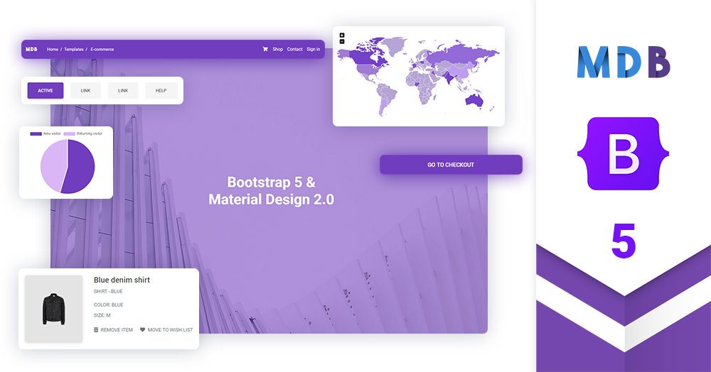
Bootstrap 5 UI KIT - 700+ components, plain JavaScript, MIT license, simple installation.
MDB is a collection of free Bootstrap templates, themes, design tools & resources.
Get started
>> Get Started in 1 minute
Simple installation via .zip, npm or cdnjs.
>> Install with Webpack
This option is useful for experienced developers it enables bundling, unit testing code formatting, linting, saas support & more.
>> Install with MDBGO
Free Hosting, WordPress support, custom domains, SSL support, free database, frontend & backend templates, webpack starter included, git repostiory, FTP & jenkins support.
>> Install with MDBGO + e-commerce shop integration
One click setup! MDB GO allows you to create a WordPress page with a single click. Regardless whether you want to create a Travel Blog or an e-commerce shop to sell your product you can easily do that. You can even combine both into single page.
About Material Design for Bootstrap 5 & Vanilla JavaScript
Trusted by 3 000 000+ developers & designers. Used by companies & institutions like
 |
 |
 |
 |

| 
| 
| 
| 
| 
| 
| 
| 
|
|
|
Bootstrap 5 tutorial
>> Learn more about Bootstrap 5
>> Subscribe to our YouTube channel with dozens of Bootstrap tutorials
|
|
|
Start learning from Basics 
|
Learn Bootstrap 5 | Crash Course for Beginners in 1.5H 
|
Demo
Simplicity and ease of use are key features of MDB 5 UI Kit. You need only one minute to install and run it.
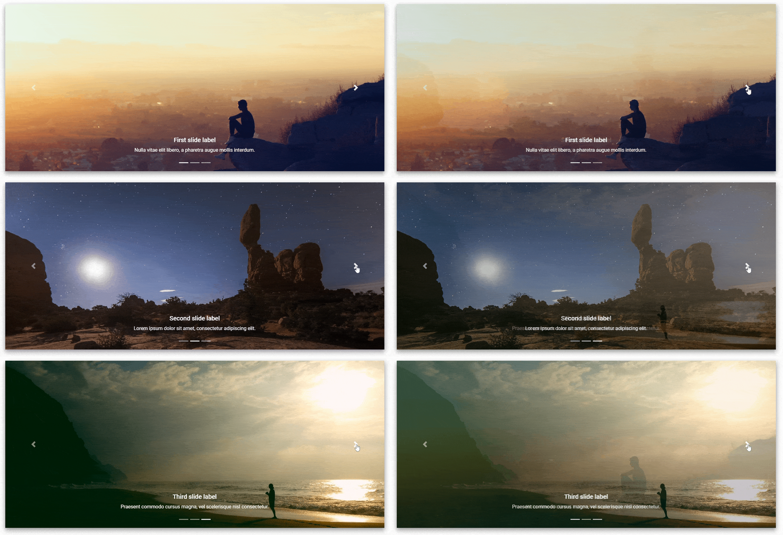
Carousel
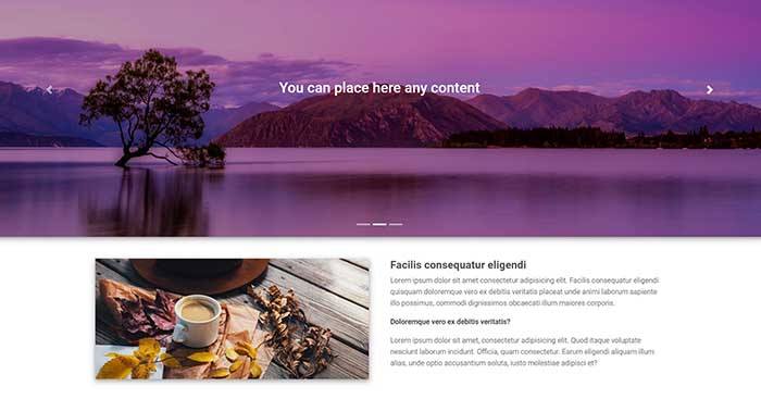
A slideshow component for cycling through elementsâimages or slides of textâlike a carousel.
Buttons
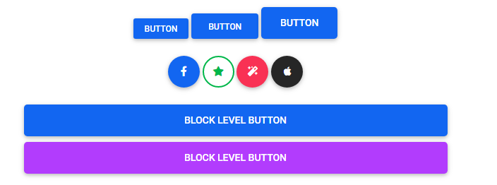
Use MDB custom button styles for actions in forms, dialogs, and more with support for multiple sizes, states, and more.



Spinners
Indicate the loading state of a component or page with MDB spinners, built entirely with HTML, CSS, and no JavaScript.


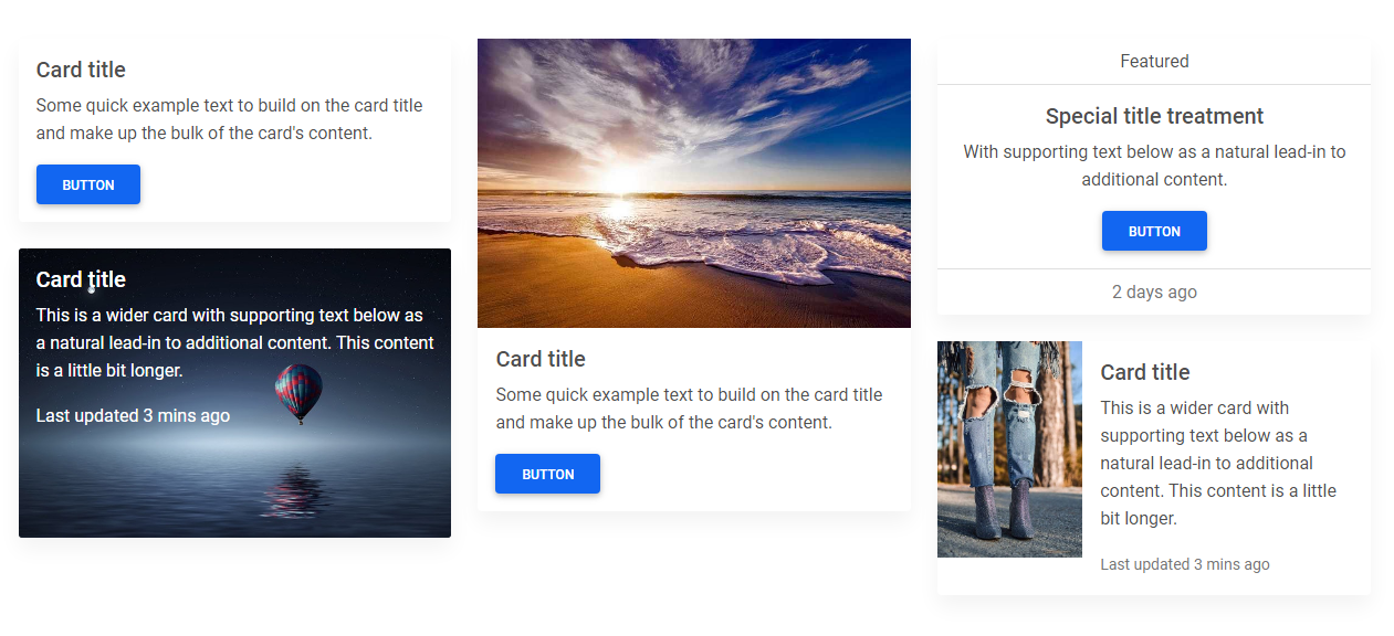
Cards
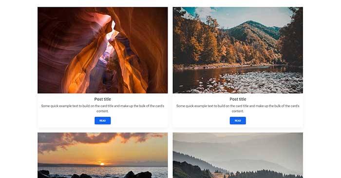
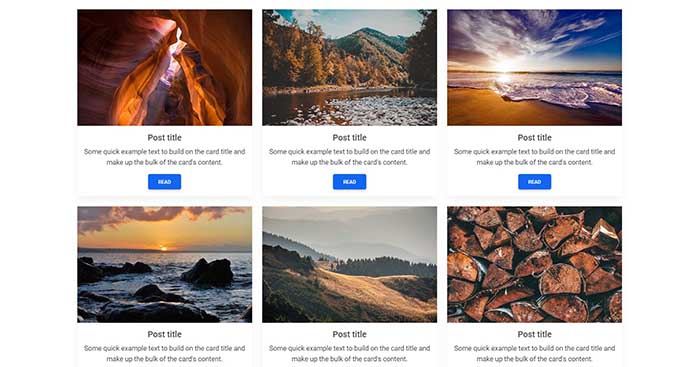
A card is a flexible and extensible content container. It includes options for headers and footers, a wide variety of content, contextual background colors, and powerful display options.
Validation
Provide valuable, actionable feedback to your users with HTML5 form validation, via browser default behaviors or custom styles and JavaScript.


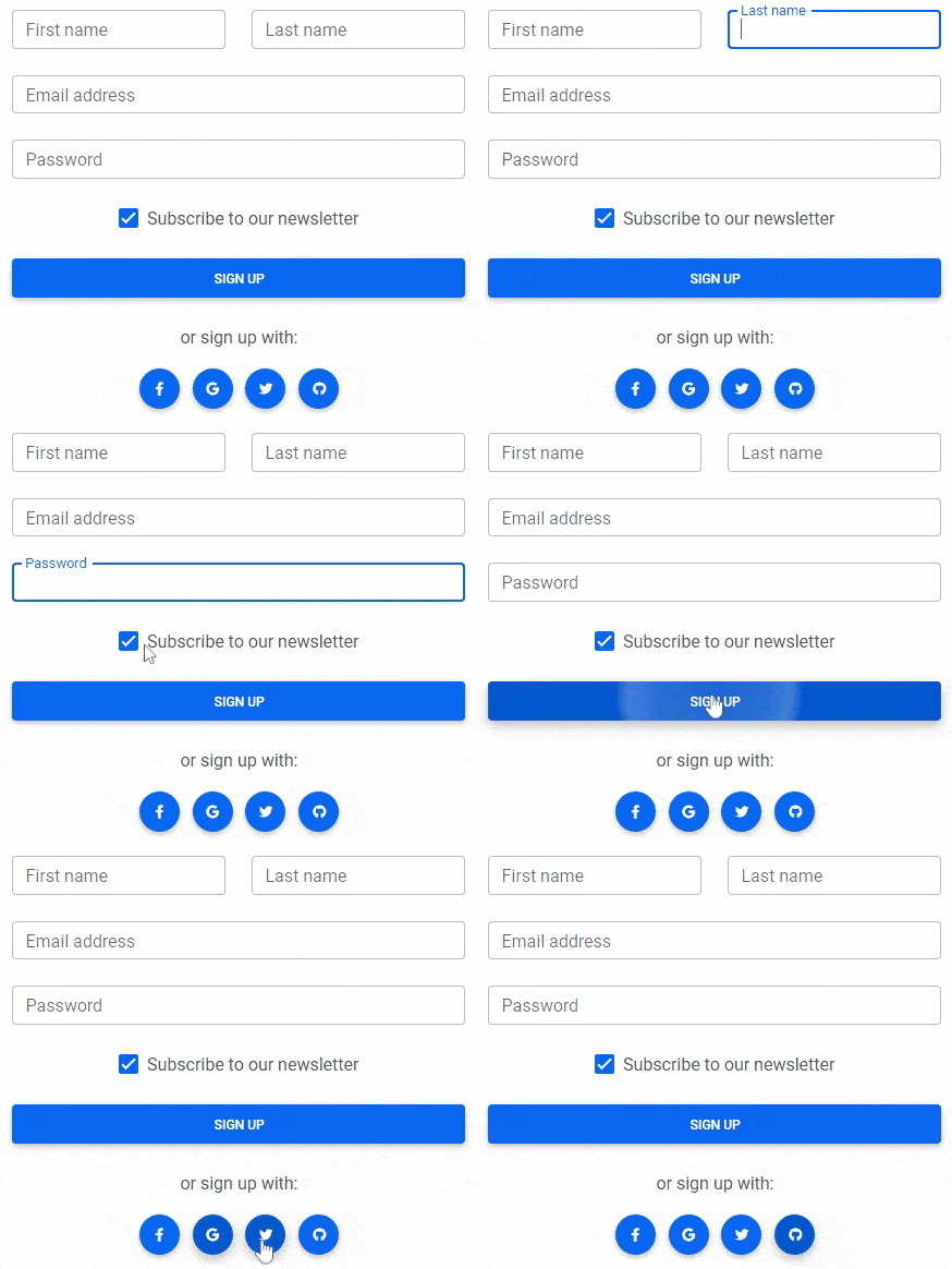
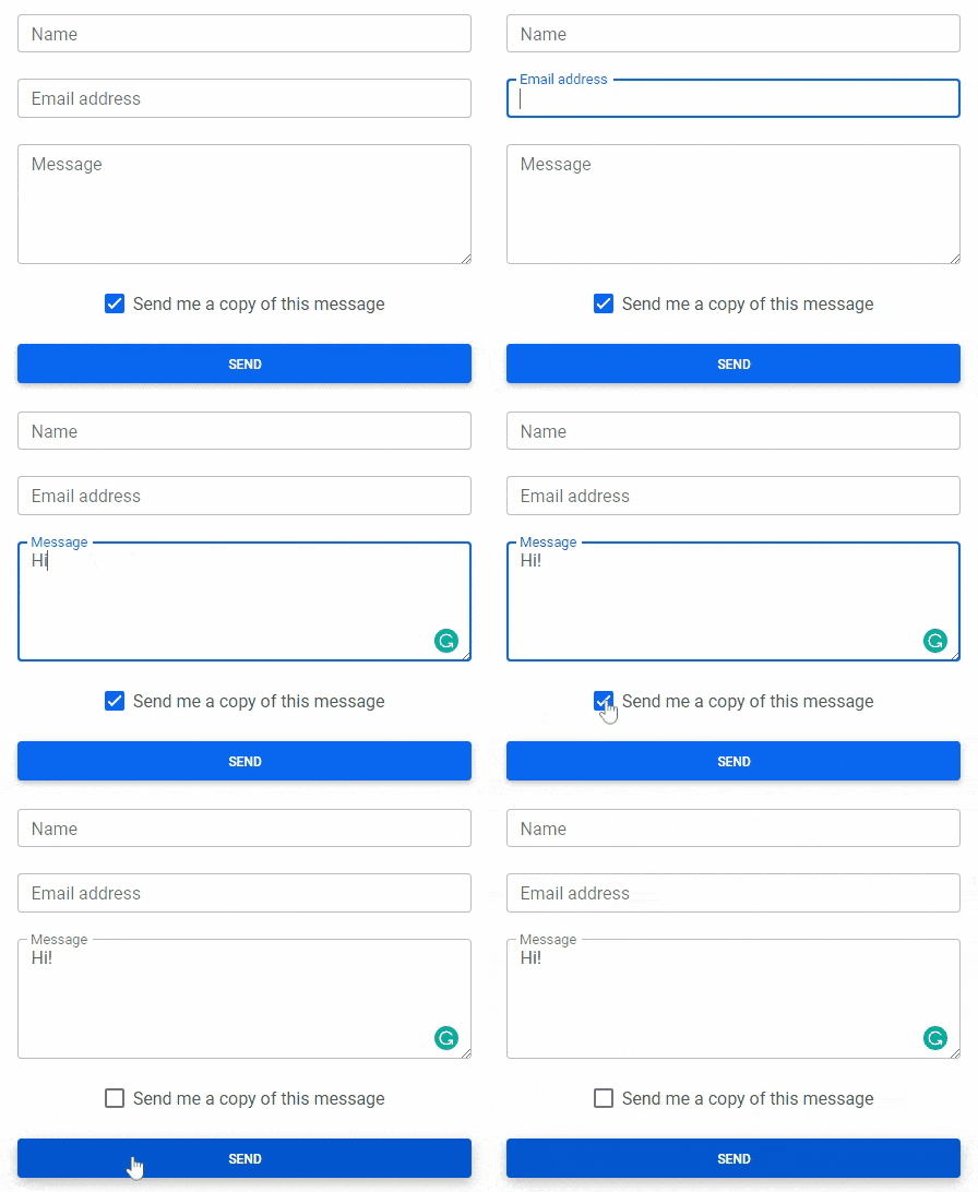
Forms
Examples and usage guidelines for form control styles, layout options, and custom components for creating a wide variety of forms.
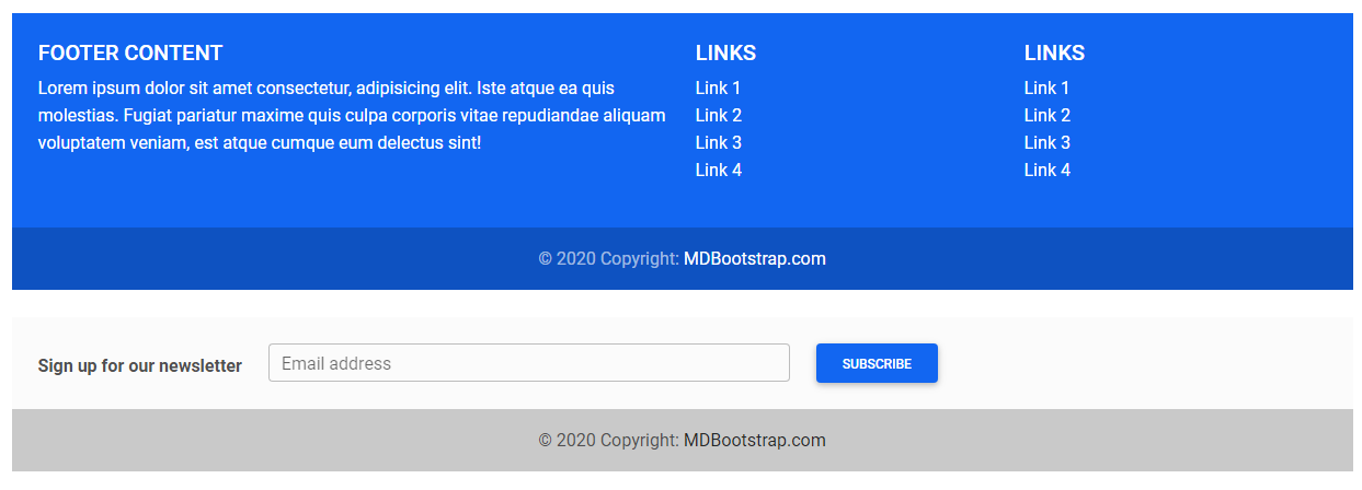
Footer
A footer is an additional navigation component. It can hold links, buttons, company info, copyrights, forms, and many other elements.
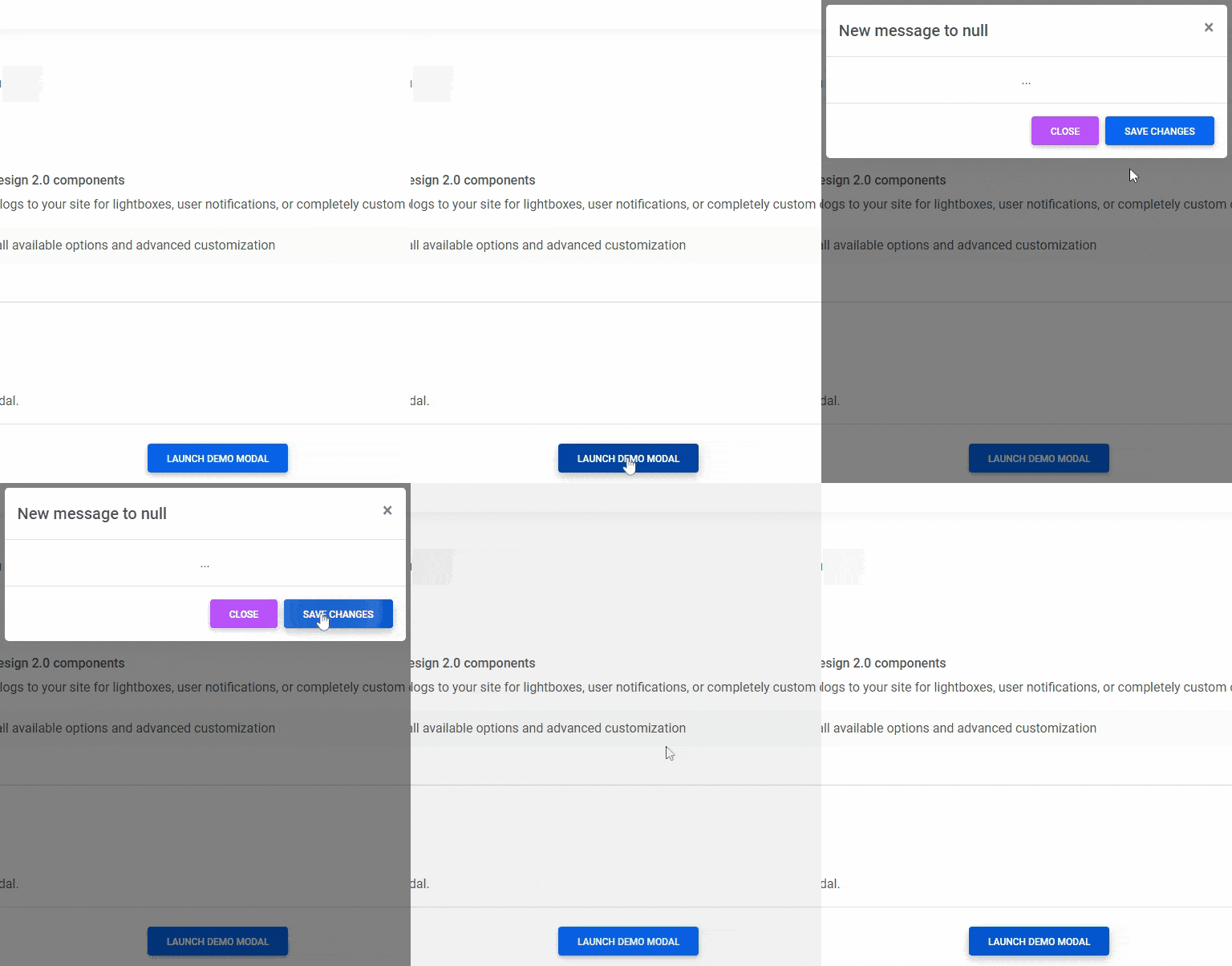
Modal
Use MDB modal plugin to add dialogs to your site for lightboxes, user notifications, or completely custom content.
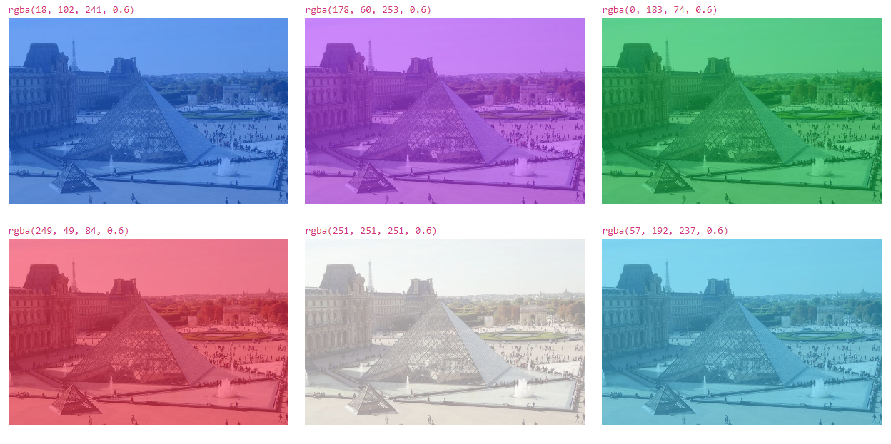
Hover
MDB hover effect appears when the user positions the computer cursor over an element without activating it. Hover effects make a website more interactive.

Tabs
Tabs are quasi-navigation components which can highly improve website clarity and increase user experience.


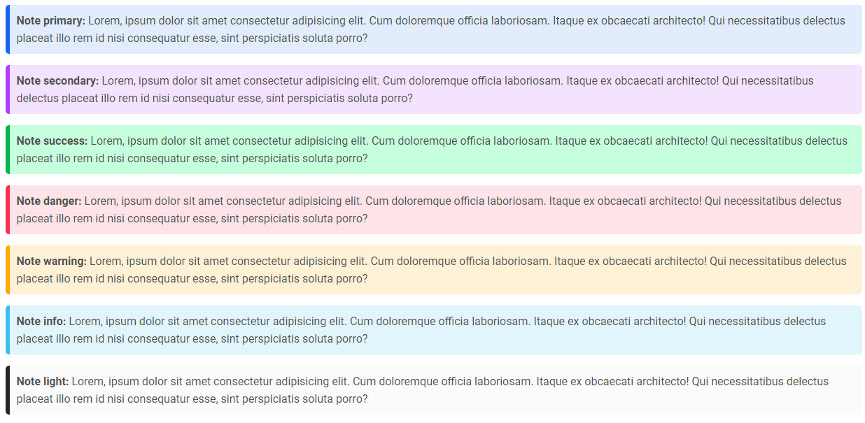
Notes
Notes are small components very helpful in inserting an additional piece of information.
ScrollSpy
Automatically update Bootstrap navigation or list group components based on scroll position to indicate which link is currently active in the viewport.

Also check out our standalone project Perfect Scrollbar which is included in MDB.
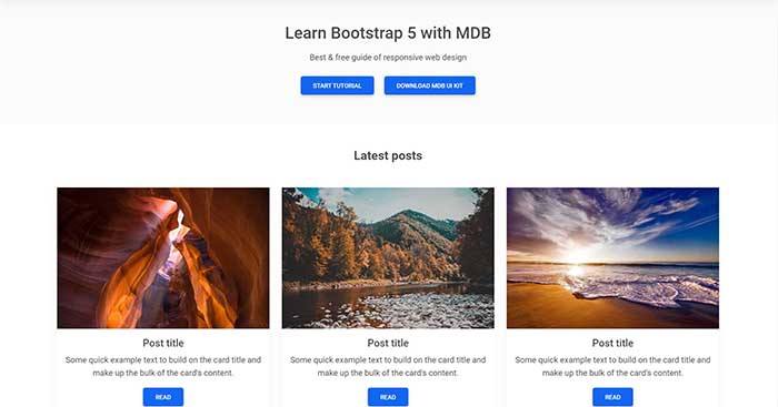
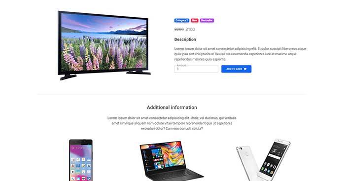
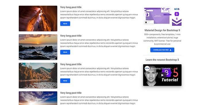
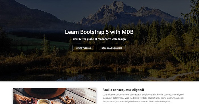
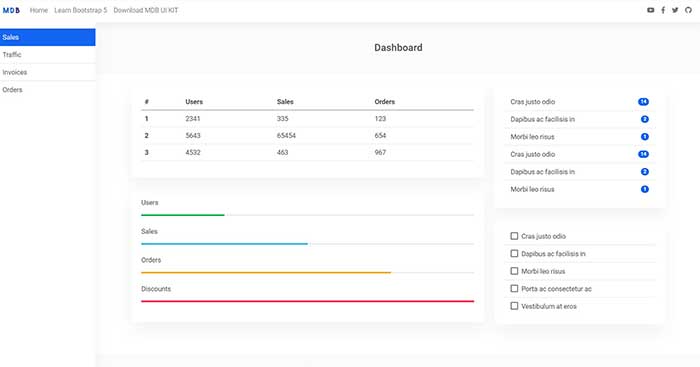
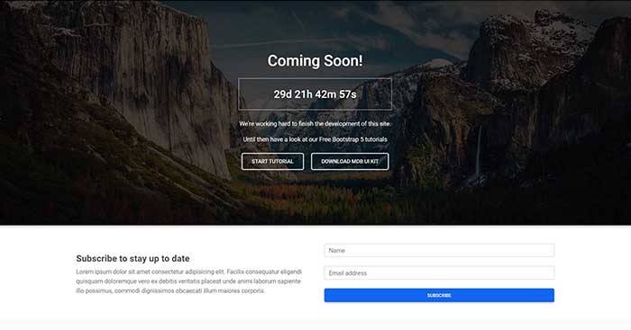
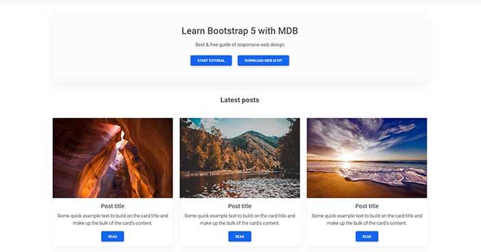
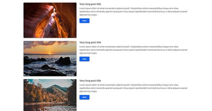
Free Bootstrap 5 templates
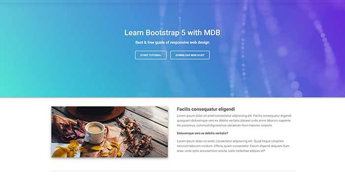
All of the templates were created with MDB 5 UI KIT (Material Design for Bootstrap 5).
MDB is a free (MIT license) library, that provides extra features and significantly extends Bootstrap's capabilities.
Extended documentation
- Bootstrap Address Form
- Bootstrap Avatar
- Bootstrap Back To Top Button
- Bootstrap Carousel Slider with Thumbnails
- Bootstrap Chat
- Bootstrap Code Blocks
- Bootstrap Comments
- Bootstrap Comparison Table
- Bootstrap Credit Card Form
- Bootstrap Drawer
- Bootstrap Nested Dropdown
- Bootstrap FAQ component / section
- Bootstrap Gallery
- Bootstrap Hamburger Menu
- Bootstrap Invoice
- Bootstrap Jumbotron
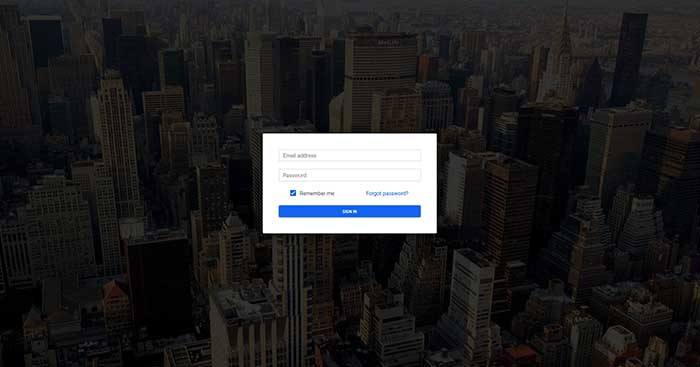
- Bootstrap Login Form
- Bootstrap Maps
- Bootstrap Media Object
- Bootstrap Mega Menu
- Bootstrap Multiselect
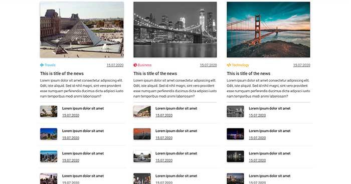
- Bootstrap News Feed
- Bootstrap Offcanvas
- Bootstrap Order Details
- Bootstrap Page Transitions
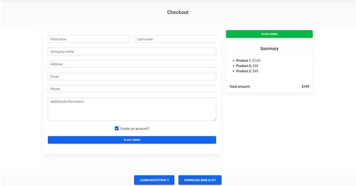
- Bootstrap Payment Forms
- Bootstrap Product Cards
- Bootstrap Profiles
- Bootstrap Quotes
- Bootstrap Registration Form
- Bootstrap Expanding Search Bar
- Bootstrap Shopping Carts
- Bootstrap Side Navbar
- Bootstrap Sidebar
- Bootstrap Social Media Icons & Buttons
- Bootstrap Square Buttons
- Bootstrap Survey Form
- Bootstrap Testimonial Slider
- Bootstrap Testimonials
- Bootstrap Textarea
- Bootstrap Timeline
- Bootstrap To Do List
- Bootstrap Video Carousel / Gallery
- Bootstrap Weather
- Bootstrap Dark Mode
- Bootstrap Padding
- Bootstrap Modal Size
- Bootstrap Modal Show, Close, Hide & Toggle
- Bootstrap Backdrop
- Bootstrap Card Deck
- Bootstrap Table Filter
- Bootstrap Slider
- Bootstrap Logo
- Bootstrap Popup
- Bootstrap Max Width
- Bootstrap Hero
- Bootstrap Select Dropdown
- Bootstrap Labels
- Bootstrap Dialog
- Bootstrap Screen Sizes
- Bootstrap Dropdown Button
- Bootstrap Side Menu
- Bootstrap Table Fixed Header
- Bootstrap Border Radius
- Bootstrap Popover On Hover
- Bootstrap Overlay
- Bootstrap Height
- Bootstrap Widgets
Top Related Projects
The most popular HTML, CSS, and JavaScript framework for developing responsive, mobile first projects on the web.
A utility-first CSS framework for rapid UI development.
Modern CSS framework based on Flexbox
Semantic is a UI component framework based around useful principles from natural language.
The most advanced responsive front-end framework in the world. Quickly create prototypes and production code for sites that work on any kind of device.
A lightweight and modular front-end framework for developing fast and powerful web interfaces
Convert  designs to code with AI

Introducing Visual Copilot: A new AI model to turn Figma designs to high quality code using your components.
Try Visual Copilot


