 obsidian-style-settings
A dynamic user interface for adjusting theme, plugin, and snippet CSS variables within Obsidian
Top Related Projects

A distraction-free and highly customizable theme for Obsidian.
Quick Overview
Obsidian Style Settings is a plugin for the Obsidian note-taking application. It allows theme and plugin developers to define a set of configuration options that users can modify through a graphical interface, enabling easy customization of CSS variables and class toggles without directly editing CSS files.
Pros
- Provides a user-friendly interface for customizing themes and plugins
- Eliminates the need for manual CSS editing, making customization accessible to non-technical users
- Allows theme and plugin developers to offer more flexible and customizable products
- Supports a wide range of setting types, including dropdowns, sliders, and color pickers
Cons
- Requires theme and plugin developers to implement support for the Style Settings plugin
- May increase the complexity of theme and plugin development
- Could potentially lead to inconsistent user experiences across different themes and plugins
- Depends on the Obsidian application and cannot be used independently
Code Examples
As this is a plugin for Obsidian and not a standalone code library, there are no direct code examples to provide. However, theme and plugin developers can define style settings using a JSON structure. Here's a basic example:
{
  "name": "My Theme",
  "id": "my-theme",
  "settings": [
    {
      "id": "accent-color",
      "title": "Accent Color",
      "type": "variable-color",
      "format": "hex",
      "default": "#007AFF"
    }
  ]
}
This example defines a color picker for an accent color in a theme.
Getting Started
To use the Style Settings plugin in Obsidian:
- Open Obsidian and go to Settings > Community Plugins
- Browse for "Style Settings" and install it
- Enable the plugin
- Go to Settings > Style Settings to access the customization options for your installed themes and plugins that support Style Settings
For theme and plugin developers, refer to the project's README for detailed instructions on how to implement Style Settings support in your projects.
Competitor Comparisons
A distraction-free and highly customizable theme for Obsidian.
Pros of Obsidian Minimal
- Offers a clean, minimalist design for Obsidian
- Provides extensive customization options through its settings panel
- Includes light and dark themes out of the box
Cons of Obsidian Minimal
- May require more setup time to achieve desired look
- Some users might find the default minimal style too sparse
- Less flexibility for custom CSS snippets compared to Style Settings
Code Comparison
Obsidian Minimal (CSS variable example):
:root {
  --font-normal: 16px;
  --font-small: 13px;
  --font-title-h1: 28px;
}
Style Settings (JSON configuration example):
{
  "name": "Typography",
  "settings": [
    {
      "id": "header-font-size",
      "title": "Header Font Size",
      "type": "variable-number",
      "default": 16
    }
  ]
}
While Obsidian Minimal focuses on providing a pre-designed minimal theme with customization options, Style Settings offers a framework for theme developers to expose customizable settings to users. Obsidian Minimal is more suitable for users seeking a ready-to-use minimal design, while Style Settings provides greater flexibility for theme creators and users who want to fine-tune various themes.
Convert  designs to code with AI

Introducing Visual Copilot: A new AI model to turn Figma designs to high quality code using your components.
Try Visual CopilotREADME
Obsidian Style Settings Plugin
This plugin allows snippet, theme, and plugin CSS files to define a set of configuration options. It then allows users to see all the tweakable settings in one settings pane. Style Settings allows both toggling classes on and off the body element, as well as setting numeric, string, and color CSS variables.
This CSS Snippet can be used to adjust every CSS variable of the default Obsidian theme.
Configurable settings are defined by comments within CSS files beginning with /* @settings. These comments must contain YAML with name, id, and settings properties. Style Settings will scan for these comments in all CSS loaded by Obsidian from the snippets, themes, and plugins directories under your vault's configuration directory (%yourVault%/.obsidian/). Please see the Obsidian Docs for more information.
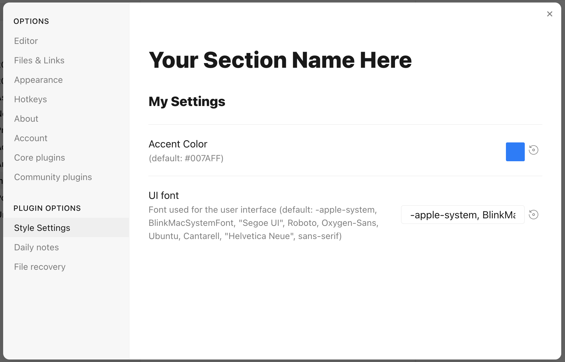
For example, adding this to a CSS snippet in your vault's snippets directory (%yourVault%/.obsidian/snippets):
/* @settings

name: Your Section Name Here
id: a-unique-id
settings:
    -
        id: my-title
        title: My Settings
        type: heading
        level: 3
    -
        id: accent
        title: Accent Color
        type: variable-color
        format: hsl-split
        default: '#007AFF'
    -
        id: text
        title: UI font
        description: Font used for the user interface
        type: variable-text
        default: -apple-system, BlinkMacSystemFont, "Segoe UI", Roboto, Oxygen-Sans, Ubuntu, Cantarell, "Helvetica Neue", sans-serif

*/
will result in:
Each setting definition must be separated by a dash (-). There are 7 setting types.
All settings definitions must have these parameters:
id: A unique id for the setting parametertitle: The name of the settingdescription(optional): a description of the settingtype: The type of setting. Can be one of:heading: a heading element for organizing settingsclass-toggle: a switch to toggle classes on thebodyelementclass-select: a dropdown menu of predefined options to add classes on thebodyelementvariable-text: a text-based CSS variablevariable-number: a numeric CSS variablevariable-number-slider: a numeric CSS variable represented by a slidervariable-select: a text-based CSS variable displayed as a dropdown menu of predefined optionsvariable-color: a color CSS variable with corresponding color picker
heading
headings can be used to organize and group settings into collapsable nested sections. Along with the required attributes, headings must contain a level attribute between 1 and 6, and can optionally contain a collapsed attribute:
/* @settings

name: Your Section Name Here
id: a-unique-id
settings:
    -
        id: this-is-a-heading
        title: My Heading
        type: heading
        level: 2
        collapsed: true

*/
info-text
info-text displays arbitrary informational text to users. The description may contain markdown if markdown is set to true.
/* @settings

name: Your Section Name Here
id: a-unique-id
settings:
    -
        id: my-info-text
        title: Information
        description: "This is *informational* text"
        type: info-text
        markdown: true

*/
class-toggle
class-toggles will toggle a css class on and off of the body element, allowing CSS themes and snippets to toggle features on and off. The id of the setting will be used as the class name. The default parameter can optionally be set to true. class-toggle also supports the addCommand property. When set to true a command will be added to obsidian to toggle the class via a hotkey or the command palette.
/* @settings

name: Your Section Name Here
id: a-unique-id
settings:
    -
        id: my-css-class
        title: My Toggle
        description: Adds my-css-class to the body element
        type: class-toggle

*/
class-select
class-select creates a dropdown of predefined options for a CSS variable. The id of the setting will be used as the variable name.
- When
allowEmptyisfalse, adefaultoption must be specified. - When
allowEmptyistrue, thedefaultattribute is optional, and may be set tonone.
/* @settings

name: Your Section Name Here
id: a-unique-id
settings:
    -
        id: theme-variant
        title: Theme variant
        description: Variations on a theme
        type: class-select
        allowEmpty: false
        default: my-class
        options:
            - my-class
            - my-other-class
            - and-yet-another

*/
Options may also be given a label:
/* @settings

name: Your Section Name Here
id: a-unique-id
settings:
    -
        id: theme-variant
        title: Theme variant
        description: Variations on a theme
        type: class-select
        allowEmpty: false
        default: my-class
        options:
            -
                label: My Class
                value: my-class
            -
                label: My Other Class
                value: my-other-class
*/
variable-text
variable-text represents any text based CSS value. The id of the setting will be used as the variable name. The output will be wrapped in quotes if quotes is set to true. variable-text settings require a default attribute.
/* @settings

name: Your Section Name Here
id: a-unique-id
settings:
    -
        id: text
        title: UI font
        description: Font used for the user interface
        type: variable-text
        default: -apple-system, BlinkMacSystemFont, "Segoe UI", Roboto, Oxygen-Sans, Ubuntu, Cantarell, "Helvetica Neue", sans-serif

*/
This will output the variable:
--text: -apple-system, BlinkMacSystemFont, "Segoe UI", Roboto, Oxygen-Sans, Ubuntu, Cantarell, "Helvetica Neue", sans-serif;
Using quotes:
/* @settings
name: Your Section Name Here
id: a-unique-id
settings:
-
id: icon
title: Bullet Icon
description: Text used in bullet points
type: variable-text
default: â¢
quotes: true
*/
This will output the variable:
--icon: 'â¢'
variable-number
variable-number represents any numeric CSS value. The id of the setting will be used as the variable name. variable-number settings require a default attribute. Optionally, a format attribute can be set. This value will be appended to the number. Eg format: px will result in 42px
/* @settings

name: Your Section Name Here
id: a-unique-id
settings:
    -
        id: line-width
        title: Line width
        description: The maximum line width in rem units
        type: variable-number
        default: 42
        format: rem

*/
This will output the variable:
--line-width: 42rem;
variable-number-slider
variable-number-slider represents any numeric CSS value. The id of the setting will be used as the variable name. variable-number-slider settings require a default attribute, as well as these three attributes:
min: The minimum possible value of the slidermax: The maximum possible value of the sliderstep: The size of each "tick" of the slider. For example, a step of 100 will only allow the slider to move in increments of 100.
Optionally, a format attribute can be set. This value will be appended to the number. Eg format: px will result in 42px
/* @settings

name: Your Section Name Here
id: a-unique-id
settings:
    -
        id: line-width
        title: Line width
        description: The maximum line width in rem units
        type: variable-number-slider
        default: 42
        min: 10
        max: 100
        step: 1

*/
This will output the variable:
--line-width: 42;
variable-select
variable-select creates a dropdown of predefined options for a CSS variable. The id of the setting will be used as the variable name. variable-select settings require a default attribute as well as a list of options.
/* @settings

name: Your Section Name Here
id: a-unique-id
settings:
    -
        id: text
        title: UI font
        description: Font used for the user interface
        type: variable-select
        default: Roboto
        options:
            - Roboto
            - Helvetica Neue
            - sans-serif
            - Segoe UI

*/
Options can optionally be given a label:
/* @settings

name: Your Section Name Here
id: a-unique-id
settings:
    -
        id: text
        title: UI font
        description: Font used for the user interface
        type: variable-select
        default: Roboto
        options:
            -
                label: The best font
                value: Roboto
            -
                label: The next best font
                value: Helvetica Neue
*/
This will output the variable:
--text: Roboto;
variable-color
variable-color creates a color picker with a variety of output format options. A default attribute is required in hex or rgb format. Note: hex color values must be wrapped in quotes. A format attribute is also required.
Optional parameters:
- Setting
opacitytotruewill enable opacity support in all output formats. - A list of alternate output formats can be supplied via the
alt-formatsetting
/* @settings

name: Your Section Name Here
id: a-unique-id
settings:
    -
        id: accent
        title: Accent Color
        type: variable-color
        opacity: false
        format: hex
        alt-format:
            -
                id: accent-rgb
                format: rgb
        default: '#007AFF'

*/
This will output the variable:
--accent: #007AFF;
--accent-rgb: rgb(0, 123, 255);
variable-themed-color
variable-themed-color is identical to variable-color except that it generates two color pickers for a light and dark variant.
/* @settings

name: Your Section Name Here
id: a-unique-id
settings:
    -
        id: accent
        title: Accent Color
        type: variable-themed-color
        format: hex
        opacity: false
        default-light: '#007AFF'
        default-dark: '#2DB253'

*/
This will output the variables:
body.theme-light.css-settings-manager { --accent: #007AFF; }
body.theme-dark.css-settings-manager { --accent: #2DB253; }
variable-color formatting options
There are 8 formatting options:
hex
--accent: #007AFF;
When opacity is set to true:
--accent: #007AFFFF;
rgb
--accent: rgb(0, 122, 255);
When opacity is set to true:
--accent: rgba(0, 122, 255, 1);
rgb-values
--accent: 0, 122, 255;
When opacity is set to true:
--accent: 0, 122, 255, 1;
rgb-split
--accent-r: 0;
--accent-g: 122;
--accent-b: 255;
When opacity is set to true:
--accent-r: 0;
--accent-g: 122;
--accent-b: 255;
--accent-a: 1;
hsl
--accent: hsl(211, 100%, 50%);
When opacity is set to true:
--accent: hsla(211, 100%, 50%, 1);
hsl-values
--accent: 211, 100%, 50%;
When opacity is set to true:
--accent: 211, 100%, 50%, 1;
hsl-split
--accent-h: 211;
--accent-s: 100%;
--accent-l: 50%;
When opacity is set to true:
--accent-h: 211;
--accent-s: 100%;
--accent-l: 50%;
--accent-a: 1;
hsl-split-decimal
--accent-h: 211;
--accent-s: 1;
--accent-l: 0.5;
When opacity is set to true:
--accent-h: 211;
--accent-s: 1;
--accent-l: 0.5;
--accent-a: 1;
color-gradient
color-gradient outputs a fixed number of colors along a gradient between two existing color variables. A format attribute is also required. Note: The to variable must be set in style settings for the gradient to be generated. Also, gradients will only be generated using colors defined under the current style settings id.
Parameters:
from: The starting color, or color that will be at step 0to: The ending color, or color that will be at step 100step: The increment at which to output a CSS variable. For example, settingstepto10will output--var-0,--var-10,--var-20, etc...format: Can be one of:hsl,rgb, orhex;pad?: When set, the number section of the variable will be padded with0's until it contains this number of digits. For example, settingpadto3andstepto10will output--var-000,--var-010,--var-020
/* @settings

name: Your Section Name Here
id: a-unique-id
settings:
    -
        id: color-base
        type: color-gradient
        from: color-base-00
        to: color-base-100
        step: 5
        pad: 2
        format: hex

*/
Plugin Support
Plugins can specify a style setting config in the plugin's CSS. Plugins must call app.workspace.trigger("parse-style-settings") when the plugin loads in order for Style Settings to be notified of CSS changes.
Localization Support
Translations for titles and descriptions can be supplied for each language Obsidian supports by using one of the following postfixes:
en: English
zh: ç®ä½ä¸æ
zh-TW: ç¹é«ä¸æ
ru: PÑÑÑкий
ko: íêµì´
it: Italiano
id: Bahasa Indonesia
ro: RomânÄ
pt-BR: Portugues do Brasil
cz: ÄeÅ¡tina
de: Deutsch
es: Español
fr: Français
no: Norsk
pl: jÄzyk polski
pt: Português
ja: æ¥æ¬èª
da: Dansk
uk: УкÑаÑнÑÑкий
sq: Shqip
tr: Türkçe (kısmi)
hi: हिनà¥à¤¦à¥ (à¤à¤à¤¶à¤¿à¤)
nl: Nederlands (gedeeltelijk)
ar: اÙعربÙØ© (جزئÙ)
For example:
/* @settings
name: Your Section Name Here
id: a-unique-id
settings:
-
id: my-css-class
title: My Toggle
title.de: Mein Toggle
title.ko: ë´ í ê¸
description: Adds my-css-class to the body element
description.de: Fügt my-css-class zum body-Element hinzu
description.ko: my-css-class를 body ììì ì¶ê°í©ëë¤.
type: class-toggle
*/
Top Related Projects
A distraction-free and highly customizable theme for Obsidian.
Convert designs to code with AI
Introducing Visual Copilot: A new AI model to turn Figma designs to high quality code using your components.
Try Visual Copilot