Top Related Projects
Color scheme for UI design.
🧛🏻♂️ One theme. All platforms.
😸 Soothing pastel theme for the high-spirited!
A utility-first CSS framework for rapid UI development.
Quick Overview
mrmrs/colors is a lightweight CSS color library that provides a set of predefined color classes. It offers a simple and efficient way to apply consistent colors across web projects, making it easy to maintain a cohesive color scheme without writing custom CSS for each color.
Pros
- Lightweight and minimal, with a small file size
- Easy to use and implement in projects
- Provides a wide range of color options
- Consistent naming convention for color classes
Cons
- Limited customization options without modifying the source
- May not cover all specific color needs for complex projects
- Potential for class name conflicts in larger projects
- Lack of recent updates or maintenance
Code Examples
- Applying text color:
<p class="blue">This text is blue</p>
<span class="red">This text is red</span>
- Setting background color:
<div class="bg-yellow">
  This div has a yellow background
</div>
- Combining text and background colors:
<button class="white bg-navy">
  White text on navy background
</button>
Getting Started
- Include the colors.css file in your HTML:
<link rel="stylesheet" href="https://unpkg.com/mrmrs-colors@1.0.0/css/colors.css">
- Use the color classes in your HTML elements:
<h1 class="blue">Blue Heading</h1>
<p class="gray">Gray paragraph text</p>
<div class="bg-silver">
  <p class="navy">Navy text on silver background</p>
</div>
That's it! You can now use the color classes provided by mrmrs/colors in your project.
Competitor Comparisons
Color scheme for UI design.
Pros of Open Color
- More extensive color palette with 13 hues and 10 shades each
- Includes accessibility information for color combinations
- Provides color values in various formats (HEX, RGB, HSL)
Cons of Open Color
- Larger file size due to more extensive color options
- May require more time to choose appropriate colors from the wider selection
- Less straightforward implementation compared to Colors' simpler approach
Code Comparison
Open Color:
.button {
  background-color: var(--oc-blue-5);
  color: var(--oc-gray-0);
}
Colors:
.button {
  background-color: var(--blue);
  color: var(--white);
}
Summary
Open Color offers a more comprehensive color system with accessibility considerations, while Colors provides a simpler, more straightforward approach. Open Color's extensive palette allows for greater flexibility but may require more effort to implement effectively. Colors, on the other hand, offers a more streamlined solution with fewer options, which can be beneficial for quick prototyping or simpler projects. The choice between the two depends on the specific needs of the project, with Open Color being more suitable for complex designs requiring fine-tuned color control, and Colors being ideal for rapid development or projects with simpler color requirements.
🧛🏻♂️ One theme. All platforms.
Pros of Dracula Theme
- Comprehensive theme support for 200+ applications and platforms
- Active community with regular updates and contributions
- Consistent dark theme design across various environments
Cons of Dracula Theme
- More complex implementation due to its extensive coverage
- Larger file size and codebase compared to Colors
- Less flexibility for customization in some applications
Code Comparison
Dracula Theme (example for VS Code):
{
  "name": "Dracula",
  "colors": {
    "editor.background": "#282a36",
    "editor.foreground": "#f8f8f2",
    "activityBarBadge.background": "#ff79c6",
    "sideBarTitle.foreground": "#bd93f9"
  }
}
Colors:
.navy { color: #001F3F; }
.blue { color: #0074D9; }
.aqua { color: #7FDBFF; }
.teal { color: #39CCCC; }
.olive { color: #3D9970; }
Colors provides a simple, lightweight color palette for web development, while Dracula Theme offers a comprehensive, dark theme solution for multiple applications and platforms. Colors is more focused on providing a set of predefined colors for quick use in web projects, whereas Dracula Theme aims to create a consistent visual experience across various development environments.
😸 Soothing pastel theme for the high-spirited!
Pros of Catppuccin
- Offers multiple color palettes with different themes (Latte, Frappé, Macchiato, Mocha)
- Provides extensive integration with various applications and tools
- Actively maintained with frequent updates and community contributions
Cons of Catppuccin
- More complex implementation due to multiple themes and integrations
- Larger file size and more extensive codebase
- May require more setup time for customization
Code Comparison
Colors:
.navy { color: #001F3F; }
.blue { color: #0074D9; }
.aqua { color: #7FDBFF; }
Catppuccin (Mocha theme):
.blue { color: #89b4fa; }
.lavender { color: #b4befe; }
.sapphire { color: #74c7ec; }
Summary
Colors is a simpler, more straightforward color palette with a focus on basic CSS implementation. Catppuccin offers a more comprehensive theming system with multiple palettes and extensive integrations, but may require more setup and customization. Colors is ideal for quick, basic color implementations, while Catppuccin is better suited for projects requiring detailed theming across various applications and tools.
A utility-first CSS framework for rapid UI development.
Pros of Tailwind CSS
- Comprehensive utility-first CSS framework with a wide range of pre-built classes
- Highly customizable with a configuration file for tailoring to project needs
- Active development and large community support
Cons of Tailwind CSS
- Steeper learning curve due to the extensive class system
- Potentially larger initial file size before optimization
- May lead to longer class strings in HTML markup
Code Comparison
Tailwind CSS:
<button class="bg-blue-500 hover:bg-blue-700 text-white font-bold py-2 px-4 rounded">
  Button
</button>
Colors:
.bg-blue { background-color: #0074D9; }
.white { color: #fff; }
.btn { /* Button styles */ }
<button class="bg-blue white btn">Button</button>
Summary
Tailwind CSS offers a more comprehensive utility-first approach with extensive customization options, while Colors provides a simpler, more focused color palette system. Tailwind CSS has a steeper learning curve but offers more flexibility, whereas Colors is easier to grasp but may require more custom CSS for complex designs. The choice between the two depends on project requirements and team preferences.
Convert  designs to code with AI

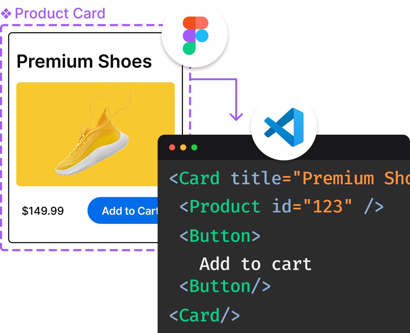
Introducing Visual Copilot: A new AI model to turn Figma designs to high quality code using your components.
Try Visual CopilotREADME
colors.css 3.0.0
Better default colors for the web. A collection of skin classes for faster prototyping and nicer looking sites.
Customize your own defaults here.
Stats
| 903 | 85 | 85 |
|---|---|---|
| bytes | selectors | declarations |
Installation
With npm
npm install --save-dev colors.css
With Git
git clone https://github.com/tachyons-css/colors.css
Usage
Using with PostCSS
Import the css module
@import "colors.css";
Then process the CSS using the tachyons-cli
$ npm i -g tachyons-cli
$ tachyons-cli path/to/css-file.css > dist/t.css
Using the CSS
The built CSS is located in the css directory. It contains an unminified and minified version.
You can either cut and paste that css or link to it directly in your html.
<link rel="stylesheet" href="path/to/module/css/colors.css">
Development
The source CSS files can be found in the src directory.
Running $ npm start will process the source CSS and place the built CSS in the css directory.
The CSS
/*

  COLORS
  Better default colors for the web

*/
/*

   VARIABLES

   - Cool
   - Warm
   - Gray Scale

*/
/*

   SKINS
   - Backgrounds
   - Colors
   - Border colors
   - SVG fills
   - SVG Strokes

*/
/* Backgrounds */
.bg-navy { background-color: #001F3F; }
.bg-blue { background-color: #0074D9; }
.bg-aqua { background-color: #7FDBFF; }
.bg-teal { background-color: #39CCCC; }
.bg-olive { background-color: #3D9970; }
.bg-green { background-color: #2ECC40; }
.bg-lime { background-color: #01FF70; }
.bg-yellow { background-color: #FFDC00; }
.bg-orange { background-color: #FF851B; }
.bg-red { background-color: #FF4136; }
.bg-fuchsia { background-color: #F012BE; }
.bg-purple { background-color: #B10DC9; }
.bg-maroon { background-color: #85144B; }
.bg-white { background-color: #FFFFFF; }
.bg-gray { background-color: #AAAAAA; }
.bg-silver { background-color: #DDDDDD; }
.bg-black { background-color: #111111; }
/* Colors */
.navy { color: #001F3F; }
.blue { color: #0074D9; }
.aqua { color: #7FDBFF; }
.teal { color: #39CCCC; }
.olive { color: #3D9970; }
.green { color: #2ECC40; }
.lime { color: #01FF70; }
.yellow { color: #FFDC00; }
.orange { color: #FF851B; }
.red { color: #FF4136; }
.fuchsia { color: #F012BE; }
.purple { color: #B10DC9; }
.maroon { color: #85144B; }
.white { color: #FFFFFF; }
.silver { color: #DDDDDD; }
.gray { color: #AAAAAA; }
.black { color: #111111; }
/* Border colors

   Use with another border utility that sets border-width and style
   i.e .border { border-width: 1px); border-style: solid); }
*/
.border--navy { border-color: #001F3F; }
.border--blue { border-color: #0074D9; }
.border--aqua { border-color: #7FDBFF; }
.border--teal { border-color: #39CCCC; }
.border--olive { border-color: #3D9970; }
.border--green { border-color: #2ECC40; }
.border--lime { border-color: #01FF70; }
.border--yellow { border-color: #FFDC00; }
.border--orange { border-color: #FF851B; }
.border--red { border-color: #FF4136; }
.border--fuchsia { border-color: #F012BE; }
.border--purple { border-color: #B10DC9; }
.border--maroon { border-color: #85144B; }
.border--white { border-color: #FFFFFF; }
.border--gray { border-color: #AAAAAA; }
.border--silver { border-color: #DDDDDD; }
.border--black { border-color: #111111; }
/* Fills for SVG */
.fill-navy { fill: #001F3F; }
.fill-blue { fill: #0074D9; }
.fill-aqua { fill: #7FDBFF; }
.fill-teal { fill: #39CCCC; }
.fill-olive { fill: #3D9970; }
.fill-green { fill: #2ECC40; }
.fill-lime { fill: #01FF70; }
.fill-yellow { fill: #FFDC00; }
.fill-orange { fill: #FF851B; }
.fill-red { fill: #FF4136; }
.fill-fuchsia { fill: #F012BE; }
.fill-purple { fill: #B10DC9; }
.fill-maroon { fill: #85144B; }
.fill-white { fill: #FFFFFF; }
.fill-gray { fill: #AAAAAA; }
.fill-silver { fill: #DDDDDD; }
.fill-black { fill: #111111; }
/* Strokes for SVG */
.stroke-navy { stroke: #001F3F; }
.stroke-blue { stroke: #0074D9; }
.stroke-aqua { stroke: #7FDBFF; }
.stroke-teal { stroke: #39CCCC; }
.stroke-olive { stroke: #3D9970; }
.stroke-green { stroke: #2ECC40; }
.stroke-lime { stroke: #01FF70; }
.stroke-yellow { stroke: #FFDC00; }
.stroke-orange { stroke: #FF851B; }
.stroke-red { stroke: #FF4136; }
.stroke-fuchsia { stroke: #F012BE; }
.stroke-purple { stroke: #B10DC9; }
.stroke-maroon { stroke: #85144B; }
.stroke-white { stroke: #FFFFFF; }
.stroke-gray { stroke: #AAAAAA; }
.stroke-silver { stroke: #DDDDDD; }
.stroke-black { stroke: #111111; }
More Open Source Color Systems
- LCH - Natural
- LCH - B-Spline
- LCH - Linear
- LCH - Monotone
- LAB - Natural
- LAB - B-Spline
- LAB - Linear
- LAB - Monotone
- RGB - Natural
- RGB - B-Spline
- RGB - Linear
- RGB - Monotone
Contributing
- Fork it
- Create your feature branch (
git checkout -b my-new-feature) - Commit your changes (
git commit -am 'Add some feature') - Push to the branch (
git push origin my-new-feature) - Create new Pull Request
Authors
License
MIT
Top Related Projects
Color scheme for UI design.
🧛🏻♂️ One theme. All platforms.
😸 Soothing pastel theme for the high-spirited!
A utility-first CSS framework for rapid UI development.
Convert  designs to code with AI

Introducing Visual Copilot: A new AI model to turn Figma designs to high quality code using your components.
Try Visual Copilot