 solved-by-flexbox
A showcase of problems once hard or impossible to solve with CSS alone, now made trivially easy with Flexbox.
Top Related Projects
A simple guide to HTML <head> elements
A modern alternative to CSS resets
A professional front-end template for building fast, robust, and adaptable web apps or sites.
The most popular HTML, CSS, and JavaScript framework for developing responsive, mobile first projects on the web.
A utility-first CSS framework for rapid UI development.
Modern CSS framework based on Flexbox
Quick Overview
Solved by Flexbox is a project showcasing how common CSS layout problems can be solved using Flexbox. It provides practical examples and demonstrations of Flexbox's capabilities, helping developers understand and implement flexible layouts more effectively.
Pros
- Offers real-world examples of Flexbox solutions
- Provides clear, interactive demonstrations
- Helps developers learn and adopt Flexbox techniques
- Regularly updated to reflect modern CSS practices
Cons
- Focuses solely on Flexbox, not covering other layout methods
- May not cover extremely complex layout scenarios
- Requires basic understanding of CSS to fully benefit
- Some examples might not be compatible with very old browsers
Code Examples
- Basic Flexbox container:
.flex-container {
  display: flex;
  justify-content: space-between;
  align-items: center;
}
This code creates a flex container with items spaced evenly and vertically centered.
- Flex item with grow and shrink properties:
.flex-item {
  flex: 1 0 auto;
}
This code makes a flex item grow to fill available space but not shrink below its base size.
- Responsive flex layout:
.responsive-layout {
  display: flex;
  flex-wrap: wrap;
}

.responsive-layout > * {
  flex: 1 1 300px;
}
This code creates a responsive layout where items wrap and have a minimum width of 300px.
Getting Started
To use the Solved by Flexbox examples:
- Visit the project website: https://philipwalton.github.io/solved-by-flexbox/
- Browse through the various examples and their explanations
- Inspect the source code of each example to understand the implementation
- Copy and adapt the relevant CSS to your own projects
- Experiment with the properties to customize the layout for your needs
For a local copy of the project:
git clone https://github.com/philipwalton/solved-by-flexbox.git
cd solved-by-flexbox
npm install
npm start
This will set up the project locally and start a development server, allowing you to explore and modify the examples.
Competitor Comparisons
A simple guide to HTML <head> elements
Pros of HEAD
- Comprehensive list of HTML head elements and meta tags
- Regularly updated with modern web standards and best practices
- Serves as a quick reference guide for developers
Cons of HEAD
- Focuses solely on HTML head elements, not addressing layout challenges
- Lacks practical examples or demonstrations of implementation
- Does not provide solutions for specific CSS layout problems
Code Comparison
HEAD:
<meta charset="utf-8">
<meta name="viewport" content="width=device-width, initial-scale=1">
<title>Page Title</title>
Solved by Flexbox:
.container {
  display: flex;
  flex-wrap: wrap;
  justify-content: space-between;
}
Summary
HEAD is a valuable resource for HTML head element best practices, while Solved by Flexbox offers practical solutions for CSS layout challenges using Flexbox. HEAD provides a comprehensive list of meta tags and head elements, making it an excellent reference for developers. On the other hand, Solved by Flexbox demonstrates how to solve common layout problems using Flexbox, with live examples and explanations.
While both repositories serve different purposes, they complement each other in web development. HEAD ensures proper document setup and metadata, while Solved by Flexbox addresses layout and design implementation. Developers may find both repositories useful in different stages of their projects.
A modern alternative to CSS resets
Pros of normalize.css
- Broader browser compatibility, addressing a wide range of cross-browser inconsistencies
- Smaller file size, making it more lightweight and faster to load
- Focuses on preserving useful browser defaults rather than removing them entirely
Cons of normalize.css
- Limited to CSS resets and normalizations, not addressing specific layout challenges
- Requires additional CSS for modern flexbox-based layouts
- May include unnecessary normalizations for projects not supporting older browsers
Code Comparison
normalize.css:
html {
  line-height: 1.15;
  -webkit-text-size-adjust: 100%;
}
body {
  margin: 0;
}
solved-by-flexbox:
.Grid {
  display: flex;
  flex-wrap: wrap;
  list-style: none;
  margin: 0;
  padding: 0;
}
While normalize.css focuses on normalizing browser defaults, solved-by-flexbox provides flexbox-based solutions for common layout problems. normalize.css is more about creating a consistent baseline across browsers, whereas solved-by-flexbox offers specific layout patterns using modern CSS techniques.
normalize.css is better suited for projects requiring broad browser support and a solid CSS reset foundation. solved-by-flexbox is ideal for developers looking to implement flexible, responsive layouts using modern CSS, but may require additional normalization for cross-browser consistency.
A professional front-end template for building fast, robust, and adaptable web apps or sites.
Pros of HTML5 Boilerplate
- Comprehensive starter template for web projects
- Includes best practices for performance, security, and cross-browser compatibility
- Regularly updated and maintained by a large community
Cons of HTML5 Boilerplate
- May include unnecessary code for simpler projects
- Requires more setup and customization for specific use cases
- Not focused on solving specific layout challenges
Code Comparison
HTML5 Boilerplate (main HTML structure):
<!doctype html>
<html class="no-js" lang="">
  <head>
    <meta charset="utf-8">
    <title></title>
    <meta name="description" content="">
Solved by Flexbox (example of a flexbox layout):
.Site {
  display: flex;
  min-height: 100vh;
  flex-direction: column;
}

.Site-content {
  flex: 1;
}
HTML5 Boilerplate provides a complete starting point for web projects, including HTML structure, CSS normalization, and JavaScript utilities. It's ideal for developers who want a solid foundation for various web projects.
Solved by Flexbox focuses specifically on demonstrating flexbox solutions for common layout problems. It's more suitable for developers looking to learn and implement flexbox techniques in their projects.
While HTML5 Boilerplate offers a broader set of tools and best practices, Solved by Flexbox provides targeted solutions for modern CSS layouts using flexbox.
The most popular HTML, CSS, and JavaScript framework for developing responsive, mobile first projects on the web.
Pros of Bootstrap
- Comprehensive framework with extensive components and utilities
- Large community and ecosystem with extensive documentation
- Cross-browser compatibility and responsive design out of the box
Cons of Bootstrap
- Heavier file size and potential performance impact
- Less flexibility for custom designs without overriding styles
- Steeper learning curve for beginners due to its extensive features
Code Comparison
Solved by Flexbox (centering an element):
.container {
  display: flex;
  justify-content: center;
  align-items: center;
}
Bootstrap (centering an element):
<div class="d-flex justify-content-center align-items-center">
  <!-- Centered content -->
</div>
Summary
Solved by Flexbox focuses on leveraging Flexbox for layout solutions, providing lightweight and flexible CSS patterns. It's ideal for developers who want to understand and implement Flexbox-based layouts directly.
Bootstrap offers a complete front-end toolkit with pre-built components, grid system, and utilities. It's suitable for rapid prototyping and building responsive websites with consistent design, but may require more effort to customize extensively.
Both repositories have their merits, with Solved by Flexbox offering a more focused approach to modern CSS layouts, while Bootstrap provides a comprehensive framework for building entire web applications.
A utility-first CSS framework for rapid UI development.
Pros of Tailwind CSS
- Comprehensive utility-first CSS framework with a vast array of pre-built classes
- Highly customizable and extensible through configuration files
- Active development and large community support
Cons of Tailwind CSS
- Steeper learning curve due to the extensive class system
- Can lead to verbose HTML markup with multiple utility classes
- Requires additional build steps and configuration
Code Comparison
Solved by Flexbox (using custom CSS):
.holy-grail {
  display: flex;
  flex-direction: column;
  min-height: 100vh;
}
Tailwind CSS (using utility classes):
<div class="flex flex-col min-h-screen">
  <!-- Content here -->
</div>
Summary
Solved by Flexbox focuses on demonstrating Flexbox solutions for common layout problems, while Tailwind CSS is a comprehensive utility-first CSS framework. Solved by Flexbox is more educational and specific to Flexbox, whereas Tailwind CSS offers a broader set of utilities for rapid UI development. Tailwind CSS provides more flexibility but requires learning its class system, while Solved by Flexbox is simpler but less extensive in scope.
Modern CSS framework based on Flexbox
Pros of Bulma
- More comprehensive CSS framework with a wider range of pre-built components
- Active development and larger community support
- Extensive documentation and examples
Cons of Bulma
- Larger file size and potential performance impact
- Less focused on specific flexbox solutions
- May require overriding styles for custom designs
Code Comparison
Bulma (column layout):
<div class="columns">
  <div class="column">First column</div>
  <div class="column">Second column</div>
  <div class="column">Third column</div>
</div>
Solved by Flexbox (holy grail layout):
.HolyGrail {
  display: flex;
  min-height: 100vh;
  flex-direction: column;
}
.HolyGrail-body {
  display: flex;
  flex: 1;
}
Bulma provides a more complete CSS framework with various components and utilities, while Solved by Flexbox focuses specifically on flexbox-based solutions for common layout problems. Bulma offers a broader range of pre-built elements and a larger ecosystem, but may be overkill for projects that only need flexbox solutions. Solved by Flexbox is more lightweight and targeted, but may require additional custom styling for a full-featured design.
Convert  designs to code with AI

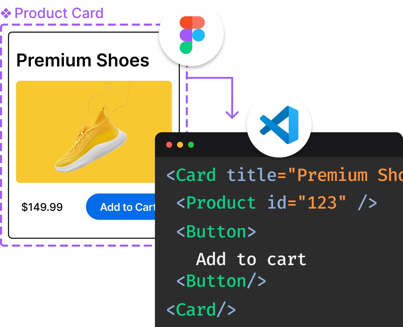
Introducing Visual Copilot: A new AI model to turn Figma designs to high quality code using your components.
Try Visual CopilotREADME
Solved by Flexbox
A showcase of problems once hard or impossible to solve with CSS alone, now made trivially easy with Flexbox.
Viewing the Site Locally
The Solved by Flexbox site can be built with Node.js. If you have Node.js installed on your system, you can run the following commands to build and serve a local copy.
# Clone the git repository and cd into the cloned directory.
git clone https://github.com/philipwalton/solved-by-flexbox.git
cd solved-by-flexbox

# Install the dependencies
npm install

# Build and serve the site at http://localhost:4000
npm start
This starts up a local server on port 4000. To view the site in your browser, navigate to http://localhost:4000. If you want to use a different port, you can pass the port number as an argument to npm start:
npm start -- -p 8080
In addition to building the site and serving it locally, this will also listen for any changes and rebuild the site as needed. This allows you to play around with the code, refresh the browser, and see your changes instantly.
Translations
The following translations have been graciously provided by the community:
Please note that translations are unofficial and may be inaccurate or out of date. To submit your own translation, please submit a pull request or open an issue and link to your translated content.
Top Related Projects
A simple guide to HTML <head> elements
A modern alternative to CSS resets
A professional front-end template for building fast, robust, and adaptable web apps or sites.
The most popular HTML, CSS, and JavaScript framework for developing responsive, mobile first projects on the web.
A utility-first CSS framework for rapid UI development.
Modern CSS framework based on Flexbox
Convert  designs to code with AI

Introducing Visual Copilot: A new AI model to turn Figma designs to high quality code using your components.
Try Visual Copilot