Top Related Projects
Modern CSS framework based on Flexbox
A utility-first CSS framework for rapid UI development.
The most popular HTML, CSS, and JavaScript framework for developing responsive, mobile first projects on the web.
A minimalist CSS framework.
A drop-in collection of CSS styles to make simple websites just a little nicer
MVP.css — Minimalist classless CSS stylesheet for HTML elements
Quick Overview
Pico.css is a minimal CSS framework for semantic HTML. It provides a lightweight set of styles that enhance the default look of HTML elements without the need for additional classes, making it easy to create clean and responsive designs quickly.
Pros
- Extremely lightweight (≈13kB minified and gzipped)
- No custom classes required, works with semantic HTML
- Customizable with CSS variables
- Responsive and mobile-first design
Cons
- Limited pre-built components compared to larger frameworks
- May require additional custom CSS for more complex layouts
- Less flexibility in design variations without custom CSS
- Not suitable for projects requiring extensive UI components
Code Examples
- Basic form example:
<form>
  <label for="email">Email address</label>
  <input type="email" id="email" name="email" placeholder="Email address" required>
  <small>We'll never share your email with anyone else.</small>
  <button type="submit">Submit</button>
</form>
- Grid layout example:
<div class="grid">
  <div>First column</div>
  <div>Second column</div>
  <div>Third column</div>
</div>
- Card-like article example:
<article>
  <header>
    <h2>Article title</h2>
  </header>
  <p>This is the article content.</p>
  <footer>
    <small>Posted on <time datetime="2023-04-20">April 20, 2023</time></small>
  </footer>
</article>
Getting Started
To use Pico.css in your project, you can include it via CDN or install it using npm:
- Via CDN:
<link rel="stylesheet" href="https://cdn.jsdelivr.net/npm/@picocss/pico@1/css/pico.min.css">
- Via npm:
npm install @picocss/pico
Then import it in your JavaScript file:
import '@picocss/pico'
Once included, Pico.css will automatically style your semantic HTML elements without the need for additional classes.
Competitor Comparisons
Modern CSS framework based on Flexbox
Pros of Bulma
- More comprehensive component library with a wider range of pre-built elements
- Extensive documentation and community support
- Modular architecture allowing for easy customization and partial imports
Cons of Bulma
- Larger file size, potentially impacting page load times
- Steeper learning curve due to more complex class naming conventions
- Requires more markup in HTML, which can lead to cluttered code
Code Comparison
Bulma:
<div class="columns">
  <div class="column">
    <div class="card">
      <div class="card-content">
        <p class="title">Card title</p>
        <p class="subtitle">Card subtitle</p>
      </div>
    </div>
  </div>
</div>
Pico:
<div class="grid">
  <div>
    <article>
      <header>Card title</header>
      <p>Card subtitle</p>
    </article>
  </div>
</div>
Bulma offers more specific classes for styling, while Pico relies on semantic HTML with minimal classes. Bulma's approach provides more granular control but requires more verbose markup. Pico's minimalist approach results in cleaner HTML but may require additional CSS for complex layouts.
A utility-first CSS framework for rapid UI development.
Pros of Tailwind CSS
- Highly customizable with a vast array of utility classes
- Offers a more comprehensive set of design options and components
- Larger community and ecosystem, with more resources and third-party tools
Cons of Tailwind CSS
- Steeper learning curve due to its extensive utility-based approach
- Larger file size, potentially impacting initial load times
- Requires more configuration and setup compared to Pico CSS
Code Comparison
Tailwind CSS:
<button class="bg-blue-500 hover:bg-blue-700 text-white font-bold py-2 px-4 rounded">
  Click me
</button>
Pico CSS:
<button>Click me</button>
Summary
Tailwind CSS offers more flexibility and customization options, making it suitable for larger, more complex projects. It has a larger community and ecosystem but comes with a steeper learning curve and requires more setup.
Pico CSS, on the other hand, provides a simpler, more lightweight solution with a focus on semantic HTML and minimal configuration. It's ideal for smaller projects or rapid prototyping where quick setup and ease of use are priorities.
The choice between the two depends on project requirements, team expertise, and desired level of customization.
The most popular HTML, CSS, and JavaScript framework for developing responsive, mobile first projects on the web.
Pros of Bootstrap
- Extensive component library and pre-built templates
- Large community and ecosystem with numerous third-party extensions
- Comprehensive documentation and extensive customization options
Cons of Bootstrap
- Larger file size and potential performance impact
- Steeper learning curve due to its extensive features and options
- More opinionated design, which may require additional effort to override
Code Comparison
Bootstrap:
<div class="container">
  <div class="row">
    <div class="col-md-6">Column 1</div>
    <div class="col-md-6">Column 2</div>
  </div>
</div>
Pico:
<div class="container">
  <div class="grid">
    <div>Column 1</div>
    <div>Column 2</div>
  </div>
</div>
Summary
Bootstrap offers a more comprehensive framework with extensive components and customization options, backed by a large community. However, it comes with a larger file size and a steeper learning curve. Pico, on the other hand, provides a lightweight and minimalistic approach, focusing on simplicity and ease of use. The code comparison demonstrates Bootstrap's more explicit class-based grid system versus Pico's simpler grid implementation.
A minimalist CSS framework.
Pros of Milligram
- Smaller file size (2kb gzipped) for faster loading
- More minimalistic design, offering greater flexibility for customization
- Includes a grid system for easier layout management
Cons of Milligram
- Less comprehensive set of pre-styled elements compared to Pico
- Requires more custom CSS for complex designs
- Less frequent updates and maintenance
Code Comparison
Milligram:
.button,
button,
input[type='button'],
input[type='reset'],
input[type='submit'] {
  background-color: #9b4dca;
  border: 0.1rem solid #9b4dca;
  border-radius: .4rem;
  color: #fff;
  cursor: pointer;
  display: inline-block;
  font-size: 1.1rem;
  font-weight: 700;
  height: 3.8rem;
  letter-spacing: .1rem;
  line-height: 3.8rem;
  padding: 0 3.0rem;
  text-align: center;
  text-decoration: none;
  text-transform: uppercase;
  white-space: nowrap;
}
Pico:
[type="button"],
[type="reset"],
[type="submit"],
button {
  --background-color: var(--primary);
  --border-color: var(--primary);
  --color: var(--primary-inverse);
  --box-shadow: var(--button-box-shadow, 0 0 0 rgba(0, 0, 0, 0));
  padding: var(--form-element-spacing-vertical)
    var(--form-element-spacing-horizontal);
  border: var(--border-width) solid var(--border-color);
  border-radius: var(--border-radius);
  outline: none;
  background-color: var(--background-color);
  box-shadow: var(--box-shadow);
  color: var(--color);
  font-weight: var(--font-weight);
  font-size: 1rem;
  line-height: var(--line-height);
  text-align: center;
  cursor: pointer;
  transition: background-color var(--transition),
    border-color var(--transition), color var(--transition),
    box-shadow var(--transition);
}
A drop-in collection of CSS styles to make simple websites just a little nicer
Pros of Water.css
- Extremely lightweight (2kb minified and gzipped)
- No classes required, making it ideal for quick prototyping
- Supports dark mode out of the box
Cons of Water.css
- Limited customization options compared to Pico
- Fewer pre-styled components and utilities
- Less active development and community support
Code Comparison
Water.css:
body {
  font-family: system-ui, sans-serif;
  line-height: 1.4;
  max-width: 800px;
  margin: 20px auto;
  padding: 0 10px;
}
Pico:
body {
  font-family: var(--font-family);
  line-height: var(--line-height);
  max-width: var(--grid-max-width);
  margin: 0 auto;
  padding: var(--spacing);
}
Both frameworks aim to provide simple, classless CSS for quick styling. Water.css focuses on extreme minimalism and ease of use, while Pico offers more customization options and a wider range of pre-styled elements. Water.css is better suited for rapid prototyping and simple projects, whereas Pico provides more flexibility for larger, more complex applications that require additional styling options.
MVP.css — Minimalist classless CSS stylesheet for HTML elements
Pros of MVP
- Extremely lightweight (only 2KB minified and gzipped)
- Includes basic styling for form elements and buttons
- Simple and easy to understand, with minimal customization options
Cons of MVP
- Limited customization options compared to Pico
- Lacks advanced features like a grid system or utility classes
- Less active development and community support
Code Comparison
MVP:
:root {
  --border-radius: 5px;
  --box-shadow: 2px 2px 10px;
  --color: #118bee;
  --color-accent: #118bee15;
  --color-bg: #fff;
  --color-bg-secondary: #e9e9e9;
}
Pico:
:root {
  --font-family: system-ui, -apple-system, "Segoe UI", "Roboto", "Ubuntu",
    "Cantarell", "Noto Sans", sans-serif, "Apple Color Emoji", "Segoe UI Emoji",
    "Segoe UI Symbol", "Noto Color Emoji";
  --line-height: 1.5;
  --font-weight: 400;
  --font-size: 16px;
  --border-radius: 0.25rem;
}
Both CSS frameworks use CSS custom properties for easy customization, but Pico offers more extensive options and a more comprehensive set of default styles. MVP focuses on simplicity and minimal styling, while Pico provides a more feature-rich foundation for building responsive websites.
Convert  designs to code with AI

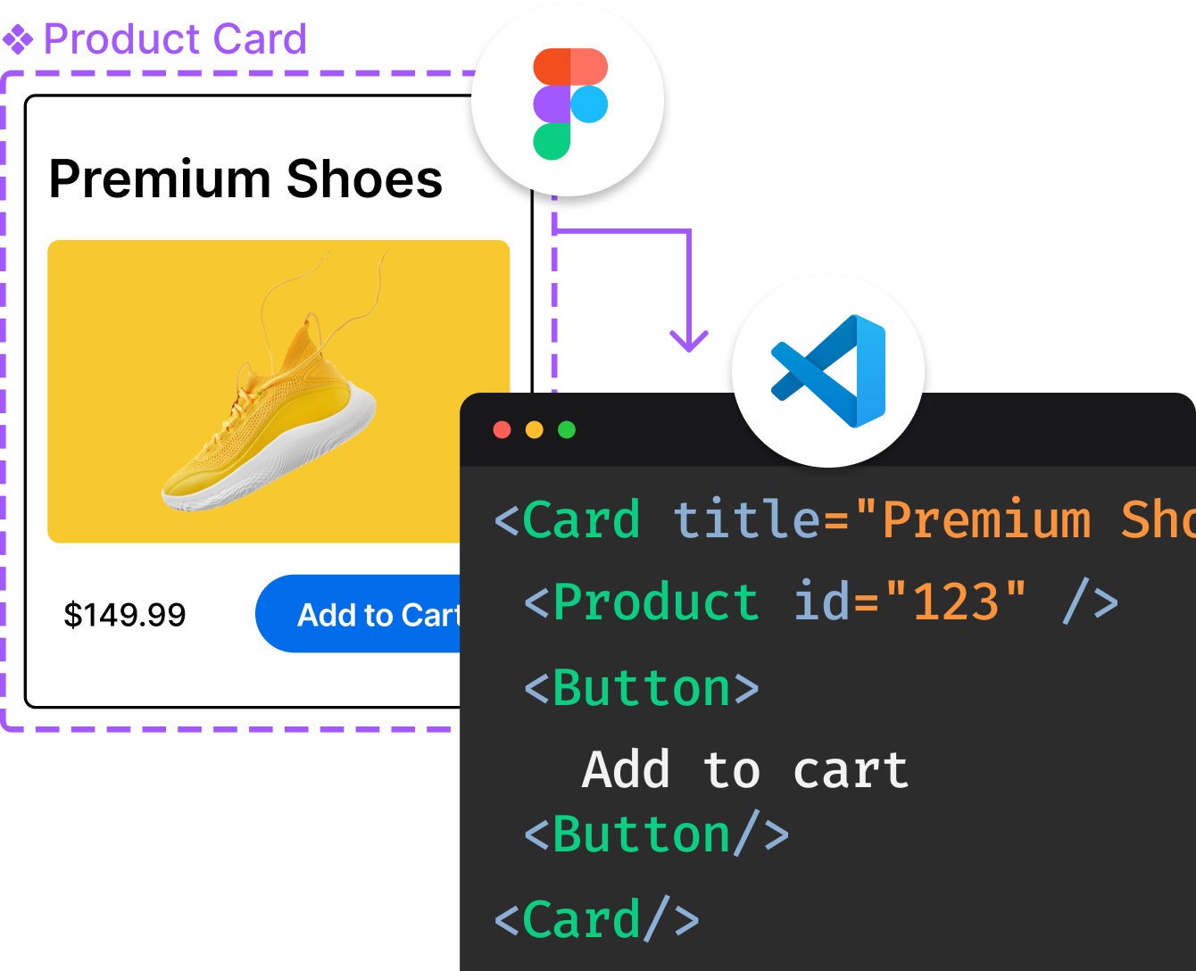
Introducing Visual Copilot: A new AI model to turn Figma designs to high quality code using your components.
Try Visual CopilotREADME
Minimal CSS Framework for Semantic HTML
A minimalist and lightweight starter kit that prioritizes semantic syntax, making every HTML element responsive and elegant by default.
Write HTML, Add Pico CSS, and Voilà !
Whatâs new in v2?
Pico v2.0 features better accessibility, easier customization with SASS, a complete color palette, a new group component, and 20 precompiled color themes totaling over 100 combinations accessible via CDN.
A Superpowered HTML Reset
With just the right amount of everything, Pico is great starting point for a clean and lightweight design system.
- Class-light and Semantic
- Great Styles with Just CSS
- Responsive Everything
- Light or Dark Mode
- Easy Customization
- Optimized Performance
Table of contents
- Quick start
- Class-less version
- Limitations
- Documentation
- Browser Support
- Contributing
- Copyright and license
Quick start
There are 4 ways to get started with pico.css:
Install manually
Download Pico and link /css/pico.min.css in the <head> of your website.
<link rel="stylesheet" href="css/pico.min.css">
Usage from CDN
Alternatively, you can use jsDelivr CDN to link pico.css.
<link rel="stylesheet" href="https://cdn.jsdelivr.net/npm/@picocss/pico@2/css/pico.min.css">
Install with NPM
npm install @picocss/pico
Or
yarn add @picocss/pico
Then, import Pico into your SCSS file with @use:
@use "pico";
Install with Composer
composer require picocss/pico
Starter HTML template
<!doctype html>
<html lang="en">
  <head>
    <meta charset="utf-8">
    <meta name="viewport" content="width=device-width, initial-scale=1">
    <meta name="color-scheme" content="light dark">
    <link rel="stylesheet" href="css/pico.min.css">
    <title>Hello world!</title>
  </head>
  <body>
    <main class="container">
      <h1>Hello world!</h1>
    </main>
  </body>
</html>
Class-less version
Pico provides a .classless version.
In this version, <header>, <main>, and <footer> inside <body> act as containers to define a centered or a fluid viewport.
Use the default .classless version if you need centered viewports:
<link
  rel="stylesheet"
  href="https://cdn.jsdelivr.net/npm/@picocss/pico@2/css/pico.classless.min.css"
/>
Or use the .fluid.classless version if you need a fluid container:
<link
  rel="stylesheet"
  href="https://cdn.jsdelivr.net/npm/@picocss/pico@2/css/pico.fluid.classless.min.css"
>
Then just write pure HTML, and it should look great:
<!doctype html>
<html lang="en">
  <head>
    <meta charset="utf-8">
    <meta name="viewport" content="width=device-width, initial-scale=1">
    <meta name="color-scheme" content="light dark">
    <link
      rel="stylesheet"
      href="https://cdn.jsdelivr.net/npm/@picocss/pico@2/css/pico.classless.min.css"
    >
    <title>Hello, world!</title>
  </head>
  <body>
    <main>
      <h1>Hello, world!</h1>
    </main>
  </body>
</html>
Limitations
Pico CSS can be used without custom CSS for quick or small projects. However, itâs designed as a starting point, like a âreset CSS on steroidsâ. As Pico does not integrate any helpers or utilities .classes, this minimal CSS framework requires SCSS or CSS knowledge to build large projects.
Documentation
Getting started
Customization
Layout
Content
Forms
Components
About
Browser Support
Pico CSS is designed and tested for the latest stable Chrome, Firefox, Edge, and Safari releases. It does not support any version of IE, including IE 11.
Contributing
If you are interested in contributing to Pico CSS, please read our contributing guidelines.
Copyright and license
Licensed under the MIT License.
Top Related Projects
Modern CSS framework based on Flexbox
A utility-first CSS framework for rapid UI development.
The most popular HTML, CSS, and JavaScript framework for developing responsive, mobile first projects on the web.
A minimalist CSS framework.
A drop-in collection of CSS styles to make simple websites just a little nicer
MVP.css — Minimalist classless CSS stylesheet for HTML elements
Convert  designs to code with AI

Introducing Visual Copilot: A new AI model to turn Figma designs to high quality code using your components.
Try Visual Copilot


