Top Related Projects
Streamlit — A faster way to build and share data apps.
Interactive Data Visualization in the browser, from Python
Panel: The powerful data exploration & web app framework for Python
Voilà turns Jupyter notebooks into standalone web applications
Visually explore, understand, and present your data.
Quick Overview
Dash is a Python framework for building analytical web applications. It allows users to create interactive dashboards and data visualization apps using pure Python, without the need for JavaScript or HTML. Dash is built on top of Flask, Plotly.js, and React.js, making it powerful yet easy to use.
Pros
- Easy to learn and use, especially for those familiar with Python
- Highly customizable and extensible
- Supports reactive and callback-based programming
- Integrates well with other data science libraries like Pandas and Scikit-learn
Cons
- Performance can be slower compared to native JavaScript frameworks
- Limited built-in UI components compared to some other frameworks
- Steeper learning curve for advanced customizations
- Documentation can be overwhelming for beginners
Code Examples
- Creating a simple Dash app with a graph:
import dash
import dash_core_components as dcc
import dash_html_components as html
from dash.dependencies import Input, Output
import plotly.express as px

app = dash.Dash(__name__)

app.layout = html.Div([
    dcc.Graph(id='example-graph'),
    dcc.Slider(id='year-slider', min=1952, max=2007, step=5, value=1952)
])

@app.callback(
    Output('example-graph', 'figure'),
    Input('year-slider', 'value')
)
def update_figure(selected_year):
    df = px.data.gapminder()
    filtered_df = df[df.year == selected_year]
    fig = px.scatter(filtered_df, x="gdpPercap", y="lifeExp", size="pop", color="continent", hover_name="country")
    return fig

if __name__ == '__main__':
    app.run_server(debug=True)
- Adding a data table to a Dash app:
import dash
import dash_core_components as dcc
import dash_html_components as html
import dash_table
import pandas as pd

df = pd.read_csv('https://raw.githubusercontent.com/plotly/datasets/master/solar.csv')

app = dash.Dash(__name__)

app.layout = html.Div([
    dash_table.DataTable(
        id='table',
        columns=[{"name": i, "id": i} for i in df.columns],
        data=df.to_dict('records'),
    )
])

if __name__ == '__main__':
    app.run_server(debug=True)
- Creating a multi-page Dash app:
import dash
import dash_core_components as dcc
import dash_html_components as html
from dash.dependencies import Input, Output

app = dash.Dash(__name__, suppress_callback_exceptions=True)

app.layout = html.Div([
    dcc.Location(id='url', refresh=False),
    html.Div(id='page-content')
])

index_layout = html.Div([
    dcc.Link('Go to Page 1', href='/page-1'),
    html.Br(),
    dcc.Link('Go to Page 2', href='/page-2'),
])

page_1_layout = html.Div([
    html.H1('Page 1'),
    dcc.Link('Go back to home', href='/')
])

page_2_layout = html.Div([
    html.H1('Page 2'),
    dcc.Link('Go back to home', href='/')
])

@app.callback(Output('page-content', 'children'),
              Input('url', 'pathname'))
def display_page(pathname):
    if pathname == '/page-1':
        return page_1_layout
    elif pathname == '/page-2':
        return page_2_layout
    else:
        return index_layout

if __name__ == '__main__':
    app.run_server(debug=True)
Getting Started
To get started with Dash, follow these steps:
-
Install Dash and its dependencies:
pip install dash plotly pandas -
Create a
Competitor Comparisons
Streamlit — A faster way to build and share data apps.
Pros of Streamlit
- Simpler and more intuitive API, allowing for faster development
- Built-in widgets and components for common data science tasks
- Automatic UI updates based on script changes
Cons of Streamlit
- Less flexibility in layout and design compared to Dash
- Limited support for complex, multi-page applications
- Fewer options for customization and advanced interactivity
Code Comparison
Streamlit example:
import streamlit as st
import pandas as pd

df = pd.read_csv("data.csv")
st.line_chart(df)
Dash example:
import dash
import dash_core_components as dcc
import dash_html_components as html
from dash.dependencies import Input, Output
import pandas as pd

app = dash.Dash(__name__)
df = pd.read_csv("data.csv")

app.layout = html.Div([
    dcc.Graph(id='graph'),
])

@app.callback(Output('graph', 'figure'), Input('graph', 'relayoutData'))
def update_graph(relayout_data):
    return {'data': [{'x': df['x'], 'y': df['y'], 'type': 'line'}]}

if __name__ == '__main__':
    app.run_server(debug=True)
Interactive Data Visualization in the browser, from Python
Pros of Bokeh
- More flexible and customizable for advanced visualizations
- Better performance for large datasets and real-time updates
- Supports standalone HTML output without a server
Cons of Bokeh
- Steeper learning curve, especially for beginners
- Less extensive documentation and community support
- Fewer built-in components for complex dashboards
Code Comparison
Bokeh:
from bokeh.plotting import figure, show
p = figure(title="Simple Line Plot")
p.line([1, 2, 3, 4, 5], [6, 7, 2, 4, 5])
show(p)
Dash:
import dash
import dash_core_components as dcc
import dash_html_components as html
from dash.dependencies import Input, Output

app = dash.Dash(__name__)
app.layout = html.Div([
    dcc.Graph(id='example-graph'),
])

if __name__ == '__main__':
    app.run_server(debug=True)
Both Bokeh and Dash are powerful libraries for creating interactive visualizations and dashboards in Python. Bokeh offers more flexibility and better performance for complex visualizations, while Dash provides a more streamlined approach for creating web applications with a focus on ease of use and integration with Plotly charts.
Panel: The powerful data exploration & web app framework for Python
Pros of Panel
- More flexible layout system with reactive components
- Supports a wider range of plotting libraries (Bokeh, Matplotlib, Plotly, etc.)
- Easier integration with existing Python workflows and Jupyter notebooks
Cons of Panel
- Smaller community and fewer resources compared to Dash
- Less extensive documentation and examples
- Steeper learning curve for beginners
Code Comparison
Panel:
import panel as pn
import numpy as np

def plot(n):
    return pn.pane.Matplotlib(plt.plot(np.random.randn(n)))

pn.interact(plot, n=pn.widgets.IntSlider(value=100, start=10, end=1000))
Dash:
import dash
from dash import dcc, html
from dash.dependencies import Input, Output
import plotly.express as px

app = dash.Dash(__name__)
app.layout = html.Div([
    dcc.Slider(id='n-slider', min=10, max=1000, value=100, step=10),
    dcc.Graph(id='plot')
])

@app.callback(Output('plot', 'figure'), Input('n-slider', 'value'))
def update_plot(n):
    return px.scatter(x=range(n), y=np.random.randn(n))

app.run_server(debug=True)
Both Panel and Dash offer powerful tools for creating interactive dashboards, but they cater to different use cases and preferences. Panel excels in flexibility and integration with existing Python workflows, while Dash provides a more structured approach with extensive documentation and a larger community.
Voilà turns Jupyter notebooks into standalone web applications
Pros of Voila
- Seamless integration with Jupyter notebooks, allowing easy conversion of existing notebooks to web applications
- Supports a wide range of Jupyter widgets and custom JavaScript libraries
- Simpler setup process for users already familiar with Jupyter ecosystem
Cons of Voila
- Less flexibility in layout and design compared to Dash
- Limited interactivity options without custom JavaScript
- Steeper learning curve for users not familiar with Jupyter notebooks
Code Comparison
Voila (in a Jupyter notebook):
import ipywidgets as widgets
from IPython.display import display

slider = widgets.IntSlider(description='Value')
output = widgets.Output()

display(slider, output)

with output:
    print(f"The slider value is: {slider.value}")
Dash:
import dash
from dash import dcc, html
from dash.dependencies import Input, Output

app = dash.Dash(__name__)
app.layout = html.Div([
    dcc.Slider(id='slider', min=0, max=100, step=1, value=50),
    html.Div(id='output')
])

@app.callback(Output('output', 'children'), Input('slider', 'value'))
def update_output(value):
    return f"The slider value is: {value}"

if __name__ == '__main__':
    app.run_server(debug=True)
Visually explore, understand, and present your data.
Pros of SandDance
- Offers unique 3D visualizations and cube-based data representations
- Provides smooth transitions between different chart types
- Integrates well with Power BI and other Microsoft tools
Cons of SandDance
- Less extensive documentation compared to Dash
- Smaller community and fewer third-party extensions
- Limited customization options for complex dashboards
Code Comparison
SandDance (TypeScript):
import * as vega from 'vega';
import { SandDance } from '@msrvida/sanddance-explorer';

const spec = {
  // Vega specification
};

SandDance.renderVegaSpec(spec);
Dash (Python):
import dash
import dash_core_components as dcc
import dash_html_components as html

app = dash.Dash(__name__)
app.layout = html.Div([
    dcc.Graph(figure=fig)
])

if __name__ == '__main__':
    app.run_server(debug=True)
Summary
While SandDance excels in creating visually striking 3D visualizations and seamless transitions between chart types, Dash offers more extensive documentation, a larger community, and greater flexibility for building complex dashboards. SandDance is particularly useful for Microsoft-centric environments, whereas Dash provides a more versatile solution for web-based data visualization applications across various platforms.
Convert  designs to code with AI

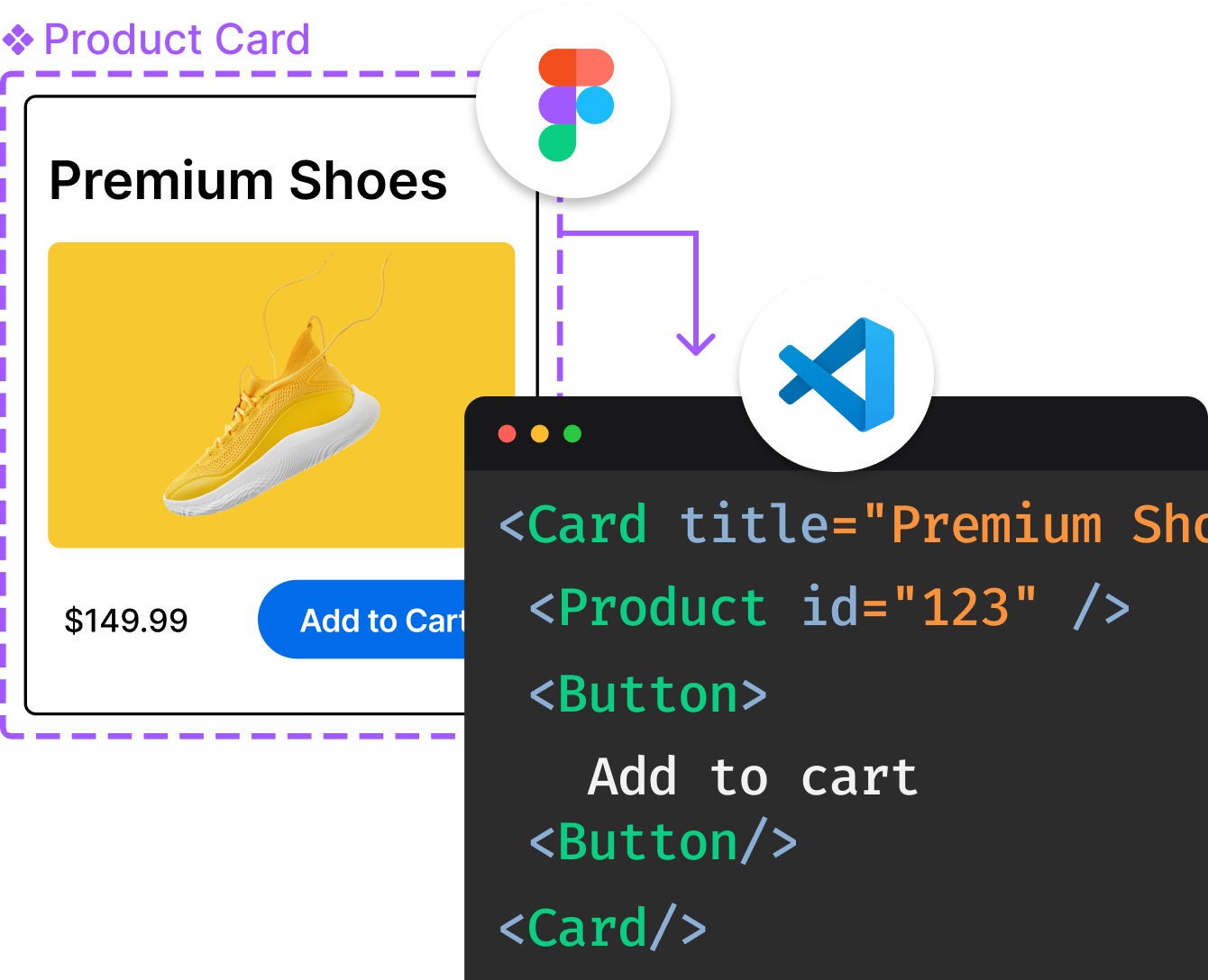
Introducing Visual Copilot: A new AI model to turn Figma designs to high quality code using your components.
Try Visual CopilotREADME
Dash
Dash is the most downloaded, trusted Python framework for building ML & data science web apps.
Built on top of Plotly.js, React and Flask, Dash ties modern UI elements like dropdowns, sliders, and graphs directly to your analytical Python code. Read our tutorial (proudly crafted â¤ï¸ with Dash itself).
-
Docs: Create your first Dash app in under 5 minutes
-
dash.gallery: Dash app gallery with Python & R code
Dash App Examples
| Dash App | Description |
|---|---|
 | Hereâs a simple example of a Dash App that ties a Dropdown to a Plotly Graph. As the user selects a value in the Dropdown, the application code dynamically exports data from Google Finance into a Pandas DataFrame. This app was written in just 43 lines of code (view the source). |
 | Dash app code is declarative and reactive, which makes it easy to build complex apps that contain many interactive elements. Hereâs an example with 5 inputs, 3 outputs, and cross filtering. This app was composed in just 160 lines of code, all of which were Python. |
 | Dash uses Plotly.js for charting. About 50 chart types are supported, including maps. |
 | Dash isn't just for dashboards. You have full control over the look and feel of your applications. Here's a Dash App that's styled to look like a PDF report. |
To learn more about Dash, read the extensive announcement letter or jump in with the user guide.
Dash OSS & Dash Enterprise
With Dash Open Source, Dash apps run on your local laptop or workstation, but cannot be easily accessed by others in your organization.
Scale up with Dash Enterprise when your Dash app is ready for department or company-wide consumption. Or, launch your initiative with Dash Enterprise from the start to unlock developer productivity gains and hands-on acceleration from Plotly's team.
ML Ops Features: A one-stop shop for ML Ops: Horizontally scalable hosting, deployment, and authentication for your Dash apps. No IT or DevOps required.
- App manager Deploy & manage Dash apps without needing IT or a DevOps team. App Manager gives you point & click control over all aspects of your Dash deployments.
- Kubernetes scaling Ensure high availability of Dash apps and scale horizontally with Dash Enterpriseâs Kubernetes architecture. No IT or Helm required.
- No code auth Control Dash app access in a few clicks. Dash Enterprise supports LDAP, AD, PKI, Okta, SAML, OpenID Connect, OAuth, SSO, and simple email authentication.
- Job Queue The Job Queue is the key to building scalable Dash apps. Move heavy computation from synchronous Dash callbacks to the Job Queue for asynchronous background processing.
Low-Code Features: Low-code Dash app capabilities that supercharge developer productivity.
- Design Kit Design like a pro without writing a line of CSS. Easily arrange, style, brand, and customize your Dash apps.
- Snapshot Engine Save & share Dash app views as links or PDFs. Or, run a Python job through Dash and have Snapshot Engine email a report when the job is done.
- Dashboard Toolkit Drag & drop layouts, chart editing, and crossfilter for your Dash apps.
- Embedding Natively embed Dash apps in an existing web application or website without the use of IFrames.
Enterprise AI Features: Everything that your data science team needs to rapidly deliver AI/ML research and business initiatives.
- AI App Marketplace Dash Enterprise ships with dozens of Dash app templates for business problems where AI/ML is having the greatest impact.
- Big Data for Pything Connect to Python's most popular big data back ends: Dask, Databricks, NVIDIA RAPIDS, Snowflake, Postgres, Vaex, and more.
- GPU & Dask Acceleration Dash Enterprise puts Pythonâs most popular HPC stack for GPU and parallel CPU computing in the hands of business users.
- Data Science Workspaces Be productive from Day 1. Write and execute Python, R, & Julia code from Dash Enterprise's onboard code editor.
See https://plotly.com/contact-us/ to get in touch.

Top Related Projects
Streamlit — A faster way to build and share data apps.
Interactive Data Visualization in the browser, from Python
Panel: The powerful data exploration & web app framework for Python
Voilà turns Jupyter notebooks into standalone web applications
Visually explore, understand, and present your data.
Convert  designs to code with AI

Introducing Visual Copilot: A new AI model to turn Figma designs to high quality code using your components.
Try Visual Copilot


