 tabler-icons
A set of over 5800 free MIT-licensed high-quality SVG icons for you to use in your web projects.
Top Related Projects

Simply beautiful open-source icons

The iconic SVG, font, and CSS toolkit

Premium hand-crafted icons built by Ionic, for Ionic apps and web apps everywhere 🌎

A scalable set of icons handcrafted with <3 by GitHub

Material Design icons by Google (Material Symbols)

Official open source SVG icon library for Bootstrap.
Quick Overview
Tabler Icons is a comprehensive set of free and open-source SVG icons designed for use in web projects. It offers a wide variety of icons in a consistent style, suitable for various applications and interfaces. The project is maintained by the Tabler team and is regularly updated with new icons.
Pros
- Large collection of over 4,200 icons in a consistent style
- Free and open-source, available under the MIT license
- Regular updates and additions to the icon set
- Multiple formats available (SVG, web font, React components)
Cons
- Limited customization options compared to some premium icon sets
- May lack some specialized icons for niche industries or applications
- Potential for inconsistency in icon design as the set grows rapidly
Code Examples
Since Tabler Icons is primarily an icon set and not a code library, there are no specific code examples to provide. However, here's a brief example of how to use Tabler Icons in an HTML document:
<!-- Using SVG directly -->
<svg xmlns="http://www.w3.org/2000/svg" class="icon icon-tabler icon-tabler-user" width="24" height="24" viewBox="0 0 24 24" stroke-width="2" stroke="currentColor" fill="none" stroke-linecap="round" stroke-linejoin="round">
   <path stroke="none" d="M0 0h24v24H0z" fill="none"></path>
   <path d="M12 7m-4 0a4 4 0 1 0 8 0a4 4 0 1 0 -8 0"></path>
   <path d="M6 21v-2a4 4 0 0 1 4 -4h4a4 4 0 0 1 4 4v2"></path>
</svg>

<!-- Using web font -->
<i class="ti ti-user"></i>
Getting Started
To use Tabler Icons in your project, you can choose from several methods:
-
CDN (for web font):
<link rel="stylesheet" href="https://cdn.jsdelivr.net/npm/@tabler/icons-webfont@latest/tabler-icons.min.css"> -
npm (for React components):
npm install @tabler/icons-react -
Download SVG files directly from the GitHub repository and use them in your project.
For more detailed instructions and usage examples, visit the official Tabler Icons documentation at https://tabler-icons.io/.
Competitor Comparisons
Simply beautiful open-source icons
Pros of Feather
- Simpler and more minimalistic design aesthetic
- Larger community and wider adoption
- More consistent icon style across the set
Cons of Feather
- Fewer icons available (around 280 compared to Tabler's 3000+)
- Less frequent updates and new icon additions
- Limited customization options out-of-the-box
Code Comparison
Feather:
<i data-feather="circle"></i>
<script>
  feather.replace()
</script>
Tabler Icons:
<svg xmlns="http://www.w3.org/2000/svg" class="icon icon-tabler icon-tabler-circle" width="24" height="24" viewBox="0 0 24 24" stroke-width="2" stroke="currentColor" fill="none" stroke-linecap="round" stroke-linejoin="round">
   <path stroke="none" d="M0 0h24v24H0z" fill="none"></path>
   <circle cx="12" cy="12" r="9"></circle>
</svg>
Both icon sets offer easy integration into web projects, but Feather provides a more streamlined implementation with its JavaScript library. Tabler Icons offers more flexibility with inline SVG, allowing for easier customization directly in the HTML.
While Feather excels in simplicity and consistency, Tabler Icons provides a much larger selection and more frequent updates. The choice between the two depends on project requirements, design preferences, and the need for specific icons.
The iconic SVG, font, and CSS toolkit
Pros of Font-Awesome
- Larger icon set with over 7,000 icons
- Well-established and widely recognized in the web development community
- Offers both free and paid (Pro) versions with additional features
Cons of Font-Awesome
- Larger file size due to the extensive icon set
- Some advanced features and icons require a paid subscription
- Can be more complex to implement and customize
Code Comparison
Tabler Icons:
<svg xmlns="http://www.w3.org/2000/svg" class="icon icon-tabler icon-tabler-user" width="24" height="24" viewBox="0 0 24 24" stroke-width="2" stroke="currentColor" fill="none" stroke-linecap="round" stroke-linejoin="round">
  <path stroke="none" d="M0 0h24v24H0z" fill="none"/>
  <circle cx="12" cy="7" r="4" />
  <path d="M6 21v-2a4 4 0 0 1 4 -4h4a4 4 0 0 1 4 4v2" />
</svg>
Font Awesome:
<i class="fas fa-user"></i>
Summary
Tabler Icons offers a more lightweight and customizable solution with SVG-based icons, making it easier to modify and style. Font Awesome provides a vast library of icons and is widely supported, but can be heavier and more complex to implement. The choice between the two depends on project requirements, desired customization level, and performance considerations.
Premium hand-crafted icons built by Ionic, for Ionic apps and web apps everywhere 🌎
Pros of Ionicons
- Larger icon set with over 1,200 icons compared to Tabler Icons' 800+
- Supports multiple file formats (SVG, WebFont, PNG, and JSX)
- Tighter integration with Ionic Framework for mobile app development
Cons of Ionicons
- Less frequent updates compared to Tabler Icons
- Heavier file size due to the larger icon set
- Some users report inconsistencies in icon styles across the set
Code Comparison
Tabler Icons usage:
<svg xmlns="http://www.w3.org/2000/svg" class="icon icon-tabler icon-tabler-user" width="24" height="24" viewBox="0 0 24 24" stroke-width="2" stroke="currentColor" fill="none" stroke-linecap="round" stroke-linejoin="round">
  <path stroke="none" d="M0 0h24v24H0z" fill="none"/>
  <circle cx="12" cy="7" r="4" />
  <path d="M6 21v-2a4 4 0 0 1 4 -4h4a4 4 0 0 1 4 4v2" />
</svg>
Ionicons usage:
<ion-icon name="person-outline"></ion-icon>
Both icon sets offer high-quality, customizable SVG icons for web and mobile applications. Tabler Icons focuses on a consistent, minimalist design with frequent updates, while Ionicons provides a larger variety of icons and better integration with Ionic Framework. The choice between the two depends on specific project requirements, design preferences, and the development ecosystem being used.
A scalable set of icons handcrafted with <3 by GitHub
Pros of Octicons
- Officially maintained by GitHub, ensuring consistency with their platform
- Extensive set of icons specifically designed for developer-focused interfaces
- Offers multiple formats including SVG, PNG, and font icons
Cons of Octicons
- More limited icon set compared to Tabler Icons
- Primarily focused on GitHub-related and development icons, less versatile for general-purpose use
- Less frequent updates and additions to the icon library
Code Comparison
Octicons usage:
<svg class="octicon octicon-mark-github" viewBox="0 0 16 16" version="1.1" width="16" height="16" aria-hidden="true">
  <path fill-rule="evenodd" d="M8 0C3.58 0 0 3.58 0 8c0 3.54 2.29 6.53 5.47 7.59.4.07.55-.17.55-.38 0-.19-.01-.82-.01-1.49-2.01.37-2.53-.49-2.69-.94-.09-.23-.48-.94-.82-1.13-.28-.15-.68-.52-.01-.53.63-.01 1.08.58 1.23.82.72 1.21 1.87.87 2.33.66.07-.52.28-.87.51-1.07-1.78-.2-3.64-.89-3.64-3.95 0-.87.31-1.59.82-2.15-.08-.2-.36-1.02.08-2.12 0 0 .67-.21 2.2.82.64-.18 1.32-.27 2-.27.68 0 1.36.09 2 .27 1.53-1.04 2.2-.82 2.2-.82.44 1.1.16 1.92.08 2.12.51.56.82 1.27.82 2.15 0 3.07-1.87 3.75-3.65 3.95.29.25.54.73.54 1.48 0 1.07-.01 1.93-.01 2.2 0 .21.15.46.55.38A8.013 8.013 0 0016 8c0-4.42-3.58-8-8-8z"></path>
</svg>
Tabler Icons usage:
<svg xmlns="http://www.w3.org/2000/svg" class="icon icon-tabler icon-tabler-brand-github" width="24" height="24" viewBox="0 0 24 24" stroke-width="2" stroke="currentColor" fill="none" stroke-linecap="round" stroke-linejoin="round">
  <path stroke="none" d="M0 0h24v24H0z" fill="none"></path>
  <path d="M9 19c-4.3 1.4 -4.3 -2.5 -6 -3m12 5v-3.5c0 -1 .1 -1.4 -.5 -2c2.8 -.3 5.5 -1.4 5.5 -6a4.6 4.6 0 0 0 -1.3 -3.2a4.2 4.2 0 0 0 -.1 -3.2s-1.1 -.3 -3.5 1.3a12.3 12.3 0 0 0 -6.2 0c-2.4 -1.6 -3.5 -1.3 -3.5 -1.3a4.2 4.2 0 0 0 -.1 3.2a4.6 4.6 0 0 0 -1.3 3.2c0 4.6 2.7 5.7 5.5 6c-.6 .6 -.6 1.2
Material Design icons by Google (Material Symbols)
Pros of Material Design Icons
- Extensive collection with over 2,000 icons
- Official Google design language, ensuring consistency with Android and other Google products
- Available in multiple formats (SVG, PNG, font) for versatile usage
Cons of Material Design Icons
- Less frequent updates compared to Tabler Icons
- Heavier file size due to the large number of icons
- May not offer as many unique or specialized icons for specific use cases
Code Comparison
Material Design Icons:
<link href="https://fonts.googleapis.com/icon?family=Material+Icons" rel="stylesheet">
<i class="material-icons">favorite</i>
Tabler Icons:
<script src="https://cdn.jsdelivr.net/npm/@tabler/icons@latest/icons-react/dist/index.umd.min.js"></script>
<IconHeart />
Summary
Material Design Icons offers a comprehensive set of icons aligned with Google's design language, making it ideal for projects that require consistency with Google products. However, Tabler Icons provides more frequent updates and a lighter package, which may be preferable for projects needing regular icon additions or a smaller footprint. The choice between the two depends on specific project requirements, design preferences, and integration needs.
Official open source SVG icon library for Bootstrap.
Pros of Icons
- Larger icon set with over 1,800 icons
- Officially maintained by the Bootstrap team, ensuring consistency with Bootstrap framework
- Includes both SVG and web font versions of icons
Cons of Icons
- Less frequent updates compared to Tabler Icons
- Limited customization options out-of-the-box
- Heavier file size due to the larger icon set
Code Comparison
Tabler Icons usage:
<svg xmlns="http://www.w3.org/2000/svg" class="icon icon-tabler icon-tabler-user" width="24" height="24" viewBox="0 0 24 24" stroke-width="2" stroke="currentColor" fill="none" stroke-linecap="round" stroke-linejoin="round">
  <path stroke="none" d="M0 0h24v24H0z" fill="none"/>
  <circle cx="12" cy="7" r="4" />
  <path d="M6 21v-2a4 4 0 0 1 4 -4h4a4 4 0 0 1 4 4v2" />
</svg>
Icons usage:
<svg xmlns="http://www.w3.org/2000/svg" width="16" height="16" fill="currentColor" class="bi bi-person" viewBox="0 0 16 16">
  <path d="M8 8a3 3 0 1 0 0-6 3 3 0 0 0 0 6zm2-3a2 2 0 1 1-4 0 2 2 0 0 1 4 0zm4 8c0 1-1 1-1 1H3s-1 0-1-1 1-4 6-4 6 3 6 4zm-1-.004c-.001-.246-.154-.986-.832-1.664C11.516 10.68 10.289 10 8 10c-2.29 0-3.516.68-4.168 1.332-.678.678-.83 1.418-.832 1.664h10z"/>
</svg>
Convert  designs to code with AI

Introducing Visual Copilot: A new AI model to turn Figma designs to high quality code using your components.
Try Visual CopilotREADME
Tabler Icons
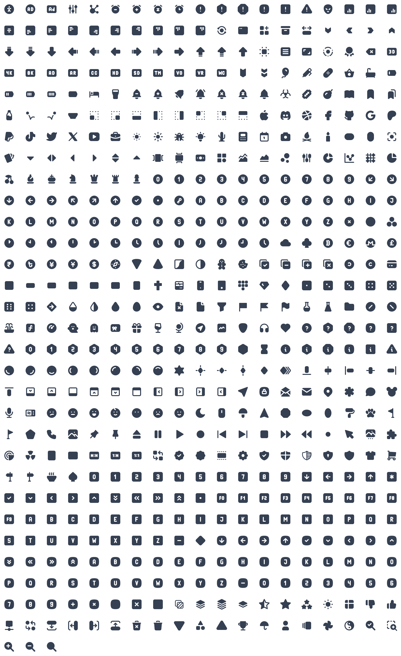
A set of 5944 free MIT-licensed high-quality SVG icons for you to use in your web projects. Each icon is designed on a 24x24 grid and a 2px stroke.
Sponsors
If you want to support our project and help me grow it, you can become a sponsor on GitHub or just donate on PayPal :)

Testing
Browser testing via:
Preview
Outline version (4963 icons)
Filled version (981 icons)
Installation
npm install @tabler/icons --save
or just download from GitHub.
Usage
All icons are built with SVG, so you can place them as <img>, background-image and inline in HTML code.
HTML image
If you load an icon as an image, you can modify its size using CSS.
<img src="path/to/icon.svg" alt="icon title" />
Inline HTML
You can paste the content of the icon file into your HTML code to display it on the page.
<a href="">
  <svg
    xmlns="http://www.w3.org/2000/svg"
    class="icon icon-tabler icon-tabler-disabled"
    width="24"
    height="24"
    viewBox="0 0 24 24"
    stroke-width="1.25"
    stroke="currentColor"
    fill="none"
    stroke-linecap="round"
    stroke-linejoin="round"
  >
    ...
  </svg>
  Click me
</a>
Thanks to that, you can change the size, color and the stroke-width of the icons with CSS code.
.icon-tabler {
  color: red;
  width: 32px;
  height: 32px;
  stroke-width: 1.25;
}
SVG sprite
Add an icon to be displayed on your page with the following markup (activity in the above example can be replaced with any valid icon name):
<svg width="24" height="24">
  <use xlink:href="path/to/tabler-sprite.svg#tabler-activity" />
</svg>
React
React components available through @tabler/icons-react package.
import { IconAward } from '@tabler/icons-react';

const MyComponent = () => {
  return <IconAward
    size={36} // set custom `width` and `height`
    color="red" // set `stroke` color
    stroke={3}  // set `stroke-width`
    strokeLinejoin="miter" // override other SVG props
  />
}
@tabler/icons-react exports its own type declarations for usage with React and Typescript.
For more details, see the documentation.
Vue
Vue components available through @tabler/icons-vue package.
<template>
  <!-- basic usage -->
  <IconHome />

  <!-- set `stroke` color -->
  <IconHome color="red"/>
  <IconHome stroke="red"/>

  <!-- set custom `width` and `height` -->
  <IconHome size="36"/>

  <!-- set `stroke-width` -->
  <IconHome strokeWidth="2"/>
  <IconHome stroke-width="2"/>
</template>

<script>
// Returns Vue component
import { IconHome } from '@tabler/icons-vue';

export default {
  components: { IconHome }
};
</script>
or with <script setup>
<script setup>
// Import Vue component
import { IconHome } from '@tabler/icons-vue';
</script>

<template>
  <IconHome color="red" size="36" strokeWidth="2"/>
</template>
For more details, see the documentation.
Angular
Angular components available through angular-tabler-icons package.
Install the package, then create icons module:
import { NgModule } from '@angular/core';

import { TablerIconsModule } from 'angular-tabler-icons';
import { IconCamera, IconHeart, IconBrandGithub } from 'angular-tabler-icons/icons';

// Select some icons (use an object, not an array)
const icons = {
  IconCamera,
  IconHeart,
  IconBrandGithub
};

@NgModule({
  imports: [
    TablerIconsModule.pick(icons)
  ],
  exports: [
    TablerIconsModule
  ]
})
export class IconsModule { }
After importing the IconsModule in your feature or shared module, use the icons as follows:
<i-tabler name="camera"></i-tabler>
<i-tabler name="heart" style="color: red;"></i-tabler>
<i-tabler name="brand-github" class="someclass"></i-tabler>
angular-tabler-icons exports its own type declarations for usage with Typescript.
For more usage documentation refer to the official documentation.
Svelte
Svelte components available through @tabler/icons-svelte package.
<script lang="ts">
  import { IconHeart } from '@tabler/icons-svelte';
</script>

<main>
  <IconHeart size={48} stroke={1} />
  <IconHeart size="32" stroke="1.5" />
  <IconHeart color="crimson" class="p-1" size="96" stroke="2" />
</main>
CDN
All files included in @tabler/icons npm package are available over a CDN.
React icons
<script src="https://cdn.jsdelivr.net/npm/@tabler/icons@latest/icons-react/dist/index.umd.min.js"></script>
Iconfont
<link rel="stylesheet" href="https://cdn.jsdelivr.net/npm/@tabler/icons-webfont@latest/tabler-icons.min.css">
To load a specific version replace latest with the desired version number.
<script src="https://cdn.jsdelivr.net/npm/@tabler/icons@1.74.0/icons-react/dist/index.umd.min.js"></script>
HTML
<i class="ti ti-brand-tabler"></i>
CSS
content: 'ec8f';
Compiling fonts
To compile fonts first install fontforge.
When compiling the font it will look for a json file compile-options.json in root folder (same folder as the package.json) In this file you can define extra options:
The default settings if you have not defined the file will be:
{
  "includeIcons": [],
  "fontForge": "fontforge",
  "strokeWidth": null
}
The fontforge executable needs to be in the path or you can set the path to the downloaded fontforge executable in the configuration file. If you installed in on a mac in your application directory it will be /Applications/FontForge.app/Contents/MacOS/FontForge. You can set this value in the compile-options.json file.
{
  "fontForge": "/Applications/FontForge.app/Contents/MacOS/FontForge"
}
To compile the fonts run:
npm run build-iconfont
By default the stroke width is 2. You can change the stroke width in the compile-options.json
{
  "strokeWidth": 1.5,
}
To reduce the font file size you can choose to compile a sub set of icons. When you leave the array empty it will compile all the fonts. To compile only two icons you can set for example the following option in the compile-options.json:
{
  "includeIcons": ["alert-octagon", "alert-triangle"]
}
Optional property includeCategories - an array or string of icon categories to include, category names are case-insensitive.
{
  "includeCategories": ["Devices", "System"]
}
or
{
  "includeCategories": "Devices System"
}
Optional property excludeIcons - an array of icon names using to exclude some category icons:
{
  "includeCategories": ["system"],
  "excludeIcons": ["adjustments"]
}
Complex solution:
{
  "includeIcons": ["alert-octagon", "alert-triangle"],
  "includeCategories": ["devices", "system"],
  "excludeIcons": ["adjustments"]
}
Jetpack Compose
For Android or Desktop you can use compose-icons to use icons in your projects. (see docs)
Multiple strokes
All icons in this repository have been created with the value of the stroke-width property, so if you change the value, you can get different icon variants that will fit in well with your design.
License
Tabler Icons is licensed under the MIT License.
Sponsor Tabler

Top Related Projects
Simply beautiful open-source icons
The iconic SVG, font, and CSS toolkit
Premium hand-crafted icons built by Ionic, for Ionic apps and web apps everywhere 🌎
A scalable set of icons handcrafted with <3 by GitHub
Material Design icons by Google (Material Symbols)
Official open source SVG icon library for Bootstrap.
Convert designs to code with AI
Introducing Visual Copilot: A new AI model to turn Figma designs to high quality code using your components.
Try Visual Copilot