Top Related Projects
A utility-first CSS framework for rapid UI development.
Modern CSS framework based on Flexbox
The most popular HTML, CSS, and JavaScript framework for developing responsive, mobile first projects on the web.
The most advanced responsive front-end framework in the world. Quickly create prototypes and production code for sites that work on any kind of device.
The instant on-demand atomic CSS engine.
Primer is GitHub's design system. This is the CSS implementation
Quick Overview
Tachyons is a functional CSS library that provides a set of small, independent modules that you can use to build custom user interfaces. It is designed to be highly modular, scalable, and responsive, making it a popular choice for web development projects.
Pros
- Modular Design: Tachyons is built on a modular architecture, allowing you to include only the styles you need, reducing the overall file size and improving performance.
- Responsive by Default: Tachyons includes built-in responsive design capabilities, making it easy to create responsive layouts without additional effort.
- Consistent Naming Convention: Tachyons uses a consistent naming convention for its classes, making it easy to understand and use the library.
- Extensive Documentation: The Tachyons project has extensive documentation, including examples and guidelines for using the library effectively.
Cons
- Learning Curve: Tachyons uses a unique approach to CSS, which may require some time to get used to, especially for developers who are more familiar with traditional CSS methodologies.
- Limited Customization: While Tachyons is highly modular, customizing the library's styles can be more challenging compared to using a more traditional CSS framework.
- Potential Bloat: If you don't carefully manage the Tachyons modules you include, your final CSS bundle can become larger than necessary.
- Lack of UI Components: Tachyons is primarily a utility-first CSS library and does not provide a comprehensive set of pre-built UI components, which some developers may prefer.
Code Examples
Here are a few examples of how you can use Tachyons in your projects:
- Creating a Responsive Grid Layout:
<div class="flex flex-wrap">
  <div class="w-100 w-50-ns pa3">
    <h2 class="f3 f2-ns">Column 1</h2>
    <p>This is the content for the first column.</p>
  </div>
  <div class="w-100 w-50-ns pa3">
    <h2 class="f3 f2-ns">Column 2</h2>
    <p>This is the content for the second column.</p>
  </div>
</div>
This code creates a responsive grid layout with two columns. The w-100 and w-50-ns classes are used to control the width of the columns, and the flex and flex-wrap classes are used to create the grid layout.
- Styling a Button:
<button class="f6 link dim br3 ph3 pv2 mb2 dib white bg-dark-blue">
  Click me
</button>
This code creates a button with a dark blue background, rounded corners, and hover effect. The f6, ph3, pv2, mb2, and dib classes are used to control the font size, padding, margin, and display properties of the button.
- Applying Responsive Typography:
<h1 class="f1 f-headline-l mb0 mt0 lh-solid">
  Responsive Heading
</h1>
<p class="f3 f2-m f1-l">
  This is a responsive paragraph of text.
</p>
This code creates a heading and a paragraph with responsive typography. The f1, f-headline-l, mb0, mt0, and lh-solid classes are used to style the heading, while the f3, f2-m, and f1-l classes are used to style the paragraph with different font sizes for different screen sizes.
Getting Started
To get started with Tachyons, you can follow these steps:
- Install Tachyons using npm or yarn:
npm install tachyons
or
yarn add tachyons
- Import the Tachyons CSS file in your project:
@import 'tachyons';
- Start using Tachyons classes in your HTML:
<div class="pa4 bg-light-gray">
Competitor Comparisons
A utility-first CSS framework for rapid UI development.
Pros of Tailwind CSS
- More comprehensive utility class system, offering greater flexibility
- Built-in responsive design utilities and dark mode support
- Active development with frequent updates and new features
Cons of Tailwind CSS
- Steeper learning curve due to larger API surface
- Potentially larger file sizes if not properly optimized
- More complex setup and configuration process
Code Comparison
Tailwind CSS:
<div class="bg-blue-500 text-white p-4 rounded-lg shadow-md hover:bg-blue-600">
  <h3 class="text-xl font-bold mb-2">Hello, Tailwind!</h3>
  <p class="text-sm">This is a sample Tailwind component.</p>
</div>
Tachyons:
<div class="bg-blue white pa4 br3 shadow-5 hover-bg-dark-blue">
  <h3 class="f3 fw6 mb2">Hello, Tachyons!</h3>
  <p class="f6">This is a sample Tachyons component.</p>
</div>
Both frameworks offer utility-first approaches to CSS, but Tailwind CSS provides more granular control and a larger set of pre-defined classes. Tachyons, on the other hand, has a simpler learning curve and a more compact class naming system. The choice between the two often depends on project requirements and personal preference.
Modern CSS framework based on Flexbox
Pros of Bulma
- More comprehensive component library with pre-built UI elements
- Modular architecture allows for easy customization and extension
- Built-in responsive grid system for flexible layouts
Cons of Bulma
- Larger file size compared to Tachyons' minimal approach
- Less flexibility for creating custom designs quickly
- Steeper learning curve due to more complex class naming conventions
Code Comparison
Bulma:
<div class="columns">
  <div class="column is-half">
    <div class="box">
      <h3 class="title is-4">Hello World</h3>
      <p class="subtitle">This is a Bulma box</p>
    </div>
  </div>
</div>
Tachyons:
<div class="flex">
  <div class="w-50">
    <div class="ba pa3 br2">
      <h3 class="f4 mb2">Hello World</h3>
      <p class="f5 mt0">This is a Tachyons box</p>
    </div>
  </div>
</div>
Both Bulma and Tachyons are popular CSS frameworks, but they have different approaches. Bulma offers a more traditional component-based structure with pre-built UI elements, while Tachyons focuses on utility classes for rapid, custom styling. The code comparison shows how Bulma uses semantic class names, while Tachyons employs abbreviated utility classes for more granular control over styling.
The most popular HTML, CSS, and JavaScript framework for developing responsive, mobile first projects on the web.
Pros of Bootstrap
- Comprehensive component library with pre-built UI elements
- Extensive documentation and large community support
- Built-in responsive grid system for easy layout management
Cons of Bootstrap
- Larger file size, potentially impacting page load times
- More opinionated design, which can lead to "Bootstrap-looking" websites
- Steeper learning curve for customization and overriding default styles
Code Comparison
Bootstrap:
<div class="container">
  <div class="row">
    <div class="col-md-6">
      <button class="btn btn-primary">Click me</button>
    </div>
  </div>
</div>
Tachyons:
<div class="mw8 center">
  <div class="flex">
    <div class="w-50-ns">
      <button class="f6 link dim br2 ph3 pv2 mb2 dib white bg-blue">Click me</button>
    </div>
  </div>
</div>
Bootstrap uses a grid system with predefined classes, while Tachyons employs a more atomic approach with utility classes. Bootstrap's component classes (like btn-primary) encapsulate multiple styles, whereas Tachyons requires combining multiple utility classes to achieve similar results. This difference reflects the core philosophy of each framework: Bootstrap's component-based approach versus Tachyons' utility-first methodology.
The most advanced responsive front-end framework in the world. Quickly create prototypes and production code for sites that work on any kind of device.
Pros of Foundation
- More comprehensive framework with built-in components and JavaScript functionality
- Extensive documentation and community support
- Flexible grid system with responsive design capabilities
Cons of Foundation
- Larger file size and potential performance impact
- Steeper learning curve due to more complex structure
- Less customizable without overriding default styles
Code Comparison
Foundation:
.button {
  @include button-style($background: $primary-color, $background-hover: scale-color($primary-color, $lightness: -15%));
}
Tachyons:
.f6 {
  font-size: .875rem;
}
.link {
  text-decoration: none;
  transition: color .15s ease-in;
}
.dim:hover {
  opacity: .5;
}
Foundation provides more complex, customizable components with built-in functionality, while Tachyons focuses on atomic, single-purpose classes for rapid development. Foundation's approach may lead to more semantic HTML but requires more setup, whereas Tachyons allows for quick styling directly in HTML at the cost of potentially less semantic markup.
The instant on-demand atomic CSS engine.
Pros of UnoCSS
- Highly customizable and extensible with a powerful preset system
- Faster compilation and smaller bundle size due to its atomic CSS approach
- Supports dynamic values and variants, allowing for more flexible styling
Cons of UnoCSS
- Steeper learning curve, especially for developers new to utility-first CSS
- Less established community and ecosystem compared to Tachyons
- May require additional configuration for optimal use in complex projects
Code Comparison
Tachyons:
.f1 { font-size: 3rem; }
.pa3 { padding: 1rem; }
.bg-light-blue { background-color: #96CCFF; }
UnoCSS:
.text-3xl { font-size: 1.875rem; line-height: 2.25rem; }
.p-4 { padding: 1rem; }
.bg-blue-200 { background-color: rgb(191 219 254); }
Summary
UnoCSS offers more flexibility and performance optimizations, making it suitable for larger projects with specific styling needs. However, Tachyons provides a simpler, more straightforward approach that may be preferable for smaller projects or teams looking for a quick start with utility-first CSS. Both libraries aim to improve CSS workflow, but UnoCSS focuses on customization and performance, while Tachyons emphasizes simplicity and ease of use.
Primer is GitHub's design system. This is the CSS implementation
Pros of Primer
- More comprehensive design system with extensive documentation
- Actively maintained by GitHub, ensuring regular updates and improvements
- Includes interactive components and JavaScript functionality
Cons of Primer
- Larger file size and potentially slower load times
- Steeper learning curve due to more complex class naming conventions
- Less flexibility for custom designs outside of GitHub's aesthetic
Code Comparison
Primer:
.btn {
  display: inline-block;
  padding: 5px 16px;
  font-size: 14px;
  font-weight: 500;
  line-height: 20px;
}
Tachyons:
.f6 {
  font-size: .875rem;
}
.fw5 {
  font-weight: 500;
}
.pv2 {
  padding-top: .5rem;
  padding-bottom: .5rem;
}
Primer uses more traditional CSS class naming, while Tachyons employs a more atomic approach with single-purpose classes. Primer's classes are often more descriptive and component-based, whereas Tachyons focuses on composing styles through multiple small utility classes.
Both frameworks have their strengths, with Primer offering a more opinionated and complete design system, and Tachyons providing greater flexibility and a smaller footprint. The choice between them depends on project requirements, team preferences, and desired level of customization.
Convert  designs to code with AI

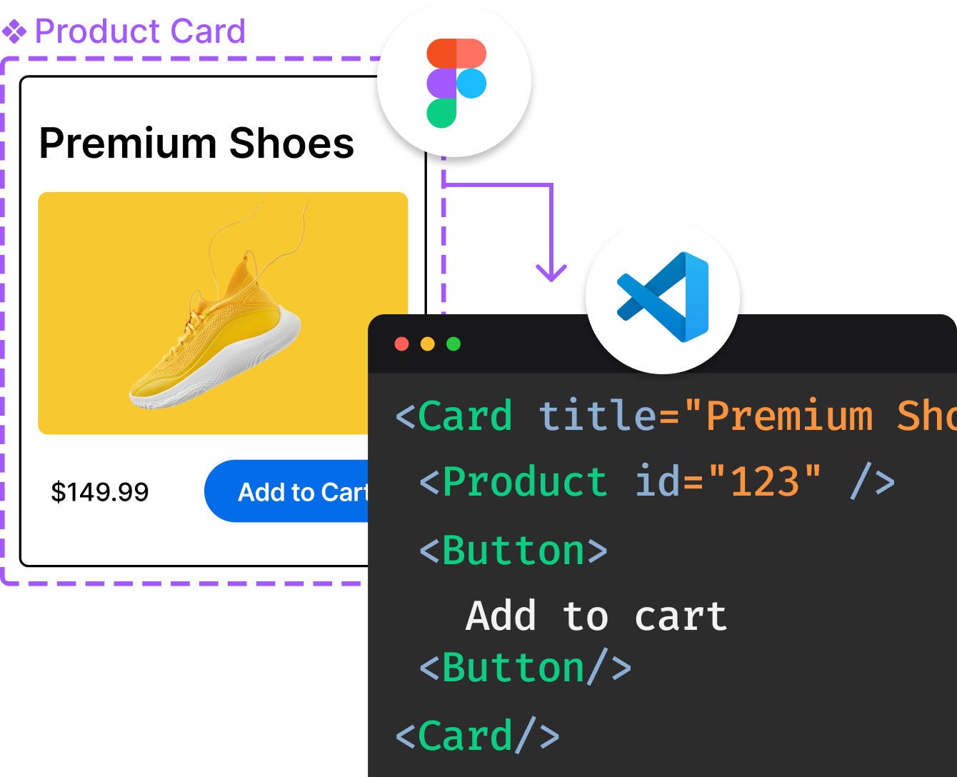
Introducing Visual Copilot: A new AI model to turn Figma designs to high quality code using your components.
Try Visual CopilotREADME
TACHYONS
Functional CSS for humans.
Quickly build and design new UI without writing CSS.
Principles
- Everything should be 100% responsive
- Everything should be readable on any device
- Everything should be as fast as possible
- Designing in the browser should be easy
- It should be easy to change any interface or part of an interface without breaking any existing interfaces
- Doing one thing extremely well promotes reusability and reduces repetition
- Documentation helps promote reusability and shared knowledge
- CSS shouldn't impede accessibility or the default functionality of HTML
- You should send the smallest possible amount of code to the user
Features
- Mobile-first CSS architecture
- 490 accessible color combinations
- 8px baseline grid
- Multiple debugging utilities to reduce layout struggles
- Single-purpose class structure
- Optimized for maximum gzip compression
- Lightweight (~14kB)
- Usable across projects
- Growing open source component library
- Works well with plain HTML, React, Ember, Angular, Rails and more
- Infinitely nestable responsive grid system
- Built with PostCSS
Getting Started
Docs can be found at http://tachyons.io/docs The modules are generally pretty small and thus quick and easy to read.
Use the CDN
The quickest and easiest way to start using Tachyons is to include a reference to the minified file in the head of your HTML file.
<link rel="stylesheet" href="https://unpkg.com/tachyons@4/css/tachyons.min.css">
Local Setup
Clone the repo from Github and install dependencies through npm.
git clone https://github.com/tachyons-css/tachyons.git
cd tachyons
npm install
Dev
If you want to just use everything in tachyons/src as a jumping off point and edit all the code yourself, you can compile all of your wonderful changes by running:
npm start
This will output both minified and unminified versions of the CSS to the CSS directory and watch the src directory for changes. It's aliased to the command:
npm run build:watch
If you'd like to just build the CSS once without watching the src directory, run:
npm run build
If you want to check that a class hasn't been redefined or 'mutated,' there is a linter to check that all of the classes have only been defined once. This can be useful if you are using another library or have written some of your own CSS and want to make sure there are no naming collisions. To do this run the command:
npm run mutations
Docs
The tachyons docs located at http://tachyons.io are all open source and located at https://github.com/tachyons-css/tachyons-css.github.io
You can clone the docs and use them as a template for documenting your own design system / patterns / components. While not everything is automated, the component library generation makes it extremely easy to generate and organize the documentation for components as demonstrated at http://tachyons.io/components
Community Resources
- DWYL Learn Tachyons: Learn how to use Tachyons to craft beautiful, responsive, functional and fast UI with minimal CSS
- Tachyons TLDR: Quick lookup for Tachyons classes, scales and color palette
- Tachyons Pro: Fun quiz for memorizing class names
Contributing
Please read our code of conduct for contributors.
Tachyons in Production
A longer list of sites that use tachyons in production can be found in sites.md We love letting the community see what people are building. Please add your link to sites.md in a PR or by opening an issue if you're willing to share to your site or project.
Featured Sites
- https://interfacelovers.com
- https://npmjs.com
- https://womenwho.design
- https://friendstalkfrontend.com
- https://play.webvr.rocks
- https://gohugo.io
- https://coralproject.net
- http://www.philipyoungg.com
- https://gitpoint.co
- https://2017.nodeconf.com.ar
- https://goldenstaterecord.com
- http://hicuties.com
- https://urlbox.io
- https://fontawesome.com
- https://purple3.herokuapp.com
- http://blunt.af/tachy.app/
- https://fenderdigital.github.io/css-utilities/intro/
- https://play.cash
- https://bitmidi.com
And of course...
Sponsors
Development of Tachyons is supported by
Help
If you have a question or need help feel free to open an issue here or jump into the Tachyons slack channel.
Top Related Projects
A utility-first CSS framework for rapid UI development.
Modern CSS framework based on Flexbox
The most popular HTML, CSS, and JavaScript framework for developing responsive, mobile first projects on the web.
The most advanced responsive front-end framework in the world. Quickly create prototypes and production code for sites that work on any kind of device.
The instant on-demand atomic CSS engine.
Primer is GitHub's design system. This is the CSS implementation
Convert  designs to code with AI

Introducing Visual Copilot: A new AI model to turn Figma designs to high quality code using your components.
Try Visual Copilot