
Top Related Projects

WinUI: a modern UI framework with a rich set of controls and styles to build dynamic and high-performing Windows applications.

The Windows Community Toolkit is a collection of helpers, extensions, and custom controls. It simplifies and demonstrates common developer tasks building .NET apps with UWP and the Windows App SDK / WinUI 3 for Windows 10 and Windows 11. The toolkit is part of the .NET Foundation.

Google's Material Design in XAML & WPF, for C# & VB.Net.

Develop Desktop, Embedded, Mobile and WebAssembly apps with C# and XAML. The most popular .NET UI client technology

A framework that allows developers to cobble together a better UI for their own WPF applications with minimal effort.

Free and beautiful XAML template pages for Xamarin.Forms apps.
Quick Overview
UI for UWP is a comprehensive suite of UI controls and components for building Windows 10 Universal Windows Platform (UWP) applications. Developed by Telerik, it offers a wide range of customizable and feature-rich controls to enhance the user interface and user experience of UWP apps.
Pros
- Extensive collection of UI controls and components
- High performance and optimized for UWP
- Consistent look and feel across different Windows 10 devices
- Regular updates and responsive support from Telerik
Cons
- Requires a commercial license for full access to all features
- Learning curve for developers new to the Telerik ecosystem
- Limited community-driven extensions compared to some open-source alternatives
- May introduce additional complexity to smaller projects
Code Examples
- Creating a RadCalendar control:
<telerik:RadCalendar x:Name="calendar"
                     DisplayMode="Month"
                     SelectionMode="Single" />
- Implementing a RadDataGrid with custom columns:
<telerik:RadDataGrid x:Name="dataGrid"
                     AutoGenerateColumns="False">
    <telerik:RadDataGrid.Columns>
        <telerik:DataGridTextColumn PropertyName="Name" Header="Name" />
        <telerik:DataGridNumericalColumn PropertyName="Age" Header="Age" />
        <telerik:DataGridDateColumn PropertyName="BirthDate" Header="Birth Date" />
    </telerik:RadDataGrid.Columns>
</telerik:RadDataGrid>
- Using RadChart to create a line chart:
<telerik:RadCartesianChart>
    <telerik:RadCartesianChart.HorizontalAxis>
        <telerik:CategoricalAxis />
    </telerik:RadCartesianChart.HorizontalAxis>
    <telerik:RadCartesianChart.VerticalAxis>
        <telerik:LinearAxis />
    </telerik:RadCartesianChart.VerticalAxis>
    <telerik:LineSeries ItemsSource="{Binding Data}">
        <telerik:LineSeries.ValueBinding>
            <telerik:PropertyNameDataPointBinding PropertyName="Value" />
        </telerik:LineSeries.ValueBinding>
        <telerik:LineSeries.CategoryBinding>
            <telerik:PropertyNameDataPointBinding PropertyName="Category" />
        </telerik:LineSeries.CategoryBinding>
    </telerik:LineSeries>
</telerik:RadCartesianChart>
Getting Started
-
Install the Telerik UI for UWP NuGet package:
Install-Package Telerik.UI.for.UniversalWindowsPlatform -
Add the Telerik namespace to your XAML file:
xmlns:telerik="using:Telerik.UI.Xaml.Controls" -
Use Telerik controls in your XAML:
<telerik:RadButton Content="Click me!" /> -
Initialize the Telerik controls in your app's constructor:
public App()
{
    this.InitializeComponent();
    Telerik.UI.Xaml.Controls.Chart.RadChartBase.DefaultPalette = new Telerik.UI.Xaml.Controls.Chart.ChartPalettes.DefaultLightPalette();
}
Competitor Comparisons
WinUI: a modern UI framework with a rich set of controls and styles to build dynamic and high-performing Windows applications.
Pros of microsoft-ui-xaml
- Officially supported by Microsoft, ensuring long-term maintenance and compatibility
- Larger community and more frequent updates
- Seamless integration with Windows 10 and 11 design language
Cons of microsoft-ui-xaml
- Limited to UWP and WinUI 3 platforms
- Steeper learning curve for developers new to XAML
- Less comprehensive set of controls compared to UI-For-UWP
Code Comparison
microsoft-ui-xaml:
<muxc:NavigationView>
    <muxc:NavigationView.MenuItems>
        <muxc:NavigationViewItem Icon="Home" Content="Home"/>
        <muxc:NavigationViewItem Icon="Settings" Content="Settings"/>
    </muxc:NavigationView.MenuItems>
</muxc:NavigationView>
UI-For-UWP:
<telerik:RadNavigationView>
    <telerik:RadNavigationView.Items>
        <telerik:RadNavigationViewItem Icon="Home" Content="Home"/>
        <telerik:RadNavigationViewItem Icon="Settings" Content="Settings"/>
    </telerik:RadNavigationView.Items>
</telerik:RadNavigationView>
Both libraries offer similar functionality, but microsoft-ui-xaml uses the muxc namespace, while UI-For-UWP uses the telerik namespace. The microsoft-ui-xaml example uses MenuItems property, while UI-For-UWP uses Items. The overall structure and usage are quite similar, making it relatively easy for developers to switch between the two libraries if needed.
The Windows Community Toolkit is a collection of helpers, extensions, and custom controls. It simplifies and demonstrates common developer tasks building .NET apps with UWP and the Windows App SDK / WinUI 3 for Windows 10 and Windows 11. The toolkit is part of the .NET Foundation.
Pros of WindowsCommunityToolkit
- Open-source and community-driven, allowing for faster updates and contributions
- Wider range of controls and helpers for various UWP development scenarios
- Regularly maintained with frequent updates and bug fixes
Cons of WindowsCommunityToolkit
- Less comprehensive documentation compared to UI-For-UWP
- May lack some advanced features found in commercial solutions
- Potential for inconsistencies due to community-driven development
Code Comparison
WindowsCommunityToolkit:
<controls:AdaptiveGridView
    OneRowModeEnabled="False"
    ItemHeight="200"
    DesiredWidth="300"
    ItemsSource="{x:Bind Items}">
</controls:AdaptiveGridView>
UI-For-UWP:
<telerik:RadDataGrid
    ItemsSource="{Binding Items}"
    AutoGenerateColumns="False">
    <telerik:RadDataGrid.Columns>
        <telerik:DataGridTextColumn PropertyName="Name"/>
    </telerik:RadDataGrid.Columns>
</telerik:RadDataGrid>
The WindowsCommunityToolkit example showcases an adaptive grid view, while the UI-For-UWP example demonstrates a data grid with custom columns. Both libraries offer similar functionality, but with different syntax and features tailored to their respective ecosystems.
Google's Material Design in XAML & WPF, for C# & VB.Net.
Pros of MaterialDesignInXamlToolkit
- Open-source and free to use, allowing for community contributions and customization
- Implements Google's Material Design principles, providing a modern and consistent UI
- Extensive documentation and samples available for developers
Cons of MaterialDesignInXamlToolkit
- Limited to Material Design aesthetics, which may not suit all application styles
- Requires more manual implementation compared to UI-For-UWP's drag-and-drop approach
- May have a steeper learning curve for developers unfamiliar with Material Design concepts
Code Comparison
MaterialDesignInXamlToolkit:
<materialDesign:Card Padding="32" Margin="16">
    <TextBlock Style="{DynamicResource MaterialDesignHeadline6TextBlock}">
        Hello World
    </TextBlock>
</materialDesign:Card>
UI-For-UWP:
<telerik:RadCard Padding="32" Margin="16">
    <TextBlock Style="{StaticResource TelerikHeadingTextBlockStyle}">
        Hello World
    </TextBlock>
</telerik:RadCard>
Both examples show a card component with similar styling, but MaterialDesignInXamlToolkit uses Material Design-specific classes and styles, while UI-For-UWP uses Telerik's custom components and styles.
Develop Desktop, Embedded, Mobile and WebAssembly apps with C# and XAML. The most popular .NET UI client technology
Pros of Avalonia
- Cross-platform support for Windows, macOS, Linux, iOS, Android, and WebAssembly
- Modern, flexible UI framework with XAML-based design
- Active development and community support
Cons of Avalonia
- Smaller ecosystem and fewer third-party controls compared to UWP
- Learning curve for developers new to XAML-based frameworks
- Some UWP-specific features may not be available or require workarounds
Code Comparison
Avalonia:
<Window xmlns="https://github.com/avaloniaui"
        xmlns:x="http://schemas.microsoft.com/winfx/2006/xaml"
        Title="Avalonia Example">
    <Button Content="Click Me" />
</Window>
UI-For-UWP:
<Page
    x:Class="UWPExample.MainPage"
    xmlns="http://schemas.microsoft.com/winfx/2006/xaml/presentation"
    xmlns:x="http://schemas.microsoft.com/winfx/2006/xaml"
    xmlns:telerik="using:Telerik.UI.Xaml.Controls">
    <telerik:RadButton Content="Click Me" />
</Page>
The code comparison shows similarities in XAML structure, but Avalonia uses its own namespace and simpler controls, while UI-For-UWP utilizes UWP-specific namespaces and Telerik controls. Avalonia's approach allows for greater cross-platform compatibility, while UI-For-UWP provides deeper integration with the UWP ecosystem and Telerik's extensive control library.
A framework that allows developers to cobble together a better UI for their own WPF applications with minimal effort.
Pros of MahApps.Metro
- Open-source and free to use, making it more accessible for developers
- Extensive community support and regular updates
- Lightweight and easy to integrate into existing WPF projects
Cons of MahApps.Metro
- Limited to WPF applications, not supporting UWP
- Less comprehensive control set compared to UI-For-UWP
- May require more custom styling and configuration for complex UI scenarios
Code Comparison
MahApps.Metro:
<Controls:MetroWindow x:Class="MainWindow"
    xmlns:Controls="http://metro.mahapps.com/winfx/xaml/controls"
    Title="MahApps.Metro Sample" Height="600" Width="800">
    <Controls:MetroAnimatedSingleRowTabControl>
        <!-- Tab content here -->
    </Controls:MetroAnimatedSingleRowTabControl>
</Controls:MetroWindow>
UI-For-UWP:
<Page x:Class="MainPage"
    xmlns:telerikPrimitives="using:Telerik.UI.Xaml.Controls.Primitives">
    <telerikPrimitives:RadTabControl>
        <!-- Tab content here -->
    </telerikPrimitives:RadTabControl>
</Page>
Both libraries offer custom controls and styling options, but UI-For-UWP is specifically designed for UWP applications, while MahApps.Metro focuses on enhancing WPF applications with a modern UI.
Free and beautiful XAML template pages for Xamarin.Forms apps.
Pros of Essential UI Kit for Xamarin.Forms
- Cross-platform support for iOS, Android, and UWP
- Extensive collection of pre-built UI templates and layouts
- Regular updates and active community support
Cons of Essential UI Kit for Xamarin.Forms
- Limited customization options compared to UI-For-UWP
- Steeper learning curve for developers new to Xamarin.Forms
Code Comparison
Essential UI Kit for Xamarin.Forms:
<ContentPage xmlns="http://xamarin.com/schemas/2014/forms"
             xmlns:x="http://schemas.microsoft.com/winfx/2009/xaml"
             xmlns:sfbutton="clr-namespace:Syncfusion.XForms.Buttons;assembly=Syncfusion.Buttons.XForms">
    <sfbutton:SfButton Text="Click me!" />
</ContentPage>
UI-For-UWP:
<Page xmlns="http://schemas.microsoft.com/winfx/2006/xaml/presentation"
      xmlns:x="http://schemas.microsoft.com/winfx/2006/xaml"
      xmlns:telerik="using:Telerik.UI.Xaml.Controls.Primitives">
    <telerik:RadButton Content="Click me!" />
</Page>
Both repositories offer UI components for their respective platforms. Essential UI Kit for Xamarin.Forms provides a wider range of pre-built templates and cross-platform support, making it suitable for rapid development across multiple platforms. UI-For-UWP, on the other hand, offers more extensive customization options and is specifically tailored for UWP applications, potentially providing better performance and integration with Windows-specific features.
Convert  designs to code with AI

Introducing Visual Copilot: A new AI model to turn Figma designs to high quality code using your components.
Try Visual CopilotREADME
Progress Telerik UI for UWP

This is an open-source version of Telerik UI for Universal Windows Platform (UWP) by Progress. The project is community-supported on Stack Overflow. Commercial support is available at telerik.com/uwp where you'll find a supported commercial trial and pricing options. Please visit telerik.com for UI tools for ASP.NET, WPF, WinForms, or JavaScript.
Build status
| Target | Branch | Status | Recommended Nuget packages version |
|---|---|---|---|
| Production | master |  | |
| Pre-release beta testing | dev | - |
Available UI Components and Documentation for UI for UWP
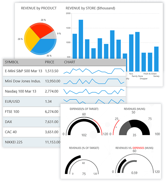
UI for UWP is built to target UWP Windows 10 application development and deliver a unique experience based on the Microsoft UX guidelines for Windows Runtime apps. It consists of the following components:
- RadAutoCompleteBox
- RadBulletGraph
- RadBusyIndicator
- RadCalendar
- RadChart
- RadDataBoundListBox
- RadDataForm
- RadDataGrid
- RadDatePicker and RadTimePicker
- RadExpander
- RadGauge
- RadHexView
- RadHubTile
- RadListView
- RadLoopingList
- RadMap
- RadNumericBox
- RadPagination
- RadRadialMenu
- RadRangeSlider
- RadRating
- RadSideDrawer
Documentation
The official documentation for UI for UWP is available here and here is the git repo for it Telerik UI for UWP documentaton repo
Demos
The UI for UWP Demos application demonstrates a great number of user case scenarios using Telerik UI for UWP.
Also, you can take a look at the Customers Orders Database sample developed by Microsoft, which showcases the usage of the RadDataGrid control.
Getting started
- Make sure you have the required software to build UWP applications
- Clone a copy of the repository code
- Open UWPControls.sln located in Controls folder and build it
- Open UWPMap.sln located in Controls folder and build it in x86/x64 and ARM configs
- All binaries are now located in Binaries folder
- You can additionaly build a NuGet package by running BuildTools/BuildNuGet.bat. The generated package will be located in the NuGet subfolder.
Downloads
If you want to skip building the project yourself, you can get the prebuilt nuget package.
How to Contribute
UI for UWP is free and open-source. We encourage and support an active, healthy community that accepts contributions from the public. We'd like you to be a part of that community.
Before contributing to UI for UWP, please:
Read our contribution guide, which houses all of the necessary info to:
- submit bugs,
- request new features, and,
- walk you through the entire process of preparing your code for a Pull Request.
Getting Help
- Use the issues list of this repo for bug reports.
- Get help on Stack Overflow or the using the commercial Telerik UI for UWP support channel.
As a fully-open source project, UI for UWP is a primarily community-supported project, as such, you are encouraged to use forums like Stack Overflow to post questions, and the issues list of this repo to report bugs.
The UI for UWP team does not provide formal support, except to those customers who have purchased a commercial license for UI for UWP. Please do not create support requests for this project in the issues list for this repo, as these will be immediately closed. You'll be directed to post your question on a community forum.
License
Licensed under the Apache License, Version 2.0. Please refer to LICENSE.md for more information.
.NET Foundation
This project is supported by the .NET Foundation.
Recent news
- Blog: Getting Started with Telerik UI for UWP
- Video on CH9: Getting Started with Telerik UI for UWP
- Blog: Telerik UI for UWP joins the .NET Foundation
- Blog: Telerik UI for UWP in Windows Template Studio
- Blog: Telerik UI for UWP toolbox support with NuGet package (alternative link)
- Video: Building Windows Apps with Adaptive UI om Channel9 (alternative link)
- Blog: Analyzing NEOs with Telerik UI for UWP
Like what you see?
If you like what you see, tweet us please
Top Related Projects
WinUI: a modern UI framework with a rich set of controls and styles to build dynamic and high-performing Windows applications.
The Windows Community Toolkit is a collection of helpers, extensions, and custom controls. It simplifies and demonstrates common developer tasks building .NET apps with UWP and the Windows App SDK / WinUI 3 for Windows 10 and Windows 11. The toolkit is part of the .NET Foundation.
Google's Material Design in XAML & WPF, for C# & VB.Net.
Develop Desktop, Embedded, Mobile and WebAssembly apps with C# and XAML. The most popular .NET UI client technology
A framework that allows developers to cobble together a better UI for their own WPF applications with minimal effort.
Free and beautiful XAML template pages for Xamarin.Forms apps.
Convert designs to code with AI
Introducing Visual Copilot: A new AI model to turn Figma designs to high quality code using your components.
Try Visual Copilot