 victory
A collection of composable React components for building interactive data visualizations
Top Related Projects
Redefined chart library built with React and D3
Bring data to life with SVG, Canvas and HTML. :bar_chart::chart_with_upwards_trend::tada:
Simple HTML5 Charts using the <canvas> tag
📊 Interactive JavaScript Charts built on SVG
nivo provides a rich set of dataviz components, built on top of the awesome d3 and React libraries
Quick Overview
Victory is a powerful and flexible data visualization library for React applications. It provides a set of customizable and composable components for creating various types of charts and graphs, making it easier for developers to build interactive and visually appealing data representations.
Pros
- Highly customizable and composable components
- Seamless integration with React applications
- Supports both SVG and Canvas rendering
- Extensive documentation and examples
Cons
- Steeper learning curve compared to simpler charting libraries
- Performance can be an issue with large datasets
- Limited built-in animation options
- Some advanced features require additional configuration
Code Examples
Creating a basic bar chart:
import React from 'react';
import { VictoryBar, VictoryChart, VictoryAxis } from 'victory';

const data = [
  { quarter: 1, earnings: 13000 },
  { quarter: 2, earnings: 16500 },
  { quarter: 3, earnings: 14250 },
  { quarter: 4, earnings: 19000 }
];

const BarChart = () => (
  <VictoryChart domainPadding={20}>
    <VictoryAxis tickValues={[1, 2, 3, 4]} tickFormat={["Q1", "Q2", "Q3", "Q4"]} />
    <VictoryAxis dependentAxis tickFormat={(x) => (`$${x / 1000}k`)} />
    <VictoryBar data={data} x="quarter" y="earnings" />
  </VictoryChart>
);
Creating a pie chart with custom styles:
import React from 'react';
import { VictoryPie } from 'victory';

const data = [
  { x: "Cats", y: 35 },
  { x: "Dogs", y: 40 },
  { x: "Birds", y: 25 }
];

const PieChart = () => (
  <VictoryPie
    data={data}
    colorScale={["tomato", "orange", "gold"]}
    radius={({ datum }) => 70 + datum.y * 2}
    innerRadius={50}
    labels={({ datum }) => `${datum.x}: ${datum.y}%`}
  />
);
Creating an interactive scatter plot:
import React from 'react';
import { VictoryScatter, VictoryChart, VictoryTooltip } from 'victory';

const data = [
  { x: 1, y: 2, label: "Point 1" },
  { x: 2, y: 3, label: "Point 2" },
  { x: 3, y: 5, label: "Point 3" },
  { x: 4, y: 4, label: "Point 4" },
  { x: 5, y: 7, label: "Point 5" }
];

const ScatterPlot = () => (
  <VictoryChart>
    <VictoryScatter
      data={data}
      size={5}
      style={{ data: { fill: "#c43a31" } }}
      labels={({ datum }) => datum.label}
      labelComponent={<VictoryTooltip />}
    />
  </VictoryChart>
);
Getting Started
To start using Victory in your React project, follow these steps:
-
Install Victory using npm or yarn:
npm install victoryor
yarn add victory -
Import the necessary components in your React file:
import { VictoryBar, VictoryChart, VictoryAxis } from 'victory'; -
Use the components to create your desired chart:
const MyChart = () => ( <VictoryChart> <VictoryBar data={data} /> </VictoryChart> ); -
Customize your chart by adding props and styles to the Victory components.
Competitor Comparisons
Redefined chart library built with React and D3
Pros of Recharts
- Simpler API and easier learning curve for beginners
- Better performance with large datasets
- More comprehensive documentation and examples
Cons of Recharts
- Less customizable than Victory for complex visualizations
- Fewer animation options out of the box
Code Comparison
Victory:
<VictoryChart>
  <VictoryBar
    data={data}
    x="quarter"
    y="earnings"
  />
</VictoryChart>
Recharts:
<BarChart data={data}>
  <XAxis dataKey="quarter" />
  <YAxis />
  <Bar dataKey="earnings" fill="#8884d8" />
</BarChart>
Both libraries offer declarative, component-based approaches to creating charts. Victory's syntax is more verbose but provides finer control over individual elements. Recharts has a more concise syntax, making it easier to create basic charts quickly.
Victory excels in customization and complex visualizations, while Recharts is more performant with large datasets and has a gentler learning curve. The choice between the two depends on specific project requirements, desired level of customization, and developer familiarity with React concepts.
Bring data to life with SVG, Canvas and HTML. :bar_chart::chart_with_upwards_trend::tada:
Pros of d3
- More flexible and powerful, allowing for complex, custom visualizations
- Extensive ecosystem with numerous plugins and extensions
- Direct manipulation of SVG elements for fine-grained control
Cons of d3
- Steeper learning curve and more verbose code
- Requires more manual work for basic charts and graphs
- Less abstraction, which can lead to more boilerplate code
Code Comparison
d3:
const svg = d3.select("body").append("svg")
    .attr("width", 400)
    .attr("height", 300);

svg.selectAll("rect")
    .data(data)
    .enter().append("rect")
    .attr("x", (d, i) => i * 45)
    .attr("y", d => 300 - d * 10)
    .attr("width", 40)
    .attr("height", d => d * 10);
Victory:
<VictoryChart>
  <VictoryBar
    data={data}
    x="category"
    y="value"
  />
</VictoryChart>
Victory provides a higher-level abstraction, making it easier to create common chart types with less code. However, d3 offers more flexibility for custom visualizations at the cost of increased complexity. The choice between the two depends on the specific requirements of the project and the developer's familiarity with each library.
Simple HTML5 Charts using the <canvas> tag
Pros of Chart.js
- Wider browser compatibility, including older versions
- Simpler API and easier learning curve for beginners
- Smaller bundle size, leading to faster load times
Cons of Chart.js
- Less customizable and flexible compared to Victory
- Limited support for complex, interactive visualizations
- Fewer chart types and options out of the box
Code Comparison
Victory:
import { VictoryBar } from 'victory';

<VictoryBar
  data={[
    { x: 'A', y: 1 },
    { x: 'B', y: 2 },
    { x: 'C', y: 3 }
  ]}
/>
Chart.js:
import Chart from 'chart.js/auto';

new Chart(ctx, {
  type: 'bar',
  data: {
    labels: ['A', 'B', 'C'],
    datasets: [{ data: [1, 2, 3] }]
  }
});
Victory offers a more declarative, React-friendly approach, while Chart.js uses a more traditional JavaScript object configuration. Victory's syntax is generally more concise and easier to read, especially for React developers. However, Chart.js's configuration style may be more familiar to developers coming from other charting libraries or vanilla JavaScript backgrounds.
📊 Interactive JavaScript Charts built on SVG
Pros of ApexCharts
- More chart types and customization options
- Built-in responsiveness and mobile-friendly design
- Easier to implement animations and interactivity
Cons of ApexCharts
- Larger file size and potentially slower performance
- Less integration with React ecosystem
- Steeper learning curve for complex configurations
Code Comparison
Victory:
<VictoryChart>
  <VictoryBar data={data} x="quarter" y="earnings" />
</VictoryChart>
ApexCharts:
<ReactApexChart
  options={{
    chart: { type: 'bar' },
    xaxis: { categories: data.map(d => d.quarter) }
  }}
  series={[{ data: data.map(d => d.earnings) }]}
  type="bar"
/>
Victory focuses on a more declarative approach with separate components for each chart element, while ApexCharts uses a configuration object and a single component for rendering. ApexCharts requires more setup in the options object but offers more built-in features. Victory's approach may be more intuitive for React developers, but ApexCharts provides more out-of-the-box functionality.
nivo provides a rich set of dataviz components, built on top of the awesome d3 and React libraries
Pros of nivo
- More chart types and customization options
- Built-in responsive design and animations
- Better documentation and examples
Cons of nivo
- Steeper learning curve due to more complex API
- Larger bundle size
Code Comparison
nivo:
<ResponsivePie
  data={data}
  margin={{ top: 40, right: 80, bottom: 80, left: 80 }}
  innerRadius={0.5}
  padAngle={0.7}
  cornerRadius={3}
  colors={{ scheme: 'nivo' }}
  borderWidth={1}
  borderColor={{ from: 'color', modifiers: [ [ 'darker', 0.2 ] ] }}
/>
Victory:
<VictoryPie
  data={data}
  innerRadius={100}
  padAngle={3}
  cornerRadius={5}
  colorScale={["tomato", "orange", "gold", "cyan", "navy"]}
/>
Both nivo and Victory are powerful data visualization libraries for React. nivo offers more chart types and customization options, along with built-in responsive design and animations. It also has better documentation and examples. However, nivo has a steeper learning curve due to its more complex API and a larger bundle size.
Victory, on the other hand, has a simpler API and is easier to get started with, but it offers fewer chart types and customization options out of the box. The code comparison shows that nivo's syntax is more verbose but offers more fine-grained control, while Victory's syntax is more concise and straightforward.
Convert  designs to code with AI

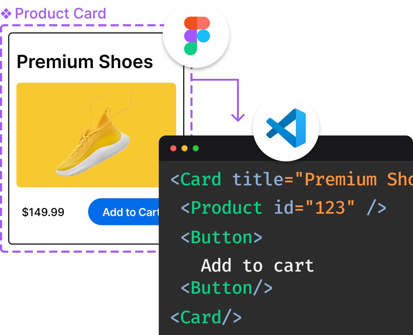
Introducing Visual Copilot: A new AI model to turn Figma designs to high quality code using your components.
Try Visual CopilotREADME
Victory
Contents
- See the docs and examples on the website: https://commerce.nearform.com/open-source/victory
- Experiment with all Victory components in this code sandbox
Getting started
- Add Victory to your project:
# npm
$ npm i --save victory
# or yarn
$ yarn add victory
- Add your first Victory component:
import React from "react";
import { render } from "react-dom";
import { VictoryPie } from "victory";

const PieChart = () => {
  return <VictoryPie />;
};

render(<PieChart />, document.getElementById("app"));
VictoryPiecomponent will be rendered, and you should see:

Requirements
Projects using Victory should also depend on React. As of victory@34.0.0 Victory requires React version 16.3.0 or above
Victory Native
Victory Native shares most of its code with Victory, and has a nearly identical API! To learn more, check out the Victory Native package README.
Contributing
Please see the Contributing guide.
Maintenance Status
Active: Formidable is actively working on this project, and we expect to continue to work for the foreseeable future. Bug reports, feature requests and pull requests are welcome.
Top Related Projects
Redefined chart library built with React and D3
Bring data to life with SVG, Canvas and HTML. :bar_chart::chart_with_upwards_trend::tada:
Simple HTML5 Charts using the <canvas> tag
📊 Interactive JavaScript Charts built on SVG
nivo provides a rich set of dataviz components, built on top of the awesome d3 and React libraries
Convert  designs to code with AI

Introducing Visual Copilot: A new AI model to turn Figma designs to high quality code using your components.
Try Visual Copilot

