 d3
d3
Bring data to life with SVG, Canvas and HTML. :bar_chart::chart_with_upwards_trend::tada:
Top Related Projects
Bring data to life with SVG, Canvas and HTML. :bar_chart::chart_with_upwards_trend::tada:
Simple HTML5 Charts using the <canvas> tag
Open-source JavaScript charting library behind Plotly and Dash
Highcharts JS, the JavaScript charting framework
Apache ECharts is a powerful, interactive charting and data visualization library for browser
Multi-Dimensional charting built to work natively with crossfilter rendered with d3.js
Quick Overview
D3.js (Data-Driven Documents) is a powerful JavaScript library for creating dynamic, interactive data visualizations in web browsers. It leverages web standards like HTML, SVG, and CSS to transform data into visual representations, offering unparalleled flexibility and control over the final output.
Pros
- Highly flexible and customizable, allowing for creation of unique and complex visualizations
- Excellent performance, even with large datasets, due to efficient data binding
- Extensive documentation and a large, active community for support
- Seamless integration with web technologies, making it ideal for web-based visualizations
Cons
- Steep learning curve, especially for those new to web technologies or data visualization
- Requires more code and setup compared to higher-level charting libraries
- Limited built-in chart types; most visualizations need to be built from scratch
- May be overkill for simple charts or graphs
Code Examples
- Creating a simple bar chart:
const data = [4, 8, 15, 16, 23, 42];

const svg = d3.select("body").append("svg")
    .attr("width", 420)
    .attr("height", 300);

svg.selectAll("rect")
    .data(data)
    .enter()
    .append("rect")
    .attr("x", (d, i) => i * 70)
    .attr("y", d => 300 - d * 5)
    .attr("width", 65)
    .attr("height", d => d * 5)
    .attr("fill", "steelblue");
- Creating a line chart:
const data = [
    {date: new Date("2023-01-01"), value: 100},
    {date: new Date("2023-02-01"), value: 150},
    {date: new Date("2023-03-01"), value: 125},
    {date: new Date("2023-04-01"), value: 200}
];

const svg = d3.select("body").append("svg")
    .attr("width", 600)
    .attr("height", 400);

const x = d3.scaleTime()
    .domain(d3.extent(data, d => d.date))
    .range([0, 600]);

const y = d3.scaleLinear()
    .domain([0, d3.max(data, d => d.value)])
    .range([400, 0]);

const line = d3.line()
    .x(d => x(d.date))
    .y(d => y(d.value));

svg.append("path")
    .datum(data)
    .attr("fill", "none")
    .attr("stroke", "steelblue")
    .attr("stroke-width", 1.5)
    .attr("d", line);
- Creating a force-directed graph:
const nodes = [{id: "A"}, {id: "B"}, {id: "C"}];
const links = [{source: "A", target: "B"}, {source: "B", target: "C"}];

const simulation = d3.forceSimulation(nodes)
    .force("link", d3.forceLink(links).id(d => d.id))
    .force("charge", d3.forceManyBody())
    .force("center", d3.forceCenter(300, 200));

const svg = d3.select("body").append("svg")
    .attr("width", 600)
    .attr("height", 400);

const link = svg.append("g")
    .selectAll("line")
    .data(links)
    .join("line")
    .attr("stroke", "#999")
    .attr("stroke-opacity", 0.6);

const node = svg.append("g")
    .selectAll("circle")
    .data(nodes)
    .join("circle")
    .attr("r", 5)
    .attr("fill", "#69b3a2");

simulation.on("tick", () => {
    link
        .attr("x1", d => d.source.
Competitor Comparisons
Bring data to life with SVG, Canvas and HTML. :bar_chart::chart_with_upwards_trend::tada:
Pros of d3
- Comprehensive library with a wide range of visualization capabilities
- Extensive documentation and large community support
- Flexible and customizable, allowing for complex and unique visualizations
Cons of d3
- Steeper learning curve for beginners
- Can be overkill for simple visualizations
- Requires more code to create basic charts compared to some other libraries
Code Comparison
d3:
d3.select("body")
  .append("svg")
  .attr("width", 200)
  .attr("height", 200)
  .append("circle")
  .attr("cx", 100)
  .attr("cy", 100)
  .attr("r", 50)
  .style("fill", "blue");
d3:
d3.select("body")
  .append("svg")
  .attr("width", 200)
  .attr("height", 200)
  .append("circle")
  .attr("cx", 100)
  .attr("cy", 100)
  .attr("r", 50)
  .style("fill", "blue");
Note: The code comparison shows identical snippets because both repositories refer to the same d3 library. The main difference between d3/d3 and d3/d3 is typically in their versioning or specific release branches, rather than in the core functionality or syntax of the library itself.
Simple HTML5 Charts using the <canvas> tag
Pros of Chart.js
- Easier to learn and use, with a simpler API
- Built-in responsive design and animation
- Smaller file size, leading to faster load times
Cons of Chart.js
- Less flexible and customizable than D3
- Limited to chart types provided by the library
- Fewer options for complex data visualizations
Code Comparison
Chart.js example:
new Chart(ctx, {
    type: 'bar',
    data: {
        labels: ['Red', 'Blue', 'Yellow'],
        datasets: [{
            label: 'Colors',
            data: [12, 19, 3]
        }]
    }
});
D3 example:
d3.select("body")
  .selectAll("div")
  .data([4, 8, 15, 16, 23, 42])
  .enter()
  .append("div")
  .style("height", d => `${d * 10}px`);
Chart.js is more concise for common chart types, while D3 offers greater control over individual elements. Chart.js abstracts away much of the complexity, making it easier for beginners to create charts quickly. D3, on the other hand, provides a lower-level API that allows for more intricate and custom visualizations, but requires more code and understanding of data binding concepts.
Open-source JavaScript charting library behind Plotly and Dash
Pros of Plotly.js
- Higher-level API, easier to create common chart types quickly
- Built-in interactivity and responsiveness
- Extensive set of pre-built chart types and layouts
Cons of Plotly.js
- Less flexible for highly custom visualizations
- Larger file size and potentially slower performance
- Steeper learning curve for advanced customizations
Code Comparison
D3.js:
const svg = d3.select("body").append("svg")
    .attr("width", 400)
    .attr("height", 300);

svg.selectAll("circle")
    .data(data)
    .enter().append("circle")
    .attr("cx", d => d.x)
    .attr("cy", d => d.y)
    .attr("r", 5);
Plotly.js:
Plotly.newPlot("myDiv", [{
    x: data.map(d => d.x),
    y: data.map(d => d.y),
    mode: "markers",
    type: "scatter"
}]);
D3 offers more granular control over SVG elements, while Plotly.js provides a higher-level API for quickly creating common chart types. D3 requires more code for basic visualizations but offers greater flexibility for custom designs. Plotly.js simplifies the process of creating interactive charts but may be less suitable for highly specialized visualizations.
Highcharts JS, the JavaScript charting framework
Pros of Highcharts
- Easier to use with a gentler learning curve
- Extensive built-in chart types and features
- Better browser compatibility, especially for older versions
Cons of Highcharts
- Commercial license required for most use cases
- Less flexibility and customization options
- Larger file size, potentially impacting page load times
Code Comparison
Highcharts:
Highcharts.chart('container', {
  series: [{
    data: [1, 2, 3, 4, 5]
  }]
});
D3:
d3.select('#container')
  .selectAll('div')
  .data([1, 2, 3, 4, 5])
  .enter()
  .append('div')
  .style('width', d => d * 20 + 'px');
Summary
Highcharts offers a more user-friendly approach with pre-built chart types, making it ideal for rapid development and less experienced developers. However, it comes with licensing costs and less flexibility.
D3, on the other hand, provides unparalleled customization and control over visualizations but requires more coding expertise and time to create basic charts. It's free and open-source, making it suitable for a wider range of projects.
The choice between Highcharts and D3 depends on project requirements, budget, and developer expertise. Highcharts is better for quick, standard visualizations, while D3 excels in creating unique, highly interactive data representations.
Apache ECharts is a powerful, interactive charting and data visualization library for browser
Pros of ECharts
- Easier to use with pre-built chart types and configurations
- Better out-of-the-box performance for large datasets
- Supports server-side rendering for improved initial load times
Cons of ECharts
- Less flexible for creating custom visualizations
- Steeper learning curve for advanced customizations
- Larger file size, which may impact load times for smaller projects
Code Comparison
ECharts:
var myChart = echarts.init(document.getElementById('main'));
var option = {
    xAxis: {type: 'category', data: ['A', 'B', 'C']},
    yAxis: {type: 'value'},
    series: [{type: 'bar', data: [1, 2, 3]}]
};
myChart.setOption(option);
D3:
var svg = d3.select("#chart").append("svg");
var x = d3.scaleBand().domain(['A', 'B', 'C']).range([0, width]);
var y = d3.scaleLinear().domain([0, 3]).range([height, 0]);
svg.selectAll("rect").data([1, 2, 3])
   .enter().append("rect").attr("x", d => x(d)).attr("y", d => y(d));
Both libraries are powerful tools for data visualization, but they cater to different needs. ECharts offers a more straightforward approach for common chart types, while D3 provides greater flexibility for custom visualizations at the cost of a steeper learning curve.
Multi-Dimensional charting built to work natively with crossfilter rendered with d3.js
Pros of dc.js
- Higher-level abstraction for creating interactive charts and dashboards
- Built-in support for crossfiltering and data aggregation
- Easier to create complex, interconnected visualizations with less code
Cons of dc.js
- Less flexible than D3 for creating custom, non-standard visualizations
- Steeper learning curve for those already familiar with D3
- Smaller community and ecosystem compared to D3
Code Comparison
D3 (creating a simple bar chart):
const svg = d3.select("body").append("svg")
    .attr("width", width)
    .attr("height", height);

svg.selectAll("rect")
    .data(data)
    .enter().append("rect")
    .attr("x", (d, i) => i * 30)
    .attr("y", d => height - d * 4)
    .attr("width", 25)
    .attr("height", d => d * 4);
dc.js (creating a simple bar chart):
const chart = dc.barChart("#chart");
chart
    .width(600)
    .height(400)
    .x(d3.scaleBand())
    .xUnits(dc.units.ordinal)
    .brushOn(false)
    .yAxisLabel("Value")
    .dimension(dimension)
    .group(group);
chart.render();
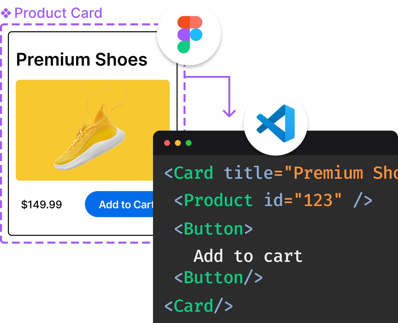
Convert  designs to code with AI

Introducing Visual Copilot: A new AI model to turn Figma designs to high quality code using your components.
Try Visual CopilotREADME
D3: Data-Driven Documents
D3 (or D3.js) is a free, open-source JavaScript library for visualizing data. Its low-level approach built on web standards offers unparalleled flexibility in authoring dynamic, data-driven graphics. For more than a decade D3 has powered groundbreaking and award-winning visualizations, become a foundational building block of higher-level chart libraries, and fostered a vibrant community of data practitioners around the world.
Daily downloads of D3 · oss-analytics
Resources
Top Related Projects
Bring data to life with SVG, Canvas and HTML. :bar_chart::chart_with_upwards_trend::tada:
Simple HTML5 Charts using the <canvas> tag
Open-source JavaScript charting library behind Plotly and Dash
Highcharts JS, the JavaScript charting framework
Apache ECharts is a powerful, interactive charting and data visualization library for browser
Multi-Dimensional charting built to work natively with crossfilter rendered with d3.js
Convert  designs to code with AI

Introducing Visual Copilot: A new AI model to turn Figma designs to high quality code using your components.
Try Visual Copilot