 react-native-app-intro
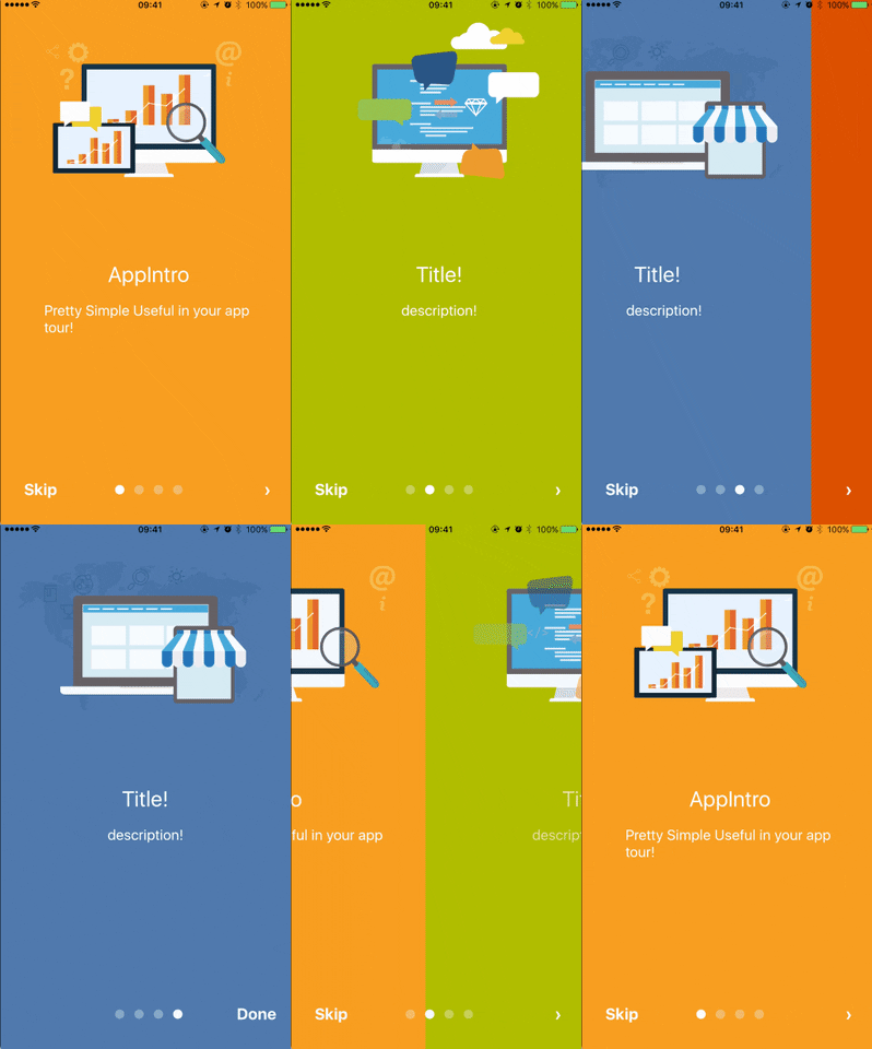
react-native-app-intro is a react native component implementing a parallax effect welcome page using base on react-native-swiper , similar to the one found in Google's app like Sheet, Drive, Docs...
Top Related Projects
Make a cool intro for your Android app.
[Archived] Highlight the best bits of your app to users quickly, simply, and cool...ly
Inspired by Heinrich Reimer Material Intro and developed with love from scratch
:octocat: PaperOnboarding is a material design slider made by @Ramotion
An implementation of tap targets from the Material Design guidelines for feature discovery.
Quick Overview
The react-native-app-intro project is a React Native library that provides a customizable and feature-rich app introduction or onboarding experience for your React Native applications. It allows you to create a smooth and engaging introduction for your users, helping them understand the key features and functionality of your app.
Pros
- Highly Customizable: The library offers a wide range of customization options, allowing you to tailor the introduction to match the branding and design of your app.
- Smooth Animations: The app introduction experience features smooth and visually appealing animations, enhancing the overall user experience.
- Flexible Content: You can easily add and customize the content, including images, titles, and descriptions, for each introduction screen.
- Responsive Design: The library is designed to work seamlessly across different device sizes and orientations, ensuring a consistent user experience.
Cons
- Dependency on React Native: As this is a React Native-specific library, it may not be suitable for non-React Native projects.
- Limited Functionality: While the library provides a solid app introduction experience, it may lack some advanced features or customization options compared to building a custom solution.
- Potential Performance Impact: Depending on the complexity of your introduction screens and the number of assets used, the library may have a slight performance impact on your app.
- Maintenance and Updates: As with any third-party library, you'll need to keep an eye on updates and potential compatibility issues with newer versions of React Native.
Code Examples
Here are a few code examples demonstrating the usage of the react-native-app-intro library:
import React from 'react';
import AppIntroSlider from 'react-native-app-intro-slider';

const slides = [
  {
    key: 'slide1',
    title: 'Welcome to our App',
    text: 'This is the first introduction screen.',
    image: require('./assets/slide1.png'),
    backgroundColor: '#59b2ab',
  },
  {
    key: 'slide2',
    title: 'Discover New Features',
    text: 'This is the second introduction screen.',
    image: require('./assets/slide2.png'),
    backgroundColor: '#febe29',
  },
  {
    key: 'slide3',
    title: 'Start Exploring',
    text: 'This is the third introduction screen.',
    image: require('./assets/slide3.png'),
    backgroundColor: '#22bcb5',
  },
];

const App = () => {
  return <AppIntroSlider slides={slides} />;
};

export default App;
This example demonstrates how to set up the AppIntroSlider component and define the content for each introduction screen.
import React from 'react';
import AppIntroSlider from 'react-native-app-intro-slider';
import { StyleSheet, View, Text, Image } from 'react-native';

const CustomSlide = ({ item }) => {
  return (
    <View style={styles.slide}>
      <Image source={item.image} style={styles.image} />
      <Text style={styles.title}>{item.title}</Text>
      <Text style={styles.text}>{item.text}</Text>
    </View>
  );
};

const App = () => {
  return (
    <AppIntroSlider
      renderItem={CustomSlide}
      data={slides}
      dotStyle={styles.dot}
      activeDotStyle={styles.activeDot}
    />
  );
};

const styles = StyleSheet.create({
  // Custom styles for the slide components
});

export default App;
This example demonstrates how to create a custom slide component and use it with the AppIntroSlider component.
Getting Started
To get started with the react-native-app-intro library, follow these steps:
- Install the library using npm or yarn:
npm install react-native-app-intro-slider
or
yarn add react-native-app-intro-slider
- Import the
AppIntroSlidercomponent and define your introduction screens:
import AppIntroSlider from
Competitor Comparisons
Make a cool intro for your Android app.
Pros of AppIntro
- Provides a more feature-rich and customizable introduction experience compared to FuYaoDe/react-native-app-intro.
- Supports a wider range of platforms, including iOS, Android, and React Native.
- Offers a larger community and more active development, with more contributors and issues/pull requests.
Cons of AppIntro
- Might have a steeper learning curve due to its more extensive feature set and customization options.
- Potentially heavier in terms of dependencies and overall project size compared to FuYaoDe/react-native-app-intro.
- May have a larger API surface area, which could make it more challenging to integrate into existing projects.
Code Comparison
FuYaoDe/react-native-app-intro
<AppIntro
  slides={[
    {
      title: 'Welcome',
      description: 'This is the first slide of the app introduction.',
      backgroundColor: '#fa931d',
      fontColor: '#fff',
      level: 1,
    },
    // Additional slides can be added here
  ]}
  onSkipBtnClick={() => console.log('Skip button was clicked')}
  onDoneBtnClick={() => console.log('Done button was clicked')}
/>
AppIntro/AppIntro
<AppIntro
  onSkipPressed={(index) => console.log(`Skipped on slide ${index}`)}
  onDonePressed={() => console.log('Done button was pressed')}
  onSlideChange={(index, total) => console.log(`Slide changed. Current index is ${index}, total is ${total}`)}
  showSkipButton={true}
  showDoneButton={true}
  // Additional props and customization options
>
  {/* Slide components can be added here */}
</AppIntro>
[Archived] Highlight the best bits of your app to users quickly, simply, and cool...ly
Pros of ShowcaseView
- Provides a clean and intuitive way to showcase features or content within an app
- Supports various types of views, including custom views, to be showcased
- Includes helpful animations and transitions to enhance the user experience
Cons of ShowcaseView
- Limited to Android platform, while FuYaoDe/react-native-app-intro supports both iOS and Android
- May require more configuration and setup compared to the more straightforward FuYaoDe/react-native-app-intro
- Lacks some of the advanced features and customization options available in FuYaoDe/react-native-app-intro
Code Comparison
FuYaoDe/react-native-app-intro
<AppIntro
  onSkipBtnClick={this.onSkipBtnClick}
  onDoneBtnClick={this.onDoneBtnClick}
  onSlideChange={this.onSlideChange}
  showSkipButton={true}
  showDoneButton={true}
/>
amlcurran/ShowcaseView
ShowcaseView showcaseView = new ShowcaseView.Builder(this)
    .setTarget(new ViewTarget(R.id.my_view))
    .setContentTitle("Showcase title")
    .setContentText("Showcase description")
    .build();
Inspired by Heinrich Reimer Material Intro and developed with love from scratch
Pros of material-intro-screen
- Provides a modern and visually appealing introduction screen for your app, following the Material Design guidelines.
- Includes a variety of customization options, allowing you to tailor the appearance and behavior to your app's branding and design.
- Supports both Android and iOS platforms, making it a cross-platform solution.
Cons of material-intro-screen
- May have a steeper learning curve compared to react-native-app-intro, as it requires more configuration and setup.
- The documentation may not be as comprehensive as some users would prefer, making it more challenging for beginners to get started.
- Depending on your app's requirements, the built-in features of material-intro-screen may not be as flexible as the more customizable react-native-app-intro.
Code Comparison
Here's a brief comparison of the code for setting up a basic introduction screen in both projects:
react-native-app-intro:
<AppIntro
  onSkipBtnClick={this.onSkipBtnClick}
  onDoneBtnClick={this.onDoneBtnClick}
  onSlideChange={this.onSlideChange}>
  <View style={{ flex: 1, backgroundColor: '#febe29', justifyContent: 'center', alignItems: 'center' }}>
    <Text>Page 1</Text>
  </View>
  <View style={{ flex: 1, backgroundColor: '#22bcb5', justifyContent: 'center', alignItems: 'center' }}>
    <Text>Page 2</Text>
  </View>
</AppIntro>
material-intro-screen:
<MaterialIntroScreen
  buttonColor="#a61c00"
  buttonIconColor="#ffffff"
  scrollToProgress={true}
  onFinish={this.onFinish}
  onSkip={this.onSkip}>
  <SlideItem
    title="Welcome"
    description="This is the first slide"
    image={<Image source={require('./assets/welcome.png')} />}
  />
  <SlideItem
    title="Second Slide"
    description="This is the second slide"
    image={<Image source={require('./assets/second.png')} />}
  />
</MaterialIntroScreen>
:octocat: PaperOnboarding is a material design slider made by @Ramotion
Pros of Paper Onboarding Android
- Provides a visually appealing and interactive onboarding experience for Android users.
- Supports customization of the onboarding screens, allowing developers to match the branding and design of their app.
- Includes built-in animations and transitions that enhance the overall user experience.
Cons of Paper Onboarding Android
- Limited to Android platform, while React Native App Intro supports both iOS and Android.
- May require more development effort to integrate into an existing Android app, compared to a cross-platform solution.
- Fewer customization options compared to a more flexible, code-driven approach like React Native App Intro.
Code Comparison
React Native App Intro
<AppIntro
  showSkipButton={false}
  onSkipBtnClick={this.onSkipBtnClick}
  onDoneBtnClick={this.onDoneBtnClick}
  customStyles={{
    // ...
  }}
>
  {/* Onboarding screens */}
</AppIntro>
Paper Onboarding Android
val paperOnboardingFragment = PaperOnboardingFragment.newInstance(
    arrayListOf(
        // Onboarding screen data
    )
)
supportFragmentManager.beginTransaction()
    .add(R.id.fragment_container, paperOnboardingFragment)
    .commit()
An implementation of tap targets from the Material Design guidelines for feature discovery.
Pros of TapTargetView
- Provides a visually appealing and interactive way to guide users through app features
- Supports customization of the target view, including size, shape, and color
- Includes built-in animations and transitions to enhance the user experience
Cons of TapTargetView
- Requires more setup and configuration compared to react-native-app-intro
- May not be as lightweight or performant as a simpler onboarding solution
- Limited support for React Native, as it is primarily designed for Android
Code Comparison
react-native-app-intro
<AppIntro
  onSkipBtnClick={this.onSkipBtnClick}
  onDoneBtnClick={this.onDoneBtnClick}
  onSlideChange={this.onSlideChange}
>
  <View style={{ flex: 1, backgroundColor: '#febe29', justifyContent: 'center', alignItems: 'center' }}>
    <Text>Page 1</Text>
  </View>
  <View style={{ flex: 1, backgroundColor: '#22bcb5', justifyContent: 'center', alignItems: 'center' }}>
    <Text>Page 2</Text>
  </View>
</AppIntro>
TapTargetView
TapTargetView.showFor(this,
    TapTarget.forView(findViewById(R.id.my_view), "This is a title", "This is a description")
        .outerCircleColor(R.color.my_primary_dark)
        .targetCircleColor(R.color.white)
        .titleTextSize(20)
        .descriptionTextSize(10)
        .descriptionTextColor(R.color.my_primary)
        .textColor(R.color.white)
        .dimColor(R.color.black)
        .drawShadow(true)
        .cancelable(false)
        .tintTarget(true)
        .transparentTarget(true),
    new TapTargetView.Listener() {
        @Override
        public void onTargetClick(TapTargetView view) {
            super.onTargetClick(view);
            // do something
        }
    });
Convert  designs to code with AI

Introducing Visual Copilot: A new AI model to turn Figma designs to high quality code using your components.
Try Visual CopilotREADME
react-native-app-intro
react-native-app-intro is a react native component implementing a parallax effect welcome page using base on react-native-swiper , similar to the one found in Google's app like Sheet, Drive, Docs...
react-native-app-intro Screen Capture
Support iosãandroid


Installation
$ npm i react-native-app-intro --save
Basic Usage
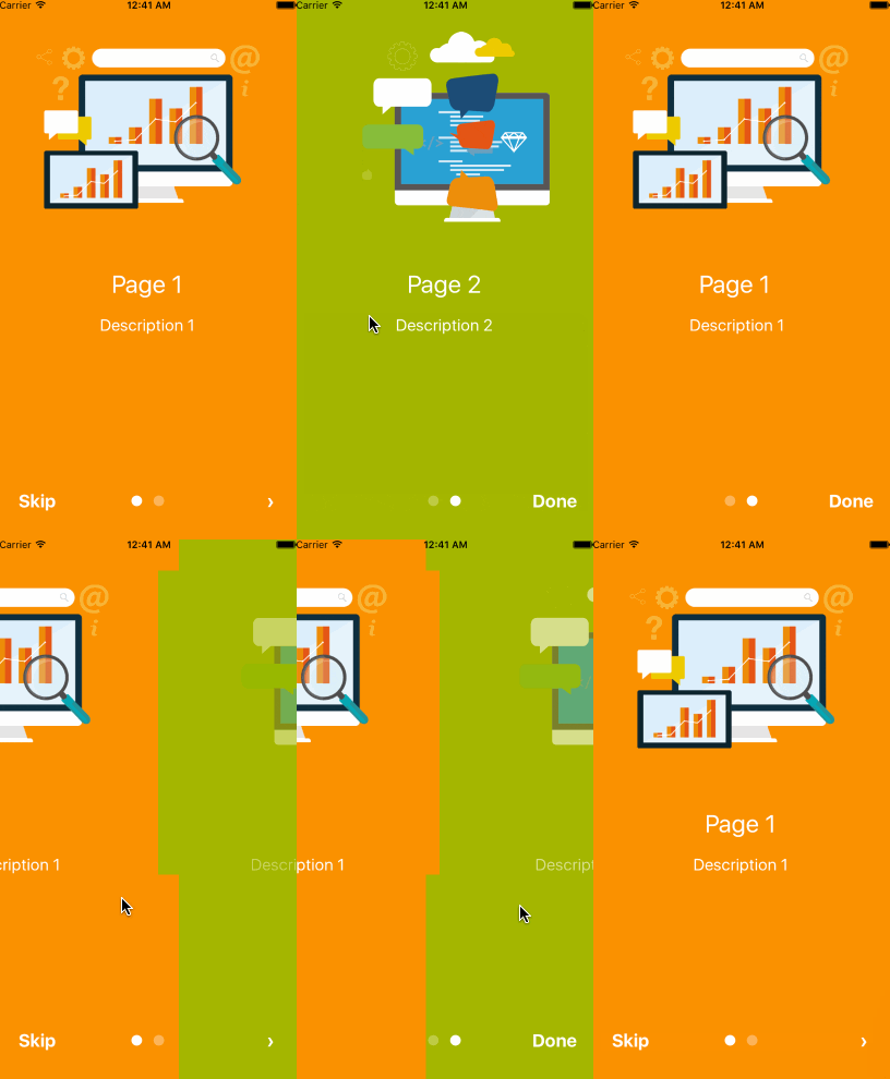
You can use pageArray quick generation your app intro with parallax effect. With the basic usage, the Android status bar will be updated to match your slide background color.


import React, { Component } from 'react';
import { AppRegistry, Alert } from 'react-native';
import AppIntro from 'react-native-app-intro';

class Example extends Component {
  onSkipBtnHandle = (index) => {
    Alert.alert('Skip');
    console.log(index);
  }
  doneBtnHandle = () => {
    Alert.alert('Done');
  }
  nextBtnHandle = (index) => {
    Alert.alert('Next');
    console.log(index);
  }
  onSlideChangeHandle = (index, total) => {
    console.log(index, total);
  }
  render() {
    const pageArray = [{
      title: 'Page 1',
      description: 'Description 1',
      img: 'https://goo.gl/Bnc3XP',
      imgStyle: {
        height: 80 * 2.5,
        width: 109 * 2.5,
      },
      backgroundColor: '#fa931d',
      fontColor: '#fff',
      level: 10,
    }, {
      title: 'Page 2',
      description: 'Description 2',
      img: require('../assets/some_image.png'),
      imgStyle: {
        height: 93 * 2.5,
        width: 103 * 2.5,
      },
      backgroundColor: '#a4b602',
      fontColor: '#fff',
      level: 10,
    }];
    return (
      <AppIntro
        onNextBtnClick={this.nextBtnHandle}
        onDoneBtnClick={this.doneBtnHandle}
        onSkipBtnClick={this.onSkipBtnHandle}
        onSlideChange={this.onSlideChangeHandle}
        pageArray={pageArray}
      />
    );
  }
}

AppRegistry.registerComponent('Example', () => Example);
Advanced Usage
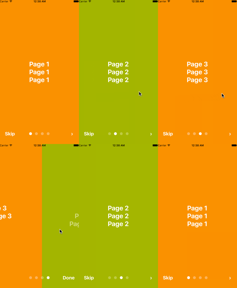
If you need customized page like my Example, you can pass in View component into AppIntro component and set level. Remember any need use parallax effect component, Need to be <View level={10}></View> inside.

import React, { Component } from 'react';
import {
  AppRegistry,
  StyleSheet,
  Text,
  View,
} from 'react-native';
import AppIntro from 'react-native-app-intro';

const styles = StyleSheet.create({
  slide: {
    flex: 1,
    justifyContent: 'center',
    alignItems: 'center',
    backgroundColor: '#9DD6EB',
    padding: 15,
  },
  text: {
    color: '#fff',
    fontSize: 30,
    fontWeight: 'bold',
  },
});

class Example extends Component {

  render() {
    return (
      <AppIntro>
        <View style={[styles.slide,{ backgroundColor: '#fa931d' }]}>
          <View level={10}><Text style={styles.text}>Page 1</Text></View>
          <View level={15}><Text style={styles.text}>Page 1</Text></View>
          <View level={8}><Text style={styles.text}>Page 1</Text></View>
        </View>
        <View style={[styles.slide, { backgroundColor: '#a4b602' }]}>
          <View level={-10}><Text style={styles.text}>Page 2</Text></View>
          <View level={5}><Text style={styles.text}>Page 2</Text></View>
          <View level={20}><Text style={styles.text}>Page 2</Text></View>
        </View>
        <View style={[styles.slide,{ backgroundColor: '#fa931d' }]}>
          <View level={8}><Text style={styles.text}>Page 3</Text></View>
          <View level={0}><Text style={styles.text}>Page 3</Text></View>
          <View level={-10}><Text style={styles.text}>Page 3</Text></View>
        </View>
        <View style={[styles.slide, { backgroundColor: '#a4b602' }]}>
          <View level={5}><Text style={styles.text}>Page 4</Text></View>
          <View level={10}><Text style={styles.text}>Page 4</Text></View>
          <View level={15}><Text style={styles.text}>Page 4</Text></View>
        </View>
      </AppIntro>
    );
  }
}
AppRegistry.registerComponent('Example', () => Example);
And in Android, image inside view component, view need widthãheight.
<View style={{
  position: 'absolute',
  top: 80,
  left: 30,
  width: windows.width,
  height: windows.height,
}} level={20}
>
  <Image style={{ width: 115, height: 70 }} source={require('./img/1/c2.png')} />
</View>
Properties
| Prop | PropType | Default Value | Description |
|---|---|---|---|
| dotColor | string | 'rgba(255,255,255,0.3)' | Bottom of the page dot color |
| activeDotColor | string | '#fff' | Active page index dot color |
| rightTextColor | string | '#fff' | The bottom right Text Doneã> color |
| leftTextColor | string | '#fff' | The bottom left Text Skip color |
| onSlideChange | (index, total) => {} | function to call when the pages change | |
| onSkipBtnClick | (index) => {} | function to call when the Skip button click | |
| onDoneBtnClick | func | function to call when the Done button click | |
| onNextBtnClick | (index) => {} | function to call when the Next '>' button click | |
| doneBtnLabel | stringãText element | Done | The bottom right custom Text label |
| skipBtnLabel | stringãText element | Skip | The bottom left custom Text label |
| nextBtnLabel | stringãText element | ⺠| The bottom left custom Text label |
| pageArray | array | In the basic usage, you can input object array to render basic view example: [[{title: 'Page 1', description: 'Description 1', img: 'https://goo.gl/uwzs0C', imgStyle: {height: 80 * 2.5, width: 109 * 2.5 }, backgroundColor: '#fa931d', fontColor: '#fff', level: 10 }] , level is parallax effect level ,if you use pageArray you can't use custom view | |
| defaultIndex | number | 0 | number of the index of the initial index |
| showSkipButton | bool | true | a boolean defining if we should render the skip button |
| showDoneButton | bool | true | a boolean that defines if we should render the done button |
| showDots | bool | true | a boolean that defines if we should render the bottom dots |
Children View Properties
| Prop | PropType | Default Value | Description |
|---|---|---|---|
| level | number | parallax effect level |
Top Related Projects
Make a cool intro for your Android app.
[Archived] Highlight the best bits of your app to users quickly, simply, and cool...ly
Inspired by Heinrich Reimer Material Intro and developed with love from scratch
:octocat: PaperOnboarding is a material design slider made by @Ramotion
An implementation of tap targets from the Material Design guidelines for feature discovery.
Convert  designs to code with AI

Introducing Visual Copilot: A new AI model to turn Figma designs to high quality code using your components.
Try Visual Copilot