 NativeBase
Mobile-first, accessible components for React Native & Web to build consistent UI across Android, iOS and Web.
Top Related Projects

Material Design for React Native (Android & iOS)

UI Components Library for React Native

:boom: React Native UI Library based on Eva Design System :new_moon_with_face::sparkles:Dark Mode

Customizable set of components for React Native applications

Cross-Platform React Native UI Toolkit

Infinite Red's battle-tested React Native project boilerplate, along with a CLI, component/model generators, and more! 9 years of continuous development and counting.
Quick Overview
NativeBase is an accessible, utility-first component library that helps you build consistent user interfaces across Android, iOS, and Web platforms using React Native. It provides a set of customizable and easy-to-use components that follow design system guidelines, allowing developers to create beautiful and responsive applications quickly.
Pros
- Cross-platform compatibility (Android, iOS, and Web)
- Extensive set of customizable UI components
- Follows accessibility guidelines for inclusive app development
- Utility-first approach for rapid development and easy customization
Cons
- Learning curve for developers new to utility-first approaches
- Some components may require additional customization for specific design needs
- Performance impact on larger applications due to the library's size
- Occasional breaking changes between major versions
Code Examples
- Creating a simple button:
import { Button } from "native-base";

function MyButton() {
  return <Button>Click me</Button>;
}
- Using a customized input field:
import { Input, VStack } from "native-base";

function CustomInput() {
  return (
    <VStack space={4} alignItems="center">
      <Input
        mx="3"
        placeholder="Enter your name"
        w="75%"
        maxWidth="300px"
      />
    </VStack>
  );
}
- Creating a responsive layout:
import { Box, HStack, VStack, Text } from "native-base";

function ResponsiveLayout() {
  return (
    <Box>
      <HStack space={3} justifyContent="center">
        <VStack space={2}>
          <Text fontSize="lg">Column 1</Text>
          <Text>Content for column 1</Text>
        </VStack>
        <VStack space={2}>
          <Text fontSize="lg">Column 2</Text>
          <Text>Content for column 2</Text>
        </VStack>
      </HStack>
    </Box>
  );
}
Getting Started
To start using NativeBase in your React Native project:
- Install NativeBase and its dependencies:
npm install native-base
npm install react-native-svg
npm install react-native-safe-area-context
- Wrap your app with the NativeBaseProvider:
import { NativeBaseProvider } from "native-base";

export default function App() {
  return (
    <NativeBaseProvider>
      {/* Your app content */}
    </NativeBaseProvider>
  );
}
- Start using NativeBase components in your app:
import { Box, Text, Button } from "native-base";

function MyComponent() {
  return (
    <Box>
      <Text>Welcome to NativeBase</Text>
      <Button>Get Started</Button>
    </Box>
  );
}
Competitor Comparisons
Material Design for React Native (Android & iOS)
Pros of react-native-paper
- More comprehensive documentation with detailed API references
- Follows Material Design guidelines more closely
- Larger community and more frequent updates
Cons of react-native-paper
- Less customizable out of the box compared to NativeBase
- Heavier bundle size due to more components and features
- Steeper learning curve for developers new to Material Design
Code Comparison
NativeBase example:
import { Box, Text, Button } from 'native-base';

const MyComponent = () => (
  <Box>
    <Text>Hello World</Text>
    <Button>Click me</Button>
  </Box>
);
react-native-paper example:
import { Surface, Text, Button } from 'react-native-paper';

const MyComponent = () => (
  <Surface>
    <Text>Hello World</Text>
    <Button mode="contained">Click me</Button>
  </Surface>
);
Both libraries offer similar component-based structures, but react-native-paper follows Material Design more strictly, as seen in the mode="contained" prop for the Button component. NativeBase provides a more flexible approach with its Box component, which can be easily customized for various layout needs.
UI Components Library for React Native
Pros of react-native-ui-lib
- More extensive component library with over 60 customizable components
- Built-in support for RTL languages and accessibility features
- Offers a powerful theming system with predefined presets
Cons of react-native-ui-lib
- Steeper learning curve due to its extensive API and features
- Larger bundle size compared to NativeBase
- Less frequent updates and potentially slower bug fixes
Code Comparison
NativeBase:
import { Box, Text, Button } from 'native-base';

const MyComponent = () => (
  <Box>
    <Text>Hello World</Text>
    <Button>Click me</Button>
  </Box>
);
react-native-ui-lib:
import { View, Text, Button } from 'react-native-ui-lib';

const MyComponent = () => (
  <View>
    <Text>Hello World</Text>
    <Button label="Click me" />
  </View>
);
Both libraries offer similar component-based structures, but react-native-ui-lib provides more specialized components and customization options. NativeBase focuses on simplicity and ease of use, while react-native-ui-lib offers a more comprehensive set of features and components at the cost of increased complexity.
:boom: React Native UI Library based on Eva Design System :new_moon_with_face::sparkles:Dark Mode
Pros of React Native UI Kitten
- More customizable theming system with support for multiple themes
- Stronger TypeScript support and type definitions
- Smaller bundle size and potentially better performance
Cons of React Native UI Kitten
- Smaller community and less frequent updates compared to NativeBase
- Fewer pre-built components and less extensive documentation
- Steeper learning curve for developers new to UI libraries
Code Comparison
NativeBase example:
import { Box, Text, Button } from 'native-base';

const MyComponent = () => (
  <Box>
    <Text>Hello World</Text>
    <Button>Click me</Button>
  </Box>
);
React Native UI Kitten example:
import { Layout, Text, Button } from '@ui-kitten/components';

const MyComponent = () => (
  <Layout>
    <Text>Hello World</Text>
    <Button>Click me</Button>
  </Layout>
);
Both libraries offer similar component-based structures, but React Native UI Kitten uses Layout instead of Box for container elements. The syntax and usage are quite similar, making it relatively easy for developers to switch between the two libraries if needed.
Customizable set of components for React Native applications
Pros of Shoutem UI
- More focused on creating a complete app ecosystem with additional tools and services
- Offers a theme editor for easy customization of UI components
- Provides a wider range of pre-built components and layouts
Cons of Shoutem UI
- Less frequently updated compared to NativeBase
- Smaller community and fewer third-party extensions
- Steeper learning curve for developers new to the Shoutem platform
Code Comparison
NativeBase:
import { Box, Text, Button } from 'native-base';

function MyComponent() {
  return (
    <Box>
      <Text>Hello World</Text>
      <Button>Click me</Button>
    </Box>
  );
}
Shoutem UI:
import { View, Text, Button } from '@shoutem/ui';

function MyComponent() {
  return (
    <View>
      <Text>Hello World</Text>
      <Button styleName="secondary">
        <Text>Click me</Text>
      </Button>
    </View>
  );
}
Both libraries offer similar component-based structures, but Shoutem UI uses a custom styleName prop for styling, while NativeBase relies more on built-in props and themes for customization.
Cross-Platform React Native UI Toolkit
Pros of React Native Elements
- Larger community and more frequent updates
- More comprehensive documentation and examples
- Easier customization through a global theme object
Cons of React Native Elements
- Less cohesive design system compared to NativeBase
- Heavier bundle size due to more components and features
- Steeper learning curve for beginners
Code Comparison
NativeBase:
import { Box, Text, Button } from 'native-base';

const MyComponent = () => (
  <Box>
    <Text>Hello World</Text>
    <Button>Click me</Button>
  </Box>
);
React Native Elements:
import { View, Text } from 'react-native';
import { Button } from 'react-native-elements';

const MyComponent = () => (
  <View>
    <Text>Hello World</Text>
    <Button title="Click me" />
  </View>
);
Both libraries offer similar component-based approaches, but NativeBase provides a more integrated ecosystem with its own layout components like Box, while React Native Elements relies more on React Native's built-in components. React Native Elements focuses on enhancing existing React Native components, whereas NativeBase aims to provide a complete UI framework with its own design system.
Infinite Red's battle-tested React Native project boilerplate, along with a CLI, component/model generators, and more! 9 years of continuous development and counting.
Pros of Ignite
- Provides a complete boilerplate and CLI for React Native projects
- Includes pre-configured state management, navigation, and testing setup
- Offers a collection of custom hooks and utilities for common React Native tasks
Cons of Ignite
- Steeper learning curve due to its opinionated structure and additional tools
- Less flexibility for developers who prefer to set up their own project structure
- May include unnecessary dependencies for simpler projects
Code Comparison
NativeBase (UI component usage):
import { Box, Text, Button } from 'native-base';

const MyComponent = () => (
  <Box>
    <Text>Hello, NativeBase!</Text>
    <Button>Click me</Button>
  </Box>
);
Ignite (boilerplate component):
import { View, Text } from "react-native"
import { Button } from "../components"

const MyScreen = () => (
  <View>
    <Text>Hello, Ignite!</Text>
    <Button text="Click me" onPress={() => {}} />
  </View>
)
NativeBase focuses on providing a comprehensive UI component library, while Ignite offers a full-featured boilerplate and project structure. NativeBase is more suitable for developers who need ready-to-use UI components, whereas Ignite is better for those who want a complete project setup with predefined architecture and tools.
Convert  designs to code with AI

Introducing Visual Copilot: A new AI model to turn Figma designs to high quality code using your components.
Try Visual CopilotREADME
âï¸ DEPRECATED
NativeBase â gluestack
ð NativeBase is evolving into gluestack-ui! What was planned as NativeBase v4 is now available as gluestack-ui - our next-generation component library built for better performance, enhanced customization, and improved developer experience. Visit gluestack.io to get started!
Important Notice: Evolution to gluestack-ui
NativeBase is entering maintenance mode as we evolve into gluestack-ui. This transition represents our commitment to providing the React Native community with more powerful, flexible, and performant UI components. If you are starting a new project with NativeBase, we recommend using gluestack-ui instead. Know More.


NativeBase is a mobile-first, accessible component library for building a consistent design system across android, iOS & web.
Table of Contents
- Introduction
- Motivation
- Features
- Dependencies
- Installation & Setup
- Components
- Examples
- KitchenSink App
- Tech Stack
- Compatible Versions
- Contributors
- Changelog
- Community
- License
1. Introduction?
NativeBase is a mobile-first, component library for React & React Native. Version 3.0 ships with complete ARIA integration, support for utility props and nearly 40 components that are consistent across Android, iOS and Web. Fast-track your dev process with NativeBase 3.0.
Recommended by Awesome React Native
NativeBase was added to the list of Frameworks of Awesome React Native and it is used by numerous React lovers across the world.
2. Motivation
Building with React Native from scratch is a tedious process with multiple steps such as adding styling, interactions, state management, responsiveness, accessibility, etc. We wanted to build and ship accessible, high-quality apps quickly.
Our inspirations include Material UI, Chakra UI, Ant Design, Braid Design System, Bootstrap, TailwindCSS & Flutter.
3. Features
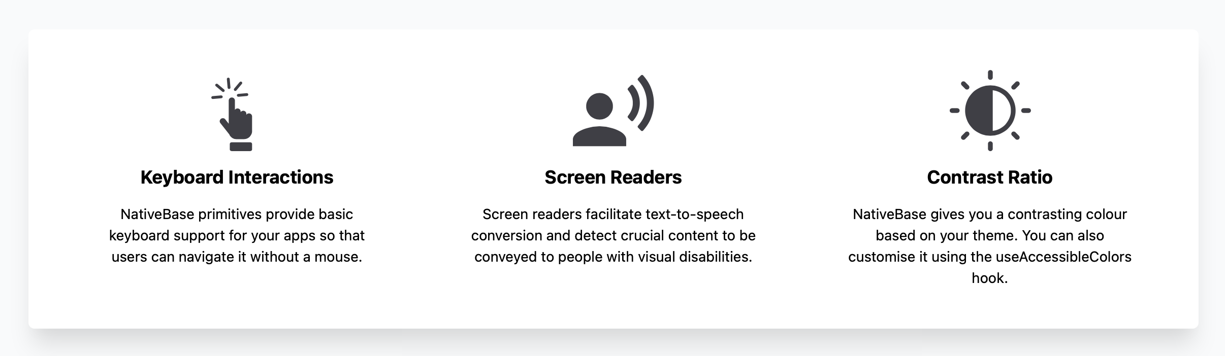
Out of the Box Accessibility
Integrated with React ARIA and React Native ARIA, which provides React hooks. This enables you to build accessible design systems in no time.
Supporting Utility Props
Powered by Styled System so you can rapidly build custom UI components with constraint-based utility style props.
Rich Component Library
NativeBase offers around 40 components so you can build seamlessly. It includes button, checkbox, flex, stack and more.
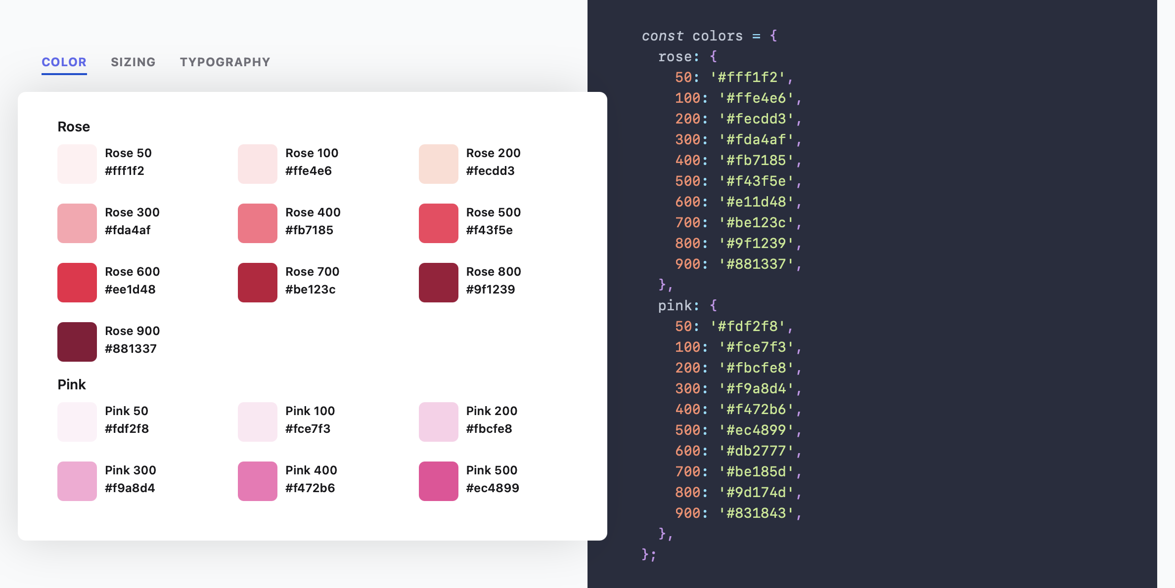
Highly Themeable
Themeability is one of the core elements of NativeBase. You can customise your app theme and component styles to your heart's content.
Available for Both Mobile and Web
NativeBase 3.0 is powered by React Native Web so you can build consistent UIs across Web, Android and iOS.
Responsiveness Made Easy
Instead of manually adding responsiveness, NativeBase 3.0 allows you to provide object and array values to add responsive styles.
Now with Dark Mode
Building apps with a dark mode setting just got a whole lot easier. NativeBase is now optimised for light and dark modes.
4. Dependencies
React Native, Expo
5. Installation
NativeBase is supported in Expo or React Native CLI initiated apps. Web support is made possible by react-native-web.
Refer the guides to setup NativeBase in your React app.
6. Components
NativeBase 3.0 is a rich component library with nearly 40 components.
7. Examples
Check out the Todo-List example
8. KitchenSink App
Kitchen Sink is a comprehensive demo app showcasing all the NativeBase components in action. It includes buttons, forms, icons, etc.


9. Tech Stack
JavaScript, React Native, Styled System
Made with :heart: at GeekyAnts
NativeBase is an open-source project made by the tech-savvy geeks at GeekyAnts. GeekyAnts is a group of React Native experts. Do get in touch with us for any help with your React Native project. Always happy to help!
10. Compatible Versions
| NativeBase | React Native |
|---|---|
| v0.1.1 | v0.22 to v0.23 |
| v0.2.0 to v0.3.1 | v0.24 to v0.25 |
| v0.4.6 to v0.4.9 | v0.26.0 - v0.27.1 |
| v0.5.0 to v0.5.15 | v0.26.0 - v0.37.0 |
| v0.5.16 to v0.5.20 | v0.38.0 - v0.39.0 |
| v2.0.0-alpha1 to v2.1.3 | v0.38.0 to v0.43.0 |
| v2.1.4 to v2.1.5 | v0.44.0 to v0.45.0 |
| v2.2.0 | v0.44.0 to v0.45.0 |
| v2.2.1 | v0.46.0 and above |
| v2.3.0 to 2.6.1 | v0.46.0 and above (does not support React 16.0.0-alpha.13) |
| v2.7.0 | v0.56.0 and above |
| v3.0.0-next.36 to v3.0.0-next-41 | v0.63.0 and above |
| v3.0.0 to latest | v0.63.0 and above |
11. Contributors
Code Contributors
This project exists thanks to all the people who contribute. [Contribute].

Financial Contributors
Become a financial contributor and help us sustain our community. [Contribute]
Individuals

Organizations
Support this project with your organization. Your logo will show up here with a link to your website. [Contribute]
12. Changelog
Check out the changelog in the official documentation
13. Community
14. License
Licensed under the MIT License, Copyright © 2021 GeekyAnts. See LICENSE for more information.
Top Related Projects
Material Design for React Native (Android & iOS)
UI Components Library for React Native
:boom: React Native UI Library based on Eva Design System :new_moon_with_face::sparkles:Dark Mode
Customizable set of components for React Native applications
Cross-Platform React Native UI Toolkit
Infinite Red's battle-tested React Native project boilerplate, along with a CLI, component/model generators, and more! 9 years of continuous development and counting.
Convert designs to code with AI
Introducing Visual Copilot: A new AI model to turn Figma designs to high quality code using your components.
Try Visual Copilot