
Top Related Projects

A collection of libraries and tools that help you build adaptive, accessible, and robust user experiences.

Material Design for React Native (Android & iOS)

Mobile-first, accessible components for React Native & Web to build consistent UI across Android, iOS and Web.

:boom: React Native UI Library based on Eva Design System :new_moon_with_face::sparkles:Dark Mode

Cross-Platform React Native UI Toolkit

Customizable set of components for React Native applications
Quick Overview
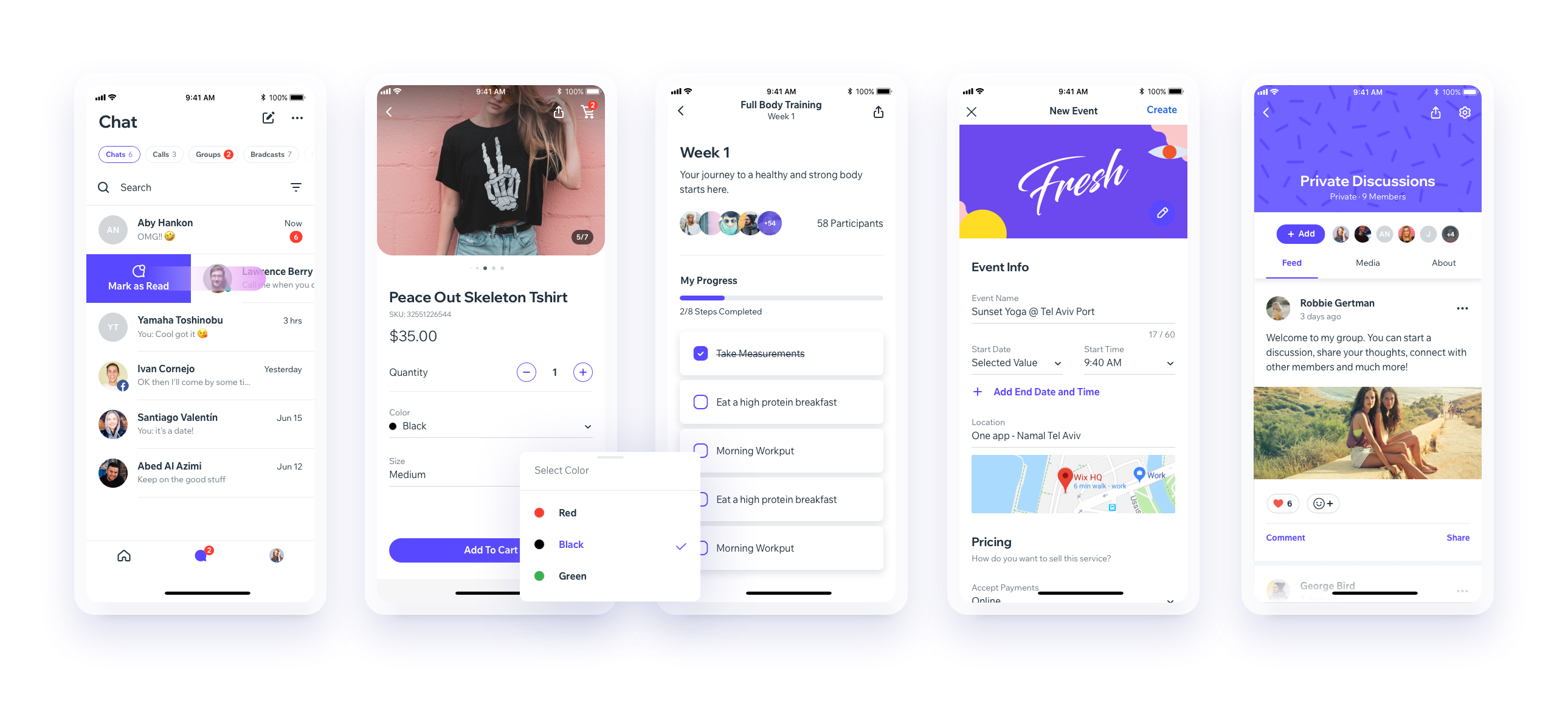
React Native UI Lib is a comprehensive UI toolset for React Native applications. It provides a wide range of customizable components, styles, and animations to help developers create beautiful and consistent user interfaces quickly and efficiently. The library is maintained by Wix and is designed to be both powerful and easy to use.
Pros
- Extensive collection of pre-built, customizable components
- Consistent design language and theming support
- Built-in animations and gestures for enhanced user experience
- Well-documented with examples and API references
Cons
- Learning curve for developers new to the library's conventions
- Some components may require additional setup or configuration
- Potential performance impact when using many complex components
- Occasional breaking changes between major versions
Code Examples
- Using a basic Button component:
import React from 'react';
import {View, Button} from 'react-native-ui-lib';

const MyComponent = () => (
  <View>
    <Button label="Press Me" onPress={() => console.log('Button pressed')} />
  </View>
);
- Creating a custom themed Card component:
import React from 'react';
import {Card, Text} from 'react-native-ui-lib';

const MyCard = () => (
  <Card
    elevation={4}
    borderRadius={10}
    containerStyle={{marginBottom: 15}}
  >
    <Card.Section
      content={[
        {text: 'Card Title', text70: true, bold: true},
        {text: 'Card subtitle', text80: true, grey40: true}
      ]}
      contentStyle={{padding: 20}}
    />
  </Card>
);
- Using the Picker component with custom styling:
import React, {useState} from 'react';
import {Picker} from 'react-native-ui-lib';

const MyPicker = () => {
  const [selectedValue, setSelectedValue] = useState('');
  return (
    <Picker
      placeholder="Select an option"
      value={selectedValue}
      onChange={value => setSelectedValue(value)}
      style={{borderWidth: 1, borderColor: 'gray'}}
    >
      <Picker.Item key="1" value="option1" label="Option 1" />
      <Picker.Item key="2" value="option2" label="Option 2" />
      <Picker.Item key="3" value="option3" label="Option 3" />
    </Picker>
  );
};
Getting Started
To start using React Native UI Lib in your project:
-
Install the library:
npm install react-native-ui-lib -
Import and use components in your React Native app:
import React from 'react'; import {View, Text, Button} from 'react-native-ui-lib'; const App = () => ( <View> <Text text50>Welcome to React Native UI Lib!</Text> <Button label="Get Started" onPress={() => console.log('Hello!')} /> </View> ); export default App; -
(Optional) Configure the library's presets in your app's entry file:
import {Typography, Colors} from 'react-native-ui-lib';

Colors.loadColors({
  primaryColor: '#2364AA',
  secondaryColor: '#81C3D7',
  textColor: '#221D23',
  errorColor: '#E63B2E',
});

Typography.loadTypographies({
  heading: {fontSize: 36, fontWeight: '600'},
  subheading: {fontSize: 28, fontWeight: '500'},
  body: {fontSize: 18, fontWeight: '400'},
});
Competitor Comparisons
A collection of libraries and tools that help you build adaptive, accessible, and robust user experiences.
Pros of React Spectrum
- Comprehensive accessibility support out-of-the-box
- Consistent design system across Adobe products
- Extensive documentation and design guidelines
Cons of React Spectrum
- Limited to web applications, not suitable for React Native
- Steeper learning curve due to its unique component structure
- Less flexibility in customization compared to React Native UI Lib
Code Comparison
React Spectrum:
import { Button } from '@adobe/react-spectrum';

function MyComponent() {
  return <Button variant="cta">Click me</Button>;
}
React Native UI Lib:
import { Button } from 'react-native-ui-lib';

function MyComponent() {
  return <Button label="Click me" size={Button.sizes.large} />;
}
React Spectrum focuses on web applications with a strong emphasis on accessibility and consistent design across Adobe products. It offers a comprehensive set of components but may have a steeper learning curve.
React Native UI Lib is more versatile, supporting both web and mobile applications built with React Native. It provides greater flexibility in customization but may require more effort to ensure accessibility.
The code comparison shows that both libraries offer similar basic functionality, but React Spectrum's API is more focused on web-specific attributes, while React Native UI Lib's API is designed to work across platforms.
Material Design for React Native (Android & iOS)
Pros of react-native-paper
- More comprehensive documentation and examples
- Stronger focus on Material Design principles
- Larger community and more frequent updates
Cons of react-native-paper
- Less customizable compared to react-native-ui-lib
- Heavier bundle size due to more components and features
- Steeper learning curve for developers new to Material Design
Code Comparison
react-native-paper:
import { Button } from 'react-native-paper';

<Button mode="contained" onPress={() => console.log('Pressed')}>
  Press me
</Button>
react-native-ui-lib:
import { Button } from 'react-native-ui-lib';

<Button label="Press me" onPress={() => console.log('Pressed')} />
Both libraries offer similar basic components, but react-native-paper follows Material Design more closely, while react-native-ui-lib provides more flexibility in styling. react-native-paper uses props like mode to define button styles, whereas react-native-ui-lib uses more straightforward props like label.
react-native-paper is generally better suited for projects aiming for a Material Design look, while react-native-ui-lib offers more customization options for unique designs. The choice between the two depends on project requirements, design preferences, and development team familiarity with each library.
Mobile-first, accessible components for React Native & Web to build consistent UI across Android, iOS and Web.
Pros of NativeBase
- More extensive component library with a wider range of pre-built UI elements
- Better theming support with a robust theme customization system
- Stronger community support and more frequent updates
Cons of NativeBase
- Steeper learning curve due to its more complex API and configuration options
- Larger bundle size, which may impact app performance
- Less flexibility in customizing individual components compared to react-native-ui-lib
Code Comparison
NativeBase:
import { Box, Text, Button } from 'native-base';

const MyComponent = () => (
  <Box>
    <Text>Hello World</Text>
    <Button>Click me</Button>
  </Box>
);
react-native-ui-lib:
import { View, Text, Button } from 'react-native-ui-lib';

const MyComponent = () => (
  <View>
    <Text>Hello World</Text>
    <Button label="Click me" />
  </View>
);
Both libraries offer similar component-based approaches, but NativeBase uses more custom components like Box, while react-native-ui-lib stays closer to React Native's core components. NativeBase's API tends to be more opinionated, while react-native-ui-lib offers a more flexible and lightweight approach to UI development.
:boom: React Native UI Library based on Eva Design System :new_moon_with_face::sparkles:Dark Mode
Pros of React Native UI Kitten
- More comprehensive theming system with light and dark mode support
- Extensive documentation and examples
- Active community and regular updates
Cons of React Native UI Kitten
- Steeper learning curve due to its custom theming approach
- Less flexibility in customizing individual components
- Larger bundle size compared to React Native UI Lib
Code Comparison
React Native UI Kitten:
import { Button, Text } from '@ui-kitten/components';

const MyButton = () => (
  <Button>
    <Text>Click me</Text>
  </Button>
);
React Native UI Lib:
import { Button, Text } from 'react-native-ui-lib';

const MyButton = () => (
  <Button label="Click me" />
);
React Native UI Kitten uses a more nested approach for component composition, while React Native UI Lib often provides more concise prop-based configurations. UI Kitten's theming system is more powerful but requires additional setup:
import { ApplicationProvider, Layout } from '@ui-kitten/components';
import * as eva from '@eva-design/eva';

const App = () => (
  <ApplicationProvider {...eva} theme={eva.light}>
    <Layout>
      {/* Your app content */}
    </Layout>
  </ApplicationProvider>
);
React Native UI Lib's theming is simpler but less comprehensive:
import { ThemeManager } from 'react-native-ui-lib';

ThemeManager.setComponentTheme('Button', {
  backgroundColor: 'blue',
});
Both libraries offer robust UI component sets, but UI Kitten focuses more on theming and design consistency, while UI Lib provides more flexibility for customization.
Cross-Platform React Native UI Toolkit
Pros of React Native Elements
- More extensive documentation and examples
- Larger community and more frequent updates
- Wider range of pre-built components
Cons of React Native Elements
- Less customizable out of the box
- Heavier bundle size due to more components
- Steeper learning curve for advanced customizations
Code Comparison
React Native Elements:
import { Button } from 'react-native-elements';

<Button
  title="Click me"
  buttonStyle={{ backgroundColor: 'blue' }}
  onPress={() => console.log('Button pressed')}
/>
React Native UI Lib:
import { Button } from 'react-native-ui-lib';

<Button
  label="Click me"
  backgroundColor="blue"
  onPress={() => console.log('Button pressed')}
/>
Both libraries offer similar functionality, but React Native UI Lib tends to have a more straightforward API with less nesting of style props. React Native Elements often requires more configuration to achieve the same result, but offers more granular control over component styling.
React Native Elements is generally better suited for projects that require a wide range of pre-built components and don't need extensive customization. React Native UI Lib, on the other hand, is ideal for projects that prioritize customization and a more lightweight bundle size.
Customizable set of components for React Native applications
Pros of Shoutem UI
- More comprehensive theming system with built-in themes
- Includes animation components for enhanced user experience
- Offers a wider range of pre-built components
Cons of Shoutem UI
- Less frequent updates and maintenance compared to React Native UI Lib
- Steeper learning curve due to its custom styling approach
- Smaller community and fewer third-party extensions
Code Comparison
React Native UI Lib:
import { View, Text, Button } from 'react-native-ui-lib';

const MyComponent = () => (
  <View>
    <Text>Hello World</Text>
    <Button label="Click me" onPress={() => {}} />
  </View>
);
Shoutem UI:
import { View, Text, Button } from '@shoutem/ui';

const MyComponent = () => (
  <View>
    <Text>Hello World</Text>
    <Button styleName="secondary" onPress={() => {}}>
      <Text>Click me</Text>
    </Button>
  </View>
);
Both libraries offer similar basic components, but Shoutem UI uses a custom styleName prop for styling, while React Native UI Lib follows a more standard React Native approach. Shoutem UI requires wrapping text within buttons, whereas React Native UI Lib provides a label prop for simplicity.
Convert  designs to code with AI

Introducing Visual Copilot: A new AI model to turn Figma designs to high quality code using your components.
Try Visual CopilotREADME


UI Toolset & Components Library for React Native


Notes
React Native New Arc
We are working on upgrading our UI Library to support the new React Native Architecture. Currently, we support React Native 0.73, and we plan to support React Native 0.77 next. While we donât have a timeline yet, this is part of our roadmap.
Links
Download our Expo demo app
(You will need the Expo App)
or open link in your devices
[expo ] exp://exp.host/@vn.chemgio/rnuilib?release-channel=default
Installing
See setup instructions here.
New Major Version 6.0
See breaking changes
For React Native >= 0.60.0
please use react-native-ui-lib
For React Native < 0.60.0
please use react-native-ui-lib@^3.0.0
Create your own Design System in 3 easy steps
Step 1
Load your foundations and presets (colors, typography, spacings, etc...)
// FoundationConfig.js

import {Colors, Typography, Spacings} from 'react-native-ui-lib';

Colors.loadColors({
  primaryColor: '#2364AA',
  secondaryColor: '#81C3D7',
  textColor: '##221D23',
  errorColor: '#E63B2E',
  successColor: '#ADC76F',
  warnColor: '##FF963C'
});

Typography.loadTypographies({
  heading: {fontSize: 36, fontWeight: '600'},
  subheading: {fontSize: 28, fontWeight: '500'},
  body: {fontSize: 18, fontWeight: '400'}
});

Spacings.loadSpacings({
  page: 20,
  card: 12,
  gridGutter: 16
});
Step 2
Set default configurations to your components
// ComponentsConfig.js

import {ThemeManager} from 'react-native-ui-lib';

// with plain object
ThemeManager.setComponentTheme('Card', {
  borderRadius: 8
});

// with a dynamic function
ThemeManager.setComponentTheme('Button', (props, context) => {
  // 'square' is not an original Button prop, but a custom prop that can
  // be used to create different variations of buttons in your app
  if (props.square) {
    return {
      borderRadius: 0
    };
  }
});
Step 3
Use it all together. Your configurations will be applied on uilib components so you can use them easily with modifiers.
// MyScreen.js

import React, {Component} from 'react';
import {View, Text, Card, Button} from 'react-native-ui-lib';

class MyScreen extends Component {
  render() {
    return (
      <View flex padding-page>
        <Text heading marginB-s4>
          My Screen
        </Text>
        <Card height={100} center padding-card marginB-s4>
          <Text body>This is an example card </Text>
        </Card>

        <Button label="Button" body bg-primaryColor square></Button>
      </View>
    );
  }
}
Contributing
Top Related Projects
A collection of libraries and tools that help you build adaptive, accessible, and robust user experiences.
Material Design for React Native (Android & iOS)
Mobile-first, accessible components for React Native & Web to build consistent UI across Android, iOS and Web.
:boom: React Native UI Library based on Eva Design System :new_moon_with_face::sparkles:Dark Mode
Cross-Platform React Native UI Toolkit
Customizable set of components for React Native applications
Convert designs to code with AI
Introducing Visual Copilot: A new AI model to turn Figma designs to high quality code using your components.
Try Visual Copilot