
Top Related Projects

Google's Material Design in XAML & WPF, for C# & VB.Net.

Develop Desktop, Embedded, Mobile and WebAssembly apps with C# and XAML. The most popular .NET UI client technology

A framework that allows developers to cobble together a better UI for their own WPF applications with minimal effort.

Dragable and tearable tab control for WPF

Modern UI for WPF

Theming .NET WinForms, C# or VB.Net, to Google's Material Design Principles.
Quick Overview
HandyControl is a WPF UI library that provides a set of customizable and modern controls for Windows Presentation Foundation applications. It offers a wide range of UI elements and styles to enhance the visual appeal and functionality of WPF applications, while maintaining a consistent and professional look.
Pros
- Extensive collection of controls and styles
- Easy to integrate and customize
- Regular updates and active community support
- Comprehensive documentation and examples
Cons
- Limited to WPF applications only
- May have a learning curve for developers new to WPF
- Some controls might not be as feature-rich as specialized alternatives
- Potential performance impact on large-scale applications
Code Examples
- Creating a custom button:
<hc:Button Content="Click Me"
           Style="{StaticResource ButtonPrimary}"
           hc:IconElement.Geometry="{StaticResource StarGeometry}"/>
- Implementing a loading indicator:
<hc:LoadingCircle Style="{StaticResource LoadingCircleLight}" />
- Using a color picker:
<hc:ColorPicker ShowDropDownButton="True"
                SelectedBrush="{Binding SelectedColor}" />
- Creating a card control:
<hc:Card Header="Card Title"
         Content="This is the card content."
         Footer="Card Footer" />
Getting Started
-
Install the HandyControl NuGet package:
Install-Package HandyControl -
Add the following to your App.xaml:
<Application.Resources> <ResourceDictionary> <ResourceDictionary.MergedDictionaries> <ResourceDictionary Source="pack://application:,,,/HandyControl;component/Themes/SkinDefault.xaml"/> <ResourceDictionary Source="pack://application:,,,/HandyControl;component/Themes/Theme.xaml"/> </ResourceDictionary.MergedDictionaries> </ResourceDictionary> </Application.Resources> -
Start using HandyControl controls in your XAML:
<Window x:Class="YourNamespace.MainWindow"
        xmlns="http://schemas.microsoft.com/winfx/2006/xaml/presentation"
        xmlns:x="http://schemas.microsoft.com/winfx/2006/xaml"
        xmlns:hc="https://handyorg.github.io/handycontrol">
    <hc:SimplePanel>
        <hc:Button Content="Hello, HandyControl!" />
    </hc:SimplePanel>
</Window>
Competitor Comparisons
Google's Material Design in XAML & WPF, for C# & VB.Net.
Pros of MaterialDesignInXamlToolkit
- More comprehensive implementation of Material Design principles
- Larger community and more frequent updates
- Better documentation and examples
Cons of MaterialDesignInXamlToolkit
- Steeper learning curve due to its extensive feature set
- Potentially heavier resource usage in some scenarios
- Less flexibility for custom styling outside of Material Design
Code Comparison
MaterialDesignInXamlToolkit:
<materialDesign:Card Padding="32" Margin="16">
    <TextBlock Style="{DynamicResource MaterialDesignHeadline6TextBlock}">
        Hello World
    </TextBlock>
</materialDesign:Card>
HandyControl:
<hc:Card Margin="16">
    <TextBlock Style="{StaticResource TextBlockLargeBold}"
               Margin="32">
        Hello World
    </TextBlock>
</hc:Card>
Both libraries offer similar components, but MaterialDesignInXamlToolkit adheres more strictly to Material Design guidelines, while HandyControl provides a broader range of styles and more flexibility in customization. MaterialDesignInXamlToolkit is better suited for projects aiming for a pure Material Design look, while HandyControl might be preferable for applications requiring a mix of styles or more custom designs.
Develop Desktop, Embedded, Mobile and WebAssembly apps with C# and XAML. The most popular .NET UI client technology
Pros of Avalonia
- Cross-platform support (Windows, macOS, Linux, iOS, Android, WebAssembly)
- XAML-based UI framework with modern features
- Active development and community support
Cons of Avalonia
- Steeper learning curve for developers new to XAML
- Smaller ecosystem compared to WPF or Windows Forms
Code Comparison
HandyControl (XAML):
<hc:Window x:Class="HandyControlDemo.MainWindow"
           xmlns="http://schemas.microsoft.com/winfx/2006/xaml/presentation"
           xmlns:x="http://schemas.microsoft.com/winfx/2006/xaml"
           xmlns:hc="https://handyorg.github.io/handycontrol">
    <hc:SimplePanel>
        <hc:Button Content="Click Me" />
    </hc:SimplePanel>
</hc:Window>
Avalonia (XAML):
<Window xmlns="https://github.com/avaloniaui"
        xmlns:x="http://schemas.microsoft.com/winfx/2006/xaml"
        x:Class="AvaloniaApplication.MainWindow">
    <Panel>
        <Button Content="Click Me" />
    </Panel>
</Window>
Summary
Avalonia offers cross-platform development capabilities and a modern XAML-based approach, making it suitable for developers looking to create applications that run on multiple operating systems. However, it may have a steeper learning curve for those unfamiliar with XAML. HandyControl, on the other hand, is primarily focused on enhancing WPF applications with additional controls and styles, making it more accessible for developers already working with WPF but limiting its cross-platform potential.
A framework that allows developers to cobble together a better UI for their own WPF applications with minimal effort.
Pros of MahApps.Metro
- More mature and established project with a larger community
- Extensive documentation and examples available
- Wider range of controls and features out-of-the-box
Cons of MahApps.Metro
- Heavier and potentially slower performance compared to HandyControl
- Less frequent updates and slower development cycle
- More opinionated design, which may not suit all projects
Code Comparison
MahApps.Metro:
<Controls:MetroWindow x:Class="MainWindow"
    xmlns:Controls="http://metro.mahapps.com/winfx/xaml/controls"
    Title="MahApps.Metro Window" Height="600" Width="800">
    <Controls:MetroWindow.RightWindowCommands>
        <Controls:WindowCommands>
            <Button Content="Settings" />
        </Controls:WindowCommands>
    </Controls:MetroWindow.RightWindowCommands>
</Controls:MetroWindow>
HandyControl:
<hc:Window x:Class="MainWindow"
    xmlns:hc="https://handyorg.github.io/handycontrol"
    Title="HandyControl Window" Height="600" Width="800">
    <hc:Window.NonClientAreaContent>
        <Button Content="Settings" HorizontalAlignment="Right" />
    </hc:Window.NonClientAreaContent>
</hc:Window>
Both libraries offer similar functionality for creating modern Windows applications, but with different approaches to styling and control implementation.
Dragable and tearable tab control for WPF
Pros of Dragablz
- Specialized in tab control and docking functionality
- Lightweight and focused on specific UI elements
- Highly customizable tab layouts and behaviors
Cons of Dragablz
- Limited scope compared to HandyControl's comprehensive UI toolkit
- Less frequent updates and maintenance
- Smaller community and fewer contributors
Code Comparison
HandyControl example (Button):
<hc:Button Content="Click Me"
           Style="{StaticResource ButtonPrimary}"
           hc:IconElement.Geometry="{StaticResource IconGeometryCheck}"/>
Dragablz example (TabControl):
<dragablz:TabablzControl>
    <dragablz:TabablzControl.InterTabController>
        <dragablz:InterTabController />
    </dragablz:TabablzControl.InterTabController>
    <TabItem Header="Tab No. 1" />
    <TabItem Header="Tab No. 2" />
</dragablz:TabablzControl>
HandyControl offers a wider range of UI controls and styles, making it suitable for comprehensive application development. Dragablz, on the other hand, excels in providing advanced tab and docking features, making it ideal for applications requiring complex tab management. While HandyControl provides a more holistic approach to UI design, Dragablz offers deeper customization for specific tab-related functionalities.
Modern UI for WPF
Pros of MUI
- More extensive documentation and examples
- Larger community and more frequent updates
- Better support for responsive design
Cons of MUI
- Steeper learning curve due to more complex architecture
- Larger file size and potential performance impact
- Less native Windows-like appearance compared to HandyControl
Code Comparison
HandyControl:
<hc:SimplePanel>
    <hc:Card>
        <TextBlock Text="Hello, HandyControl!" />
    </hc:Card>
</hc:SimplePanel>
MUI:
<mui:ModernWindow>
    <mui:ModernFrame>
        <TextBlock Text="Hello, MUI!" />
    </mui:ModernFrame>
</mui:ModernWindow>
Both libraries offer custom controls and styling options for WPF applications. HandyControl focuses on providing a native Windows look and feel, while MUI offers a more modern and customizable interface. HandyControl's SimplePanel and Card controls are straightforward to use, whereas MUI's ModernWindow and ModernFrame provide a more structured layout approach. The choice between the two depends on the specific project requirements, desired aesthetics, and development team preferences.
Theming .NET WinForms, C# or VB.Net, to Google's Material Design Principles.
Pros of MaterialSkin
- Focused specifically on Material Design, providing a more authentic Material look
- Simpler API and easier to implement for basic Material Design interfaces
- Lighter weight library with fewer dependencies
Cons of MaterialSkin
- Less comprehensive control set compared to HandyControl
- Limited customization options beyond Material Design guidelines
- Less frequent updates and maintenance
Code Comparison
MaterialSkin:
MaterialSkinManager.Instance.AddFormToManage(this);
MaterialSkinManager.Instance.Theme = MaterialSkinManager.Themes.LIGHT;
MaterialSkinManager.Instance.ColorScheme = new ColorScheme(Primary.Blue400, Primary.Blue500, Primary.Blue500, Accent.LightBlue200, TextShade.WHITE);
HandyControl:
<hc:Window x:Class="HandyControlDemo.MainWindow"
           xmlns="http://schemas.microsoft.com/winfx/2006/xaml/presentation"
           xmlns:x="http://schemas.microsoft.com/winfx/2006/xaml"
           xmlns:hc="https://handyorg.github.io/handycontrol"
           Style="{StaticResource WindowPrimary}"
           Title="MainWindow" Height="450" Width="800">
</hc:Window>
MaterialSkin focuses on programmatic setup of Material Design themes, while HandyControl uses XAML-based styling and offers a wider range of controls and customization options. HandyControl provides a more comprehensive UI toolkit, while MaterialSkin specializes in Material Design implementation for Windows Forms applications.
Convert  designs to code with AI

Introducing Visual Copilot: A new AI model to turn Figma designs to high quality code using your components.
Try Visual CopilotREADME
Blogroll
SimpleFactoryGenerator - A simple factory source generator that enables the pattern to not violate the open-close principle.
WpfExtensions - Some syntactic sugar for Wpf development.


é¢åä¸å½
ææ¯äº¤æµ
https://join.slack.com/t/handycontrol/shared_invite/zt-sw29prqd-okFmRlmETdtWhnF7C3foxA
ç äº
https://gitee.com/handyorg/HandyControl/
ä¸æææ¡£
https://handyorg.github.io/handycontrol/
èµå©
-
以HandyControlçåä¹ä¸ºæ åäºä¸åè´¡ç®ï¼è¯·èç³»æ们ä¸èµå©å¢ï¼
-
为æ们è´ä¹°é²è±æ´åæ°´ ï¼æ¯ä»å®æ«ç ï¼

Contributors


Backers


Special thanks to
Projects using HandyControl

if your project is not listed here, let us know! ð
Usage
Step 1: Add a reference to HandyControl or search for HandyControl on the nuget;
Install-Package HandyControl
Step 2: Add code in App.xaml as follows:
<Application.Resources>
    <ResourceDictionary>
        <ResourceDictionary.MergedDictionaries>
            <ResourceDictionary Source="pack://application:,,,/HandyControl;component/Themes/SkinDefault.xaml"/>
            <ResourceDictionary Source="pack://application:,,,/HandyControl;component/Themes/Theme.xaml"/>
        </ResourceDictionary.MergedDictionaries>
    </ResourceDictionary>
</Application.Resources>
Step 3: Add NameSpace:
xmlns:hc="https://handyorg.github.io/handycontrol"
Step 4: Enjoy coding
VSIX packages for Visual Studio
| VS2019 |
|---|
Stargazers over time

Overview
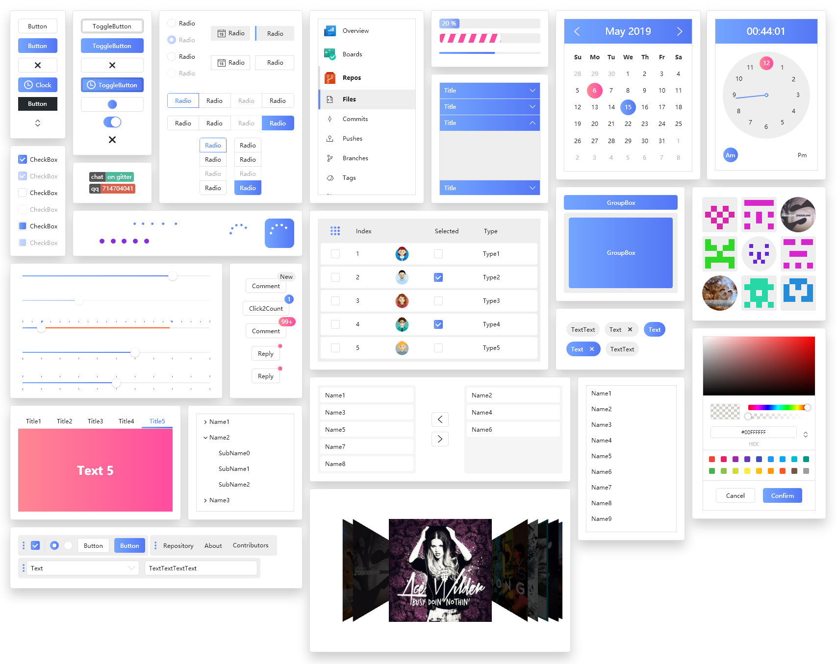
Latest examples
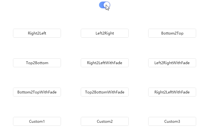
ConfettiCannon

Watermark
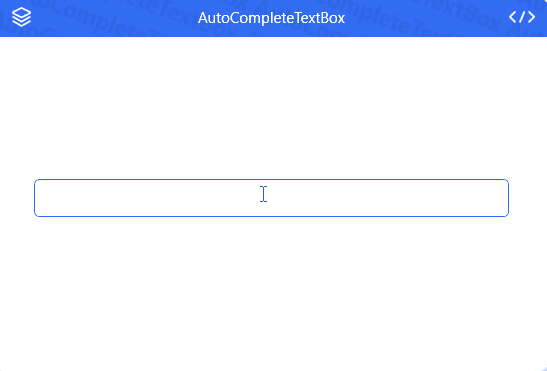
AutoCompleteTextBox
ElementGroup
UniformSpacingPanel
History publication
FlexPanel
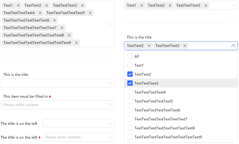
CheckComboBox
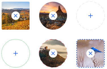
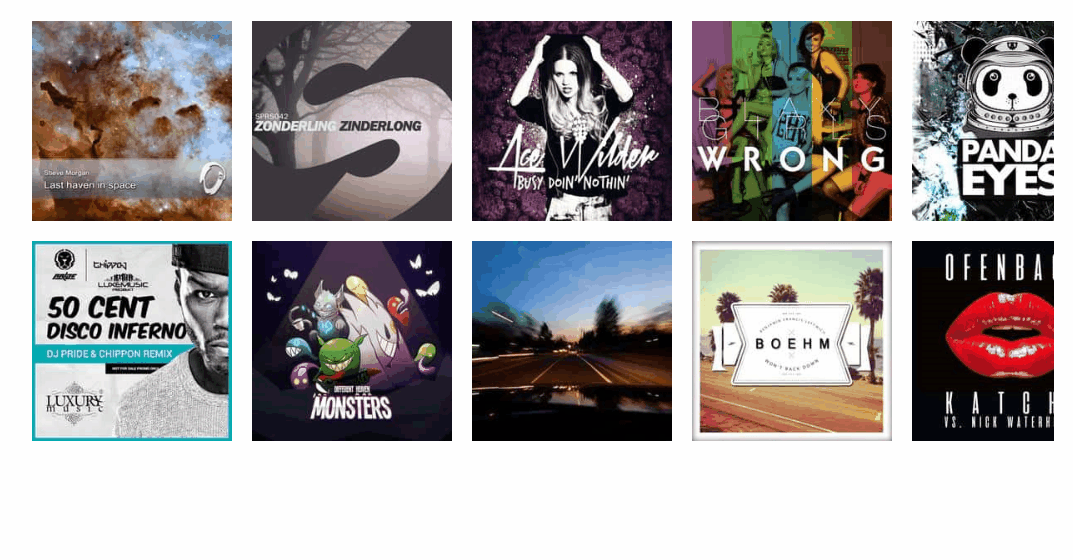
ImageSelector
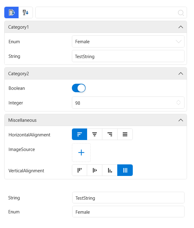
PropertyGrid
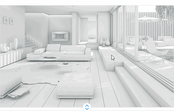
Screenshot
GooeyEffect
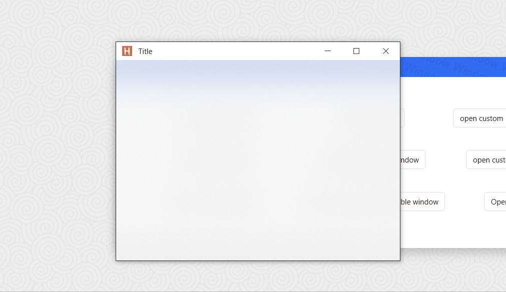
GlowWindow
FlowDocumentScrollViewerStyle
PinBox
Effects
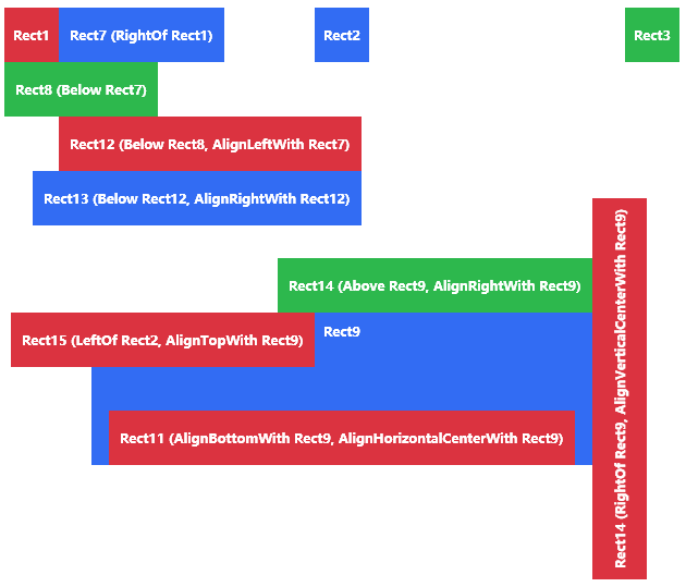
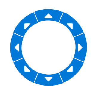
RelativePanel
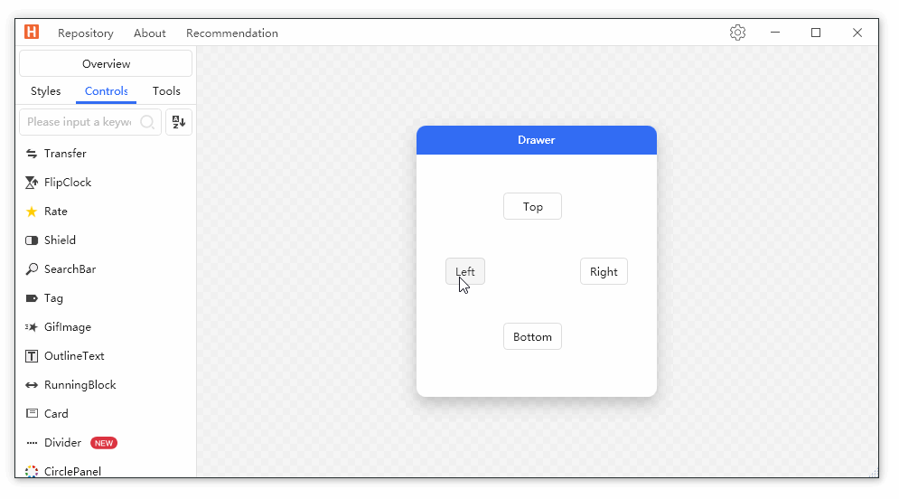
Drawer
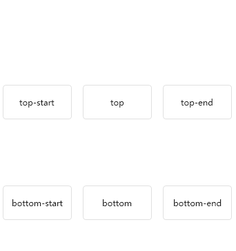
Poptip
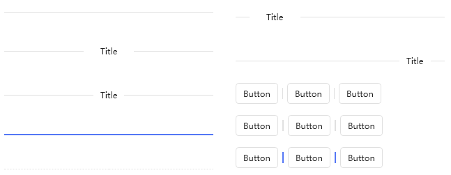
Divider
GeometryAnimation

SplitButton
FloatingBlock
HoneycombPanel
RunningBlock
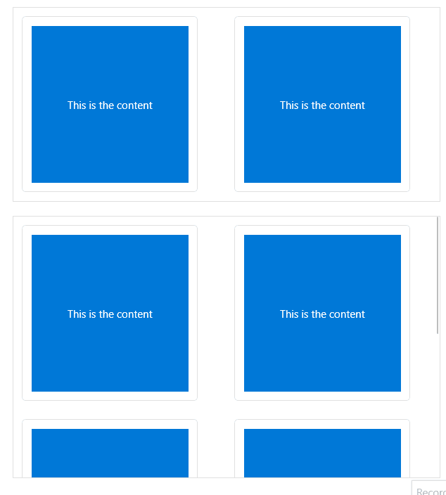
ImageBlock
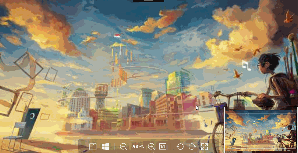
Magnifier
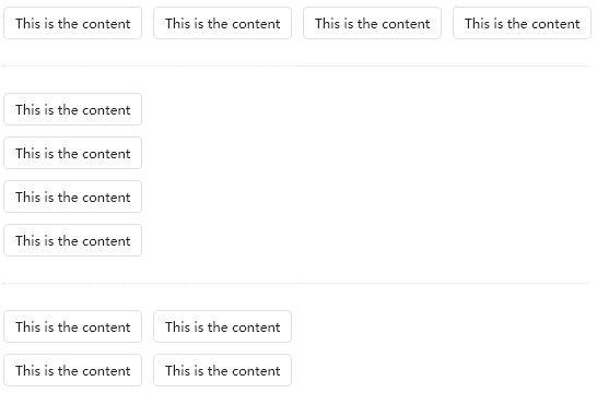
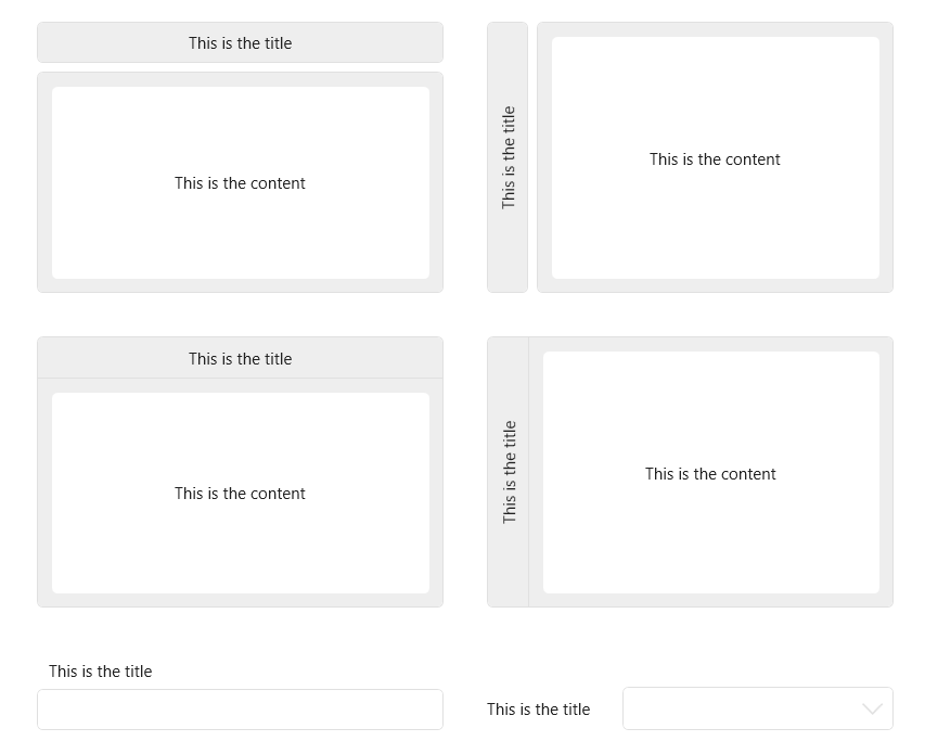
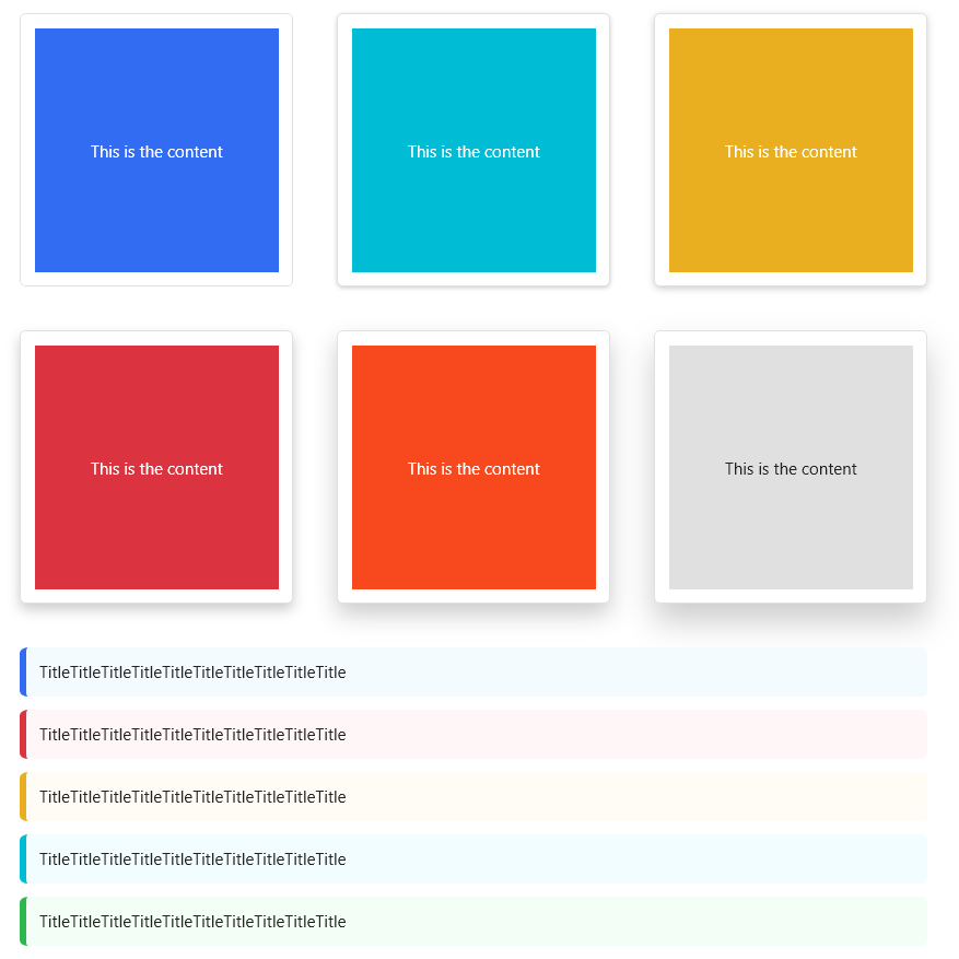
Card
ButtonGroup
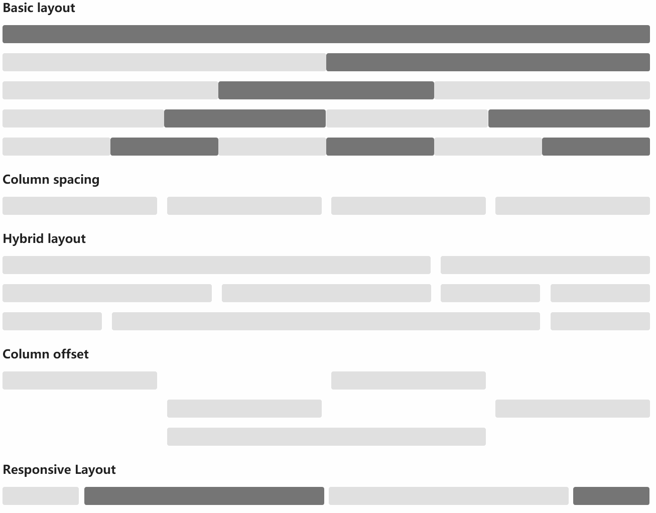
Grid
SideMenu
NotifyIcon
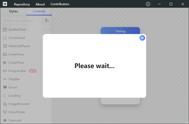
Dialog
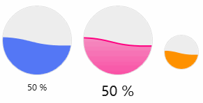
WaveProgressBar
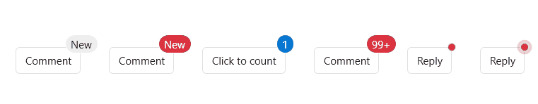
Badge
Gravatar
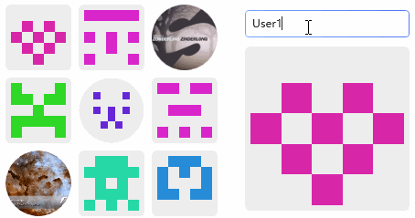
GoToTop

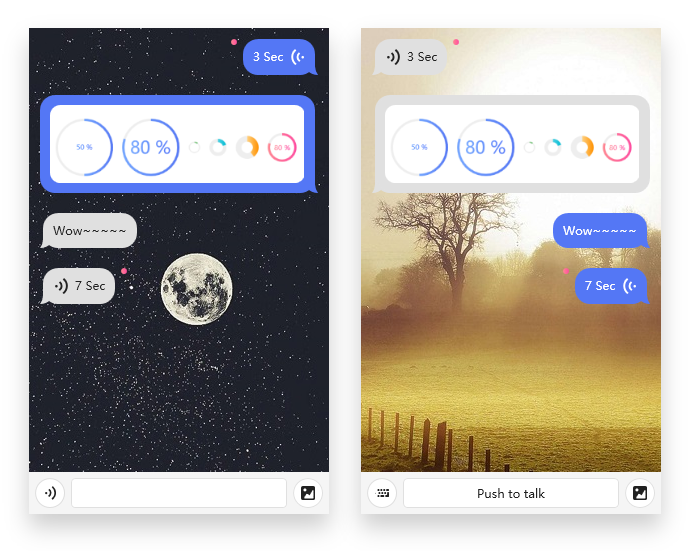
ChatBubble
Label
Transfer
ProgressButton
CoverFlow

CoverView
MessageBox
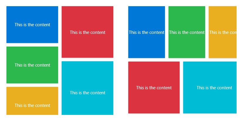
WaterfallPanel
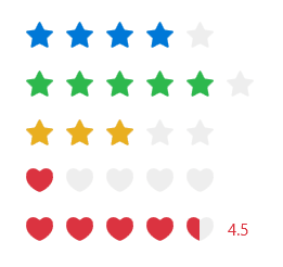
Rate
BlurWindow
FlipClock

Shield
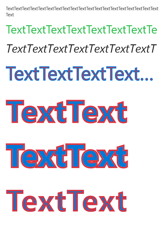
OutlineText
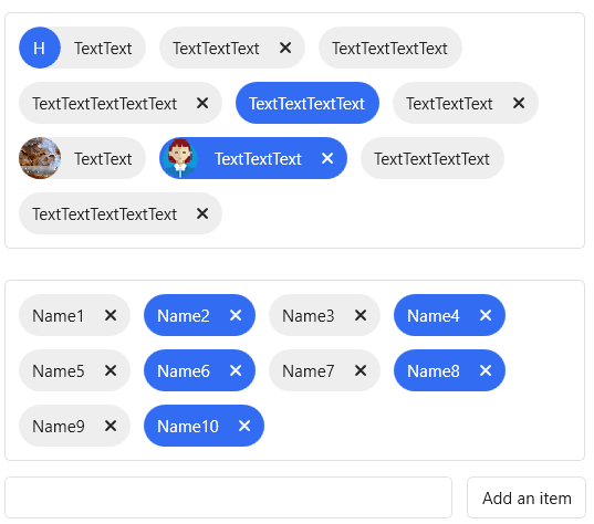
Tag
ToolBar
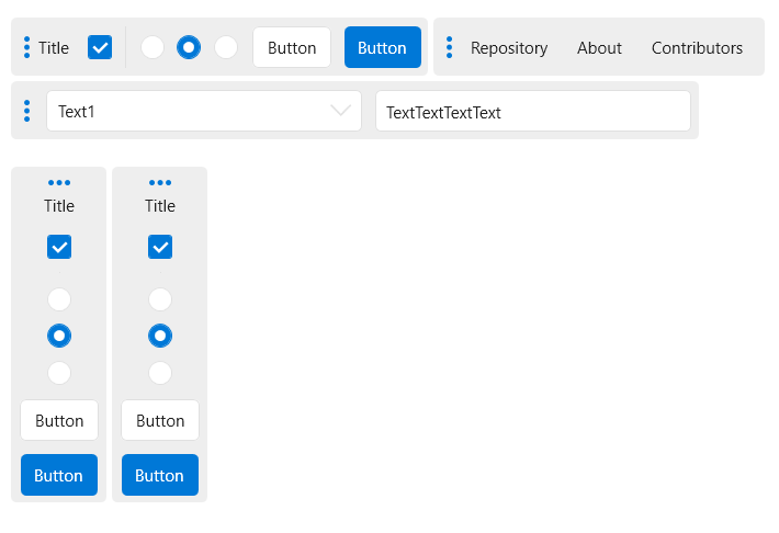
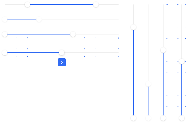
Slider
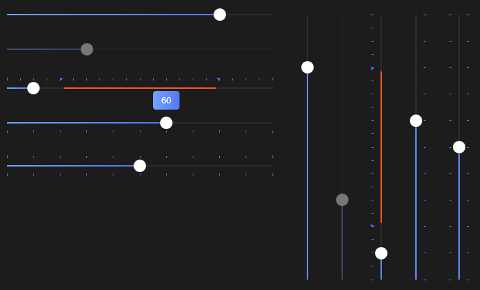
RangeSlider
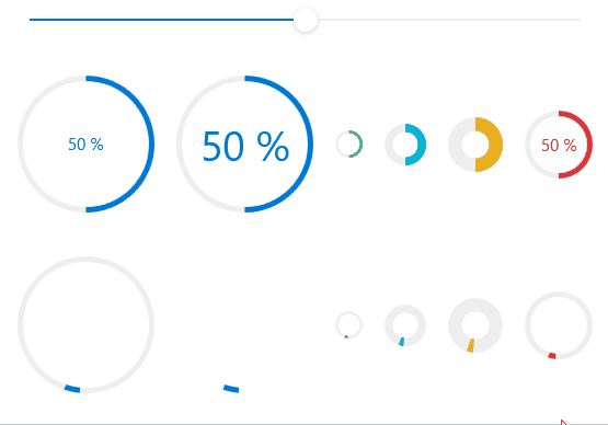
CircleProgressBar
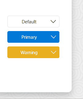
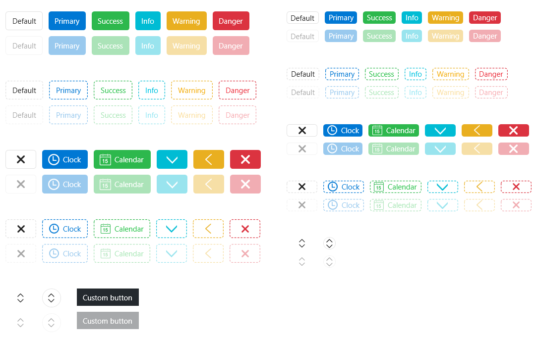
ButtonStyle
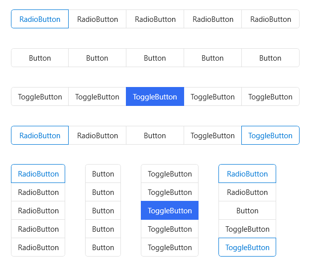
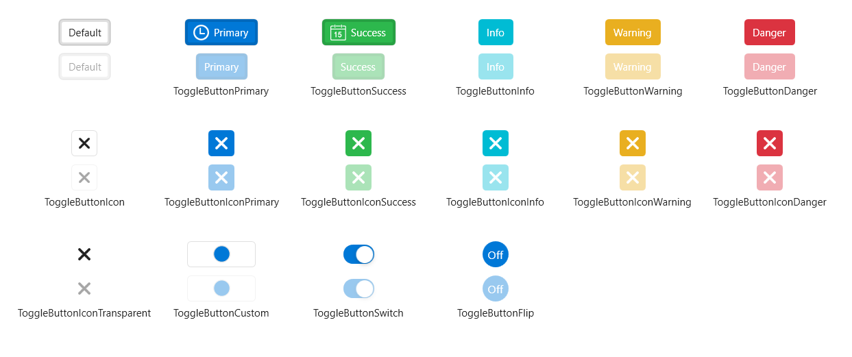
ToggleButtonStyle
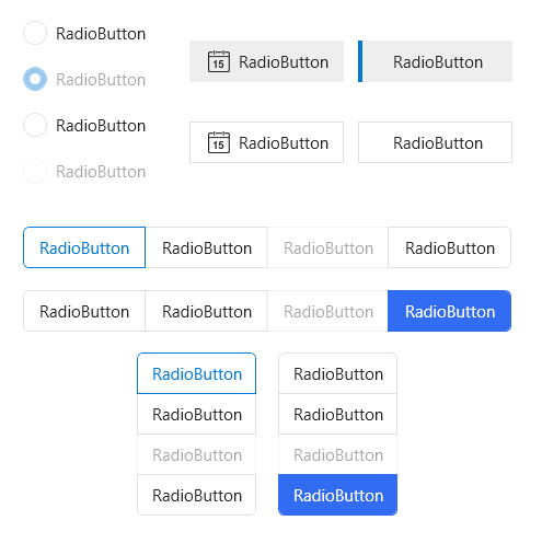
RadioButtonStyle
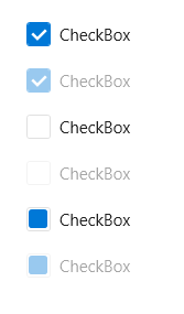
CheckBoxStyle
ListBoxStyle
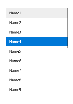
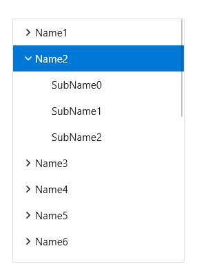
TreeViewStyle
ListViewStyle
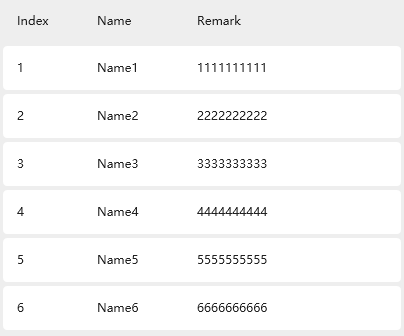
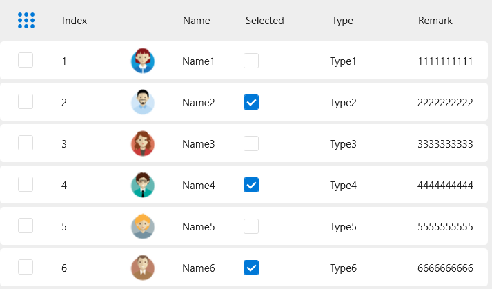
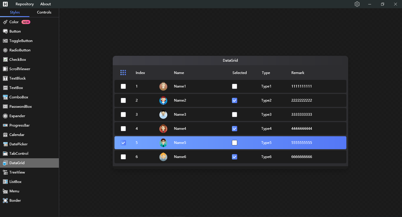
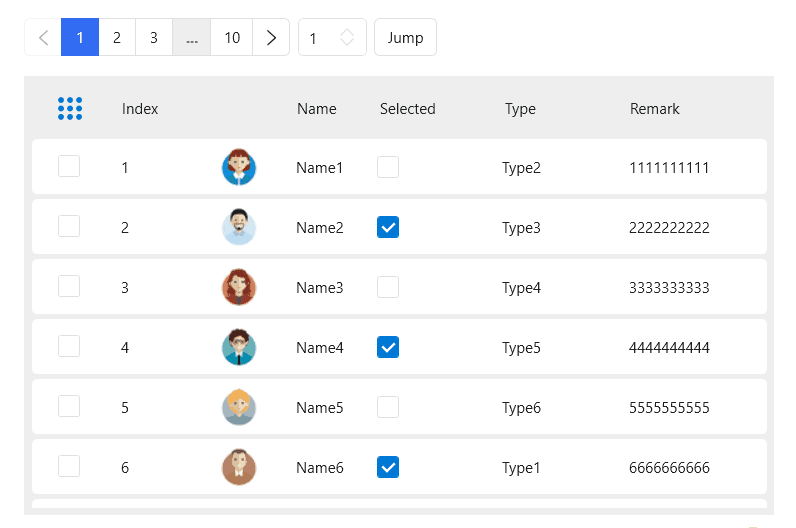
DataGrid
Now you can switch to dark theme
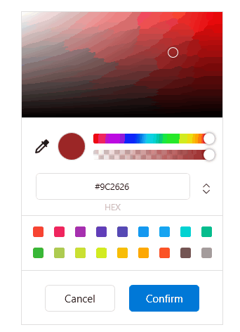
ColorPicker
Loading

Carousel

Pagination
Expander
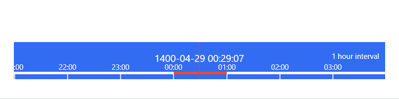
TimeBar
ImageBrowser
PreviewSlider
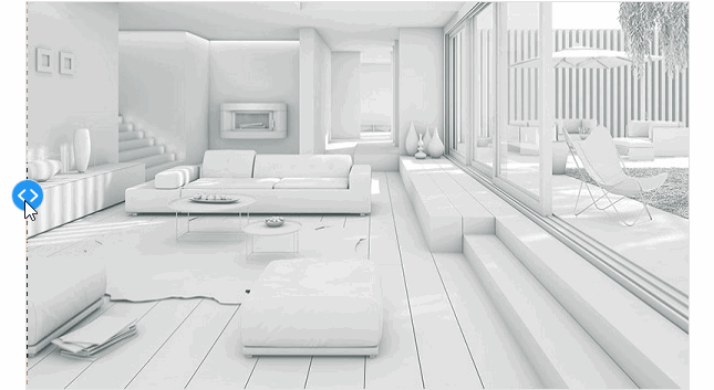
CompareSlider
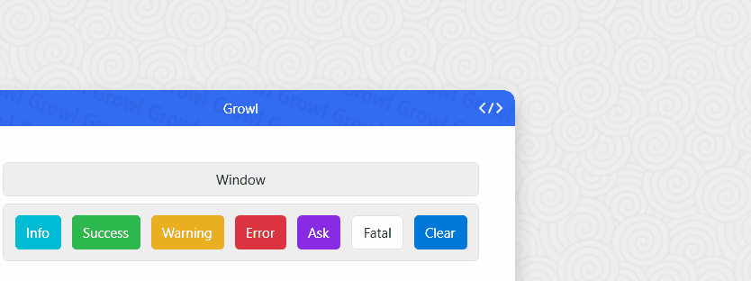
Growl
AnimationPath
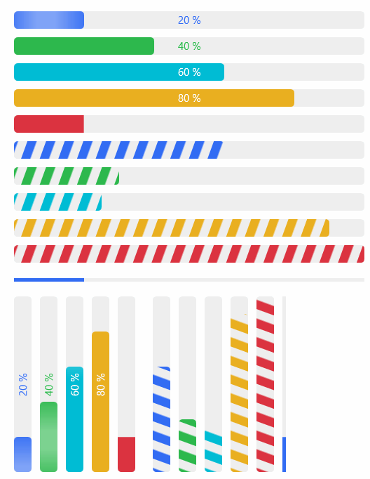
ProgressBar
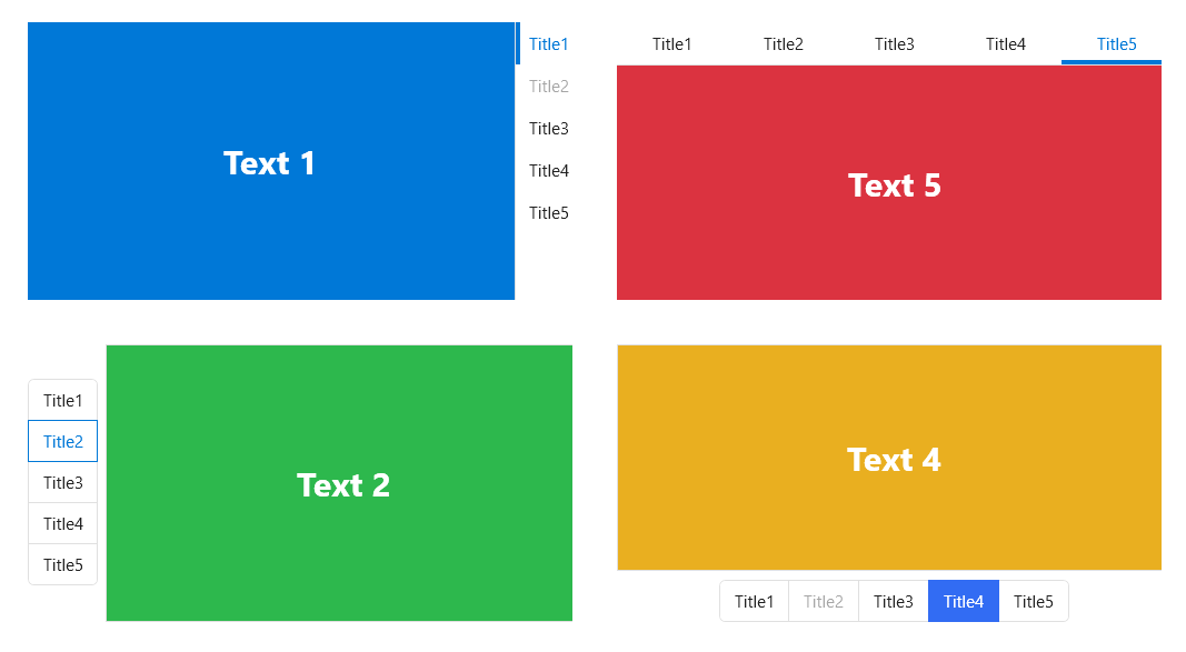
TabControl

TabControlStyle
GroupBox
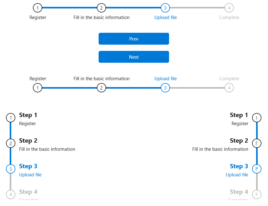
StepBar
GifImage
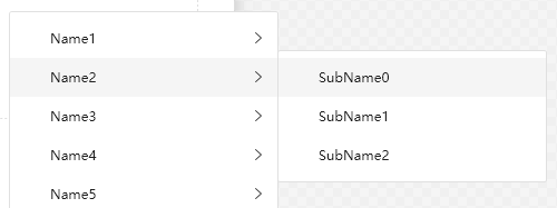
ContextMenu
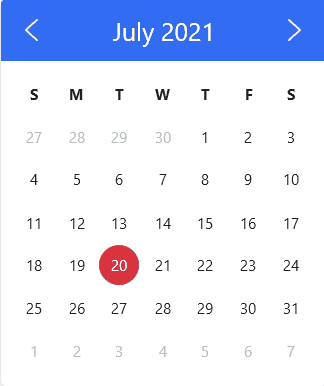
Calendar
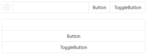
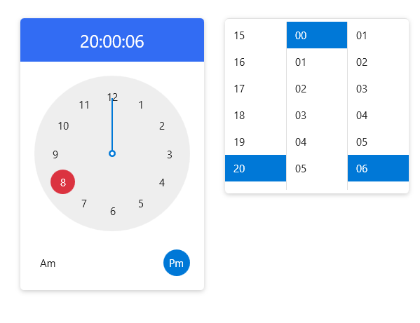
Clock
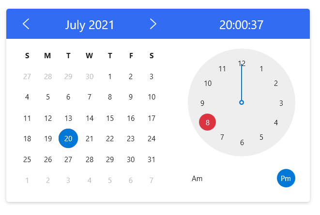
CalendarWithClock
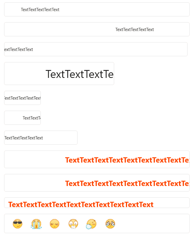
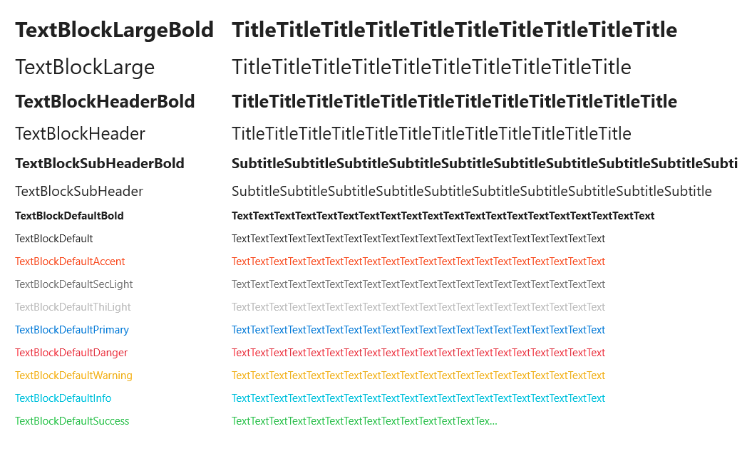
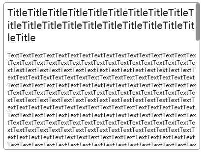
TextBlock
RichTextBoxStyle
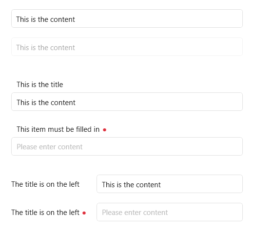
TextBox
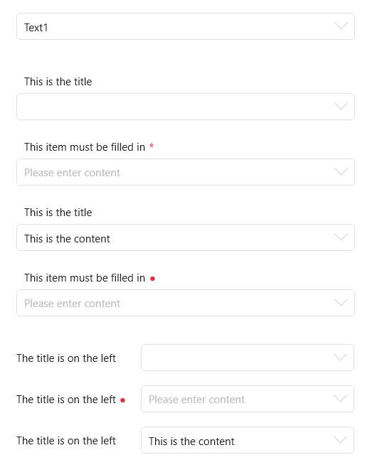
ComboBox
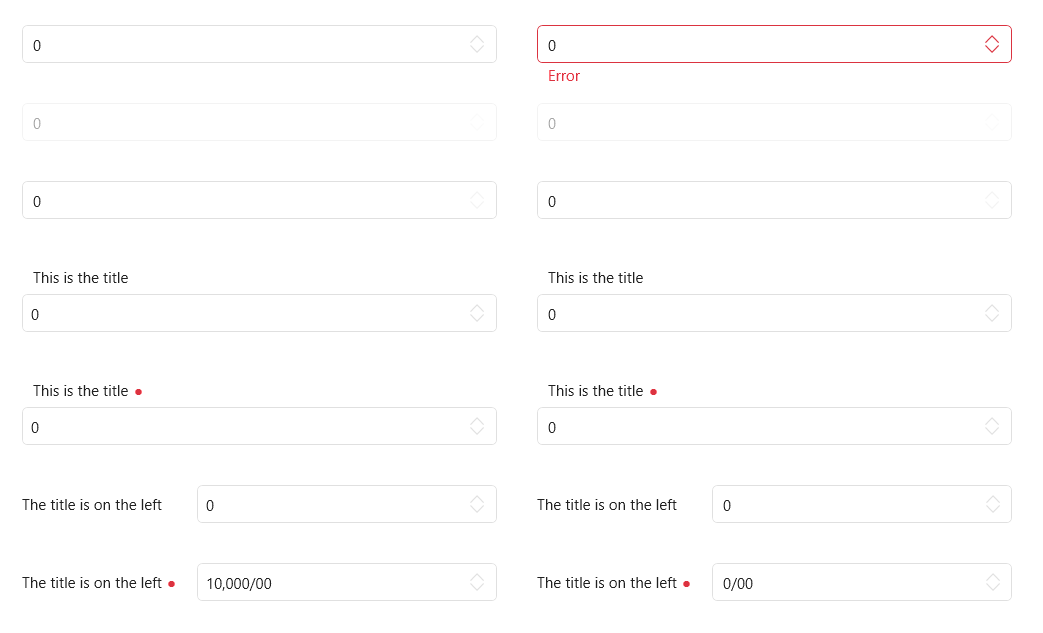
NumericUpDown
SearchBar

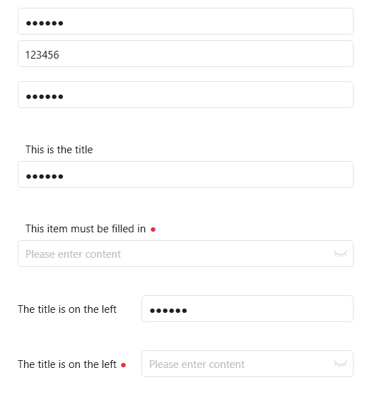
PasswordBox
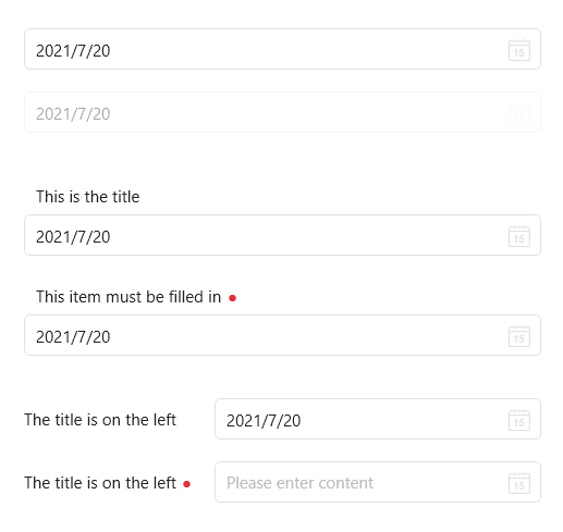
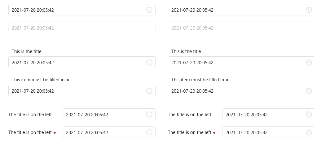
DatePicker
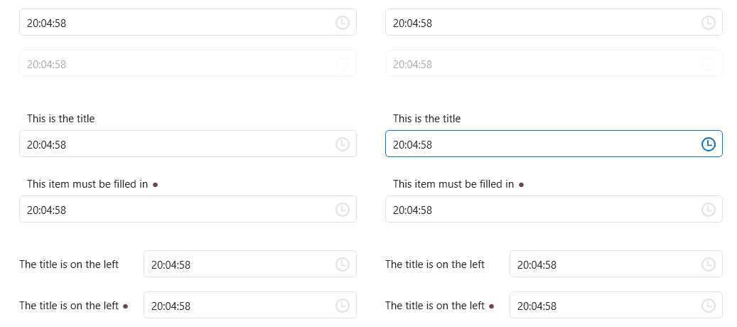
TimePicker
DateTimePicker
ScrollViewer
CirclePanel
TransitioningContentControl
BorderStyle
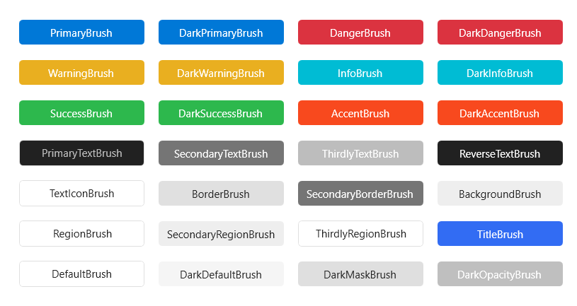
Brush
Top Related Projects
Google's Material Design in XAML & WPF, for C# & VB.Net.
Develop Desktop, Embedded, Mobile and WebAssembly apps with C# and XAML. The most popular .NET UI client technology
A framework that allows developers to cobble together a better UI for their own WPF applications with minimal effort.
Dragable and tearable tab control for WPF
Modern UI for WPF
Theming .NET WinForms, C# or VB.Net, to Google's Material Design Principles.
Convert designs to code with AI
Introducing Visual Copilot: A new AI model to turn Figma designs to high quality code using your components.
Try Visual Copilot