 MGSwipeTableCell
An easy to use UITableViewCell subclass that allows to display swippable buttons with a variety of transitions.
Top Related Projects
Swipeable UITableViewCell/UICollectionViewCell based on the stock Mail.app, implemented in Swift.
An easy-to-use UITableViewCell subclass that implements a swippable content view which exposes utility buttons (similar to iOS 7 Mail Application)
:point_up_2: Convenient UITableViewCell subclass that implements a swippable content to trigger actions (similar to the Mailbox app).
Swipe to "like" or "dislike" any view, just like Tinder.app. Build a flashcard app, a photo viewer, and more, in minutes, not hours!
Quick Overview
MGSwipeTableCell is an easy-to-use UITableViewCell subclass that allows the addition of swipe gestures to table view cells with a variety of transition effects. It provides support for both left and right swipe actions, customizable buttons, and various animation styles, making it a versatile solution for implementing swipeable table cells in iOS applications.
Pros
- Easy integration with existing UITableView implementations
- Highly customizable with multiple transition styles and button options
- Supports both left and right swipe actions
- Smooth animations and gesture handling
Cons
- Limited to UITableView cells (not compatible with UICollectionView)
- May require additional work to implement complex custom layouts
- Potential performance impact with large numbers of swipeable cells
Code Examples
- Basic usage with default settings:
class MyTableViewController: UITableViewController, MGSwipeTableCellDelegate {
    override func tableView(_ tableView: UITableView, cellForRowAt indexPath: IndexPath) -> UITableViewCell {
        let cell = tableView.dequeueReusableCell(withIdentifier: "Cell") as! MGSwipeTableCell
        cell.delegate = self
        cell.rightButtons = [MGSwipeButton(title: "Delete", backgroundColor: .red)]
        return cell
    }
}
- Customizing button appearance:
let deleteButton = MGSwipeButton(title: "Delete", icon: UIImage(named: "delete-icon"), backgroundColor: .red)
let moreButton = MGSwipeButton(title: "More", backgroundColor: .lightGray)
cell.rightButtons = [deleteButton, moreButton]
cell.rightSwipeSettings.transition = .rotate3D
- Implementing swipe callbacks:
func swipeTableCell(_ cell: MGSwipeTableCell, tappedButtonAt index: Int, direction: MGSwipeDirection, fromExpansion: Bool) -> Bool {
    if direction == .rightToLeft && index == 0 {
        // Handle delete action
        return true
    }
    return false
}
Getting Started
-
Install MGSwipeTableCell using CocoaPods by adding the following to your Podfile:
pod 'MGSwipeTableCell' -
Import the library in your Swift file:
import MGSwipeTableCell -
Create a custom table view cell that subclasses MGSwipeTableCell:
class MyCustomCell: MGSwipeTableCell { // Customize your cell here } -
Implement the MGSwipeTableCellDelegate methods in your view controller to handle swipe actions.
Competitor Comparisons
Swipeable UITableViewCell/UICollectionViewCell based on the stock Mail.app, implemented in Swift.
Pros of SwipeCellKit
- More actively maintained with recent updates and bug fixes
- Supports both UITableView and UICollectionView
- Offers more customization options for swipe actions
Cons of SwipeCellKit
- Slightly more complex setup process
- May have a steeper learning curve for beginners
- Requires iOS 9.0 or later, while MGSwipeTableCell supports iOS 7.0+
Code Comparison
MGSwipeTableCell:
let cell = MGSwipeTableCell()
cell.rightButtons = [MGSwipeButton(title: "Delete", backgroundColor: .red)]
cell.leftSwipeSettings.transition = .rotate3D
SwipeCellKit:
let cell = SwipeTableViewCell()
cell.delegate = self
let deleteAction = SwipeAction(style: .destructive, title: "Delete") { action, indexPath in
    // Handle delete action
}
cell.addSwipe(actions: [deleteAction], for: .right)
Both libraries offer similar functionality for creating swipeable table cells, but SwipeCellKit provides more modern syntax and additional features. MGSwipeTableCell is simpler to implement for basic use cases, while SwipeCellKit offers more flexibility and customization options at the cost of slightly increased complexity.
An easy-to-use UITableViewCell subclass that implements a swippable content view which exposes utility buttons (similar to iOS 7 Mail Application)
Pros of SWTableViewCell
- More customizable appearance with built-in transitions and styles
- Easier to implement multiple buttons on both sides of the cell
- Better support for dynamic button widths
Cons of SWTableViewCell
- Less actively maintained (last update in 2017)
- Fewer features for handling gestures and animations
- Limited support for iOS versions beyond iOS 7
Code Comparison
SWTableViewCell:
SWTableViewCell *cell = [tableView dequeueReusableCellWithIdentifier:@"cell"];
[cell setRightUtilityButtons:[self rightButtons] WithButtonWidth:80.0f];
[cell setLeftUtilityButtons:[self leftButtons] WithButtonWidth:80.0f];
MGSwipeTableCell:
MGSwipeTableCell *cell = [tableView dequeueReusableCellWithIdentifier:@"cell"];
cell.rightButtons = @[[MGSwipeButton buttonWithTitle:@"Delete" backgroundColor:[UIColor redColor]]];
cell.leftButtons = @[[MGSwipeButton buttonWithTitle:@"More" backgroundColor:[UIColor blueColor]]];
Both libraries provide similar functionality for adding swipeable buttons to table view cells. SWTableViewCell offers more built-in customization options, while MGSwipeTableCell provides a simpler API and more active development. The choice between the two depends on specific project requirements and the need for ongoing support and updates.
:point_up_2: Convenient UITableViewCell subclass that implements a swippable content to trigger actions (similar to the Mailbox app).
Pros of MCSwipeTableViewCell
- Simpler implementation with fewer customization options, making it easier to use for basic swipe actions
- Smoother animations and transitions between swipe states
- Lighter weight library with fewer dependencies
Cons of MCSwipeTableViewCell
- Limited functionality compared to MGSwipeTableCell, with fewer built-in features
- Less active development and community support
- Lacks some advanced customization options available in MGSwipeTableCell
Code Comparison
MCSwipeTableViewCell:
cell.setSwipeGestureWithView(view: deleteView, color: .red, mode: .exit, state: .state1) { (cell, state, mode) in
    // Handle swipe action
}
MGSwipeTableCell:
cell.rightButtons = [MGSwipeButton(title: "Delete", backgroundColor: .red, callback: { (cell) -> Bool in
    // Handle swipe action
    return true
})]
Both libraries provide easy-to-use APIs for implementing swipe actions in table view cells. MCSwipeTableViewCell focuses on simplicity and smooth animations, while MGSwipeTableCell offers more advanced features and customization options.
MCSwipeTableViewCell is better suited for projects requiring basic swipe functionality with minimal setup, while MGSwipeTableCell is ideal for applications needing extensive customization and advanced swipe actions.
Consider your project requirements and the level of complexity needed when choosing between these two libraries.
Swipe to "like" or "dislike" any view, just like Tinder.app. Build a flashcard app, a photo viewer, and more, in minutes, not hours!
Pros of MDCSwipeToChoose
- Designed specifically for Tinder-like swipe interactions
- Includes built-in animations and visual feedback
- Simpler implementation for basic swipe-to-choose functionality
Cons of MDCSwipeToChoose
- Less flexible for custom swipe actions
- Limited to left and right swipe directions
- Fewer customization options for appearance and behavior
Code Comparison
MDCSwipeToChoose:
MDCSwipeToChooseView *swipeView = [[MDCSwipeToChooseView alloc] initWithFrame:frame
                                                                     options:options];
[swipeView.imageView setImage:[UIImage imageNamed:@"photo"]];
[self.view addSubview:swipeView];
MGSwipeTableCell:
MGSwipeTableCell *cell = [tableView dequeueReusableCellWithIdentifier:@"programmaticCell"];
cell.rightButtons = @[[MGSwipeButton buttonWithTitle:@"Delete" backgroundColor:[UIColor redColor]]];
cell.leftButtons = @[[MGSwipeButton buttonWithTitle:@"Mark" backgroundColor:[UIColor blueColor]]];
MDCSwipeToChoose is more focused on creating Tinder-like interfaces with simple left/right swipe choices, while MGSwipeTableCell offers more versatile swipe actions for table view cells, including multiple buttons and customizable appearances. MGSwipeTableCell provides greater flexibility for various swipe-based interactions in table views, whereas MDCSwipeToChoose is optimized for a specific use case of binary choice swiping.
Convert  designs to code with AI

Introducing Visual Copilot: A new AI model to turn Figma designs to high quality code using your components.
Try Visual CopilotREADME
MGSwipeTableCell
MGSwipeTableCell is an easy to use UITableViewCell subclass that allows to display swipeable buttons with a variety of transitions.
This library is compatible with all the different ways to create a UITableViewCell: system predefined styles, programmatically created cells, cells loaded from a xib and prototype cells within a storyboard. You can use autolayout if you want.
Works on iOS >= 5.0. Tested on all iOS versions on iPhone and iPad: iOS 7, iOS 8, iOS 9, iOS 10, iOS 11, iOS 12, iOS 13, iOS 14.
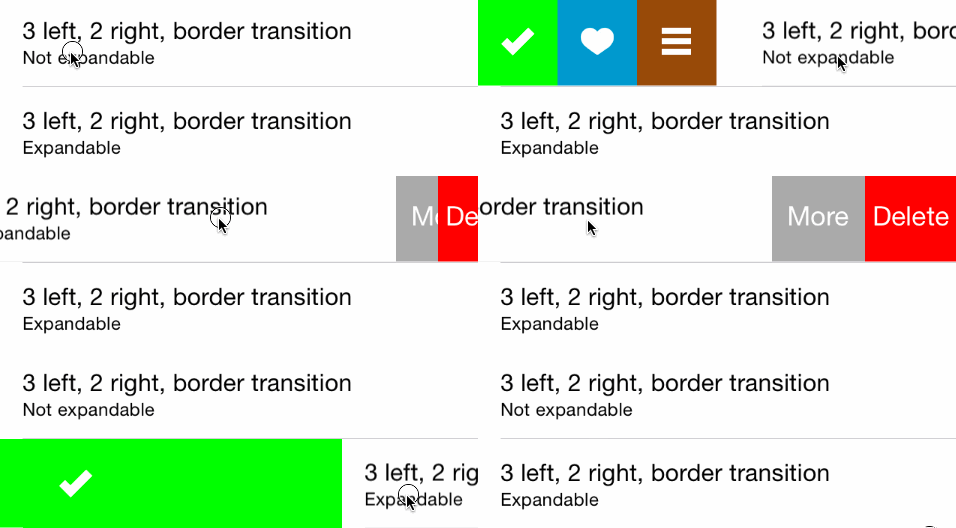
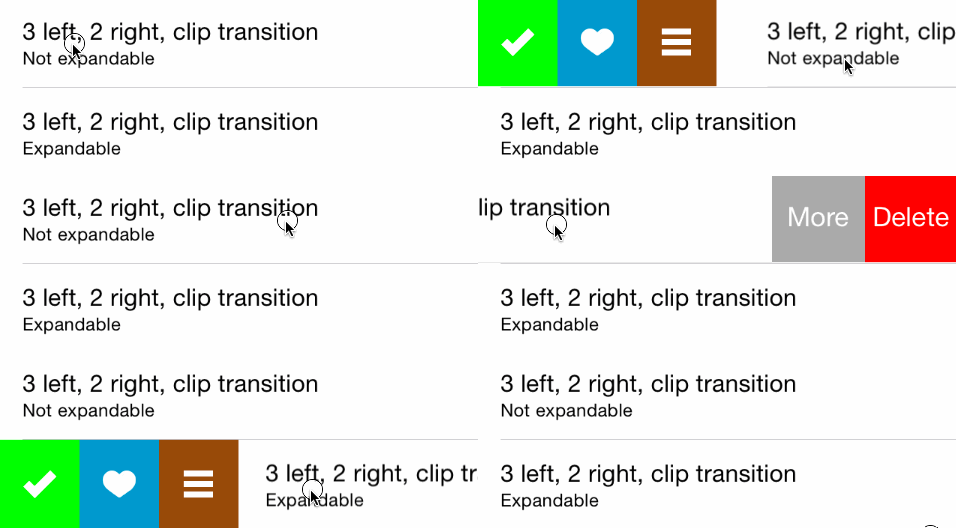
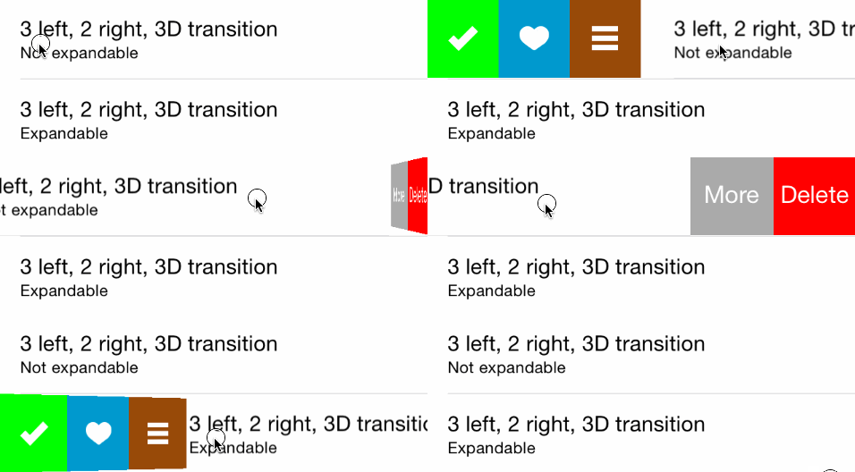
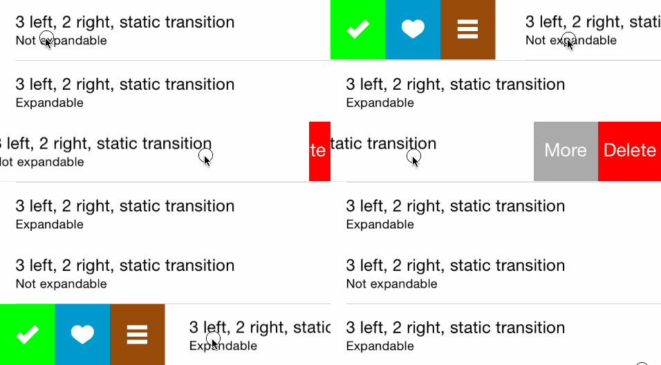
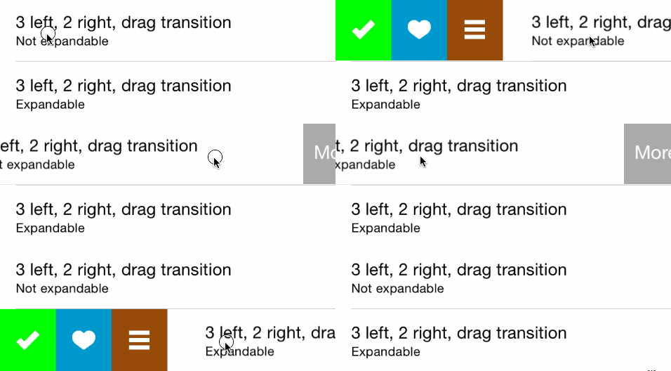
Transitions demo
Border transition
Clip transition
3D transition
Static transition
Drag transition
API Reference
See MGSwipeTableCell.h header file for a complete overview of the capabilities of the class.
See MailAppDemo for a complete project which mimics Apple's Mail App (written in Objective-C)
See MailAppDemoSwift for a complete project which mimics Apple's Mail App (Written in Swift)
See SpotifyDemo for a complete project which mimics Spotify App swipe style
See MGSwipeDemo for a complete project where you can test the variety of transitions on a real device/simulator.
Setup your project
You can use CocoaPods to include MGSwipeTableCell into you project:
pod 'MGSwipeTableCell'
You can use Carthage to include MGSwipeTableCell into your project. Just add this dependency to your Cartfile:
github "MortimerGoro/MGSwipeTableCell"
You can use Swift Package Manager to include MGSwipeTableCell into you project:
.package(url: "https://github.com/MortimerGoro/MGSwipeTableCell.git", from: "1.6.0")
Usage
Basic
Integrating MGSwipeTableCell in your project is very easy. Basically, you only have to inherit from MGSwipeTableCell instead of UITableViewCell, or directly instantiate MGSwipeTableCell instances with iOS predefined cell styles. You can layout your cell content as you are used to do, MGSwipeTableCell doesn't force you to change layouts.
Here is a example of a MGSwipeTableCell using iOS predefined styles. You can set an array of buttons to cell.leftButtons and/or cell.rightButtons properties. MGSwipeButton is a convenience class, you are not forced to use it. You can use your own UIButtons or UIViews. You can configure transitions (and swipe thresholds) with the leftSwipeSettings and/or rightSwipeSettings properties
Objective-C
- (UITableViewCell *)tableView:(UITableView *)tableView cellForRowAtIndexPath:(NSIndexPath *)indexPath
{
    static NSString * reuseIdentifier = @"programmaticCell";
    MGSwipeTableCell * cell = [self.tableView dequeueReusableCellWithIdentifier:reuseIdentifier];
    if (!cell) {
        cell = [[MGSwipeTableCell alloc] initWithStyle:UITableViewCellStyleSubtitle reuseIdentifier:reuseIdentifier];
    }

    cell.textLabel.text = @"Title";
    cell.detailTextLabel.text = @"Detail text";
    cell.delegate = self; //optional


    //configure left buttons
    cell.leftButtons = @[[MGSwipeButton buttonWithTitle:@"" icon:[UIImage imageNamed:@"check.png"] backgroundColor:[UIColor greenColor]],
                          [MGSwipeButton buttonWithTitle:@"" icon:[UIImage imageNamed:@"fav.png"] backgroundColor:[UIColor blueColor]]];
    cell.leftSwipeSettings.transition = MGSwipeTransition3D;

    //configure right buttons
    cell.rightButtons = @[[MGSwipeButton buttonWithTitle:@"Delete" backgroundColor:[UIColor redColor]],
                           [MGSwipeButton buttonWithTitle:@"More" backgroundColor:[UIColor lightGrayColor]]];
    cell.rightSwipeSettings.transition = MGSwipeTransition3D;
    return cell;
}
Swift
func tableView(_ tableView: UITableView, cellForRowAt indexPath: IndexPath) -> UITableViewCell
{
    let reuseIdentifier = "programmaticCell"
    var cell = tableView.dequeueReusableCell(withIdentifier: reuseIdentifier, for: indexPath) as! MGSwipeTableCell

    cell.textLabel!.text = "Title"
    cell.detailTextLabel!.text = "Detail text"
    cell.delegate = self //optional

    //configure left buttons
    cell.leftButtons = [MGSwipeButton(title: "", icon: UIImage(named:"check.png"), backgroundColor: .green),
                        MGSwipeButton(title: "", icon: UIImage(named:"fav.png"), backgroundColor: .blue)]
    cell.leftSwipeSettings.transition = .rotate3D

    //configure right buttons
    cell.rightButtons = [MGSwipeButton(title: "Delete", backgroundColor: .red),
                         MGSwipeButton(title: "More",backgroundColor: .lightGray)]
    cell.rightSwipeSettings.transition = .rotate3D

    return cell
}
In order to listen for button click events you can implement the optional MGSwipeTableCellDelegate, or if you are too lazy to do that, the MGSwipeButton class comes with a convenience block callback ;)
Objective-c
[MGSwipeButton buttonWithTitle:@"More" backgroundColor:[UIColor lightGrayColor] callback:^BOOL(MGSwipeTableCell *sender) {
      NSLog(@"Convenience callback for swipe buttons!");
}]
Swift
MGSwipeButton(title: "Delete", backgroundColor: .red) {
      (sender: MGSwipeTableCell!) -> Bool in
      print("Convenience callback for swipe buttons!")
      return true
    }
Delegate
MGSwipeTableCellDelegate is an optional delegate to configure swipe buttons or to receive triggered actions or another events. Buttons can be configured inline when the cell is created instead of using this delegate, but using the delegate improves memory usage since buttons are only created on demand.
@protocol MGSwipeTableCellDelegate <NSObject>

@optional
/**
 * Delegate method to enable/disable swipe gestures
 * @return YES if swipe is allowed
 **/
-(BOOL) swipeTableCell:(MGSwipeTableCell*) cell canSwipe:(MGSwipeDirection) direction;
/**
 * Delegate method invoked when the current swipe state changes
 @param state the current Swipe State
 @param gestureIsActive YES if the user swipe gesture is active. No if the uses has already ended the gesture
 **/
-(void) swipeTableCell:(MGSwipeTableCell*) cell didChangeSwipeState:(MGSwipeState) state gestureIsActive:(BOOL) gestureIsActive;
/**
 * Called when the user clicks a swipe button or when a expandable button is automatically triggered
 * @return YES to autohide the current swipe buttons
 **/
-(BOOL) swipeTableCell:(MGSwipeTableCell*) cell tappedButtonAtIndex:(NSInteger) index direction:(MGSwipeDirection)direction fromExpansion:(BOOL) fromExpansion;
/**
 * Delegate method to setup the swipe buttons and swipe/expansion settings
 * Buttons can be any kind of UIView but it's recommended to use the convenience MGSwipeButton class
 * Setting up buttons with this delegate instead of using cell properties improves memory usage because buttons are only created in demand
 * @param swipeTableCell the UITableViewCell to configure. You can get the indexPath using [tableView indexPathForCell:cell]
 * @param direction The swipe direction (left to right or right to left)
 * @param swipeSettings instance to configure the swipe transition and setting (optional)
 * @param expansionSettings instance to configure button expansions (optional)
 * @return Buttons array
 **/
-(NSArray*) swipeTableCell:(MGSwipeTableCell*) cell swipeButtonsForDirection:(MGSwipeDirection)direction
             swipeSettings:(MGSwipeSettings*) swipeSettings expansionSettings:(MGSwipeExpansionSettings*) expansionSettings;

@end
Expandable buttons
Buttons are not expandable by default. You can set up expandable buttons using cell.leftExpansion and cell.rightExpansion properties
Expandable button events are triggered automatically when the user ends the swipe gesture and the expansion is active (configurable via threshold value). Triggered expandable buttons can bounce back to their initial position or fill the entire UITableViewCell, you can select the desired animation using fillOnTrigger property.
@interface MGSwipeExpansionSettings: NSObject
/** index of the expandable button (in the left or right buttons arrays) */
@property (nonatomic, assign) NSInteger buttonIndex;
/** if true the button fills the cell on trigger, else it bounces back to its initial position */
@property (nonatomic, assign) BOOL fillOnTrigger;
/** Size proportional threshold to trigger the expansion button. Default value 1.5 */
@property (nonatomic, assign) CGFloat threshold;
@end
Rounded corners and swipe buttons
MGSwipeTableCell supports rounded corners. Example:
cell.layer.cornerRadius = 50
cell.backgroundColor = UIColor.gray
cell.clipsToBounds = true
cell.swipeBackgroundColor = UIColor.gray

License
The MIT License (MIT)
Copyright (c) 2014 Imanol Fernandez @MortimerGoro
Permission is hereby granted, free of charge, to any person obtaining a copy of this software and associated documentation files (the "Software"), to deal in the Software without restriction, including without limitation the rights to use, copy, modify, merge, publish, distribute, sublicense, and/or sell copies of the Software, and to permit persons to whom the Software is furnished to do so, subject to the following conditions:
The above copyright notice and this permission notice shall be included in all copies or substantial portions of the Software.
THE SOFTWARE IS PROVIDED "AS IS", WITHOUT WARRANTY OF ANY KIND, EXPRESS OR IMPLIED, INCLUDING BUT NOT LIMITED TO THE WARRANTIES OF MERCHANTABILITY, FITNESS FOR A PARTICULAR PURPOSE AND NONINFRINGEMENT. IN NO EVENT SHALL THE AUTHORS OR COPYRIGHT HOLDERS BE LIABLE FOR ANY CLAIM, DAMAGES OR OTHER LIABILITY, WHETHER IN AN ACTION OF CONTRACT, TORT OR OTHERWISE, ARISING FROM, OUT OF OR IN CONNECTION WITH THE SOFTWARE OR THE USE OR OTHER DEALINGS IN THE SOFTWARE.
Top Related Projects
Swipeable UITableViewCell/UICollectionViewCell based on the stock Mail.app, implemented in Swift.
An easy-to-use UITableViewCell subclass that implements a swippable content view which exposes utility buttons (similar to iOS 7 Mail Application)
:point_up_2: Convenient UITableViewCell subclass that implements a swippable content to trigger actions (similar to the Mailbox app).
Swipe to "like" or "dislike" any view, just like Tinder.app. Build a flashcard app, a photo viewer, and more, in minutes, not hours!
Convert  designs to code with AI

Introducing Visual Copilot: A new AI model to turn Figma designs to high quality code using your components.
Try Visual Copilot