 weui-wxss
A UI library by WeChat official design team, includes the most useful widgets/modules.
Top Related Projects
A UI library by WeChat official design team, includes the most useful widgets/modules in mobile web applications.
轻量、可靠的小程序 UI 组件库
:dog: 一套组件化、可复用、易扩展的微信小程序 UI 组件库
一套高质量的微信小程序 UI 组件库
Essential UI blocks for building mobile web apps.
Quick Overview
WeUI-WXSS is a WeChat-specific UI library developed by Tencent for creating WeChat Mini Programs. It provides a set of consistent and customizable UI components that adhere to WeChat's design guidelines, allowing developers to create native-looking WeChat Mini Program interfaces efficiently.
Pros
- Officially supported by Tencent, ensuring compatibility with WeChat Mini Programs
- Comprehensive set of UI components tailored for WeChat's ecosystem
- Follows WeChat's design language, providing a native look and feel
- Regular updates and maintenance from Tencent's team
Cons
- Limited to WeChat Mini Program development, not suitable for other platforms
- Customization options may be restricted to maintain consistency with WeChat's design
- Learning curve for developers not familiar with WeChat Mini Program development
- Dependency on WeChat's platform and potential limitations imposed by it
Code Examples
- Using a WeUI button:
<button class="weui-btn weui-btn_primary">Primary Button</button>
- Implementing a WeUI cell:
<view class="weui-cell weui-cell_access">
  <view class="weui-cell__bd">Cell Title</view>
  <view class="weui-cell__ft weui-cell__ft_in-access"></view>
</view>
- Creating a WeUI form:
<view class="weui-cells weui-cells_form">
  <view class="weui-cell">
    <view class="weui-cell__hd">
      <label class="weui-label">Name</label>
    </view>
    <view class="weui-cell__bd">
      <input class="weui-input" placeholder="Enter your name"/>
    </view>
  </view>
</view>
Getting Started
To use WeUI-WXSS in your WeChat Mini Program:
-
Clone the repository:
git clone https://github.com/Tencent/weui-wxss.git -
Copy the
dist/stylefolder to your Mini Program project. -
In your WXSS file, import the WeUI styles:
@import '/style/weui.wxss'; -
Start using WeUI classes in your WXML files:
<view class="weui-btn-area">
  <button class="weui-btn weui-btn_primary">Button</button>
</view>
Competitor Comparisons
A UI library by WeChat official design team, includes the most useful widgets/modules in mobile web applications.
Pros of weui
- More comprehensive UI component library for web applications
- Supports multiple frameworks (vanilla JS, React, Vue)
- Better suited for cross-platform web development
Cons of weui
- Larger file size and potentially more complex implementation
- May require additional setup for specific frameworks
- Less optimized for WeChat Mini Program development
Code Comparison
weui (HTML/CSS):
<a href="javascript:;" class="weui-btn weui-btn_primary">Primary Button</a>
<a href="javascript:;" class="weui-btn weui-btn_default">Default Button</a>
weui-wxss (WXML/WXSS):
<button class="weui-btn" type="primary">Primary Button</button>
<button class="weui-btn" type="default">Default Button</button>
The weui-wxss code is more specific to WeChat Mini Program syntax, while weui uses standard HTML elements with CSS classes.
weui-wxss is tailored specifically for WeChat Mini Programs, offering a streamlined and optimized solution for this platform. It has a smaller file size and is easier to implement in Mini Program projects. However, it lacks the versatility of weui for broader web application development across different frameworks and platforms.
Both libraries provide a consistent WeChat-style UI, but developers should choose based on their specific project requirements and target platform.
轻量、可靠的小程序 UI 组件库
Pros of vant-weapp
- More comprehensive component library with over 70 components
- Better documentation and examples for each component
- Active development and frequent updates
Cons of vant-weapp
- Larger file size due to more components
- Steeper learning curve for beginners
- Less native WeChat UI feel compared to weui-wxss
Code Comparison
weui-wxss:
.weui-btn {
  position: relative;
  display: block;
  margin-left: auto;
  margin-right: auto;
  padding-left: 14px;
  padding-right: 14px;
}
vant-weapp:
.van-button {
  position: relative;
  display: inline-block;
  box-sizing: border-box;
  height: 44px;
  padding: 0;
  font-size: 16px;
  line-height: 42px;
}
The code comparison shows that vant-weapp uses a more modern CSS approach with box-sizing and specific height/line-height values, while weui-wxss focuses on basic positioning and padding. vant-weapp's approach may offer more consistent styling across different components but could be less flexible for custom designs.
Both libraries provide essential UI components for WeChat Mini Programs, but vant-weapp offers a more extensive set of components and better documentation. weui-wxss, being developed by Tencent, provides a more native WeChat look and feel. The choice between the two depends on project requirements, desired UI aesthetics, and developer preferences.
:dog: 一套组件化、可复用、易扩展的微信小程序 UI 组件库
Pros of wux-weapp
- More comprehensive component library with a wider range of UI elements
- Better documentation and examples for each component
- Regular updates and active community support
Cons of wux-weapp
- Larger file size and potentially higher performance overhead
- Steeper learning curve due to more complex API and customization options
- Less native-looking UI compared to WeUI's design philosophy
Code Comparison
weui-wxss:
<view class="weui-cells">
  <view class="weui-cell">
    <view class="weui-cell__bd">Cell Content</view>
  </view>
</view>
wux-weapp:
<wux-cell-group>
  <wux-cell title="Cell Content"></wux-cell>
</wux-cell-group>
The code comparison shows that wux-weapp uses custom components with more abstracted properties, while weui-wxss relies on class-based styling with a structure closer to standard HTML.
wux-weapp offers more flexibility and features out of the box, but weui-wxss provides a simpler, more lightweight approach that closely follows WeChat's design guidelines. The choice between the two depends on project requirements, desired customization level, and performance considerations.
一套高质量的微信小程序 UI 组件库
Pros of iview-weapp
- More comprehensive component library with a wider range of UI elements
- Better documentation and examples for each component
- Regular updates and active community support
Cons of iview-weapp
- Larger file size and potentially higher performance overhead
- Less native-looking components compared to WeUI's design philosophy
- Steeper learning curve for developers new to the framework
Code Comparison
iview-weapp:
<i-button type="primary" bind:click="handleClick">Click me</i-button>
<i-input v-model="value" placeholder="Enter text" />
<i-cell-group>
    <i-cell title="Cell Title" value="Content"></i-cell>
</i-cell-group>
weui-wxss:
<button class="weui-btn weui-btn_primary" bindtap="handleClick">Click me</button>
<input class="weui-input" placeholder="Enter text" bindinput="handleInput" />
<view class="weui-cells">
    <view class="weui-cell">
        <view class="weui-cell__bd">Cell Title</view>
        <view class="weui-cell__ft">Content</view>
    </view>
</view>
Both libraries offer solutions for creating UI components in WeChat Mini Programs, but iview-weapp provides a more extensive set of pre-built components with easier implementation, while weui-wxss offers a more lightweight and native-looking approach. The choice between them depends on the specific project requirements and developer preferences.
Essential UI blocks for building mobile web apps.
Pros of ant-design-mobile
- More comprehensive component library with a wider range of UI elements
- Better documentation and examples for developers
- Active development and frequent updates
Cons of ant-design-mobile
- Larger file size and potentially slower performance
- Steeper learning curve due to more complex API
Code Comparison
ant-design-mobile:
import { Button } from 'antd-mobile'

const App = () => (
  <Button color='primary' size='large'>
    Submit
  </Button>
)
weui-wxss:
<button class="weui-btn weui-btn_primary">
  Submit
</button>
Summary
ant-design-mobile offers a more feature-rich and well-documented UI library for mobile web applications, while weui-wxss provides a simpler, lightweight solution specifically designed for WeChat Mini Programs. The choice between the two depends on the specific requirements of your project, such as platform compatibility, performance needs, and desired customization options.
Both libraries aim to provide a consistent and user-friendly mobile UI experience, but they cater to different ecosystems and development approaches. Consider factors like project scope, target audience, and development team familiarity when deciding between these two options.
Convert  designs to code with AI
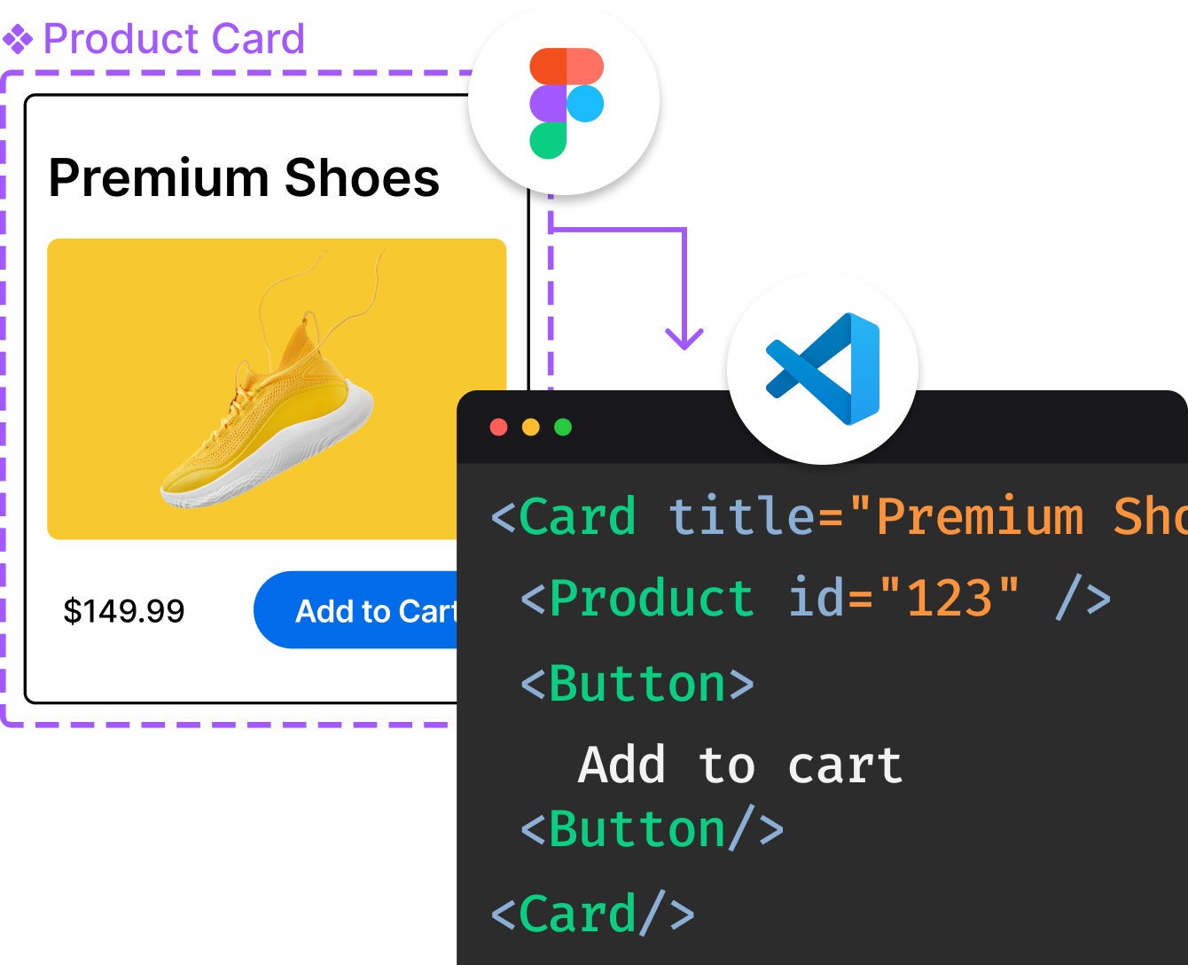
Introducing Visual Copilot: A new AI model to turn Figma designs to high quality code using your components.
Try Visual CopilotREADME
WeUI for å°ç¨åº 为微信å°ç¨åºé身设计
æ¦è¿°
WeUI æ¯ä¸å¥å微信åçè§è§ä½éªä¸è´çåºç¡æ ·å¼åºï¼ç±å¾®ä¿¡å®æ¹è®¾è®¡å¢é为微信å
ç½é¡µå微信å°ç¨åºé身设计ï¼ä»¤ç¨æ·ç使ç¨æç¥æ´å ç»ä¸ãå
å«buttonãcellãdialogã progressã toastãarticleãactionsheetãiconçåå¼å
ç´ ã
以ä¸å 容æ¯çº¯UIåºï¼å¦ææ³ä½¿ç¨é»è¾å°è£ çæ¬ï¼è¯·çå°ç¨åºç»ä»¶åº - WeUI
使ç¨
- æ ·å¼æ件å¯ç´æ¥å¼ç¨
dist/style/weui.wxssï¼æè åç¬å¼ç¨dist/style/widgetä¸çç»ä»¶çwxss - ç»ä»¶çwxmlç»æ请ç
dist/example/ä¸çç»ä»¶
rpxçæ¬
é»è®¤çæ¬ä½¿ç¨çæ¯pxãè¿éä¹æä¾rpxçæ¬ï¼æ件å¨dist-rpx-modeç®å½ä¸ã
WeUI é»æ模å¼
å¨æ ¹ç»ç¹å¢å å±æ§ data-weui-theme="dark"
å¦:
<view data-weui-theme="dark">
    ...
</view>
é¢è§
ç¨å¾®ä¿¡webå¼åè
å·¥å
·æå¼distç®å½ï¼**请注æï¼æ¯distç®å½ï¼ä¸æ¯æ´ä¸ªé¡¹ç®**ï¼


ææ¡£
WeUI è§è§æ ååè weui-design
License
The MIT License(http://opensource.org/licenses/MIT)
请èªç±å°äº«åååä¸å¼æº
è´¡ç®
å¦æä½ æ好çæè§æ建议ï¼æ¬¢è¿ç»æ们æissueæpull requestã
Top Related Projects
A UI library by WeChat official design team, includes the most useful widgets/modules in mobile web applications.
轻量、可靠的小程序 UI 组件库
:dog: 一套组件化、可复用、易扩展的微信小程序 UI 组件库
一套高质量的微信小程序 UI 组件库
Essential UI blocks for building mobile web apps.
Convert  designs to code with AI

Introducing Visual Copilot: A new AI model to turn Figma designs to high quality code using your components.
Try Visual Copilot