
Top Related Projects

GitHub repo for the MDN Learning Area.

Documentation about css-modules

Transforming styles with JS plugins

A modular minifier, built on top of the PostCSS ecosystem.
Quick Overview
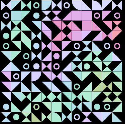
The chokcoco/iCSS repository is a collection of CSS techniques and effects, showcasing the power and versatility of CSS. It provides a wide range of examples and demonstrations, covering various aspects of CSS, from animations and transformations to creative layouts and visual effects.
Pros
- Comprehensive Collection: The repository offers a diverse range of CSS examples, catering to developers of all skill levels, from beginners to experts.
- Innovative Techniques: The project showcases innovative and creative CSS techniques, pushing the boundaries of what can be achieved with CSS alone.
- Visual Inspiration: The project serves as a valuable source of inspiration for developers looking to enhance the visual appeal and interactivity of their web applications.
- Well-Documented: The repository includes detailed explanations and code snippets for each example, making it easy for users to understand and implement the techniques.
Cons
- Lack of Structured Organization: The repository can feel overwhelming due to the large number of examples, and it may be challenging to navigate and find specific techniques.
- Limited Practical Applications: While the examples are visually impressive, some of the techniques may not be directly applicable to real-world web development projects.
- Potential Performance Concerns: Some of the more complex CSS effects and animations may have performance implications, which should be considered when implementing them in production environments.
- Dependency on Modern Browsers: Many of the techniques rely on the latest CSS features, which may not be supported by older or less-capable browsers.
Code Examples
Example 1: Animated Gradient Background
body {
  background: linear-gradient(-45deg, #ee7752, #e73c7e, #23a6d5, #23d5ab);
  background-size: 400% 400%;
  animation: gradient 15s ease infinite;
}

@keyframes gradient {
  0% {
    background-position: 0% 50%;
  }
  50% {
    background-position: 100% 50%;
  }
  100% {
    background-position: 0% 50%;
  }
}
This code creates an animated gradient background that smoothly transitions between different colors, creating a visually striking effect.
Example 2: 3D Cube Rotation
.cube {
  width: 200px;
  height: 200px;
  position: relative;
  transform-style: preserve-3d;
  transform-origin: 100px 100px;
  animation: rotate 10s linear infinite;
}

.face {
  position: absolute;
  width: 200px;
  height: 200px;
  opacity: 0.8;
}

@keyframes rotate {
  from { transform: rotateX(-30deg) rotateY(45deg); }
  to { transform: rotateX(330deg) rotateY(405deg); }
}
This code creates a 3D cube that rotates continuously, demonstrating the power of CSS transformations and animations.
Example 3: Glitch Text Effect
.glitch {
  position: relative;
  color: white;
  font-size: 4em;
  letter-spacing: 0.5em;
  animation: glitch 2s infinite;
}

@keyframes glitch {
  2%, 64% {
    transform: translate(2px, 0);
  }
  4%, 60% {
    transform: translate(-2px, 0);
  }
  62% {
    transform: translate(0, 0);
  }
}
This code creates a glitch text effect, where the text appears to be distorted and flickering, adding a unique and visually striking element to the design.
Getting Started
To get started with the chokcoco/iCSS repository, follow these steps:
- Clone the repository to your local machine:
git clone https://github.com/chokcoco/iCSS.git
- Navigate to the project directory:
cd iCSS
-
Open the project in your preferred code editor and explore the various CSS examples and techniques.
-
To view the examples in your web browser, you can either:
- Open the individual HTML
Competitor Comparisons
GitHub repo for the MDN Learning Area.
Pros of mdn/learning-area
- Comprehensive coverage of web development topics, including HTML, CSS, JavaScript, and more.
- Detailed explanations and step-by-step tutorials for beginners.
- Actively maintained and updated by the Mozilla Developer Network (MDN) team.
Cons of mdn/learning-area
- Less focused on specific CSS techniques and effects compared to iCSS.
- May not provide as much in-depth exploration of advanced CSS concepts.
- The learning area is spread across multiple repositories, which may make it less cohesive.
Code Comparison
iCSS:
.box {
  width: 200px;
  height: 200px;
  background-color: #f1f1f1;
  border-radius: 50%;
  box-shadow: 0 0 20px rgba(0, 0, 0, 0.1);
  transition: all 0.3s ease;
}

.box:hover {
  transform: scale(1.1);
  box-shadow: 0 0 30px rgba(0, 0, 0, 0.2);
}
learning-area:
<section class="hero">
  <div class="hero-body">
    <div class="container">
      <h1 class="title">
        Welcome to our website!
      </h1>
      <h2 class="subtitle">
        Explore our amazing content.
      </h2>
    </div>
  </div>
</section>
Documentation about css-modules
Pros of css-modules/css-modules
- Provides a way to scope CSS to specific components, reducing the risk of naming conflicts and global styles.
- Integrates well with popular build tools like Webpack, Rollup, and Parcel.
- Supports dynamic class names, allowing for more flexible and programmatic styling.
Cons of css-modules/css-modules
- Requires additional setup and configuration, which can be a barrier for some developers.
- Might not be as intuitive for developers who are used to traditional global CSS.
- Can make it more difficult to debug and inspect styles in the browser.
Code Comparison
iCSS
.box {
  width: 100px;
  height: 100px;
  background-color: #ccc;
  transition: all 0.3s;
}

.box:hover {
  transform: scale(1.2);
}
css-modules
.box {
  width: 100px;
  height: 100px;
  background-color: #ccc;
  transition: all 0.3s;
}

.box:hover {
  transform: scale(1.2);
}
The main difference between the two is that css-modules uses a unique class name generated by the build tool, while iCSS uses a traditional class name. This allows css-modules to provide better scoping and avoid naming conflicts.
Transforming styles with JS plugins
Pros of PostCSS
- PostCSS is a widely-used and well-established CSS processing tool, with a large and active community.
- It provides a modular and extensible architecture, allowing developers to easily integrate various plugins to enhance their CSS workflow.
- PostCSS has excellent documentation and a wealth of available plugins, making it a versatile and powerful choice for CSS processing.
Cons of PostCSS
- The learning curve for PostCSS can be steeper than some other CSS processing tools, as it requires understanding the plugin ecosystem and configuration.
- The flexibility of PostCSS can also be a drawback, as the wide range of available plugins can make it challenging to choose the right ones for a specific project.
Code Comparison
PostCSS:
const postcss = require('postcss');
const autoprefixer = require('autoprefixer');

postcss([autoprefixer])
  .process(css, { from: 'src/app.css', to: 'dist/app.css' })
  .then(result => {
    fs.writeFileSync('dist/app.css', result.css);
    if (result.map) fs.writeFileSync('dist/app.css.map', result.map);
  });
iCSS:
const iCSS = require('icss');

const result = iCSS.parse(`
  .foo {
    color: red;
    font-size: 16px;
  }
`);

console.log(result.css); // Output: ".foo{color:red;font-size:16px}"
console.log(result.map); // Output: { ... }
A modular minifier, built on top of the PostCSS ecosystem.
Pros of cssnano/cssnano
- cssnano is a modular CSS optimiser that can be used as a PostCSS plugin, making it easy to integrate into existing build processes.
- cssnano provides a wide range of optimisation techniques, including minification, compression, and removal of unused CSS.
- cssnano is actively maintained and has a large community of contributors, ensuring ongoing development and support.
Cons of cssnano/cssnano
- cssnano may not be as visually engaging or interactive as iCSS, which focuses more on creative CSS techniques.
- The documentation for cssnano may not be as comprehensive or user-friendly as that of iCSS, which is known for its detailed and well-organized tutorials.
Code Comparison
cssnano/cssnano:
.example {
  font-size: 16px;
  color: #333;
  padding: 10px 20px;
}
After optimization:
.example{font-size:16px;color:#333;padding:10px 20px}
iCSS:
.example {
  background: linear-gradient(45deg, #f44336, #e91e63);
  -webkit-background-clip: text;
  -webkit-text-fill-color: transparent;
  font-size: 3rem;
  font-weight: bold;
}
This code creates a gradient text effect, which is a more creative and visually engaging CSS technique compared to the basic minification performed by cssnano.
Convert  designs to code with AI

Introducing Visual Copilot: A new AI model to turn Figma designs to high quality code using your components.
Try Visual CopilotREADME
CSS å¥ææ·«å·§ï¼å¨è¿éï¼é½æã
æ¬ Repo å´ç» CSS/Webå¨ç» å±å¼ï¼è°ä¸äºæ趣çè¯é¢ï¼å 容天马è¡ç©ºï¼æ³å°ä»ä¹è¯´ä»ä¹ï¼ä¸ä» æ¯ä¸ºäºæ宽解å³é®é¢çæè·¯ï¼æ´æ¶åä¸äºå®¹æ忽è§ææ¯ååæ趣ç CSS ç»èã
ææå
容é½å¨ Issues ä¸ï¼åæ¥æ´æ°å°æç个人å客ï¼è§å¾ä¸éçå¯ä»¥ç¹ä¸ª star æ¶èæ¯æã
æåç±»è¿è¡é 读
iCSS å端趣é»
ææå 容é¦åæ´æ°å°æçå ¬ä¼å·ï¼ä»¥å iCSS æé«è´¨é微信群èï¼æå ´è¶£ä¸è¦éè¿ï¼

LIST
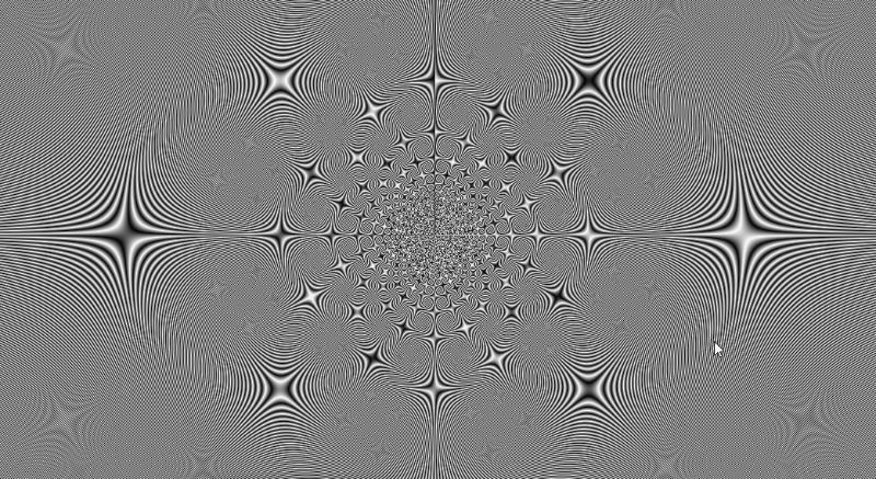
220ãæµè§å¨åçãç£å¸ãææï¼Anchor Positioning éç¹å®ä½ç¥å¨è§£æ
219ãå·§ç¨ CSS å®ç°é«é¢åºç°çå¤ææªç¶æé® - å å¹å¹³æ»åè§
218ãå·§ç¨ CSS å®ç°é«é¢åºç°çå¤ææªç¶æé® - é空çå å¹åè§è¾¹æ¡
217ããå¨ç»è¿é¶ãåæ ç¾å®ç°å¤è¡ææ¬éæ»å¨é¢è²åæ¢
216ããç°ä»£ CSSãæ´å¼ºå¤§ç :nth-child éæ©å¨
215ãå ¨å°ºå¯¸ç带åè§çæ¸åè¾¹æ¡
214ãå·§å¦ä½¿ç¨å¤ç§æ¹å¼å®ç°å侧é´å½±
213ãæ¸åè¾¹æ¡æåææï¼CSS è½»æ¾æ¿æï¼
212ããå¨ç»è¿é¶ãç¥å¥çå¡ç Hover ææä¸ Blur çç¹æ§æ¢ç©¶
211ããå¨ç»è¿é¶ãç±» ChatGpt å¤è¡ææ¬æåææ
210ããç°ä»£ CSSãæ åæ»å¨æ¡æ§å¶è§è scrollbar-color å scrollbar-width
209ããå¨ç»è¿é¶ãæå ·åæçé¼ æ 交äºå¨ç»
208ããå¨ç»è¿é¶ãå·§ç¨ CSS/SVG å®ç°å¤æ线æ¡å æå¨ç»
207ããå¸å±è¿é¶ãå·§ç¨ :has & drop-shadow å®ç°å¤æå¸å±ææ
206ãç°ä»£ CSS 解å³æ¹æ¡ï¼accent-color 强è°è²
205ããå¨ç»è¿é¶ãç¥å¥ç 3D å¡çåå éªçå¨æ
204ãç°ä»£ CSS 解å³æ¹æ¡ï¼æåé¢è²èªå¨éé èæ¯è²ï¼
203ã带åè§çè线边æ¡ï¼CSS ä¸å¨è¯ä¸
202ããå¸å±æå·§ãFlex å¸å±ä¸å± ä¸æº¢åºæ»å¨æªæé®é¢
201ãCSS ä¹è½å®ç° if å¤æï¼å®ç°å¨æé«åº¦ä¸çä¸åæ ·å¼å±ç°
200ããå¨ç»è¿é¶ãåæ ç¾ä¸å¤è²åéæºæåéæºé¢è²å¨ç»
199ãCSS è¿åææ¯ç»´å æ¯çæ°åå¨ç»

198ããå¨ç»è¿é¶ãç¥å¥çèæ¯ï¼çåå±æº4æ¥é£ Loading å¨ç»è¿å

197ããå¨ç»è¿é¶ãå½è·¯å¾å¨ç»éå°æ»å¨é©±å¨ï¼

196ãç°ä»£ CSS 解å³æ¹æ¡ï¼åçåµå¥ï¼Nestingï¼
195ãç°ä»£ CSS 解å³æ¹æ¡ï¼æ°å¦å½æ° Round

194ãéæï¼CSS ä¹è½å®ç°ç¢°ææ£æµï¼
193ãæ¢å ä½éªï¼è¶ 强ç Anchor Positioning éç¹å®ä½

192ãç¥å¥ç 3D 磨ç ç»çéè§ææ
191ããå¨ç»è¿é¶ãæææç Emoji 3D 表æ åæ¢ææ
190ããå¨ç»è¿é¶ãæææçç½æ ¼ä¸è½æ¸æ¬¡å è½½ææ

189ã解æ¾ç产åï¼transform æ¯æåç¬èµå¼æ¹å
188ãåæ ç¾ä¸çæ¥é´/é»å¤æ¨¡å¼åæ¢æé®ææ
187ãç°ä»£ CSS 解å³æ¹æ¡ï¼CSS åçæ¯æçä¸è§å½æ°

186ãæææçæ°æ³¡ Loading ææ

185ãæ趣çå èæè½åå¾å¨ç»

184ãCSS é«é¶å°æå·§ - è§åæ¸åçå¦ç¨ï¼

183ãå·§ç¨ CSS åéï¼å®ç°å¨ç»å½æ°å¤ç¨ï¼å¶ä½é«çº§ææ满çç½æ ¼å¨ç»

182ãCSS é«é¶æå·§ -- ä¸å®å®½ææ¬æº¢åºè·é©¬ç¯ææå®ç¾è§£å³æ¹æ¡

181ãç±å°è§å¤§ï¼ä¸è§åé åæé®è§£å³æ¹æ¡

180ãå¨æè§å£åä½ä¹ dvhãsvhãlvh

179ãå¼å±ä¸å¼ å¾ï¼æ建ç¥å¥ç CSS ææ

178ãå·§ç¨è§è§éç¼æ³ï¼è¿å 3D æåç¹æ

177ãä¸è§åå¾å½¢èæ¯æçé«é¶æå·§ -- é ·ç«çå 边形ç½æ ¼èæ¯å¾

176ãç°ä»£ CSS é«é¶æå·§ï¼ä¸è§åè¾¹æ¡è§£å³æ¹æ¡

175ãç°ä»£ CSS é«é¶æå·§ï¼å®ç¾ç波浪è¿åº¦æ¡ææï¼
174ãç°ä»£ CSS é«é¶æå·§ï¼å Canvas ä¸æ ·èªç±ç»å¾æå»ºæ ·å¼ï¼

173ãç°ä»£ CSS ä¹é«é¶å¾çæ¸éæ¶å¤±æ¯

172ãé¤äº filter è¿æä»ä¹ç½®ç°ç½ç«çæ¹å¼ï¼

171ãå¿«éæ建 3D Visualization of DOM

170ãCSS at-rules(@) è§åæ«ç²
169ãCSS æ¸åé¯é½¿æ¶å¤±æ¯

168ãè¶ å¼ºçè¹æå®ç½æ»å¨æåç¹æå®ç°

167ãè¶ å¼ºç纯 CSS é¼ æ ç¹å»ææ½ææ

166ã两éè¶ æææç CSS é¢è¯é¢ï¼è¯è¯ä½ çåºç¡
165ãåæ ç¾å®ç°å¤æçæ£çå¸å±

164ãæ°æ¶ä»£å¸å±æ°ç¹æ§ -- 容å¨æ¥è¯¢

163ãæææç水平横å溢åºæ»å¨
162ãé«é¶ CSS æå·§å¨å¤æå¨æä¸çåºç¨

161ãæææçæ¹åè£å overflow: clip

160ãå·§ç¨ transition å®ç°çè§é¢ APP ç¹èµå¨ç»

159ãå¦åï¼çº¯ CSS å®ç°æ¼å¾æ¸¸æ
158ãå¤è¡ææ¬ä¸çæåæ¸éæ¶å¤±æ¯

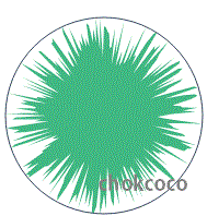
157ãä½¿ç¨ CSS æ建强大ä¸é ·ç«çç²åå¨ç»

156ãå¦ç¨ CSS æ建è±å¼éè§èæ¯ææ

155ãåè§å¤§æå¨ï¼ä½¿ç¨æ»¤éæ建åè§å波浪ææï¼
154ãè¶ é ·ç«ç转åºå¨ç»ï¼CSS è½»æ¾æ¿ä¸ï¼

153ãå©ç¨åªå£°æ建ç¾å¦ç CSS å¾å½¢
152ãé«é¶åå¾æå·§ï¼åºäºåå¼ å¾ççä»»æé¢è²è½¬æ¢

151ã使ç¨çº¯ CSS å®ç°è¶ é ·ç«çç²æ§æ°æ³¡ææ

150ãè¶ Nice çè¡¨æ ¼ååºå¼å¸å±å°æå·§
149ãæææçé¼ æ æé交äºæ¢ç©¶

148ãä½¿ç¨ content-visibility ä¼å渲ææ§è½
147ãæåè½®æä¸å¾çè½®æï¼CSS ä¸å¨è¯ä¸

146ãå¨ç»å°æå·§ï¼éè¿ hover 让å¨ç»åªè¿è¡ä¸æ¬¡ä¸åçå¨æåä¸å¸§

145ãæµ è°é»è¾éæ©å¨ isãwhereãnotãhas
144ãç°ä»£ CSS 解å³æ¹æ¡ï¼CSS æ°å¦å½æ°
143ã离谱ç CSSï¼ä»è¡¨çå»åº¦å°èºæ¯åªçº¸

142ã让交äºæ´å çå¨ï¼æææçé¼ æ è·é 3D æ转å¨æ

141ãAmazingï¼å·§ç¨ CSS è§å·®å®ç°é ·ç«äº¤äºå¨æ
140ãç°ä»£ CSS 解å³æ¹æ¡ï¼Modern CSS Reset
139ãå·§ç¨ background-clip å®ç°è¶ 强çæåå¨æ

138ãä¸éæææç CSS é¢è¯é¢ï¼FizzBuââzz ~
137ã2022 å¹´æåç©ç®çæ°ç¹æ§ CSS @layer å°åºæ¯ä¸ªå¥ï¼
136ãCSS é´å½±è¿é¶ï¼å®ç°æ´å çç«ä½çé´å½±ææï¼
135ãå©ç¨æ··å模å¼ï¼è®©æåæºè½éé èæ¯é¢è²

134ãç³»ç»æ§å¦ä¹ CSS æååå ¨ DEMO ç»ä¹
133ãå·§ç¨ CSS æ建æ¸å彩è²äºç»´ç

132ãæ¥äºæ¥äºï¼å®ç»äºæ¥äºï¼å¨ç»ææé @scroll-timeline

131ãçªç ´éå¶ï¼CSS font-variation å¯ååä½çé å

130ãå°æå·§ | æ¸åæ¶å¤±é®ç½©çå¤ç§å®ç°æ¹å¼

129ãå·§ç¨ CSS å®ç°ç«å½©ä¸è§è¾¹æ¡å¨ç»

128ãæ«ç²è´´ï¼2021 CSS æå·é¨ç¹æ§é½æ¯äºå¥ï¼

127ãçé¾æçï¼è¿ç¨ transform 导è´ææ¬æ¨¡ç³çç°è±¡æ¢ç©¶
126ãLPL Ban/Pick é人é¶æ®µçé®ç½©æææ¯å¦ä½å®ç°çï¼

125ãå·§ç¨ CSS å®ç°å¨æçº¿æ¡ Loading å¨ç»

124ãæ·±å ¥æµ åº CSS å¨ç»

123ãå¦ç¨æ»¤éæ建é«çº§ææ满ç磨ç ç»çæ¸åèæ¯

122ãæ·±å ¥æ¢è®¨ filter ä¸ backdrop-filter çå¼å
121ãAmazingï¼ï¼CSS ä¹è½å®ç°çé¾ææï¼

120ãAmazingï¼ï¼CSS ä¹è½å®ç°æå ï¼

119ãç¥å¥ç滤éï¼å·§å¦å®ç°å å¹çå¹³æ»åè§

118ãå©ç¨ clip-path å®ç°å¨æåºåè£åª
117ãä½¿ç¨ CSS è½»æ¾å®ç°ä¸äºé«é¢åºç°çå¥å½¢æªç¶æé®
116ãå·§ç¨æ¸åå®ç°é«çº§ææ满çèæ¯å å¨ç»

115ãå·§ç¨æ»¤éå®ç°é«çº§ææ满çæåå¿«éªåæ¢ææ

114ã3D ç©¿æ¢ææï¼ä½¿ç¨ CSS è½»æ¾æå®
113ãä» ä» ä½¿ç¨ HTML/CSS å®ç°è¿åº¦æ¡ç N ç§æ¹å¼

112ãCSS å¥ææ·«å·§ | å·§å¦å®ç°æåäºæ¬¡å ç²åå è¾¹æ¡
111ãå©ç¨ CSS Overview é¢æ¿éæä¼åä½ çç½ç«
110ãå°æå·§ | ä¸è¡ä»£ç å®ç°å¤´åä¸å½æçèå

109ãCSS å¥ææ·«å·§ | å¦ç¨ drop-shadow å®ç°çº¿æ¡å å½±ææ

108ãCSS å¥ææ·«å·§ | å¦ç¨æ··å模å¼å®ç°æåé空波浪ææ

107ãå¦ç¨ background å®ç°è±å¼æåææ

106ãå®ç°ä¸ä¸ªä¼å¨ç鸿è LOGO

105ãå·§ç¨æ¨¡ç³å®ç°æåç 3D ææ

104ãå¥æå¦æ³ CSS 3D å¨ç» | ä» ä½¿ç¨ CSS è½å¶ä½åºå¤æè³çå¨ç»ï¼

103ãCSS å¥æå¦æ³ | ä½¿ç¨ resize å®ç°å¼ºå¤§çå¾çææ½åæ¢é¢è§åè½

102ãCSS å³å°æ¯æåµå¥ï¼SASS/LESS çé¢å¤çå¨å·²æ ç¨æ¦ä¹å°ï¼
101ããWebå¨ç»ãç§ææå足çæé»å符é¨å¨ç»

100ãCSS ä¸çä¸çæ¹ä½ä¸é¡ºåº

99ãå·§å¦çå®ç°å¸¦åè§çä¸è§å½¢

98ãCSS å¥æå¦æ³ | å ¨å ¼å®¹çæ¯ç»çææ

97ãè¯è¯é ·ç«ç 3D è§è§

96ãWeb å¨ç»åååæå·§æµ æ

95ãCSS ::marker 让æååºå·æ´æææ
94ãSingle Div ç»å¾æå·§

93ãæ°æ¶ä»£åæå¸å±ä¸å®å ¨æå
92ãæææç ::maker 伪å ç´
91ãä½¿ç¨ CSS prefers-* è§èï¼æåç½ç«çå¯è®¿é®æ§ä¸å¥å£®æ§
90ãå°æå·§ï¼CSS æåå¾ç主é¢è²åè½æ¢ç´¢

89ãä¸ç§å·§å¦çä½¿ç¨ CSS å¶ä½æ³¢æµªææçæè·¯

88ãæ¢ç§ç¥å¥çæ²çº¿å¨ç» motion-path

87ãæ°æ¶ä»£å¸å±ä¸ä¸äºæææçç¹æ§

86ãCSS è¿è½è¿æ ·ç©ï¼å¥æå¦æ³æ¸åçèºæ¯

85ãCSS @propertyï¼è®©ä¸å¯è½åå¯è½

84ãCSS æåè£ é¥° text-decoration & text-emphasis

83ãèç常è°ä¹ CSS å®ç°ä¸è§å½¢

82ãå·§ç¨ SVG 滤éå¶ä½æææå¨æ

81ãæææï¼ä¸è§åè¾¹æ¡ççææ¹æ¡

80ãå°æå·§ï¼CSS æ´åææ¬æº¢åºçç¥ç¹æ§æ¢ç©¶

79ãå¥æå¦æ³ CSS æåå¨ç»

78ãå·§ç¨ -webkit-box-reflect åå½±å®ç°åç±»å¨æ

77ãä½¿ç¨ mask å®ç°è§é¢å¼¹å¹äººç©é®ç½©è¿æ»¤

76ãä½ å¯è½ä¸ç¥éç transition æå·§ä¸ç»è
75ãCSSå¥æå¦æ³ -- ä½¿ç¨ CSS åé èºæ¯å¾æ¡

74ãçå»æ ç¾ fieldset ä¸ legend çå¦ç¨

73ãCSS å¥æå¦æ³è¾¹æ¡å¨ç»

72ãCSS æå·§ä¸åï¼å¨æé«åº¦è¿æ¸¡å¨ç»
71ãå¦ä½ä¸ä½¿ç¨ overflow: hidden å®ç° overflow: hiddenï¼
70ãæ°´å¹³åç´å± ä¸æ·±å ¥ææ
69ãä¸è¡ CSS 代ç çé å
68ã使ç¨çº¯ CSS å®ç°æ»å¨é´å½±ææ
67ãæ¢ç©¶ position-sticky 失æé®é¢
66ãCSS èºæ¯ -- ä½¿ç¨ background åé åç§ç¾å¦çèæ¯

65ãä½¿ç¨ tabindex é å focus-within å·§å¦å®ç°ç¶éæ©å¨
64ãCSS æå·§ä¸å -- ä¸å®å®½æº¢åºææ¬éé æ»å¨

63ãå¥å¦ç CSS MASK

62ãä½¿ç¨ display: contents å¢å¼ºé¡µé¢è¯ä¹
61ãCSS æ éèºæ¯
60ãå·§å¦å®ç°å¸¦åè§çæ¸åè¾¹æ¡

59ãæ·±å ¥ç解 CSSï¼Cascading Style Sheetsï¼ä¸çå±å ï¼Cascadingï¼
58ãå·§ç¨ CSS å®ç°é ·ç«çå çµå¨ç»

57ãä½¿ç¨ sroll-snap-type ä¼åæ»å¨

56ãå¨ CSS ä¸ä½¿ç¨ä¸è§å½æ°ç»å¶æ²çº¿å¾å½¢åå±ç¤ºå¨ç»

55ãCSS é´å½±å¨ç»ä¼åæå·§ä¸å
54ãWeb åä½ font-family åæ¢ç§
53ãä½ æä¸ç¥éç CSS è´å¼æå·§ä¸ç»è

52ãA Guide to CSS Rules
51ãCSS å±æ§éæ©å¨çæ·±å ¥ææ
50ãæ¢ç§ flex ä¸ä¸æä¸ç¥å¥çèªå¨ margin
49ãå·§å¦ä½¿ç¨ CSS æ§å¶å¨ç»è¡è¿

48ãCSS ç«ç°ï¼ä¸å¨è¯ä¸

47ãä¸å¯æè®®ç纯 CSS å®ç°é¼ æ è·é

46ãæ趣ç box-decoration-break
45ãä¸å¯æè®®ç纯 CSS è¿åº¦æ¡ææ
44ãæ¢ç©¶ CSS æ··å模å¼\滤éå¯¼è´ CSS 3D 失æé®é¢
43ãä½ æä¸ç¥éç CSS é´å½±æå·§ä¸ç»è

42ãæ»å¨è§å·®? CSSä¸å¨è¯ä¸

41ãç¥å¥çéæ©å¨ :focus-within

40ãPure CSS Button Effect
39ãå¦ç¨ scale ä¸ transfrom-originï¼ç²¾åæ§å¶å¨ç»æ¹å
38ãä¸å¯æè®®ç纯 CSS 导èªæ ä¸å线è·éææ
å¦ä½ä½¿ç¨çº¯ CSS å¶ä½ä¸è¿°ä¸å线è·éææï¼

37ãä¸¤è¡ CSS 代ç å®ç°å¾çä»»æé¢è²èµè²ææ¯
36ãtext-fill-color ä¸ color çå¼å
35ãä½ æä¸ç¥éç CSS 滤éæå·§ä¸ç»è

34ãä½ æä¸ç¥éç CSS å¨ç»æå·§ä¸ç»è

33ãfixed å®ä½å¤±æ || ä¸åæ§å¶ç position:fixed
32ãCSS æ°ç¹æ§containï¼æ§å¶é¡µé¢çéç»ä¸éæ
31ã纯 CSS å®ç°æ³¢æµªææ!

30ãå¥å¦ç CSS shapesï¼CSSå¾å½¢ï¼
29ãä¸å¯æè®®çæ··åæ¨¡å¼ background-blend-mode

28ãä¸å¯æè®®çæ··åæ¨¡å¼ mix-blend-mode

27ãç¥å¥ç conic-gradient è§åæ¸å

26ãå¥å¦ç-webkit-background-clip: text
25ãvhãvwãvminãvmax ç¥å¤å°
24ã纯 CSS å®ç°çå¸æµå¸å±
23ãè°è° CSS å ³é®å initialãinherit å unset
22ã纯 CSS æ¹å¼å®ç° CSS å¨ç»çæåä¸ææ¾
21ãæé« CSS å¨ç»æ§è½çæ£ç¡®å§¿å¿ | çå端 CSS å¨ç»æ§è½æåç 究
20ãå·§å¦å°å¶ä½èæ¯è²æ¸åå¨ç»ï¼
å¦ä½å®ç°ä¸è¿°çèæ¯è²æ¸åå¨ç»ï¼

19ãæ·±å ¥æ¢è®¨ CSS ç¹æ§æ£æµ @supports ä¸ Modernizr
18ãä½¿ç¨ position:sticky å®ç°ç²æ§å¸å±

17ãåæ¢ç©¶åä½ç渲æè§åå fallback æºå¶
16ãä½ è¯¥ç¥éçåä½ font-family
15ãreset.css ç¥å¤å°
14ãCSSå½åæ¹å¼æ¯å¦æå¿ è¦è§è
13ãå¼äººç©ç®ç CSS èªå®ä¹å±æ§ï¼CSS Variableï¼
12ãç»ææ§ä¼ªç±»éæ©å¨
11ãIFCãBFCãGFC ä¸ FFC ç¥å¤å°
10ãå·§å¦çå®ç° CSS æ线
使ç¨å个æ ç¾ï¼å¦ä½å®ç°ä¸å¾æ示çæ线ææ:
9ãå·§å¦çå¤åçé«å¸å±
è§å®ä¸é¢çå¸å±ï¼å®ç°å¤åçé«å¸å±ï¼è¦æ±ä¸¤åèæ¯è²çé«ã
<div class="container">
<div class="left">å¤åçé«å¸å±å·¦</div>
<div class="right">å¤åçé«å¸å±å³</div>
</div>
8ã纯CSSç导èªæ Tabåæ¢æ¹æ¡
ä¸ç¨ Javascriptï¼ä½¿ç¨çº¯ CSS æ¹æ¡ï¼å®ç°ç±»ä¼¼ä¸å¾ç导èªæ Tab åæ¢ï¼

7ãå ¨å ¼å®¹çæåä¸æ¡è¾¹ç线é®é¢
ççä¸å¾ï¼å¸¸è§äºä¸äºå¯¼èªæ ä¸ï¼è¦æ±æ¯è¡ä¸æåä¸åçå³è¾¹æ¡æ¶å¤±ï¼å¦ä½å¨æææµè§å¨ä¸æ便æ·æä¼é çå®ç°ï¼
6ãå ¨å ¼å®¹çå¤åååå¸å±é®é¢
å¦ä½å®ç°ä¸åè¿ç§å¤åååå¸å±ï¼

5ã纯 CSS å®ç°åè¡å± ä¸æ¾ç¤ºæåï¼å¤è¡å± å·¦æ¾ç¤ºï¼æå¤ä¸¤è¡è¶ è¿ç¨çç¥å·ç»å°¾
4ãä»å影说起ï¼è°è° CSS ç»§æ¿ inherit
3ãå±å 顺åºï¼stacking levelï¼ä¸å æ ä¸ä¸æï¼stacking contextï¼ç¥å¤å°ï¼
2ã类似ä¸é¢è¿æ ·çæ¡çº¹è¾¹æ¡ï¼åªä½¿ç¨ä¸ä¸ªæ ç¾ï¼å¯ä»¥æå¤å°ç§å®ç°æ¹å¼ -- ä»æ¡çº¹è¾¹æ¡çå®ç°è°çå模åï¼

1ãä¸é¢è¿ä¸ªå·¦è¾¹ç«æ¡å¾å½¢ï¼åªä½¿ç¨ä¸ä¸ªæ ç¾ï¼å¯ä»¥æå¤å°ç§å®ç°æ¹å¼ï¼

Stargazers over time

Top Related Projects
GitHub repo for the MDN Learning Area.
Documentation about css-modules
Transforming styles with JS plugins
A modular minifier, built on top of the PostCSS ecosystem.
Convert designs to code with AI
Introducing Visual Copilot: A new AI model to turn Figma designs to high quality code using your components.
Try Visual Copilot