 moveable
Moveable! Draggable! Resizable! Scalable! Rotatable! Warpable! Pinchable! Groupable! Snappable!
Top Related Projects
Beautiful and accessible drag and drop for lists with React
A set of higher-order components to turn any list into an animated, accessible and touch-friendly sortable list✌️
Infinite responsive, sortable, filterable and draggable layouts
Reorderable drag-and-drop lists for modern browsers and touch devices. No jQuery or framework required.
🖱 A resizable and draggable component for React.
A draggable and resizable grid layout with responsive breakpoints, for React.
Quick Overview
Moveable is a powerful JavaScript library that enables draggable, resizable, scalable, rotatable, and groupable elements on web pages. It provides a versatile set of tools for creating interactive user interfaces with smooth and customizable element manipulation.
Pros
- Highly flexible with support for multiple transformation types (drag, resize, rotate, etc.)
- Extensive customization options for appearance and behavior
- Supports both mouse and touch events for broad device compatibility
- Lightweight and performant, with minimal dependencies
Cons
- Steep learning curve due to the wide range of features and options
- Documentation could be more comprehensive, especially for advanced use cases
- Some users report occasional issues with complex nested transformations
- Limited built-in styling options, requiring additional CSS for polished looks
Code Examples
Creating a basic moveable element:
import Moveable from "moveable";

const moveable = new Moveable(document.body, {
  target: document.querySelector(".target"),
  draggable: true,
  resizable: true,
  rotatable: true
});

moveable.on("drag", ({ target, transform }) => {
  target.style.transform = transform;
});
Implementing a snappable grid:
const moveable = new Moveable(document.body, {
  target: document.querySelector(".target"),
  draggable: true,
  snappable: true,
  snapGridWidth: 50,
  snapGridHeight: 50
});

moveable.on("drag", ({ target, transform }) => {
  target.style.transform = transform;
});
Creating a group of moveable elements:
const moveableGroup = new Moveable(document.body, {
  target: [".target1", ".target2", ".target3"],
  draggable: true,
  resizable: true,
  rotatable: true,
  groupable: true
});

moveableGroup.on("dragGroupStart", ({ targets }) => {
  console.log("Group drag started", targets);
});
Getting Started
To use Moveable in your project, follow these steps:
-
Install the package:
npm install moveable -
Import and initialize Moveable in your JavaScript file:
import Moveable from "moveable"; const moveable = new Moveable(document.body, { target: document.querySelector(".your-target-element"), draggable: true, resizable: true, rotatable: true }); moveable.on("drag", ({ target, transform }) => { target.style.transform = transform; }); -
Add the target element to your HTML:
<div class="your-target-element">Moveable Element</div> -
Style your target element as needed and start interacting with it on your web page.
Competitor Comparisons
Beautiful and accessible drag and drop for lists with React
Pros of react-beautiful-dnd
- Specifically designed for React applications, offering seamless integration
- Provides a natural and accessible drag-and-drop experience
- Extensive documentation and community support
Cons of react-beautiful-dnd
- Limited to list and grid layouts, less flexible for complex scenarios
- Heavier bundle size compared to Moveable
- Less suitable for non-React projects or those requiring broader functionality
Code Comparison
react-beautiful-dnd:
import { DragDropContext, Droppable, Draggable } from 'react-beautiful-dnd';

<DragDropContext onDragEnd={onDragEnd}>
  <Droppable droppableId="list">
    {(provided) => (
      <ul {...provided.droppableProps} ref={provided.innerRef}>
        {items.map((item, index) => (
          <Draggable key={item.id} draggableId={item.id} index={index}>
            {(provided) => (
              <li ref={provided.innerRef} {...provided.draggableProps} {...provided.dragHandleProps}>
                {item.content}
              </li>
            )}
          </Draggable>
        ))}
        {provided.placeholder}
      </ul>
    )}
  </Droppable>
</DragDropContext>
Moveable:
import Moveable from "moveable";

const moveable = new Moveable(document.body, {
  target: document.querySelector(".target"),
  draggable: true,
  resizable: true,
  rotatable: true
});

moveable.on("drag", ({ target, transform }) => {
  target.style.transform = transform;
});
A set of higher-order components to turn any list into an animated, accessible and touch-friendly sortable list✌️
Pros of react-sortable-hoc
- Specifically designed for React applications, offering seamless integration
- Focuses on sortable functionality, providing a more specialized solution
- Extensive documentation and examples for various use cases
Cons of react-sortable-hoc
- Limited to sorting functionality, lacking other drag-and-drop features
- Less flexible for non-React projects or complex interactions
Code Comparison
react-sortable-hoc:
import { SortableContainer, SortableElement } from 'react-sortable-hoc';

const SortableItem = SortableElement(({value}) => <li>{value}</li>);
const SortableList = SortableContainer(({items}) => {
  return (
    <ul>
      {items.map((value, index) => (
        <SortableItem key={`item-${index}`} index={index} value={value} />
      ))}
    </ul>
  );
});
Moveable:
import Moveable from "moveable";

const moveable = new Moveable(document.body, {
  target: document.querySelector(".target"),
  draggable: true,
  resizable: true,
  rotatable: true
});

moveable.on("drag", ({ target, transform }) => {
  target.style.transform = transform;
});
Summary
While react-sortable-hoc excels in providing a specialized sorting solution for React applications, Moveable offers a more versatile toolkit for various drag-and-drop interactions across different frameworks. react-sortable-hoc is ideal for projects requiring simple, efficient sorting functionality, whereas Moveable is better suited for complex, multi-faceted drag-and-drop implementations.
Infinite responsive, sortable, filterable and draggable layouts
Pros of Muuri
- Specialized in grid layouts and sorting
- Built-in support for animations and drag-and-drop functionality
- Lightweight and performant, with minimal dependencies
Cons of Muuri
- Limited to grid-based layouts
- Less flexible for non-grid positioning and resizing
- Smaller community and fewer updates compared to Moveable
Code Comparison
Muuri:
const grid = new Muuri('.grid', {
  dragEnabled: true,
  sortData: {
    id: (item, element) => element.getAttribute('data-id')
  }
});
Moveable:
const moveable = new Moveable(document.body, {
  target: document.querySelector(".target"),
  draggable: true,
  resizable: true,
  rotatable: true
});
Summary
Muuri excels in creating responsive grid layouts with built-in sorting and drag-and-drop functionality. It's lightweight and performant, making it ideal for projects focused on grid-based designs. However, its specialization limits its flexibility compared to Moveable.
Moveable offers a more versatile approach, allowing for various types of element manipulation beyond grid layouts. It provides a wider range of features for positioning, resizing, and rotating elements, making it suitable for more diverse projects. However, this versatility may come at the cost of a steeper learning curve and potentially more complex implementation for simpler grid-based layouts.
Choose Muuri for grid-focused projects with sorting needs, and Moveable for more flexible element manipulation across different layout types.
Reorderable drag-and-drop lists for modern browsers and touch devices. No jQuery or framework required.
Pros of Sortable
- Focused specifically on drag-and-drop sorting functionality
- Lightweight and easy to implement for basic sorting needs
- Extensive browser support, including older versions
Cons of Sortable
- Limited to sorting functionality, less versatile for other interactions
- May require additional plugins or libraries for more complex use cases
Code Comparison
Sortable:
new Sortable(document.getElementById('list'), {
  animation: 150,
  ghostClass: 'blue-background-class'
});
Moveable:
const moveable = new Moveable(document.body, {
  target: document.querySelector(".target"),
  draggable: true,
  resizable: true,
  rotatable: true
});
Key Differences
- Sortable focuses on list sorting, while Moveable offers a broader range of element manipulations (dragging, resizing, rotating)
- Moveable provides more advanced features like snapping and guidelines
- Sortable is generally simpler to set up for basic sorting needs, while Moveable offers more flexibility for complex interactions
Use Cases
- Choose Sortable for straightforward list reordering tasks
- Opt for Moveable when you need diverse element manipulations beyond sorting, such as resizing or rotating elements
🖱 A resizable and draggable component for React.
Pros of react-rnd
- Specifically designed for React applications, ensuring seamless integration
- Simpler API with fewer options, making it easier to get started quickly
- Built-in support for both resizing and dragging out of the box
Cons of react-rnd
- Limited to React applications, lacking versatility for other frameworks
- Fewer customization options and advanced features compared to Moveable
- Less frequent updates and potentially slower bug fixes
Code Comparison
react-rnd:
<Rnd
  default={{
    x: 0,
    y: 0,
    width: 320,
    height: 200
  }}
>
  Resizable and draggable content
</Rnd>
Moveable:
<Moveable
  target={document.querySelector(".target")}
  draggable={true}
  resizable={true}
  rotatable={true}
/>
Key Differences
- react-rnd is React-specific, while Moveable is framework-agnostic
- Moveable offers more advanced features like rotation, scaling, and snapping
- react-rnd has a simpler API, while Moveable provides more granular control
- Moveable supports a wider range of interactions and transformations
Use Cases
- Choose react-rnd for quick implementation in React projects with basic needs
- Opt for Moveable when requiring advanced features or working with multiple frameworks
A draggable and resizable grid layout with responsive breakpoints, for React.
Pros of react-grid-layout
- Specifically designed for React applications, offering seamless integration
- Provides a grid-based layout system with draggable and resizable elements
- Supports responsive layouts and breakpoints out of the box
Cons of react-grid-layout
- Limited to grid-based layouts, less flexible for free-form positioning
- Steeper learning curve due to its specific API and configuration options
- May introduce unnecessary complexity for simpler layout requirements
Code Comparison
react-grid-layout:
import GridLayout from 'react-grid-layout';

<GridLayout
  className="layout"
  layout={[
    { i: 'a', x: 0, y: 0, w: 1, h: 2 },
    { i: 'b', x: 1, y: 0, w: 3, h: 2 },
    { i: 'c', x: 4, y: 0, w: 1, h: 2 }
  ]}
  cols={12}
  rowHeight={30}
>
  <div key="a">A</div>
  <div key="b">B</div>
  <div key="c">C</div>
</GridLayout>
moveable:
import Moveable from "moveable";

const moveable = new Moveable(document.body, {
  target: document.querySelector(".target"),
  draggable: true,
  resizable: true,
  rotatable: true
});

moveable.on("drag", ({ target, transform }) => {
  target.style.transform = transform;
});
Convert  designs to code with AI

Introducing Visual Copilot: A new AI model to turn Figma designs to high quality code using your components.
Try Visual CopilotREADME

Moveable
Moveable is Draggable, Resizable, Scalable, Rotatable, Warpable, Pinchable, Groupable, Snappable
Github / Demo / Storybook / API / Main Project
| Moveable | |||
|---|---|---|---|
| Draggable | Resizable | Scalable | Rotatable |

|

|

|

|
| Warpable | Pinchable | Groupable | Snappable |
 |
 |
 |
 |
| Clippable | Roundable | OriginDraggable | Selecto |
 |
 |
 |
 |
ð¥ Features
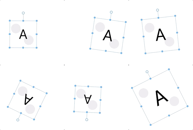
- Draggable refers to the ability to drag and move targets.
- Resizable indicates whether the target's width and height can be increased or decreased.
- Scalable indicates whether the target's x and y can be scale of transform.
- Rotatable indicates whether the target can be rotated.
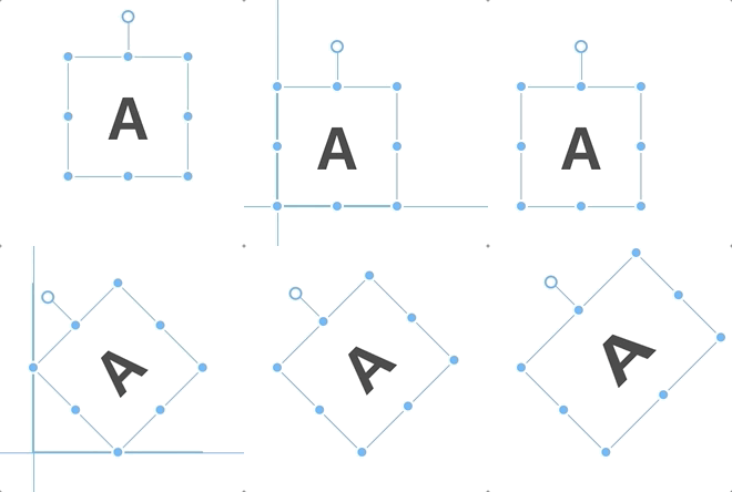
- Warpable indicates whether the target can be warped (distorted, bented).
- Pinchable indicates whether the target can be pinched with draggable, resizable, scalable, rotatable.
- Groupable indicates Whether the targets can be moved in group with draggable, resizable, scalable, rotatable.
- Snappable indicates whether to snap to the guideline.
- OriginDraggable* indicates Whether to drag origin.
- Clippable indicates Whether to clip the target.
- Roundable indicates Whether to show and drag or double click border-radius.
- Support SVG Elements (svg, path, line, ellipse, g, rect, ...etc)
- Support Major Browsers
- Support 3d Transform
âï¸ Installation
npm
$ npm i moveable
scripts
<script src="//daybrush.com/moveable/release/latest/dist/moveable.min.js"></script>
ð Documents
ð How to use
- All classes of moveable control box and able elements have a
moveable-prefix. So please don't putmoveable-class name in target.
import Moveable from "moveable";

const moveable = new Moveable(document.body, {
    target: document.querySelector(".target"),
    // If the container is null, the position is fixed. (default: parentElement(document.body))
    container: document.body,
    draggable: true,
    resizable: true,
    scalable: true,
    rotatable: true,
    warpable: true,
    // Enabling pinchable lets you use events that
    // can be used in draggable, resizable, scalable, and rotateable.
    pinchable: true, // ["resizable", "scalable", "rotatable"]
    origin: true,
    keepRatio: true,
    // Resize, Scale Events at edges.
    edge: false,
    throttleDrag: 0,
    throttleResize: 0,
    throttleScale: 0,
    throttleRotate: 0,
});
/* draggable */
moveable.on("dragStart", ({ target, clientX, clientY }) => {
    console.log("onDragStart", target);
}).on("drag", ({
    target, transform,
    left, top, right, bottom,
    beforeDelta, beforeDist, delta, dist,
    clientX, clientY,
}) => {
    console.log("onDrag left, top", left, top);
    target!.style.left = `${left}px`;
    target!.style.top = `${top}px`;
    // console.log("onDrag translate", dist);
    // target!.style.transform = transform;
}).on("dragEnd", ({ target, isDrag, clientX, clientY }) => {
    console.log("onDragEnd", target, isDrag);
});

/* resizable */
moveable.on("resizeStart", ({ target, clientX, clientY }) => {
    console.log("onResizeStart", target);
}).on("resize", ({ target, width, height, dist, delta, clientX, clientY }) => {
    console.log("onResize", target);
    delta[0] && (target!.style.width = `${width}px`);
    delta[1] && (target!.style.height = `${height}px`);
}).on("resizeEnd", ({ target, isDrag, clientX, clientY }) => {
    console.log("onResizeEnd", target, isDrag);
});

/* scalable */
moveable.on("scaleStart", ({ target, clientX, clientY }) => {
    console.log("onScaleStart", target);
}).on("scale", ({
    target, scale, dist, delta, transform, clientX, clientY,
}: OnScale) => {
    console.log("onScale scale", scale);
    target!.style.transform = transform;
}).on("scaleEnd", ({ target, isDrag, clientX, clientY }) => {
    console.log("onScaleEnd", target, isDrag);
});

/* rotatable */
moveable.on("rotateStart", ({ target, clientX, clientY }) => {
    console.log("onRotateStart", target);
}).on("rotate", ({ target, beforeDelta, delta, dist, transform, clientX, clientY }) => {
    console.log("onRotate", dist);
    target!.style.transform = transform;
}).on("rotateEnd", ({ target, isDrag, clientX, clientY }) => {
    console.log("onRotateEnd", target, isDrag);
});

/* warpable */
this.matrix = [
    1, 0, 0, 0,
    0, 1, 0, 0,
    0, 0, 1, 0,
    0, 0, 0, 1,
];
moveable.on("warpStart", ({ target, clientX, clientY }) => {
    console.log("onWarpStart", target);
}).on("warp", ({
    target,
    clientX,
    clientY,
    delta,
    dist,
    multiply,
    transform,
}) => {
    console.log("onWarp", target);
    // target.style.transform = transform;
    this.matrix = multiply(this.matrix, delta);
    target.style.transform = `matrix3d(${this.matrix.join(",")})`;
}).on("warpEnd", ({ target, isDrag, clientX, clientY }) => {
    console.log("onWarpEnd", target, isDrag);
});

/* pinchable */
// Enabling pinchable lets you use events that
// can be used in draggable, resizable, scalable, and rotateable.
moveable.on("pinchStart", ({ target, clientX, clientY }) => {
    // pinchStart event occur before dragStart, rotateStart, scaleStart, resizeStart
    console.log("onPinchStart");
}).on("pinch", ({ target, clientX, clientY, datas }) => {
    // pinch event occur before drag, rotate, scale, resize
    console.log("onPinch");
}).on("pinchEnd", ({ isDrag, target, clientX, clientY, datas }) => {
    // pinchEnd event occur before dragEnd, rotateEnd, scaleEnd, resizeEnd
    console.log("onPinchEnd");
});
ð¦ Packages
- moveable: A Vanilla Component that create Moveable, Draggable, Resizable, Scalable, Rotatable, Warpable, Pinchable.
- react-moveable: A React Component that create Moveable, Draggable, Resizable, Scalable, Rotatable, Warpable, Pinchable.
- preact-moveable: A Preact Component that create Moveable, Draggable, Resizable, Scalable, Rotatable, Warpable, Pinchable.
- ngx-moveable: An Angular Component that create Moveable, Draggable, Resizable, Scalable, Rotatable, Warpable, Pinchable.
- svelte-moveable: A Svelte Component that create Moveable, Draggable, Resizable, Scalable, Rotatable, Warpable, Pinchable.
- lit-moveable: A Lit Component that create Moveable, Draggable, Resizable, Scalable, Rotatable, Warpable, Pinchable.
- vue-moveable: A Vue Component that create Moveable, Draggable, Resizable, Scalable, Rotatable, Warpable, Pinchable.
- vue3-moveable: A Vue 3 Component that create Moveable, Draggable, Resizable, Scalable, Rotatable, Warpable, Pinchable.
âï¸ Developments
The moveable repo is managed as a monorepo with yarn.
yarn config set registry https://registry.npmjs.org/
The main project was made with react and I used croact to make it lighter with umd.
For development and testing, check in packages/react-moveable.
npm run storybook
$ yarn
$ npm run packages:build
$ npm run storybook
Runs the app in the development mode.
Open http://localhost:6006 to view it in the browser.
The page will reload if you make edits.
You will also see any lint errors in the console.
âï¸ Show Your Support
Please give a âï¸ if this project helped you!
ð Contributing
If you have any questions or requests or want to contribute to moveable or other packages, please write the issue or give me a Pull Request freely.
Code Contributors
This project exists thanks to all the people who contribute. [Contribute].
ð Bug Report
If you find a bug, please report to us opening a new Issue on GitHub.
Sponsors
Open Collective Financial Contributors
Become a financial contributor and help us sustain our community. [Contribute]
Individuals
Organizations
Support this project with your organization. Your logo will show up here with a link to your website. [Contribute]
ð License
This project is MIT licensed.
MIT License

Copyright (c) 2019 Daybrush

Permission is hereby granted, free of charge, to any person obtaining a copy
of this software and associated documentation files (the "Software"), to deal
in the Software without restriction, including without limitation the rights
to use, copy, modify, merge, publish, distribute, sublicense, and/or sell
copies of the Software, and to permit persons to whom the Software is
furnished to do so, subject to the following conditions:

The above copyright notice and this permission notice shall be included in all
copies or substantial portions of the Software.

THE SOFTWARE IS PROVIDED "AS IS", WITHOUT WARRANTY OF ANY KIND, EXPRESS OR
IMPLIED, INCLUDING BUT NOT LIMITED TO THE WARRANTIES OF MERCHANTABILITY,
FITNESS FOR A PARTICULAR PURPOSE AND NONINFRINGEMENT. IN NO EVENT SHALL THE
AUTHORS OR COPYRIGHT HOLDERS BE LIABLE FOR ANY CLAIM, DAMAGES OR OTHER
LIABILITY, WHETHER IN AN ACTION OF CONTRACT, TORT OR OTHERWISE, ARISING FROM,
OUT OF OR IN CONNECTION WITH THE SOFTWARE OR THE USE OR OTHER DEALINGS IN THE
SOFTWARE.
Top Related Projects
Beautiful and accessible drag and drop for lists with React
A set of higher-order components to turn any list into an animated, accessible and touch-friendly sortable list✌️
Infinite responsive, sortable, filterable and draggable layouts
Reorderable drag-and-drop lists for modern browsers and touch devices. No jQuery or framework required.
🖱 A resizable and draggable component for React.
A draggable and resizable grid layout with responsive breakpoints, for React.
Convert  designs to code with AI

Introducing Visual Copilot: A new AI model to turn Figma designs to high quality code using your components.
Try Visual Copilot


