
Top Related Projects

:balloon: Modernized and sophisticated tooltips, fully customizable with an arrow and animations for Android.

Create Toast like tooltips, but targets can be specified, plus custom properties and features

An page indicator for Android ViewPager
Quick Overview
ViewTooltip is an Android library that allows developers to easily add tooltips to their app's UI elements. It provides a simple and customizable way to display informative popups or hints associated with specific views in an Android application.
Pros
- Easy to implement and integrate into existing Android projects
- Highly customizable, allowing for various styles, animations, and positioning options
- Supports both Java and Kotlin
- Lightweight and doesn't require many dependencies
Cons
- Limited documentation and examples available
- May not be actively maintained (last update was over a year ago)
- Some reported issues with compatibility on newer Android versions
- Lacks advanced features like multi-step tooltips or complex layouts
Code Examples
- Basic tooltip creation:
ViewTooltip
    .on(targetView)
    .text("This is a tooltip")
    .show()
- Customizing tooltip appearance:
ViewTooltip
    .on(targetView)
    .position(ViewTooltip.Position.TOP)
    .align(ViewTooltip.ALIGN.CENTER)
    .text("Customized tooltip")
    .textColor(Color.WHITE)
    .color(Color.BLUE)
    .textSize(TypedValue.COMPLEX_UNIT_SP, 18f)
    .show()
- Adding click listener to dismiss tooltip:
val tooltip = ViewTooltip
    .on(targetView)
    .text("Click to dismiss")
    .clickToHide(true)
    .autoHide(false)
    .show()

tooltip.setOnClickListener { tooltip.close() }
Getting Started
- Add the JitPack repository to your project's
build.gradlefile:
allprojects {
    repositories {
        ...
        maven { url 'https://jitpack.io' }
    }
}
- Add the dependency to your app's
build.gradlefile:
dependencies {
    implementation 'com.github.florent37:ViewTooltip:1.2.2'
}
- Sync your project, and you're ready to use ViewTooltip in your Android app!
Competitor Comparisons
:balloon: Modernized and sophisticated tooltips, fully customizable with an arrow and animations for Android.
Pros of Balloon
- More customization options, including arrow positioning and custom layouts
- Built-in support for animations and transitions
- Better documentation and more comprehensive examples
Cons of Balloon
- Larger library size, potentially impacting app performance
- Steeper learning curve due to more complex API
Code Comparison
ViewTooltip:
ViewTooltip
    .on(view)
    .position(ViewTooltip.Position.TOP)
    .text("Hello World!")
    .show()
Balloon:
Balloon.Builder(context)
    .setArrowSize(10)
    .setArrowPosition(0.7f)
    .setWidth(BalloonSizeSpec.WRAP)
    .setHeight(65)
    .setText("Hello World!")
    .build()
    .showAlignBottom(anchor)
Both libraries offer easy-to-use APIs for creating tooltips, but Balloon provides more granular control over appearance and positioning. ViewTooltip has a simpler API, making it quicker to implement basic tooltips. Balloon's additional features come at the cost of a more verbose setup process.
While ViewTooltip focuses on simplicity, Balloon offers a wider range of customization options, making it suitable for more complex tooltip requirements. Developers should consider their specific needs and the trade-offs between simplicity and flexibility when choosing between these libraries.
Create Toast like tooltips, but targets can be specified, plus custom properties and features
Pros of android-target-tooltip
- More customization options for tooltip appearance and behavior
- Supports custom views inside tooltips
- Includes built-in animations for tooltip entry/exit
Cons of android-target-tooltip
- More complex API, potentially steeper learning curve
- Larger library size due to additional features
- Less frequent updates and maintenance
Code Comparison
ViewTooltip:
ViewTooltip
    .on(targetView)
    .autoHide(true, 1000)
    .corner(30)
    .textColor(Color.WHITE)
    .backgroundColor(Color.BLACK)
    .text("Hello World!")
    .show()
android-target-tooltip:
Tooltip.make(
    context,
    Builder(gravity, tooltipLayoutId, anchorView, root)
        .animate(TooltipAnimation.SCALE)
        .withCustomView(R.layout.custom_tooltip)
        .withStyleId(R.style.ToolTipLayoutDefaultStyle)
        .text("Hello World!")
)
Both libraries offer easy-to-use APIs for creating tooltips, but android-target-tooltip provides more options for customization and animation. ViewTooltip has a more concise syntax and focuses on simplicity. The choice between the two depends on the specific requirements of your project, such as the level of customization needed and the importance of library size and maintenance.
An page indicator for Android ViewPager
Pros of PageIndicatorView
- Specifically designed for page indicators, offering a wide range of customization options for this purpose
- Provides animated transitions between pages, enhancing the user experience
- Supports various indicator shapes (circle, square, dash) and customizable colors
Cons of PageIndicatorView
- Limited to page indication functionality, less versatile than ViewTooltip
- May require additional setup for integration with ViewPager or other scrollable views
- Less frequent updates and maintenance compared to ViewTooltip
Code Comparison
PageIndicatorView:
pageIndicatorView.setCount(5); // specify total count of indicators
pageIndicatorView.setSelection(2); // specify selection by position
pageIndicatorView.setRadius(5); // specify radius in dp
ViewTooltip:
ViewTooltip
    .on(view)
    .position(ViewTooltip.Position.TOP)
    .text("Hello World!")
    .show();
PageIndicatorView focuses on creating and customizing page indicators, while ViewTooltip is designed for displaying tooltips on various views. PageIndicatorView offers more specific functionality for pagination, whereas ViewTooltip provides a more general-purpose solution for adding informational popups to UI elements.
Convert  designs to code with AI

Introducing Visual Copilot: A new AI model to turn Figma designs to high quality code using your components.
Try Visual CopilotREADME
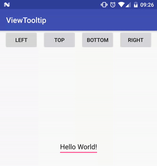
ViewTooltip

ViewTooltip
        .on(this, editText)
        .autoHide(true, 1000)
        .corner(30)
        .position(ViewTooltip.Position.RIGHT)
        .text("Right")
        .show();

Download

dependencies {
    implementation 'com.github.florent37:viewtooltip:(last version)'
}
Methods
ViewTooltip
        .on(this, editText)

        .autoHide(true / false, 1000)
        .clickToHide(true / false)

        .align(START / CENTER)

        .position(TOP / LEFT / RIGHT / BOTTOM)

        .text("The text")

        .textColor(Color.WHITE)
        .color(Color.BLACK)

        .corner(10)

        .arrowWidth(15)
        .arrowHeight(15)

        .distanceWithView(0)

        //change the opening animation
        .animation(new ViewTooltip.TooltipAnimation(){...})

        //listeners
        .onDisplay(new ViewTooltip.ListenerDisplay() {
            @Override
            public void onDisplay(View view) {

            }
        })
        .onHide(new ViewTooltip.ListenerHide() {
            @Override
            public void onHide(View view) {

            }
        })
        .show();
Prevent view to not be outside screen
ViewTooltip will not allow to be outside of screen, it will automatically adjust his size
History
1.2.0
- Compatible with AndroidX
1.1.7
- Set text as Int
- Added shadowColor
1.1.5
- Use Fragment V4
- Added aistanceWithView
1.1.4
- Added arrowWidth / arrowHeight
1.1.3
- Fix align bottom, text out of screen
1.1.1
- Added shadow
1.0.8
- Clip tooltip to screen (top / bottom)
- Text format HTML
1.0.6
- Fix align
1.0.5
- .customView()
- .remove()
1.0.3
- Clip tooltip to screen width
1.0.2
- Added corner
Credits
Author: Florent Champigny
Blog : http://www.tutos-android-france.com/
Fiches Plateau Moto : https://www.fiches-plateau-moto.fr/


Third Party Bindings
React Native
You may now use this library with React Native via the module here
License
Copyright 2017 Florent37, Inc.

Licensed under the Apache License, Version 2.0 (the "License");
you may not use this file except in compliance with the License.
You may obtain a copy of the License at

   http://www.apache.org/licenses/LICENSE-2.0

Unless required by applicable law or agreed to in writing, software
distributed under the License is distributed on an "AS IS" BASIS,
WITHOUT WARRANTIES OR CONDITIONS OF ANY KIND, either express or implied.
See the License for the specific language governing permissions and
limitations under the License.
Top Related Projects
:balloon: Modernized and sophisticated tooltips, fully customizable with an arrow and animations for Android.
Create Toast like tooltips, but targets can be specified, plus custom properties and features
An page indicator for Android ViewPager
Convert designs to code with AI
Introducing Visual Copilot: A new AI model to turn Figma designs to high quality code using your components.
Try Visual Copilot