
Top Related Projects

A lightweight indicator like in nexus 5 launcher

Three material Dots Indicators for view pagers in Android !

Paging indicator widgets compatible with the ViewPager from the Android Support Library and ActionBarSherlock.
Quick Overview
PageIndicatorView is an Android library that provides customizable indicators for ViewPager and RecyclerView. It offers a wide range of animation options and customization features, making it easy to create attractive and interactive page indicators for your Android applications.
Pros
- Highly customizable with numerous animation options
- Supports both ViewPager and RecyclerView
- Easy to integrate into existing projects
- Regularly maintained and updated
Cons
- Limited to Android platform
- May require additional configuration for complex layouts
- Some advanced features might have a learning curve
Code Examples
- Basic setup with ViewPager:
val viewPager: ViewPager = findViewById(R.id.viewPager)
val pageIndicatorView: PageIndicatorView = findViewById(R.id.pageIndicatorView)

pageIndicatorView.setViewPager(viewPager)
- Customizing indicator appearance:
pageIndicatorView.apply {
    setCount(5) // Set number of indicators
    setRadius(8) // Set indicator radius
    setSelectedColor(Color.RED) // Set selected indicator color
    setUnselectedColor(Color.GRAY) // Set unselected indicator color
}
- Adding animation:
pageIndicatorView.setAnimationType(AnimationType.WORM)
- Using with RecyclerView:
val recyclerView: RecyclerView = findViewById(R.id.recyclerView)
val pageIndicatorView: PageIndicatorView = findViewById(R.id.pageIndicatorView)

pageIndicatorView.attachToRecyclerView(recyclerView)
Getting Started
- Add the dependency to your app's
build.gradlefile:
dependencies {
    implementation 'com.romandanylyk:pageindicatorview:1.0.3'
}
- Add PageIndicatorView to your layout XML:
<com.rd.PageIndicatorView
    android:id="@+id/pageIndicatorView"
    android:layout_width="wrap_content"
    android:layout_height="wrap_content"
    app:piv_animationType="worm"
    app:piv_viewPager="@id/viewPager"/>
- Initialize and customize in your Activity or Fragment:
val pageIndicatorView: PageIndicatorView = findViewById(R.id.pageIndicatorView)
pageIndicatorView.setCount(5) // Set number of indicators
pageIndicatorView.setViewPager(viewPager) // Connect with ViewPager
Competitor Comparisons
A lightweight indicator like in nexus 5 launcher
Pros of CircleIndicator
- Simpler implementation with fewer customization options, making it easier to use for basic needs
- Lightweight library with a smaller footprint
- Supports both ViewPager and ViewPager2
Cons of CircleIndicator
- Limited animation options compared to PageIndicatorView
- Fewer customization features for indicator appearance
- Less active development and updates
Code Comparison
PageIndicatorView:
val pageIndicatorView = findViewById<PageIndicatorView>(R.id.pageIndicatorView)
pageIndicatorView.count = 5 // Set the number of pages
pageIndicatorView.selection = 2 // Set the current selected page
pageIndicatorView.setAnimationType(AnimationType.WORM)
CircleIndicator:
val circleIndicator = findViewById<CircleIndicator>(R.id.circleIndicator)
viewPager.adapter = adapter // Assuming you have a ViewPager and adapter
circleIndicator.setViewPager(viewPager)
PageIndicatorView offers more customization options and animation types out of the box, while CircleIndicator provides a simpler API for basic usage. PageIndicatorView allows for more granular control over the indicator's appearance and behavior, making it suitable for projects requiring advanced customization. CircleIndicator, on the other hand, is more straightforward to implement and may be preferable for simpler use cases or when a lightweight solution is needed.
Three material Dots Indicators for view pagers in Android !
Pros of dotsindicator
- Simpler API and easier to implement
- Supports animation between selected and unselected states
- Customizable dot size, spacing, and colors
Cons of dotsindicator
- Fewer customization options compared to PageIndicatorView
- Limited animation styles
- Less active development and community support
Code Comparison
PageIndicatorView:
val pageIndicatorView = findViewById<PageIndicatorView>(R.id.pageIndicatorView)
pageIndicatorView.count = 5
pageIndicatorView.selection = 2
pageIndicatorView.setAnimationType(AnimationType.WORM)
dotsindicator:
val dotsIndicator = findViewById<DotsIndicator>(R.id.dots_indicator)
val viewPager = findViewById<ViewPager>(R.id.view_pager)
dotsIndicator.setViewPager(viewPager)
Both libraries offer easy-to-use APIs for implementing page indicators in Android applications. PageIndicatorView provides more extensive customization options and animation styles, making it suitable for complex designs. On the other hand, dotsindicator offers a simpler implementation with basic customization, which may be sufficient for many use cases. The choice between the two depends on the specific requirements of your project and the level of customization needed.
Paging indicator widgets compatible with the ViewPager from the Android Support Library and ActionBarSherlock.
Pros of ViewPagerIndicator
- More established and widely used in the Android community
- Offers a broader range of indicator styles and customization options
- Supports older Android versions, providing better backward compatibility
Cons of ViewPagerIndicator
- Not actively maintained (last update was in 2014)
- Uses older Android development practices and libraries
- May require more setup and configuration compared to PageIndicatorView
Code Comparison
ViewPagerIndicator:
CirclePageIndicator indicator = (CirclePageIndicator)findViewById(R.id.indicator);
indicator.setViewPager(pager);
indicator.setSnap(true);
PageIndicatorView:
PageIndicatorView pageIndicatorView = findViewById(R.id.pageIndicatorView);
pageIndicatorView.setCount(5); // specify total count of indicators
pageIndicatorView.setSelection(2); // specify selection
ViewPagerIndicator requires more setup and is tightly coupled with ViewPager, while PageIndicatorView offers a more straightforward API and can be used independently. PageIndicatorView provides a more modern approach with easier customization and animation options. However, ViewPagerIndicator might be preferred for projects requiring support for older Android versions or those already using it in existing codebases.
Convert  designs to code with AI

Introducing Visual Copilot: A new AI model to turn Figma designs to high quality code using your components.
Try Visual CopilotREADME
PageIndicatorView

PageIndicatorView is light library to indicate ViewPager's selected page with different animations and ability to customise it as you need.
Integration
To add pageindicatorview to your project, first make sure in root build.gradle you have specified the following repository:
    repositories {
        jcenter()
    }
Note: by creating new project in Android Studio it will have
jcenterrepository specified by default, so you will not need to add it manually.
Once you make sure you have jcenter repository in your project, all you need to do is to add the following line in dependencies section of your project build.gradle.
See latest library version
implementation 'com.romandanylyk:pageindicatorview:X.X.X'
If your project already use appcompat-v7 support library, you can omit PageIndicatorView dependencies by adding a single .aar file to your project, that will decrease total amount of methods used in your project.
implementation 'com.romandanylyk:pageindicatorview:X.X.X@aar'
Keep in mind, that PageIndicatorView has min API level 14 and these dependencies:
implementation 'com.android.support:appcompat-v7:27.1.1'
implementation 'com.android.support:recyclerview-v7:27.1.1'
implementation 'com.android.support:support-core-ui:27.1.1'
Usage Sample
Usage of PageIndicatorView is quite simple. All you need to do is to declare a view in your layout.xml and call setSelection method to select specific indicator - that's it!
PageIndicatorView pageIndicatorView = findViewById(R.id.pageIndicatorView);
        pageIndicatorView.setCount(5); // specify total count of indicators
        pageIndicatorView.setSelection(2);
But if you're as lazy as I'm - then there is another option to handle PageIndicatorView
     <com.rd.PageIndicatorView
        android:id="@+id/pageIndicatorView"
        android:layout_width="wrap_content"
        android:layout_height="wrap_content"
        android:layout_centerInParent="true"
        app:piv_animationType="scale"
        app:piv_dynamicCount="true"
        app:piv_interactiveAnimation="true"
        app:piv_selectedColor="@color/gray_50"
        app:piv_unselectedColor="@color/gray_300"
        app:piv_viewPager="@id/viewPager"
        attrs:piv_padding="12dp"
        attrs:piv_radius="8dp" />
All the piv_ attributes here are specific for PageIndicatorView so you can customise it as you want with attributes - pretty handy.
But what is more important here is app:piv_viewPager="@id/viewPager".
What it actually do is catch up your ViewPager and automatically handles all the event's to selected the right page - so you don't need to call setSelection method on your own.
Another handy options here that works with your ViewPager as a whole is
app:piv_dynamicCount="true" and app:piv_interactiveAnimation="true"
Dynamic count will automatically updates PageIndicatorView total count as you updates pages count in your ViewPager - so that's pretty useful.
While interactive animation will progress the animation process within your swipe position, which makes animation more natural and responsive to end user.
Note: Because
setViewPagerIduses an instance ofViewPager, using it in recycler could lead to id conflicts, soPageIndicatorViewwill not know properly what is the rightViewPagerto work with. Instead you should handle selected indicators on your own programatically.
  pager.addOnPageChangeListener(new ViewPager.OnPageChangeListener() {
            @Override
            public void onPageScrolled(int position, float positionOffset, int positionOffsetPixels) {/*empty*/}

            @Override
            public void onPageSelected(int position) {
                pageIndicatorView.setSelection(position);
            }

            @Override
            public void onPageScrollStateChanged(int state) {/*empty*/}
        });
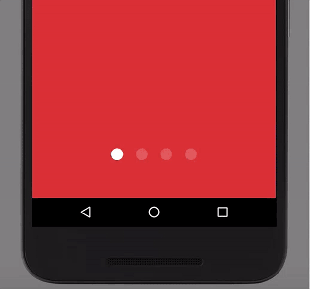
Here you can see all the animations PageIndicatorView support.
| Name | Support version | Preview |
|---|---|---|
AnimationType.NONE | 0.0.1 |  |
AnimationType.COLOR | 0.0.1 |  |
AnimationType.SCALE | 0.0.1 |  |
AnimationType.SLIDE | 0.0.1 |  |
AnimationType.WORM | 0.0.1 |  |
AnimationType.FILL | 0.0.6 |  |
AnimationType.THIN_WORM | 0.0.7 |  |
AnimationType.DROP | 0.1.0 |  |
AnimationType.SWAP | 0.1.1 |  |
Release Note
See release notes on github releases or Bintray release notes.
License
Copyright 2017 Roman Danylyk

Licensed under the Apache License, Version 2.0 (the "License");
you may not use this file except in compliance with the License.
You may obtain a copy of the License at

    http://www.apache.org/licenses/LICENSE-2.0

Unless required by applicable law or agreed to in writing, software
distributed under the License is distributed on an "AS IS" BASIS,
WITHOUT WARRANTIES OR CONDITIONS OF ANY KIND, either express or implied.
See the License for the specific language governing permissions and
limitations under the License.
Top Related Projects
A lightweight indicator like in nexus 5 launcher
Three material Dots Indicators for view pagers in Android !
Paging indicator widgets compatible with the ViewPager from the Android Support Library and ActionBarSherlock.
Convert designs to code with AI
Introducing Visual Copilot: A new AI model to turn Figma designs to high quality code using your components.
Try Visual Copilot