
Top Related Projects

A lightweight, plug-and-play indefinite pager indicator for RecyclerViews & ViewPagers.

An page indicator for Android ViewPager

A lightweight indicator like in nexus 5 launcher

Paging indicator widgets compatible with the ViewPager from the Android Support Library and ActionBarSherlock.
Quick Overview
DotsIndicator is an Android library that provides customizable dots indicators for ViewPager and ViewPager2. It offers a simple way to add attractive and interactive page indicators to your Android applications, enhancing the user experience when navigating through multiple pages or screens.
Pros
- Easy integration with ViewPager and ViewPager2
- Highly customizable appearance (color, size, spacing, etc.)
- Smooth animations for dot transitions
- Lightweight and efficient implementation
Cons
- Limited to dots-style indicators only
- May require additional customization for complex layouts
- Documentation could be more comprehensive
- Not frequently updated (last update was in 2020)
Code Examples
- Basic setup with ViewPager2:
val dotsIndicator = findViewById<DotsIndicator>(R.id.dots_indicator)
val viewPager2 = findViewById<ViewPager2>(R.id.view_pager)
dotsIndicator.setViewPager2(viewPager2)
- Customizing dot appearance:
dotsIndicator.apply {
    setDotsColor(ContextCompat.getColor(context, R.color.dot_color))
    setSelectedDotColor(ContextCompat.getColor(context, R.color.selected_dot_color))
    setDotIndicatorColor(ContextCompat.getColor(context, R.color.indicator_color))
    setDotSize(resources.getDimension(R.dimen.dot_size))
    setDotSpacing(resources.getDimension(R.dimen.dot_spacing))
}
- Using with a custom adapter:
class MyPagerAdapter(fragmentActivity: FragmentActivity) : FragmentStateAdapter(fragmentActivity) {
    override fun getItemCount(): Int = 5
    override fun createFragment(position: Int): Fragment = MyFragment.newInstance(position)
}

viewPager2.adapter = MyPagerAdapter(this)
dotsIndicator.setViewPager2(viewPager2)
Getting Started
- Add the JitPack repository to your project's build.gradle file:
allprojects {
    repositories {
        ...
        maven { url 'https://jitpack.io' }
    }
}
- Add the dependency to your app's build.gradle file:
dependencies {
    implementation 'com.github.tommybuonomo:dotsindicator:4.3'
}
- Add the DotsIndicator to your layout XML:
<com.tbuonomo.viewpagerdotsindicator.DotsIndicator
    android:id="@+id/dots_indicator"
    android:layout_width="wrap_content"
    android:layout_height="wrap_content"
    app:dotsColor="@color/default_dot_color"
    app:dotsCornerRadius="8dp"
    app:dotsSize="16dp"
    app:dotsSpacing="4dp"
    app:dotsWidthFactor="2.5"
    app:selectedDotColor="@color/selected_dot_color"
    app:progressMode="true" />
- In your activity or fragment, link the DotsIndicator with your ViewPager2:
val dotsIndicator = findViewById<DotsIndicator>(R.id.dots_indicator)
val viewPager2 = findViewById<ViewPager2>(R.id.view_pager)
dotsIndicator.setViewPager2(viewPager2)
Competitor Comparisons
A lightweight, plug-and-play indefinite pager indicator for RecyclerViews & ViewPagers.
Pros of Android-Indefinite-Pager-Indicator
- Supports an indefinite number of pages, ideal for dynamic content
- Offers more customization options for dot appearance and behavior
- Includes built-in animations for smooth transitions between pages
Cons of Android-Indefinite-Pager-Indicator
- Less actively maintained, with fewer recent updates
- May require more setup and configuration compared to dotsindicator
- Limited documentation and examples available
Code Comparison
Android-Indefinite-Pager-Indicator:
<com.rbrooks.indefinitepagerindicator.IndefinitePagerIndicator
    android:layout_width="wrap_content"
    android:layout_height="wrap_content"
    app:dotRadius="4dp"
    app:selectedDotRadius="5.5dp"
    app:dotColor="@color/gray"
    app:selectedDotColor="@color/black" />
dotsindicator:
<com.tbuonomo.viewpagerdotsindicator.DotsIndicator
    android:layout_width="wrap_content"
    android:layout_height="wrap_content"
    app:dotsColor="@color/blue_inactive"
    app:dotsCornerRadius="8dp"
    app:dotsSize="16dp"
    app:dotsSpacing="4dp"
    app:dotsWidthFactor="2.5" />
Both libraries offer similar functionality for adding page indicators to ViewPagers. Android-Indefinite-Pager-Indicator excels in handling an unlimited number of pages and provides more customization options. However, dotsindicator is more actively maintained and may be easier to implement for simpler use cases. The choice between the two depends on specific project requirements and preferences for customization vs. simplicity.
An page indicator for Android ViewPager
Pros of PageIndicatorView
- More customization options, including animation styles and indicator shapes
- Supports both static and dynamic page count
- Extensive documentation and sample usage
Cons of PageIndicatorView
- Larger library size, potentially impacting app performance
- More complex implementation due to additional features
- May require more setup time for basic use cases
Code Comparison
PageIndicatorView:
val pageIndicatorView = findViewById<PageIndicatorView>(R.id.pageIndicatorView)
pageIndicatorView.count = 5 // specify total count
pageIndicatorView.selection = 2 // specify selection
DotsIndicator:
val dotsIndicator = findViewById<DotsIndicator>(R.id.dots_indicator)
dotsIndicator.attachTo(viewPager)
PageIndicatorView offers more granular control over the indicator's appearance and behavior, while DotsIndicator provides a simpler implementation for basic use cases. PageIndicatorView requires manual setup of count and selection, whereas DotsIndicator can be directly attached to a ViewPager.
Both libraries offer smooth animations and support for ViewPager and ViewPager2. PageIndicatorView provides more customization options but may be overkill for simple implementations. DotsIndicator is lighter and easier to set up but offers fewer advanced features.
A lightweight indicator like in nexus 5 launcher
Pros of CircleIndicator
- Simpler implementation with fewer customization options, making it easier to use for basic needs
- Lightweight library with minimal dependencies
- Supports both ViewPager and ViewPager2
Cons of CircleIndicator
- Limited customization options compared to dotsindicator
- Lacks advanced features like animation styles and color customization
- May not be suitable for complex UI designs requiring more intricate indicators
Code Comparison
CircleIndicator:
<me.relex.circleindicator.CircleIndicator
    android:id="@+id/indicator"
    android:layout_width="match_parent"
    android:layout_height="48dp"/>
dotsindicator:
<com.tbuonomo.viewpagerdotsindicator.DotsIndicator
    android:id="@+id/dots_indicator"
    android:layout_width="wrap_content"
    android:layout_height="wrap_content"
    app:dotsColor="@color/blue_inactive"
    app:dotsCornerRadius="8dp"
    app:dotsSize="16dp"
    app:dotsSpacing="4dp"
    app:dotsWidthFactor="2.5"
    app:selectedDotColor="@color/blue_active"
    app:progressMode="true"/>
The code comparison shows that dotsindicator offers more customization options directly in the XML layout, while CircleIndicator has a simpler implementation with fewer attributes. This reflects the overall difference in flexibility and customization between the two libraries.
Paging indicator widgets compatible with the ViewPager from the Android Support Library and ActionBarSherlock.
Pros of ViewPagerIndicator
- More customization options for indicator styles (line, circle, title, etc.)
- Supports a wider range of Android versions
- Well-established library with a large user base and community support
Cons of ViewPagerIndicator
- Not actively maintained (last update in 2016)
- Requires more setup and configuration compared to dotsindicator
- May have compatibility issues with newer Android versions and libraries
Code Comparison
ViewPagerIndicator:
CirclePageIndicator indicator = (CirclePageIndicator)findViewById(R.id.indicator);
indicator.setViewPager(viewPager);
indicator.setRadius(10);
indicator.setFillColor(Color.BLACK);
dotsindicator:
DotsIndicator dotsIndicator = findViewById(R.id.dots_indicator);
ViewPager2 viewPager2 = findViewById(R.id.view_pager2);
dotsIndicator.setViewPager2(viewPager2);
ViewPagerIndicator offers more granular control over indicator appearance, while dotsindicator provides a simpler setup process with fewer lines of code. dotsindicator is more up-to-date and compatible with ViewPager2, making it a better choice for newer projects. However, ViewPagerIndicator still has value for projects requiring extensive customization or supporting older Android versions.
Convert  designs to code with AI

Introducing Visual Copilot: A new AI model to turn Figma designs to high quality code using your components.
Try Visual CopilotREADME
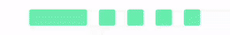
Pager Dots Indicator
Dots indicator is an Android library available for Jetpack Compose and XML ð
Don't forget to star the project if you like it!
 ==
== 
Feel free to submit issues and enhancement requests !
How to
Gradle
repositories {
    google()
    mavenCentral()
}

dependencies {
    implementation("com.tbuonomo:dotsindicator:5.1.0")
}
For Jetpack Compose
Column {
    var pageCount by remember { mutableStateOf(5) }
    val pagerState = rememberPagerState()
    HorizontalPager(
        modifier = Modifier.padding(top = 24.dp),
        pageCount = pageCount,
        contentPadding = PaddingValues(horizontal = 64.dp),
        pageSpacing = 24.dp,
        state = pagerState
    ) {
        PagePlaceholderItem()
    }
    DotsIndicator(
        dotCount = pageCount,
        type = ShiftIndicatorType(dotsGraphic = DotGraphic(color = MaterialTheme.colorScheme.primary)),
        pagerState = pagerState
    )
}
4 types are available in JetpackCompose
ShiftIndicatorType
DotsIndicator(
    dotCount = pageCount,
    type = ShiftIndicatorType(dotsGraphic = DotGraphic(color = MaterialTheme.colorScheme.primary)),
    pagerState = pagerState
)
SpringIndicatorType
DotsIndicator(
    dotCount = pageCount,
    type = SpringIndicatorType(
        dotsGraphic = DotGraphic(
            16.dp,
            borderWidth = 2.dp,
            borderColor = MaterialTheme.colorScheme.primary,
            color = Color.Transparent
        ),
        selectorDotGraphic = DotGraphic(
            14.dp,
            color = MaterialTheme.colorScheme.primary
        )
    ),
    pagerState = pagerState
)
WormIndicatorType
DotsIndicator(
    dotCount = pageCount,
    type = WormIndicatorType(
        dotsGraphic = DotGraphic(
            16.dp,
            borderWidth = 2.dp,
            borderColor = MaterialTheme.colorScheme.primary,
            color = Color.Transparent,
        ),
        wormDotGraphic = DotGraphic(
            16.dp,
            color = MaterialTheme.colorScheme.primary,
        )
    ),
    pagerState = pagerState
)
BalloonIndicatorType
DotsIndicator(
    dotCount = pageCount,
    type = BalloonIndicatorType(
        dotsGraphic = DotGraphic(
            color = MaterialTheme.colorScheme.primary,
            size = 8.dp
        ),
        balloonSizeFactor = 2f
    ),
    dotSpacing = 20.dp,
    pagerState = pagerState
)
For XML
DotsIndicator

In your XML layout
<com.tbuonomo.viewpagerdotsindicator.DotsIndicator
    android:id="@+id/dots_indicator"
    android:layout_width="wrap_content"
    android:layout_height="wrap_content"
    app:dotsColor="@color/material_white"
    app:dotsCornerRadius="8dp"
    app:dotsSize="16dp"
    app:dotsSpacing="4dp"
    app:dotsWidthFactor="2.5"
    app:selectedDotColor="@color/md_blue_200"
    app:progressMode="true"
    />
Custom Attributes
| Attribute | Description |
|---|---|
dotsColor | Color of the dots |
selectedDotColor | Color of the selected dot (by default the dotsColor) |
progressMode | Lets the selected dot color to the dots behind the current one |
dotsSize | Size in dp of the dots (by default 16dp) |
dotsSpacing | Size in dp of the space between the dots (by default 4dp) |
dotsWidthFactor | The dots scale factor for page indication (by default 2.5) |
dotsCornerRadius | The dots corner radius (by default the half of dotsSize for circularity) |
In your Kotlin code
    val dotsIndicator = findViewById<DotsIndicator>(R.id.dots_indicator)
    val viewPager = findViewById<ViewPager>(R.id.view_pager)
    val adapter = ViewPagerAdapter()
    viewPager.adapter = adapter
    dotsIndicator.attachTo(viewPager)
SpringDotsIndicator


In your XML layout
<com.tbuonomo.viewpagerdotsindicator.SpringDotsIndicator
    android:id="@+id/spring_dots_indicator"
    android:layout_width="wrap_content"
    android:layout_height="wrap_content"
    app:dampingRatio="0.5"
    app:dotsColor="@color/material_white"
    app:dotsStrokeColor="@color/material_yellow"
    app:dotsCornerRadius="2dp"
    app:dotsSize="16dp"
    app:dotsSpacing="6dp"
    app:dotsStrokeWidth="2dp"
    app:stiffness="300"
    />
Custom Attributes
| Attribute | Description |
|---|---|
dotsColor | Color of the indicator dot |
dotsStrokeColor | Color of the stroke dots (by default the indicator color) |
dotsSize | Size in dp of the dots (by default 16dp) |
dotsSpacing | Size in dp of the space between the dots (by default 4dp) |
dotsCornerRadius | The dots corner radius (by default the half of dotsSize for circularity) |
dotsStrokeWidth | The dots stroke width (by default 2dp) |
dampingRatio | The damping ratio of the spring force (by default 0.5) |
stiffness | The stiffness of the spring force (by default 300) |
In your Kotlin code
    val springDotsIndicator = findViewById<SpringDotsIndicator>(R.id.spring_dots_indicator)
    val viewPager = findViewById<ViewPager>(R.id.view_pager)
    val adapter = ViewPagerAdapter()
    viewPager.adapter = adapter
    springDotsIndicator.attachTo(viewPager)
WormDotsIndicator


In your XML layout
<com.tbuonomo.viewpagerdotsindicator.WormDotsIndicator
    android:id="@+id/worm_dots_indicator"
    android:layout_width="wrap_content"
    android:layout_height="wrap_content"
    app:dotsColor="@color/material_blueA200"
    app:dotsStrokeColor="@color/material_yellow"
    app:dotsCornerRadius="8dp"
    app:dotsSize="16dp"
    app:dotsSpacing="4dp"
    app:dotsStrokeWidth="2dp"
    />
Custom Attributes
| Attribute | Description |
|---|---|
dotsColor | Color of the indicator dot |
dotsStrokeColor | Color of the stroke dots (by default the indicator color) |
dotsSize | Size in dp of the dots (by default 16dp) |
dotsSpacing | Size in dp of the space between the dots (by default 4dp) |
dotsCornerRadius | The dots corner radius (by default the half of dotsSize for circularity) |
dotsStrokeWidth | The dots stroke width (by default 2dp) |
In your Kotlin code
    val wormDotsIndicator = findViewById<WormDotsIndicator>(R.id.worm_dots_indicator)
    val viewPager = findViewById<ViewPager>(R.id.view_pager)
    val adapter = ViewPagerAdapter()
    viewPager.adapter = adapter
    wormDotsIndicator.attachTo(viewPager)
Support of ViewPager2
The attachTo can take a ViewPager or a ViewPager2
Help Maintenance
If you could help me to continue maintain this repo, buying me a cup of coffee will make my life really happy and get much energy out of it.

Changelog
5.1.0
- Fix import issues
- Upgrade AGP versions
- Migrate repo to Maven Central Repository
5.0
- Add Jetpack Compose support with 4 types: ShiftIndicatorType, SpringIndicatorType, WormIndicatorType, BalloonIndicatorType
4.3
- Fix #144, #143, #139, #135, #133, #131, #126, #109, #95, #93, #86, #85, #80, #78, #73, #68, #58
- Methods
setViewPagerandsetViewPager2are now deprecated and replaced byattachTo(...)
4.2
Fix #115
The library is now on MavenCentral.
The library name moves from com.tbuonomo.andrui:viewpagerdotsindicator to com.tbuonomo:dotsindicator
4.1.2
4.1.1
Fix crash
4.1
4.0
- Support of ViewPager2 (fix #40)
- Convert all the project to Kotlin
- Migration to AndroidX
- Fix #37: findViewById, causing missing adapter error
3.0.3
- Fix #20: Dots indicator initialises with the wrong number of dots initially
3.0.2
- Add attribute
selectedDotColorandprogressModetoDotsIndicator - Fix RTL issues and improve
DotsIndicatorglobally
2.1.0
- Add attribute
dotsStrokeColortoSpringDotsIndicatorandWormDotsIndicator
License
Copyright 2016 Tommy Buonomo

Licensed under the Apache License, Version 2.0 (the "License");
you may not use this file except in compliance with the License.
You may obtain a copy of the License at

    http://www.apache.org/licenses/LICENSE-2.0

Unless required by applicable law or agreed to in writing, software
distributed under the License is distributed on an "AS IS" BASIS,
WITHOUT WARRANTIES OR CONDITIONS OF ANY KIND, either express or implied.
See the License for the specific language governing permissions and
limitations under the License.
Top Related Projects
A lightweight, plug-and-play indefinite pager indicator for RecyclerViews & ViewPagers.
An page indicator for Android ViewPager
A lightweight indicator like in nexus 5 launcher
Paging indicator widgets compatible with the ViewPager from the Android Support Library and ActionBarSherlock.
Convert designs to code with AI
Introducing Visual Copilot: A new AI model to turn Figma designs to high quality code using your components.
Try Visual Copilot