 Android-Indefinite-Pager-Indicator
A lightweight, plug-and-play indefinite pager indicator for RecyclerViews & ViewPagers.
Top Related Projects

Paging indicator widgets compatible with the ViewPager from the Android Support Library and ActionBarSherlock.

An page indicator for Android ViewPager

Three material Dots Indicators for view pagers in Android !

A lightweight indicator like in nexus 5 launcher
Quick Overview
Android-Indefinite-Pager-Indicator is a lightweight, customizable library for Android that provides a page indicator for ViewPagers with an indefinite number of pages. It offers smooth animations and supports both finite and infinite pagers, making it ideal for carousels and similar UI components.
Pros
- Easy integration with ViewPager and ViewPager2
- Highly customizable appearance and behavior
- Smooth animations for page transitions
- Supports both finite and infinite pagers
Cons
- Limited to Android platform
- Requires additional setup for custom ViewPagers
- May not be suitable for complex paging scenarios
- Dependency on AndroidX libraries
Code Examples
- Basic setup with ViewPager2:
val viewPager: ViewPager2 = findViewById(R.id.view_pager)
val indicator: IndefinitePagerIndicator = findViewById(R.id.indicator)

indicator.attachToViewPager(viewPager)
- Customizing indicator appearance:
indicator.apply {
    dotRadius = 8f
    selectedDotRadius = 10f
    dotColor = ContextCompat.getColor(context, R.color.dot_color)
    selectedDotColor = ContextCompat.getColor(context, R.color.selected_dot_color)
    dotSeparation = 16f
}
- Using with RecyclerView:
val recyclerView: RecyclerView = findViewById(R.id.recycler_view)
val indicator: IndefinitePagerIndicator = findViewById(R.id.indicator)

indicator.attachToRecyclerView(recyclerView)
Getting Started
- Add the dependency to your app's
build.gradle:
dependencies {
    implementation 'com.ryanjeffreybrooks:indefinitepagerindicator:1.0.10'
}
- Add the
IndefinitePagerIndicatorto your layout:
<com.rbrooks.indefinitepagerindicator.IndefinitePagerIndicator
    android:id="@+id/indicator"
    android:layout_width="wrap_content"
    android:layout_height="wrap_content"
    app:dotColor="@color/gray"
    app:selectedDotColor="@color/black"
    app:dotRadius="4dp"
    app:selectedDotRadius="5.5dp"
    app:dotSeparation="8dp"/>
- In your activity or fragment, attach the indicator to your ViewPager or RecyclerView:
val viewPager: ViewPager2 = findViewById(R.id.view_pager)
val indicator: IndefinitePagerIndicator = findViewById(R.id.indicator)
indicator.attachToViewPager(viewPager)
That's it! The indicator will now update automatically as the user swipes through pages.
Competitor Comparisons
Paging indicator widgets compatible with the ViewPager from the Android Support Library and ActionBarSherlock.
Pros of ViewPagerIndicator
- More established and widely used library with a larger community
- Offers a variety of indicator styles (e.g., circle, line, title, tab, underline)
- Supports older Android versions and has been battle-tested in many applications
Cons of ViewPagerIndicator
- No longer actively maintained (last commit in 2016)
- Doesn't support newer ViewPager2 or Jetpack Compose
- May require additional work to integrate with modern Android development practices
Code Comparison
ViewPagerIndicator:
CirclePageIndicator indicator = (CirclePageIndicator)findViewById(R.id.indicator);
indicator.setViewPager(viewPager);
Android-Indefinite-Pager-Indicator:
val indicator = findViewById<IndefinitePagerIndicator>(R.id.indicator)
indicator.attachToViewPager(viewPager)
Both libraries offer simple integration, but Android-Indefinite-Pager-Indicator uses Kotlin and has a more modern API. ViewPagerIndicator requires more setup for different indicator styles, while Android-Indefinite-Pager-Indicator focuses on a single, customizable style.
ViewPagerIndicator provides more options out-of-the-box, but Android-Indefinite-Pager-Indicator offers better support for infinite scrolling and modern Android development practices. The choice between the two depends on specific project requirements, target Android versions, and desired indicator styles.
An page indicator for Android ViewPager
Pros of PageIndicatorView
- More customization options, including various animation styles and indicator shapes
- Supports both ViewPager and RecyclerView
- Larger community and more frequent updates
Cons of PageIndicatorView
- Slightly more complex implementation due to additional features
- Larger library size, which may impact app size
Code Comparison
PageIndicatorView:
<com.romandanylyk.pageindicatorview.PageIndicatorView
    android:id="@+id/pageIndicatorView"
    android:layout_width="wrap_content"
    android:layout_height="wrap_content"
    app:piv_animationType="scale"
    app:piv_dynamicCount="true"/>
Android-Indefinite-Pager-Indicator:
<com.rbrooks.indefinitepagerindicator.IndefinitePagerIndicator
    android:id="@+id/indicator"
    android:layout_width="wrap_content"
    android:layout_height="wrap_content"
    app:dotRadius="4dp"
    app:selectedDotRadius="5.5dp"/>
Both libraries offer easy-to-use XML implementations, but PageIndicatorView provides more customization options directly in the XML attributes. Android-Indefinite-Pager-Indicator focuses on simplicity and ease of use, with fewer configuration options out of the box.
PageIndicatorView is better suited for projects requiring extensive customization and animation options, while Android-Indefinite-Pager-Indicator is ideal for simpler implementations with a focus on indefinite paging support.
Three material Dots Indicators for view pagers in Android !
Pros of dotsindicator
- More customization options, including fade and scale animations
- Supports both ViewPager and ViewPager2
- Offers a wider variety of dot shapes (circle, square, rounded square)
Cons of dotsindicator
- Slightly more complex setup process
- Less intuitive API for some customizations
- May require more configuration for basic use cases
Code Comparison
Android-Indefinite-Pager-Indicator:
<com.rbrooks.indefinitepagerindicator.IndefinitePagerIndicator
    android:layout_width="wrap_content"
    android:layout_height="wrap_content"
    app:dotRadius="4dp"
    app:selectedDotRadius="5.5dp"
    app:dotColor="@color/gray"
    app:selectedDotColor="@color/black" />
dotsindicator:
<com.tbuonomo.viewpagerdotsindicator.DotsIndicator
    android:layout_width="wrap_content"
    android:layout_height="wrap_content"
    app:dotsColor="@color/gray"
    app:selectedDotColor="@color/black"
    app:dotsCornerRadius="8dp"
    app:dotsSize="16dp"
    app:dotsSpacing="4dp"
    app:dotsWidthFactor="2.5" />
Both libraries provide similar functionality for creating page indicators, but dotsindicator offers more customization options at the cost of a slightly more complex setup. Android-Indefinite-Pager-Indicator has a simpler API and may be easier to implement for basic use cases. The choice between the two depends on the specific requirements of your project and the level of customization needed.
A lightweight indicator like in nexus 5 launcher
Pros of CircleIndicator
- Simpler implementation with fewer customization options, making it easier to use for basic scenarios
- Supports both ViewPager and ViewPager2 out of the box
- Smaller codebase, potentially leading to a lighter library
Cons of CircleIndicator
- Limited customization options compared to Android-Indefinite-Pager-Indicator
- Doesn't support indefinite paging or looping indicators
- Less flexible for complex layouts or unique designs
Code Comparison
CircleIndicator:
CircleIndicator indicator = findViewById(R.id.indicator);
ViewPager viewPager = findViewById(R.id.viewPager);
indicator.setViewPager(viewPager);
Android-Indefinite-Pager-Indicator:
val viewPager: ViewPager = findViewById(R.id.viewPager)
val pagerIndicator: IndefinitePagerIndicator = findViewById(R.id.indicator)
pagerIndicator.attachToViewPager(viewPager)
Both libraries offer simple setup, but Android-Indefinite-Pager-Indicator provides more customization options through XML attributes or programmatically:
<com.rbrooks.indefinitepagerindicator.IndefinitePagerIndicator
    android:layout_width="wrap_content"
    android:layout_height="wrap_content"
    app:dotRadius="8dp"
    app:selectedDotRadius="10dp"
    app:dotColor="@color/gray"
    app:selectedDotColor="@color/black"
    app:dotSeparation="16dp"/>
CircleIndicator is more suitable for simple implementations, while Android-Indefinite-Pager-Indicator offers greater flexibility for complex designs and indefinite paging scenarios.
Convert  designs to code with AI

Introducing Visual Copilot: A new AI model to turn Figma designs to high quality code using your components.
Try Visual CopilotREADME
Android Indefinite Pager Indicator
A lightweight, plug-and-play indefinite pager indicator for RecyclerViews & ViewPagers.

Usage

Important Information
From now on, all the new updates will be published in jitpack.io.
To use the IndefinitePagerIndicator, simply add the gradle dependency to your module's build.gradle file:
implementation 'com.github.rbro112:Android-Indefinite-Pager-Indicator:Tag'
or
implementation 'com.github.wching:Android-Indefinite-Pager-Indicator:Tag'
both of them work ð
Min SDK supported is version 16 - Jelly Bean.
Getting Started
Attaching the indicator to a RecyclerView / Viewpager / Viewpager2 takes only one line of code. After this, the Indefinite Pager Indicator will handle everything else.
RecyclerView
- Add the IndefinitePagerIndicator view to your XML file
<com.rbrooks.indefinitepagerindicator.IndefinitePagerIndicator
        android:id="@+id/recyclerview_pager_indicator"
        android:layout_width="wrap_content"
        android:layout_height="wrap_content"
        ...
        />
- Find the view in your activity, fragment, etc.
findViewById(R.id.recyclerview_pager_indicator);
- Attach the RecyclerView to your IndefinitePagerIndicator
indefinitePagerIndicator.attachToRecyclerView(recyclerView);
That's it! The IndefinitePagerIndicator will handle updating as your RecyclerView does.
ViewPager
- Add the IndefinitePagerIndicator view to your XML file
<com.rbrooks.indefinitepagerindicator.IndefinitePagerIndicator
        android:id="@+id/viewpager_pager_indicator"
        android:layout_width="wrap_content"
        android:layout_height="wrap_content"
        ...
        />
- Find the view in your activity, fragment, etc.
findViewById(R.id.viewpager_pager_indicator);
- Attach the ViewPager to your IndefinitePagerIndicator
indefinitePagerIndicator.attachToViewPager(viewPager);
That's it! The IndefinitePagerIndicator will handle updating as your ViewPager does.
The position of the ViewPager can also be changed programmatically with viewPager.setCurrentItem(position) and the IndefinitePagerIndicator will update successfully.
Sample
A sample application is included in the repository. To view the sample:
- Clone the repository locally
git clone git@github.com:rbro112/Android-Indefinite-Pager-Indicator.git
- Build and run the sample module.

Customizing
To customize the IndefinitePagerIndicator, modify any of the following attributes in the XML code (or set them programmatically) for your IndefinitePagerIndicator view.
| Attribute | Explanation | Default Value | Example Code | Result |
|---|---|---|---|---|
| dotRadius | The radius of a dot indicator in DP. | 4dp | indefinite_pager_indicator:dotRadius="8dp" |  |
| selectedDotRadius | The radius of the currently selected dot indicator in DP. | 5.5dp | indefinite_pager_indicator:selectedDotRadius="6dp" |  |
| dotColor | The color of a dot indicator. | #e8e8e8 | indefinite_pager_indicator:dotColor="#ff0000" |  |
| selectedDotColor | The color of the currently selected dot indicator. | #ffffff | indefinite_pager_indicator:selectedDotColor="#ff0000" |  |
| dotSeparation | The distance from edge to edge of each dot in DP. | 10dp | indefinite_pager_indicator:dotSeparation="16dp" |  |
| dotCount | The number of large visible dot indicators at any time. | 5 | indefinite_pager_indicator:dotCount="3" |  |
| fadingDotCount | The number of dot indicators that fade towards the edge. | 1 | indefinite_pager_indicator:fadingDotCount="2" |  |
| supportRTL | Adds support for RTL ViewPagers | false | indefinite_pager_indicator:supportRTL="true" | If current layout mode is RTL, indicator will move from right to left with scrolling. |
| verticalSupport | Adds support for a vertical setup | false | indefinite_pager_indicator::verticalSupport="true" | 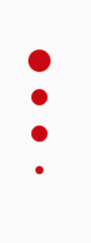 |
If you would like to help, submit a PR! We have the following features pending:
-
"Instagram" style -- Selected dot starts at the left of the view rather than starting in the center.
-
Support for padding.
-
Support for small drawables.
Notes
Follow us on Twitter: @rbro112 @wchingb
Let us know what you think!
Contributions encouraged and welcome!
License
MIT License

Copyright (c) 2022 Ryan Brooks

Permission is hereby granted, free of charge, to any person obtaining a copy
of this software and associated documentation files (the "Software"), to deal
in the Software without restriction, including without limitation the rights
to use, copy, modify, merge, publish, distribute, sublicense, and/or sell
copies of the Software, and to permit persons to whom the Software is
furnished to do so, subject to the following conditions:

The above copyright notice and this permission notice shall be included in all
copies or substantial portions of the Software.

THE SOFTWARE IS PROVIDED "AS IS", WITHOUT WARRANTY OF ANY KIND, EXPRESS OR
IMPLIED, INCLUDING BUT NOT LIMITED TO THE WARRANTIES OF MERCHANTABILITY,
FITNESS FOR A PARTICULAR PURPOSE AND NONINFRINGEMENT. IN NO EVENT SHALL THE
AUTHORS OR COPYRIGHT HOLDERS BE LIABLE FOR ANY CLAIM, DAMAGES OR OTHER
LIABILITY, WHETHER IN AN ACTION OF CONTRACT, TORT OR OTHERWISE, ARISING FROM,
OUT OF OR IN CONNECTION WITH THE SOFTWARE OR THE USE OR OTHER DEALINGS IN THE
SOFTWARE.
Top Related Projects
Paging indicator widgets compatible with the ViewPager from the Android Support Library and ActionBarSherlock.
An page indicator for Android ViewPager
Three material Dots Indicators for view pagers in Android !
A lightweight indicator like in nexus 5 launcher
Convert designs to code with AI
Introducing Visual Copilot: A new AI model to turn Figma designs to high quality code using your components.
Try Visual Copilot