Top Related Projects
📊 Interactive JavaScript Charts built on SVG
Simple HTML5 Charts using the <canvas> tag
Bring data to life with SVG, Canvas and HTML. :bar_chart::chart_with_upwards_trend::tada:
Highcharts JS, the JavaScript charting framework
Open-source JavaScript charting library behind Plotly and Dash
JavaScript 3D Library.
Quick Overview
uPlot is a fast, lightweight JavaScript charting library for time series data. It focuses on performance and minimal overhead, making it suitable for rendering large datasets efficiently in web applications.
Pros
- Extremely fast rendering and low memory usage
- Small file size (< 25 KB min.gz)
- Supports zooming, panning, and tooltips out of the box
- Highly customizable with a simple API
Cons
- Limited chart types compared to more comprehensive libraries
- Steeper learning curve for complex customizations
- Primarily focused on time series data, may not be ideal for other chart types
- Less extensive documentation compared to larger charting libraries
Code Examples
- Creating a basic line chart:
let data = [
  [1546300800, 1546387200],    // x-values (timestamps)
  [35, 71],                    // y-values (series 1)
];

let opts = {
  width: 600,
  height: 400,
  series: [
    {},
    {
      stroke: "red",
      fill: "rgba(255,0,0,0.1)",
    },
  ],
};

let u = new uPlot(opts, data, document.body);
- Adding multiple series to a chart:
let data = [
  [1546300800, 1546387200, 1546473600],
  [35, 71, 55],
  [24, 62, 44],
  [10, 45, 30],
];

let opts = {
  width: 600,
  height: 400,
  series: [
    {},
    { stroke: "red" },
    { stroke: "blue" },
    { stroke: "green" },
  ],
};

let u = new uPlot(opts, data, document.body);
- Customizing axes and adding a legend:
let opts = {
  width: 600,
  height: 400,
  scales: {
    x: {
      time: true,
    },
    y: {
      range: [0, 100],
    },
  },
  axes: [
    { stroke: "#000000" },
    { stroke: "#000000", label: "Value" },
  ],
  series: [
    {},
    {
      label: "Series 1",
      stroke: "red",
    },
  ],
  legend: {
    show: true,
  },
};

let u = new uPlot(opts, data, document.body);
Getting Started
- Include uPlot in your HTML file:
<link rel="stylesheet" href="https://unpkg.com/uplot@1.6.24/dist/uPlot.min.css">
<script src="https://unpkg.com/uplot@1.6.24/dist/uPlot.iife.min.js"></script>
- Create a container for the chart:
<div id="chart"></div>
- Initialize uPlot with data and options:
let data = [
  [1, 2, 3, 4, 5],
  [10, 20, 30, 40, 50],
];

let opts = {
  width: 600,
  height: 400,
  series: [{}, {}],
};

let u = new uPlot(opts, data, document.getElementById("chart"));
Competitor Comparisons
📊 Interactive JavaScript Charts built on SVG
Pros of ApexCharts
- More feature-rich with a wide variety of chart types and customization options
- Extensive documentation and examples for easier implementation
- Built-in responsiveness and animation capabilities
Cons of ApexCharts
- Larger file size and potentially slower performance for large datasets
- Steeper learning curve due to more complex API and configuration options
- Higher memory usage, especially for real-time or frequently updating charts
Code Comparison
uPlot:
let opts = {
  width: 600,
  height: 400,
  series: [
    {},
    {
      stroke: "red",
      fill: "rgba(255,0,0,0.1)",
    },
  ],
};

let uplot = new uPlot(opts, data, document.body);
ApexCharts:
var options = {
  chart: {
    type: 'line',
    width: 600,
    height: 400
  },
  series: [{
    name: 'sales',
    data: [30,40,35,50,49,60,70,91,125]
  }],
  stroke: {
    curve: 'smooth'
  }
};

var chart = new ApexCharts(document.querySelector("#chart"), options);
chart.render();
Both libraries offer powerful charting capabilities, but uPlot focuses on performance and minimalism, while ApexCharts provides a more comprehensive set of features and customization options. The choice between them depends on specific project requirements, such as performance needs, desired chart types, and level of customization required.
Simple HTML5 Charts using the <canvas> tag
Pros of Chart.js
- More extensive documentation and larger community support
- Wider range of chart types and customization options
- Built-in responsiveness and animation features
Cons of Chart.js
- Larger file size and potentially slower performance for large datasets
- More complex API and steeper learning curve
- Higher memory usage, especially for real-time data updates
Code Comparison
uPlot:
let opts = {
  width: 600,
  height: 400,
  series: [
    {},
    {
      stroke: "red",
      fill: "rgba(255,0,0,0.1)",
    },
  ],
};

let uplot = new uPlot(opts, data, document.body);
Chart.js:
const ctx = document.getElementById('myChart').getContext('2d');
const chart = new Chart(ctx, {
  type: 'line',
  data: {
    labels: ['Red', 'Blue', 'Yellow', 'Green', 'Purple', 'Orange'],
    datasets: [{
      label: '# of Votes',
      data: [12, 19, 3, 5, 2, 3],
      borderColor: 'red',
      backgroundColor: 'rgba(255,0,0,0.1)',
    }]
  },
});
uPlot is designed for high-performance rendering of large datasets, with a smaller file size and simpler API. It excels in scenarios requiring real-time updates and handling of big data. Chart.js offers more built-in features, chart types, and customization options, making it suitable for a wider range of use cases, especially when advanced interactivity and diverse chart styles are needed.
Bring data to life with SVG, Canvas and HTML. :bar_chart::chart_with_upwards_trend::tada:
Pros of d3
- Highly flexible and customizable for creating a wide range of complex visualizations
- Large ecosystem with numerous extensions and plugins
- Extensive documentation and community support
Cons of d3
- Steeper learning curve due to its low-level API
- Larger file size and potentially slower performance for simple charts
- Requires more code to create basic visualizations
Code Comparison
d3:
const svg = d3.select("body").append("svg")
    .attr("width", 400)
    .attr("height", 200);

svg.append("circle")
    .attr("cx", 200)
    .attr("cy", 100)
    .attr("r", 50)
    .style("fill", "blue");
uPlot:
let opts = {
    width: 400,
    height: 200,
    series: [
        {},
        {
            stroke: "blue",
            fill: "blue",
        }
    ]
};

let data = [
    [1, 2, 3, 4],
    [10, 20, 30, 40]
];

let u = new uPlot(opts, data, document.body);
Summary
d3 offers more flexibility and a broader range of visualization options, making it suitable for complex, custom charts. However, it has a steeper learning curve and requires more code for basic visualizations. uPlot, on the other hand, is more focused on performance and simplicity for time series charts, making it easier to use for specific use cases but less versatile overall.
Highcharts JS, the JavaScript charting framework
Pros of Highcharts
- Extensive feature set with a wide variety of chart types
- Robust documentation and community support
- Cross-browser compatibility and mobile responsiveness
Cons of Highcharts
- Larger file size and potentially slower performance
- Commercial license required for most use cases
- Steeper learning curve due to complex API
Code Comparison
uPlot:
let opts = {
    width: 600,
    height: 400,
    series: [
        {},
        {
            stroke: "red",
            fill: "rgba(255,0,0,0.1)",
        },
    ],
};

let uplot = new uPlot(opts, data, document.body);
Highcharts:
Highcharts.chart('container', {
    chart: {
        type: 'line'
    },
    series: [{
        data: [1, 2, 3, 4, 5]
    }]
});
uPlot is designed for simplicity and performance, offering a lightweight solution for time series charts. It has a smaller footprint and faster rendering times, making it ideal for applications with large datasets or real-time updates. However, it has a more limited set of features and chart types compared to Highcharts.
Highcharts, on the other hand, provides a comprehensive charting library with a wide range of chart types and customization options. It offers better browser compatibility and accessibility features but comes at the cost of a larger file size and potential performance overhead for simpler use cases.
Open-source JavaScript charting library behind Plotly and Dash
Pros of Plotly.js
- Extensive chart types and customization options
- Strong community support and extensive documentation
- Built-in interactivity features like zooming and panning
Cons of Plotly.js
- Larger file size and potentially slower performance for large datasets
- Steeper learning curve due to its comprehensive feature set
- Higher memory usage, especially for complex visualizations
Code Comparison
uPlot:
let opts = {
    width: 600,
    height: 400,
    series: [
        {},
        {
            stroke: "red",
            fill: "rgba(255,0,0,0.1)",
        },
    ],
};

let uplot = new uPlot(opts, data, document.body);
Plotly.js:
let trace = {
    x: [1, 2, 3, 4],
    y: [10, 15, 13, 17],
    type: 'scatter'
};

let layout = {
    title: 'Simple Line Chart'
};

Plotly.newPlot('myDiv', [trace], layout);
Summary
uPlot is a lightweight, high-performance charting library focused on time series data. It offers excellent performance for large datasets but has a more limited set of chart types. Plotly.js, on the other hand, provides a wide range of chart types and customization options, making it suitable for diverse visualization needs. However, it comes with a larger file size and potentially slower performance for very large datasets. The choice between the two depends on specific project requirements, such as performance needs, chart complexity, and desired interactivity features.
JavaScript 3D Library.
Pros of three.js
- Powerful 3D rendering capabilities for complex visualizations
- Large, active community with extensive documentation and examples
- Supports a wide range of 3D features, including animations and physics
Cons of three.js
- Steeper learning curve due to its complexity and extensive API
- Larger file size and potentially higher performance overhead
- May be overkill for simple 2D chart and graph visualizations
Code Comparison
three.js (3D scene setup):
const scene = new THREE.Scene();
const camera = new THREE.PerspectiveCamera(75, window.innerWidth / window.innerHeight, 0.1, 1000);
const renderer = new THREE.WebGLRenderer();
renderer.setSize(window.innerWidth, window.innerHeight);
document.body.appendChild(renderer.domElement);
uPlot (2D chart setup):
let opts = {
    width: 800,
    height: 400,
    series: [
        {},
        {label: "Data Series"}
    ]
};
let uplot = new uPlot(opts, data, document.body);
Summary
three.js is a comprehensive 3D graphics library, ideal for complex 3D visualizations and interactive experiences. It offers a wide range of features but comes with a steeper learning curve and higher overhead. uPlot, on the other hand, is focused on efficient 2D charting with a simpler API and smaller footprint, making it more suitable for lightweight data visualization tasks.
Convert  designs to code with AI

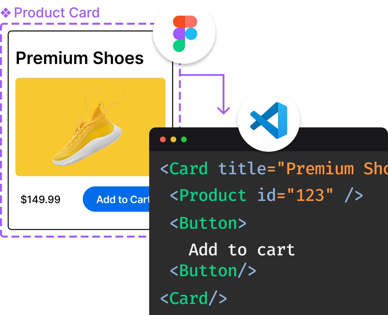
Introducing Visual Copilot: A new AI model to turn Figma designs to high quality code using your components.
Try Visual CopilotREADME
 μPlot
μPlot
A small (~50 KB min), fast chart for time series, lines, areas, ohlc & bars (MIT Licensed)
Introduction
uPlot is a fast, memory-efficient Canvas 2D-based chart for plotting time series, lines, areas, ohlc & bars. From a cold start it can create an interactive chart containing 166,650 data points in 25ms, scaling linearly at ~100,000 pts/ms afterwards. In addition to fast initial render, the zooming and cursor performance is by far the best of any similar charting lib; at ~50 KB, it's likely the smallest and fastest time series plotter that doesn't make use of context-limited WebGL shaders or WASM, both of which have much higher startup cost and code size.
In most sane cases, you can live-stream data with uPlot at 60fps, though it may begin to struggle beyond 100k in-view points. When updating 3,600 points at 60fps, uPlot uses 10% CPU and 12.3MB RAM. The next fastest Canvas-based libs (Chart.js and ECharts) use 40% / 77MB and 70% / 85MB, respectively. If you need to stream, give unclog your rendering pipeline a try. If that does not help, consider reducing the update frequency or switch to a WebGL/WebGPU solution, like danchitnis/webgl-plot, huww98/TimeChart, epezent/implot.

Features
- Multiple series w/toggle
- Multiple y-axes, scales & grids
- Temporal or numeric x-axis
- Linear, uniform or logarithmic scales
- Line & Area styles (stroke, fill, width, dash)
- Pluggable path renderers linear, spline, stepped, bars
- Zoom with auto-rescale
- Legend with live values
- Support for IANA Time Zone Names & DST
- Support for missing data
- Cursor sync for multiple charts
- Focus closest series
- Data streaming (live update)
- High / Low bands
- A lean, consistent, and powerful API with hooks & plugins
Non-Features
In order to stay lean, fast and focused the following features will not be added:
- No data parsing, aggregation, summation or statistical processing - just do it in advance. e.g. simples-statistics, https://github.com/leeoniya/uDSV
- No transitions or animations - they're always pure distractions.
- No collision avoidance for axis tick labels, so may require manual tweaking of spacing metrics if label customization significiantly increases default label widths.
- No stacked series: see "Stacked Area Graphs Are Not Your Friend" and a horrific demo. While smooth spline interpolation is available, its use is strongly discouraged: Your data is misrepresented!. Both visualizations are terrible at accurately communicating information.
- No built-in drag scrolling/panning due to ambiguous native zoom/selection behavior. However, this can be added externally via the plugin/hooks API: zoom-wheel, zoom-touch.
Documentation (WIP)
The docs are a perpetual work in progress, it seems. Start with /docs/README.md for a conceptual overview. The full API is further documented via comments in /dist/uPlot.d.ts. Additionally, an ever-expanding collection of runnable /demos covers the vast majority of uPlot's API.
Third-party Integrations
- React, Vue.js and Svelte (Sergey Kalinichev)
- Python (Stéphane Caron)
Performance
Benchmarks done on this hardware:
- Date: 2023-03-11
- AMD Ryzen 7 PRO 5850U @ 1.9GHz, 32GB RAM
- EndeavourOS/Arch (KDE/Plasma), Chrome 113.0.5638.0 (64-bit)
- 4K display scaled to 1440p (1.5 devicePixelRatio)

Full size: https://leeoniya.github.io/uPlot/demos/multi-bars.html
Raw data: https://github.com/leeoniya/uPlot/blob/master/bench/results.json
| lib                    | size    | done    | js,rend,paint,sys | heap peak,final | mousemove (10s)     |
| ---------------------- | ------- | ------- | ----------------- | --------------- | ------------------- |
| uPlot v1.6.24          | 47.9 KB |   34 ms |   51   2   1   34 |  21 MB   3 MB   |  218  360  146  196 |
| Chart.js v4.2.1        |  254 KB |   38 ms |   90   2   1   40 |  29 MB  10 MB   | 1154   46  165  235 |
| Flot v3.0.0            |  494 KB |   60 ms |  105   5   1   52 |  41 MB  21 MB   | ---                 |
| ECharts v5.4.1         | 1000 KB |   55 ms |  148   3   1   35 |  17 MB   3 MB   | 1943  444  203  208 |
| dygraphs v2.2.1        |  132 KB |   90 ms |  163   2   1   33 |  88 MB  42 MB   | 1438  371  174  268 |
| LightningChart® v4.0.2 | 1300 KB |  --- ms |  250   2   1   33 |  33 MB  13 MB   | 5390  120  128  325 |
| CanvasJS v3.7.5        |  489 KB |  130 ms |  266   4   1   35 |  98 MB  69 MB   | 1030  445   90  246 |
| dvxCharts v5.1.0       |  373 KB |  160 ms |  264  23   1   62 | 100 MB  61 MB   |  687  779  206  197 |
| Highcharts v10.3.3     |  413 KB |  --- ms |  416   7   1   38 |  97 MB  55 MB   | 1286  824  205  242 |
| Plotly.js v2.18.2      | 3600 KB |  310 ms |  655  14   1   40 | 104 MB  70 MB   | 1814  163   25  208 |
| ApexCharts v3.37.1     |  503 KB |  685 ms |  694   9   1   33 | 175 MB  46 MB   | 1708  421  106  207 |
| ZingChart v2.9.10      |  871 KB |  681 ms |  717   7   1  105 | 290 MB 195 MB   | 9021  305   41   71 |
| amCharts v5.3.7        |  625 KB |  --- ms | 1601   3   3   46 | 147 MB 121 MB   | 9171   71  460  167 |
- libs are sorted by their initial, cold-start, render performance (excluding network transfer time to download the lib)
sizeincludes the lib itself plus any dependencies required to render the benchmark, e.g. Moment, jQuery, etc.- Flot does not make available any minified assets and all their examples use the uncompressed sources; they also use an uncompressed version of jQuery :/
Some libraries provide their own performance demos:
- https://echarts.apache.org/next/examples/en/index.html
- https://github.com/sveinn-steinarsson/flot-downsample/
- https://dygraphs.com/tests/dygraph-many-points-benchmark.html
- https://www.chartjs.org/docs/latest/general/performance.html
- https://dash.plotly.com/performance
- https://www.highcharts.com/docs/advanced-chart-features/boost-module
- https://danchitnis.github.io/webgl-plot-examples/vanilla/
- https://huww98.github.io/TimeChart/docs/performance
- https://www.arction.com/lightningchart-js-performance/
TODO (all of these use SVG, so performance should be similar to Highcharts):
- Chartist.js
- d3-based
- C3.js
- dc.js
- MetricsGraphics
- rickshaw
Unclog your rendering pipeline
Your browser's performance is highly dependent on your hardware, operating system, and GPU drivers.
If you're using a Chromium-based browser, there are some hidden settings that can unlock significant performance improvements for Canvas2D rendering. Most of these have to do with where and how the rasterization is performed.
Head over to https://leeoniya.github.io/uPlot/demos/sine-stream.html and open up Chrome's DevTools (F12), then toggle the Performance Monitor.

For me:
- On Windows 10 Desktop, Core i7-8700, 16GB RAM, AMD RX480 GPU, 2048 x 1080 resolution = 57% CPU usage
- On Manjaro Laptop (Arch Linux), AMD Ryzen 7 PRO 5850U, 48GB RAM, AMD Radeon RX Vega 8 (integrated GPU), 4K resolution = 99% CPU usage
If your CPU is close to 100%, it may be rasterizing everything in the same CPU process.
Pop open chrome://gpu and see what's orange or red.

Then open chrome://flags and search for "raster" to see what can be force-enabled.

- On my Manjaro/Ryzen/Integrated GPU setup, force-enabling
Canvas out-of-process rasterizationresulted in a dramatic framerate improvement. - On my Windows/i7/Dedicated GPU setup, toggling the same flags moved the work to another process (still good), but did not have a significant framerate impact.
YMMV!
Acknowledgements
- Dan Vanderkam's dygraphs was a big inspiration; in fact, my stale pull request #948 was a primary motivator for μPlot's inception.
- Adam Pearce for #15 - remove redundant lineTo commands.
Top Related Projects
📊 Interactive JavaScript Charts built on SVG
Simple HTML5 Charts using the <canvas> tag
Bring data to life with SVG, Canvas and HTML. :bar_chart::chart_with_upwards_trend::tada:
Highcharts JS, the JavaScript charting framework
Open-source JavaScript charting library behind Plotly and Dash
JavaScript 3D Library.
Convert  designs to code with AI

Introducing Visual Copilot: A new AI model to turn Figma designs to high quality code using your components.
Try Visual Copilot