 material-components-web
Modular and customizable Material Design UI components for the web
Top Related Projects
The most popular HTML, CSS, and JavaScript framework for developing responsive, mobile first projects on the web.
A utility-first CSS framework for rapid UI development.
Material UI: Comprehensive React component library that implements Google's Material Design. Free forever.
Semantic is a UI component framework based around useful principles from natural language.
The most advanced responsive front-end framework in the world. Quickly create prototypes and production code for sites that work on any kind of device.
A lightweight and modular front-end framework for developing fast and powerful web interfaces
Quick Overview
Material Components for the Web (MDC Web) is an open-source library that provides modular and customizable UI components adhering to Google's Material Design principles. It offers a collection of reusable components for building responsive and accessible web applications with a consistent look and feel across different platforms and devices.
Pros
- Implements Material Design guidelines, ensuring a modern and visually appealing interface
- Modular architecture allows for easy integration of individual components
- Provides accessibility features out of the box
- Supports customization through Sass variables and mixins
Cons
- Learning curve for developers unfamiliar with Material Design concepts
- Some components may require additional JavaScript for full functionality
- Regular updates to match evolving Material Design specifications can lead to breaking changes
- Limited design flexibility compared to building custom components from scratch
Code Examples
- Button component:
<button class="mdc-button">
  <span class="mdc-button__ripple"></span>
  <span class="mdc-button__label">Click me</span>
</button>
- Text field component:
<label class="mdc-text-field mdc-text-field--filled">
  <span class="mdc-text-field__ripple"></span>
  <span class="mdc-floating-label" id="my-label">Username</span>
  <input class="mdc-text-field__input" type="text" aria-labelledby="my-label">
  <span class="mdc-line-ripple"></span>
</label>
- Top app bar component:
<header class="mdc-top-app-bar">
  <div class="mdc-top-app-bar__row">
    <section class="mdc-top-app-bar__section mdc-top-app-bar__section--align-start">
      <button class="material-icons mdc-top-app-bar__navigation-icon mdc-icon-button">menu</button>
      <span class="mdc-top-app-bar__title">My App</span>
    </section>
  </div>
</header>
Getting Started
- Install MDC Web via npm:
npm install @material/web
- Import the desired component's JavaScript and CSS:
import {MDCRipple} from '@material/ripple';
import '@material/button/dist/mdc.button.css';
- Instantiate the component in your JavaScript:
const button = document.querySelector('.mdc-button');
const buttonRipple = new MDCRipple(button);
- Use the component in your HTML as shown in the code examples above.
Competitor Comparisons
The most popular HTML, CSS, and JavaScript framework for developing responsive, mobile first projects on the web.
Pros of Bootstrap
- Extensive documentation and large community support
- Wider browser compatibility, including older versions
- More customizable with a robust theming system
Cons of Bootstrap
- Heavier file size, potentially impacting page load times
- Less adherence to specific design guidelines, leading to potential inconsistency
- Steeper learning curve for advanced customization
Code Comparison
Bootstrap:
<div class="card" style="width: 18rem;">
  <div class="card-body">
    <h5 class="card-title">Card title</h5>
    <p class="card-text">Some quick example text.</p>
    <a href="#" class="btn btn-primary">Go somewhere</a>
  </div>
</div>
Material Components Web:
<div class="mdc-card">
  <div class="mdc-card__primary-action">
    <div class="mdc-card__content">
      <h2 class="mdc-typography--headline6">Card title</h2>
      <p class="mdc-typography--body2">Some quick example text.</p>
    </div>
    <mdc-button raised>Go somewhere</mdc-button>
  </div>
</div>
Both frameworks offer robust component libraries, but Material Components Web adheres more strictly to Material Design principles, while Bootstrap provides more flexibility in design choices. The code examples showcase the different approaches to creating a simple card component, with Bootstrap using utility classes and Material Components Web using more semantic class names.
A utility-first CSS framework for rapid UI development.
Pros of Tailwind CSS
- Highly customizable and flexible, allowing for rapid UI development
- Smaller file size and better performance due to its utility-first approach
- Extensive documentation and active community support
Cons of Tailwind CSS
- Steeper learning curve for developers accustomed to traditional CSS frameworks
- Can lead to longer class names and potentially cluttered HTML markup
- Less opinionated design system compared to Material Design
Code Comparison
Material Components Web:
<button class="mdc-button mdc-button--raised">
  <span class="mdc-button__label">Button</span>
</button>
Tailwind CSS:
<button class="bg-blue-500 hover:bg-blue-700 text-white font-bold py-2 px-4 rounded">
  Button
</button>
Both frameworks offer different approaches to styling components. Material Components Web provides pre-designed components adhering to Material Design principles, while Tailwind CSS offers utility classes for building custom designs quickly. The choice between them depends on project requirements, team preferences, and design goals.
Material UI: Comprehensive React component library that implements Google's Material Design. Free forever.
Pros of Material-UI
- More comprehensive component library with a wider range of pre-built components
- Better documentation and community support, making it easier for developers to get started
- Stronger TypeScript support and integration
Cons of Material-UI
- Larger bundle size, which may impact performance for smaller projects
- Steeper learning curve due to its extensive API and customization options
- Less adherence to Material Design guidelines compared to Material Components Web
Code Comparison
Material-UI:
import Button from '@mui/material/Button';

function App() {
  return <Button variant="contained">Hello World</Button>;
}
Material Components Web:
import { MDCRipple } from '@material/ripple';

const button = document.querySelector('.mdc-button');
const buttonRipple = new MDCRipple(button);
Material-UI offers a more React-centric approach with component imports, while Material Components Web requires more manual setup and initialization of components. Material-UI's approach is generally more convenient for React developers, but Material Components Web provides more granular control over component behavior and styling.
Semantic is a UI component framework based around useful principles from natural language.
Pros of Semantic-UI
- More extensive set of UI components and themes out-of-the-box
- Easier to customize with intuitive class naming conventions
- Better documentation and community support
Cons of Semantic-UI
- Larger file size, which may impact page load times
- Less frequent updates and maintenance compared to Material Components Web
- Not as closely aligned with Material Design principles
Code Comparison
Semantic-UI button:
<button class="ui primary button">
  Click me
</button>
Material Components Web button:
<button class="mdc-button mdc-button--raised">
  <span class="mdc-button__label">Click me</span>
</button>
Both frameworks offer easy-to-use class-based styling, but Semantic-UI's approach is more intuitive and requires less markup. Material Components Web follows the Material Design guidelines more closely, which may be preferable for projects aiming for a Google-like look and feel.
Semantic-UI's development has slowed down in recent years, while Material Components Web is actively maintained by Google. However, Semantic-UI's extensive component library and theming system make it a popular choice for rapid prototyping and projects that require a wide range of UI elements out-of-the-box.
The most advanced responsive front-end framework in the world. Quickly create prototypes and production code for sites that work on any kind of device.
Pros of Foundation
- More flexible and customizable, allowing for greater design freedom
- Extensive documentation and community support
- Includes built-in accessibility features
Cons of Foundation
- Steeper learning curve for beginners
- Less consistent with Material Design principles
- Larger file size, potentially impacting performance
Code Comparison
Foundation:
@include foundation-global-styles;
@include foundation-grid;
@include foundation-typography;
@include foundation-button;
@include foundation-forms;
Material Components Web:
@use "@material/button";
@use "@material/card";
@use "@material/typography";

@include button.core-styles;
@include card.core-styles;
@include typography.core-styles;
Foundation uses a more modular approach, allowing developers to include only the components they need. Material Components Web follows a similar pattern but with a different syntax.
Both frameworks offer a wide range of UI components and utilities, but Foundation provides more flexibility in terms of customization. Material Components Web adheres more strictly to Google's Material Design guidelines, ensuring a consistent look and feel across projects.
While Foundation has been around longer and has a larger community, Material Components Web benefits from Google's backing and integration with other Material Design tools and resources.
A lightweight and modular front-end framework for developing fast and powerful web interfaces
Pros of UIkit
- Lightweight and modular, allowing for easy customization
- Extensive documentation and examples for quick implementation
- Built-in JavaScript functionality for interactive components
Cons of UIkit
- Less brand recognition compared to Material Design
- Smaller community and ecosystem
- May require more custom styling for a unique look
Code Comparison
UIkit:
<div class="uk-card uk-card-default">
    <div class="uk-card-header">
        <h3 class="uk-card-title">Card Title</h3>
    </div>
    <div class="uk-card-body">
        <p>Card content</p>
    </div>
</div>
Material Components Web:
<div class="mdc-card">
    <div class="mdc-card__primary-action">
        <div class="mdc-card__content">
            <h2 class="mdc-typography--headline6">Card Title</h2>
            <p class="mdc-typography--body2">Card content</p>
        </div>
    </div>
</div>
Both frameworks offer component-based structures for creating UI elements. UIkit uses a more straightforward class naming convention, while Material Components Web follows a more specific naming scheme aligned with Material Design principles. The code examples demonstrate how to create a basic card component in each framework, highlighting the differences in class names and structure.
Convert  designs to code with AI

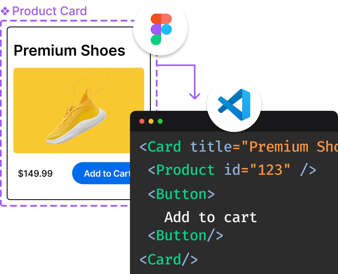
Introducing Visual Copilot: A new AI model to turn Figma designs to high quality code using your components.
Try Visual CopilotREADME
Note:
This project is no longer actively maintained. While automated updates may still occur, the team will not be prioritizing new features or bug fixes, and those updates will be turned off in the future.
For Angular users, our friends at Angular Material moved away from this library, and they expect that this may actually allow for faster iteration - see their blog post for more information.
Material Components for the web
Material Components for the web helps developers execute Material Design. Developed by a core team of engineers and UX designers at Google, these components enable a reliable development workflow to build beautiful and functional web projects.
Material Web strives to seamlessly incorporate into a wider range of usage contexts, from simple static websites to complex, JavaScript-heavy applications to hybrid client/server rendering systems. In short, whether you're already heavily invested in another framework or not, it should be easy to incorporate Material Components into your site in a lightweight, idiomatic fashion.
Material Components for the web is the successor to Material Design Lite. In addition to implementing the Material Design guidelines, it provides more flexible theming customization, not only in terms of color, but also typography, shape, states, and more. It is also specifically architected for adaptability to various major web frameworks.
NOTE: Material Components Web tends to release breaking changes on a monthly basis, but follows semver so you can control when you incorporate them. We typically follow a 2-week release schedule which includes one major release per month with breaking changes, and intermediate patch releases with bug fixes.
Important links
- Getting Started Guide
- Demos (external site)
- Material on other frameworks
- Examples using Material Web
- Contributing
- Material Design Guidelines (external site)
- Supported browsers
- All Components
- Changelog
Quick start
Using via CDN
<!-- Required styles for Material Web -->
<link rel="stylesheet" href="https://unpkg.com/material-components-web@latest/dist/material-components-web.min.css">

<!-- Render textfield component -->
<label class="mdc-text-field mdc-text-field--filled">
  <span class="mdc-text-field__ripple"></span>
  <span class="mdc-floating-label" id="my-label">Label</span>
  <input type="text" class="mdc-text-field__input" aria-labelledby="my-label">
  <span class="mdc-line-ripple"></span>
</label>

<!-- Required Material Web JavaScript library -->
<script src="https://unpkg.com/material-components-web@latest/dist/material-components-web.min.js"></script>
<!-- Instantiate single textfield component rendered in the document -->
<script>
  mdc.textField.MDCTextField.attachTo(document.querySelector<HTMLElement>('.mdc-text-field'));
</script>
Please see quick start demo on codepen for full example.
Using NPM
This guide assumes you have webpack configured to compile Sass into CSS. To configure webpack, please see the full getting started guide. You can also see the final code and result in the Material Starter Kit.
Install textfield node module to your project.
npm install @material/textfield
HTML
Sample usage of text field component. Please see Textfield component page for more options.
<label class="mdc-text-field mdc-text-field--filled">
  <span class="mdc-text-field__ripple"></span>
  <input type="text" class="mdc-text-field__input" aria-labelledby="my-label">
  <span class="mdc-floating-label" id="my-label">Label</span>
  <span class="mdc-line-ripple"></span>
</label>
CSS
Load styles required for text field component.
@use "@material/floating-label/mdc-floating-label";
@use "@material/line-ripple/mdc-line-ripple";
@use "@material/notched-outline/mdc-notched-outline";
@use "@material/textfield";

@include textfield.core-styles;
JavaScript
Import MDCTextField module to instantiate text field component.
import {MDCTextField} from '@material/textfield';
const textField = new MDCTextField(document.querySelector<HTMLElement>('.mdc-text-field'));
This'll initialize text field component on a single .mdc-text-field element.
Please see quick start demo on glitch for full example.
Need help?
We're constantly trying to improve our components. If Github Issues don't fit your needs, then please visit us on our Discord Channel.
Top Related Projects
The most popular HTML, CSS, and JavaScript framework for developing responsive, mobile first projects on the web.
A utility-first CSS framework for rapid UI development.
Material UI: Comprehensive React component library that implements Google's Material Design. Free forever.
Semantic is a UI component framework based around useful principles from natural language.
The most advanced responsive front-end framework in the world. Quickly create prototypes and production code for sites that work on any kind of device.
A lightweight and modular front-end framework for developing fast and powerful web interfaces
Convert  designs to code with AI

Introducing Visual Copilot: A new AI model to turn Figma designs to high quality code using your components.
Try Visual Copilot
