 Android-Iconics
Android-Iconics - Use any icon font, or vector (.svg) as drawable in your application.
Top Related Projects

Material Design icons by Google (Material Symbols)

Android integration of multiple icon providers such as FontAwesome, Entypo, Typicons,...

😍 A beautiful, fluid, and extensible dialogs API for Kotlin & Android.

Custom fonts in Android the easy way...

A support library for VectorDrawable and AnimatedVectorDrawable classes introduced in Lollipop

This light-weight library provides images with letter/text like the Gmail app. It extends the Drawable class thus can be used with existing/custom/network ImageView classes. Also included is a fluent interface for creating drawables and a customizable ColorGenerator.
Quick Overview
Android-Iconics is a powerful library for integrating vector icons into Android applications. It provides a unified way to use various icon fonts, including custom ones, and allows for easy customization of icons in terms of size, color, and style. This library simplifies the process of adding and managing icons in Android projects.
Pros
- Supports a wide range of icon fonts and custom icon sets
- Easy integration and customization of icons
- Reduces app size by using vector icons instead of multiple PNG assets
- Provides a consistent API for working with different icon types
Cons
- May have a slight learning curve for developers new to icon fonts
- Requires additional setup compared to using built-in Android drawables
- Performance impact might be noticeable with a large number of icons on screen
- Limited support for complex multi-color icons
Code Examples
- Adding an icon to a TextView:
IconicsDrawable(this, FontAwesome.Icon.faw_android).apply {
    colorInt = Color.RED
    sizeDp = 24
}.let { icon ->
    textView.setCompoundDrawablesWithIntrinsicBounds(icon, null, null, null)
}
- Creating a menu item with an icon:
menu.add("Home").apply {
    icon = IconicsDrawable(context, GoogleMaterial.Icon.gmd_home)
}
- Using icons in XML layouts:
<IconicsTextView
    android:layout_width="wrap_content"
    android:layout_height="wrap_content"
    android:text="Home {gmd-home}"
    app:iiv_color="@android:color/black"
    app:iiv_icon="gmd-home" />
Getting Started
- Add the dependency to your
build.gradlefile:
implementation 'com.mikepenz:iconics-core:5.3.4'
implementation 'com.mikepenz:iconics-views:5.3.4'
implementation 'com.mikepenz:community-material-typeface:6.4.95.0-kotlin@aar'
- Initialize the library in your Application class:
class MyApplication : Application() {
    override fun onCreate() {
        super.onCreate()
        Iconics.init(applicationContext)
        Iconics.registerFont(CommunityMaterial)
    }
}
- Use icons in your app:
val icon = IconicsDrawable(this, CommunityMaterial.Icon.cmd_android)
imageView.setImageDrawable(icon)
Competitor Comparisons
Material Design icons by Google (Material Symbols)
Pros of Material Design Icons
- Official Google design system, ensuring consistency with Android and Google products
- Extensive icon set covering a wide range of use cases
- Regular updates and additions to the icon library
Cons of Material Design Icons
- Limited customization options for icons within the library
- Requires manual integration and management in Android projects
- Larger file size due to comprehensive icon set
Code Comparison
Material Design Icons:
<ImageView
    android:layout_width="24dp"
    android:layout_height="24dp"
    android:src="@drawable/ic_favorite" />
Android-Iconics:
IconicsDrawable(this, FontAwesome.Icon.faw_heart).apply {
    colorInt = Color.RED
    sizeDp = 24
}
Android-Iconics offers a more programmatic approach to icon management, allowing for easier customization and dynamic icon creation. Material Design Icons, on the other hand, relies on traditional Android resource management.
Android-Iconics provides a unified API for multiple icon packs, enabling developers to easily switch between different icon sets. Material Design Icons is focused solely on Google's design language, which may limit flexibility for projects requiring diverse icon styles.
While Material Design Icons ensures consistency with Google's design principles, Android-Iconics offers greater versatility and ease of use for developers who need to work with various icon libraries or require more dynamic icon manipulation in their Android applications.
Android integration of multiple icon providers such as FontAwesome, Entypo, Typicons,...
Pros of android-iconify
- Simpler API and easier integration for basic icon usage
- Supports custom fonts and icon packs out of the box
- Smaller library size, potentially reducing app bloat
Cons of android-iconify
- Less flexibility in customizing icons programmatically
- Fewer built-in icon sets compared to Android-Iconics
- Limited support for advanced features like icon animations
Code Comparison
android-iconify:
IconDrawable iconDrawable = new IconDrawable(this, FontAwesome.Icon.fa_android)
    .colorRes(R.color.primary)
    .sizeDp(24);
imageView.setImageDrawable(iconDrawable);
Android-Iconics:
IconicsDrawable iconDrawable = new IconicsDrawable(this)
    .icon(FontAwesome.Icon.faw_android)
    .color(ContextCompat.getColor(this, R.color.primary))
    .sizeDp(24);
imageView.setImageDrawable(iconDrawable);
Both libraries offer similar basic functionality for displaying icons, but Android-Iconics provides more advanced customization options and a wider range of icon sets. android-iconify is simpler to use for basic icon integration, while Android-Iconics offers greater flexibility for complex icon manipulations and animations. The choice between the two depends on the specific requirements of your project and the level of icon customization needed.
😍 A beautiful, fluid, and extensible dialogs API for Kotlin & Android.
Pros of material-dialogs
- Comprehensive set of pre-built dialog types for various use cases
- Extensive customization options for dialog appearance and behavior
- Active development and community support
Cons of material-dialogs
- Larger library size compared to Android-Iconics
- Steeper learning curve due to more complex API
Code Comparison
material-dialogs:
MaterialDialog(this).show {
    title(R.string.dialog_title)
    message(R.string.dialog_message)
    positiveButton(R.string.agree)
    negativeButton(R.string.disagree)
}
Android-Iconics:
IconicsDrawable(this)
    .icon(FontAwesome.Icon.faw_android)
    .color(ContextCompat.getColor(this, R.color.md_blue_500))
    .sizeDp(24)
material-dialogs focuses on creating and customizing dialogs, while Android-Iconics specializes in icon management and rendering. The code snippets demonstrate their primary use cases: material-dialogs for creating dialogs with various options, and Android-Iconics for generating icon drawables.
material-dialogs is more suitable for projects requiring extensive dialog functionality, while Android-Iconics is ideal for projects needing flexible icon management across the app. The choice between the two depends on the specific requirements of your Android project.
Custom fonts in Android the easy way...
Pros of Calligraphy
- Focuses specifically on custom fonts, making it simpler for font-related tasks
- Allows for easy application of custom fonts to entire views or activities
- Integrates seamlessly with XML layouts, reducing the need for programmatic font setting
Cons of Calligraphy
- Limited to font customization, lacking support for icons and other graphical elements
- May require more setup for complex font hierarchies or dynamic font changes
- Less actively maintained compared to Android-Iconics
Code Comparison
Calligraphy:
<TextView
    android:layout_width="wrap_content"
    android:layout_height="wrap_content"
    android:text="Custom Font Text"
    fontPath="fonts/MyCustomFont.ttf" />
Android-Iconics:
<IconicsTextView
    android:layout_width="wrap_content"
    android:layout_height="wrap_content"
    android:text="{faw-android} Custom Icon and Text"
    app:iiv_icon="faw-android" />
Both libraries offer easy integration with XML layouts, but Android-Iconics provides more flexibility for combining icons and text, while Calligraphy focuses solely on custom fonts. Android-Iconics offers a wider range of customization options, including icon color, size, and positioning, making it more versatile for complex UI designs.
A support library for VectorDrawable and AnimatedVectorDrawable classes introduced in Lollipop
Pros of vector-compat
- Specifically designed for backward compatibility of vector drawables
- Simpler implementation for basic vector drawable support
- Lighter weight library focused on a single purpose
Cons of vector-compat
- Limited to vector drawable support only
- Less actively maintained compared to Android-Iconics
- Fewer customization options for icons
Code Comparison
vector-compat:
VectorDrawableCompat.create(getResources(), R.drawable.ic_vector, getTheme());
Android-Iconics:
new IconicsDrawable(this)
    .icon(FontAwesome.Icon.faw_android)
    .color(Color.RED)
    .sizeDp(24);
Summary
vector-compat is a focused library for adding vector drawable support to older Android versions. It's simpler to use for basic vector drawable needs but lacks the extensive customization options of Android-Iconics.
Android-Iconics offers a more comprehensive icon solution with support for multiple icon fonts, extensive customization, and active development. It's better suited for projects requiring diverse icon options and advanced styling.
Choose vector-compat for straightforward vector drawable compatibility, or Android-Iconics for a feature-rich icon management system with broader capabilities.
This light-weight library provides images with letter/text like the Gmail app. It extends the Drawable class thus can be used with existing/custom/network ImageView classes. Also included is a fluent interface for creating drawables and a customizable ColorGenerator.
Pros of TextDrawable
- Lightweight and focused on generating text-based drawables
- Simple API for creating letter/text avatars with customizable colors
- Supports both rectangular and circular shapes for drawables
Cons of TextDrawable
- Limited to text-based drawables, lacks support for vector icons
- Less flexibility in terms of customization options
- Not actively maintained (last update was several years ago)
Code Comparison
TextDrawable:
TextDrawable drawable = TextDrawable.builder()
    .buildRound("A", Color.RED);
imageView.setImageDrawable(drawable);
Android-Iconics:
IconicsDrawable drawable = new IconicsDrawable(this)
    .icon(FontAwesome.Icon.faw_android)
    .color(Color.RED)
    .size(24);
imageView.setImageDrawable(drawable);
TextDrawable focuses on creating simple text-based drawables, while Android-Iconics provides a more comprehensive solution for using vector icons and fonts in Android applications. Android-Iconics offers a wider range of customization options and supports multiple icon libraries, making it more versatile for complex icon requirements. However, TextDrawable may be preferred for simpler use cases where only text-based avatars are needed, due to its straightforward API and lightweight nature.
Convert  designs to code with AI

Introducing Visual Copilot: A new AI model to turn Figma designs to high quality code using your components.
Try Visual CopilotREADME
Android-Iconics
... allows to include any icon font with all its vector icons in your project. No limits. Scale with no limit, use any color at any time, provide a contour, and many additional customizations...
What's included ð • Setup ð ï¸ • Migration Guide 𧬠• WIKI / FAQ ð • Custom Font ðï¸ • Sample App
What's included ð
- No customization limitations (size, color, contour, background, padding, positioning, ...)
- Shadow support
- Use as XML Drawable starting API 24
- One icon source (no more mdpi, hdpi, ...)
- Flexibility
- Size
- Colors
- Contour
- Shadow
- Auto mirroring for RTL (opt-in)
- If it takes a Drawable, it will also work with the IconicsDrawable!
- Save in APK size
- Compose support
Already available fonts
- Google Material Design Icons
- Material Design Iconic Font
- Fontawesome
- Meteocons
- Octicons
- Community Material
- Weather Icons
- Typeicons
- Entypo
- Devicon
- Foundation Icons
- Ionicons
- Material Design DX
- Pixeden 7 Stroke
- Phosphor
- Simple Icons
- Or create your own font with any icon needed.
Setup
Latest releases ð
- Kotlin | v5.4.0
- Pre-Release | v5.5.0-b01
1. Provide the gradle dependency
dependencies {
    //the core iconics library (without any widgets)
    implementation "com.mikepenz:iconics-core:${latestAndroidIconicsRelease}"
    implementation "androidx.appcompat:appcompat:${versions.appCompat}"
}
1b. (optional) Add the view's dependency
//this adds all ui view widgets (IconicsButton, IconicsImageView, ...)
implementation "com.mikepenz:iconics-views:${latestAndroidIconicsRelease}"
2. Choose your desired fonts
[!NOTE] Fonts ending with
-kotlinrequire at least v4.x of Android-Iconics v5.1.x or newer requires the latest font versions
implementation 'com.mikepenz:google-material-typeface:4.0.0.3-kotlin@aar'
implementation 'com.mikepenz:google-material-typeface-{outlined|rounded|sharp}:4.0.0.2-kotlin@aar'
implementation 'com.mikepenz:material-design-iconic-typeface:2.2.0.9-kotlin@aar'
implementation 'com.mikepenz:fontawesome-typeface:5.9.0.3-kotlin@aar'
implementation 'com.mikepenz:octicons-typeface:11.1.0.1-kotlin@aar'
implementation 'com.mikepenz:meteocons-typeface:1.1.0.8-kotlin@aar'
implementation 'com.mikepenz:community-material-typeface:7.0.96.1-kotlin@aar' // note 5.3.45.1 and newer alphabetically sorts, and merges in 3 sections
implementation 'com.mikepenz:weather-icons-typeface:2.0.10.8-kotlin@aar'
implementation 'com.mikepenz:typeicons-typeface:2.0.7.8-kotlin@aar'
implementation 'com.mikepenz:entypo-typeface:1.0.0.8-kotlin@aar'
implementation 'com.mikepenz:devicon-typeface:2.0.0.8-kotlin@aar'
implementation 'com.mikepenz:foundation-icons-typeface:3.0.0.8-kotlin@aar'
implementation 'com.mikepenz:ionicons-typeface:2.0.1.8-kotlin@aar'
implementation 'com.mikepenz:pixeden-7-stroke-typeface:1.2.0.6-kotlin@aar'
implementation 'com.mikepenz:material-design-icons-dx-typeface:5.0.1.3-kotlin@aar'
implementation 'com.mikepenz:phosphor-typeface:1.0.0.1-kotlin@aar'
implementation 'com.mikepenz:simple-icons-typeface:17.0.0.3@aar'
[!NOTE] For users of the version catalog, it is not possible to add the type, however you can do so via the implementation definition.
implementation(libs.material.typeface) { artifact { type = "aar" } }
[!WARNING]
The fonts use thejetpack startuplibrary to automatically register themselves. Ifjetpack startupis disabled, it is required to manually register the fonts. Please find additional details in the Register fonts.
Usage
[!NOTE]
It might be required to callIconics.init(applicationContext)if no context based APIs are used from the library otherwise.
Use as drawable
IconicsDrawable(this, FontAwesome.Icon.faw_android).apply {
    colorInt = Color.RED
    sizeDp = 24
}
Use via XML
If you use the Iconics library via XML provide the icon you want to use in the following syntax: gmd-favorite --> fontId-iconName. A list of the
available fonts and their fontId can be found here.
All icon names from the default fonts can be found via the DEMO application.
Notation within text
Use the { icon-definer } syntax
Some great text with a {faw-android} font awesome icon and {met-wind} meteocons icons.
Drawable XML (API 24+)
Specify the drawable in your drawable folder.
<com.mikepenz.iconics.IconicsDrawable
    xmlns:app="http://schemas.android.com/apk/res-auto"
    app:ico_icon="gmd_favorite"
    app:ico_color="#0000FF"
    app:ico_contour_width="1dp"
    app:ico_contour_color="#00FFFF"
    app:ico_size="24dp" />
    // all custom theming attributes supported
Use like any normal drawable in your application. This feature was suggested and initially provided by @dzamlo
Custom Views
As IconicsImageView
<com.mikepenz.iconics.view.IconicsImageView
    android:layout_width="72dp"
    android:layout_height="72dp"
    app:iiv_color="@android:color/holo_red_dark"
    app:iiv_icon="gmd-favorite" />  // or @string/gmd_favorite with our generator
    //app:iiv_size="12dp"
    //app:iiv_padding="2dp"
    //app:iiv_contour_color="#FF0000"
    //app:iiv_contour_width="2dp"
    //app:iiv_background_color="#FFFF00"
    //app:iiv_corner_radius="2dp"
    //app:iiv_background_contour_color="#FF0000"
    //app:iiv_background_contour_width="1dp"
    //app:iiv_shadow_radius="4dp"
    //app:iiv_shadow_dx="1dp"
    //app:iiv_shadow_dy="1dp"
    //app:iiv_animations="spin|blink_alpha|blink_scale"
As IconicsTextView
<com.mikepenz.iconics.view.IconicsTextView
    android:text="abc{hif-test}defgh{faw-adjust}ijk{fon-test1}lmnopqrstuv{fon-test2}wxyz"
    android:textColor="@android:color/black"
    android:layout_width="wrap_content"
    android:layout_height="56dp"
    android:textSize="16sp"/>
As IconicsButton
<com.mikepenz.iconics.view.IconicsButton
    android:text="{faw-adjust} Button"
    android:layout_width="120dp"
    android:layout_height="60dp"/>
Compose
To include the experimental compose support in your project add the following dependency to your project (since v5.2.0)
implementation "com.mikepenz:iconics-compose:${latestAndroidIconicsRelease}"
Use the provided Image wrapper and set the icon.
Image(
    GoogleMaterial.Icon.gmd_access_alarm,
    colorFilter = ColorFilter.tint(MaterialTheme.colors.primary),
)
Screenshots
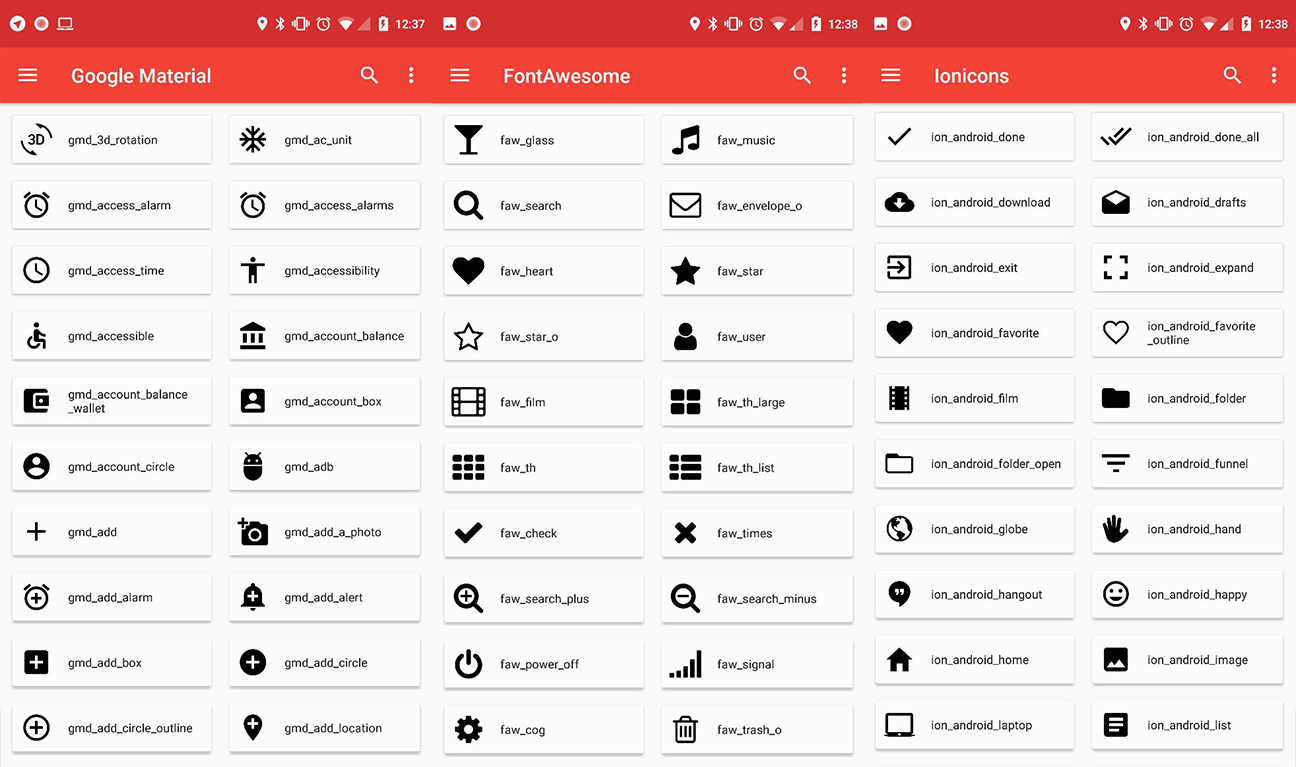
Available fonts
| Link | Prefix | Dependency |
|---|---|---|
| Google Material Design Icons **ORIGINAL by | ||
| Google** | gmd,gmo,gmr,gms | implementation 'com.mikepenz:google-material-typeface{-outlined,rounded,sharp}:+@aar' |
| Material Design Iconic Font **Google Material | ||
| Iconic** | gmi | implementation 'com.mikepenz:material-design-iconic-typeface:+@aar' |
| Fontawesome | faw | implementation 'com.mikepenz:fontawesome-typeface:+@aar' |
| FontawesomeBrand | fab | implementation 'com.mikepenz:fontawesome-typeface:+@aar' |
| FontawesomeRegular | far | implementation 'com.mikepenz:fontawesome-typeface:+@aar' |
| Meteocons | met | implementation 'com.mikepenz:meteocons-typeface:+@aar' |
| Octicons | oct | implementation 'com.mikepenz:octicons-typeface:+@aar' |
| Community Material | cmd | implementation 'com.mikepenz:community-material-typeface:+@aar' |
| Weather Icons | wic | implementation 'com.mikepenz:weather-icons-typeface:+@aar' |
| Typeicons | typ | implementation 'com.mikepenz:typeicons-typeface:+@aar' |
| Entypo | ent | implementation 'com.mikepenz:entypo-typeface:+@aar' |
| Devicon | dev | implementation 'com.mikepenz:devicon-typeface:+@aar' |
| Foundation Icons | fou | implementation 'com.mikepenz:foundation-icons-typeface:+@aar' |
| Ionicons | ion | implementation 'com.mikepenz:ionicons-typeface:+@aar' |
| Pixden7Stroke | pe7 | implementation 'com.mikepenz:pixeden-7-stroke-typeface:+@aar' |
| Material Design DX | cmf | implementation 'com.mikepenz:material-design-icons-dx-typeface:+@aar' |
| Phosphor Icons | pho | implementation 'com.mikepenz:phosphor-typeface:+@aar' |
| Simple Icons | sim | implementation 'com.mikepenz:simple-icons-typeface:+@aar' |
Licenses for all included fonts are linked inside the class or can be found on the coresponding repositories.
Compatibility Note
appcompat:1.4.x
Appcompat v1.4.x introduces default enabled emoji support into all AppCompat* views, which prevents the IconicsView* views (iconics-views module) from properly applying the spannable style.
To fix this problem, emoji support has to be disabled by doing:
app:emojiCompatEnabled="false"
More information on the appcompat emoji support: https://developer.android.com/jetpack/androidx/releases/appcompat#1.4.0-alpha01
Advanced Usage
Register fonts
If you want to add your own custom font, or a GenericFont you have to register this font (before using it). The best place to do this is the Application.
And initialize Iconics as you wish
class CustomApplication : Application() {
    override fun onCreate() {
        super.onCreate()

        //register custom fonts like this (or also provide a font definition file)
        Iconics.registerFont(CustomFont())
    }
}
Advanced IconicsBuilder
Everything is easy and simple. Right? But now you got a single icon within your textview and you need additional styling? Just define the style for all icons or only a specific one. You can find this in the PlaygroundActivity of the sample too.
Iconics.Builder()
    .style(ForegroundColorSpan(Color.WHITE), BackgroundColorSpan(Color.BLACK), RelativeSizeSpan(2f))
    .styleFor(FontAwesome.Icon.faw_adjust, BackgroundColorSpan(Color.RED))
    .on(tv1)
    .build()
String icon-key or typeface enum
Sometimes you won't like to use the icon-key ("faw-adjust") like this, but use the enum provided by a specific font. Both is valid:
IconicsDrawable(this, "faw-adjust").actionBar()
IconicsDrawable(this, FontAwesome.Icon.faw_adjust).apply {
    sizeDp = 24
    paddingDp = 1
}
Create custom fonts
This is possible with only the *.ttf and *.css mapping file. And will take you 2 minutes.
You can get these two files by downloading a web icon font, or if you want to create your own custom icon font from *.svg files then you can use following tools:
After you got those two files, head over to the icon addon creation tool android-iconics.mikepenz.com. Enter all the information. Add the *.ttf and *.css and click the button. It will generate and download the icon font addon as zip. (this tool is local only, no files are sent to a server, you can safely use it with any icons)
String fields for icons
For generating string field for each of icons of your font, you can use this simple generator: Android-Iconics String Generator
Android module generator
A awesome gradle plugin which can automatically fetch a font from Fontastic, and generate the Android Module for your project. Iconics-Font-Generator
ProGuard / R8
ProGuard / R8 rules are bundled internally with each font.
Special Contributor
- Baptiste Lagache Thanks for the gradle font module generator
- Also thanks for all the other contributors.
Credits
- Joan Zapata He is the creator of Android-Iconify which gave me the idea of this project. Some core concepts and ideas were reused, but everything is written from scratch.
- Christopher Jenkins Thanks for the great usage of a custom
ContextWrapperinside Calligraphy - Stephan Schober
Developed By
-
Mike Penz
-
Peter Gulko
License
Copyright 2021 Mike Penz

Licensed under the Apache License, Version 2.0 (the "License");
you may not use this file except in compliance with the License.
You may obtain a copy of the License at

   http://www.apache.org/licenses/LICENSE-2.0

Unless required by applicable law or agreed to in writing, software
distributed under the License is distributed on an "AS IS" BASIS,
WITHOUT WARRANTIES OR CONDITIONS OF ANY KIND, either express or implied.
See the License for the specific language governing permissions and
limitations under the License.
Top Related Projects
Material Design icons by Google (Material Symbols)
Android integration of multiple icon providers such as FontAwesome, Entypo, Typicons,...
😍 A beautiful, fluid, and extensible dialogs API for Kotlin & Android.
Custom fonts in Android the easy way...
A support library for VectorDrawable and AnimatedVectorDrawable classes introduced in Lollipop
This light-weight library provides images with letter/text like the Gmail app. It extends the Drawable class thus can be used with existing/custom/network ImageView classes. Also included is a fluent interface for creating drawables and a customizable ColorGenerator.
Convert designs to code with AI
Introducing Visual Copilot: A new AI model to turn Figma designs to high quality code using your components.
Try Visual Copilot