 material-dialogs
😍 A beautiful, fluid, and extensible dialogs API for Kotlin & Android.
Top Related Projects

[DEPRECATED] A fast PDF reader component for Android development

:octocat: 📃 FoldingCell is a material design expanding content cell inspired by folding paper material made by @Ramotion

An Android Animation library which easily add itemanimator to RecyclerView items.

A powerful 🚀 Android chart view / graph view library, supporting line- bar- pie- radar- bubble- and candlestick charts as well as scaling, panning and animations.

A circular ImageView for Android

Image Cropping Library for Android
Quick Overview
Material Dialogs is a popular Android library that provides a set of customizable, Material Design-compliant dialog components. It offers an extensive range of dialog types and configurations, making it easier for developers to create consistent and visually appealing dialogs in their Android applications.
Pros
- Extensive customization options for dialog appearance and behavior
- Follows Material Design guidelines for a modern, cohesive look
- Supports both Kotlin and Java
- Regular updates and active community support
Cons
- Large library size may increase app size
- Learning curve for advanced customizations
- Some features require additional dependencies
- May not be necessary for simple dialog requirements
Code Examples
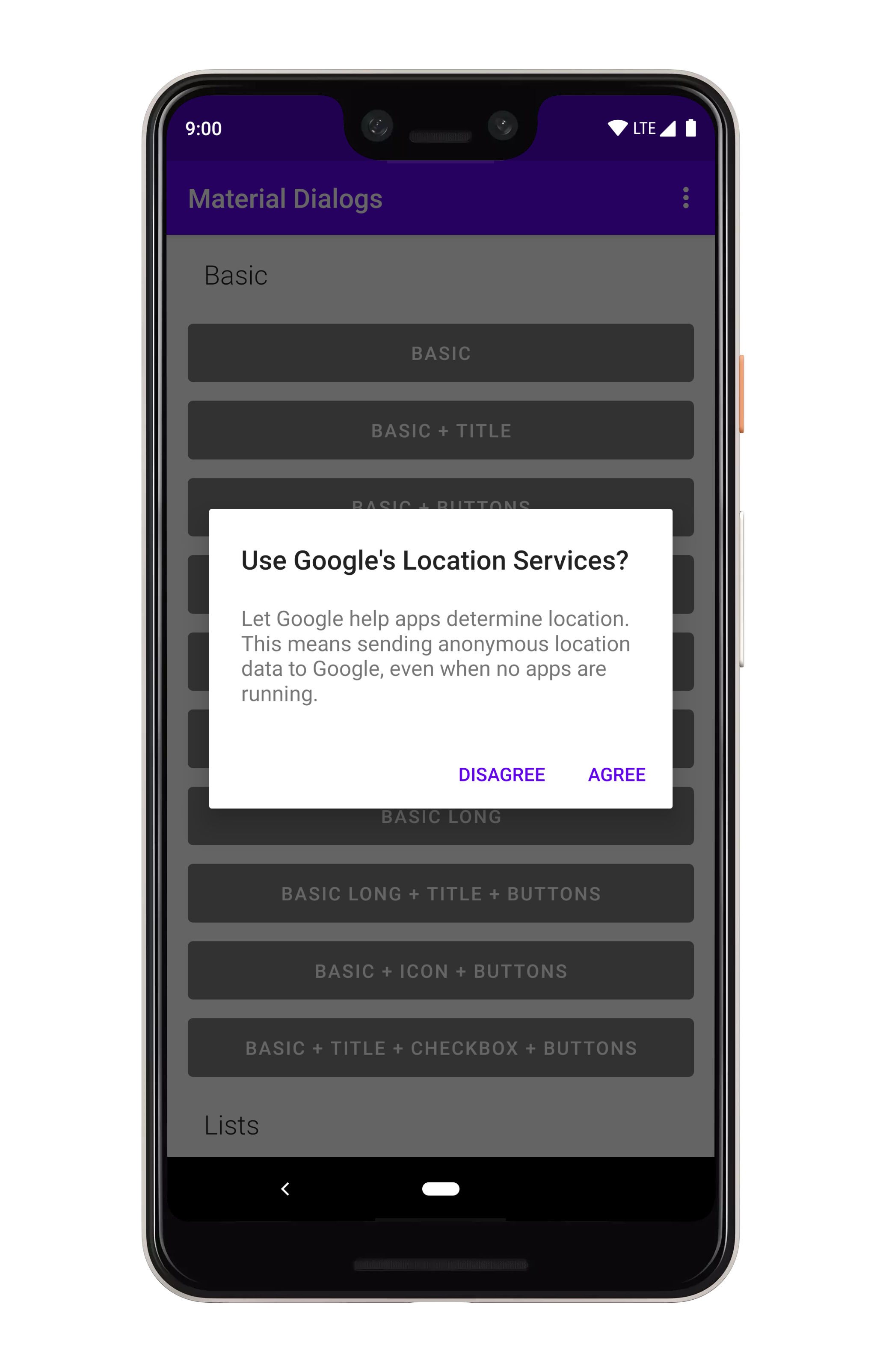
- Basic alert dialog:
MaterialDialog(this).show {
    title(R.string.dialog_title)
    message(R.string.dialog_message)
    positiveButton(R.string.agree)
    negativeButton(R.string.disagree)
}
- List dialog:
MaterialDialog(this).show {
    listItems(R.array.items) { dialog, index, text ->
        // Handle item selection
    }
}
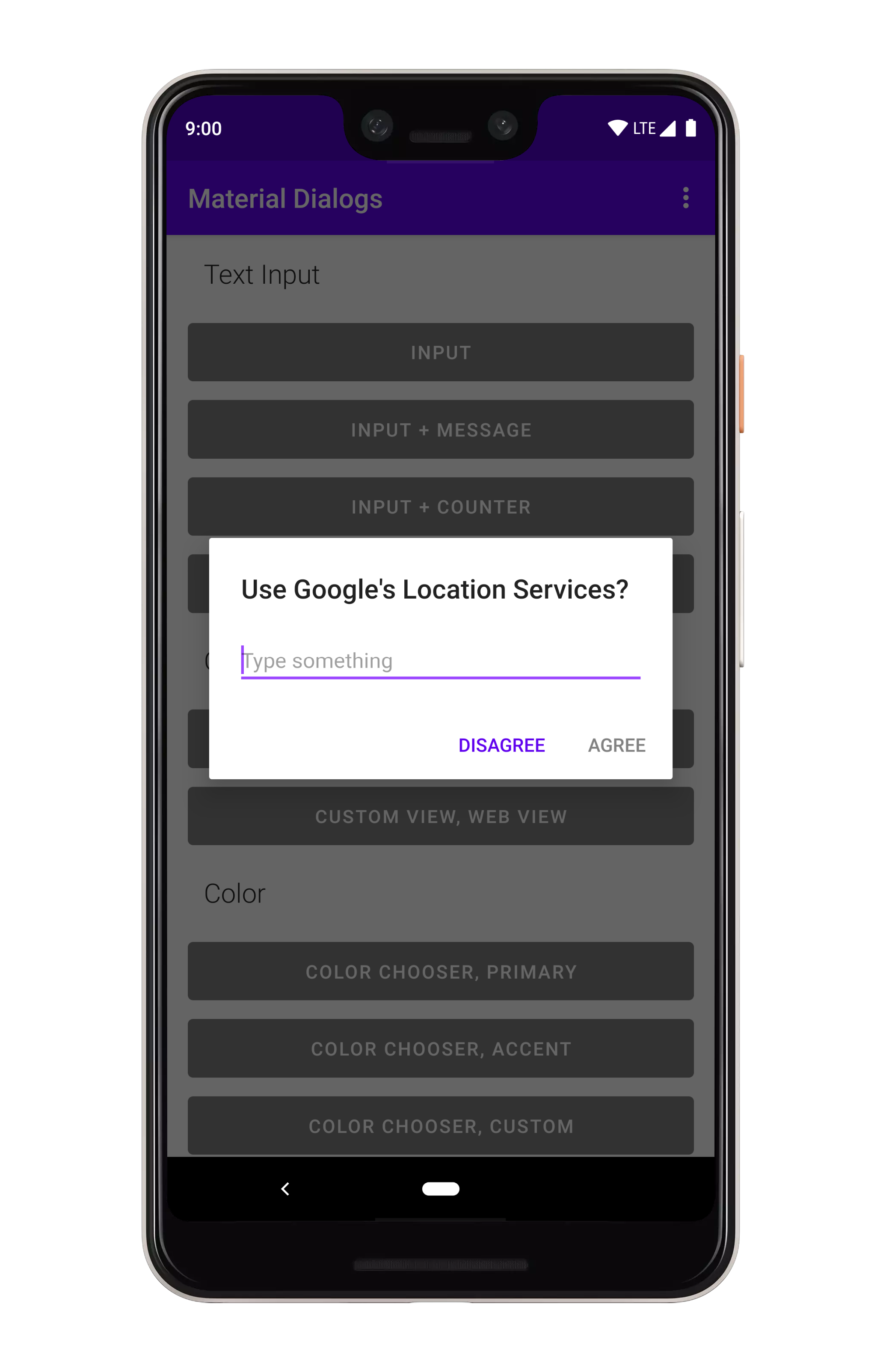
- Input dialog:
MaterialDialog(this).show {
    input(hint = "Enter your name") { dialog, text ->
        // Use the input
    }
    positiveButton(R.string.submit)
}
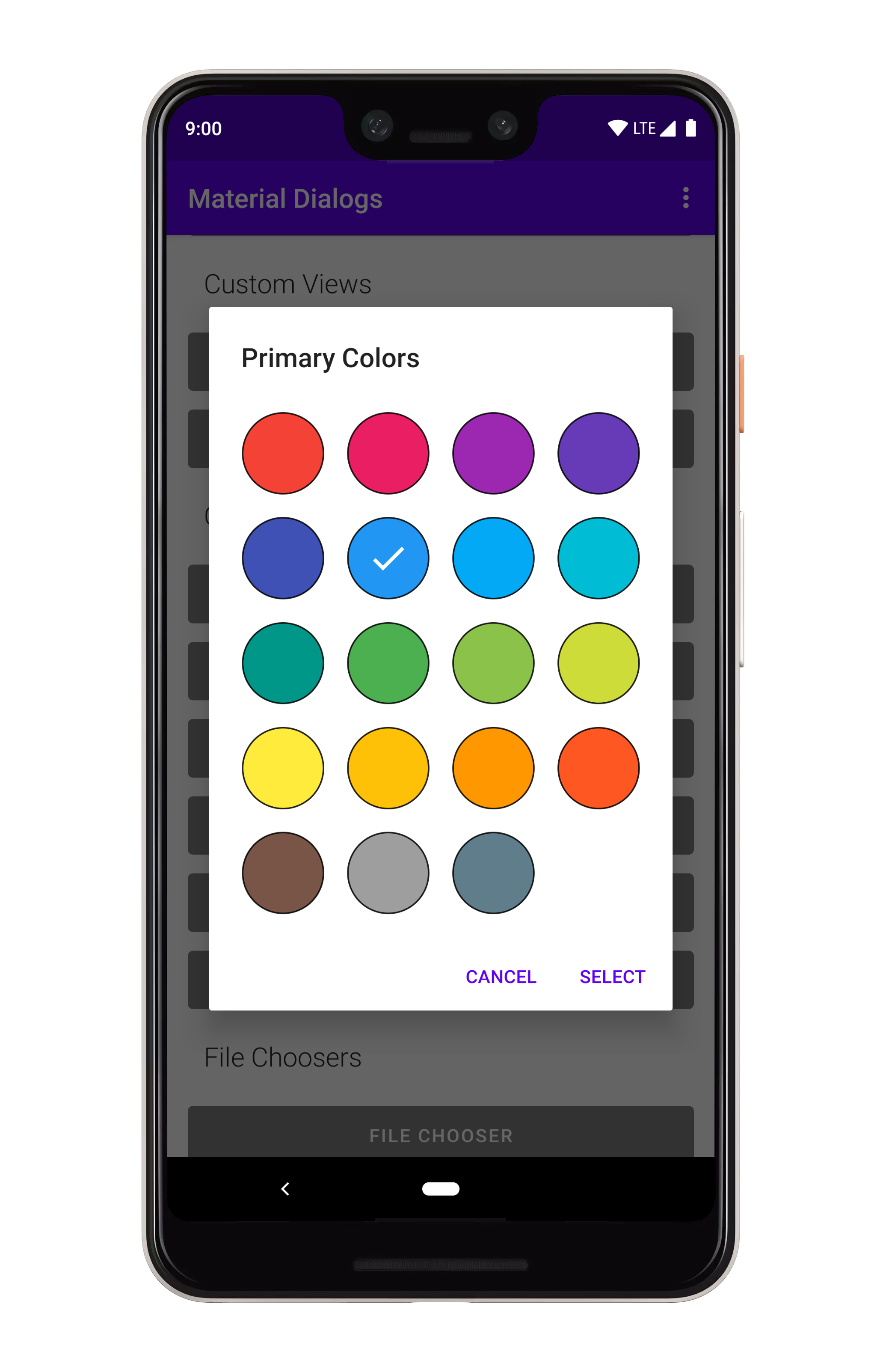
- Color chooser dialog:
MaterialDialog(this).show {
    colorChooser(colors = ColorPalette.Primary) { dialog, color ->
        // Use selected color
    }
    positiveButton(R.string.select)
}
Getting Started
- Add the dependency to your app's
build.gradle:
dependencies {
    implementation 'com.afollestad.material-dialogs:core:3.3.0'
}
- For additional features, add specific modules:
implementation 'com.afollestad.material-dialogs:input:3.3.0'
implementation 'com.afollestad.material-dialogs:color:3.3.0'
implementation 'com.afollestad.material-dialogs:datetime:3.3.0'
- Use the library in your Kotlin code:
import com.afollestad.materialdialogs.MaterialDialog

// ... In your activity or fragment
MaterialDialog(this).show {
    title(R.string.dialog_title)
    message(R.string.dialog_message)
    positiveButton(R.string.ok)
}
Competitor Comparisons
[DEPRECATED] A fast PDF reader component for Android development
Pros of android-pdfview
- Specialized for PDF rendering and viewing on Android
- Lightweight and focused on a single functionality
- Provides smooth scrolling and zooming for PDF documents
Cons of android-pdfview
- Limited to PDF-related features only
- Less actively maintained compared to material-dialogs
- Fewer customization options for UI elements
Code Comparison
android-pdfview:
PDFView pdfView = findViewById(R.id.pdfView);
pdfView.fromAsset("sample.pdf")
    .defaultPage(0)
    .onLoad(this)
    .load();
material-dialogs:
MaterialDialog(this).show {
    title(R.string.dialog_title)
    message(R.string.dialog_message)
    positiveButton(R.string.agree)
    negativeButton(R.string.disagree)
}
Summary
android-pdfview is a specialized library for PDF viewing on Android, offering smooth scrolling and zooming. However, it's limited to PDF-related features and less actively maintained. material-dialogs, on the other hand, is a more versatile library for creating various types of dialogs with extensive customization options. The choice between the two depends on the specific needs of your project – PDF viewing or dialog creation.
:octocat: 📃 FoldingCell is a material design expanding content cell inspired by folding paper material made by @Ramotion
Pros of folding-cell-android
- Unique and visually appealing expandable cell animation
- Customizable content for both folded and unfolded states
- Lightweight library focused on a single UI component
Cons of folding-cell-android
- Limited to a specific UI pattern, less versatile than material-dialogs
- Fewer customization options for overall appearance and behavior
- Less frequent updates and smaller community support
Code Comparison
folding-cell-android:
val foldingCell = findViewById<FoldingCell>(R.id.folding_cell)
foldingCell.setOnClickListener {
    foldingCell.toggle(false)
}
material-dialogs:
MaterialDialog(this).show {
    title(R.string.dialog_title)
    message(R.string.dialog_message)
    positiveButton(R.string.agree)
    negativeButton(R.string.disagree)
}
Summary
folding-cell-android offers a unique and visually appealing expandable cell animation, ideal for specific UI designs that require this particular interaction. However, it's less versatile compared to material-dialogs, which provides a wide range of dialog types and customization options. material-dialogs is more suitable for general-purpose dialog implementations across various app scenarios, while folding-cell-android excels in creating eye-catching list items with expandable content.
An Android Animation library which easily add itemanimator to RecyclerView items.
Pros of recyclerview-animators
- Focused specifically on RecyclerView animations, providing a wide range of pre-built animation options
- Lightweight library with minimal impact on app size
- Easy to implement and customize animations with simple method calls
Cons of recyclerview-animators
- Limited to RecyclerView animations, not a comprehensive UI component library
- May require additional libraries for other UI elements and dialogs
- Less frequent updates and maintenance compared to material-dialogs
Code Comparison
recyclerview-animators:
val animator = SlideInLeftAnimator()
recyclerView.itemAnimator = animator
material-dialogs:
MaterialDialog(this).show {
    title(R.string.dialog_title)
    message(R.string.dialog_message)
    positiveButton(R.string.agree)
}
Summary
recyclerview-animators is a specialized library for RecyclerView animations, offering a wide range of pre-built options with easy implementation. It's lightweight but limited in scope compared to material-dialogs, which provides a comprehensive set of UI components and dialog options. material-dialogs offers more frequent updates and broader functionality, while recyclerview-animators focuses solely on enhancing RecyclerView animations.
A powerful 🚀 Android chart view / graph view library, supporting line- bar- pie- radar- bubble- and candlestick charts as well as scaling, panning and animations.
Pros of MPAndroidChart
- Specialized for creating various types of charts and graphs
- Extensive customization options for chart appearance and behavior
- Supports real-time data updates and animations
Cons of MPAndroidChart
- Steeper learning curve due to its focus on charting functionality
- Limited to chart-related UI components
- May require additional libraries for non-chart UI elements
Code Comparison
MPAndroidChart:
val chart = LineChart(context)
val entries = ArrayList<Entry>()
entries.add(Entry(1f, 10f))
entries.add(Entry(2f, 20f))
val dataSet = LineDataSet(entries, "Label")
val lineData = LineData(dataSet)
chart.data = lineData
chart.invalidate()
material-dialogs:
MaterialDialog(this).show {
    title(R.string.dialog_title)
    message(R.string.dialog_message)
    positiveButton(R.string.agree)
    negativeButton(R.string.disagree)
}
Summary
MPAndroidChart excels in creating sophisticated charts and graphs with extensive customization options, while material-dialogs focuses on providing a wide range of dialog types for general UI interactions. MPAndroidChart is more specialized and may have a steeper learning curve, whereas material-dialogs offers a simpler API for creating common dialog interfaces. The choice between the two depends on the specific requirements of your project, with MPAndroidChart being ideal for data visualization tasks and material-dialogs better suited for general UI dialogs and user interactions.
A circular ImageView for Android
Pros of CircleImageView
- Focused on a single, specific functionality (circular image views)
- Lightweight and easy to integrate
- Supports border and shadow customization
Cons of CircleImageView
- Limited to circular image views only
- Lacks the extensive dialog customization options of Material Dialogs
- No built-in support for complex layouts or animations
Code Comparison
CircleImageView:
<de.hdodenhof.circleimageview.CircleImageView
    android:layout_width="96dp"
    android:layout_height="96dp"
    android:src="@drawable/profile"
    app:civ_border_width="2dp"
    app:civ_border_color="#FF000000"/>
Material Dialogs:
MaterialDialog(this).show {
    title(R.string.dialog_title)
    message(R.string.dialog_message)
    positiveButton(R.string.agree)
    negativeButton(R.string.disagree)
}
CircleImageView is a specialized library for creating circular image views with customizable borders and shadows. It's lightweight and easy to use but limited in scope. Material Dialogs, on the other hand, offers a comprehensive solution for creating and customizing various types of dialogs in Android applications, with a wider range of features and flexibility.
Image Cropping Library for Android
Pros of uCrop
- Specialized for image cropping and rotation
- Offers a visually appealing and intuitive user interface
- Provides real-time preview of cropping results
Cons of uCrop
- Limited to image manipulation functionality
- May require additional libraries for other UI components
- Less frequent updates compared to material-dialogs
Code Comparison
material-dialogs:
MaterialDialog(this).show {
    title(R.string.dialog_title)
    message(R.string.dialog_message)
    positiveButton(R.string.agree)
    negativeButton(R.string.disagree)
}
uCrop:
UCrop.of(sourceUri, destinationUri)
    .withAspectRatio(16f, 9f)
    .withMaxResultSize(maxWidth, maxHeight)
    .start(this)
material-dialogs is a comprehensive library for creating various types of dialogs in Android applications, offering a wide range of customization options. It's suitable for general-purpose dialog creation and user interactions.
uCrop, on the other hand, is a specialized library focused on image cropping and rotation. It provides a polished UI for image manipulation tasks but lacks the versatility of material-dialogs for other dialog types.
The choice between these libraries depends on the specific requirements of your project. If you need a general-purpose dialog solution, material-dialogs is more suitable. For image cropping functionality, uCrop offers a dedicated and feature-rich solution.
Convert  designs to code with AI

Introducing Visual Copilot: A new AI model to turn Figma designs to high quality code using your components.
Try Visual CopilotREADME
Material Dialogs
View Releases and Changelogs
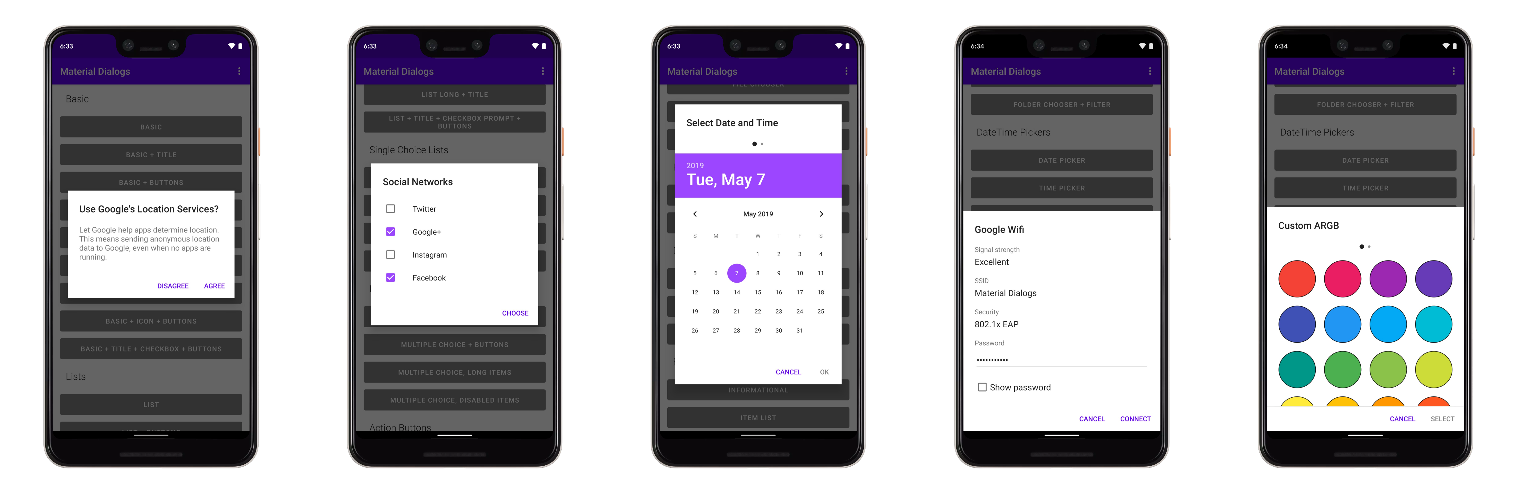
Modules
The core module is the fundamental module that you need in order to use this library. The others are extensions to core.
Please note that since Material Dialogs 2.x.x, this library only supports Kotlin. The latest Java version is 0.9.6.0 and can be found here. Note that 0.9.6.0 is unsupported, bugs & improvements will not be made to that version.
Core
Core Tutorial and Samples
The core module contains everything you need to get started with the library. It contains all
core and normal-use functionality.
dependencies {
  ...
  implementation 'com.afollestad.material-dialogs:core:3.3.0'
}
Input
Input Tutorial and Samples
The input module contains extensions to the core module, such as a text input dialog.
dependencies {
  ...
  implementation 'com.afollestad.material-dialogs:input:3.3.0'
}
Files
Files Tutorial and Samples
The files module contains extensions to the core module, such as a file and folder chooser.
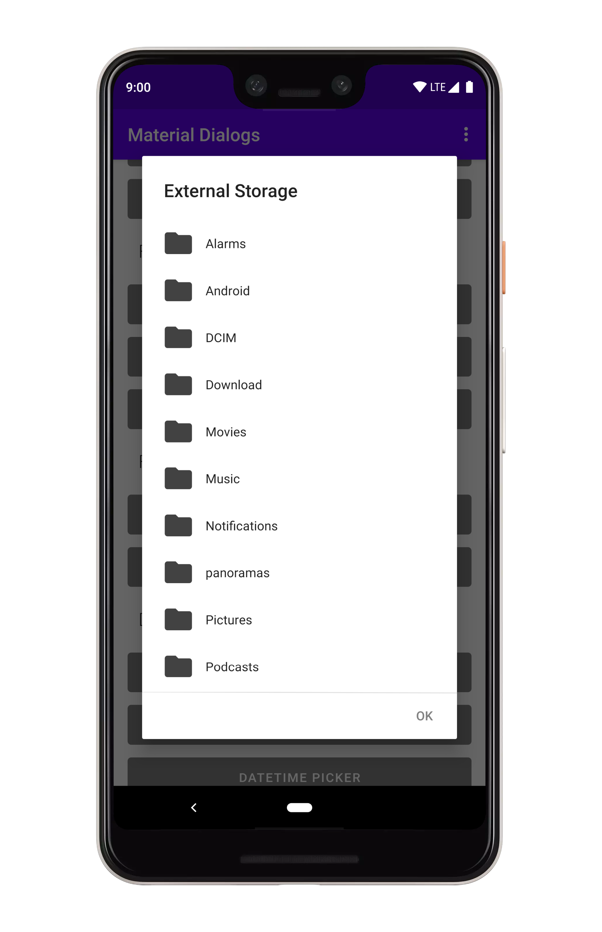
dependencies {
  ...
  implementation 'com.afollestad.material-dialogs:files:3.3.0'
}
Color
Color Tutorial and Samples
The color module contains extensions to the core module, such as a color chooser.
dependencies {
  ...
  implementation 'com.afollestad.material-dialogs:color:3.3.0'
}
DateTime
DateTime Tutorial and Samples
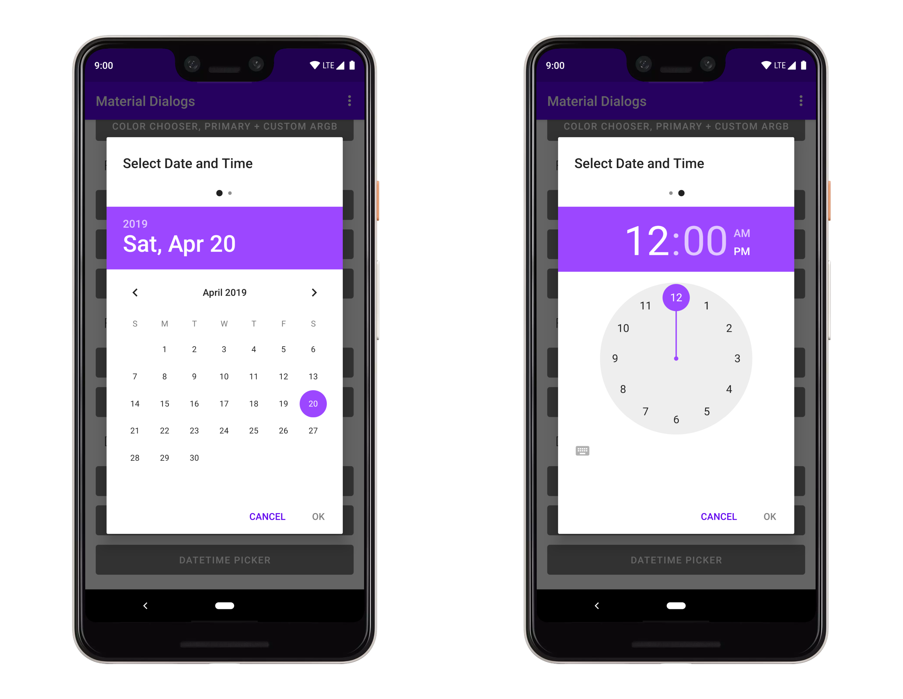
The datetime module contains extensions to make date, time, and date-time picker dialogs.
dependencies {
  ...
  implementation 'com.afollestad.material-dialogs:datetime:3.3.0'
}
Bottom Sheets
Bottom Sheets Tutorial and Samples
The bottomsheets module contains extensions to turn modal dialogs into bottom sheets, among
other functionality like showing a grid of items. Be sure to checkout the sample project for this,
too!
dependencies {
  ...
  implementation 'com.afollestad.material-dialogs:bottomsheets:3.3.0'
}
Lifecycle
Lifecycle Tutorial and Samples
The lifecycle module contains extensions to make dialogs work with AndroidX lifecycles.
dependencies {
  ...
  implementation 'com.afollestad.material-dialogs:lifecycle:3.3.0'
}
Top Related Projects
[DEPRECATED] A fast PDF reader component for Android development
:octocat: 📃 FoldingCell is a material design expanding content cell inspired by folding paper material made by @Ramotion
An Android Animation library which easily add itemanimator to RecyclerView items.
A powerful 🚀 Android chart view / graph view library, supporting line- bar- pie- radar- bubble- and candlestick charts as well as scaling, panning and animations.
A circular ImageView for Android
Image Cropping Library for Android
Convert designs to code with AI
Introducing Visual Copilot: A new AI model to turn Figma designs to high quality code using your components.
Try Visual Copilot