
Top Related Projects

A data-first Rust-native UI design toolkit.

A cross-platform GUI library for Rust, inspired by Elm

egui: an easy-to-use immediate mode GUI in Rust that runs on both web and native

Rust bindings for the FLTK GUI library.

Build smaller, faster, and more secure desktop and mobile applications with a web frontend.
Quick Overview
OrbTk is a cross-platform UI toolkit for building scalable user interfaces in Rust. It aims to provide a consistent API across different platforms, including desktop, web, and embedded systems, while maintaining a small footprint and high performance.
Pros
- Cross-platform compatibility (desktop, web, and embedded)
- Built with Rust, offering safety and performance benefits
- Modular architecture allowing for easy customization
- Active development and community support
Cons
- Relatively young project, still in development
- Limited documentation compared to more established UI frameworks
- Smaller ecosystem of third-party components and extensions
- Learning curve for developers new to Rust or reactive UI paradigms
Code Examples
- Creating a simple window with a button:
use orbtk::prelude::*;

fn main() {
    Application::new()
        .window(|ctx| {
            Window::new()
                .title("OrbTk Example")
                .position((100.0, 100.0))
                .size(300.0, 200.0)
                .child(
                    Button::new()
                        .text("Click me!")
                        .on_click(|_| println!("Button clicked!"))
                        .build(ctx),
                )
                .build(ctx)
        })
        .run();
}
- Creating a counter with state:
use orbtk::prelude::*;

#[derive(Default, AsAny)]
struct CounterState {
    count: i32,
}

impl CounterState {
    fn increment(&mut self) {
        self.count += 1;
    }
}

widget!(Counter<CounterState>: MouseHandler {
    count: i32
});

impl Template for Counter {
    fn template(self, id: Entity, ctx: &mut BuildContext) -> Self {
        self.name("Counter")
            .count(0)
            .child(
                Button::new()
                    .text(id.get_count().to_string())
                    .on_click(move |ctx, _| {
                        ctx.get_mut::<CounterState>().increment();
                        ctx.child("").set("text", ctx.get::<CounterState>().count.to_string());
                    })
                    .build(ctx),
            )
    }
}

fn main() {
    Application::new()
        .window(|ctx| {
            Window::new()
                .title("Counter Example")
                .position((100.0, 100.0))
                .size(300.0, 200.0)
                .child(Counter::new().build(ctx))
                .build(ctx)
        })
        .run();
}
Getting Started
To get started with OrbTk, follow these steps:
-
Add OrbTk to your
Cargo.toml:[dependencies] orbtk = "0.3.1-alpha3" -
Import the prelude in your Rust file:
use orbtk::prelude::*; -
Create a simple application:
fn main() { Application::new() .window(|ctx| { Window::new() .title("My First OrbTk App") .child( TextBlock::new() .text("Hello, OrbTk!") .build(ctx), ) .build(ctx) }) .run(); } -
Run your application with
cargo run
Competitor Comparisons
A data-first Rust-native UI design toolkit.
Pros of Druid
- More active development with frequent updates and contributions
- Better documentation and examples for easier onboarding
- Stronger focus on cross-platform compatibility
Cons of Druid
- Steeper learning curve due to more complex architecture
- Less integrated with a specific operating system (unlike OrbTk's Redox OS focus)
- Potentially higher resource usage for simple applications
Code Comparison
OrbTk example:
use orbtk::prelude::*;

fn main() {
    Application::new()
        .window(|ctx| {
            Window::new()
                .title("OrbTk Example")
                .child(TextBlock::new().text("Hello, OrbTk!").build(ctx))
                .build(ctx)
        })
        .run();
}
Druid example:
use druid::widget::{Label, Flex};
use druid::{AppLauncher, WindowDesc, Widget};

fn main() {
    let main_window = WindowDesc::new(ui_builder());
    AppLauncher::with_window(main_window)
        .launch("Hello, Druid!".to_string())
        .expect("Failed to launch application");
}

fn ui_builder() -> impl Widget<String> {
    Flex::column().with_child(Label::new("Hello, Druid!"))
}
A cross-platform GUI library for Rust, inspired by Elm
Pros of iced
- More active development and larger community support
- Cross-platform support for desktop, web, and mobile
- Extensive documentation and examples
Cons of iced
- Steeper learning curve for beginners
- Less flexible styling options compared to OrbTk
Code Comparison
iced:
use iced::{button, Button, Column, Element, Sandbox, Settings, Text};

struct Counter {
    value: i32,
    increment_button: button::State,
    decrement_button: button::State,
}

impl Sandbox for Counter {
    // Implementation details...
}
OrbTk:
use orbtk::prelude::*;

#[derive(Default, AsAny)]
pub struct MainView;

impl Widget for MainView {
    fn create() -> Self {
        MainView
    }

    fn view(&self, ctx: &mut BuildContext) -> Widget {
        // Widget tree definition...
    }
}
Both frameworks use a declarative approach for building user interfaces, but iced focuses on a more functional style, while OrbTk leans towards an object-oriented paradigm. iced's API is generally considered more intuitive for Rust developers, while OrbTk offers more flexibility in terms of custom widgets and layouts.
egui: an easy-to-use immediate mode GUI in Rust that runs on both web and native
Pros of egui
- More active development with frequent updates and contributions
- Better performance, especially for complex UIs and animations
- Wider platform support, including web (WebAssembly) and mobile
Cons of egui
- Steeper learning curve due to its immediate mode GUI paradigm
- Less native look and feel compared to OrbTK's widget-based approach
- Limited built-in theming options out of the box
Code Comparison
OrbTK example:
use orbtk::prelude::*;

fn main() {
    Application::new()
        .window(|ctx| {
            Window::new()
                .title("OrbTK Example")
                .child(TextBlock::new().text("Hello, OrbTK!").build(ctx))
                .build(ctx)
        })
        .run();
}
egui example:
use eframe::egui;

fn main() -> Result<(), eframe::Error> {
    eframe::run_native(
        "egui Example",
        eframe::NativeOptions::default(),
        Box::new(|_cc| Box::new(MyApp::default())),
    )
}

struct MyApp;
impl eframe::App for MyApp {
    fn update(&mut self, ctx: &egui::Context, _frame: &mut eframe::Frame) {
        egui::CentralPanel::default().show(ctx, |ui| {
            ui.label("Hello, egui!");
        });
    }
}
Rust bindings for the FLTK GUI library.
Pros of fltk-rs
- Mature and stable, based on the well-established FLTK C++ library
- Cross-platform support with native look and feel
- Lightweight with minimal dependencies
Cons of fltk-rs
- Less modern UI aesthetics compared to OrbTK
- Steeper learning curve for Rust developers unfamiliar with FLTK
Code Comparison
FLTK-rs:
use fltk::{app, button::Button, frame::Frame, prelude::*, window::Window};

fn main() {
    let app = app::App::default();
    let mut wind = Window::new(100, 100, 400, 300, "Hello from rust");
    let mut frame = Frame::new(0, 0, 400, 200, "");
    let mut but = Button::new(160, 210, 80, 40, "Click me!");
    wind.end();
    wind.show();
    but.set_callback(move |_| frame.set_label("Hello World!"));
    app.run().unwrap();
}
OrbTK:
use orbtk::prelude::*;

fn main() {
    Application::new()
        .window(|ctx| {
            Window::new()
                .title("OrbTk example")
                .position((100.0, 100.0))
                .size(420.0, 730.0)
                .child(TextBlock::new().text("Hello World!").build(ctx))
                .build(ctx)
        })
        .run();
}
Both libraries offer straightforward ways to create windows and UI elements, but FLTK-rs follows a more traditional imperative approach, while OrbTK uses a declarative style with a builder pattern.
Build smaller, faster, and more secure desktop and mobile applications with a web frontend.
Pros of Tauri
- Cross-platform support for desktop apps using web technologies
- Smaller bundle sizes and better performance than Electron
- Strong security features and customizable system tray
Cons of Tauri
- Less mature ecosystem compared to OrbTK
- Steeper learning curve for developers new to Rust
- Limited to desktop applications, while OrbTK supports embedded systems
Code Comparison
OrbTK:
use orbtk::prelude::*;

fn main() {
    Application::new()
        .window(|ctx| {
            Window::new()
                .title("OrbTK Example")
                .child(TextBlock::new().text("Hello, OrbTK!"))
                .build(ctx)
        })
        .run();
}
Tauri:
#[tauri::command]
fn greet(name: &str) -> String {
    format!("Hello, {}!", name)
}

fn main() {
    tauri::Builder::default()
        .invoke_handler(tauri::generate_handler![greet])
        .run(tauri::generate_context!())
        .expect("error while running tauri application");
}
Both OrbTK and Tauri are Rust-based frameworks for building user interfaces, but they target different use cases. OrbTK is more focused on creating native UIs for various platforms, including embedded systems, while Tauri specializes in building desktop applications using web technologies with a Rust backend.
Convert  designs to code with AI

Introducing Visual Copilot: A new AI model to turn Figma designs to high quality code using your components.
Try Visual CopilotREADME
OrbTk is Sunsetting
It is with great sadness that I announce that OrbTk is sunsetting. In the many years since I first made OrbTk, the Rust GUI ecosystem has grown at an amazing rate. Toolkits with more features have developed, and which are more actively maintained. I first created this project to bootstrap UI development on Redox OS. Many of the applications on Redox use OrbTk. @FloVanGH stepped in to do large refactoring between the 0.2 and 0.3 release, which modernized the OrbTk API. @rzerres stepped in to add many features and maintain OrbTk since the 0.3 release.
I have since moved on to working with iced. @FloVanGH has taken a job working on slint. And @rzerres has expressed interest in using slint for their projects. Both iced and slint provide renderer agnostic toolkits that will be compatible with Redox OS, but they also support more features than OrbTk. So, I have decided, with agreement from @rzerres, that OrbTk is to stop being actively maintained, in favor of these other Rust native toolkits.
Original README
The Orbital Widget Toolkit is a cross-platform (G)UI toolkit for building scalable user interfaces with the programming language Rust. It's based on the Entity Component System Pattern and provides a functional Reactive-like API.
The main goals of OrbTk are speed, ease of use, and cross-platform compatibility.
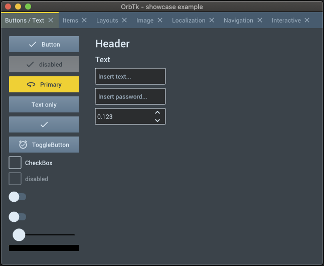
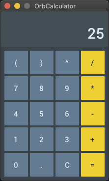
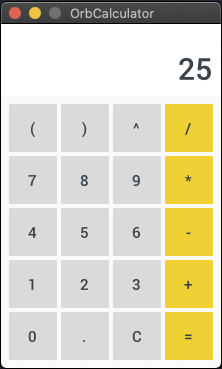
Screenshots
The next images are taken from example applications, that have been compiled for MacOS / OS-X.
- The
showcaseexample
- Themed
calculatorexamples
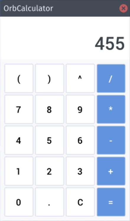
Other screenshots have been rendered from examples code, that is stored
inside the orbtk crate.
Features:
- Modern lightweight API
- Cross platform
- Modular crates
- Based on Entity Component System library DCES
- Flexible event system
- Integrated widget library
- Custom widgets
- Custom theming engine
- Dynamic theme switching
- Integrated debugging tools
- Localization
Platforms
- Redox OS
- Linux
- macOS
- Windows
- openBSD (not tested, but should work)
- Web (broken, will be fixed soon)
- Android (wip, will be released soon)
- iOS (wip, will be released soon)
- Ubuntu Touch (on hold)
Planned features
- Conformable use of async
- More default widgets
- Book
- Animations
- Split application in modules
- 3D context
- More integrated debugging tools
Documentation
Build and open documentation
You can build and view the latest documentation by executing the following command:
cargo doc --no-deps --open
OrbTk book
The OrbTk book is written from a developers perspective. It aims to introduce the basic concept, beside a bird's eye view of the toolkit structure. An in depth discussion of the provided crates is followed by example listings. This section collects example code with annotated blocks. The annotations are targeting best practice usage of available widgets, their interaction with other modules coupled with a descriptive text where reasonable.
A precompiled version is available for online reading. You are invited to checkout its repository at OrbTk book.
Please do not expect at finalized version. It is not complete at
all. The given statis is marked as work in progress (WIP). Any help to
improve the chapters and/or translations are quite welcome.
Usage
To include OrbTk as an external dependency into your project, add this
line to its Cargo.toml file:
...
[dependencies]
...
orbtk = "0.3.1-alpha4"
...
To use the latest development version of OrbTk as an external
dependency, add this line into its Cargo.toml file:
...
[dependencies]
...
orbtk = { git = "https://github.com/redox-os/orbtk.git", branch = "develop" }
...
You can also check out the OrbTk template project to start a new project: https://github.com/redox-os/orbtk-template
Minimal Example
use orbtk::prelude::*;

fn main() {
	  Application::new()
		.window(|ctx| {
			Window::new()
				.title("OrbTk - minimal example")
				.position((100.0, 100.0))
				.size(420.0, 730.0)
				.child(TextBlock::new().text("OrbTk").build(ctx))
				.build(ctx)
		})
		.run();
}
Base concepts
Widget
Widgets are the building blocks of user interfaces in OrbTk. They are
things like Buttons, TextBoxes, ListViews, Views (Screens) and
Grid(Layout)s. Each widget implements the Widget
trait
and is generated by the widget!
macro. A
widget consists of a name like Button and a list of its properties
like text: String, background: Brush or count: u32. After the
build method of a widget is called it's added to the Entity
Component System where it exists as an Entity (index) with
Components. The struct of a widget serves as a builder using the
builder
pattern.
Basic usage of the widget! macro:
widget!(
	MyWidget {
	  background: Brush,
	  count: u32,
	  text: String,
	  ...
	}
);
Widget Templates
Each widget has to implement the Template
trait.
The template defines the structure and the default values that the
widget will store in its properties. For example: You can define your
hand-crafted Button widget (lets call it MyButton). MyButton is
represented as a tree of three child widgets: A top level
Container widget that will hand over to its child, the StackPanel
widget, which in turn will hand over to its child, the TextBlock
widget.
The next code snippet prints out the source code of this basic Template trait:
impl Template for MyButton {
	fn template(self, id: Entity, ctx: &mut BuildContext) -> Self {
		 self.name("MyButton")
			.style("my_button_style")
			.background("#000000")
			.count(0)
			.text("Initial text")
			.child(Container::new()
					// Container references the same background as MyButton
					.background(id)
					.child(TextBlock::new()
							// TextBlock references the same text as MyButton
							.text(id)
							.build(ctx)
					)
					.build(ctx)
			)
	}
}
Widget State
Any changes that are triggered via user interaction or via events are handled inside the state of a widget. If generated, they are processed to manipulate the inner state. Each state must implement the State trait. The inner state of a widget is represented by the current values of its properties.
Have a look at this code snippet to make up a state trait:
#[derive(Default, AsAny)]
struct MyState {
	...
}

impl State for MyState {
	fn update(&mut self, _: &mut Registry, ctx: &mut Context) {
		// update the widget
		...
	}
}

widget!(
	// Add MyState as state of MyWidget
	MyWidget<MyState> {
		...
	}
);
The update method requires a Context
parameter.
This structure provides access to the state's widget itself (the entity)
and its components (the properties). It also provides methods (the associated functions) to access
the children of the widget, this it is able to manipulate the widget tree.
Styling widgets and define themes
OrbTk provides a theme engine base on
RON. The engine provides the
following features:
- Split theme in different files
- Reference resources values in the theme files (colors, font stuff)
- Derive styles
- Dynamic theme switching
- State styling (pressed | selected | focused | disabled)
Have a look at this short style definition:
Theme (
	styles: {
		"base": (
			properties: {
				"font_size": "$FONT_SIZE_12",
				"font_family": "$MEDIUM_FONT",
			}
		),
		"button": (
			base: "base",
			properties: {
				"background": "$BLACK",
			},
			states: [
				(
					key: "pressed",
					properties: {
						"background": "$WHITE",
					}
				)
			]
		)
	},
	resource: {
		"BLACK": "#000000",
		"WHITE": "#ffffff",
		"MEDIUM_FONT": "Roboto-Medium",
		"FONT_SIZE_12": 12,
		"FONT_SIZE_16": 16,
	}
)
But you are not requested to reference a theme engine. OrbTk
enables as well the declaraton of property values inside the source
code (inlined theming).
Localization
OrbTk supports the functionality to register an application wide localization service. A localization service has to implement the Localization trait.
Example
pub struct MyLocalization {
	...
}

impl Localization for MyLocalization {
	/// Gets the current language by language key e.g. `en_US` or `de_DE`.
	fn language(&self) -> &String {
		...
	}

	/// Sets the current language by key e.g. `en_US` or `de_DE`.
	fn set_language(&mut self, key: &str) {
		...
	}

	/// Gets the translated text for the given key. If there is no given translation the `key` will be returned as result.
	fn text(&self, key: String) -> String {
		...
	}
}
It is possible to register a localization service for an application. Simply make use of the RonLocalization, that can read localization dictionaries coded in the RON format.
Example
let de_de = r#"
	Dictionary(
		words: {
			"hello": "Hallo",
			"world": "Welt",
		}
	)
	"#;

Application::new()
	.localization(
		RonLocalization::create()
			// sets the initial language
			.language("en_US")
			// adds an language dictionary to the localization service.
			.dictionary("de_DE", de_de)
			.build()
	)
	.window(|ctx| {
		Window::new()
			.title("OrbTk - showcase example")
			.position((100, 100))
			.size(600, 730)
			.resizable(true)
			.child(TextBlock::new().text("hello").build(ctx))
			.build(ctx)
	})
	.run();
Inside this example code the text property (value hello) is used
as the key. This key is matched to the correponding value inside the
dictionary of the corresponding localization service. If you haven't defined a
dictionary for the current language, OrbTk will simply take the value of the property itself.
You are free to start development without and any localization, but add it afterwards.
You may switch the language at runtime. Inside the state widget you simply consume the set_language method, that is accessible via the
Context
structure.
Run Examples
Build with sdl2 installation
If your target Operating-System is Linux, macOS or Windows, a
sdl2 installation is required. Please check the documentation that
is provieded for th rust-sdk2 crate.
Build with sdl2 from source
As an alternative, you may build OrbTk while bundling sdl2. To activate the bundled feature go ahead like this:
cargo run --example showcase --features bundled
Please asure, that you toolchain will provide a working C compiler (e.g. gcc, clang, or MS's compiler).
To target linux, you also need to provide cmake:
sudo apt install cmake
If you have trouble build the provided OrbTk examples or simply don't want to use a C compiler, please check the backend section. It contains alternatives.
All example source-code resides inside the examples subdirectory of the orbtk subcrate.
Compile, start and play around with the showcase example while executing the following command:
cargo run --example showcase --release
OrbTk has an integrated debug tools. It will oultline the bounds of
all managed widgets inside the widget tree. This will include
invisible ones. You may also want to print out the tree structure of your app.
This is activated, via feature flags like this:
cargo run --example showcase --release --features "debug, log"
Run Examples with cargo-node
To run the examples as a browser, electron or cordova app you have to install cargo-node:
cargo install -f cargo-node
cargo-node itself relies on npm version 6.9.0, which is included with Node.js version 10.16.3. You can download it
from its homepage.
Rust's cargo is also required. All cargo-node's dependencies are installed automatically.
Start examples
To start the showcase example as a node binary, executing one of the following commands:
- Run as browser app:
cargo node run --target browser --example showcase
- Run as electron app:
cargo node run --target electron --example showcase
- Run as cordova app on android:
cargo node run --target android --example showcase
crates structure
- orbtk: sub-crate, that provides all needed components to build an OrbTk
cross platform UI. - orbtk_core: sub-crate, that provides the
core componentsof Orbtk (widget basics, tree handling, theming) - orbtk_orbclient: sub-crate, that handles cross platform aware
window and event management. It is based on OrbClient. - orbtk_tinyskia: Wrapper methods that consumes the tiny-skia
2D rendering engine. - orbtk_widgets: sub-crate providing the standard OrbTk
widget libraryand andtheming support.
Inspirations
Showcases
- Plural Planner: Task app
- Space Editor: 2D Tile Map Editor compatible with OrbGame
- twin-commander: A twin-panel file manager specifically for the Redox OS
Contribution
If you want to help and improve OrbTk submit your feedback via the issue tracker. All pull requests are welcome and will be reviewed. You can also discuss with other OrbTk developers via the Redox chat interface. Please join the orbtk channel.
Contribution check list
- Please document for all your
pubstructs, traits and functions. - Please add suitable tests methods.
- Use static &str for widget ids and new style definitions.
- For widget development check ProgressBar or Slider as an example.
- Add your changes inside CHANGELOG.md
- Extend the example section to show consumption of your code.
- Always run
cargo fmtbefore uploading. - Please run
cargo cippybefore uploading. - Create the PR using our template.
License
Source-Code is licensed under MIT license (LICENSE).
© 2017-2022 Jeremy Soller
© 2018-2022 Florian Blasius
This documentation work is licensed under a Creative Common License 4.0

© 2020-2022 Ralf Zerres
Top Related Projects
A data-first Rust-native UI design toolkit.
A cross-platform GUI library for Rust, inspired by Elm
egui: an easy-to-use immediate mode GUI in Rust that runs on both web and native
Rust bindings for the FLTK GUI library.
Build smaller, faster, and more secure desktop and mobile applications with a web frontend.
Convert designs to code with AI
Introducing Visual Copilot: A new AI model to turn Figma designs to high quality code using your components.
Try Visual Copilot