
Top Related Projects

A React-based UI toolkit for the web

An enterprise-class UI design language and React UI library

Material UI: Comprehensive React component library that implements Google's Material Design. Free forever.

Chakra UI is a component system for building SaaS products with speed ⚡️

A utility-first CSS framework for rapid UI development.

Fluent UI web represents a collection of utilities, React components, and web components for building web applications.
Quick Overview
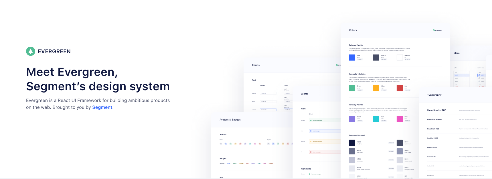
Evergreen is a React UI Framework developed by Segment for building ambitious products on the web. It provides a comprehensive set of accessible, composable, and customizable components that can be used to create consistent and beautiful user interfaces.
Pros
- Extensive set of pre-built, accessible components
- Consistent design language and theming capabilities
- Well-documented with interactive examples
- Actively maintained and regularly updated
Cons
- Opinionated design system may not fit all project aesthetics
- Learning curve for developers new to the framework
- Limited customization options compared to more flexible UI libraries
- Larger bundle size compared to minimal UI libraries
Code Examples
Creating a basic button:
import { Button } from 'evergreen-ui'

function MyComponent() {
  return <Button appearance="primary">Click me</Button>
}
Using a dialog component:
import { Dialog, Button } from 'evergreen-ui'

function MyComponent() {
  const [isShown, setIsShown] = React.useState(false)

  return (
    <>
      <Button onClick={() => setIsShown(true)}>Open Dialog</Button>
      <Dialog
        isShown={isShown}
        title="Dialog Title"
        onCloseComplete={() => setIsShown(false)}
        confirmLabel="Confirm"
      >
        Dialog content goes here
      </Dialog>
    </>
  )
}
Creating a form with validation:
import { TextInputField, Button } from 'evergreen-ui'

function MyForm() {
  const [email, setEmail] = React.useState('')
  const [isInvalid, setIsInvalid] = React.useState(false)

  const handleSubmit = (e) => {
    e.preventDefault()
    setIsInvalid(!email.includes('@'))
  }

  return (
    <form onSubmit={handleSubmit}>
      <TextInputField
        label="Email"
        value={email}
        onChange={(e) => setEmail(e.target.value)}
        isInvalid={isInvalid}
        validationMessage={isInvalid ? "Invalid email address" : null}
      />
      <Button type="submit">Submit</Button>
    </form>
  )
}
Getting Started
To start using Evergreen in your React project:
-
Install the package:
npm install evergreen-ui -
Import and use components in your React application:
import React from 'react' import { Button, Heading } from 'evergreen-ui' function App() { return ( <div> <Heading>Welcome to Evergreen</Heading> <Button appearance="primary">Get Started</Button> </div> ) } export default App -
Evergreen components are now ready to use in your application. Refer to the official documentation for more advanced usage and customization options.
Competitor Comparisons
A React-based UI toolkit for the web
Pros of Blueprint
- More comprehensive component library with a wider range of UI elements
- Stronger TypeScript support and type definitions
- Better documentation and extensive API references
Cons of Blueprint
- Steeper learning curve due to its complexity and extensive features
- Larger bundle size, which may impact performance in smaller projects
- Less frequent updates and releases compared to Evergreen
Code Comparison
Blueprint:
import { Button, Intent } from "@blueprintjs/core";

<Button intent={Intent.PRIMARY} text="Click me" />
Evergreen:
import { Button } from "evergreen-ui";

<Button appearance="primary">Click me</Button>
Both libraries offer similar component APIs, but Blueprint provides more customization options and uses TypeScript-specific features like enums for props. Evergreen's API is generally simpler and more straightforward.
Blueprint is better suited for large-scale enterprise applications with complex UI requirements, while Evergreen is ideal for smaller projects or teams looking for a lightweight, easy-to-use UI library. Blueprint offers more out-of-the-box components and customization options, but Evergreen provides a more streamlined development experience with its simpler API and faster learning curve.
An enterprise-class UI design language and React UI library
Pros of Ant Design
- Larger ecosystem with more components and extensive documentation
- Strong community support and frequent updates
- Better internationalization and localization features
Cons of Ant Design
- Steeper learning curve due to its extensive API and customization options
- Larger bundle size, which may impact initial load times
- More opinionated design system, potentially requiring more effort to customize
Code Comparison
Ant Design button example:
import { Button } from 'antd';

const MyComponent = () => (
  <Button type="primary">Click me</Button>
);
Evergreen button example:
import { Button } from 'evergreen-ui';

const MyComponent = () => (
  <Button appearance="primary">Click me</Button>
);
Both libraries offer similar component APIs, but Ant Design generally provides more props and customization options. Evergreen's API is often simpler and more straightforward, which can be beneficial for smaller projects or teams with less experience in React component libraries.
Ant Design is better suited for large-scale applications with complex UI requirements and international audiences. Evergreen, on the other hand, is ideal for projects that prioritize simplicity and quick implementation, with a focus on clean, modern design out of the box.
Material UI: Comprehensive React component library that implements Google's Material Design. Free forever.
Pros of Material-UI
- Larger ecosystem with extensive documentation and community support
- More comprehensive component library with advanced features
- Better theming capabilities and customization options
Cons of Material-UI
- Steeper learning curve due to its complexity
- Larger bundle size, which may impact performance
- Opinionated design system that may not fit all project styles
Code Comparison
Material-UI:
import { Button, ThemeProvider, createTheme } from '@mui/material';

const theme = createTheme();

function App() {
  return (
    <ThemeProvider theme={theme}>
      <Button variant="contained">Click me</Button>
    </ThemeProvider>
  );
}
Evergreen:
import { Button, ThemeProvider, defaultTheme } from 'evergreen-ui';

function App() {
  return (
    <ThemeProvider value={defaultTheme}>
      <Button appearance="primary">Click me</Button>
    </ThemeProvider>
  );
}
Both libraries offer similar component-based structures and theming capabilities. However, Material-UI provides more advanced theming options and a wider range of component variants. Evergreen's API is generally simpler and more straightforward, making it easier to get started with but potentially limiting for complex use cases.
Chakra UI is a component system for building SaaS products with speed ⚡️
Pros of Chakra UI
- More extensive component library with a wider range of pre-built UI elements
- Better theming and customization options, allowing for easier brand alignment
- Stronger accessibility features out-of-the-box
Cons of Chakra UI
- Steeper learning curve due to more complex API and configuration options
- Larger bundle size, which may impact initial load times for applications
Code Comparison
Chakra UI button example:
import { Button } from "@chakra-ui/react"

function MyComponent() {
  return <Button colorScheme="blue">Click me</Button>
}
Evergreen button example:
import { Button } from "evergreen-ui"

function MyComponent() {
  return <Button appearance="primary">Click me</Button>
}
Both Chakra UI and Evergreen provide React component libraries for building user interfaces. Chakra UI offers a more comprehensive set of components and better customization options, making it suitable for larger, more complex projects. Evergreen, on the other hand, has a simpler API and smaller bundle size, which can be advantageous for smaller projects or when quick prototyping is needed. The code examples demonstrate the slight differences in syntax and prop naming conventions between the two libraries.
A utility-first CSS framework for rapid UI development.
Pros of Tailwind CSS
- Highly customizable and flexible, allowing for rapid UI development
- Utility-first approach enables quick styling without leaving HTML
- Large and active community, with extensive documentation and resources
Cons of Tailwind CSS
- Steeper learning curve for developers new to utility-first CSS
- Can lead to verbose HTML markup, potentially reducing readability
- Requires additional build steps and configuration for optimal usage
Code Comparison
Tailwind CSS:
<button class="bg-blue-500 hover:bg-blue-700 text-white font-bold py-2 px-4 rounded">
  Click me
</button>
Evergreen:
import { Button } from 'evergreen-ui'

<Button appearance="primary" intent="success">
  Click me
</Button>
Summary
Tailwind CSS offers a utility-first approach to styling, providing flexibility and rapid development capabilities. It excels in customization but may require more setup and learning. Evergreen, on the other hand, provides pre-built components with a consistent design system, making it easier to get started but potentially limiting customization options. The choice between the two depends on project requirements, team expertise, and desired level of control over styling.
Fluent UI web represents a collection of utilities, React components, and web components for building web applications.
Pros of Fluent UI
- Extensive component library with a wide range of UI elements
- Strong integration with Microsoft products and services
- Robust theming system for consistent design across applications
Cons of Fluent UI
- Steeper learning curve due to its comprehensive nature
- Larger bundle size, which may impact performance in smaller projects
- Less flexibility for customization compared to Evergreen
Code Comparison
Evergreen button example:
import { Button } from 'evergreen-ui'

<Button appearance="primary">Click me</Button>
Fluent UI button example:
import { PrimaryButton } from '@fluentui/react'

<PrimaryButton text="Click me" />
Both libraries offer similar functionality, but Fluent UI's components are often more specific (e.g., PrimaryButton instead of a general Button with props). Evergreen's approach may be more flexible for some developers, while Fluent UI's structure can lead to more consistent implementations across projects.
Evergreen tends to use a more prop-based approach for customization, while Fluent UI often relies on separate components for different variants. This difference in philosophy can impact how developers structure their code and manage component variations.
Convert  designs to code with AI

Introducing Visual Copilot: A new AI model to turn Figma designs to high quality code using your components.
Try Visual CopilotREADME
-
Works out of the box. Evergreen contains a set of polished React components that work out of the box.
-
Flexible & composable. Evergreen components are built on top of a React UI Primitive for endless composability.
-
Enterprise-grade. Evergreen features a UI design language for enterprise-grade web applications.
Documentation & Community
Evergreen v7 Migration guide
Evergreen v7 migration guide
Install and use components
ð² Evergreen is made up of multiple components and tools which you can import one by one. All you need to do is install the evergreen-ui package:
$ yarn add evergreen-ui
# or
$ npm install --save evergreen-ui
A working version, assuming you are using something like Create React App, might look like this:
import React from 'react'
import ReactDOM from 'react-dom'
import { Button } from 'evergreen-ui'
ReactDOM.render(<Button>I am using ð² Evergreen!</Button>, document.getElementById('root'))
Core values of ð² Evergreen
-
Evergreen is built on the belief that you can never predict all future requirements, only prepare for it. Instead of creating fixed configurations that work today, Evergreen promotes building systems that anticipate new and changing design requirements.
-
Evergreen is built on the belief that things should work out of the box with smart defaults, but also offer full control when needed. For example, Evergreen uses CSS-in-JS and builds on top of the Box component in ui-box.
-
Evergreen is built on the belief that using Evergreen and contributing to Evergreen should be a pleasant experience. We prioritize documentation and all the tools for a solid developer experience. We advocate respect and inclusivity in our writings and interactions.
FAQ
Theming support?
Evergreen supports a robust theming layer out of the box. You can check out these docs for more information regarding theming in Evergreen.
How does Server Side Rendering (SSR) work?
Evergreen offers easy Server Side Rendering (SSR) and automatic hydration.
Evergreen bundles its own CSS-in-JS solution from ui-box. To make it super easy to do server side rendering and hydration, Evergreen exposes a extractStyles() function.
- How to use it with Next.js in the ssr-next example app.
- How to use it with GatsbyJS
Contributing to Evergreen
Please see CONTRIBUTING.md for more information on how to contribute!
ð Contributors
We will add you to the list if you make any meaningful contribution!
- Jeroen Ransijn
- Roland Warmerdam
- Ben McMahon
- Matt Shwery
- Colin Lohner
- Allen Kleiner
- Chris Chuck
- Brandon Scott
- ... many other on the Segment team and open-source contributors
This project is maintained by Segment
Please take a look at the contributing guide to better understand what to work on.
ð Respect earns Respect
Please respect our Code of Conduct, in short:
- Using welcoming and inclusive language
- Being respectful of differing viewpoints and experiences
- Gracefully accepting constructive criticism
- Focusing on what is best for the community
- Showing empathy towards other community members
License
Evergreen is released under the MIT license. The BlueprintJS icons are licensed under a custom Apache 2.0 license.
Copyright © 2021 Segment.io, Inc.
Top Related Projects
A React-based UI toolkit for the web
An enterprise-class UI design language and React UI library
Material UI: Comprehensive React component library that implements Google's Material Design. Free forever.
Chakra UI is a component system for building SaaS products with speed ⚡️
A utility-first CSS framework for rapid UI development.
Fluent UI web represents a collection of utilities, React components, and web components for building web applications.
Convert designs to code with AI
Introducing Visual Copilot: A new AI model to turn Figma designs to high quality code using your components.
Try Visual Copilot