 react-styleguidist
Isolated React component development environment with a living style guide
Top Related Projects

Storybook is the industry standard workshop for building, documenting, and testing UI components in isolation

✍ It has never been so easy to document your things!

A CLI and library to extract information from React component files for documentation generation purposes.

Sandbox for developing and testing UI components in isolation

♠️ React MDX-based presentation decks

A React-based library for creating sleek presentations using JSX syntax that gives you the ability to live demo your code.
Quick Overview
React Styleguidist is an isolated React component development environment with a living style guide. It helps developers create and document reusable React components, providing a platform for component showcasing, testing, and documentation generation.
Pros
- Automatic documentation generation from propTypes and comments
- Live component playground for interactive testing
- Customizable and themeable interface
- Supports TypeScript and Flow type annotations
Cons
- Learning curve for initial setup and configuration
- Can be resource-intensive for large projects
- Limited built-in support for state management libraries
- Occasional issues with complex component setups
Code Examples
- Basic component example:
import React from 'react';
import PropTypes from 'prop-types';

/**
 * A simple button component
 */
function Button({ label, onClick }) {
  return <button onClick={onClick}>{label}</button>;
}

Button.propTypes = {
  /** The button label */
  label: PropTypes.string.isRequired,
  /** Click handler */
  onClick: PropTypes.func,
};

export default Button;
- Using the Playground in documentation:
import Button from './Button';

/**
 * Button examples:
 */
<>
  <Button label="Click me" onClick={() => alert('Clicked!')} />
  <Button label="Disabled" disabled />
</>
- Customizing Styleguidist configuration:
// styleguide.config.js
module.exports = {
  components: 'src/components/**/*.js',
  webpackConfig: {
    module: {
      rules: [
        {
          test: /\.jsx?$/,
          exclude: /node_modules/,
          loader: 'babel-loader',
        },
      ],
    },
  },
};
Getting Started
-
Install React Styleguidist:
npm install --save-dev react-styleguidist -
Add a script to your
package.json:{ "scripts": { "styleguide": "styleguidist server", "styleguide:build": "styleguidist build" } } -
Create a
styleguide.config.jsfile in your project root:module.exports = { components: 'src/components/**/*.js' }; -
Run the style guide:
npm run styleguide
This will start a development server with your component documentation.
Competitor Comparisons
Storybook is the industry standard workshop for building, documenting, and testing UI components in isolation
Pros of Storybook
- Wider ecosystem with more addons and integrations
- Better support for multiple frameworks (React, Vue, Angular, etc.)
- More advanced features like visual testing and accessibility checks
Cons of Storybook
- Steeper learning curve and more complex setup
- Heavier build size and potentially slower performance
- Can be overwhelming for smaller projects or teams
Code Comparison
React Styleguidist:
import Button from './Button';

<Button>Click me</Button>
Storybook:
import { Button } from './Button';

export default {
  title: 'Button',
  component: Button,
};

export const Primary = () => <Button primary>Button</Button>;
React Styleguidist focuses on a simpler, documentation-first approach with Markdown files, while Storybook uses a more structured, story-based format. Storybook's code structure allows for more advanced configurations and variations of components, but React Styleguidist's approach can be quicker to set up for basic documentation needs.
Both tools serve similar purposes but cater to different project sizes and complexity levels. React Styleguidist is often preferred for smaller projects or when rapid documentation is needed, while Storybook shines in larger, more complex applications with diverse component libraries.
✍ It has never been so easy to document your things!
Pros of Docz
- Built on Gatsby, offering better performance and static site generation capabilities
- More flexible theming system with easy customization options
- Supports MDX out of the box, allowing for interactive documentation
Cons of Docz
- Steeper learning curve, especially for developers unfamiliar with Gatsby
- Less mature ecosystem compared to React Styleguidist
- May require more configuration for complex setups
Code Comparison
React Styleguidist:
import React from 'react'
import { Button } from './Button'

export default function ButtonExample() {
  return <Button>Click me</Button>
}
Docz:
---
name: Button
---

import { Playground, Props } from 'docz'
import { Button } from './Button'

# Button

<Props of={Button} />

<Playground>
  <Button>Click me</Button>
</Playground>
The main difference in the code examples is that Docz uses a more declarative approach with MDX, combining Markdown and JSX. This allows for a more integrated documentation experience, while React Styleguidist separates the component example from its documentation.
A CLI and library to extract information from React component files for documentation generation purposes.
Pros of react-docgen
- Lightweight and focused solely on extracting component information
- Can be easily integrated into custom documentation workflows
- Supports TypeScript out of the box
Cons of react-docgen
- Lacks built-in UI for rendering documentation
- Requires additional setup to generate a complete style guide
- Limited customization options for output format
Code Comparison
react-docgen:
const docgen = require('react-docgen');
const componentInfo = docgen.parse(source);
console.log(componentInfo);
react-styleguidist:
module.exports = {
  components: 'src/components/**/*.js',
  webpackConfig: require('./webpack.config.js')
};
react-docgen focuses on extracting component information programmatically, while react-styleguidist provides a complete solution for generating and displaying a style guide.
react-docgen is better suited for developers who want to build custom documentation tools or integrate component information into existing systems. It offers more flexibility but requires additional work to create a polished documentation site.
react-styleguidist, on the other hand, offers a more comprehensive out-of-the-box solution for creating styleguides and component documentation. It includes a built-in UI, live component previews, and easier configuration, making it ideal for teams looking for a quick and visually appealing documentation setup.
Sandbox for developing and testing UI components in isolation
Pros of React Cosmos
- More flexible and customizable, allowing for complex component setups and scenarios
- Better suited for testing and debugging components in isolation
- Supports stateful fixtures, enabling dynamic component testing
Cons of React Cosmos
- Steeper learning curve due to its more advanced features
- Less focus on documentation generation compared to React Styleguidist
- May require more setup and configuration for basic use cases
Code Comparison
React Cosmos:
// cosmos.decorator.js
import { Decorator } from 'react-cosmos';

export default ({ children }) => (
  <ThemeProvider theme={lightTheme}>{children}</ThemeProvider>
);
React Styleguidist:
// styleguide.config.js
module.exports = {
  components: 'src/components/**/[A-Z]*.js',
  theme: {
    color: {
      link: 'firebrick',
      linkHover: 'salmon'
    }
  }
};
React Cosmos focuses on creating fixtures for component testing, while React Styleguidist emphasizes documentation and style guide generation. React Cosmos offers more advanced features for component development and testing, but React Styleguidist provides an easier setup for creating component documentation and showcasing components in various states.
♠️ React MDX-based presentation decks
Pros of mdx-deck
- Focused on creating slide decks using MDX, offering a simpler and more streamlined approach
- Built-in themes and customization options for quick and easy styling
- Supports live code editing and execution within slides
Cons of mdx-deck
- Limited to presentation-style content, less suitable for comprehensive documentation
- Fewer built-in features for component documentation and testing
- May require additional setup for advanced customization and integration with other tools
Code Comparison
mdx-deck:
import { Head, Notes } from 'mdx-deck'

# My Presentation

---

## Slide 2

<Notes>Speaker notes go here</Notes>
React Styleguidist:
import React from 'react'
import PropTypes from 'prop-types'

/**
 * Button component description
 */
function Button({ children, onClick }) {
  return <button onClick={onClick}>{children}</button>
}

Button.propTypes = {
  children: PropTypes.node.isRequired,
  onClick: PropTypes.func,
}

export default Button
A React-based library for creating sleek presentations using JSX syntax that gives you the ability to live demo your code.
Pros of Spectacle
- Focused specifically on creating presentations and slideshows
- Offers a wide range of pre-built components for slide creation
- Provides a more streamlined API for creating slides quickly
Cons of Spectacle
- Less flexible for general-purpose component documentation
- Limited customization options compared to React Styleguidist
- Steeper learning curve for non-presentation use cases
Code Comparison
React Styleguidist:
import { Button } from './Button';

<Button onClick={() => console.log('Clicked!')}>
  Click me
</Button>
Spectacle:
import { Slide, Text, Appear } from 'spectacle';

<Slide>
  <Text>Welcome to my presentation</Text>
  <Appear><Text>This text will appear</Text></Appear>
</Slide>
React Styleguidist is designed for creating comprehensive component documentation and style guides, offering a more flexible approach to showcasing and testing React components. It excels in generating interactive documentation with live editing capabilities.
Spectacle, on the other hand, is tailored specifically for creating presentations using React. It provides a set of components and utilities optimized for building slideshows, making it easier to create visually appealing presentations quickly.
While both libraries use React, their primary use cases differ. React Styleguidist is better suited for developers looking to document and showcase their component libraries, while Spectacle is ideal for those creating interactive presentations or slideshows using React.
Convert  designs to code with AI

Introducing Visual Copilot: A new AI model to turn Figma designs to high quality code using your components.
Try Visual CopilotREADME
Isolated React component development environment with a living style guide


React Styleguidist is a component development environment with hot reloaded dev server and a living style guide that you can share with your team. It lists component propTypes and shows live, editable usage examples based on Markdown files. Check out the demo style guide.
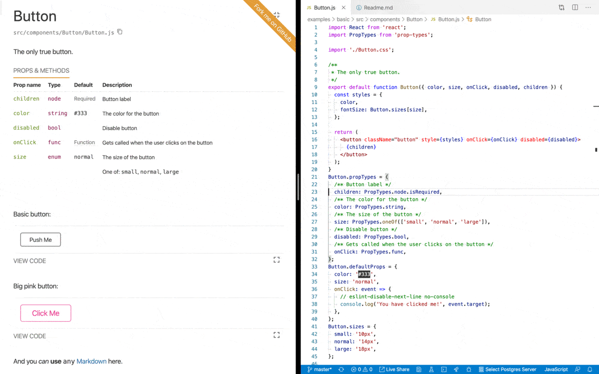
Usage
- Getting Started: install and run Styleguidist
- Documenting components: how to write documentation
- Locating components: point Styleguidist to your React components
- Configuring webpack: tell Styleguidist how to load your code
- Cookbook: how to solve common tasks with Styleguidist
Advanced documentation
Examples
- Basic style guide, source
- Style guide with sections, source
- Style guide with customized styles, source
- Style guide with custom express endpoints, source
- Create React App integration, source
Showcase
Real projects using React Styleguidist:
- Rumble Charts
- better-react-spinkit
- Semantic UI Components for React
- Dialog Components
- Bulma Components
- Yammer Components
- More projectsâ¦
Integration with other tools
- Create React App â supported out of the box, see the Getting Started guide
- Vue, see Vue Styleguidist
Third-party tools
- snapguidist: snapshot testing for React Styleguidist
- react-styleguidist-visual: automated visual testing for React Styleguidist, using Puppeteer and pixelmatch
- styleguidist-scrapper: scrapper script for documentation generated by React Styleguidist
Resources
- The Dream of Styleguide Driven Development talk by Sara Vieira
- Building React Components Library talk by Robert Haritonov
- Say Cheese: Snapshots and Visual Testing
- Interview with Artem Sapegin about React Styleguidist.
Change log
The change log can be found on the Releases page.
Contributing
Everyone is welcome to contribute. Please take a moment to read the contributing guidelines and the developer guide.
Sponsoring
Become a sponsor and get your logo on our Readme on GitHub with a link to your site.
Become a backer get your image on our Readme on GitHub with a link to your site.

Authors and license
Artem Sapegin and contributors.
Logo by Sara Vieira and Andrey Okonetchnikov.
MIT License, see the included License.md file.
Top Related Projects
Storybook is the industry standard workshop for building, documenting, and testing UI components in isolation
✍ It has never been so easy to document your things!
A CLI and library to extract information from React component files for documentation generation purposes.
Sandbox for developing and testing UI components in isolation
♠️ React MDX-based presentation decks
A React-based library for creating sleek presentations using JSX syntax that gives you the ability to live demo your code.
Convert designs to code with AI
Introducing Visual Copilot: A new AI model to turn Figma designs to high quality code using your components.
Try Visual Copilot