 tailwindcss-container-queries
A plugin for Tailwind CSS v3.2+ that provides utilities for container queries.
Top Related Projects
A utility-first CSS framework for rapid UI development.
Transforming styles with JS plugins
Sass makes CSS fun!
Visual primitives for the component age. Use the best bits of ES6 and CSS to style your apps without stress 💅
👩🎤 CSS-in-JS library designed for high performance style composition
Quick Overview
Tailwindcss-container-queries is a plugin for Tailwind CSS that adds support for container queries. It allows developers to style elements based on the size of their containing element rather than the viewport, enabling more flexible and responsive designs.
Pros
- Enhances responsive design capabilities by allowing styles based on container size
- Seamlessly integrates with existing Tailwind CSS workflows
- Provides a simple and intuitive syntax for defining container queries
- Improves component reusability across different layouts
Cons
- Adds complexity to the styling process, potentially increasing the learning curve
- May increase the overall CSS file size due to additional utility classes
- Limited browser support for container queries (as of 2023, not all browsers fully support this feature)
- Requires careful planning to avoid potential performance issues with nested queries
Code Examples
- Basic container query usage:
<div class="@container">
  <div class="@lg:text-2xl @sm:text-base">
    This text changes size based on the container width
  </div>
</div>
- Combining container queries with Tailwind's responsive utilities:
<div class="@container">
  <div class="md:@lg:grid md:@lg:grid-cols-2 md:@sm:flex md:@sm:flex-col">
    <div>Column 1</div>
    <div>Column 2</div>
  </div>
</div>
- Using custom container query breakpoints:
<div class="@container">
  <div class="@[800px]:bg-blue-500 @[400px]:bg-red-500">
    This div changes background color at custom breakpoints
  </div>
</div>
Getting Started
-
Install the plugin:
npm install @tailwindcss/container-queries -
Add the plugin to your
tailwind.config.js:module.exports = { plugins: [ require('@tailwindcss/container-queries'), ], } -
Use container queries in your HTML:
<div class="@container">
  <div class="@md:text-lg @sm:text-sm">
    Responsive text using container queries
  </div>
</div>
Competitor Comparisons
A utility-first CSS framework for rapid UI development.
Pros of tailwindcss
- Comprehensive utility-first CSS framework with a wide range of pre-built classes
- Extensive documentation and large community support
- Highly customizable and configurable to fit various project needs
Cons of tailwindcss
- Larger file size due to the extensive set of utility classes
- Steeper learning curve for developers new to utility-first CSS
- May require additional setup for specific features like container queries
Code Comparison
tailwindcss:
.element {
  @apply text-lg font-bold text-blue-500 hover:text-blue-700;
}
tailwindcss-container-queries:
.element {
  @container (min-width: 640px) {
    @apply text-lg font-bold text-blue-500 hover:text-blue-700;
  }
}
The main difference is that tailwindcss-container-queries allows for container-based responsive design, while tailwindcss focuses on viewport-based responsiveness. The container queries plugin extends Tailwind's functionality to include container-specific styling, which can be particularly useful for component-based designs and more granular control over layout changes.
Transforming styles with JS plugins
Pros of PostCSS
- Highly extensible with a large ecosystem of plugins
- Language-agnostic, supporting various CSS syntaxes and preprocessors
- Widely adopted and battle-tested in production environments
Cons of PostCSS
- Requires more configuration and setup compared to Tailwind's container queries
- May have a steeper learning curve for beginners
- Performance can vary depending on the number of plugins used
Code Comparison
PostCSS:
.element {
  @media (min-width: 768px) {
    width: 50%;
  }
}
Tailwind CSS Container Queries:
<div class="@container">
  <div class="@md:w-1/2">
    <!-- Content -->
  </div>
</div>
PostCSS is a versatile tool for transforming CSS with JavaScript plugins, while Tailwind CSS Container Queries focuses specifically on implementing container queries within the Tailwind ecosystem. PostCSS offers more flexibility and can be used with various CSS methodologies, but it may require more setup. Tailwind CSS Container Queries provides a more streamlined approach for implementing container queries within Tailwind projects, but it's limited to that specific use case and framework.
Sass makes CSS fun!
Pros of Sass
- More mature and established preprocessor with a larger ecosystem
- Offers advanced features like mixins, functions, and control directives
- Provides a full programming language for complex styling logic
Cons of Sass
- Requires compilation step, which can slow down development workflow
- Steeper learning curve for developers new to CSS preprocessors
- Less focus on modern CSS features and responsive design patterns
Code Comparison
Sass:
@mixin responsive-container {
  max-width: 100%;
  @media (min-width: 768px) {
    max-width: 720px;
  }
}
Tailwind CSS Container Queries:
<div class="@container">
  <div class="@md:max-w-[720px]">
    <!-- Content -->
  </div>
</div>
Sass offers a more programmatic approach with mixins and variables, while Tailwind CSS Container Queries provides a utility-first approach with inline classes. Sass requires separate compilation, whereas Tailwind CSS Container Queries can be used directly in HTML with minimal setup. The Tailwind approach is more focused on modern responsive design techniques, specifically leveraging container queries for more granular control over layout based on parent container size rather than viewport size.
Visual primitives for the component age. Use the best bits of ES6 and CSS to style your apps without stress 💅
Pros of styled-components
- Allows for dynamic styling based on props, enabling more flexible and reusable components
- Provides a seamless integration of CSS within JavaScript, improving developer experience
- Supports automatic vendor prefixing and unique class names to avoid style conflicts
Cons of styled-components
- Increases bundle size due to the additional JavaScript required for styling
- May have a steeper learning curve for developers unfamiliar with CSS-in-JS concepts
- Can lead to performance issues in large applications with many styled components
Code Comparison
styled-components:
const Button = styled.button`
  background-color: ${props => props.primary ? 'blue' : 'white'};
  color: ${props => props.primary ? 'white' : 'blue'};
  padding: 10px 20px;
  border: 2px solid blue;
`;
tailwindcss-container-queries:
<div class="@container">
  <div class="@sm:text-lg @md:text-xl @lg:text-2xl">
    Responsive text based on container size
  </div>
</div>
The styled-components example demonstrates dynamic styling based on props, while the tailwindcss-container-queries example shows responsive styling based on container size using utility classes.
👩🎤 CSS-in-JS library designed for high performance style composition
Pros of emotion
- Flexible and powerful CSS-in-JS solution
- Supports server-side rendering out of the box
- Extensive ecosystem with additional libraries and tools
Cons of emotion
- Steeper learning curve for developers new to CSS-in-JS
- Runtime performance overhead compared to traditional CSS
- Requires additional setup and configuration
Code Comparison
emotion:
import { css } from '@emotion/react'

const style = css`
  color: hotpink;
  @media (max-width: 768px) {
    color: blue;
  }
`
tailwindcss-container-queries:
<div class="@container">
  <div class="@lg:text-blue-500 text-pink-500">
    Responsive text
  </div>
</div>
emotion focuses on CSS-in-JS, allowing for dynamic styles and complex logic within JavaScript. tailwindcss-container-queries extends Tailwind CSS with container query functionality, providing a utility-first approach to responsive design based on parent container sizes rather than viewport dimensions.
While emotion offers more flexibility and programmatic control over styles, tailwindcss-container-queries provides a simpler, more declarative way to handle container-based responsiveness within the familiar Tailwind CSS framework.
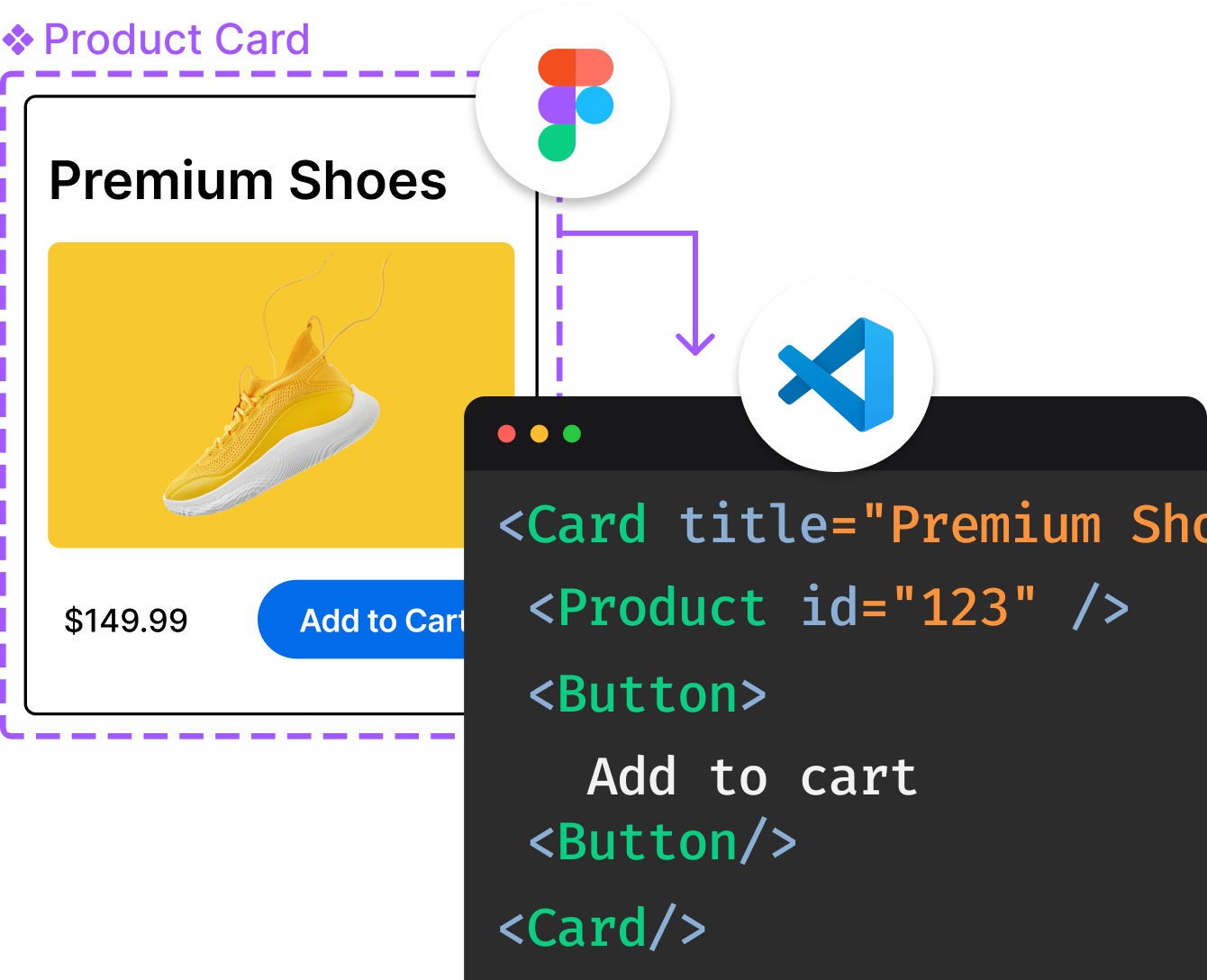
Convert  designs to code with AI

Introducing Visual Copilot: A new AI model to turn Figma designs to high quality code using your components.
Try Visual CopilotREADME
[!NOTE] As of Tailwind CSS v4.0, container queries are supported in the framework by default and this plugin is no longer required.
@tailwindcss/container-queries
A plugin for Tailwind CSS v3.2+ that provides utilities for container queries.
Installation
Install the plugin from npm:
npm install -D @tailwindcss/container-queries
Then add the plugin to your tailwind.config.js file:
// tailwind.config.js
module.exports = {
  theme: {
    // ...
  },
  plugins: [
    require('@tailwindcss/container-queries'),
    // ...
  ],
}
Usage
Start by marking an element as a container using the @container class, and then applying styles based on the size of that container using the container variants like @md:, @lg:, and @xl::
<div class="@container">
  <div class="@lg:underline">
    <!-- This text will be underlined when the container is larger than `32rem` -->
  </div>
</div>
By default we provide container sizes from @xs (20rem) to @7xl (80rem).
Named containers
You can optionally name containers using a @container/{name} class, and then include that name in the container variants using classes like @lg/{name}:underline:
<div class="@container/main">
  <!-- ... -->
  <div class="@lg/main:underline">
    <!-- This text will be underlined when the "main" container is larger than `32rem` -->
  </div>
</div>
Arbitrary container sizes
In addition to using one of the container sizes provided by default, you can also create one-off sizes using any arbitrary value:
<div class="@container">
  <div class="@[17.5rem]:underline">
    <!-- This text will be underlined when the container is larger than `17.5rem` -->
  </div>
</div>
Removing a container
To stop an element from acting as a container, use the @container-normal class.
With a prefix
If you have configured Tailwind to use a prefix, make sure to prefix both the @container class and any classes where you are using a container query modifier:
<div class="tw-@container">
  <!-- ... -->
  <div class="@lg:tw-underline">
    <!-- ... -->
  </div>
</div>
Configuration
By default we ship with the following configured values:
| Name | CSS |
|---|---|
@xs | @container (min-width: 20rem /* 320px */) |
@sm | @container (min-width: 24rem /* 384px */) |
@md | @container (min-width: 28rem /* 448px */) |
@lg | @container (min-width: 32rem /* 512px */) |
@xl | @container (min-width: 36rem /* 576px */) |
@2xl | @container (min-width: 42rem /* 672px */) |
@3xl | @container (min-width: 48rem /* 768px */) |
@4xl | @container (min-width: 56rem /* 896px */) |
@5xl | @container (min-width: 64rem /* 1024px */) |
@6xl | @container (min-width: 72rem /* 1152px */) |
@7xl | @container (min-width: 80rem /* 1280px */) |
You can configure which values are available for this plugin under the containers key in your tailwind.config.js file:
// tailwind.config.js
module.exports = {
  theme: {
    extend: {
      containers: {
        '2xs': '16rem',
      },
    },
  },
}
Top Related Projects
A utility-first CSS framework for rapid UI development.
Transforming styles with JS plugins
Sass makes CSS fun!
Visual primitives for the component age. Use the best bits of ES6 and CSS to style your apps without stress 💅
👩🎤 CSS-in-JS library designed for high performance style composition
Convert  designs to code with AI

Introducing Visual Copilot: A new AI model to turn Figma designs to high quality code using your components.
Try Visual Copilot