 flowbite
Open-source UI component library and front-end development framework based on Tailwind CSS
Top Related Projects
A utility-first CSS framework for rapid UI development.
David AI is a free and open-source collection of customizable, production-ready UI components built with Tailwind CSS.
Tailwind CSS components that support RTL languages & fully responsive based on Flexbox & CSS Grid with elegant Dark Mode 🚀 ☄️.
Quick Overview
Flowbite is an open-source UI component library built on top of Tailwind CSS. It provides a set of pre-built, customizable components and interactive elements to help developers create modern and responsive web interfaces quickly and efficiently.
Pros
- Extensive collection of pre-built components and templates
- Seamless integration with Tailwind CSS for easy customization
- Active community and regular updates
- Comprehensive documentation and examples
Cons
- Learning curve for developers new to Tailwind CSS
- Some components may require additional JavaScript for full functionality
- Limited design flexibility compared to building from scratch
- Potential for increased bundle size due to unused components
Code Examples
- Creating a button with Flowbite classes:
<button type="button" class="text-white bg-blue-700 hover:bg-blue-800 focus:ring-4 focus:ring-blue-300 font-medium rounded-lg text-sm px-5 py-2.5 mr-2 mb-2 dark:bg-blue-600 dark:hover:bg-blue-700 focus:outline-none dark:focus:ring-blue-800">
  Click me
</button>
- Implementing a dropdown menu:
<button id="dropdownDefaultButton" data-dropdown-toggle="dropdown" class="text-white bg-blue-700 hover:bg-blue-800 focus:ring-4 focus:outline-none focus:ring-blue-300 font-medium rounded-lg text-sm px-4 py-2.5 text-center inline-flex items-center dark:bg-blue-600 dark:hover:bg-blue-700 dark:focus:ring-blue-800" type="button">
  Dropdown button <svg class="w-4 h-4 ml-2" aria-hidden="true" fill="none" stroke="currentColor" viewBox="0 0 24 24" xmlns="http://www.w3.org/2000/svg"><path stroke-linecap="round" stroke-linejoin="round" stroke-width="2" d="M19 9l-7 7-7-7"></path></svg>
</button>
<div id="dropdown" class="z-10 hidden bg-white divide-y divide-gray-100 rounded-lg shadow w-44 dark:bg-gray-700">
  <ul class="py-2 text-sm text-gray-700 dark:text-gray-200" aria-labelledby="dropdownDefaultButton">
    <li><a href="#" class="block px-4 py-2 hover:bg-gray-100 dark:hover:bg-gray-600 dark:hover:text-white">Dashboard</a></li>
    <li><a href="#" class="block px-4 py-2 hover:bg-gray-100 dark:hover:bg-gray-600 dark:hover:text-white">Settings</a></li>
    <li><a href="#" class="block px-4 py-2 hover:bg-gray-100 dark:hover:bg-gray-600 dark:hover:text-white">Earnings</a></li>
    <li><a href="#" class="block px-4 py-2 hover:bg-gray-100 dark:hover:bg-gray-600 dark:hover:text-white">Sign out</a></li>
  </ul>
</div>
- Creating a responsive navbar:
<nav class="bg-white border-gray-200 dark:bg-gray-900">
  <div class="max-w-screen-xl flex flex-wrap items-center justify-between mx-auto p-4">
    <a href="https://flowbite.com/" class="flex items-center">
      <img src="https://flowbite.com/docs/images/logo.svg" class="h-8 mr-3" alt="Flowbite Logo" />
      <span class="self-center text-2xl font-semibold whitespace-nowrap dark:text-white">Flowbite</span>
    </a>
    <button data-collapse-toggle="navbar-default" type="button"
Competitor Comparisons
A utility-first CSS framework for rapid UI development.
Pros of Tailwind CSS
- More flexible and customizable, allowing for fine-grained control over styles
- Larger community and ecosystem, with extensive documentation and resources
- Utility-first approach enables rapid development and consistent design
Cons of Tailwind CSS
- Steeper learning curve for developers new to utility-first CSS
- Can lead to longer class names and potentially cluttered HTML
- Requires additional configuration for optimal performance
Code Comparison
Tailwind CSS:
<button class="bg-blue-500 hover:bg-blue-700 text-white font-bold py-2 px-4 rounded">
  Button
</button>
Flowbite:
<button type="button" class="text-white bg-blue-700 hover:bg-blue-800 focus:ring-4 focus:ring-blue-300 font-medium rounded-lg text-sm px-5 py-2.5 mr-2 mb-2 dark:bg-blue-600 dark:hover:bg-blue-700 focus:outline-none dark:focus:ring-blue-800">
  Button
</button>
Summary
Tailwind CSS offers more flexibility and customization options, with a larger ecosystem and utility-first approach. However, it may have a steeper learning curve and require more configuration. Flowbite, built on top of Tailwind CSS, provides pre-built components and a more straightforward implementation, but with less customization options. The code comparison shows that Tailwind CSS allows for more concise class names, while Flowbite includes additional styling and dark mode support out of the box.
David AI is a free and open-source collection of customizable, production-ready UI components built with Tailwind CSS.
Pros of David AI
- Focuses on AI-driven design and development tools
- Offers a more comprehensive suite of AI-powered features
- Provides a unique approach to AI-assisted web development
Cons of David AI
- Less mature and established compared to Flowbite
- Smaller community and potentially fewer resources available
- May have a steeper learning curve due to AI-centric approach
Code Comparison
David AI (AI-assisted component generation):
import david_ai

component = david_ai.generate_component("navbar", style="modern")
print(component.render())
Flowbite (Traditional component usage):
<nav class="bg-white border-gray-200 dark:bg-gray-900">
  <div class="max-w-screen-xl flex flex-wrap items-center justify-between mx-auto p-4">
    <!-- Navbar content -->
  </div>
</nav>
David AI focuses on AI-driven development, offering tools for generating and customizing components using AI. This approach can potentially speed up development but may require learning new concepts and workflows.
Flowbite, on the other hand, provides a more traditional component library with pre-built, customizable elements. It offers a familiar development experience and extensive documentation, making it easier for developers to get started quickly.
The choice between these repositories depends on the project requirements, team expertise, and willingness to adopt AI-driven development practices.
Tailwind CSS components that support RTL languages & fully responsive based on Flexbox & CSS Grid with elegant Dark Mode 🚀 ☄️.
Pros of MerakiUI
- Lightweight and minimalistic design, focusing on essential components
- Easier to customize and integrate into existing projects
- Provides a wider variety of pre-built components and layouts
Cons of MerakiUI
- Less comprehensive documentation compared to Flowbite
- Smaller community and fewer regular updates
- Limited browser compatibility information
Code Comparison
MerakiUI button example:
<button class="px-6 py-2 font-medium tracking-wide text-white capitalize transition-colors duration-300 transform bg-blue-600 rounded-md hover:bg-blue-500 focus:outline-none focus:ring focus:ring-blue-300 focus:ring-opacity-80">
    Button
</button>
Flowbite button example:
<button type="button" class="text-white bg-blue-700 hover:bg-blue-800 focus:ring-4 focus:ring-blue-300 font-medium rounded-lg text-sm px-5 py-2.5 mr-2 mb-2 dark:bg-blue-600 dark:hover:bg-blue-700 focus:outline-none dark:focus:ring-blue-800">
    Button
</button>
Both libraries offer similar functionality, but MerakiUI's approach is more lightweight and customizable, while Flowbite provides a more comprehensive set of utility classes and dark mode support out of the box.
Convert  designs to code with AI

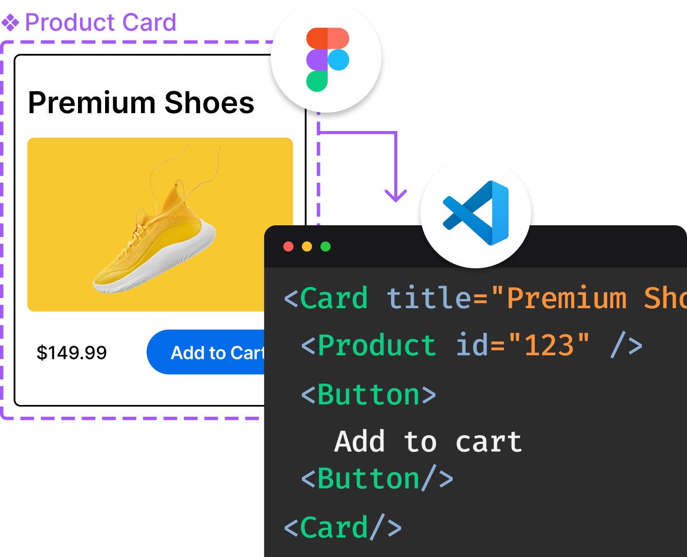
Introducing Visual Copilot: A new AI model to turn Figma designs to high quality code using your components.
Try Visual CopilotREADME

Build websites even faster with components on top of Tailwind CSS
Table of Contents
- Table of Contents
- Documentation
- Getting started
- Components
- Figma Design System
- Flowbite Blocks
- Flowbite Icons
- Flowbite GPT
- Pro version
- Hire us
- Learn Design Concepts
- Community
- Copyright and license
Documentation
For full documentation, visit flowbite.com.
Getting started
Flowbite can be included as a plugin into an existing Tailwind CSS project and it is supposed to help you build websites faster by having a set of web components to work with built with the utility classes from Tailwind CSS.
Install using NPM
Make sure that you have Node.js and Tailwind CSS installed. This guide works with Tailwind v4.
- Install Flowbite as a dependency using NPM by running the following command:
npm install flowbite
- Import Flowbite as a plugin inside your main Tailwind CSS file:
@plugin "flowbite/plugin";
- Make sure that you add the Flowbite JS source files to your CSS file:
@source "../node_modules/flowbite";
- Include the JavaScript code that powers the interactive elements before the end of your
<body>tag:
<script src="../path/to/flowbite/dist/flowbite.min.js"></script>
Learn more about the Flowbite JavaScript API and functionalities in the JavaScript section.
If you have and old project with Tailwind CSS v3 then check out this guide to learn how to upgrade to v4.
Include using CDN
The quickest way to get started working with Flowbite is to include the CSS and JS into your project via CDN.
Require the following minified stylesheet inside the head tag:
<link href="https://cdn.jsdelivr.net/npm/flowbite@{{< current_version >}}/dist/flowbite.min.css" rel="stylesheet" />
And include the following JavaScript file before the end of the body element:
<script src="https://cdn.jsdelivr.net/npm/flowbite@{{< current_version >}}/dist/flowbite.min.js"></script>
Please remember that the best way to work with Tailwind CSS and Flowbite is by purging the CSS classes.
Bundled JavaScript
One of the most popular way of using Flowbite is to include the bundled Javascript file which is UMD ready using a bundler such as Webpack or Parcel which makes sure that all of the data attributes and functionality will work out-of-the-box.
You can directly import the main JavaScript file inside your bundled app-bundle.js file like this:
import 'flowbite';
This file has access to all of the components and it automatically applies event listeners to the data attributes.
Data attributes
The preferred way to use the interactive UI components from Flowbite is via the data attributes interface which allows us to add functionality via the HTML element attributes and most of the examples on our documentation applies this strategy.
For example, to set up a modal component all you need to do is use data-modal-target and data-modal-{toggle|show|hide} to toggle, show, or hide the component by clicking on any trigger element.
<button data-modal-target="defaultModal" data-modal-toggle="defaultModal" class="block text-white bg-blue-700 hover:bg-blue-800 focus:ring-4 focus:outline-none focus:ring-blue-300 font-medium rounded-lg text-sm px-5 py-2.5 text-center dark:bg-blue-600 dark:hover:bg-blue-700 dark:focus:ring-blue-800" type="button">
Toggle modal
</button>
<!-- Main modal -->
<div id="defaultModal" tabindex="-1" aria-hidden="true" class="fixed top-0 left-0 right-0 z-50 hidden w-full p-4 overflow-x-hidden overflow-y-auto md:inset-0 h-[calc(100%-1rem)] max-h-full">
<div class="relative w-full max-w-2xl max-h-full">
<!-- Modal content -->
<div class="relative bg-white rounded-lg shadow-sm dark:bg-gray-700">
<!-- Modal header -->
<div class="flex items-start justify-between p-4 border-b rounded-t dark:border-gray-600 border-gray-200">
<h3 class="text-xl font-semibold text-gray-900 dark:text-white">
Terms of Service
</h3>
<button type="button" class="text-gray-400 bg-transparent hover:bg-gray-200 hover:text-gray-900 rounded-lg text-sm p-1.5 ml-auto inline-flex items-center dark:hover:bg-gray-600 dark:hover:text-white" data-modal-hide="defaultModal">
<svg aria-hidden="true" class="w-5 h-5" fill="currentColor" viewBox="0 0 20 20" xmlns="http://www.w3.org/2000/svg"><path fill-rule="evenodd" d="M4.293 4.293a1 1 0 011.414 0L10 8.586l4.293-4.293a1 1 0 111.414 1.414L11.414 10l4.293 4.293a1 1 0 01-1.414 1.414L10 11.414l-4.293 4.293a1 1 0 01-1.414-1.414L8.586 10 4.293 5.707a1 1 0 010-1.414z" clip-rule="evenodd"></path></svg>
<span class="sr-only">Close modal</span>
</button>
</div>
<!-- Modal body -->
<div class="p-6 space-y-6">
<p class="text-base leading-relaxed text-gray-500 dark:text-gray-400">
With less than a month to go before the European Union enacts new consumer privacy laws for its citizens, companies around the world are updating their terms of service agreements to comply.
</p>
<p class="text-base leading-relaxed text-gray-500 dark:text-gray-400">
The European Unionâs General Data Protection Regulation (G.D.P.R.) goes into effect on May 25 and is meant to ensure a common set of data rights in the European Union. It requires organizations to notify users as soon as possible of high-risk data breaches that could personally affect them.
</p>
</div>
<!-- Modal footer -->
<div class="flex items-center p-6 space-x-2 border-t border-gray-200 rounded-b dark:border-gray-600">
<button data-modal-hide="defaultModal" type="button" class="text-white bg-blue-700 hover:bg-blue-800 focus:ring-4 focus:outline-none focus:ring-blue-300 font-medium rounded-lg text-sm px-5 py-2.5 text-center dark:bg-blue-600 dark:hover:bg-blue-700 dark:focus:ring-blue-800">I accept</button>
<button data-modal-hide="defaultModal" type="button" class="text-gray-500 bg-white hover:bg-gray-100 focus:ring-4 focus:outline-none focus:ring-blue-300 rounded-lg border border-gray-200 text-sm font-medium px-5 py-2.5 hover:text-gray-900 focus:z-10 dark:bg-gray-700 dark:text-gray-300 dark:border-gray-500 dark:hover:text-white dark:hover:bg-gray-600 dark:focus:ring-gray-600">Decline</button>
</div>
</div>
</div>
</div>
Init functions
You can also use the init functions to set up the event listeners yourself. Here's an example how you can do it with Vue or Nuxt:
<script setup>
import { onMounted } from 'vue'
import { initFlowbite } from 'flowbite'

// initialize components based on data attribute selectors
onMounted(() => {
    initFlowbite();
})
</script>

<template>
    // Modal HTML markup with data attributes from Flowbite
</template>
The initFlowbite function sets up all of the init functions for dropdowns, modals, navbars, tooltips and so on to hook onto the data attributes. Alternatively, you can also initialise each component category class separately with initDropdowns or initModals.
You can view more examples by browsing the components from Flowbite.
ESM and CJS
Flowbite also offers an API for using the components programmatically and it supports both CJS and ESM for JavaScript which can be helpful if you need to expand the default capabilities of the data attributes interface and get access to function callbacks.
Here's an example how you can import and create a new Modal component inside JavaScript:
import { Modal } from 'flowbite'

const $modalElement = document.querySelector('#modalEl');

const modalOptions = {
    placement: 'bottom-right',
    backdrop: 'dynamic',
    backdropClasses: 'bg-gray-900/50 dark:bg-gray-900/80 fixed inset-0 z-40',
    onHide: () => {
        console.log('modal is hidden');
    },
    onShow: () => {
        console.log('modal is shown');
    },
    onToggle: () => {
        console.log('modal has been toggled');
    }
}

const modal = new Modal($modalElement, modalOptions);

modal.show();
Check out the JavaScript behaviour section of each component's page to learn how you can use this.
TypeScript
Flowbite supports type declarations for the interactive UI components including object interfaces and parameter types. Check out the following examples to learn how you can use types with Flowbite.
Additionally to our code above, we will now import some relevant types from the Flowbite package, namely the ModalOptions and ModalInterface:
import { Modal } from 'flowbite'
import type { ModalOptions, ModalInterface } from 'flowbite'

// other code
Generally speaking, all of the components have an interface definition that you can use whenever you create a new object to make sure that you're using the correct types of parameters and methods.
When creating a new modal you can set the ModalInterface as the main type:
const modal: ModalInterface = new Modal($modalElement, modalOptions);
Flowbite also supports type definitions for the options object so if you want to set the placement of the modal based on types, here's how you would do that:
const modalOptions: ModalOptions = {
    placement: 'top-right'
}

const modal: ModalInterface = new Modal($modalElement, modalOptions);
Learn more about Flowbite and TypeScript in the quickstart guide.
RTL support
All of the Flowbite UI components have native RTL support and you can easily set it up by using the dir="rtl" attribute on the HTML element. Read more about Flowbite and RTL support here.
JavaScript Frameworks
The awesome open-source community also built and currently maintains the following standalone libraries for React, Vue, Svelte, Angular and Qwik:
- ð Flowbite React Library
- ð Flowbite Vue Library
- ð¸ Flowbite Svelte Library
- ð Flowbite Angular Library
- ð¿ Flowbite Qwik Library
We also wrote integration guides for the following front-end frameworks and libraries:
- ð Flowbite with React guide
- ð Flowbite with Next.js guide
- ð Flowbite with Remix guide
- ð Flowbite with Vue guide
- ð Flowbite with Nuxt guide
- ð Flowbite with Svelte guide
- ð Flowbite with Astro guide
- ð Flowbite with MeteorJS guide
- ð Flowbite with Gatsby guide
- ð Flowbite with SolidJS guide
- ð Flowbite with Qwik guide
Back-end Frameworks
Flowbite has a great integration with most of the back-end frameworks because it relies on vanilla JavaScript:
- ð Using Flowbite with Laravel
- ð¼ Using Flowbite with Symfony
- ð Using Flowbite with Ruby on Rails 7
- ð Using Flowbite with Phoenix (Elixir)
- ð¸ Using Flowbite with Django
- ð¶ Using Flowbite with Flask
Components
Flowbite is an open source collection of UI components built with the utility classes from Tailwind CSS that you can use as a starting point when coding user interfaces and websites.
Figma Design System
If you need the Figma files for the components you can check out our website for more information:
ð¨ Get access to the Figma design files
Flowbite Blocks
Check out Flowbite Blocks to get access to over 400+ website sections coded in Tailwind CSS and Flowbite:
ð¦ Check out Flowbite Blocks
Flowbite Icons
Start using over 450+ free and open-source collection of solid and outline SVG icons built for Tailwind CSS and with support for Figma and JSX (React):
ð Check out the icons
Flowbite GPT
We've developed a custom trained ChatGPT model that you can use to generate website sections and pages based on the resources from Flowbite and Tailwind CSS.
ð¤ Generate with Flowbite GPT
Pro version
Get access to all premium features including the Figma design system, access to all Flowbite Block sections and a dashboard UI interface:
Hire us
If you're ready to take your application to the next level you can work with us on your project with developers who have been using Flowbite and Tailwind CSS.
ðââï¸ Work with us
Learn Design Concepts
If you want to create even better Flowbite pages, learn design fundamentals from Teach Me Design - Enhance UI, a book that covers color theory, typography, UI and UX so you can make the most to implement the Flowbite Ecosystem!
Community
If you need help or just want to discuss about the library join the community on Github:
â¨ï¸ Discuss about Flowbite on GitHub
For casual chatting with others using the library:
ð¬ Join the Flowbite Discord Server
Video tutorials and presentations using Flowbite:
ð¥ Subscribe to our YouTube channel
Copyright and license
The Flowbite name and logos are trademarks of Bergside Inc.
Top Related Projects
A utility-first CSS framework for rapid UI development.
David AI is a free and open-source collection of customizable, production-ready UI components built with Tailwind CSS.
Tailwind CSS components that support RTL languages & fully responsive based on Flexbox & CSS Grid with elegant Dark Mode 🚀 ☄️.
Convert  designs to code with AI

Introducing Visual Copilot: A new AI model to turn Figma designs to high quality code using your components.
Try Visual Copilot


